Media | Articles
Vellum Venom Vignette: These crying eyes of mine
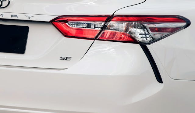
Cars used to look like modernist architecture, with gentle curves that were almost invisible against logically straight body panels. A good example even from the post-2000 era is the E39 5 Series; this midsize BMW sedan sported modest curves thrown into its classically gorgeous body. Such understatement is generally frowned upon these days. Exaggeration is the norm, DLO FAIL had the gall to enter the realm of hypercars, and some designs embrace this curvaceous madness to the point of shedding tears of exasperation. Even minivans cry such tears, ditching flatter body panels for more organic, flowing lines complete with runny mascara around their taillights.

These automotive crying eyes and bad mascara jobs came up in a conversation with my girlfriend, as we waited for curbside grocery pickup. A Toyota Sienna minivan joined us in the queue. She mentioned her distaste for this design, and we made the Tammy Faye Bakker reference to prove the point. No matter, let’s dig deeper into the problem.
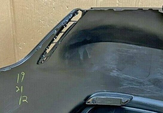
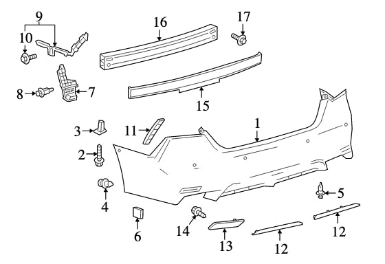
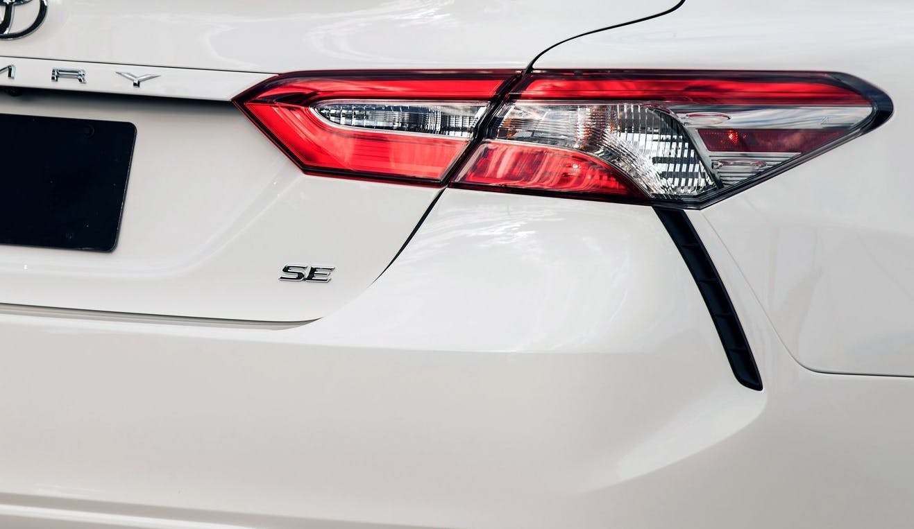
The Camry’s makeup gaffe is only on the SE and XSE models, as they take a regular Camry’s bumper and strategically punch a hole in it. A cosmetic trim plate is added (#11, right photo) to show off the fact that’s a legit hole where you’d never expect one. Yes, it’s real, so it theoretically gets a bad rap like Tammy Faye (who wasn’t nearly as one-dimensional as one might expect). And it’s nice to have a sporty-ish appliance for less than a base model Toyota Highlander, right? Isn’t this design foible a victimless crime?
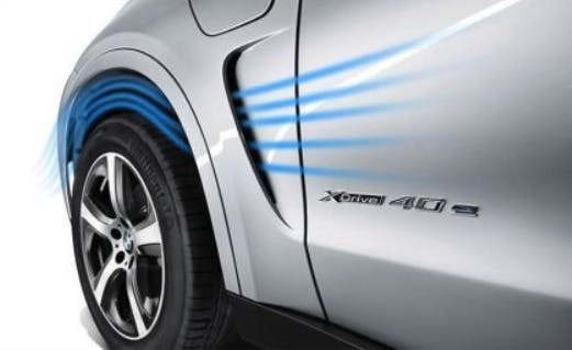
Possibly. But at some point these pointless aerodynamic appendages are a prosperity gospel power grab that’s heretic to the design purist. Any vent behind the rear wheel is intended for air management of a supercar with acres of downforce, or as one of two holes managing the airstream’s wake around the tire. Or it can be an “exhaust vent” for cooling the rear brakes, an engine radiator, or a turbo’s intercooler on said supercar. After sifting through the Camry’s press releases and body parts catalogues, and given Sam Smith’s experience behind the wheel, I have a hard time believing Toyota made those real holes to serve a real purpose.

Well, a purpose outside of pure styling, anyway. Consider that every Camry has the requisite aero tweaks in this area with no extra holes, trim pieces, or added cost. Take a close look at the bodyside flank that follows the curve of the SE/XSE’s bumper hole. These sharp flanks likely reduce drag as the air whizzes past the body. But these flanks exist on all Camrys.
Marketplace
Buy and sell classics with confidence
The extra bumper holes of the SE/XSE do a good job making the execution look cooler, especially since the tail lights themselves have internal curves that logically translate into the mascara stains. And I say that without (much) sarcasm or (any) hate, as such flare for design is what made the jet age, midcentury aesthetic of the 1950s so wonderful in the first place.
I just wish the mascara stain was detached from the taillights and handled a bit more like the W205 C-Class.

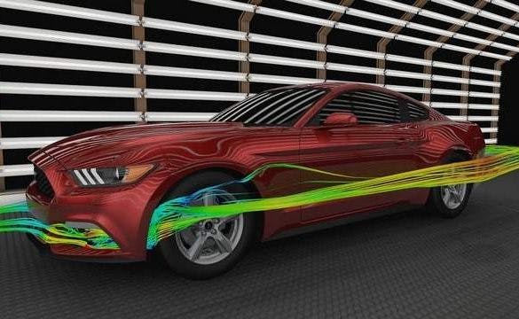
Or it could have been a part of the air scoopage (technical term) in a functional air curtain, utilized by many and perhaps entered into the mainstream collective consciousness thanks to the 2015 Ford Mustang’s promotional material. Air curtains have their place, especially considering how every aero trick in the book must be implemented to lower drag, increase fuel economy, and help automakers appease their CAFE taskmasters. (For those needing more information on air curtains, this video does a fantastic job.)
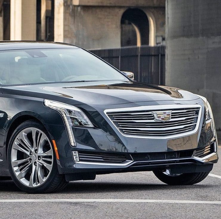
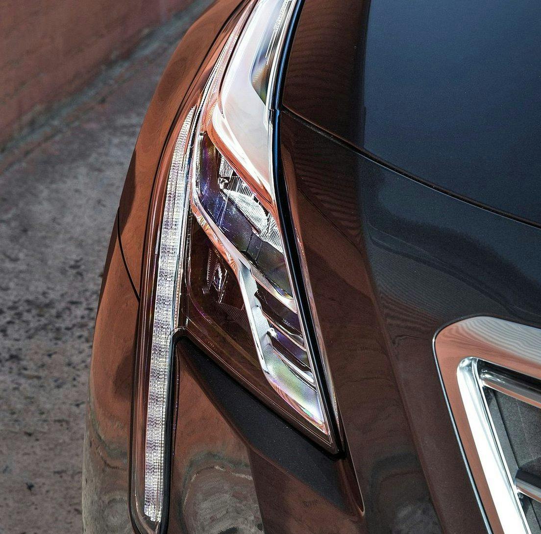
Back to the matter at hand, and the fact that crying car lights aren’t just a problem restricted to the posteriors of Toyota products. Probably the best examples come from Cadillac’s portfolio, with jewel-like appendages crying away but (mercifully) steering clear of the aforementioned mascara faux-pas.
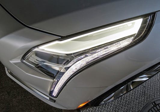
Cadillac’s interpretation of the weeping light is functional (as daytime running lights and often amber LED turn signals) and are an integral part of the body’s design, making the leading edge stand out much like the chrome trim of the slab-sided 1961–69 Lincoln Continental. Bawl all you want Cadillac, it looks good on you! And it might even look good on the upcoming Lyriq EV, as well as every other vehicle looking to make a bolder statement than its competition.
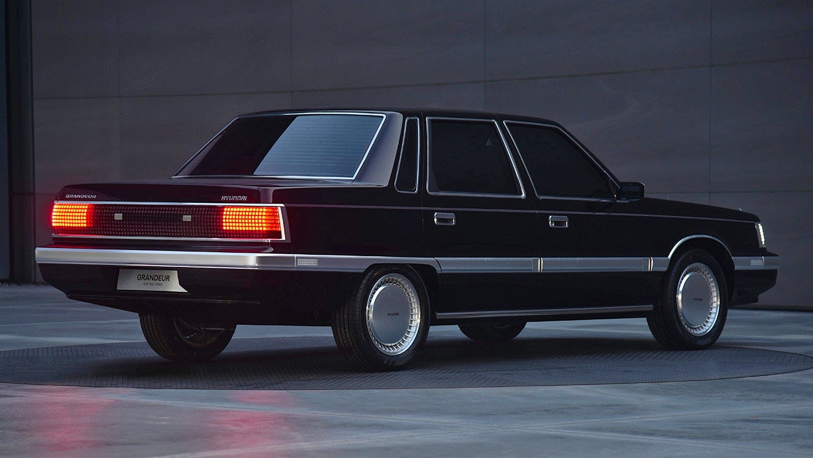
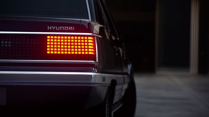
Sooner or later, everyone will get sick of seeing these tears of automotive creativity. There is a lifecycle to every trend. That moment can’t happen soon enough for me, as its time for designers to make timeless, traditional yet thoroughly modern lighting pods—like the Hyundai Grandeur EV. Of course, this example is too literal to work on modern cars with soaring belt lines and taller posteriors. But hey, it’d bring to my face a tear of joy.
