Media | Articles
De Tomaso P72 designer is “euphoric” over public’s reaction
Although Hagerty is predominantly a classic car insurance company, now and again a modern car comes along that blows us away. That was the case at the 2019 Goodwood Festival of Speed, when we experienced the unveiling of the new De Tomaso P72.
Since then, social media has been ablaze with pictures of this photogenic new car, but we wanted more than photos. So spoke to the designer himself, Jowyn Wong, founder of Wyn Design and also the designer of the De Tomaso Apollo IE. Wong discusses his influences, as well as the similarities between the P72 and other cars, in the exclusive interview below. His answers have been edited slightly for clarity.
Hagerty: How did It feel to experience the amazing public reaction to the P72 at Goodwood?
JW: The reaction and energy was remarkably special; I don’t think anyone expected to see the revival of De Tomaso in such a form. The experience of the unveiling and watching her roar up the circuit was euphoric.
Yes, many people that we spoke to expected more of a development of the Pantera GT5, not something so shapely as the P72. What can you say about the design journey? What were your influences?
Marketplace
Buy and sell classics with confidence
JW: The P72 is the spiritual successor to the De Tomaso P70. It is designed to tell a story of the ’60s period. The aesthetics of the vehicle itself convey this message with its period styling that is reimagined with the latest modern design tools and state of the art engineering. Every line tells a story that relates to historical relevance; it’s a combination of art and history offered in a modern and effective package. Everyone is telling stories of performance figures and aerodynamic capabilities, but the P72 breathes life into the lost art and beauty in automotive design.


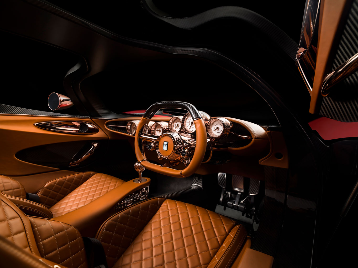
What about that stunning interior, with its copper details and exposed gear linkages?
JW: The interior represents the period from the mid 1950s to ’60s, particularly luxurious design themes in automotive styling that were so astonishingly beautiful I felt it was lost and forgotten. I took the opportunity to integrate these stunning themes and details with a modern approach, while carefully preserving its origin and intent.
And what of those colors!
JW: We chose that direction for the colors because the original P70 was red with gold wheels; the combination was typically Italian, further emphasizing its period approach to design. Polished copper details were my own flavor. As the product is positioned to attend several major automotive shows, I felt it was necessary to put on a good show and make her shine, resulting with healthy conflicting reactions. Generally, most of the audience loves the direction. As we have to remember, 50 percent of the audience aren’t automotive enthusiasts; it’s rather art and design in the form of automotive.
Finally, there’s been a lot of discussion about the outward similarities between the P72 and Jim Glickenhaus’ Ferrari P4/5, bodied by Pininfarina. Was it one of your inspirations?
JW: Jim’s car was absolutely not an inspiration. If you compare the designs, they are very different. Jim’s interpretation is more of a 2000s modern approach at the time. It is a beautiful car, but P72’s contours feature long strokes of curves with all edges that are rounded off. The P4/5’s design language speaks an entirely different philosophy. It comes with many straight lines and harder edges; the entire body is boxed, whilst the P72 is what we call a Coke-bottle body and is absolutely fluid in approach. At first glance, I can see why people think so, and both pay homage to P cars to the ’60s, which are all very similar to start with.
Learn more about Wyn Design here.


