Media | Articles
Why touchscreens are infecting everything
Buying a new car? I hope you like touchscreens—modern interiors are full of them. Blame Tesla or Apple or the entire Zoomer generation, but the trend of shoving more and more functionality into a capacitive display isn’t going away.
The death of haptics, muscle memory, and good ol’ tactile involvement shouldn’t be taken lightly, and you probably know that touchscreens have significant drawbacks when used in a vehicle interior. But there are also some real benefits. Let’s look at the positives and negatives and get to the bottom of the subject: Are the days numbered for the humble physical button?
More Screens: But why?
I spoke with leading experts in the field, from user-experience (UX) designers to manufacturer reps and analysts. Almost all of them singled out one factor in touchscreen proliferation: cost.

Connor Hill, the global design lead at Toyota Connected, Toyota’s development lab for digital mobility, told me: “In terms of pure cost, fewer switches to produce equals savings to the company and customer.” Hill offered a caveat, noting the pessimism of his statement, but his view is definitely realistic.
Another major factor is the growing percentage of consumers who genuinely want a vehicle with screens. Drew Meehan is the senior product manager and a former UX designer at mapping and navigation company TomTom. “People like touchscreens,” he said, “and see them as being modern and relatable, because they echo their consumer devices.” Meaning: phones. “For OEMs, this is a win-win scenario. They can save money while simultaneously providing an experience that’s perceived by consumers as more premium, more modern, and more approachable than traditional in-car systems, like rotary knob controllers.”
Marketplace
Buy and sell classics with confidence
Finally, there’s flexibility and the ability to grow. In an era of over-the-air software updates, where a download tonight might give your car fun new features for tomorrow’s commute, allowing the user experience to evolve is key. “Over the air updates impact software,” said Christopher Schreiner, the product director of UX innovation at consulting firm Strategy Analytics. “Having all features software-driven behind a touchscreen provides greater ability to fix bugs or provide improvements.”

It’s worth remembering that changes meant to be improvements don’t always work out that way. Around a year ago, Tesla pushed out a major software update, V11, which rearranged many of the major components in its cars’ primary touch interface. Some owners didn’t like the change and took to popular online discussion destinations like Reddit, where complaint threads saw thousands of upvotes.
And yet, so many of us hate them
There is, of course, a healthy list of reasons why touchscreens don’t always satisfy. “Any time a driver takes their eyes away from the road, the risk of an accident climbs,” Robby DeGraff said. DeGraff is an industry analyst at analytics firm AutoPacific. That risk, he notes, applies “regardless [of whether you’re] zooming in on a map or quickly checking to ensure you’ve tapped the right physical button to turn on the window defroster.”
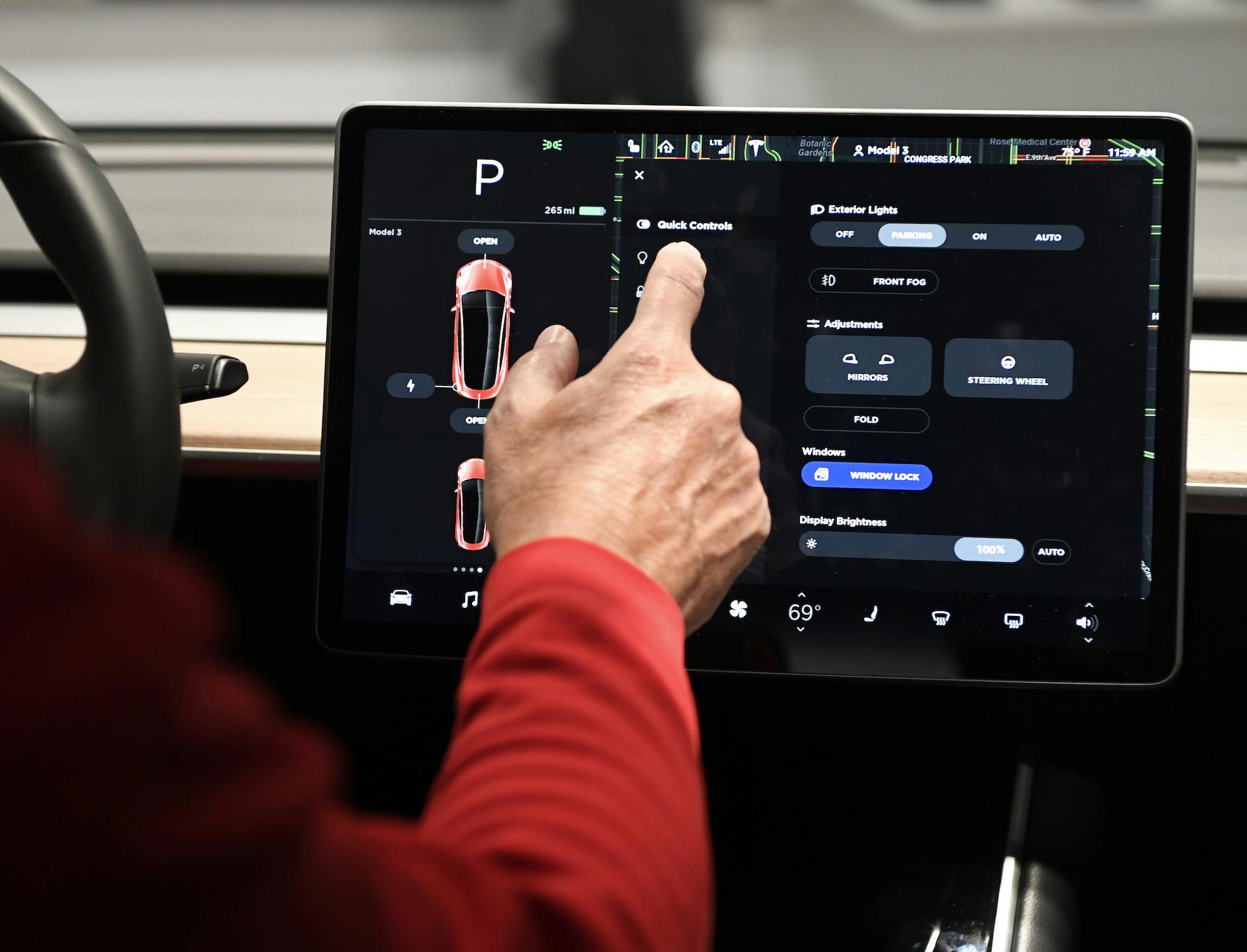
Nor is the problem as simple as merely looking at a screen to locate a virtual button. Many touchscreen interactions require two or more taps to access a feature or function—the driver must open a menu, then navigate a submenu, then drag a control slider to perform some task once accomplished by simply twisting a knob. A knob that could be located through muscle memory and without taking your eyes off the road. “Navigating through a maze of menus and submenus is not only time-consuming but dangerous to do in motion,” DeGraff added.
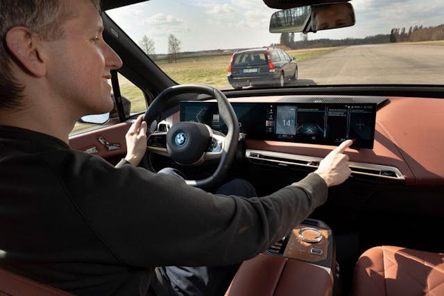
Add a bumpy road to the equation, things get even worse. “Using a touchscreen while driving is nothing like a smartphone experience,” Strategy’s Schreiner said. “There is a reach involved, at a slightly awkward angle, while traveling at 70 mph. Icon sizes need to reflect this, and interior designers need to provide anchors for the elbow and/or wrist, to allow for better use.”
If all that weren’t enough, there’s also weather. Northerners will tell you that capacitive touchscreens can be miserable to use in colder months. Fingers wrapped up in your warmest mittens? Good luck toggling the seat heaters in your Model 3.
Still, it’s getting better
At this point, touchscreens have been in cars for decades. It’s worth remembering that, while early examples were universally awful—slow, distracting, often buggy—the technology has actually improved a great deal in recent years.

Much of that improvement comes down to hardware. Toyota’s Hill blamed slow processors and cheap displays for many of the industry’s early woes. UX designers, he noted, have also learned a lot since. A big focus now, he said, is creating responsive designs that work well on all display sizes. There is also a push to simplify things as much as possible: “The best thing we can do as designers,” Hill said, “is to be great editors—cut anything that doesn’t have significant value, and fight for simplicity on behalf of our users.”
TomTom’s Meehan told me about “cognitive load”—the amount of thought required for a person to perform a given action. Design simplicity, he said, is crucial in reducing that load: “What’s important is that drivers know where to find important functions without having to think too much. And without having to search through deep menus, navigation structures, or hidden features.”
What comes next?
What does the future hold? Probably more touchscreens—at least in the short term. “Data from our AutoPacific 2022 Future Attribute Demand Study revealed that 29 percent of consumers nationwide, who intend to buy a new vehicle within the next three years, want a center screen that’s ten inches or larger,” DeGraff said. (For perspective, the current largest Apple iPad is now 10.9 inches; an iPad Mini, the bottom of the range, offers a screen around two inches smaller.)
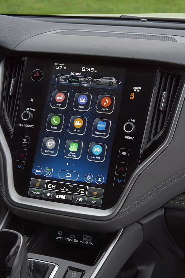
Still, DeGraff said, there is reason for optimism—we may see something of a return to physical cockpit controls. “The latest VW Golf GTI and Golf R debuted with strictly touch-capacitive surfaces for just about everything on the vehicle. It was so cumbersome, and quite frankly dangerous. Now, top brass at VW have confirmed that the car will soon [return to] physical buttons.”
TomTom’s Meehan is also optimistic. “There are quite a few design teams and leaders who are now backing off full-touchscreen systems in order to improve the user experience,” he said. “Big screens aren’t likely to go anywhere anytime soon, but over the next few years, I expect to see a slow return of physical controls for basic or repeat functions, like HVAC, lights, and media volume.”
In other words, if you’re a fan of the humble volume knob, don’t give up. There may be a little more tactility in our future after all.






Seems like, “Data from our AutoPacific 2022 Future Attribute Demand Study revealed that 29 percent of consumers nationwide, who intend to buy a new vehicle within the next three years, want a center screen that’s ten inches or larger,” could also read, “Data from our AutoPacific 2022 Future Attribute Demand Study revealed that 71 percent of consumers nationwide, who intend to buy a new vehicle within the next three years, DO NOT want a center screen that’s ten inches or larger.” Hmmmm.
“In terms of pure cost, fewer switches to produce equals savings to the company and customer.”
Well, until it breaks, anyway. Or, one emergency stop sends one cell phone flying into said screen rendering it inoprative.
When touchscreens first appeared, I embraced them for the same reasons everyone else did. Now, I hate them. Because they break. And when they do, they’re really expensive to repair. The Sync system on my 2011 Mustang broke twice. The first repair cost $600. I didn’t repair it the second time. Knowing what i know now, I’ll take buttons any day.
My fishing buddy liked his screen and the backup camera – until one day when backing up he took off the passenger mirror on a tree. Using the mirror instead of technology would have saved him $800.
Too bad we have so few choices – I’d rather have things I could replace than everything wired into a central point of failure.
Don’t text and drive, but it’s ok to scroll through your song list? At least my brother in law has the sense to tell the passenger what he wants to listen to and delegates it.
Voice activated interface would be much safer, although who knows what additional premium it would add to the cost.
As far as the reduced cost for manufacturers, when did this happen? Seems like my cost increased along with a large jump in profits.
I like lots of buttons, switches gauges all over the place. Let’s thrown in a few multi-controllers and joysticks as well. I would like a handful of those old foot-activated high-beam switches all over the floor while we are at it. I want my car to look like a cockpit of a 747.
Seriously, I have two Tesla’s both with large touch screens that receive over-the-air updates frequently and I can’t imagine it any other way.
Just another thing that will break after the warranty is up.🤬
For 40 years I have always purchased a new vehicle and kept it for a few years. The last one I purchased was a 2015 Ram 2500 Diesel that I ordered. I hated it and it had the smallest touchscreen available in the line. I sold it two years later and replaced it with a mint 1994 Ford F-150 XLT. No touch screens and it can be maintained faily easily and economically. The first manufacturer that offers a new vehicle sans touch screens will get my business.
“Luddites Unite!”
I grew up using computers and have no problem with tech for tech’s sake. But it’s absolutely ridiculous to migrate basic functions from buttons and knobs to submenus on a touchscreen. HVAC, audio volume, wipers, interior lights, cruise control, etc. need to remain as eyes-on-the-road as possible because we use those all the time. Having to navigate submenus is fine for infotainment and esoteric settings. We can add much functionality to electronically controlled systems in a vehicle – imagine having multiple modes for electric sliding doors, where there’s a fast “bailout” speed for emergencies and an ordinary use speed. Adjusting the color, brightness, and pattern of interior lighting is fine on a touchscreen but turning on a maplight to find where you dropped something should be as quick and intuitive as possible. As for the size of the screens, at some point a large screen makes it more difficult to see outside the vehicle at night. Designers need to be selective in their usage. Voice controls *must* improve drastically; it’s fine to adjust things on submenus when parked but madness to expect drivers to do it safely at 70mph. Many functions should be completely disabled at speed for the sake of safety. Need to pair a Bluetooth device or access YouTube? PULL OVER.
I said it many times…technology isn’t the problem, it’s how and when we use it. The temptation of “immediacy” in many things we do, and it’s resultant compulsion to react instead of plan ahead, and delaying, has created a culture of not planning, and making necessary adjustments ahead of or before getting under way.
It’s not only dangerous and problematic when driving, but in most other aspects of life as well.
To be honest there is a bit of common sense that needs to be employed here.
#1 most of the cars out there that need radio or heat adjusted are climate controlled and have both touch screen and knobs. As for the radio most have touch screen and and buttons on the wheel.
Any of the other functions are often programing options that you should do while stopped. They are options you set like do 4 doors unlock or one, set the mirrors to tilt down when backing or not. These options are things you can not program with a knob and even on the screen they are intended to be done parked.
The phone number is one where it is either done by voice or you pick from a menu in the Drivers Info Center in the dash in front of you. Buttons are on the wheel.
The safety factor here just takes a little common sense. Most of my experience is on GM cars and they are not bad. Some others may not be as good with redundant knobs of buttons.
The most important info is in the Driver Info Center in the dash between the Speedo and tack. It is not distracting at all.
I think much of this is a bit over blown. It is not like texting on a hand held phone as you drive. If you have a function that bad then pull over. Odds are it is a function not intended to be used while driving.
What the Automakers should consider is locking out some of these features if not in park. Sometimes you just have to corral the heard.
With all technology comes great responsibility no matter what or where as you can do great damage if you don’t use the common sense God has given all of us.
Dear hyperv6 – you think “God has given us all” common sense? Man, you drive around a far different crowd of people than I do, my friend.
I do not want to veer off into theology debates, but in the department of Common Sense, all men are NOT created equal. 😐
Brilliant… These same car exec’s push all electric at a time when there is not enough electric to go around now (with just 2% EV’s on the road). Now they add in all this technology and yet some have had to shut down production due to not having any chips.
Maybe a good discussion with actual people that will buy these things might be a better route to take for these exec’s…
The insanity may be confirmed when they put touchscreens on motorcycles.
I hate touch screens in cars and will not buy a car with one. Not only are they annoying, but distracting, and whoever thought it a good idea to direct a drivers attention away from the serious business of driving to a “screen” so he can change the radio station, or defog his rear window? Where was/is the NTSA on this one? How are these less dangerous than texting while driving? I will enjoy my older analog cars thank you, and leave the computers and monitors in my office where they belong.
Open note to GM—–Please offer a No-Tech Silverado, or my ’19 is my last. I would pay more. I can work everything in my ’06 Z06 Vette, ’95 Firebird, and ’70 El Camino w/o taking my eyes off of the road. And I don’t need a phone while driving.
Simplified. Real reason why touch screens are with us and will never leave: They Look Cool.
Pain in the ass, with all their drawbacks even dangerous they look good and that’s the real reason we want them.