Media | Articles
Why touchscreens are infecting everything
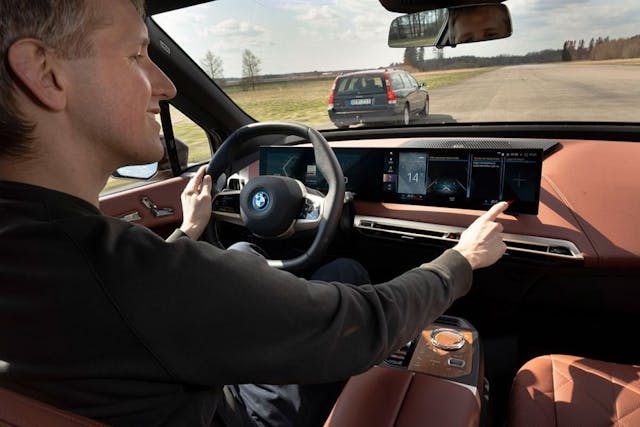
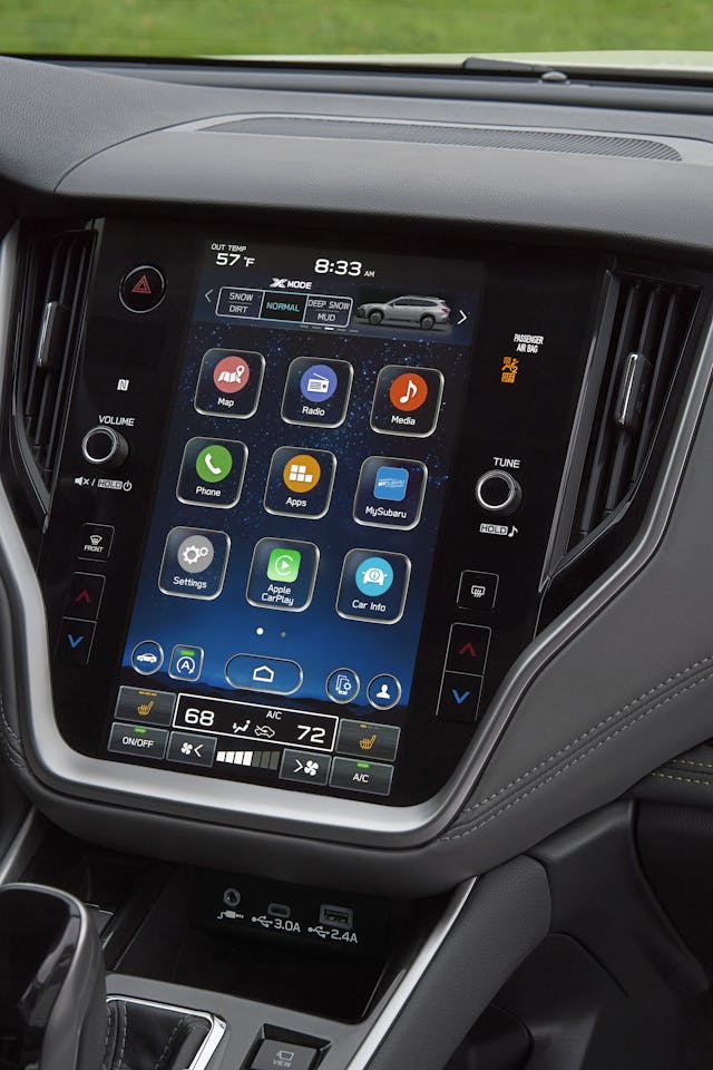
Buying a new car? I hope you like touchscreens—modern interiors are full of them. Blame Tesla or Apple or the entire Zoomer generation, but the trend of shoving more and more functionality into a capacitive display isn’t going away.
The death of haptics, muscle memory, and good ol’ tactile involvement shouldn’t be taken lightly, and you probably know that touchscreens have significant drawbacks when used in a vehicle interior. But there are also some real benefits. Let’s look at the positives and negatives and get to the bottom of the subject: Are the days numbered for the humble physical button?
More Screens: But why?
I spoke with leading experts in the field, from user-experience (UX) designers to manufacturer reps and analysts. Almost all of them singled out one factor in touchscreen proliferation: cost.

Connor Hill, the global design lead at Toyota Connected, Toyota’s development lab for digital mobility, told me: “In terms of pure cost, fewer switches to produce equals savings to the company and customer.” Hill offered a caveat, noting the pessimism of his statement, but his view is definitely realistic.
Another major factor is the growing percentage of consumers who genuinely want a vehicle with screens. Drew Meehan is the senior product manager and a former UX designer at mapping and navigation company TomTom. “People like touchscreens,” he said, “and see them as being modern and relatable, because they echo their consumer devices.” Meaning: phones. “For OEMs, this is a win-win scenario. They can save money while simultaneously providing an experience that’s perceived by consumers as more premium, more modern, and more approachable than traditional in-car systems, like rotary knob controllers.”
Marketplace
Buy and sell classics with confidence
Finally, there’s flexibility and the ability to grow. In an era of over-the-air software updates, where a download tonight might give your car fun new features for tomorrow’s commute, allowing the user experience to evolve is key. “Over the air updates impact software,” said Christopher Schreiner, the product director of UX innovation at consulting firm Strategy Analytics. “Having all features software-driven behind a touchscreen provides greater ability to fix bugs or provide improvements.”

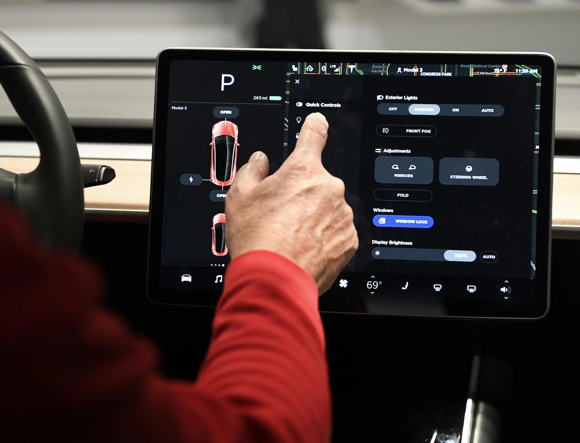
It’s worth remembering that changes meant to be improvements don’t always work out that way. Around a year ago, Tesla pushed out a major software update, V11, which rearranged many of the major components in its cars’ primary touch interface. Some owners didn’t like the change and took to popular online discussion destinations like Reddit, where complaint threads saw thousands of upvotes.
And yet, so many of us hate them
There is, of course, a healthy list of reasons why touchscreens don’t always satisfy. “Any time a driver takes their eyes away from the road, the risk of an accident climbs,” Robby DeGraff said. DeGraff is an industry analyst at analytics firm AutoPacific. That risk, he notes, applies “regardless [of whether you’re] zooming in on a map or quickly checking to ensure you’ve tapped the right physical button to turn on the window defroster.”
Nor is the problem as simple as merely looking at a screen to locate a virtual button. Many touchscreen interactions require two or more taps to access a feature or function—the driver must open a menu, then navigate a submenu, then drag a control slider to perform some task once accomplished by simply twisting a knob. A knob that could be located through muscle memory and without taking your eyes off the road. “Navigating through a maze of menus and submenus is not only time-consuming but dangerous to do in motion,” DeGraff added.

Add a bumpy road to the equation, things get even worse. “Using a touchscreen while driving is nothing like a smartphone experience,” Strategy’s Schreiner said. “There is a reach involved, at a slightly awkward angle, while traveling at 70 mph. Icon sizes need to reflect this, and interior designers need to provide anchors for the elbow and/or wrist, to allow for better use.”
If all that weren’t enough, there’s also weather. Northerners will tell you that capacitive touchscreens can be miserable to use in colder months. Fingers wrapped up in your warmest mittens? Good luck toggling the seat heaters in your Model 3.
Still, it’s getting better
At this point, touchscreens have been in cars for decades. It’s worth remembering that, while early examples were universally awful—slow, distracting, often buggy—the technology has actually improved a great deal in recent years.

Much of that improvement comes down to hardware. Toyota’s Hill blamed slow processors and cheap displays for many of the industry’s early woes. UX designers, he noted, have also learned a lot since. A big focus now, he said, is creating responsive designs that work well on all display sizes. There is also a push to simplify things as much as possible: “The best thing we can do as designers,” Hill said, “is to be great editors—cut anything that doesn’t have significant value, and fight for simplicity on behalf of our users.”
TomTom’s Meehan told me about “cognitive load”—the amount of thought required for a person to perform a given action. Design simplicity, he said, is crucial in reducing that load: “What’s important is that drivers know where to find important functions without having to think too much. And without having to search through deep menus, navigation structures, or hidden features.”
What comes next?
What does the future hold? Probably more touchscreens—at least in the short term. “Data from our AutoPacific 2022 Future Attribute Demand Study revealed that 29 percent of consumers nationwide, who intend to buy a new vehicle within the next three years, want a center screen that’s ten inches or larger,” DeGraff said. (For perspective, the current largest Apple iPad is now 10.9 inches; an iPad Mini, the bottom of the range, offers a screen around two inches smaller.)

Still, DeGraff said, there is reason for optimism—we may see something of a return to physical cockpit controls. “The latest VW Golf GTI and Golf R debuted with strictly touch-capacitive surfaces for just about everything on the vehicle. It was so cumbersome, and quite frankly dangerous. Now, top brass at VW have confirmed that the car will soon [return to] physical buttons.”
TomTom’s Meehan is also optimistic. “There are quite a few design teams and leaders who are now backing off full-touchscreen systems in order to improve the user experience,” he said. “Big screens aren’t likely to go anywhere anytime soon, but over the next few years, I expect to see a slow return of physical controls for basic or repeat functions, like HVAC, lights, and media volume.”
In other words, if you’re a fan of the humble volume knob, don’t give up. There may be a little more tactility in our future after all.


I’m an Insurance Broker…….I don’t like them , distraction , and most applications take 2 or more taps…….your eyes are off the road for 2-3 seconds…… KABOOM…….someone is dead. LESS is MORE in an automobile. People wonder why there are so many accident…….look at the screen !
My first time using a touch screen was in a mid-80s Buick Riviera rental car in Ft Lauderdale, FL. I was trying to change something on the screen (climate control?) when I had my first (and only) fender bender.
It was relatively minor, and the guy I hit, and the responding officer were more interested in the touchscreen technology than they were in documenting the accident.
I try to avoid excessive touch screens in cars I own, but it is getting harder and harder to find nowadays.
Touchscreens in cars is one of the most dangerous stupid ideas ever put in an automobile.
So a police offer can give me a ticket for fiddling with my phone while driving, but not for using a touchscreen. Why? Because it’s on the dashboard? I see them as distracting and less purposeful than a comparable button or dial. And I’ve owned more than a few cars with touch screens. I will say that most of these cars had steering wheel buttons and voice commands that let me avoid the screen while driving. Once stopped though, I do enjoy the tech features of the touchscreen.
I don’t care for all this “modern” stuff. I drive a ’55 Mercury. I also have a large screen…it covers the whole back door & keeps the flies out all summer long. There.
It’s time to outlaw these dangerous distractions in cars as well as cellphone availability while moving. People need to look out the windshield and operate the vehicle, not play with toys while driving. Check out the list of options my 57 Chevy had available when built. Everything needed in a car could be ordered including a vacuum ash tray, and two cup holders were on the open glove compartment door usable when stopped. No toys were needed then or now.
I’m only 40 and I can’t stand a lot of the tech they are putting in vehicles now. Sure, they “look cool” but do they really function any better? I don’t find it to be the case. For comparison, I had a 2011 Grand Cherokee with nav. Yes, the radio was touch screen, but very basic. Everything else was controlled with physical buttons and it had physical gauges. My sister bought a 2018 Grand Cherokee. When I first saw the updated interior – huge screen, less buttons, and gauges replaced with a screen, I thought it looked pretty cool, however when I actually drove it and tried to use everything, my opinion quickly changed – my old 2011 was much easier to drive and accomplish simple tasks such as turning on heated seats – and way less distracting.
I guess that is why for my newest vehicle I went with a 5th gen Toyota 4runner. Other than the little nav screen which is about the same as my old 2011 Grand Cherokee, everything else is old school – reminds me of my first Toyotas – early 90s Celica models – intuitive, easy to use, still has all the necessities, comfortable, reliable, and easy to drive.
IMO, the flash of screens everywhere just isn’t worth it/doesn’t live up to the hype. Sometimes, what appears to be progress is quite the opposite.
The first part of the article says it all! Cheaper to build. The H E double L with everything else
I have a 2021 Ford Explorer ST that has a nice combination of touchscreen and tactile buttons and knobs. The touchscreen is great but you don’t have to use it if you don’t want to. I find it a bit safer not to sometimes.
I bought a 2017 Camaro and it has one of those things. Once I learned how to turn it off it hasn’t bothered me, I don’t know why it’s there in the first place. All the HVAC controls are on the manual controls and the various gauge functions on the steering wheel.
What annoys me is the lack of a disc player. I’ve been told that I can put all the discs on to sticks. All 500+? I’ll never live that long!
So, I’ve got this thing taking up valuable space and no music. The music issue I corrected by sticking electric cut-outs on the exhaust.
At this point I’m looking at finding a way to remove this blank screen thing and install something useful. The screen size would appear to accommodate six Autometer gauges, you can never have too many of those.
My solution is “delete option”. No dealer will stock them, but they could be ordered without this BS.
My Lexus still has a cd player and I’m so glad for that. They’re often called outdated because they still do this. And sometimes too many gauges make you paranoid! Believe me, I know! I had a dash full of gauges and I found myself always watching every little move they made. Looks really cool though.
I have old cars and new cars so I see both all the time. I had a Mercedes that had all the voice activated commands. Whether it was ac adjustment, change radio station, skip song, or adjust seat. All voice command. My Lexus has the “mouse pad” so you don’t have to reach for the screen, but you still have to look at it. The navigation is disabled while in drive on most late cars as well. If I need navigation in my older car, now I’m having to fiddle with my phone, which doesn’t disable while in drive. Don’t worry, I always pull off in a parking lot or shoulder! That being said, I love my older cars so much better than my newer ones. I have a brand new $100k Lexus and I drive my 79 Volvo more. Haha!!!
If 29 percent of the people want a touchscreen 10″ or larger, would it be safe to say 71 percent do not? I’m not a fan of having so much of the driving experience related to the touch screen. The steering wheels are getting way too cluttered also. I don’t mind sitting in my driveway and deeper settings to personalize my settings, but basic functions should be one click away. Voice activated would be great nut also can be distracting when you have to keep repeating yourself
To me, touch screens are impossible to integrate into dashboard designs. Bentley and Rolls-Royce have it right making them disappear completely until you need them. That said, screens do offer more options than ever before. Kind of like going to McDonald’s and taking 15 minutes to use their ordering screens when you could have just gone up to a server and said “I’d like a Big Mac Meal, please.” I think the future of this should be Augmented Reality technology projected on the windshield with sensors to detect hand gestures and voice commands so you never have to take your eyes off the road. The tech already exists. I guess it is just cost.
Hate ’em! Here’s an example why – Recently rented a car for a 1000+ mile drive. Happened to be a Ford Edge, but I doubt this is unique to Ford. Car had about 40K miles on it. On day, I hit the volume up button on the steering wheel and the screen totally froze up. Clock stopped clocking and no functions worked. Nothing could restore it. After shutting the car down and restarting, the screen came up blank. Drove the last 150 miles that day with no radio. Next morning, everything seemed fine. Chilly morning, so my wife clicked on her heated seat. 15 minutes, the screen flaked out again so she couldn’t turn it off. This time, a full shut down and restart brought it back to normal. Stayed OK for the rest of the trip, but you can be sure we never turned on the seat heat again! If I owned this car, I assume this would be an expensive, out-of-warranty repair, with very difficult diagnosis since it was intermittent.
I second all the touchscreen venom. However, am I the only one who finds it degrading to have to speak to machines? Recently I was told that for a particular service, I would need to scan a QR code and use an app. I said “don’t have a smartphone” (I do). After some back/forth disbelief this service provider finally gave me an accommodation. Now I’ll be breezing right past the hordes scanning, uploading and hoping their phones are charged, etc. I wonder if they’ll envy me or just see me as a luddite?