Media | Articles
Vision Thing: Pop-culture relevance does not guarantee good design
It’s no secret that I’m very over pop culture’s continued efforts to eat its own tail. Movies, music, fashion, design; nothing has been able to exist for the last twenty years or so without referencing the past. The current era of postmodernism has given this cultural stagnation an intellectual rigor it doesn’t deserve.
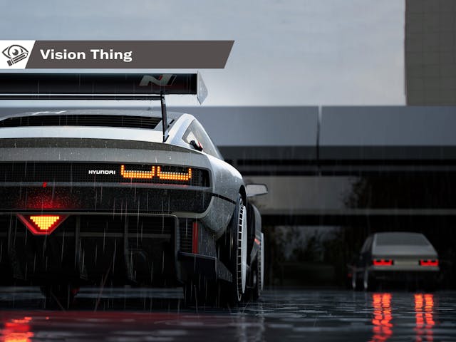
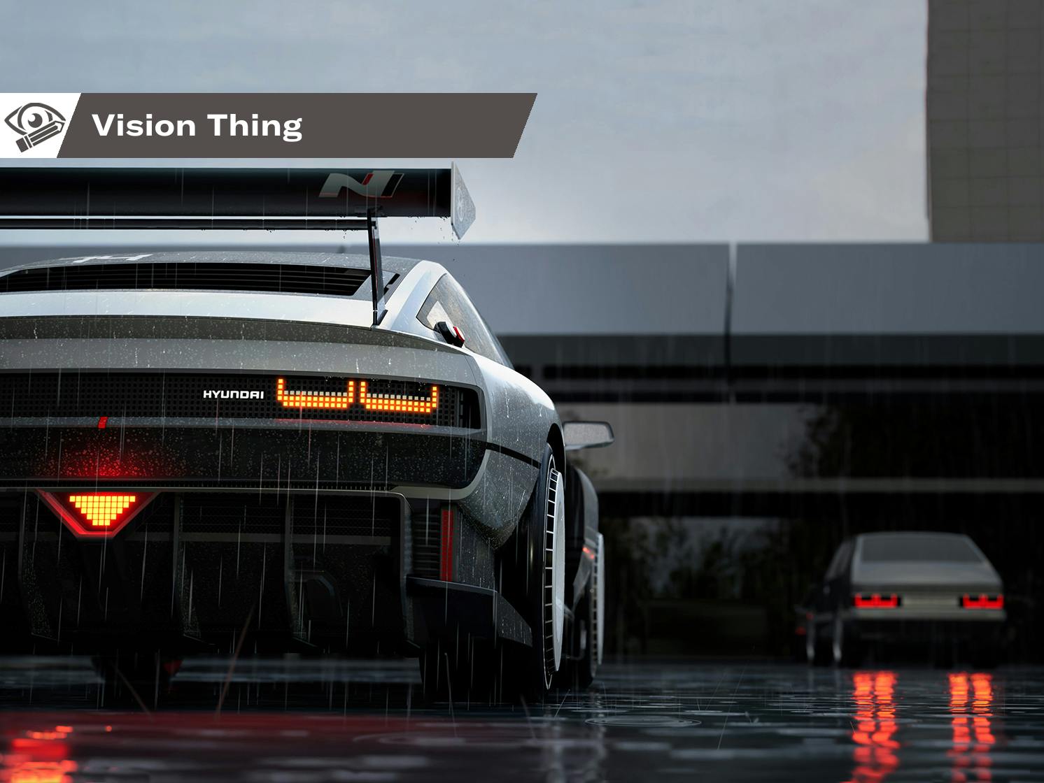
Would the Hyundai N Vision 74 concept have hit as hard without the overt ’80s influences? I doubt it. It’s a handsome thing, but strip away the pixels, turbofan wheels, and radical drivetrain and it’s utterly conventional. Hyundai had no choice, as it is a relatively young company with no visual heritage nor iconic models to call its own (unless you’re a big Pony or Excel fan). Without a Mustang or a 911 in the ranks, Hyundai opted to tap into the synthwave zeitgeist as a shortcut to relevance.
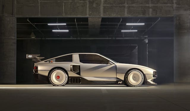
Here’s my whole problem with this approach (you knew I had one): It only remains relevant as long as those influences do. Once the buying public moves on from this particular, backward-looking cultural and aesthetic predilection, these designs are going to be more dated than neon leisure wear.
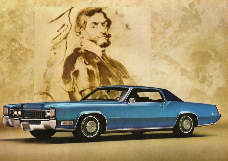
Good design is shaped by the time in which it exists, but it is not beholden to it. Off the top of my head, the late ’60s Mitchell-era Cadillacs, the early ’70s “fuselage body” Mopars, or the NSU Ro80 are timeless in their appeal; they don’t rely on trendiness for design credibility.
Which is how I recently managed to get into a gentle online imbroglio with a design critic. This gentleman wrote a piece suggesting that one of the only true measures of a car’s design success was its pop-culture relevance. Wait, what?
Marketplace
Buy and sell classics with confidence
So instead of creating a vehicle that fulfills a customer’s needs with both logic and aesthetic appeal, I should have been trying to style something for the next James Bond film? (That’s a bit of an inside joke, as this kinda did sorta not quite happen, but I’m not going any further considering the statute of limitations on such matters.)
To be fair, the author in question does attempt to separate pop-culture relevance by association from pop-culture success. I feel he is getting into semantics to shore up a shaky premise, but let’s start at the beginning. The first line of the article states “car design is no science.” Well, I have a bachelors of art and a masters of art; the clue is right there in the titles.
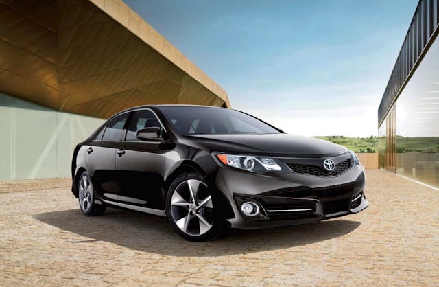
“To try and measure its success is a task so fraught with limitations, the result cannot be anything but pseudo-scientific,” the piece continues. Except, of course, that artistic endeavors can be deemed good/bad in the same manner as its scientific counterparts: by the judgment and opinions of qualified peers. It’s problematic to suggest that only car designs achieving cultural relevance are truly successful.
This mistakenly conflates two different characteristics: popular and good. There are plenty of cars that are great, iconic even, but are they good designs? Not necessarily. We can talk about their form, proportions, visual features, and their time and place in history, but does it all come together in a way that transcends and offers something new, different, or enduring?
Certain things become popular because they appeal to a great number of people, but is there something else of merit they offer? For example, I was as disappointed when 9-1-1 Lone Star disappeared from British TV schedules as much as the next Rob Lowe fan, but high-brow television it wasn’t. It’s simply a well-constructed, entertainingly fun show that I enjoyed watching, but let’s not pretend it’s Sir Alec Guinness in Tinker Tailor Soldier Spy.
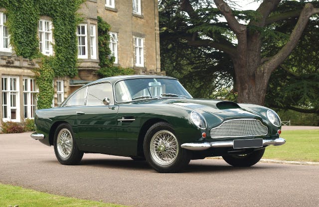
Our erstwhile design critic used the Silver Birch Aston Martin DB5 to support his argument that if the car wasn’t driven by the most famous employee of His Majesty’s Secret Service it wouldn’t be so desirable. There’s one small problem with this: The ostensibly similar DB4, which enjoys no cultural reference points whatsoever, is only slightly less valuable. In the case of the Zagato-bodied versions, the gap is even thinner.
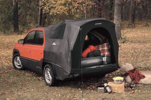
He also cites the Pontiac Aztek as having achieved pop-culture relevance, by association. Apart from Radwood-style irony, few are truly celebrating the Aztek. If it were earnestly lauded, we’d being seeing cherished examples setting fire to the marketplace.)
This brings up a question: Can we have discussions about the design of the Aston and the Pontiac that’s separate from their iconography? Absolutely, as both were deliberate, considered pieces of product placement by the series’ producers. It said something about the fictional characters who drove them—a subliminal trick of “show, don’t tell” to the audience. Screen infamy has no bearing whatsoever in any serious debate about their merits as pieces of automotive design.
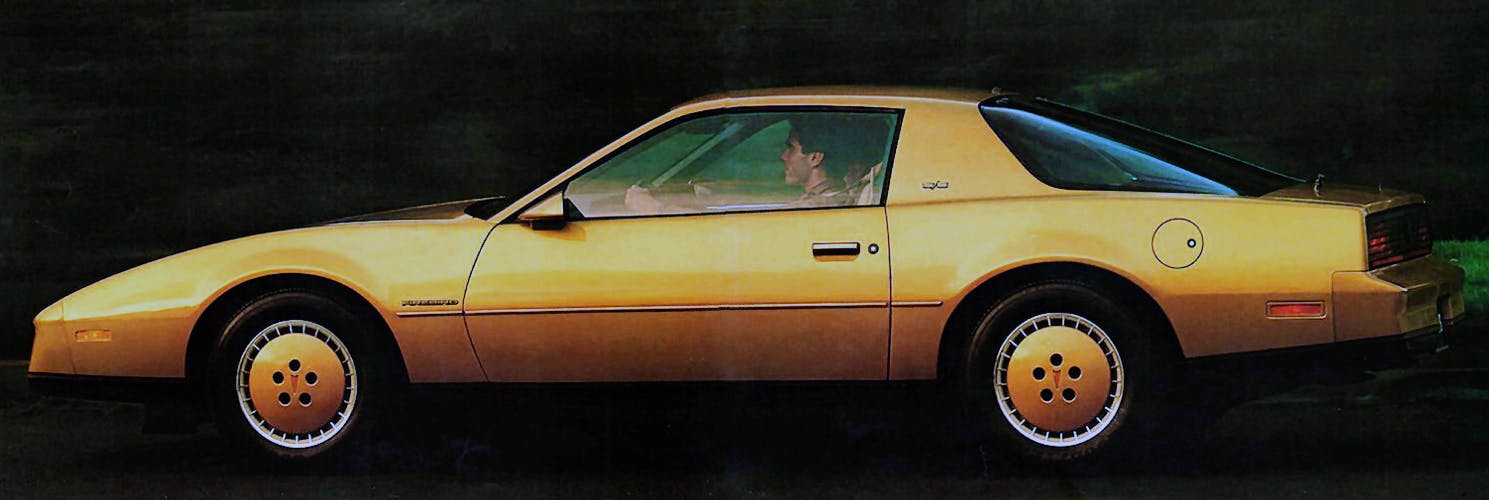
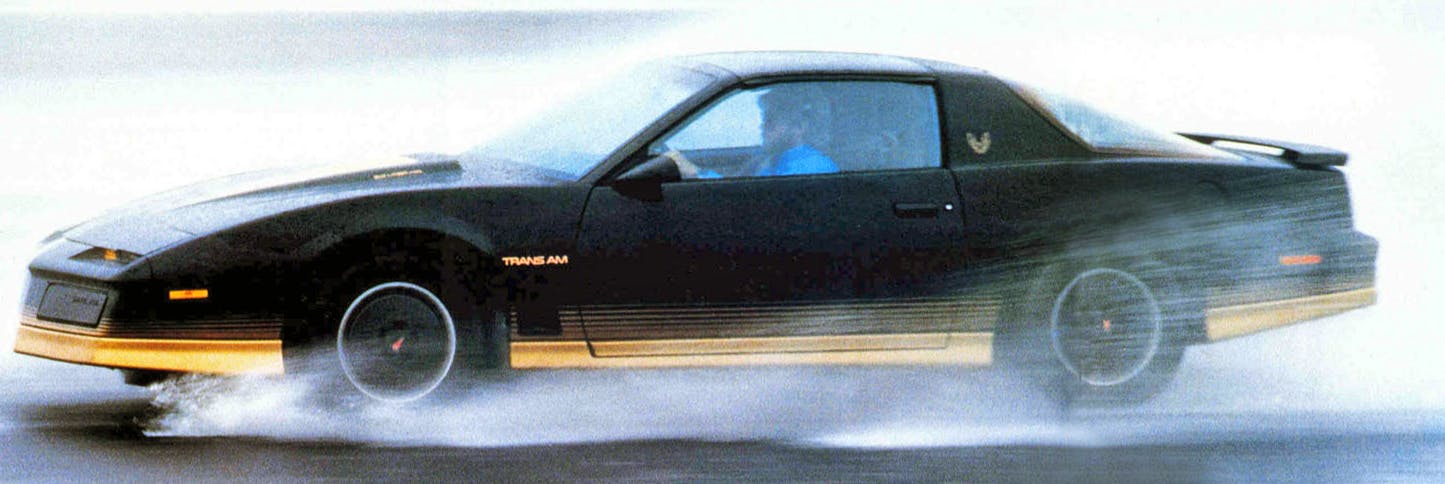
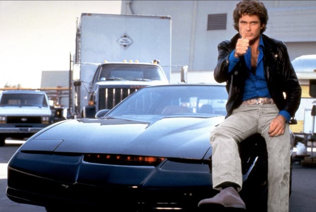
Let’s flip this asinine argument around for a moment. Could we say with a straight face that a 1982 Firebird would not be worthy of our attention were it not for Knight Rider?
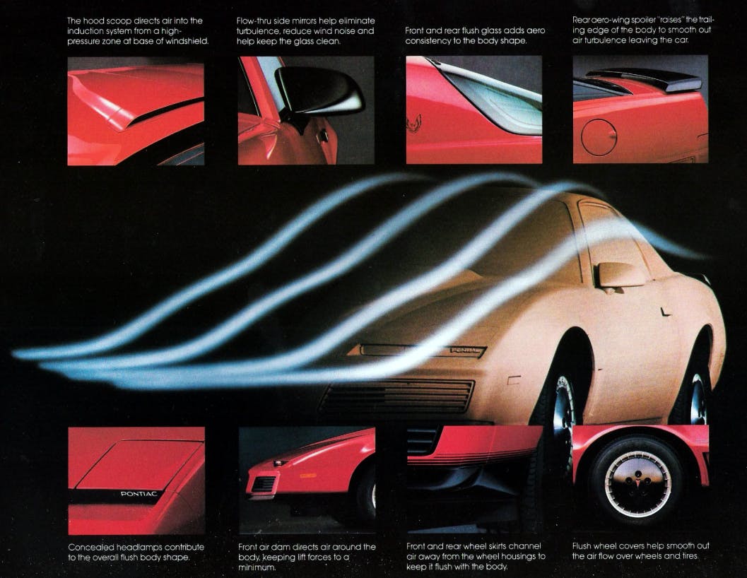
Let’s see: Downsized and lightened for the third generation, the Firebird represented a quantum leap of what had gone before in terms of engineering, technology, and appearance. Consider the wrap over rear tailgate glass. Imagine the engineering and financial challenges of getting that into production in the early ’80s: The Porsche 924 pioneered this in 1976, but that car was much shallower in profile. And Pontiac made it work in far higher numbers, for much less money. The rake of the windshield was 62 degrees, far steeper than anything GM had previously attempted. This created a body with a drag coefficient of 0.32, a full four years before the revolutionary 1986 Ford Taurus.
Sure, the quality wasn’t great, and the packaging was a bit suspect (no glove compartment, à la pre-facelift 986-generation Porsche Boxster). Yet the third-generation Firebird didn’t need Glen A. Larson to become a proper American classic. Did he help sell a few? Undoubtedly, as Pontiac was in a bit of a sales slump at the time. But there’s no wondering why Universal Studios executives recognized immediately that the Firebird was perfect for its new Friday night action-adventure series about a high-tech crime-fighting car and his human partner.
Alas, let us return to the article that set me off on this diatribe. The author ridicules turn-of-the century remakes (Fiat 500, New Beetle, fifth-generation Mustang, and BMW-era Mini) for exploiting pop culture appeal in the form of retro design. One could argue that the original versions of these cars had almost all been immortalized onscreen in one way or another. (I’m struggling to think of a starring role for the 500, but there’s always Herbie, Bullitt, and The Italian Job.) But that is not the argument being made here. Instead, these retro designs are being criticized for not staying true to their original design brief, which completely fails to take into account how the market had moved on in the intervening years. Was VW really going to build a rear-engine Beetle in the late 1990s, rather than share a convenient platform with the front-drive Golf?
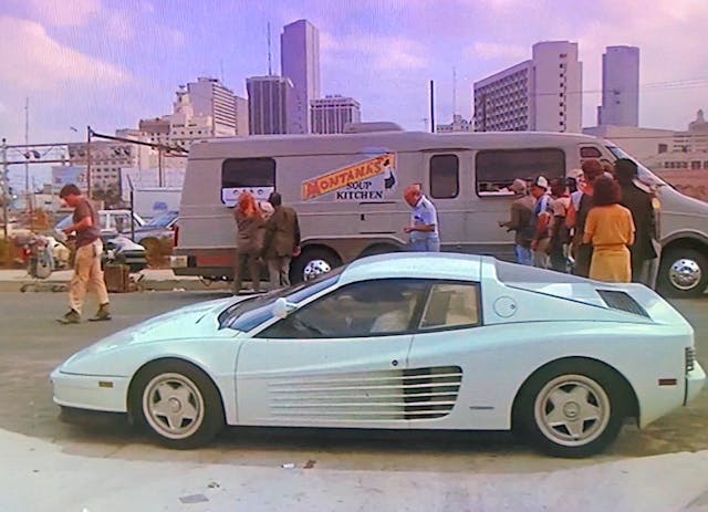
Knight Rider and car-centered shows like it were the result of happenstance, not foresight. The Dukes of Hazzard producers chose the ’69 Dodge Charger because when the show premiered in 1979 the cars were cheap and plentiful. It didn’t matter that they wrecked three per episode, because the cars were worth nothing and no one wanted them. Michael Mann loved Ferraris so much he didn’t want to subject a real one to the trials of filming Miami Vice, so he used a Daytona replica. This upset the Old Man in Modena so much he sued, but he eventually backed down and agreed to provide two Testarossas for the rest of the series.
Pick any one of your favorite shows from the period, and the choice of car purely comes down to expedience and the demands of churning out 22 episodes of network television on a weekly basis.
No one could have foreseen a future in which these shows turned into digitally archived (and easily retrieved!) memories—or, more to the point, a future in which this vintage media would be forced into ubiquity by a cohort of creative taste makers who never experienced them first-hand. I enjoyed these car-based action adventure shows as much as any eight-year-old at the time; they were my introduction to cool and exotic American cars I didn’t see on British roads. But if I go to a car show now as an adult and see a Ghostbusters Ecto-1 or a Robocop Taurus, I think they’re a bit naff. I’d rather see the unadorned original and judge it on its merits as a car, rather than a prop.
Which is why I can’t stand this style of pseudo-academic essaying. It reflects everything which in my view is wrong concerning discussions about design these days. At worst, it’s intellectual gatekeeping. Being a good communicator about design also means being a good salesman and explaining things in a clear, coherent way. (What I try to do here. If my head retreats too far into my turtleneck, I trust that you will let me know.)
Let’s be honest, the best hero car from an ’80s TV show was the Coyote X (a.k.a McLaren M6GT) from Hardcastle and McCormick. Anybody got a line on one?
***
Adrian Clarke is a professional car designer, earning a degree in automotive design from Coventry University and a masters in vehicle design from the Royal College of Art in London. He worked for several years at a major European OEM, and in the ’90s his daily driver in London was a 1979 Ford Thunderbird.
Check out the Hagerty Media homepage so you don’t miss a single story, or better yet, bookmark it.


I think the 1990-1996 Corvettes have been overlooked design-wise due to the “gold-chain, midlife crisis” car tag attributed to Corvettes.
Agreed, I think the C4 overall is a strong piece of work. I considered a very nice ZR1 in red before I bought the Mondial. It’s much better than the flabby C5 which came after it.
Just happy to be able to use the word “naff” now! I’ll use it on my kids (“That tat is naff”) and it’ll be part of American Pop Culture in no time.
McCormick hopping in the car, immediately laying rubber and redlining in pursuit of the bad guy – a favourite memory of daytime tv repeats.
I’ve come around to thinking good retro design is a lot less lazy than just putting pinched headlights and overly aggressive bumpers on every model. A retro design usually has to be made to work in a much larger vehicle (for a modern segment’s dimension expectations) reproduction, and generally goes against the popular design elements mentioned above. Although it’s becoming clear that each generation flowing a retro design starts to blend more and more contemporary elements (Mustang, Mini, TT).
I enjoy the retro design conversation/argument.
I loved the 2005 Mustang when it came out. Wasn’t a Mustang person, hadn’t been on my list. 3 years later I got a used one off the dealer lot (the red interior did it). It was a fun car with some flaws (i.e., interior plastics varied in quality). I miss the red interior more than the rest of the style of the car though, and I prefer the circa 2013 Mustang most of any modern Mustang. The “that’s different” charm of the 2005 when new is gone.
I own (for some time now) a 1969 Mustang. Love the 4 headlights (not fussy on the 70 front end). It’s my favourite of the old Mustang designs. The two Mustangs I have owned don’t have side coves (often cited as a key Mustang design language piece). If a design has continuously used a design language is it retro? (Like if Beetle had never had gaps in production).
PT Cruisers amuse me, the HHR was tolerable but the SSR and last Thunderbird are misses to me. Beetles are okay, Fiat 500 I think that has to be your thing. Mini works for the most part (don’t get the oversizing of them in some versions). Camaros look like a toy design to me. The Challenger is too chunky but I still love them… but mostly because I have a really hard time naming another 2000+ car design I like that isn’t exclusive/big bucks type stuff, off the top of my head:
Some of the arts & science Cadillacs, Kia Stinger if I pretend it is a 2 seater with a back door for my backpack… the outgoing Nissan Z, C8 Vettes…
Retro can be done badly or well. I have covered some of this in an earlier column, but yeah the PT was a novelty when it came out (and sold and sold and sold) as did the New Beetle but that wore out it’s welcome a lot quicker. The MINI for the fist two generations where absolutely bang on the money. What our critic friend neglects to mention is that Minis were fun to drive and the MINI nails this. The SSR was a pastiche of a truck that never existed and the Thunderbird was a redo too far. The irony is you could have done a modern Thunderbird on that platform and done something really stylish and credible.
When I see modern designs from Lexus and BMW and others I see the tools use to create the design. Not the human behind the tools. That is to say, I see lines pulled and pinched in software because it is easy to pull and pinch lines with these tools. The tail is wagging the dog in these design “ideas”.
As a designer it’s very easy for me to spot stuff posted online by enthusiastic amateurs that has been ‘designed in the software’. I can tell they’ve done maybe one or two sketches and then worked it all out digitally. It’s a crutch for people who haven’t really developed their sketching skills. When I see my students doing this I always impress on them they should have a clear understanding of the 3D forms and how the whole thing fits together before firing up Alias or Blender.
This is a fascinating discussion, and a rare case wherein I disagree with Adrian. His credentials give him the authority to assign metrics to an art form which ends up either supporting the popular view or being scoffed by the masses. As with any artistic pursuit, the bulk of humanity can agree the work is hideous but if just one person thinks it’s beautiful then the fact is it’s beautiful…to that person. Of course there are infinite variations between the “accepted” extremes giving us plenty of fodder for this very discussion. It’s why we don’t all drive the same car, like the same music or lust after the same woman. No amount of analysis should change that person’s opinion, and that’s my firmly held opinion.
This is a point I see quite a lot, and at it’s essence it’s beauty is in the eye of the beholder. That’s partly the point I was trying to make in this article – something can have widespread appeal and be good, but not necessarily great. A great design isn’t always beautiful to look at (although it should appeal visually on some level) but has other factors that elevate above the merely good. I think the appeal of a piece of art or music is much more personal – you either get it or you don’t. With cars there is a lot more to consider than just the appearance. I spoke about this in an earlier column, but as a designer it’s important I understand what customers like, even if it’s not to my personal taste.