Media | Articles
Vision Thing: Pop-culture relevance does not guarantee good design
It’s no secret that I’m very over pop culture’s continued efforts to eat its own tail. Movies, music, fashion, design; nothing has been able to exist for the last twenty years or so without referencing the past. The current era of postmodernism has given this cultural stagnation an intellectual rigor it doesn’t deserve.
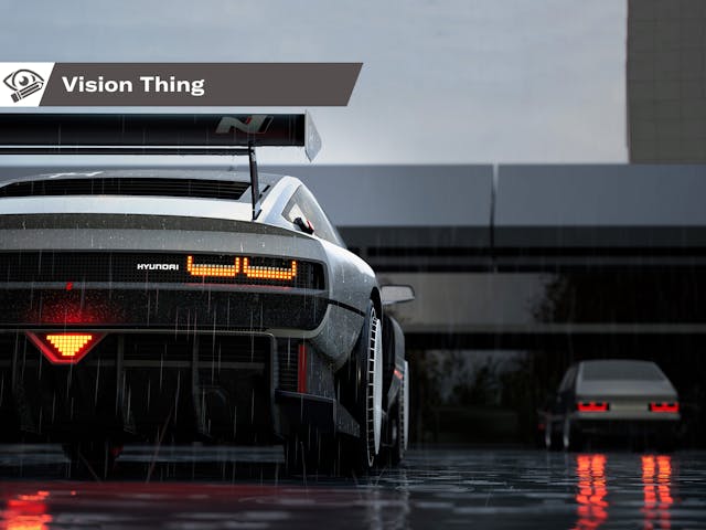
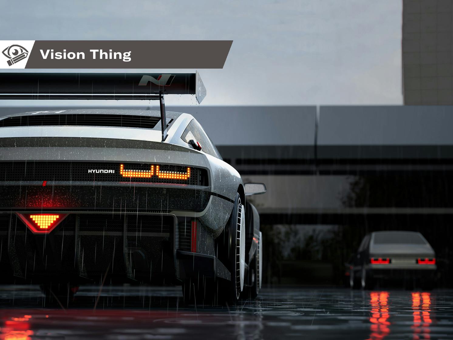
Would the Hyundai N Vision 74 concept have hit as hard without the overt ’80s influences? I doubt it. It’s a handsome thing, but strip away the pixels, turbofan wheels, and radical drivetrain and it’s utterly conventional. Hyundai had no choice, as it is a relatively young company with no visual heritage nor iconic models to call its own (unless you’re a big Pony or Excel fan). Without a Mustang or a 911 in the ranks, Hyundai opted to tap into the synthwave zeitgeist as a shortcut to relevance.
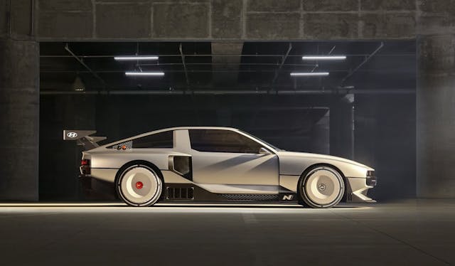
Here’s my whole problem with this approach (you knew I had one): It only remains relevant as long as those influences do. Once the buying public moves on from this particular, backward-looking cultural and aesthetic predilection, these designs are going to be more dated than neon leisure wear.
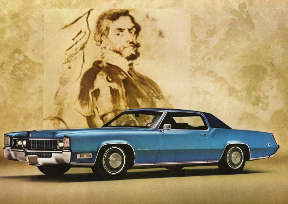
Good design is shaped by the time in which it exists, but it is not beholden to it. Off the top of my head, the late ’60s Mitchell-era Cadillacs, the early ’70s “fuselage body” Mopars, or the NSU Ro80 are timeless in their appeal; they don’t rely on trendiness for design credibility.
Which is how I recently managed to get into a gentle online imbroglio with a design critic. This gentleman wrote a piece suggesting that one of the only true measures of a car’s design success was its pop-culture relevance. Wait, what?
Marketplace
Buy and sell classics with confidence
So instead of creating a vehicle that fulfills a customer’s needs with both logic and aesthetic appeal, I should have been trying to style something for the next James Bond film? (That’s a bit of an inside joke, as this kinda did sorta not quite happen, but I’m not going any further considering the statute of limitations on such matters.)
To be fair, the author in question does attempt to separate pop-culture relevance by association from pop-culture success. I feel he is getting into semantics to shore up a shaky premise, but let’s start at the beginning. The first line of the article states “car design is no science.” Well, I have a bachelors of art and a masters of art; the clue is right there in the titles.
“To try and measure its success is a task so fraught with limitations, the result cannot be anything but pseudo-scientific,” the piece continues. Except, of course, that artistic endeavors can be deemed good/bad in the same manner as its scientific counterparts: by the judgment and opinions of qualified peers. It’s problematic to suggest that only car designs achieving cultural relevance are truly successful.
This mistakenly conflates two different characteristics: popular and good. There are plenty of cars that are great, iconic even, but are they good designs? Not necessarily. We can talk about their form, proportions, visual features, and their time and place in history, but does it all come together in a way that transcends and offers something new, different, or enduring?
Certain things become popular because they appeal to a great number of people, but is there something else of merit they offer? For example, I was as disappointed when 9-1-1 Lone Star disappeared from British TV schedules as much as the next Rob Lowe fan, but high-brow television it wasn’t. It’s simply a well-constructed, entertainingly fun show that I enjoyed watching, but let’s not pretend it’s Sir Alec Guinness in Tinker Tailor Soldier Spy.
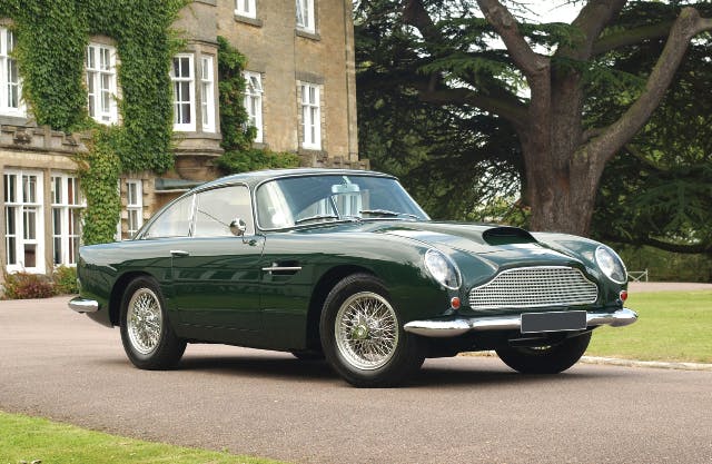
Our erstwhile design critic used the Silver Birch Aston Martin DB5 to support his argument that if the car wasn’t driven by the most famous employee of His Majesty’s Secret Service it wouldn’t be so desirable. There’s one small problem with this: The ostensibly similar DB4, which enjoys no cultural reference points whatsoever, is only slightly less valuable. In the case of the Zagato-bodied versions, the gap is even thinner.
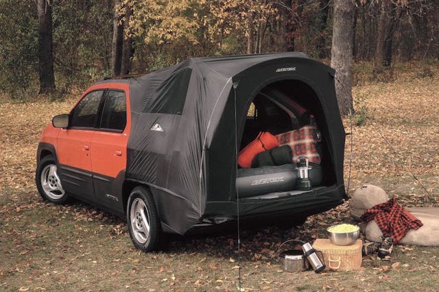
He also cites the Pontiac Aztek as having achieved pop-culture relevance, by association. Apart from Radwood-style irony, few are truly celebrating the Aztek. If it were earnestly lauded, we’d being seeing cherished examples setting fire to the marketplace.)
This brings up a question: Can we have discussions about the design of the Aston and the Pontiac that’s separate from their iconography? Absolutely, as both were deliberate, considered pieces of product placement by the series’ producers. It said something about the fictional characters who drove them—a subliminal trick of “show, don’t tell” to the audience. Screen infamy has no bearing whatsoever in any serious debate about their merits as pieces of automotive design.
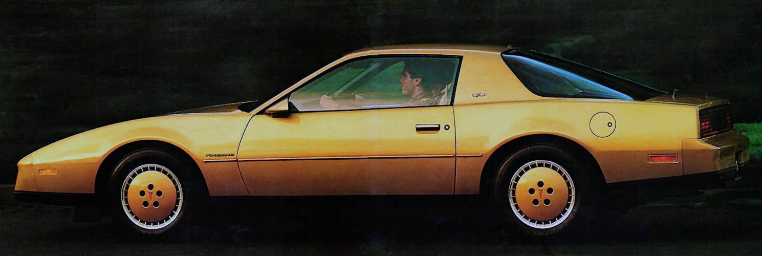
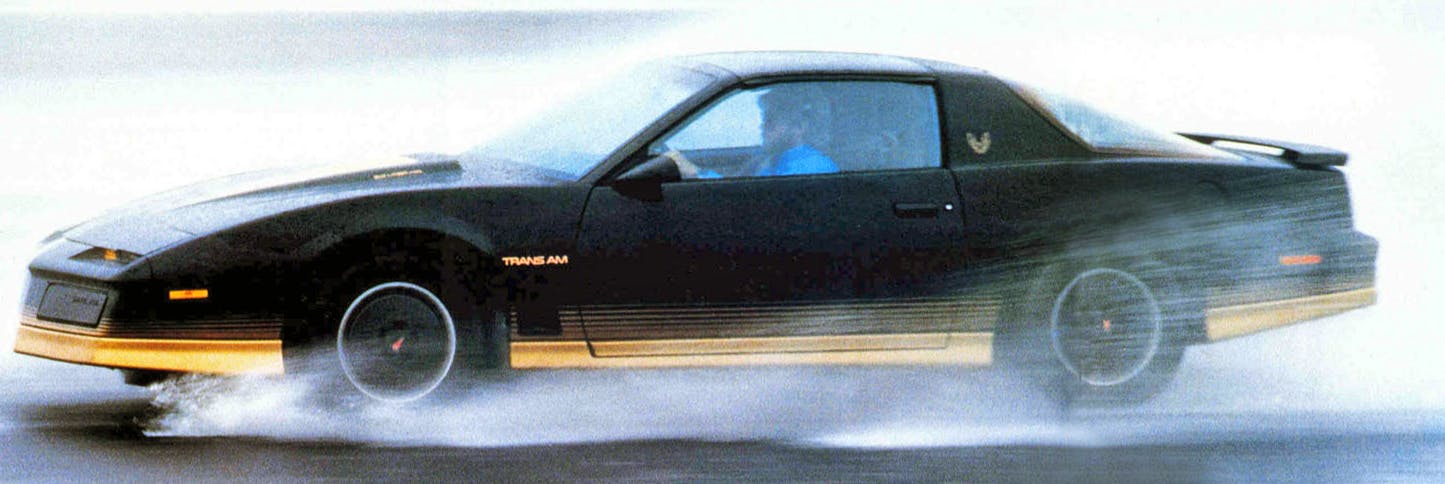
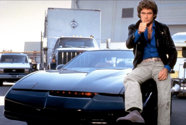
Let’s flip this asinine argument around for a moment. Could we say with a straight face that a 1982 Firebird would not be worthy of our attention were it not for Knight Rider?
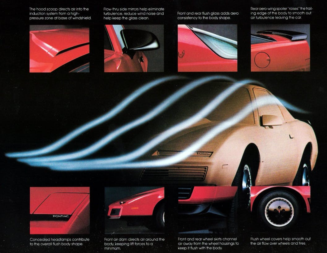
Let’s see: Downsized and lightened for the third generation, the Firebird represented a quantum leap of what had gone before in terms of engineering, technology, and appearance. Consider the wrap over rear tailgate glass. Imagine the engineering and financial challenges of getting that into production in the early ’80s: The Porsche 924 pioneered this in 1976, but that car was much shallower in profile. And Pontiac made it work in far higher numbers, for much less money. The rake of the windshield was 62 degrees, far steeper than anything GM had previously attempted. This created a body with a drag coefficient of 0.32, a full four years before the revolutionary 1986 Ford Taurus.
Sure, the quality wasn’t great, and the packaging was a bit suspect (no glove compartment, à la pre-facelift 986-generation Porsche Boxster). Yet the third-generation Firebird didn’t need Glen A. Larson to become a proper American classic. Did he help sell a few? Undoubtedly, as Pontiac was in a bit of a sales slump at the time. But there’s no wondering why Universal Studios executives recognized immediately that the Firebird was perfect for its new Friday night action-adventure series about a high-tech crime-fighting car and his human partner.
Alas, let us return to the article that set me off on this diatribe. The author ridicules turn-of-the century remakes (Fiat 500, New Beetle, fifth-generation Mustang, and BMW-era Mini) for exploiting pop culture appeal in the form of retro design. One could argue that the original versions of these cars had almost all been immortalized onscreen in one way or another. (I’m struggling to think of a starring role for the 500, but there’s always Herbie, Bullitt, and The Italian Job.) But that is not the argument being made here. Instead, these retro designs are being criticized for not staying true to their original design brief, which completely fails to take into account how the market had moved on in the intervening years. Was VW really going to build a rear-engine Beetle in the late 1990s, rather than share a convenient platform with the front-drive Golf?
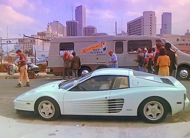
Knight Rider and car-centered shows like it were the result of happenstance, not foresight. The Dukes of Hazzard producers chose the ’69 Dodge Charger because when the show premiered in 1979 the cars were cheap and plentiful. It didn’t matter that they wrecked three per episode, because the cars were worth nothing and no one wanted them. Michael Mann loved Ferraris so much he didn’t want to subject a real one to the trials of filming Miami Vice, so he used a Daytona replica. This upset the Old Man in Modena so much he sued, but he eventually backed down and agreed to provide two Testarossas for the rest of the series.
Pick any one of your favorite shows from the period, and the choice of car purely comes down to expedience and the demands of churning out 22 episodes of network television on a weekly basis.
No one could have foreseen a future in which these shows turned into digitally archived (and easily retrieved!) memories—or, more to the point, a future in which this vintage media would be forced into ubiquity by a cohort of creative taste makers who never experienced them first-hand. I enjoyed these car-based action adventure shows as much as any eight-year-old at the time; they were my introduction to cool and exotic American cars I didn’t see on British roads. But if I go to a car show now as an adult and see a Ghostbusters Ecto-1 or a Robocop Taurus, I think they’re a bit naff. I’d rather see the unadorned original and judge it on its merits as a car, rather than a prop.
Which is why I can’t stand this style of pseudo-academic essaying. It reflects everything which in my view is wrong concerning discussions about design these days. At worst, it’s intellectual gatekeeping. Being a good communicator about design also means being a good salesman and explaining things in a clear, coherent way. (What I try to do here. If my head retreats too far into my turtleneck, I trust that you will let me know.)
Let’s be honest, the best hero car from an ’80s TV show was the Coyote X (a.k.a McLaren M6GT) from Hardcastle and McCormick. Anybody got a line on one?
***
Adrian Clarke is a professional car designer, earning a degree in automotive design from Coventry University and a masters in vehicle design from the Royal College of Art in London. He worked for several years at a major European OEM, and in the ’90s his daily driver in London was a 1979 Ford Thunderbird.
Check out the Hagerty Media homepage so you don’t miss a single story, or better yet, bookmark it.


Neon leisure wear is NOT dated!!!
I was never cool enough to pull it off in the first place!
As usual, Adrian is on point. This was another great read.
—
Hazzard Chargers were cheap and plentiful enough, but also cool enough to the be the hero car. The inversion of the muscle car “cool ladder” from 90s magazines until now pretty much matches up with the kid audience of that show growing up. There’s a lot of high value Mopar now and they were hardly covered pre 2000s.
But… most of the big value ones have the coke bottle styling. Some the modern Challenger echoes of course, without quite nailing it (I’d take a modern Challenger in a heartbeat if it made sense for me). So I think people getting past the only Ford or only GM bias would have seen these gain big value without the Duke boys.
—
Take the Bourke-designed (Loewy studio) 1953 Studebaker Starliner Coupe. It had its moment. The company didn’t fully capitalize on the sales potential in that moment. A few years go by and the company is gone. The bullet nose stude that preceeded it is arguably more pop culture relevant (Muppet movie, big presence in the “Dare to be different” movement Hot Rod Magazine has pushed off and on since the late 80s).
But…
Look at that design compared to the 1970 Camaro, arguably one of the top “pony car” designs period. [saying this as a Mustang owner] So I would suggest a pretty significant legacy for Bourke’s work even if it doesn’t get acknowledged as such.
I made that same argument in a college art class in the early ’70’s: that the current Camaro/Firebird were in profile very close to the ’53 Stude. The teacher had never seen the Stude before. Neither had most of my classmates.
I saw Goldfinger when it came out as a youngster, and I always thought that Tilly Masterson’s new Mustang was a much better looking car than that frumpy expensive English Aston Martin.
Still do. People confuse expensive with stylish.
I think the preference of Mustang over Aston comes down to taste – I’m not much of a fan of the original Mustang from an appearance point of view (my Mustang taste starts with the ’70), but weirdly my favorite Aston is the V8 Vantage from the eighties (a car that owes a lot of it’s appearance to the OG Mustang). From a pure design perspective none of them are that outstanding (they’re handsome enough but not revolutionary), but they are important iconic cars no doubt.
Irv Rybicki, who replaced Bill Mitchell as VP of GM Design, thought the ’70 Camaro is (or was) one of the best cars GM ever did. I don’t think it was recognized as such at the time, but looking back now there’s no doubt it was outstanding. Because there were still annual model changes then, and it had the misfortune to stagger into the malaise era with godawful tape packages, some of the impact was a bit lost.
I also think there is a little bit of snobbery around American car design when viewed through European eyes, which in my mind is ridiculous, when one of Mitchell’s stated aims with the ’70 Camaro was to make a more European flavored car.
I have a general theory that there are only so many notes that can be thrown together without being ear-splittingly offensive, only so many story lines that can be thrown at books and movies etc. before you start inevitably repeating things that have been done before… and we crank this stuff out like a puppy mill, seriously shortening the cosmic amount of time before you end up in repeat mode
Car design has an additional hurdle where regulations and performance requirements are increasingly influencing the shape of the car to the point where you don’t even have the option of repeating the past. Aside from the fact that the average consumer appears to lack something in the taste department and wants to blend in and buy essentially the same roundy-looking SUV the neighbor has… and in the same relatively limited color pallete of grey, silver, or whatever the approved colors of the era are… car design doesn’t have much hope of doing anything new or interesting
Even if you copied the 60s Cadillac or the Aston Martin or ‘allowed it to influence your design’, you probably couldn’t build it, and outside of a few eccentrics (like us) nobody would buy it
I’ve had thoughts along these lines as well.
I compare it to electric guitars, you can sort them by look rather easily:
Fender Strat, Fender Telecaster, Gibson Les Paul, Gibson, Flying V and a dozen or so more ending with “wild novelty design”. It’s really hard for anyone (even Fender) to come up with a new design that isn’t just a mutation of what already exists and in many cases the guitar companies are not compelled to do so as most “new” ideas don’t sell.
Car companies adopted this logic differently though with consumers buying into the 1-2 year it needs to be a new design thing that in modern day is still 3-5 years (outside of many Toyotas and Nissans). I’ll concede the “evolved designs” of F150 and Subaru sort of cheat this notion by making new generations that look similar but share few parts. Era blandness is not new (look at the full slate of 1952 cars, or 1964) but the last 20+ years having such dull colours and few outlier designs does make it feel grim.
Chevy doesn’t want to sell me a sedan. I’d buy a continuation (stylistically and in feel/purpose) 55 Bel Air or 70 Chevelle. If they wanted to go bigger a 66 Impala fastback or the fastback roof on a 69 Impala would happily have me buying an unchanged design multiple times (like having a stratocaster after a stratocaster).
Those examples are all great designs to me. Maybe this electric rollerskate world we are moving into??? will reinvent the “catalogue model” concept and I could pick from any of the body designs I want… like custom golf carts!
I think it’s partly due to products entering a sort of final form as the product development matures. Think about mobile phones – we had a wild west for a few years but now the form factor has essentially settled on the flat rectangle with a touchscreen as the default. Same with televisions now we have cheap flat OLED screens.
I still think the EV skateboard is somewhat of a false promise. I see a lot of people without any real engineering or design knowledge espousing them, but the reality is modern vehicles are a very complicated jigsaw of systems that cannot all be conveniently packaged in a 6″ deep chassis. That’s before you think about how to attach a bodyshell that would pass crash regs.
I’m a Mopar guy so I’ll take a ’70 Fury if we’re talking full sizers!
Speaking of which, “YouTuber and engineer Fran Blanche: ‘AI is plagiarizing our past to generate our future.'”
https://fstoppers.com/composite/ai-will-mean-end-digital-photography-624981
If you follow my writing I’ve spoken about the current fascination with AI and as it relates to car design at the moment. I don’t think visual creatives are under any immediate threat because of the limited way the software operates.
However I saw on Twitter this morning VO artists for video games are being asked to sign contracts which licenses the sound of their voices to be used by the publishers in AI generated speech in the future. If they don’t sign, they don’t get the work. This is extremely troubling and ties into larger problems about how creative work is not valued (probably because it’s not considered by typical owners of capital ‘real work’).
I have used enough software alleging to have AI to know that most don’t, and the few that come close probably require massive amounts of processing power. I suspect that there are a few firms out there that will be able to maintain these systems and be profitable, but I do not anticipate any real risk of widespread AI replacing living breathing thinking human beings
Wrap over glass – not the 1966 Barracuda, well earlier than the 924?
https://www.classiccarstudio.com/wp-content/uploads/legacy/1120/2.jpg
Yes, but that’s not a hatchback, it doesn’t need to survive the same stresses as a moving door.
Ha thanks for the save, I should have qualified it better!
1. “At worst, it’s intellectual gatekeeping.”
2. “Artistic endeavors can be deemed good/bad … by the judgment and opinions of qualified peers”
Discuss.
(How I do love your articles!).
Thank you. It is possible to talk intelligently about design without descending into a meaningless word salad.
When I saw the side view of the Hyundai concept, my first thought was Dekon Monza… the IMSA racers from the 70s, which I love. Upon further inspection I think there is some Delorean mixed in, especially in the rear glass area.
Pop culture and ar design? Hmm, Bullitt or Eleanor Mustangs, anyone?
*car
(fat finger issue).
The TV series Breaking Bad made the Pontiac Asstech a very highly collectible prize with no tent required.
Here is the key to designs.
#1 Creating a great design is not easy.
#2 Too often what is a great design is misunderstood.
A great design is something that you not only see but you feel it inside. The shape of a 250 Lusso is one that you look at the curves and love to feel them when washing. The 250 Lusso is made of of a number of good decisions in different areas of the car. It also is a time less design that still looks good today.
Designers today to be fair do not have a clear open drawing pad as crash rules, Aero and efficiency has capped things they can do. But it is still possible to pull off a good car just harder to do and make original.
The one area of laziness is the Retro deal. Yes it is fun and a good diversion but like the 6th gen Camaro and latest Mustang enough is enough. Even worse the Challenger just never measured up to the original with the fat heavy look.
Sure a few models may have has a cultural boost. Some it made a big difference like the Aztek and Breaking Bad others like the Bandit TA would still be very popular movie or not. Same for Gone in Sixty Seconds. Let’s face it if you are relying on culture to be popular then you got something wrong with the car to start with. No breaking bad and the Aztek would be forgotten.
Most MOPARs today are enjoying increasing values but a while back you could not give them away. The fact the market prices out many of the other models made some turn to these cars and once repo parts arrived it made it easier to restore them. It was not so much the Dukes but parts availability.
Another aspect is unique aspects of some cars as it is just cool to be different and something that not many others have. I find that with my car. While many have more invested in their paint than I have in my car I can draw a crowd as it is a good looking car and one that is not often seen in good or modified condition with period correct parts. When I had a Chevelle I was just one of many even with a Tunnel Ram.
I have been invited by GM and Summit Racing to display the car and even invited to a large custom show because they wanted the car there. They even came and picked it up.
There is a formula to all of this and not everyone can figure it out but much of it can be found in the eye and heart. When you see it and feel it inside you know it is right.
So what kind of car do you have?
My daily is an L320 2011 Range Rover Sport, and my classic is a 1983 Ferrari Mondial QV, my adventures with which are documented here on Hagerty (and Hagerty UK).
So much of design today seems to be by committee or just copy & paste. copy & Paste your existing designs into smaller and bigger versions or copy & paste a competitors vehicle styling. It makes something truly different stand out that much more today.
The Aztek, how that is radwood popular I don’t know.
I like that Hyundai concept thing- looks like a Delorean, 300zx, and Conquest Tsi had a baby.
The original Coyote X was indeed based off a McLaren, but at some point they built a Coyote X using a DeLorean as the basis. You can find pictures of the work in progress online.
I know it was based off of the Manta Montage kit (the molds for which were taken from a McLaren M6 GT) but I did not know that there was Delorean based one was well. What’s hilarious is in the opening credits the engine started and rev counter opening shot is clearly a Ferrari 308.
I agree with most points presented, but I think the Hyundai is being unfairly judged. Yes, its adorned with many 80’s-tastic retro cues (which I love by the way), but strip them away and you’re left with another example of timeless design-the wedge. It’s the basic design element that portrays power and motion all in one shape.
I wrote about this elsewhere, and you’re not totally wrong, the basic shape is pretty timeless and handsome (but has been done before). The point is it WAS adorned with a very specific set of visual cues on purpose to appeal to a certain demographic.
Sure looks a lot like my 1982 Supra?