Media | Articles
Vision Thing: Design, as advertised?
I do come around to things late sometimes. Part of it, I guess, is because my autism makes it appear to others that I have my head up my ass. There’s also my sheltered upbringing, which meant I wasn’t exposed to pop culture. Discovering things for myself is something at which I’ve had to work very hard. Like any mid-to-late-nineties misfit who found themselves left of the dial, I eventually stumbled across comedian Bill Hicks … about ten years after he died.
Eventually, I realized Bill had been doing his part for the environment by, er, recycling a lot of his material. (When an audience member once called him out on this, he proceeded to ad-lib an entire new set.) But one of his most famous, most cynical not-a-gags is this segment from a diatribe about the evils of advertising:
“By the way if anyone here is in advertising or marketing … kill yourself. It’s just a little thought; I’m just trying to plant seeds. Maybe one day they’ll take root—I don’t know. You try, you do what you can.”
“(Kill yourself.) Seriously though, if you are, do.”*
*(Editor’s Note: The inclusion of Hicks’ genuine animus against corporatism is not intended to make light of suicide. If you are someone you know is in crisis, find help at the American Foundation for Suicide Prevention, call or text 988, or text TALK to 741741.)
Marketplace
Buy and sell classics with confidence
At the time I’d just read No Logo and was throwing copies at the heads of everyone I knew, so his screed resonated deeply. Advertising was evil, corporations were monsters, everything had a dollar value, and as Rage Against the Machine once suggested, I certainly wasn’t going to “do what you told me.”
But as I moved into my better get my life together (ha!) thirties, I was discovering was that I was really into creative stuff. I love a really good advert, for example. Especially a good car advert. In 2003, I was in a local pub one Sunday afternoon when for about 120 seconds I was suddenly rooted to the floor, drink in each hand, captivated by what I was seeing on the big screen: Cog by Honda. Even though an Accord station wagon only appears briefly at the end, it’s widely considered one of the greatest car adverts of all time.
A few years earlier, Ford of Europe released the Puma. A clenched paw of a car, designed by Ian Callum, it packed a singing Yamaha 1.7-liter engine under its hood. I was in the kitchen of the studio I was living in with my then-wife. “Hey baby, come and look at this advert,” she said as it appeared on our portable color television.
There was Steve McQueen, in split screen edits back tracked by Lalo Schifrin driving a Puma around San Francisco. An actor who had been dead for 17 years behind the wheel of something you couldn’t even buy in North America. That is how you sell a car.
As the media landscape has fractured, so has the way car companies try to get their message across. It’s no longer enough to have a killer print campaign or a series of memorable television spots. Conventional advertising was upended some years ago as social media proliferated and the how, rather than the what, became more important. Everything must have a backstory. We probably have the Portland and Austin types to thank for this, with their devotion to supposed authenticity and how the products they deem worthy are made. It doesn’t matter if what you’re selling is any good, as long as it was crafted by hand in a slow-motion Instagram reel.
Here’s the deal: Design is a process. It’s not a thing in and of itself. Everything is designed either well or badly, but elevating it as some sort of practice that only your company can offer is BS.
Apple probably didn’t help with those ridiculous adverts with the Jony Ive voice over, but we’re now in a situation where talking about design has become a key part of the overall marketing effort, rather than something that’s simply intrinsic to creating a good product.
I saw this nonsense firsthand when I was a student at the Royal College of Art. Jaguar Land Rover filmed this video while I was a student there (I have a “blink and you’ll miss it” cameo, to boot). It’s extremely cringe-worthy, and yes, Gerry McGovern and Ian Callum really didn’t get along at all. The annoying part is they both made fantastic points about the realities of car design, but it’s lost in the sheer uncomfortableness of the whole thing.
Talking heads aside, what’s worse is when manufacturers and their marketing departments attempt to show you how your car is designed, as if revealing all the effort they made somehow makes it a better product. Thing is, none of it is real. Look at this recently released video from Honda:
We open on a shot of the “Honda Design” signage, before the camera swoops round to what is supposed to the studio. There’s some movable walls, so maybe it is but I’m not convinced.

Now we have the chief designer talking, but notice the model in the background. It’s completely dressed (painted and covered in Di-Noc) apart from the front fender. This will be a model explicitly used for this sort of publicity. When I started, there was a model of our new car that was half painted, half clay; every time there was any filming or photographs for publication, it was wheeled out for the camera. I saw it on a BBC TV show a couple of months ago, so by now that model must be at least seven or eight years old.
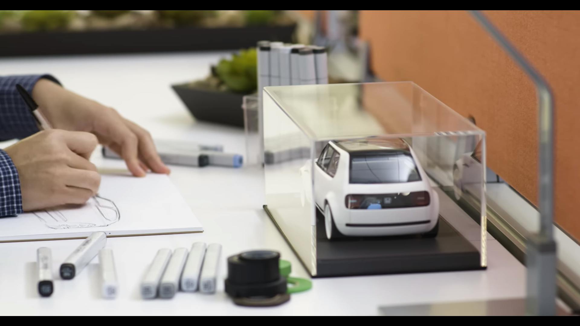
Ah, an aspiring young designer sketching at his desk. And a good-looking, clean cut young chap he must be? Well again, no surprise there. You don’t want a black clad weirdo with a daft haircut and a load of piercings like me popping up. Notice the carefully-placed Honda model on his desk. Yeah right! I had a Jeff Gordon 1/24th NASCAR die-cast and a Tie Fighter model on mine. Have a good look at the sketches. You can see they’re all the same car, because OEMs rarely want to show you what you could have got. Also, he doesn’t have a PC or a graphics tablet, so it’s obviously staged on a spare table.
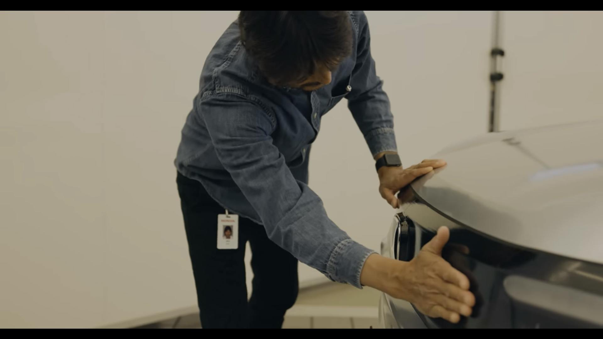
Okay, now I’ve talked about how one of the benefits of a clay model is you can touch it; human hands are extremely sensitive to variations in surface and you need to run your fingers along a shut line or a radius to feel how consistent it is. What you never do is Jiro’s act of rubbing of the damn thing like its a lamp sprouting a genie granting you three wishes. The warmth of your hand can mess up the clay if you’re too enthusiastic, too heavy handed with it.
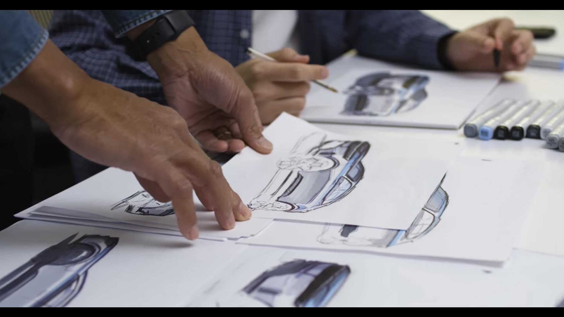
Our young friend here is sketching with Copic markers. These are industry standard (and expensive), but you rarely use them in the studio. That’s because sketching digitally is so much quicker, cleaner and easier, not to mention Copic markers bleed your ball point line work, so you have to use them with a pencil. At least the fumes aren’t as bad as the old-school Chartpaks.

We’re all about virtual reality and the “metaverse now,” and companies like Gravity Sketch are making a big push towards getting their tools integrated into the workflow. But what is our friend actually doing here? We can’t see what he can see, and he’s the only one there with a headset on. You don’t need VR for cross studio collaboration, all you need is a decent internet connection and a couple of big screens.
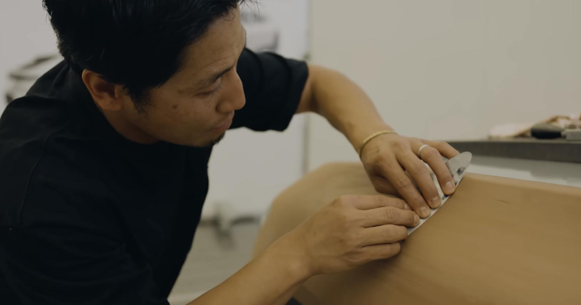
Okay, let’s put some clay on the model, and then scrape it off because this provides our brand with analog authenticity. This is genuinely done only for the camera; you have your existing clay and then get the modelers (the good-looking ones, naturally) to look like they’re working on it in a facsimile of the way it works in reality. I mean, you don’t want to muck up an actual real working model, right?
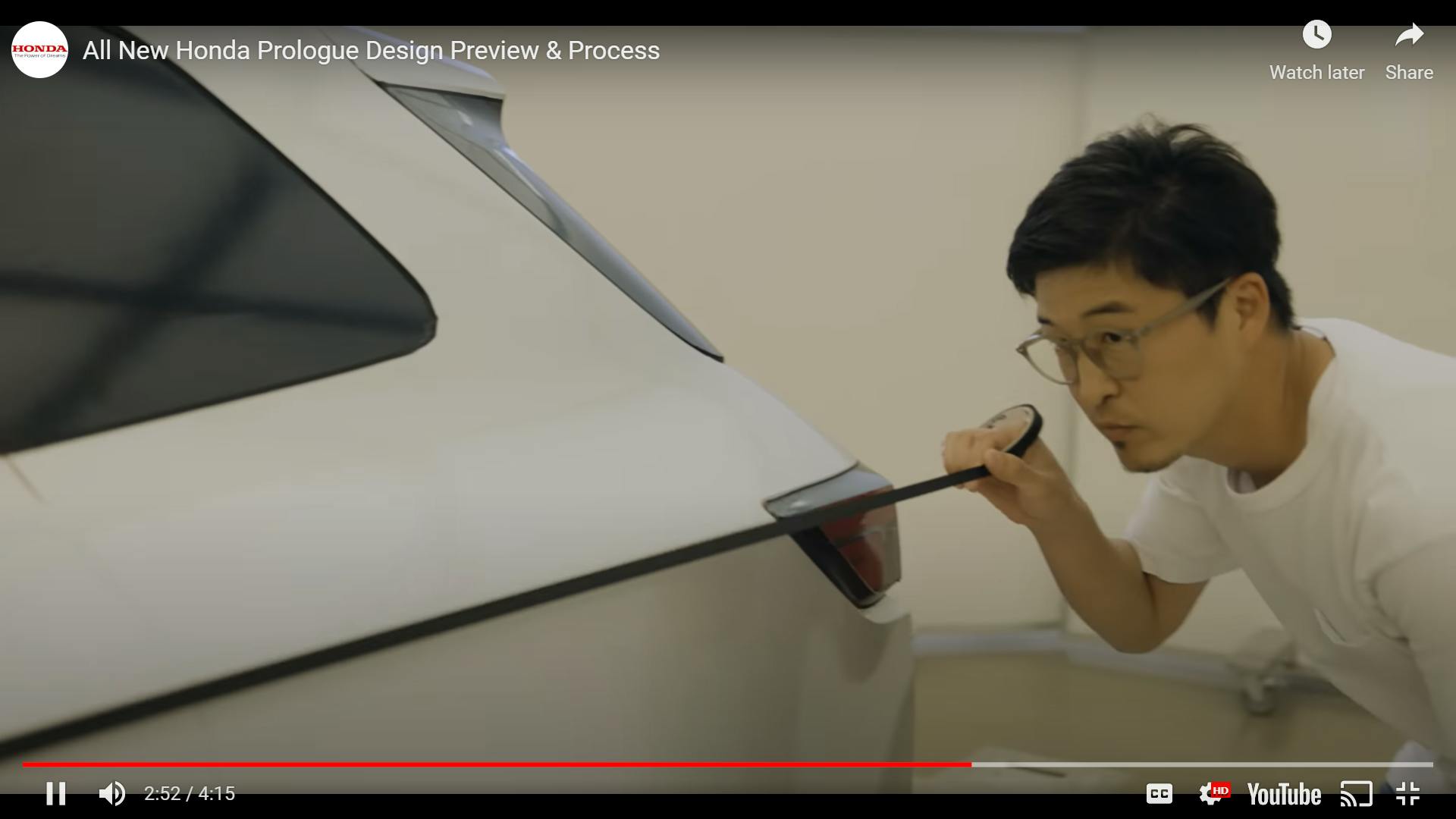
Designers use tape to help them figure out graphics and feature lines. It’s made by a company called Rinrei and is made from Japanese rice paper. They make it in a variety of widths, and it doesn’t leave a residue. What you do is work out where you want your line to be on the surface of the model, giving the clay modeler a reference point. Or if a model is being prepped for painting, you can define a line to be sanded to, so features are not lost when it’s being rubbed down. What you don’t do is tape on a painted model which already has its feature lines defined, because what’s the point?

Here we see a modeler waving a handheld scanner at the clay. This is real. It’s how the model’s surface is captured to give the digital surfacing team a reference for their initial 3D clay model. Then the model is tweaked by hand, and then it’s scanned and remodeled again, and then that data is used to mill the clay again.

It’s always impressive when you see a designer dashing off a cool sketch freehand, isn’t it? I remember seeing an interview with Wayne Burgess where he knocked out a pen sketch of the Jaguar F-Type while waffling to camera. When you’ve worked on a car in a studio for four to five years, you can draw it with your eyes closed. I can still do it to this day on the cars I worked on.
What bugs me about this Honda video (and countless others) is how it shows a little bit of how cars are designed, and that it’s a complete falsehood. What’s being done here does reflect reality, but it’s nothing more than a reflection. Which is ironic given they are trying to use authenticity as a selling point. Perhaps what legendary ad man David Ogilvy said in 1963 proves the point:
“If advertisers would give up flatulent puffery, and turn to the kind of factual, informative advertising which I have provided for Rolls-Royce, KLM and Shell, they would not only increase their sales, but they would also place themselves on the side of angels. The more informative your advertising, the more persuasive it will be.”
Sure, it’s a bit quaint. I still don’t think Bill Hicks would approve, but design is nothing if not honest. Save the commercials for selling me the car on an emotional level. Good design should speak for itself.
***
Adrian Clarke is a professional car designer, earning a degree in automotive design from Coventry University and a Masters in Vehicle Design from the Royal College of Art in London. He worked for several years at a major European OEM, and in the ’90s his daily driver in London was a 1979 Ford Thunderbird.


