Media | Articles
Vision Thing: Bear witness to my favorite things
These days, it’s useful to have a list of favorites. A list of favorite albums, or movies, perhaps. Depending on the circles you move in, the subject of conversation might be about TV, art, or beverages . Such lists are a little reductive, but it’s helpful to have them as go-to standbys to get you out of (or into) an awkward dinner party conversation. Something you can enthusiastically waffle about for as long as is politely necessary. By such things we define our own self, as well as make a presentation for the eyes of others.
A reader recently cornered me in the comments section and enquired as to my favorite car. As with any piece of pop culture, how does one choose? It’s not like a sports team, where your loyalty lies with only one. With sports there are rules, which I created because I can (as this is my column). Your team should be local to where you are from: Being from East London, I support West Ham United. I’ve never understood people hailing from where I do supporting one of the Manchester soccer clubs or even worse, Chelsea who are a West London team.
As enthusiasts we have a broad spread of appreciation for cars of all color and stripe, but there will always be those that (for various reasons) we hold that much closer to our hearts. What we admire in a car is a reflection of our preferences, interests, memories, and biases. We like what we like; it would be terribly dull if we all liked the same thing. Personal taste is subjective.
Good design, however, is not.
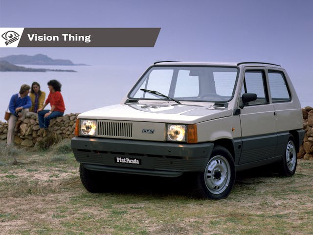
Not least because I am nothing if not a self-styled contrarian PITA, I choose for my favorite car the 1980 Fiat Panda. Are those morning coffee spit takes I hear? Let me explain.
Marketplace
Buy and sell classics with confidence
I may have a top ten (more like a top fifty), but the original Panda distills so many influences that are personally pleasing to me that it’s impossible to resist.
Designed in 1979 and revealed in 1980, the Panda was envisioned as a modern interpretation of the “people’s car”. The same fundamental thread runs through the simple, rugged and economical, yet thoughtful spirit of cars like the original Mini, Citroen 2CV, Renault 4, and the Beetle. Problem was, both the Mini and the Renault 4 were labor-intensive to build and took years to turn a profit. For cash-strapped Fiat that wasn’t an option. It needed a car that was economical to build and sell from the get-go. And therein lies some of the Panda’s genius.
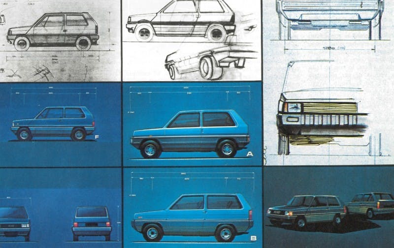
Fiat took the unusual step of entrusting development to an outside studio: in this case Italdesign, headed by il maestro—Giorgetto Giugiaro. Handing him a brief to replace the Fiat 500/126 while weighing the same and costing no more, it was to carry four passengers with a very Italian cargo in tow: two 50-liter casks of wine in the trunk. Giugiaro saw Fiat as an enabler for his ideas—a distinct reversal of the traditional external studio/OEM relationship. He took an egalitarian approach; he wanted a class-neutral car that much like the Mini, suitable for peasants and princes alike.
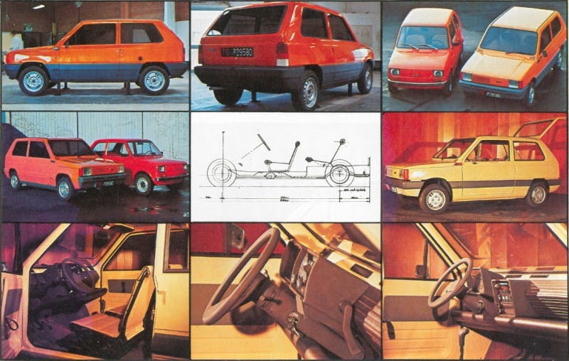
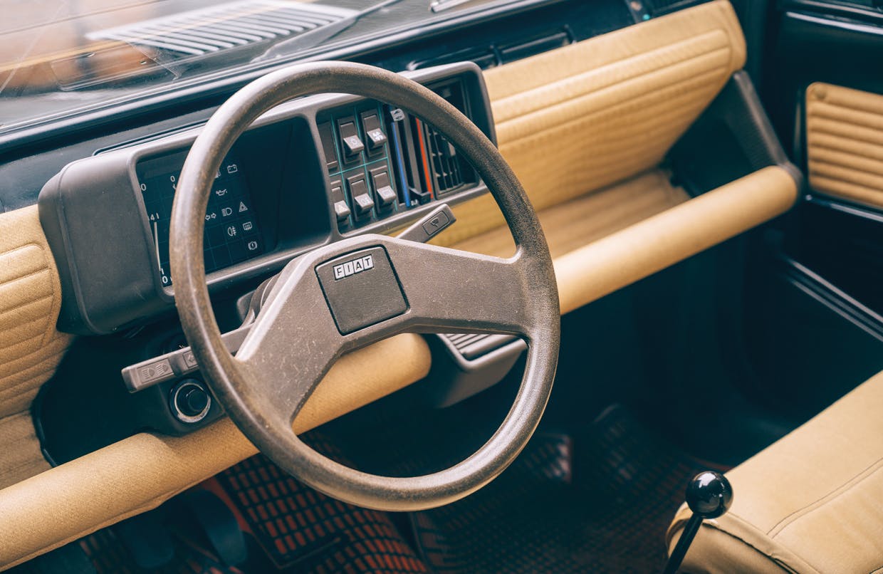
Cleverness abounds with the Panda – the seats are simple foam covered frames with removable covers (so they can be washed) and the rear seat is essentially a hammock, so it can be mounted into various positions to increase comfort, improve cargo space or an fold flat into an impromptu bed. The instrument binnacle, mounted on a bar with fabric suspended below for full width oddment storage, simply swaps sides for easy LHD to RHD conversion. The boxy profile maximizes the interior volume of its modest 11 ½ feet length. Flat glass means the glazing on the left and right hand sides is identical, and allows for a single wiper. The windshield washer doesn’t use a pump – it’s a simple big rubber button that acts as a bellow to squirt water from the jets. (When you’re stuck in traffic and bored, thump the button hard and see how many cars behind you can take a shower.)
It was powered (as it were) by two fire breathing engines: the 30hp air cooled 750cc parallel twin from the Fiat 500, or the 903cc water cooled four from the Fiat 127, which gave you a tarmac bothering 45bhp (basically the Panda GTi). With your two throttle positions being either closed or foot to the floor, in a 1400lbs car they were enough. Because they had differing cooling requirements, the asymmetric grille had slats on the left for the 30, on the right for the 45. It’s the same metal stamping, simply flipped upside down. The bumpers were sturdy unpainted polypropylene – perfect for the bash and crash of narrow Italian streets. Within a couple of years there was a mountain goat like full time four wheel drive model, examples of which are still earning a living in rural Italy to this day. In 1990 they even made an EV version.
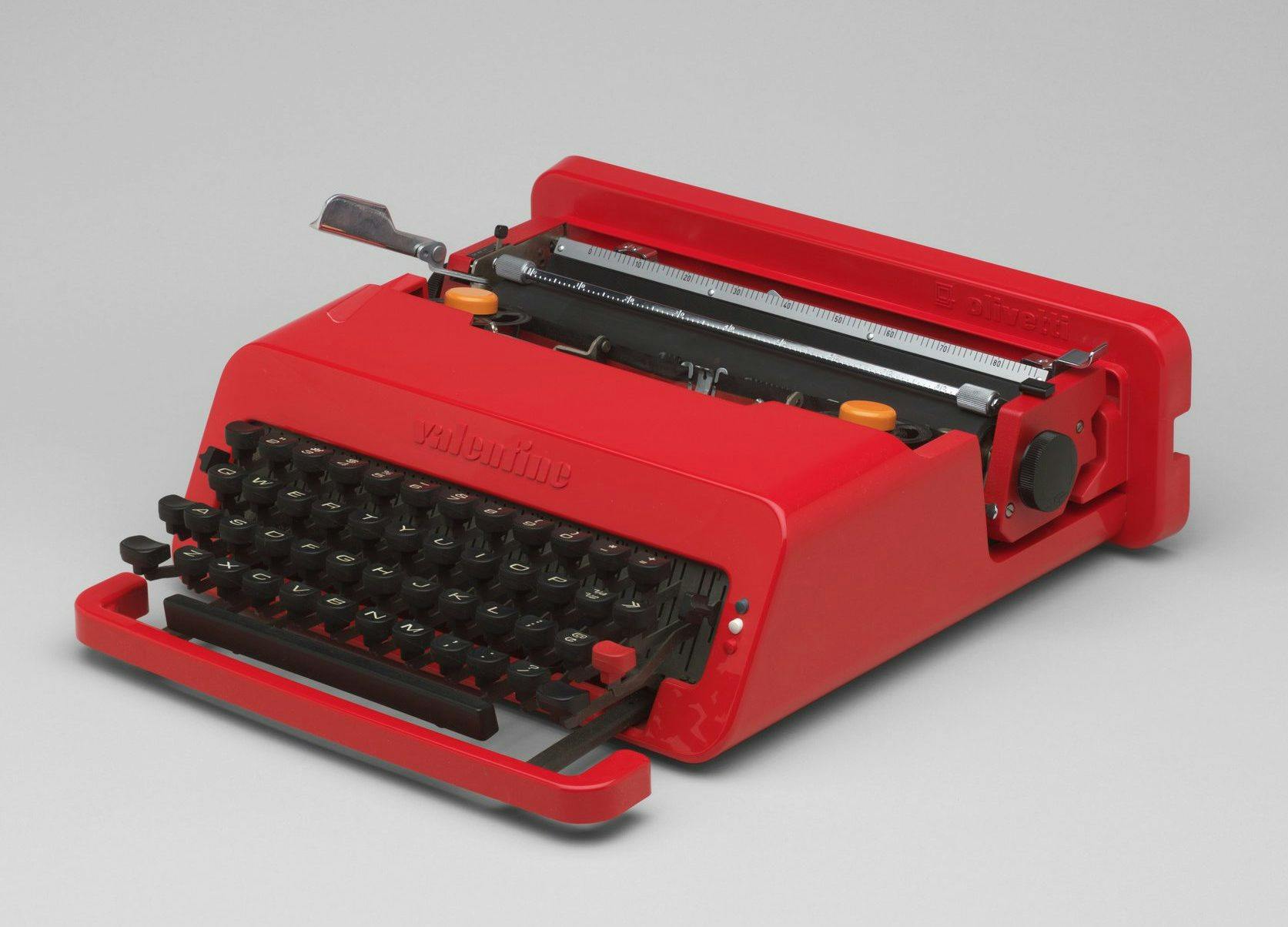
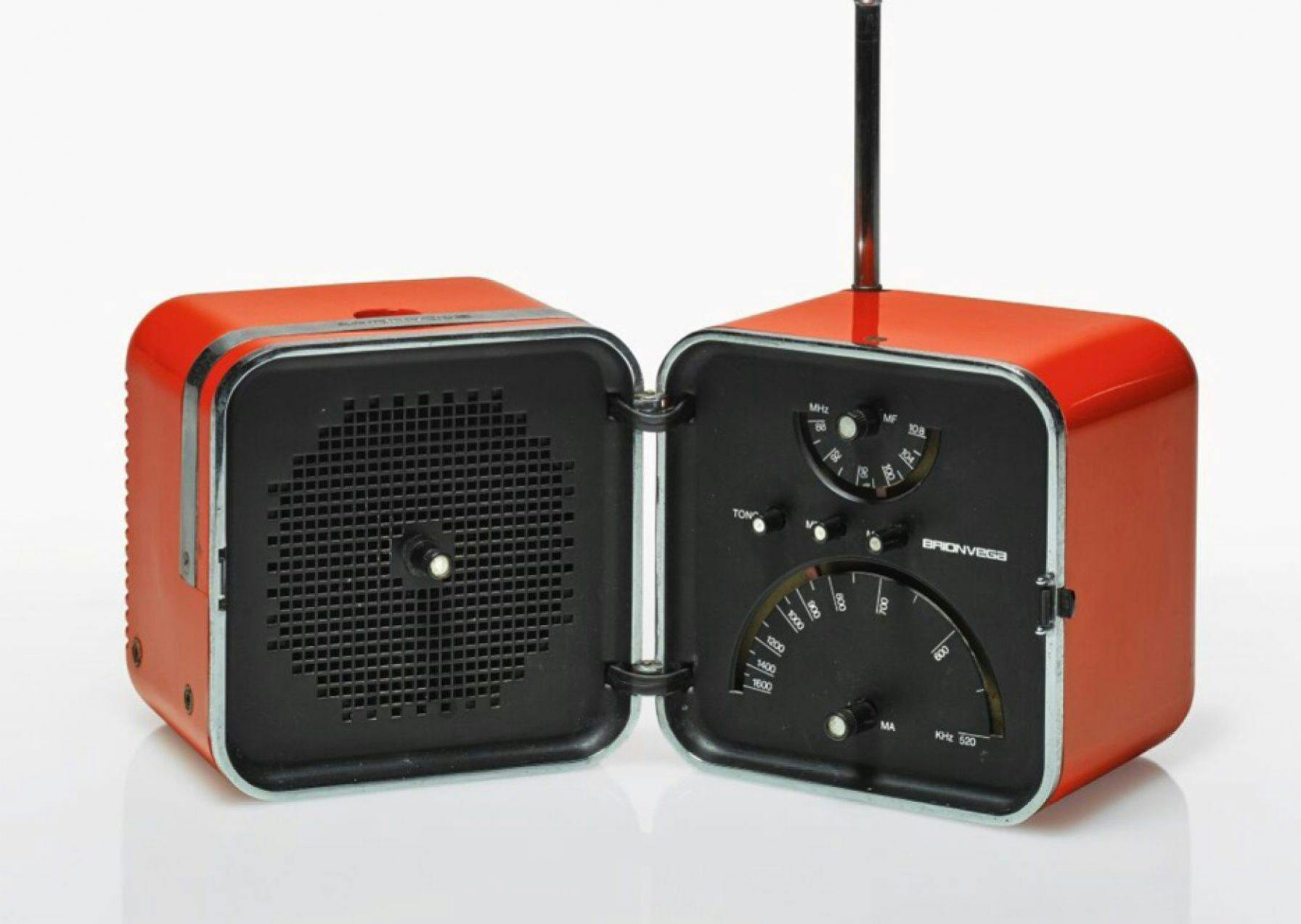
What we have with the Panda is an honest and ingenious little car that stayed in production for over twenty years with very few updates. It’s not classically pretty. But it is chic and utterly charming, and there’s a logical beauty to it in the great tradition of Italian industrial design. You can draw a straight line to a Panda from a 1969 Olivetti Valentine portable typewriter via a 1966 Brionvega Cubo radio.
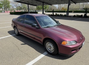
Over time, Fiat gave it an ever-so-slightly more plush interior, and the dead beam rear axle was updated for a semi independent one. My own example was from the mid-Nineties, and came with a full-length fabric roof, sparkly purple paint and (gasp!) plastic wheel trims. It was brilliant—after my marriage went sideways, I stuffed IKEA furniture into/onto that Panda during the move.
The Panda is the sort of car that designers are obsessed with. And it’s the automotive internet hot take machine believes we should be building now—a sort of vehicular hair shirt to atone for the ecological sins of the automobile. While it has design credibility out the wazoo, today is not forty years ago. Times have changed, and such an unpretentious device would never sell.
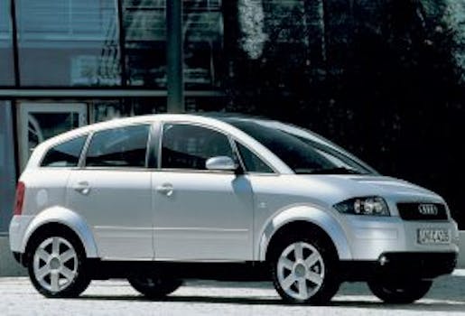
The Audi A2 of 1999 was again the sort of car that gets marker pushers like me weeping tears of joy behind their funky plastic glasses, wins numerous design awards, and gets displayed in museums. In this case, it failed to resonate with the buying public. Constructed entirely from aluminum and meant to be a “small Audi, not a cheap Audi,” customers were turned off by its high purchase price and awkward styling, and not at all turned on by its light weight and good fuel economy.
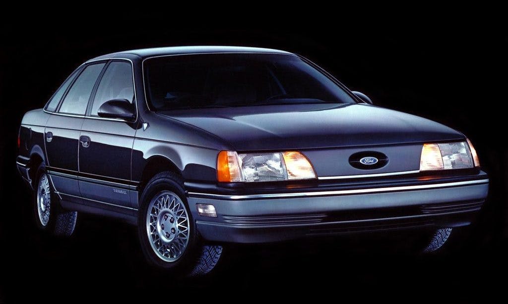
In 1982, Ford of Europe introduced the Sierra. It took the science of aero efficiency and concerns around safety and crafted an entirely new aesthetic. Smooth, rounded and with a minimal approach to exterior decoration it cost a fortune to develop and nearly drove Ford of Europe to bankruptcy. When revealed, the Sierra stunned customers and commentators alike, albeit for completely different reasons. Buyers hated there was no traditional sedan, no grille, and as such christened it a jelly mold. The design literati politely clapped at the sheer bravura being displayed by a mass-market OEM. No one bought it. Ford learned these lessons the hard way by the time it attempted the same trick again for the mid-’80s Taurus; it launched with a small grill and in keeping with American tastes, a more decorated appearance.

Eventually the Sierra was willed into success by the sheer might of the Ford marketing machine—and by toning down its overt modernism. Bolting in a 2.0-liter turbo engine with help from friends at Cosworth (and dominating European touring car racing) helped shift a few units as well.

A critical ability for a car designer to possess is the ability to separate personal taste from professional taste. A designer should be able to put aside their feelings about what is important to them and understand what consumers want and what will sell, lest they disappear up their own creative backsides. I cannot stand The Beatles (one or two notable exceptions aside, as music begins for me in 1976 with punk), but I do recognize that apart from being loved by nearly everyone and influential, they made a massive contribution to pop music through their song writing, musical composition, recording techniques, and how they marketed themselves.
When the original Nissan Juke first started appearing everywhere, I couldn’t believe such a challenging-looking car could get made and be so popular. It slowly dawned on me that not only was it cheap to buy, it was meant to be challenging to look at (although the stance and proportions are spot-on) because the youthful market where it was aimed wanted something that didn’t look like anything else on the road.
Design for design’s sake is never a good thing. Perhaps in our financially straitened, full-life-cycle future, the market will accept another round of small footprint cars. But buyers won’t accept discomfort, inconvenience, or being a visual outlaw for the sake of another glass trophy on the chief designers desk.
Now excuse me while I do a little conservation of my own and see if I can find a Panda to adopt…
