Media | Articles
Vellum Venom Vignette: A new Sante Fe and the depreciation of “face” value
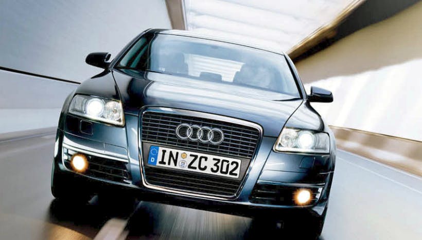
We may never know why Satoshi Wada made the formerly staid, static bumper of the Audi A6 into the gaping maw that changed the world in 2004. But from there on out, oversized grilles—with real-estate ratios bordering on prewar standards—became commonplace. Yet unlike yesteryear’s frontal speed holes, the faces of today’s automobiles are so large and toothy that disturbing amounts of teeth are non-functional.
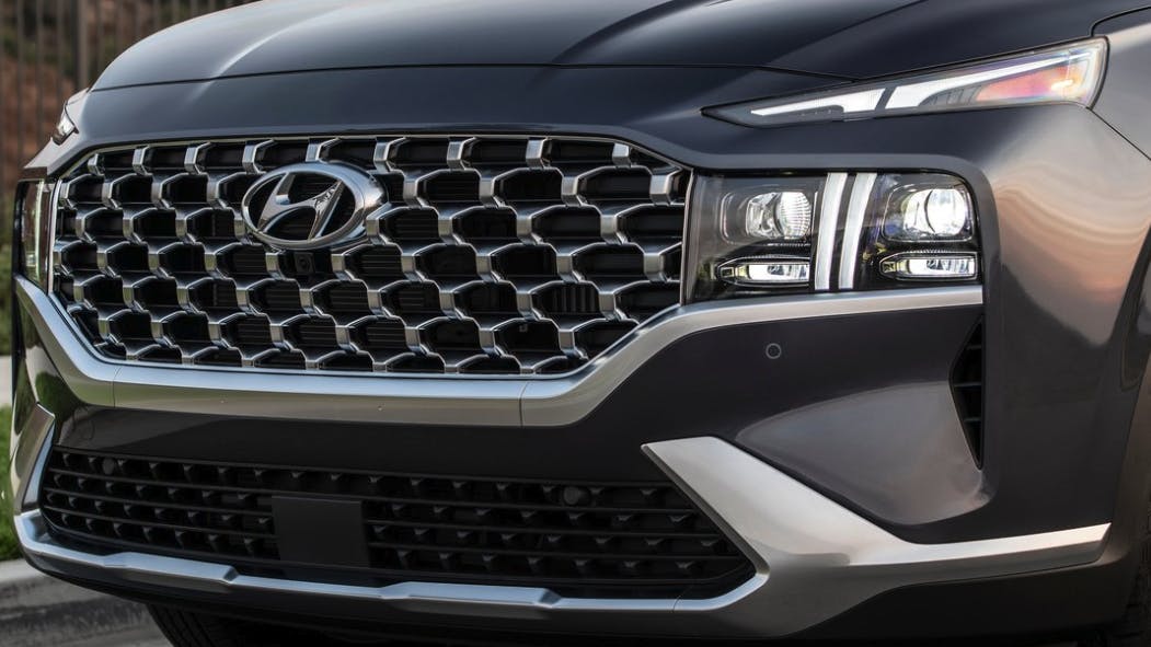
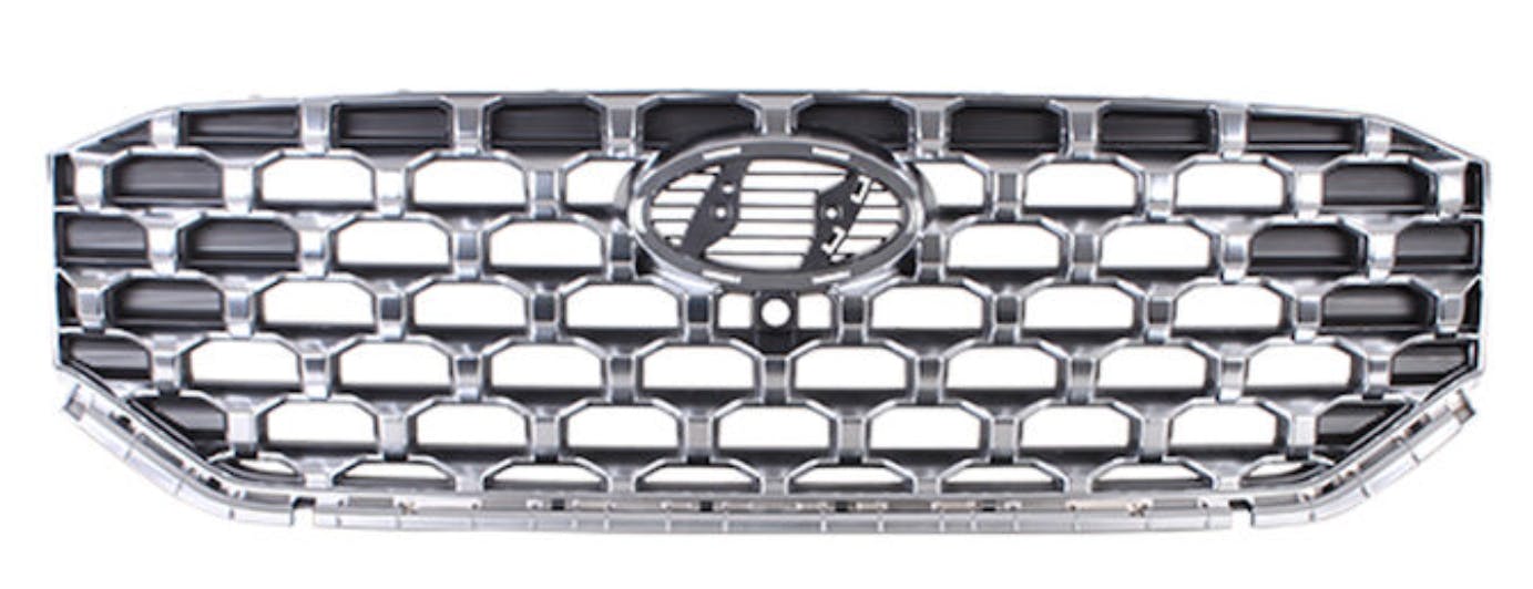
It’s a shame, but better aerodynamics merits smaller grille openings than most designers would wish. It’s not the designer’s fault that vehicles are as tall and bloated as they are today, but a designer’s workaround is a grill veneer, one with all the honesty of the fake wood present in a Chevy Nova Concours. No, really—take a close look at all (most?) modern grilles and you’ll see how much of it is a solid casting of black plastic.
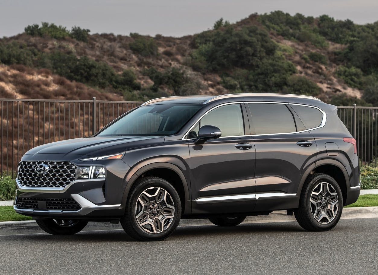
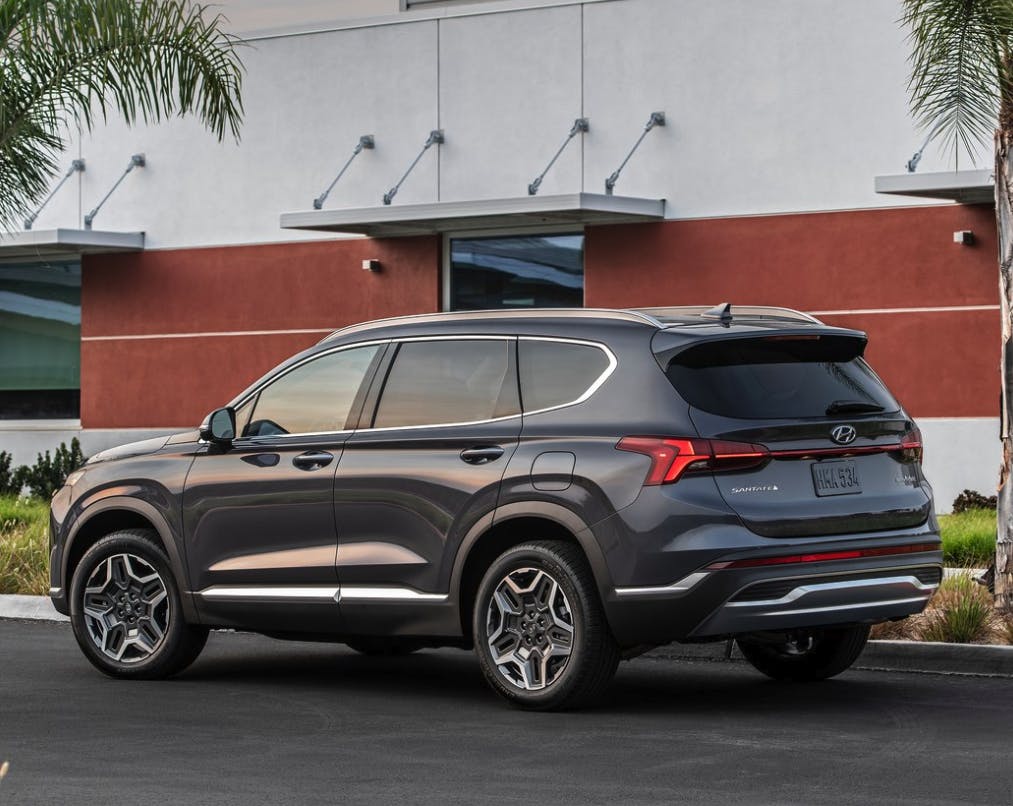
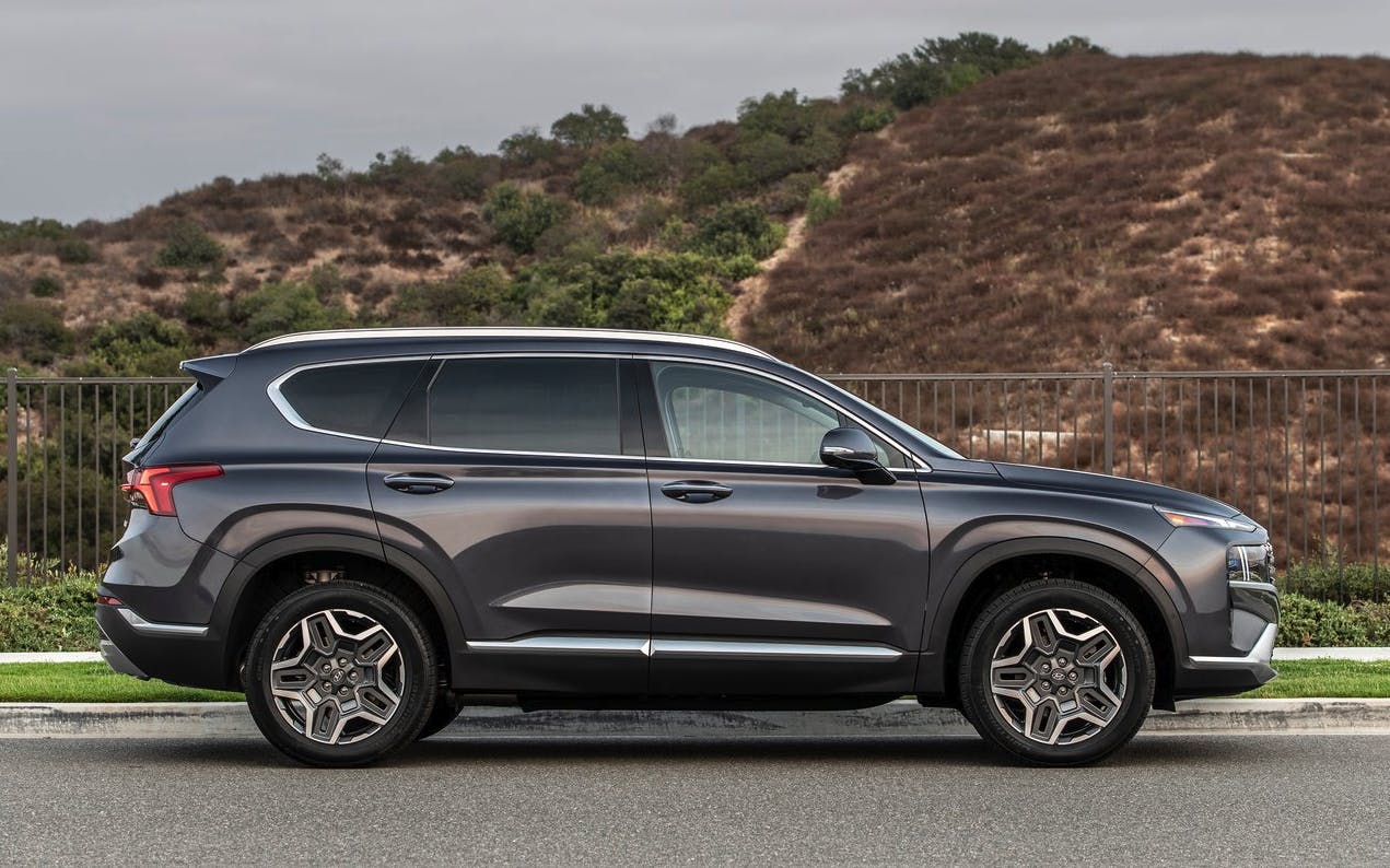
While we can’t blame Audi for the trend of fake teeth, oversized grille faces are now the predominant component that ensures every car has a recognizable, palatable, and marketable face. On the current (2023 model year) Hyundai Santa Fe, there are 20-something block-off plates that turn the grille into the sort of non-functional real estate normally accomplished by a painted fascia. That painted part once provided a logical transition to headlight assemblies at each corner. Without it, the Santa Fe’s headlights turn into puffy beaver cheeks adjacent to that toothy, partially fake smile.
It’s all very organic and logical, and we’ve seen this far too many times in our daily commutes. There’s no hate in my assessment: The 2023 Santa Fe’s face shows a logical evolution from Audi’s rounded, organic, gaping maw into something worthy of a mid-level CUV. Grilles as faces have been pushed to a delightfully logical extreme, but it’s so disingenuous on many modern machines.
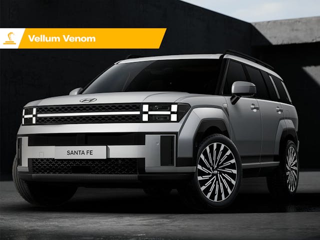
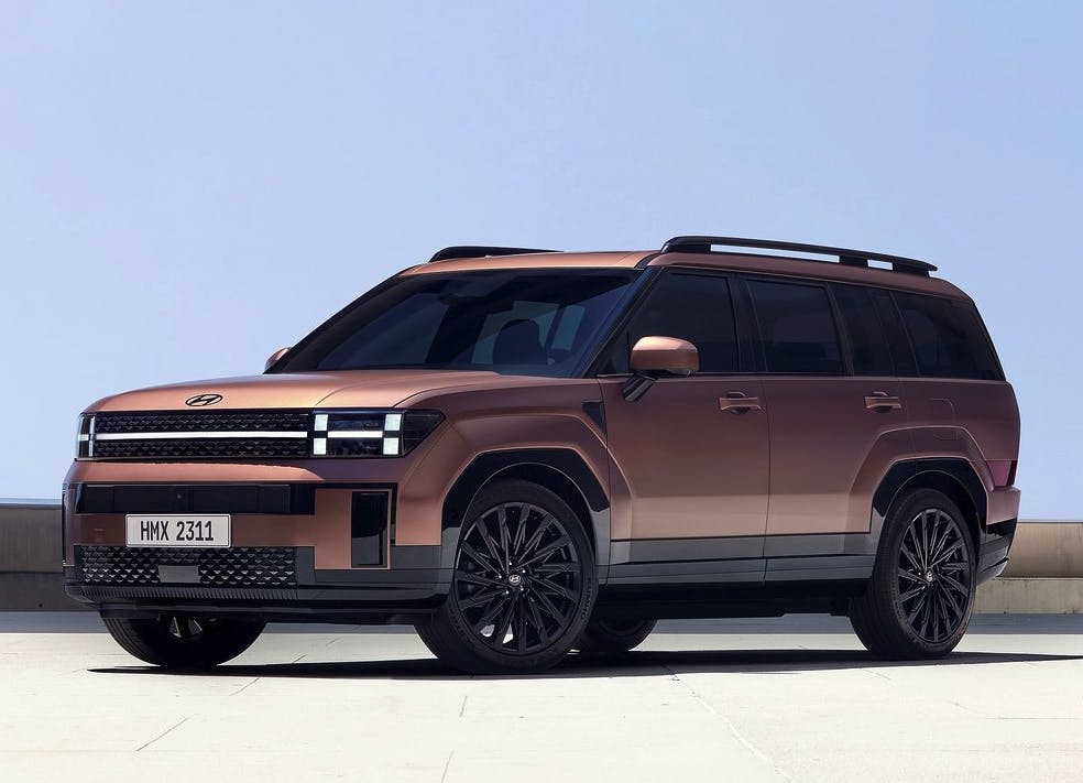
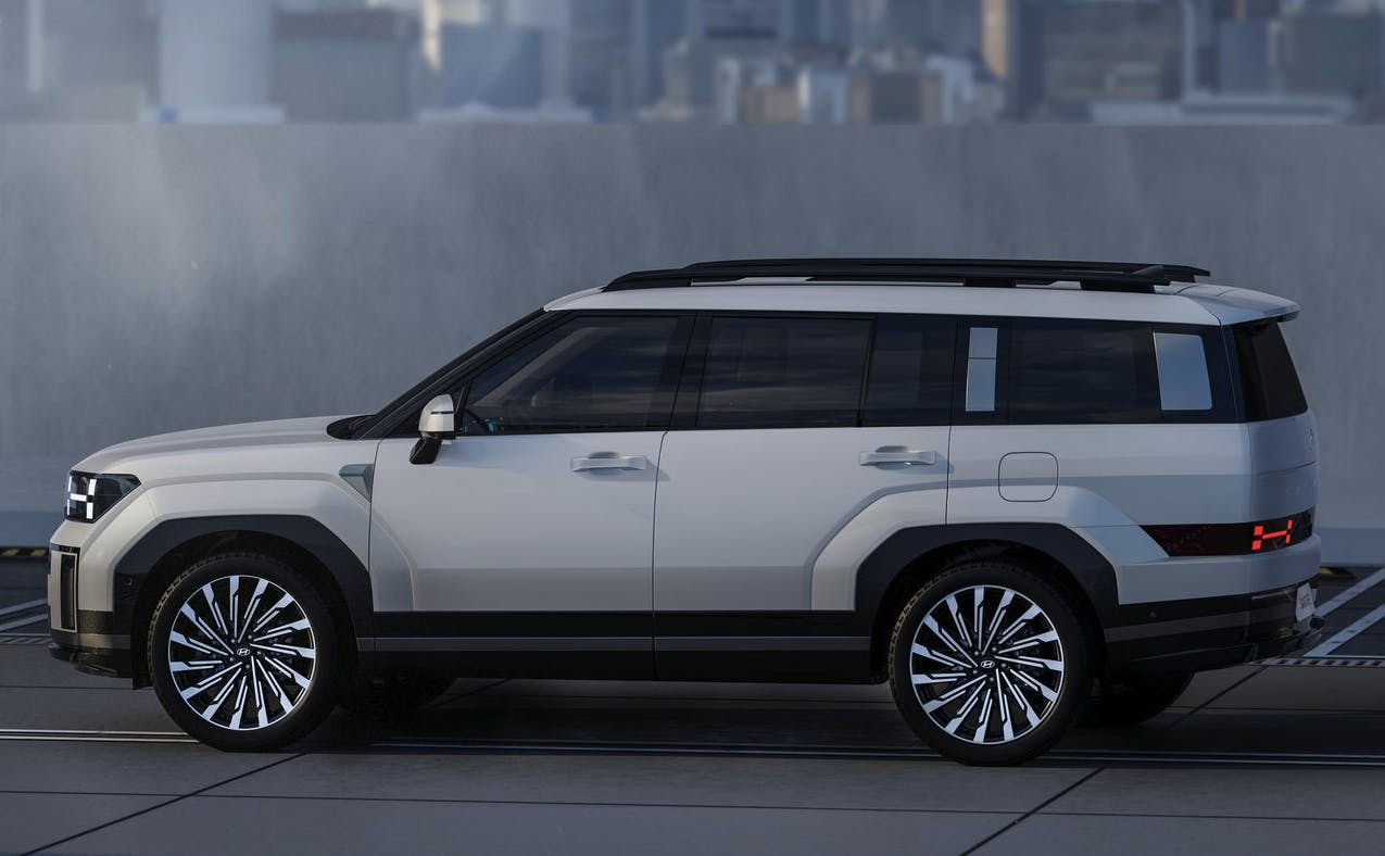
Enter a new look with a familiar name. The 2024 Hyundai Santa Fe eschews our current trend of faking smiles and illogical headlights, bringing an honest face into the extremely profitable market of jacked up station wagons crossover utility vehicles. Instead of trying to make a face with a bold grille and catchy lighting pods, we are treated to a democratization of facial features via layers upon layers of modernist shapes.
Marketplace
Buy and sell classics with confidence
That last sentence includes a lot of words that might fall flat. If so, consider this: It is clear that a mainstream Hyundai vehicle is officially adopting the 8-bit school of design first seen on the Ioniq 5. And 8-bit styling has strong roots in modern architecture from almost a century ago, as I can’t remember how many times I’ve associated the graphics in an Atari 2600 video game with that of modern architecture. (I’m looking at you, Atari Adventure versus any Brutalist building on a college campus.)
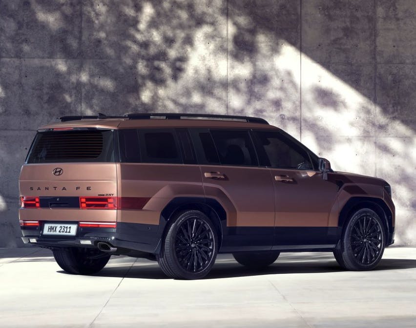
The Modernist tones continue at the side and rear of the new SUV, as the Santa Fe is now embracing the machinery that brings it to life. (And, perhaps, also embracing the buildings that house the design studios where the model originated?)
No matter, the influence of the revolutionary Ioniq 5 means the Santa Fe now looks less like a copy of a Land Rover. Sure, the roof pillars give off a Discovery vibe, but suggesting the Ioniq-infused Santa Fe is ripping off whole chunks of prestigious English DNA is like suggesting the 1986 Ford Taurus photocopied the 1982 Audi 5000 . . . neglecting the fact that Ford made its own wild-looking jellybean in the 1982 Ford Sierra. Don’t fall for that particular Pitfall.

Sigh. Sometimes a bad pun is needed to make a Modernist point: Going blocky with 8-bit design is a winning move in our contemporary world, either as Gen-X pop culture nostalgia or for a CUV that looks like nothing in its price bracket. The Santa Fe absolutely stands on its own four wheels, even if the jamming of the front wheel-arch contours into the front doors is rather tacky. There are layers upon layers of beauty and purpose in this new design, provided you find beauty in other Modernist designs.
The Santa Fe does for suburban families what Unité d’habitation did for living spaces in European city centers. That said, comparing the transportation needs of an American middle-class family in 2023 to the housing shortage created after WWII is a bit disingenuous. Modernism paved the way for lifting people out of poverty, serving as a guiding light for more housing in our growing, densifying cities. Applying this notion to cars may seem unorthodox, but modern CUVs certainly reach skyward—much like an apartment complex.

Let’s see more of the Sante Fe’s “blockiness” in other vehicles, and reject organic faces with fake smiling grilles. Pointless contours must be replaced with functional, logical blocks of painted panels, eye-catching LED chips, and purposeful areas of negative space. We don’t need fake teeth to make a shiny, happy, recognizable face. We should embrace the modernist principle of functionality, found in the original Ford Explorer, Jeep Cherokee, the Squarebody Chevy Suburbans, and those iconic Land Rovers.

A happy face may be nice on a “bug-eye”Austin Healey Sprite or on an animated NC Miata, but adding modernist construction to the 2024 Santa Fe makes it much more appealing as a utilitarian product. There’s a chance this architectural appeal could translate into success on a larger scale than that of the long-forgotten Ford Flex.
Who knows, a (growing?) family of architecturally pleasant automobiles could indeed carve out a profitable piece of the pie. So join me in saying goodbye to the organic face of modern cars, and get excited for a return to modernism. Or do the opposite, if you’re feeling contrarian, and get one of the big-grilled crossovers before their memorable faces disappear from new car showrooms . . . because they are likely facing extinction.
***
Check out the Hagerty Media homepage so you don’t miss a single story, or better yet, bookmark it. To get our best stories delivered right to your inbox, subscribe to our newsletters.


Hi Sajeev, I wanted to let you know that I love reading your articles! Nobody else really writes stuff like it! I just purchased a 2023 Hyundai Elantra Limited in Electra Gray and am fascinated by the design on this car. There is nothing else on the road like it. Would love to hear some detailed thoughts on its design from you! Also, that color is the only one that in combination with the black grille looks good IMO.
Hi Andrew,
Thank you so much, it means a lot to hear from readers like you. The Elantra is an impressive achievement considering smaller/cheaper cars are usually not detailed/rendered/finessed to this extent, to make such a cohesive design from such radical folds and creases. Aside from my usual disdain for DLO FAIL (i.e. the plastic triangle behind the rear doors) from anything but the cheapest of vehicles (i.e. this isn’t a Hyundai Accent) I think the Elantra is a fantastic design as it is truly the rolling embodiment of origami, and the harmony it creates when executed correctly.
Thanks, Sajeev! I definitely agree on the DLO fail. But love the car otherwise. Please keep writing!
Thank you again for reading. Now I have more reason to keep this going!
Jeep XJ was a great looking vehicle for the same reasons: boxy, blocky, no pretense or fluff.
It’s the lost design piece that makes some of those early 80s Japanese cars look so good in retrospect. Not the same old thing.
I like curves on cars too (coke bottle muscle cars for example), I just don’t need everything to be so similar I am reading the badge to know what it is.
The important thing to remember is that curves are crucial to the Santa Fe’s success: tumblehome on the body sides, gentle curves in the front bumper and rear hatch, etc.
The only difference is how curves are no longer the dominant force in the design, and that’s truly worth celebrating.
Let’s hope Hyundai is among the leaders of the next generation of design language. I owned three Audis before the company aped Ghostface from Scream. They lost me as a customer, and I moved on. The clean lines of this Santa Fe design can usher in a new era much like what mid-century modern did in the ’60s. Bold moves done right like this is what steals customers. After Audi, I have become nearly brand-loyal to another brand in part due to my connection with its design language. Hyundai has an opportunity to gain long-term customers if it executes well.
The 2024 Hyundai Santa Fe looks remarkably like a 2010 Ford Flex…. everything old is new again.
I was also thinking about the Ford Flex here. To me it shows Hyundai has no idea what it wants to do with style and will do anything. It’s a bland looking box, but it may be a bit more functional in the back because of it. Either way it’s likely not something I would want.
One other thing: cleaning those oversized complex grills! I borrowed a friend’s Hyundai Pallisade for a trip from Phoenix to Calgary. It was a nightmare to clean all the bug juice off the grill, even after going through a car wash!
> “Let’s see more of the Sante Fe’s ‘blockiness’ in other vehicles”
Lexus GX 550 enters the chat
You couldn’t give me a Hyundai, but I do applaud their willingness to step outside the box (no pun intended) with their styling over the past couple of years. Bravo, Hyundai!
Here’s a fun experiment – Go to your favorite car news site that has thumbnail photos next to the stories. Then scroll down quickly with your eyes half-squinted. It will be amazing how the cars (errr, CUVs) in the photos all look so much alike that you may not be able to recognize them without looking at the badging.
I like the styling of this new Santa Fe very much. It looks alot like my 2019 Ford Flex, which to me, is a good thing. There is a very practical aspect to this type of design as well because the boxiness doesn’t compromise passenger comfort or great cargo space for swoopy styling.
Yes, I am in love with the practical D-pillar of both the Flex and the new Santa Fe. We are finally seeing a mainstream CUV that is embracing its boxy SUV roots in that regard.
I agree with the comment that almost all CUV’s look alike.
The Lexus Rx350 started the design. Hyundai (who made a Jag copy with the Elantra body) made the first 350 clone with its Tucson. Honda’s CRV, the RAV4 and Ford Escape became almost indistinguishable, again, with the badge removed. I took the letters for the words, “Hyundai” and “Tucson” off the back of my car (They are only plastic, adhesive backed letters). People couldn’t tell which make it was.
I applaud Hyundai for re-doing the body it the Santa Fe. It had a weird bulge on the top of the front fender that looked like the top of the head of a spawning salmon that was really off-putting.
I have bookends; a ‘71 MG B AND a 2019 Nissan LEAF. So, function follows form which follows fun.
Car design is very much art. It is what you bring to it. Different folks experience the same car differently.
Now the
Thank you for bringing such an interesting perspective to card design analysis. I always liked the Ford Flex design, for many of the reasons I like the new Santa Fe design. But then, I’m a big fan of midcentury modern design. I’d love to see the interior of the Santa Fe to see if they manage to bring some organic warmth while keeping the modern vibe, as opposed to just slapping big iPad-like screens on an otherwise empty dash.
Thank you for your kind words. I rarely talk about interiors (exterior design is so much to chew on its own) but the Santa Fe’s insides are kinda Land Rover like, probably not really bringing the warmth you seek. Here’s a pic: https://www.netcarshow.com/hyundai/2024-santa_fe/1280×960/wallpaper_0f.htm
My take is that the giant grilles were/are an effort to provide brand identity to vehicles that the demands of aero design have rendered largely indistinguishable. Likewise all the unnecessary lines on body panels. The current generation Land Rovers seem to have found a way around that by reaching back to Modernist principles. Hallelujah!
Interestingly, what I consider the most successful current designs, the Tesla Models 3 and Y, have (almost) no grilles at all. And by most successful I mean my spouse and non car enthusiast friends (virtually everyone I know) recognize Teslas and literally nothing else.
Sajeev, I believe it was the MY05 A6 that started the “Whale Shark Maw” movement, not the ’06.
We purchased a 2004.5 A6 specifically because of the ’05’s new grille design.
While normal today (well, I’m not sure I’ll ever consider BMW’s current Beaver Tooth interpretation “normal”), Audi’s single frame grille was shocking and revolutionary at the time and seemingly gave the middle finger to Pininfarina who, 60 years earlier, had delivered us from spindly, vertical, waterfall grilles.
I like this Santa Fe, but then I live in a Brutalist building. 😉
Oops, my mistake! Wikipedia says it was first released in 2004 in Europe, so I am fixing that now. I bet 2005 was for North America?
Always nice to hear from Brutal residents, especially when it comes to vehicles that are clearly under their umbrella.
The Ford Flex with AWD and towing package was a great value and vehicle, with impressive leg room for second row passengers and cargo capacity. Ford no longer offers an affordable vehicle with the same capabilities and value.