Media | Articles
Vellum Venom: 2024 Hyundai Kona & Hotel Marcel
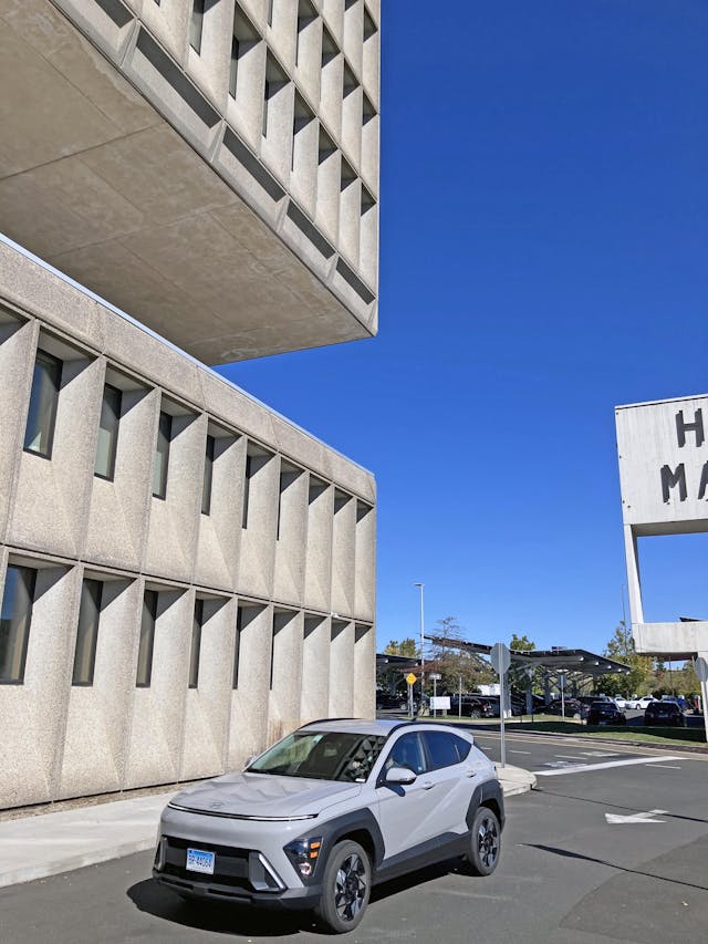
The year 2022 was a delightful one for both a brutalist building built for a tire company and a small South Korean crossover with a distinctly architectural style. In May 2022, the former home of Armstrong Rubber (later Pirelli) was converted into a boutique hotel, named after its creator, the modernist architect Marcel Breuer. Built in 1970, the Hotel Marcel is in New Haven CT, and stands tall and proud on a plot of land owned by company known for making modernist treasures on a smaller scale: IKEA.
Somewhere between the Hotel Marcel and IKEA lies our automotive design subject. By December 2022, Hyundai’s successful foray into 8-bit, architectural design went down their portfolio, reaching the subcompact Kona CUV. Both the Hotel Marcel and the Hyundai Kona are brutish and brash design statements that stick out like a delightfully sore thumb in their environments, and I was lucky enough to get both in the same place.

I spotted this nearly-new, brutally cement colored Kona in the rental car lot at Bradley International Airport, after realizing the only option within my preferred method of transport (sedans) had a strong smell of cigarette smoke and sanitizer. Luck was still on my side as my passenger, the esteemed Adam Wilcox of Hagerty Insider, was fine with diverting to New Haven to experience both works of modernist design before our flights back home.

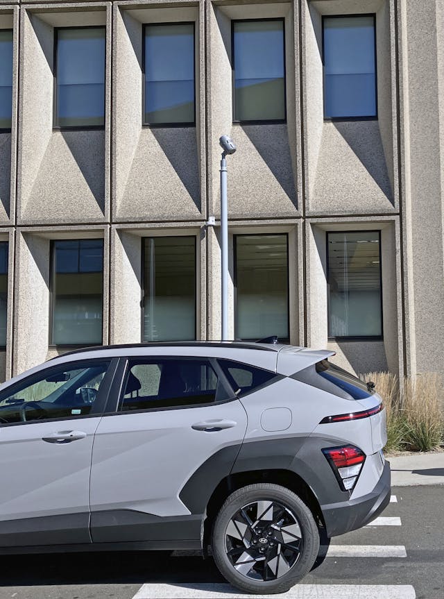
At the end of our visit, I believe my esteemed colleague appreciated the design parallels between Crossover Utility and hotel, and felt the diversion from the airport was worth his time. So let’s run the Hyundai over the vellum to see what we can learn, and we will throw in a dash of Brutalist perfection from a former tire company turned posh hotel in the process.
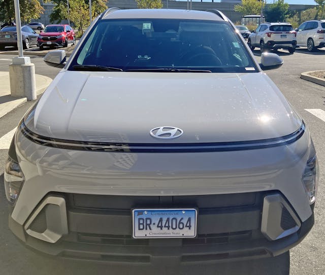
The all-new Kona certainly occupies the same spot in the market as the outgoing model, but the architectural lines and futuristic angles are more building-like than the traditional grille and bright eyed lighting pods of the last Kona. The mere fact that Hyundai deleted chrome in the headlights is cause for celebration, as a new design language that concentrates on the whole vehicle can now come into focus.
Marketplace
Buy and sell classics with confidence
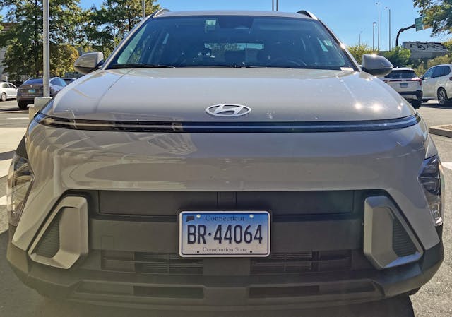
Where the heck are those headlights? Not having a recognizable face like a traditional vehicle is a bit disconcerting, in a “RoboCop used to be a human” kinda way. For some it’s a dystopian future, for others its a functional rejection of the need for relatable facial features on the front end of a vehicle.

The rounded contours of the front bumper blend shockingly seamlessly into a relatively flat hood with a blocky power bulge, topped off with Hyundai’s tragically ovoid corporate logo. Only the black stripe below the hood gives away the fact that this CUV lacks a traditional face.
Or perhaps it does have a traditional face, as RoboCop’s iconic helmet has been around for decades, and a long sweep of a running light is far from unique in our digitized, EV-centric world. The backwards sweep of the bumper to reach the hood shows just how much surfacing was needed to make this blocky robot into a sleek CUV for the highway.

The bumper and hood surfacing (witnessed in the bending of the Hotel Marcel’s brutalist window frames) turns into a steep, flat drop signaling the area where a traditional bumper resides. This is a dramatic change from the previous Kona, which used a gaping maw grille to fill in the real estate.

But perhaps the negative space afforded by a grille-less future is more honest, and more appealing?
That steep drop continues to the end, with a Sci-Fi mix of painted surfaces, silver finished frames on features (for lack of a better word) that look like HVAC ducting, and flat-black paneling for maximum functionality.

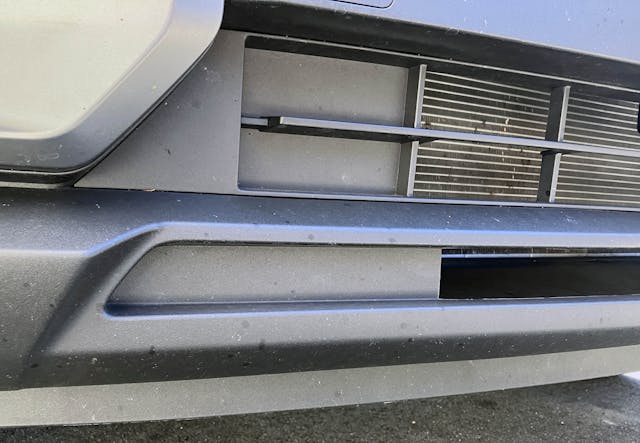
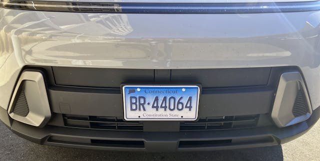

Like a loading dock at the side of a modernist glass building, there’s a surprising amount of doors and functional shapes masked by that flat black plastic covering. There are intake ducts, tow hook covers, and even block-off plates that look perfect for accessories like driving lights…or red/blue emergency lights for a RoboCop reboot?
All the details also help distract the eyes, lest they get fixated on the front license plate that’s significantly taller than the bumper’s footprint for said plate.


The sharp angles of the fake duct provide necessary tension to a lower front bumper that would otherwise be a boring slab of angular plastic. The irony is that while I was photographing the Kona, my co-worker Adam Wilcox noticed the loading ramp of the Hotel Marcel had the same thing going on with its walls.
Modernism may be minimal in shape compared to other schools of thought, but when done right, they are rarely boring.

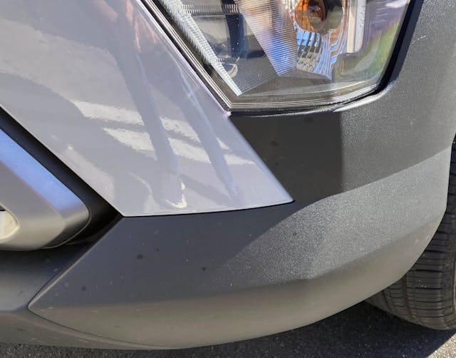
While the headlight finally comes into focus as you round the corner of the Kona’s front end, take a moment to notice how the lower bumper’s valence becomes a natural extension of the headlight, and somehow masks it in an even larger shadow of black plastic. All those angles and triangles point in a similar direction, not to a singular vanishing point. Its is like a crowd of people pointing to someone walking onto a stage, not everyone can point exactly to the same location in a gigantic arena.

Due to lighting conditions with my phone (and my need to hurry so I didn’t miss my flight home) the Kona’s turn signal lens was the clearest part to highlight in the headlight assembly. It’s a conventional filament bulb, with a shockingly unconventional SSD card-like slot to the side. Above it is a ribbed texture, followed by side marker lights and the headlight.
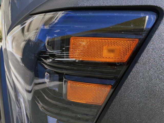
The LED low and high beam blocks were a welcome surprise, and absolutely help with the RoboCop style mask theme that’s presented in the Kona’s front clip. Perfectly porporationed amber reflector/marker lights at the side give the headlight bulbs a sense of speed. Its a similar feel to that of the 2014-18 Chevrolet Silverado, but with a level of depth and texture lacking in the GM pickup.
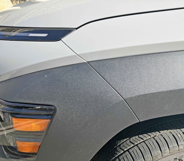
Crossover utilities are supposed to be tall, and the Kona feels lofty when noticing how much space there is above the headlights and below the skinny running light. Slashes, hard bends and soft contours in the metal and plastic body work do keep this area from being boring, but this would make for one helluva 6000 SUX futuristic luxury sedan if this space wasn’t needed in the first place.

The hood cut line shares the same real estate as the large running light, and at the front that translates into a seemingly invisible panel gap. This is what separates the good designs from bad, when things like headlights brush up against fenders and hoods to minimize the presence of a cut line. Lamborghini is generally very good at ensuring headlights do this clean-up work, for example.
But when you must leave the lighting pod’s real estate and make a hood cut line? Might as well give the design a little bump upward as it moves backward. The bump up does not translate into a hood that takes a back seat to the fender, instead the Kona has a clamshell hood like the Kia Soul, or the first generation (2001-06) Chevrolet Avalanche.
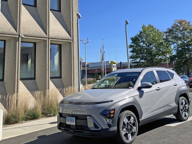
From the front three quarter view we see how the 2024 Kona uses angular, unfinished plastic wheel arches to “hide” the blackout headlights. Said arches also work well with the center bumper design, as both elements harmonize with the bumper’s gray painted area. The painted area is now a smug face with aggressive “fingers” shooting outward from each corner.

This is the joy in modern Hyundai designs, as you suddenly see something new in the front fascia-to-fender transition as you walk around the body. I first saw this trend with the Ioniq 5 during my pilgrimage to the modernist mecca that is Columbus, Indiana.
Unlike the Kona’s rough plastic flares, the Ioniq 5 used painted panels to give a rhombus-like shape that starts at the front of the headlight, and ends at the rear wheel. This rhombus lights up on a sunny day, forcing the eye to appreciate this transition instead of conventional “features” like the bumper or the rest of the body side. Picasso would be proud.

It’s a shame the Kona couldn’t pull off a rhombus shape in this space like the Ioniq 5, but cheap CUVs generally need to look more aggressive. Angry wheel arches in rough plastic castings are de rigueur for taller vehicles, and the same “Slashes, hard bends, and soft contours” that existed between the headlight and running lights continues down the fender.


While many fenders have an unfortunate upward bend to reach the (surprisingly tidy and understated) cowl and fast A-pillar, both this Kona and the aforementioned Avalanche make it work because of the bold use of a clamshell hood.
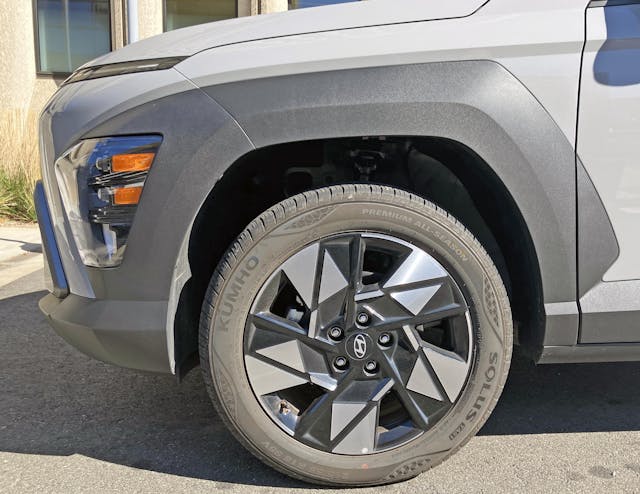
Note how the forward-thrusting flare/headlight seemingly shoots out (backward) from the thrust of the bumper’s central vent. Logical transitions only go so far, however, as that fender flare is still affixed to a small vehicle with a tiny dash-to-axle. Because there’s no real estate, the front door “needs” a fender flare extension affixed to its painted surface.
The crazy wheel design certainly helps draw your attention away from the flare’s awkward transition at the end. This design is not ideal, but this vehicle retails for under $25,000: making for a lot to love on a modest budget.


Unlike the radical depth of geometry present in the BMW M3’s wheels, this is basically a disc wheel with shards of triangles and rhombuses machined out of it. Paint it all black, add some diamond cutting to the flat surface to give it the appeal of shiny aluminum, and you’re done. This is serious style for a small price tag, but the geometric Easter Egg found in the Kumho tire’s sidewall was an unexpected delight.

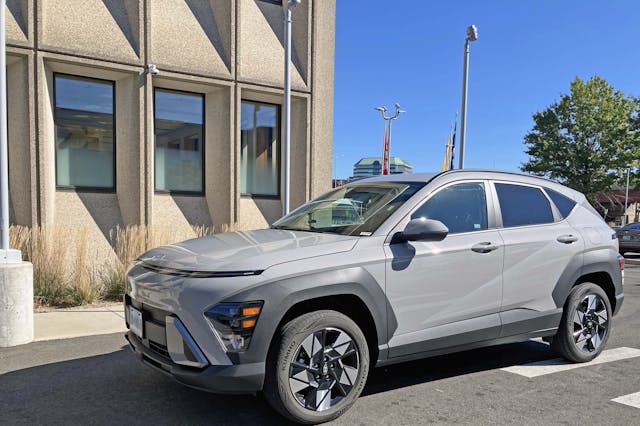
Busy wheels neither detract or add to such a radical use of wheel flaring for a boring class of vehicle. Strong geometric elements are present even as we transition to the center of the body, ensuring every panel is treated to the same attention to detail as that front end.


What keeps the Kona grounded as a uniform design is the relative lack of surfacing to the A- and B-pillars. Ancillary objects like the side view mirror’s angular glass alludes to an impressive level of geometric abstraction elsewhere, but the super clean B-pillar is the sign of a clean, modernist design.
The same can be true of the Hotel Marcel, as it’s blend of radical angles on what should just be a rectangular building is delightful to experience in person.
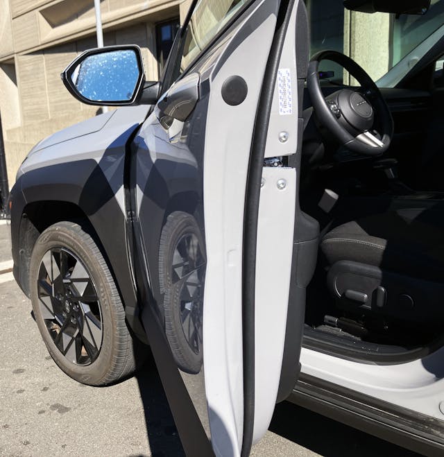
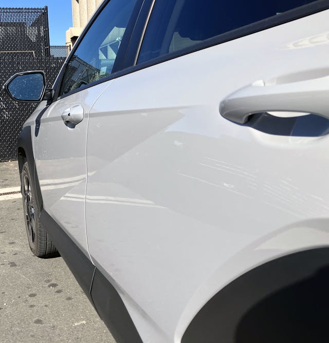

Much like the side-view mirror being “kind of square” in its geometric machinations, the body side is almost flat. You will notice the surfacing when opening the front door, and how that work translates into a triangular spear in the rear door.
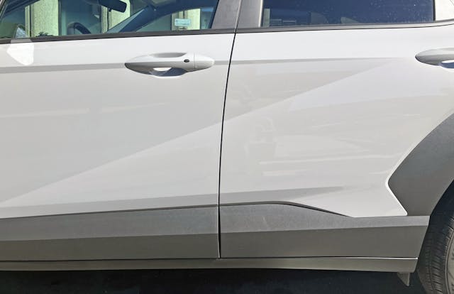
And unlike spears/sweeps/swooshes along the bodysides of other cars, the Kona (and other Hyundais for that matter) integrates this surfacing into a more prominent “Z” shape in the doors. The “Z” is what differentiates half-hearted CUV body surfacing to something properly integrated in a cute ute, and it projects aggression and speed like no singular stroke can muster.

Part of what makes that “Z” so delightful is the addition of almost three inches of wheelbase for this new Kona, and a total increase of 5.7 inches in length for all those angry angles to attack upon. Side surfacing generally doesn’t play a significant role in aerodynamics, and the Kona EV has a drag coefficient of 0.27. (I reckon the EV has a smoother nose than this gas model.

There’s a delightful amount of surface detailing below that “Z” and above the rocker panel. The painted area tucks inward to provide negative space for plastic cladding below to extend outward in a distinctly running board-like fashion. While we generally hate plastic cladding (see almost every Pontiac from the 1990s) it can be integrated into a singular form, even a complex one like this Kona.

The smooth curve of the Kona’s C-pillar and quarter window belie the radical surfacing and “Z” shape below. A mix of hard and soft surfaces are usually necessary to make an impressive car design, and the Kona is no different in this regard.
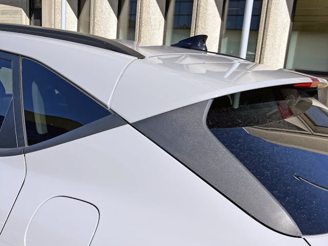

Perhaps I spoke too soon, as the central vanishing point in the Kona’s C-pillar is a pretty radical way to draw the viewer’s eye to the end point of the quarter window, and to begin the hatchback’s aerodynamic paneling. A C-pillar that looks like the hallway from a first-person shooter is about as radical as you can get for an affordable cute-ute!
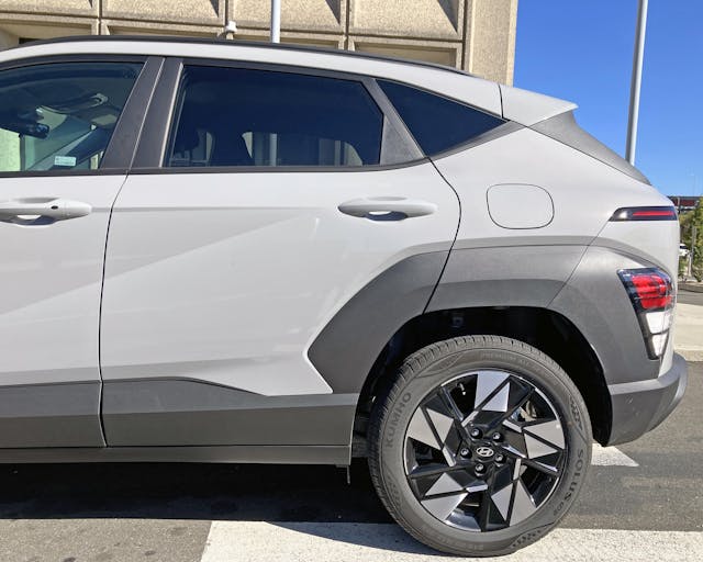
Fixations on central vanishing points aside, the Kona’s aggressive rear wheel flare replicates what’s seen at the front, but with a tail-light assembly at the back. And then we see a thin red line above the lights, which replicates the running light at the front. The Kona’s lighting pods really make this CUV special, as they work with the panels around them, and ensure front and rear ends are both unconventional and cohesive at the same time.
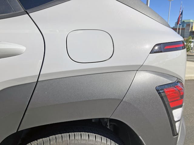
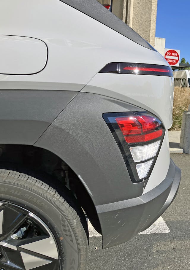

But before we proceed, the same level of “slashes, hard bends and soft contours in the metal and plastic body work” that we saw at the front fender are equally represented in the rear quarter panel. While they aren’t symmetrical, the rear fender extension and tail light assembly sure look like they’d work on the front end of the body.
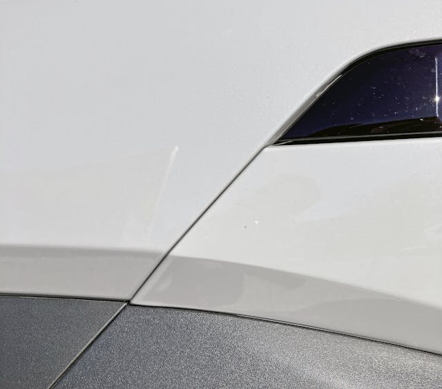
While the body panels fit exceedingly well, this level of surfacing (between the two light panels) causes cameras to see imperfections that do not exist in person. This is called perspective distortion, and it happens much less in older vehicles with more traditional body surfaces.


Perhaps Hyundai couldn’t make darker lighting panels as Toyota did with the spendier Crown CUV, but there are three layers of lights just like the front headlight assembly. The red brake/reflector area has a series of horizontal lines with unique end shapes, the turn signal remains an amber filament bulb in a clear lens, while the reverse light is pure white.
I bet the aftermarket will one day make a deliciously dark (and likely illegal) replacement to match the front. Doing so will provide a level of cohesion that the designers likely intended for in the first place.


Much like the harmony between the headlights and the center panel housing the front license plate, the Kona’s tail lights pair nicely with the negative space reserved to hide the license plate lights and hatchback door release. A pointed end for a gently smiling bit of open area, if you will.
Such a blend of soft and hard contours should not work, but Hyundai made it happen just like Marcel Breuer did with this building: conventional windows buried under brutalist concrete caverns is one thing, but those loooong horizontal slashes are as radical as the Kona’s fender flares. Both building and CUV make it work.


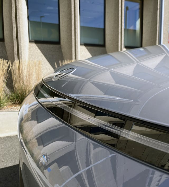
The parallels between the changing shapes present as you walk around the Hotel Marcel’s windows and the unique geometry of the Kona’s CHMSL are not literal, but both elements looks different depending on your vantage point. The location of a light source also matters, though that’s more relevant to the Brutalist building.
In the case of the CHMSL, the thinning trapezoidal design isn’t clear until you are under the Kona’s integral roof spoiler. (i.e. The last photo in the above set.)

About that roof spoiler: it doesn’t hang out very far from the hatchback, and the plastic side skirts at the end of the glass keep it from looking as cool as it could be. Stylish or not, odds are this bit ensures cleaner air flow at the Kona’s posterior, which likely contributes to its impressive coefficient of drag.


Regarding vantage points once again, isn’t it amazing how the Kona’s marker light goes from a gentle smile to a hard, straight line depending on your height?
Unlike the interplay of light and shadow on the Hotel Marcel’s sunken windows, this is solely due to having a straight line on a curved surface. And this is a delightful detail to ponder on a car at any price.


There is a tragedy in Hyundai’s new 8-bit school of car design and their oval logo. While that “H” is also a deconstructed shape of two people shaking hands, the derivative frame (i.e. how many automakers need an oval for their logo?) no longer works with the brand’s unique DNA. The Kona is a surprisingly inspired design, even with the bargain basement pricing. What holds it back is this bubbly, 1990s-worthy corporate graphic at each end of the robotic body.

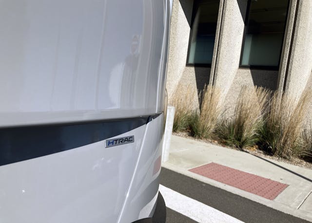
Or perhaps I am too harsh on that little egg shaped logo, as I’m fascinated at how round Hyundai made this posterior. Moving just a few inches towards the Kona’s center line makes the brake light absolutely disappear. This won’t affect the lights’ visibility for pedestrians or other drivers, only to those foolish enough to get this close to the hatchback.
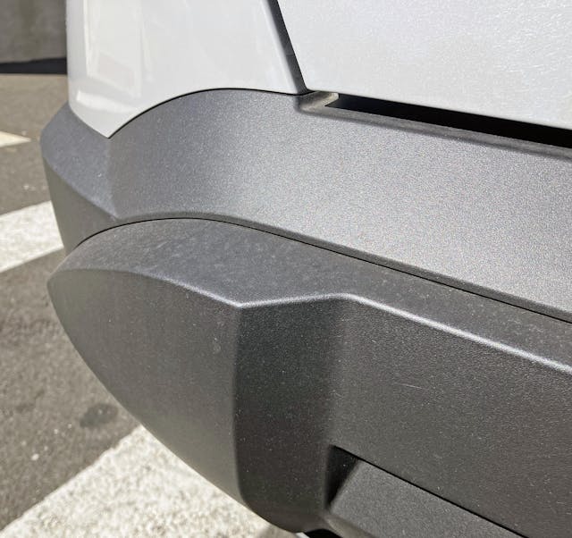
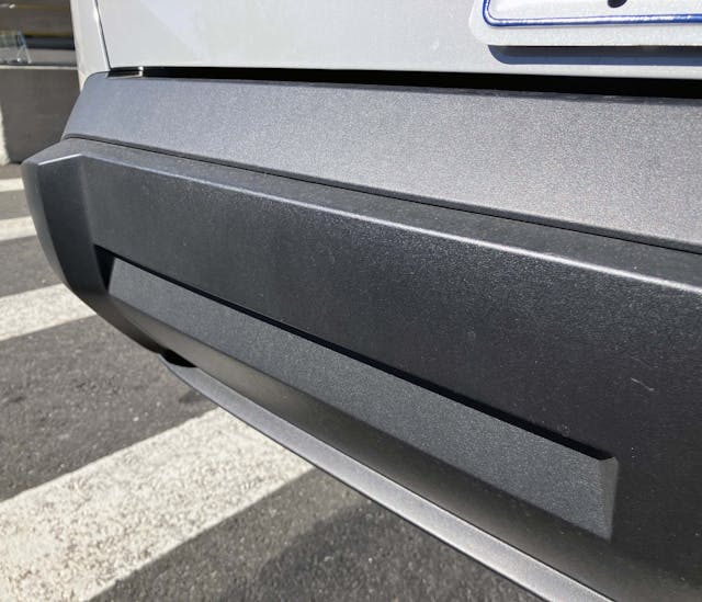
The integral plastic bumperettes jutting out of the rear bumper do not match those fake vents in the middle of the Kona’s front bumper, but perhaps discretion is the better part of valor in this case. The pair of long slots between the bumperettes likely serve no functional purpose, but do a good job visually thinning this large chunk of textured plastic.
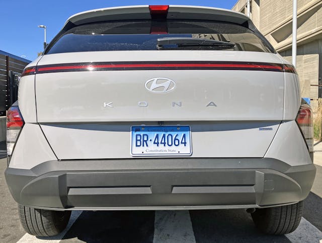
While the rear doesn’t entirely match the front, its clear both ends of the Kona have a down the road graphic that looks like no other brand. Unlike the front, the rear has extensively more contouring, thanks to its rounded hatchback, quarter panels, and fender flares. You see contrast too, as the bottom half of the hatchback (where the license plate resides) is flat. This pairing makes for a shadow that looks like it’s smiling in the afternoon sun.

Brutalist architecture isn’t to everyone’s taste, but good design can stand the test of time. The Kona’s design signature outshines that of its competition from GM, Ford, Honda, Toyota, and possibly even its Kia sister-ship. And not just from one vantage point, but from every angle.
In a world with stagnant CUV design and threats from derivative Chinese vehicles with shockingly tempting asking prices, Hyundai did us a solid. They gave us a reason to choose CUV design creativity over everything else, without the penalty of overpaying for the privilege.

To that effect, there’s no doubt that the posh Hotel Marcel is more interesting to look at than a similar four-star hotel, much less your average Motel 6. Natural light plays with the window frames like no mass-produced hotel could ever dream of, and the huge chunk of negative space in the third floor is even more radical than the Hyundai Kona’s lighting pods attached to fender flares.
We are lucky both designs were conceived, and survived the critical worlds both designs live in. The Hyundai Kona could have endured a less aggressive re-style in 2022, and IKEA could have found a way to demolish this iconic building in favor of more parking spaces for their retail operation.
Perhaps this is a good place to end this Vellum Venom, and let you enjoy the finer points of the Hotel Marcel in the slideshow above. As always, thank you so much for reading. I hope you have a lovely day.


Sajeev, converting an office building of that design must have been a massive undertaking to route all the plumbing, electrical, fiber optics to the individual hotel rooms. I would venture a guess that al plumbing and electrical came through a central stack near the elevators. Using the existing conduct for offices and conference rooms would not have been workable plus no plumbing would have existed outside the lavatories on each floor. Glad it was saved, as the pin heads in DC want to sell and tear down the J Edgar Hoover Building and it is an outstanding example, but suffers from the same problem of all buildings of this this design (massive concrete slabs as floors). Great building, but an appliance being presented as a car… keep up the great work
Thank you for reading! I suspect we will see more office buildings being repurposed into apartments as time progresses (sounds like its already happening in earnest in San Francisco) and Hotel Marcel proves it can be done. The lobby was clearly a cramped space for a corporate office, but it turns into a cozy boutique hotel with surprising ease.
Another great article in the series, Sajeev. I had the pleasure of staying there right after it opened, so they had not finished revamping the top floor. If you can find a picture of the space, it was almost organic, especially compared to the rest of the building. I agree that the Ioniq 5 would have have been a better match for this building, but really, wouldn’t the Karlmann King SUV be the ultimate choice in this case? We need the Hagerty folks to get on getting you one.
Thank you for reading, and your kind words. I haven’t seen the top floor in person or online yet, but that design sounds shockingly different from what I would expect after my first visit.
Not going to lie, I had to google “Karlmann King SUV” and that would be the ideal pairing to this building (and many other Brutalist icons). Well, it would need to be painted flat gray, but otherwise it’s perfect. 🙂
It looks to me a lot like the Ioniq 5 although a bit more subdued.