Media | Articles
Vellum Venom: 2023 Chevrolet Malibu 1LT
One American sedan is still rolling off the assembly line, be it in Azerbaijan, in China, or in these United States, surviving and thriving in a global marketplace. With well over 10 million sold worldwide since 1964, the Malibu has been everything from a gussied-up Chevelle to the middle-class family sedan presented here. Which makes it a winner, and not entirely by attrition.
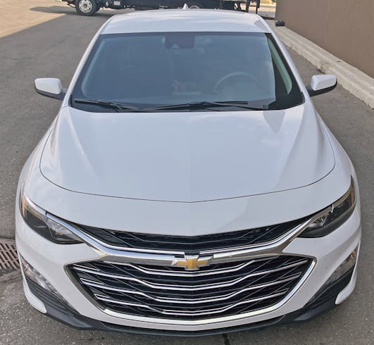
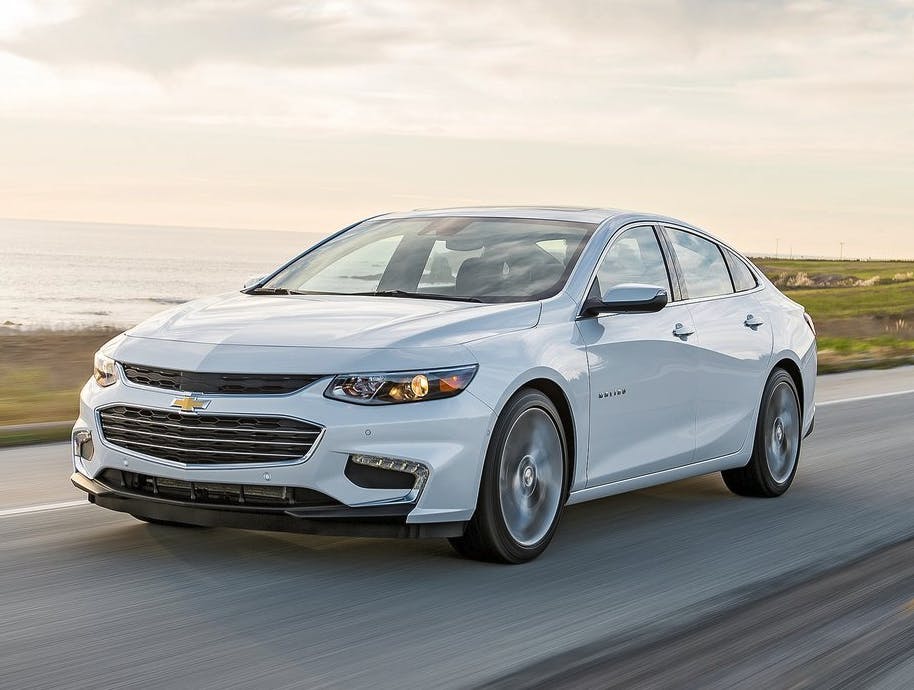
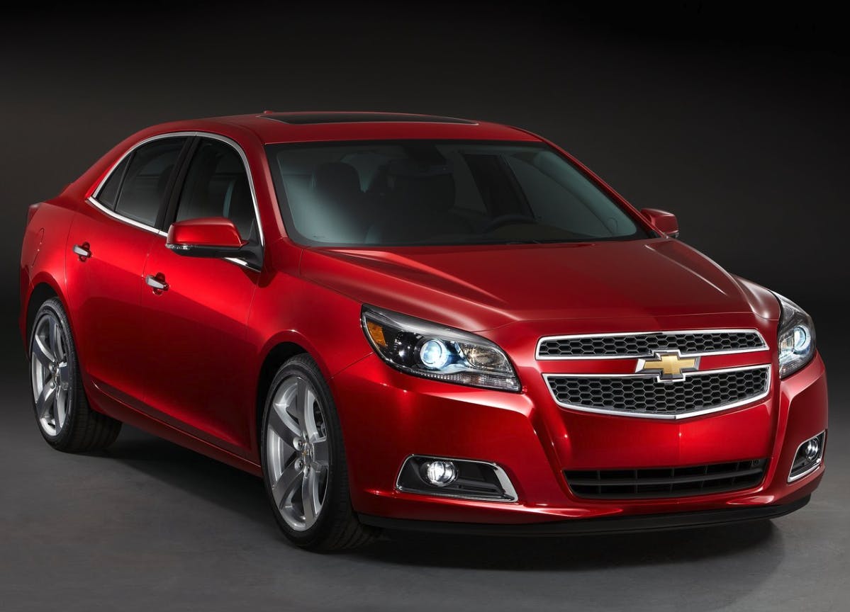
Finding a family sedan is harder than it used to be, especially if you want to buy American. But the current Malibu is a perfectly respectable car, American or otherwise. Even better, a 2019 refresh gave the Malibu a face worthy of competition with imported sedans and every crossover utility on the market. It’s big and bold, but also delicate and effortless. So let’s run this Canadian-spec Malibu, which I rented last month, over the vellum.
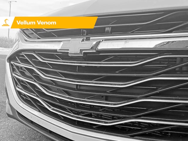
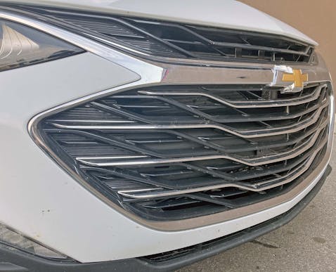
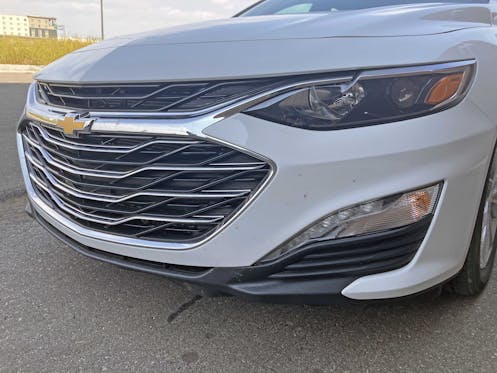
I’m not a huge fan of the Gaping Maw School of Design (TM), but it offers a beautiful way to integrate pedestrian safety into a modern automobile. And in the case of the Malibu, a larger opening made decades of Chevrolet split grilles finally make sense. Note how the grille’s lower chrome bands form a muscular ripple in the center, a shape that translates back to the hood’s pointed beak and muscular power bulge.
This is a very refined design with fantastic surfacing, giving the Malibu a front end on par with that of any premium vehicle from a more aspirational brand. And that’s a big deal considering previous implementations.
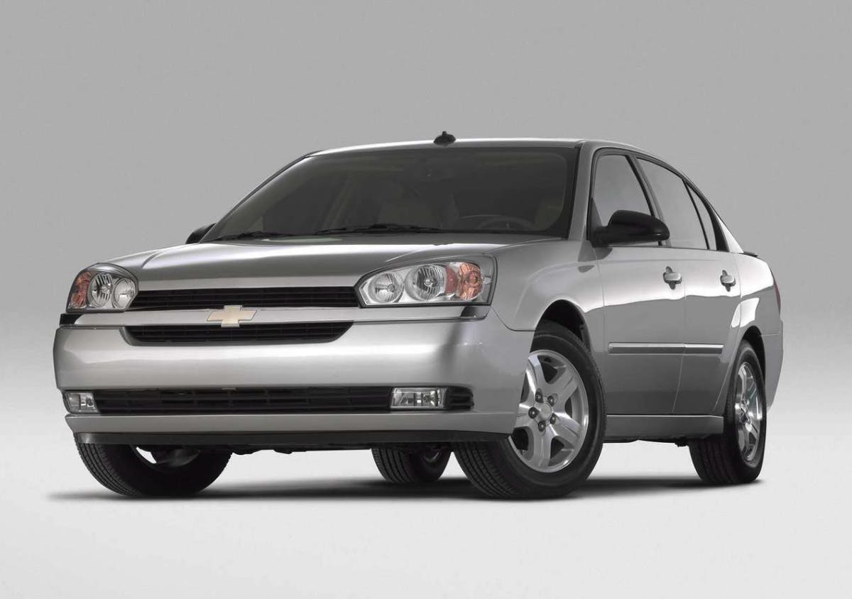
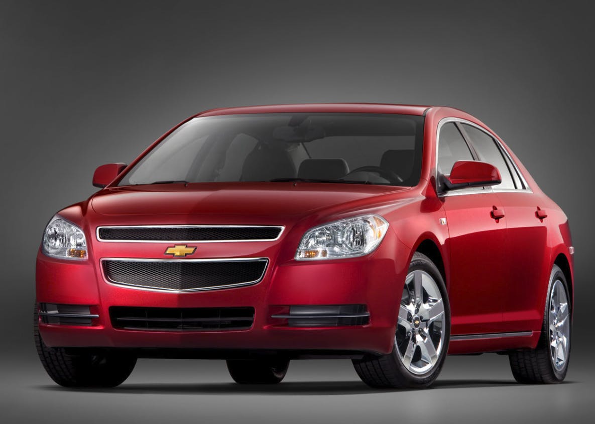
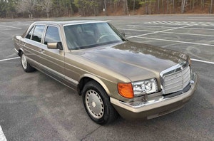
But don’t take my word for it: Take a look at the slideshow above, and the half-baked, bisected-by-bowtie grilles that preceded our car below. Every Malibu before this 2019 redesign sported a milquetoast grille that was lost in a sea of bold-faced Chrysler 300s.
Marketplace
Buy and sell classics with confidence
This expensive-looking grille makes no apologies for its design: Chrome-accented black plastic is the modern-day equivalent of tail fins on American sedans from decades past.
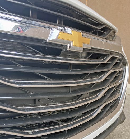
Even the grille’s details are done right: The Chevy bowtie emblem boldly sticks out farther than the center grille bar but is elegantly molded around said bar.
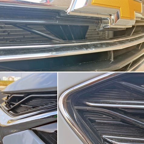
The obligatory blocked-out grille holes, something I usually dislike, are pushed so far into the background that it takes serious effort to spot them. There are simply too many crisp horizontal lines, subtle contours, and chrome trimming to make the block-off plates visible to the passerby. Even better, the block-off plates’ linear relief pattern is nestled so deeply behind the bars of the grille bars that they are rewarding to behold once you get up close.
Even the holes for a front license plate are downright impossible to spot behind all that gently bechromed geometry.
 Sajeev Mehta
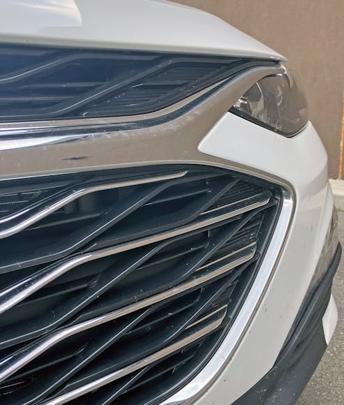
This is one of the few bad angles for the Malibu’s grille: the headlights and painted bumper are absolutely dwarfed by this angry grille with a furrowed brow.
But it’s okay to be angry when almost all of your brother sedans from the Motor City have fallen by the wayside. The Malibu’s center chrome spear turns into a frame inside the headlight assembly. The transition from indoor to outdoor chrome trim is a bit awkward, but it’s downright breathtaking considering this isn’t a luxury vehicle.
More to the point, I’m thrilled that such attention was paid to a vehicle that stickers for $25,100 in today’s economy ($33,074 CAD as rented).
The grille and headlights combine to make the face of a vehicle that we all should be proud to own over others at the same price point. From the front, the Malibu is more restrained than a Camry, far more exciting than an Accord, and, best of all, it’s a gen-u-wine family sedan and not a crossover utility.
The cooling ducts and front splitter are non-functional, but remember how much real estate needs to be covered on tall, boxy front fascias of modern cars. This execution looks pretty great, with secondary lamps mimicking the “cooling duct” texture, itself a nice homage to the grille’s texture.
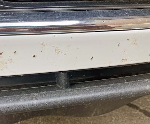
The color contrast between white paint up top and black trim below adds functionality, as the bumper is less likely to need a pricey bumper repaint in a minor collision. Hopefully, some sections of that massive grille can be rebuilt individually, like that of the Fusion sedan before it.
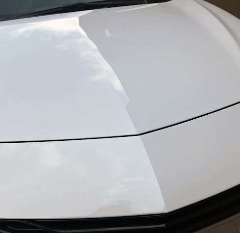
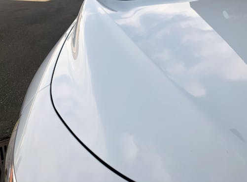
Is this the pointed hood of a Chevy Camaro? The DNA of Chevrolet’s pony car is very much on display in the Malibu, and that’s another reason why this body style might be the best of the Malibu series.
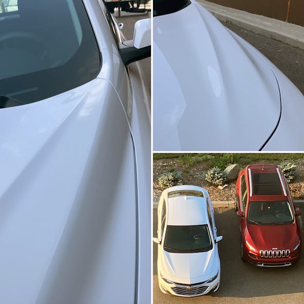
The sheer volume of creases on the hood makes no sense from up close, but their proliferation is not unique to the Malibu. The mission of these lines makes more sense when you step back.
The hood lines are actually a transition from a low front fascia (relatively low, anyway, provided a Chevy Corsica doesn’t park nearby for reference) to the tall cowl below the A-pillar. Go way back, like back into your hotel room, and the lines turn into connective tissue: the lines that add logic to the space between the cowl and the aforementioned “muscular ripple” in the center of the grille.
Speaking of connective tissue, there’s a hard line at the grille’s widest point, mirrored by the hard edge that frames the secondary lighting pod and fake cooling duct. It’s a nice compliment, one that doesn’t try too hard to make the visual handshake work.
The Camaro’s front-end design makes an even bigger impression on the Malibu, as the header panel pushes the Malibu’s hood back just like it does on Chevy’s pony car. The turn signal also has the same smart upkick in its tail, albeit with a chrome frame to work with the grille.
But the Malibu’s proportioning makes it clear this is a front-wheel-drive sedan for modest family needs, and not a rear-wheel-drive Camaro.
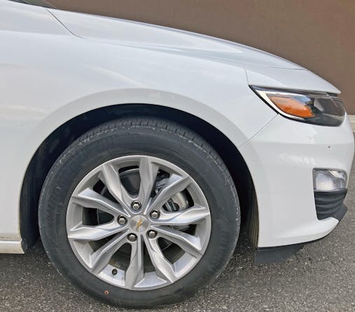
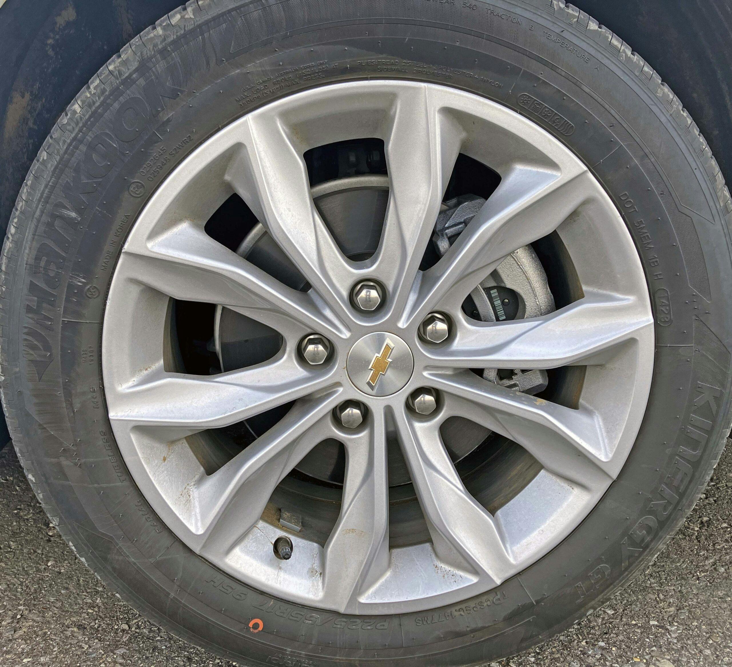
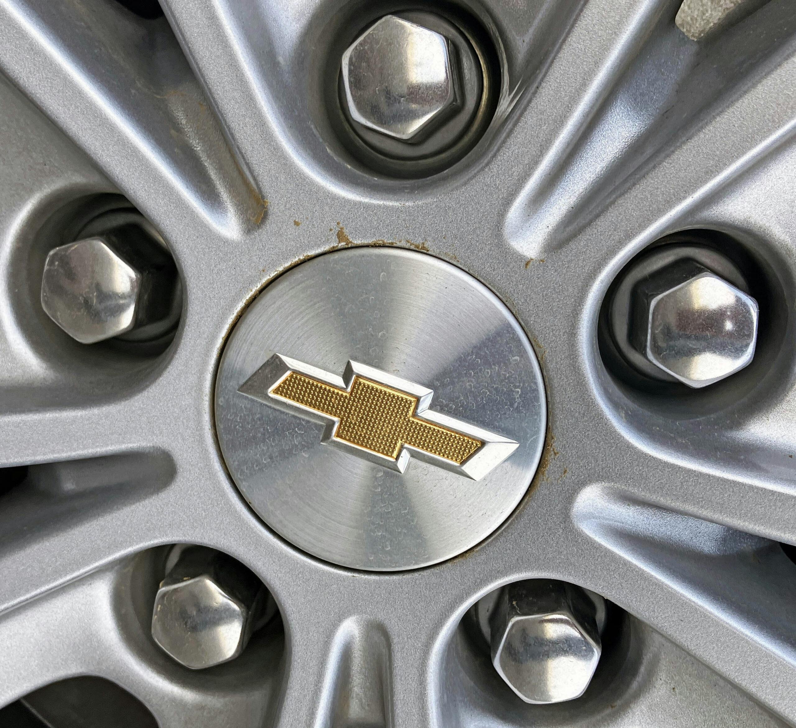
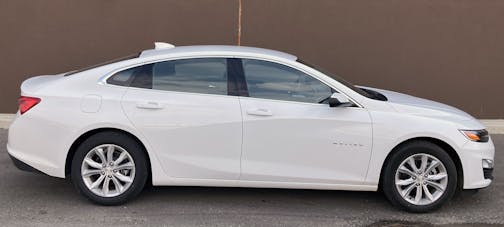
Much like the grille, the level of surfacing on the 1LT grade Malibu’s 17-inch wheels is impressive. Someone took the time to craft these muscular spokes and spent the money for the brushed aluminum center caps, which add a bit of prestige.
The front end’s aggressive face transitions to a bodyside akin to that of the Chevy Impala (RIP 2021), but the surfacing is far more subtle than that of the former flagship Chevy sedan.
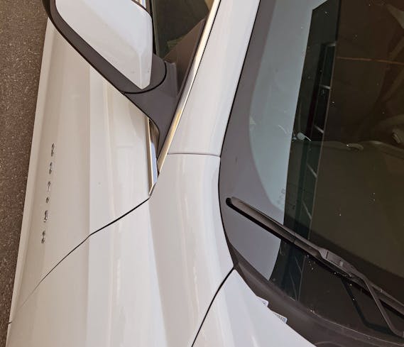
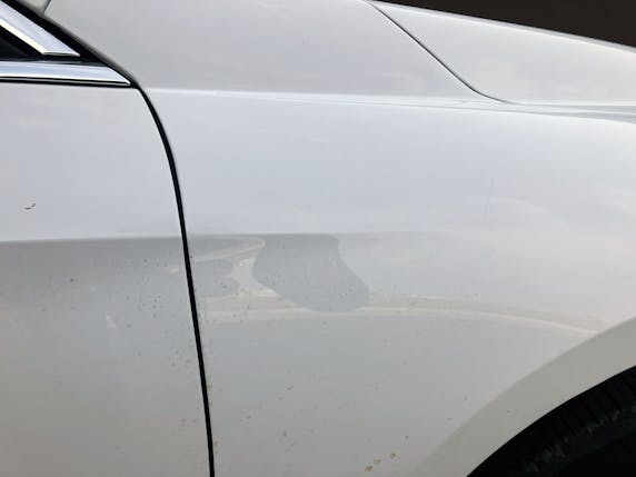
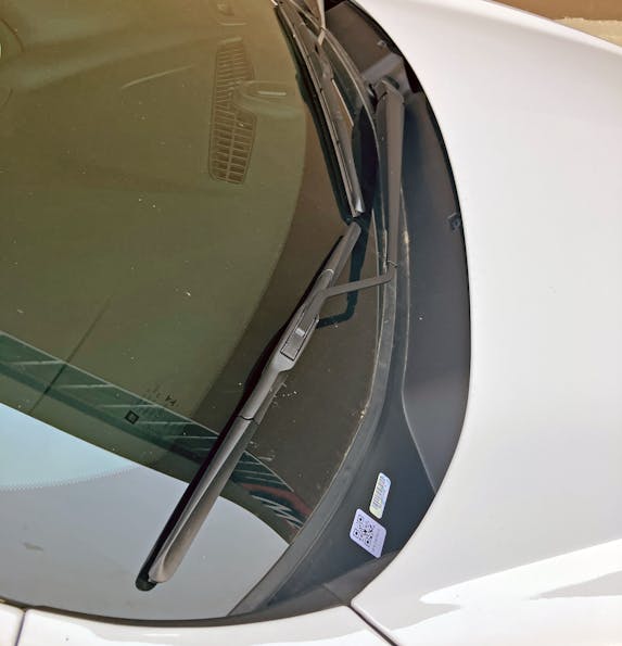
Unlike the Impala, even the hard bends in its side profile are muted by curved transitions. The block of metal between the hood and the A-pillar is regrettable, but this tall cowl needs a filler panel in the fender to make everything line up.
To wit, imagine if the cowl ended where that chrome strip begins. This would be a far, far, sleeker design.
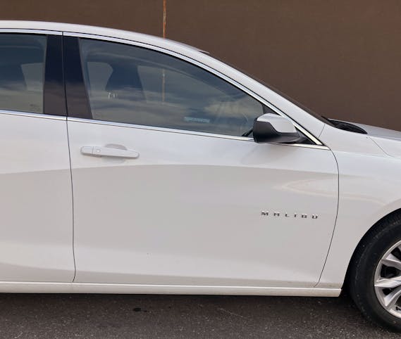
While the Malibu’s door lettering appears to be perched high atop this body, it actually falls closer to the midpoint of the door, which is unfortunate but expected with a cowl this tall. Still, the door stretches impressively forward, while the contouring of the body side is subtle and almost expensive-looking.
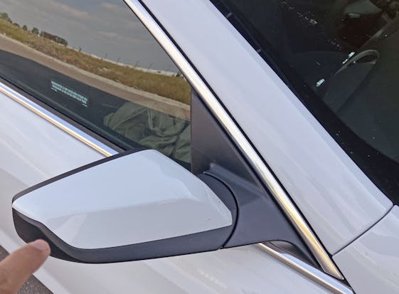
That long A-pillar makes for a sleek door, and pricey chrome trim and this nicely chiseled sideview mirror look more upmarket than the Malibu’s base price would suggest. Note the strong shadow where my finger’s pointing, as this assembly is sculpted quite nicely.
Too bad about the excess flashing on the mirror’s mounting panel—affordable family cars exist for good reason.
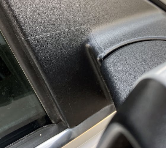
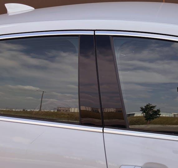
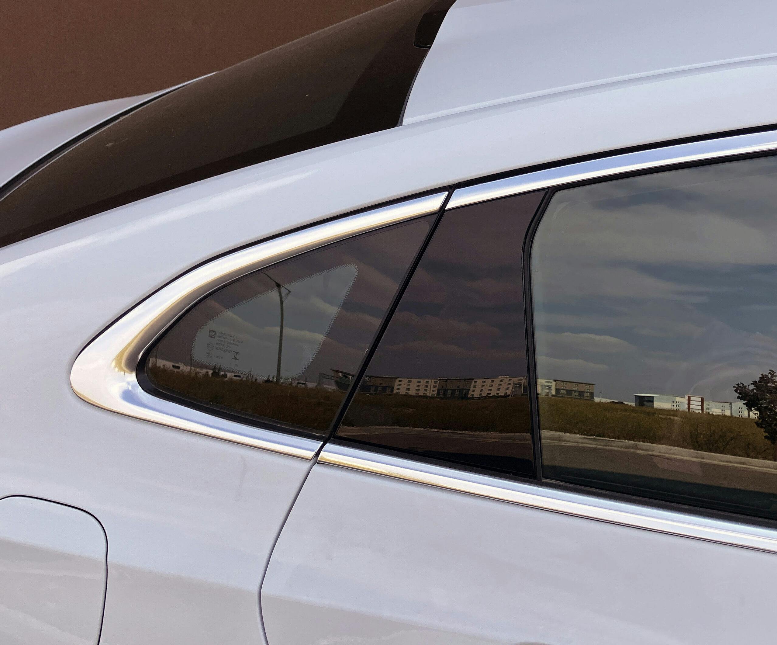
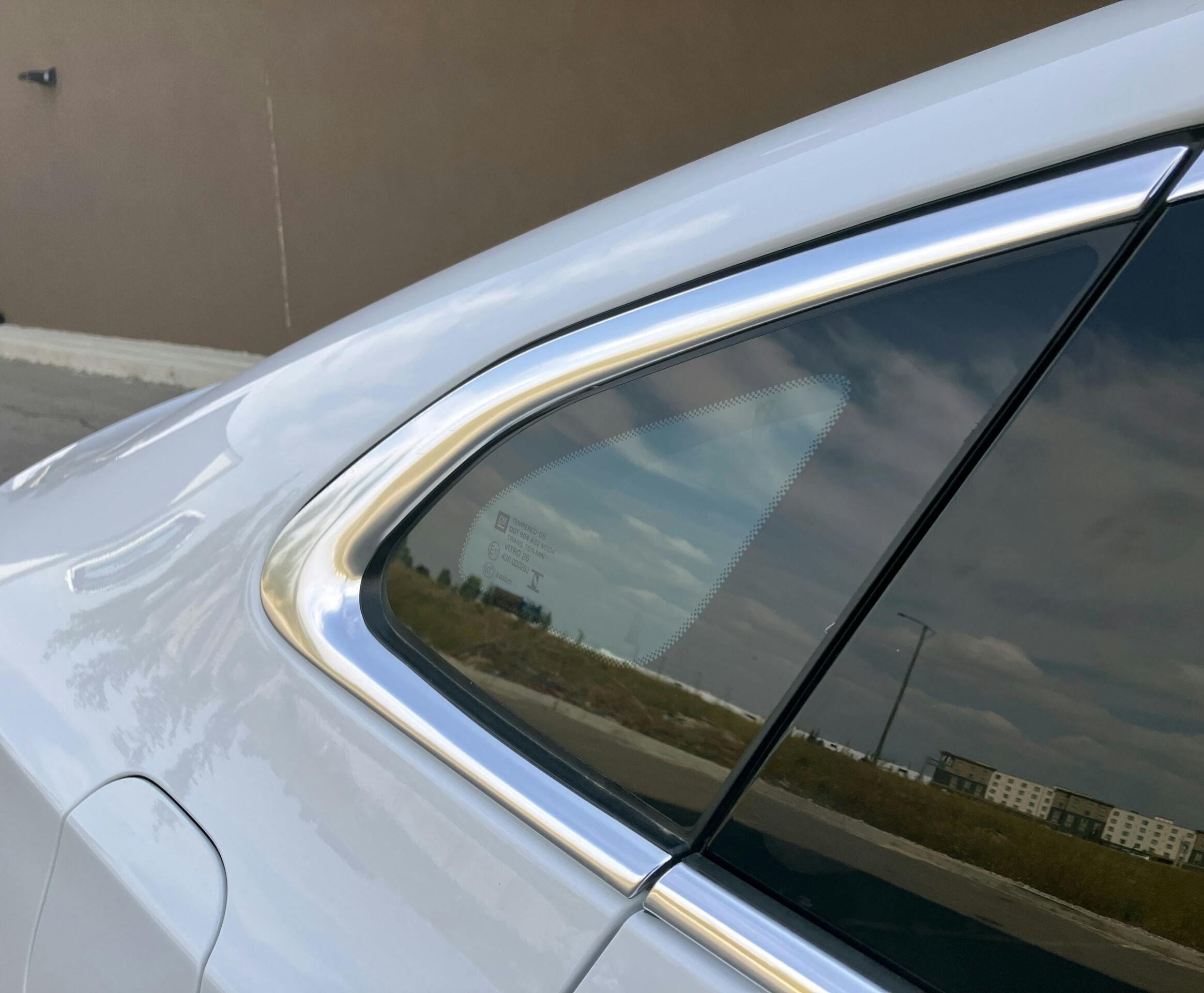
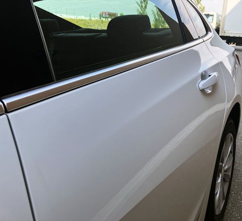
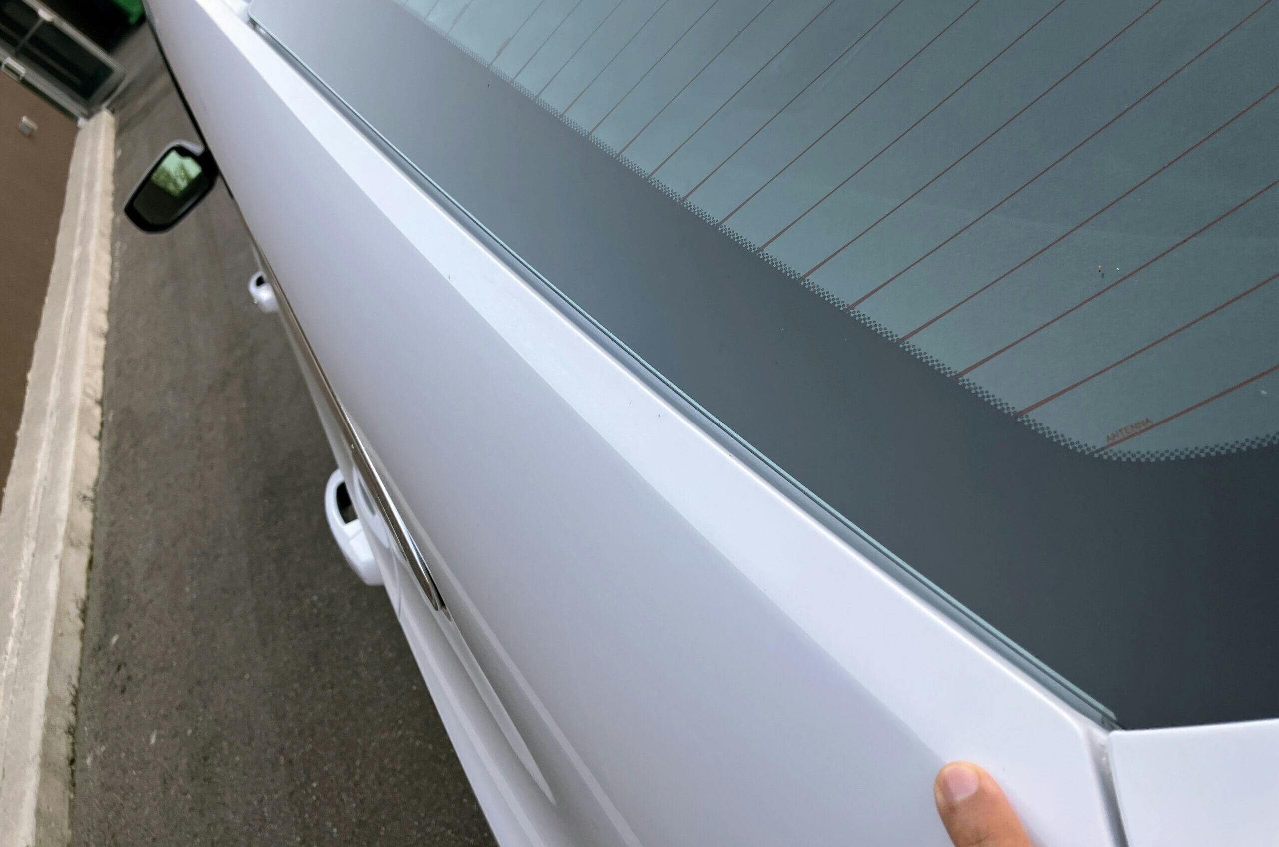
More to the point, I’m glad Chevrolet spent the money in places that matter. Like this blackout pillar trim, as it helps the chrome-rimmed DLO truly stand out.
Ditto the fact that Chevrolet spent the money for an actual piece of glass behind the rear window, instead of the DLO FAIL we see in the other sedan in GM’s portfolio.
It truly feels like Chevy’s designers had more time, money, and desire to surface the Malibu compared to their counterparts at Cadillac who made the CT5.
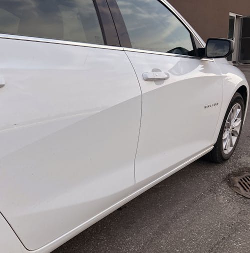
The only bit of bodyside surfacing that doesn’t quite work is the character line, which gets a bit too close to the negative area reserved for fingers to curl around the pull-out door handle.
And that character line has an aggressive downward trajectory as it slides back to the rear door. It is not terribly organic because of the door handle’s location—dropping it down an inch or so wouldn’t kill the flow.
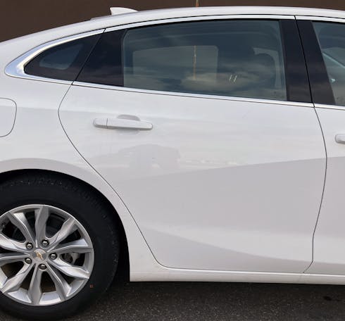
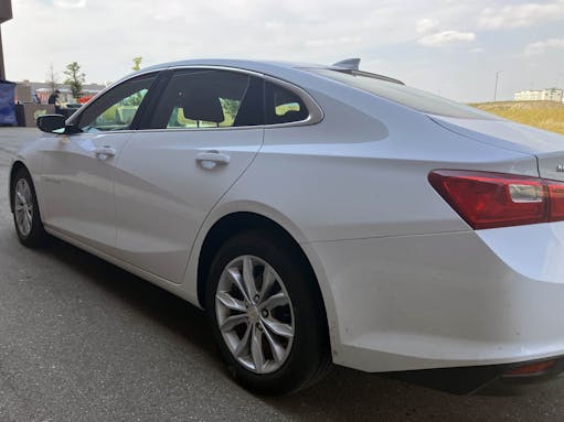
And when that character line falls down the door, another one begins, crossing (too closely!) over the rear door handle, and becoming a significant design element in the quarter panel.
Indeed, it becomes a hard crease that does a fantastic job of elongating the quarter panel. Too bad it also has to crease the filler door; very few designs get away with an unbent gas door.
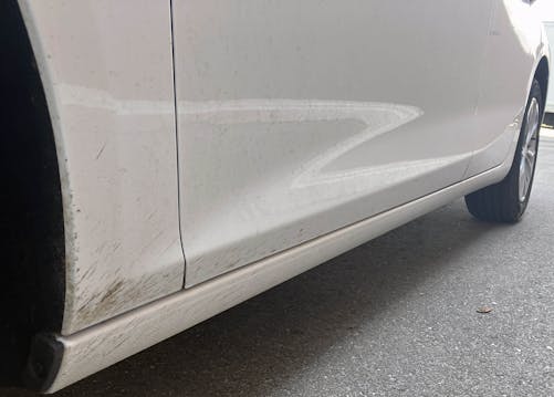
Down by the rocker panel, you can see how a few hard bends remain across the body (the chassis needs to remain flat for passenger space) but a cosmetic character line does bend upward to harmonize with the downward bend just a few feet away.
These body creases really make you forget how tall modern vehicles are, don’t they? Yeah, me neither.
This body’s presence in rental fleets almost ensures it won’t be considered automotive art; its main role is to be an alternative to a Nissan rival. (Remember the infamous Big Altima Energy movement?) And that’s a shame, as the all-glass DLO, chiseled doors, and long strokes across the body deserve more recognition outside of airport parking lots.
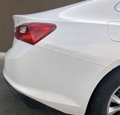
But this one crease in the quarter panel? It feels unnecessary, relative to the flatted-out plane around the wheel arch, and almost fights the mandatory cut line for the rear bumper. I’d eliminate this bit of surface tension and let the cutline do its job, visually speaking.
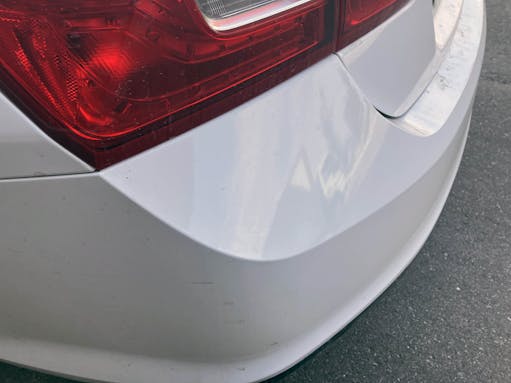
Aside from the aforementioned crease, this might be the best angle on the Malibu. The bumper moves skyward to meet the tall rear deck, and the tail lights are squinting, like they are thinking long and hard about something. The integrated decklid spoiler kicks up, like an angry forehead enhancing those slitted eyes, while the bumper cutline goes right up to the tail lights like a mean mugging mouth.
But this is far from an overly angry family sedan. There’s a lot of swoopy, harmonious curves here, accomplishing so much without resorting to the tacked-on blobs seen on the Toyota Camry.
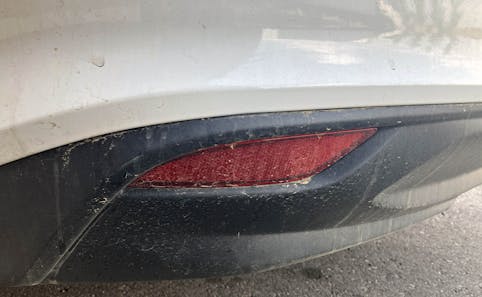
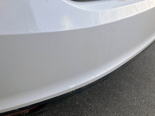
The bumper’s upward slope is accentuated by this black panel, which pretends to be a diffuser. Blackout trim panels at the top or bottom of a body are a common trick these days to reduce visual bulk, and they really help accentuate the aggressive upward slope of the bumper.
Large relief patterns and an integrated reflector also help reduce the visual bulk of this tall vehicle.
Sometimes I wish body sides had character lines that were this linear and flowing instead of swooshes and such stamped onto those huge doors.
The bumper’s upper character line aggressively moves upward to meet the taillight, thereby reducing the size of the bumper shelf and providing a clean break for aerodynamic efficiency along the bodyside.
Those squinting tail lights meet a center relief in the trunklid that looks like a menacing grin. The trunk itself has a gentle, sculptural curve from top to bottom, which smooths out the grin and makes it feel more natural than the jagged elements in the C8 Corvette’s license plate area.
That sculptural curve ensures there’s plenty of room to tuck a backup camera in the license-plate relief …
… but the curve isn’t wild enough to mess with the bowtie emblem’s mounting surface.
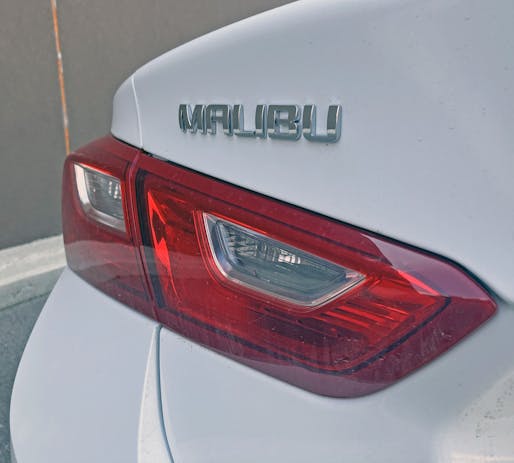
Ditto the surface behind the Malibu emblem. You can see just how “hard” the lights squint from other angles, just by looking at their drop in height relative to the emblem’s horizontal orientation.
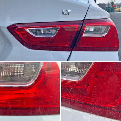
The red lights themselves have a replicated “L” pattern in their internal diffusers, an accent that makes them almost as cool as the fancy LED units found on 2LT Malibu, as the duplication really accentuates the squint.
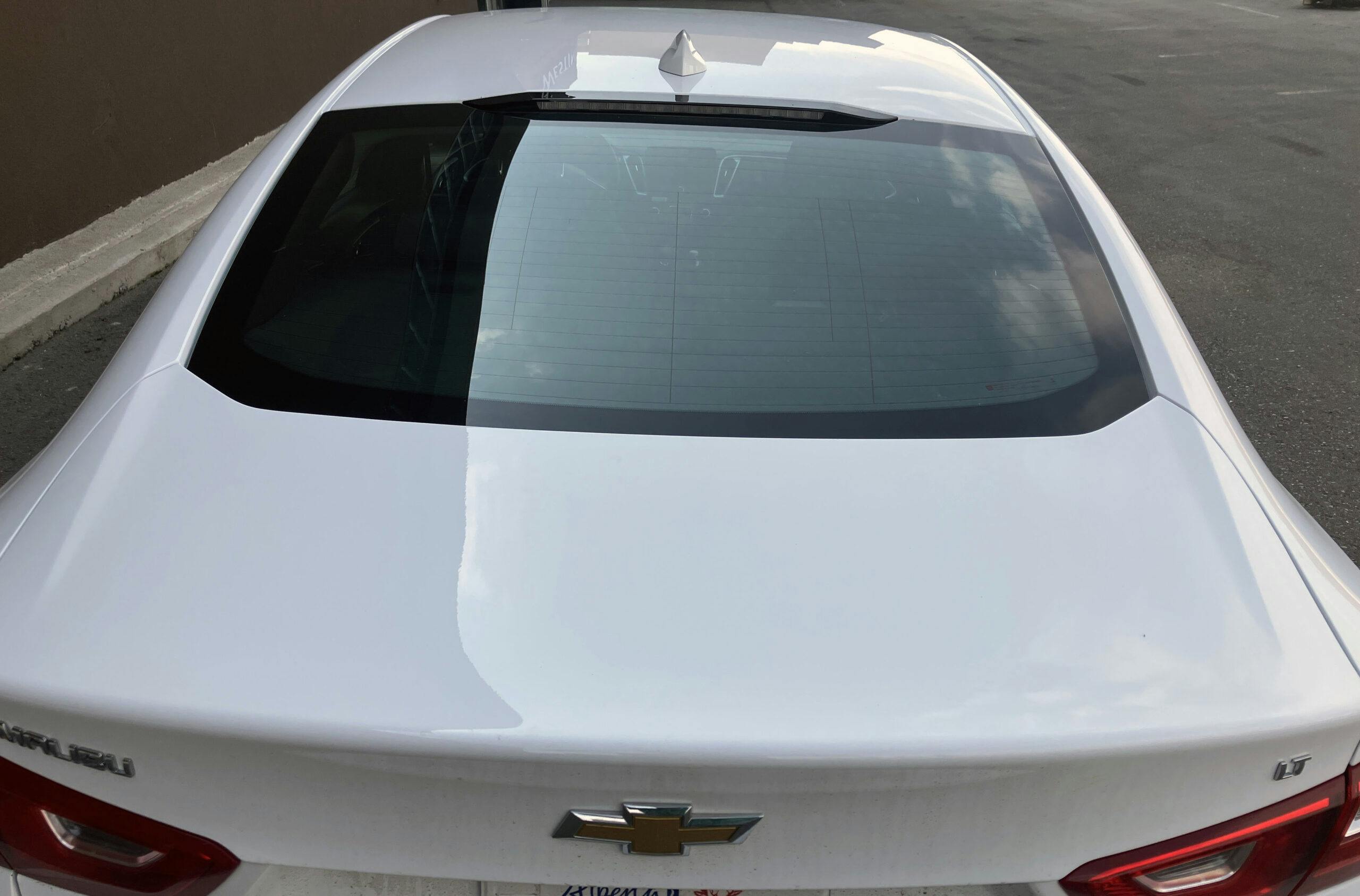
Get above the vehicle, and the fastback-style roof sports aggressive muscles that effortlessly translate to the deck lid.
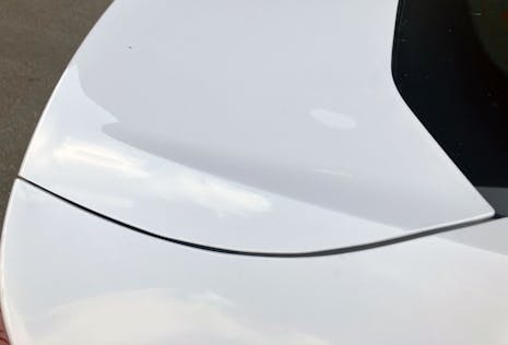
It’s just a shame the muscular character line fights for your attention with a downright counterintuitive cutline between the trunk and the quarter panel. Odds are the cutline could be slightly modified to have the aggression of the character line while still working as a functional door with bulky hinges.
The strong linear elements presented in the rear are matched by exposed rain gutters on the roof. I never loved the gutter covers on similar family sedans, as it leaves more money for stockholders desirable items like a big screen with Apple CarPlay/Android Auto.
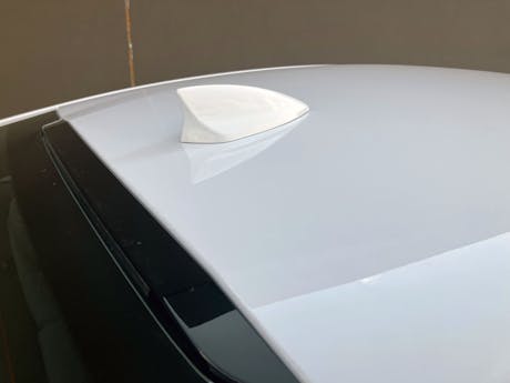
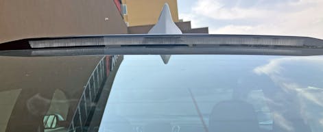
Because tech sells, and that color-matched antenna is proof. But it’s also resting on an elevated plateau on the roof. I wonder why?
Oh wow, that bump in the roof is for a white strip that turns red for the Malibu’s CHMSL. This kind of surprise and delight I would never have suspected in this car, but it’s precisely why I wanted to write this installment of Vellum Venom.
Here’s the thing: Even the most boring, mundane, and forgettable piece of product design was designed by folks who (at one point) were thrilled to be doing this task. I am sure even designer Yves Behar has some level of pride in the Juicero, as his efforts aren’t necessarily the problem with that doomed product. But comparing a failed San Francisco start-up to work on a General Motors product is a bit disingenuous, even if the results of both ventures are equally forgettable to most onlookers.
At least plenty of folks will enjoy driving this Chevy Malibu, in either a fleet or retail setting. Many won’t admit it, but some just want to understand why they’re intrigued by this vehicle. If so, I hope I helped make that happen.
I firmly believe these lines will age extremely well over time. And with that, thank you again for reading Vellum Venom. Have a good week!
***
place_marketplace_manual]
Check out the Hagerty Media homepage so you don’t miss a single story, or better yet, bookmark it. To get our best stories delivered right to your inbox, subscribe to our newsletters.


















I really enjoy reading your content. No one else is breaking down the exterior design of an overlooked option in a dwindling segment in such elaborate detail.
And I am glad you are here to appreciate my effort, David. Thank you.
GM is not marketing the Malibu much if at all. In Canada, we seldom see them on dealer lots (but they do exist, I just looked). The media has us convinced that sedans all got cancelled 3-4 years ago aside from Honda/Toyota/Subaru.
Meanwhile sales are climbing in the late years of a generation… because there are so few car options out there. I did see an article suggesting there will be a next-gen Malibu now rather than all-gone in 2024.
Malibu is hindered by some really hideous previous generations making it a model I hadn’t even thought about in years. Fusion absolutely stole some Mustang styling to its benefit. Smart of GM to make this recent Malibu better looking.
Advertise them, offer them in fun colors (Dodge’s playbook), give them some of the classic (lol) Cavalier/Monza/Celebrity trim levels like Z-24, Eurosport, etc. maybe even some real options like AWD. No other domestic is doing it… and for many people that’s a key thing (who makes it)*
*Even though many Toyotas, etc. have high % of American content. To some that fact matters not.
Advertising is very, very expensive. Making frilly trim levels and fun colors is probably more expensive, plus Dodge already cornered that market. Neither matter at this point in the family sedan’s life cycle. Better to help your margins by letting attrition entice the market over to your showrooms, and not pay a dime doing it.
You know, follow the playbook of the Crown Victoria/Town Car. The only reason those cars died was because they wouldn’t comply with side/head impact safety standards coming into effect in 2012(?), so Ford had no problem cranking them out. I bet the Malibu is going down that very same path.
I’m sure the business case to not advertise is strong.
Seizing moments matters to though. Dodge has dropped the playbook (on colours in sedans) so steal it.
Be cheeky. Sign a deal with Disney (owner of the Simpsons IP) and do a Malibu “Stacey edition” in Pink. That would go viral pretty fast I expect.
I like the way you think. If Chevy did a little more to sparkle up the package it could very well do better in certain regions (i.e. us Southerners love us some stylish sedans) but I fear they’d just screw it up and make the modern equivalent of the Chevy Venture Warner Brothers Edition.
I personally think the Malibu’s tall flanks would look sweet in a retro panel or lowrider paint job. (Actually both) Unleash a few of those for the media and let them make their rounds at dealerships and more people would absolutely be attracted to them.
When I last needed a new car, you could lease Malibus for like $200 a month. They were incredible bargains!
Hmmm! Just for kicks I googled “2023 Malibu lease” and my local dealers are advertising $469 a month with $0 down. Perhaps you can shop/haggle to get it closer to $400, but wow, things are getting pricey these days.
Too bad such a cool name is wasted on a rental fleet vehicle. It should called an “Appliance” Great job on the details.
Thanks, but trust me, it’s still a cool car. You just have to be someone who still appreciates driving a sedan over a CUV. There’s a reason why we only see these in fleets, and it has nothing to do with the car and everything to do with humans.
Way to sweat out the details. Nicely researched and well written! I see these cars on the street occasionally, but they haven’t really registered with me. Like you seem to be, I’m a bit turned off by the Gaping Maw grilles on everything nowadays; they remind me of the gigantic blunder GM made in 1958 with the hugely over-wrought, chrome-dripping-from-every-panel monstrosities they mistakenly thought the public wanted.
Thank you for reading, Mike. The Gaping Maw face used to be a big point of contention for me, but at this point, its better just to give up and see it as a product of the era that mandated it into existence.
As an industrial designer (and one time aspiring auto stylist) turned design engineer, I too love your posts and I love that you are giving the Malibu its due.
I find the upper dropping body line a bit out of place, with nothing else in the design to relate to. I think a simple straight crease extending the nose’s middle crease on the back side of the front wheel opening and fading away in the rear door would be nicer and would give the badge an anchoring point. What do you think?
Thank you for reading, it’s wonderful to hear from someone in the industry, as your take on cars is quite insightful compared to the average comment about these sitting in a rental car lot.
I agree with your assertion about the body side contours, but unless you are Mazda and can get away with “boring” body sides with extremely subtle surfacing, it’s a bad idea to go that mild. You don’t want to make a sedan that disappears in a sea of SUVs when you are styling cars for a volume automaker like Chevrolet.
I thought the last Impala looked good for the class and this is basically the 9/10ths version. And Chevy will kill it so they can sell more crossovers (or at least they think).