Media | Articles
Vellum Venom: 2019 Ferrari 488 Pista
Legendary design firm Carrozzeria Pininfarina penned the lines for famous Ferraris through the decades, like 250 LM in the 1960s, the 512 BB in the ’70s, and the 1984 Testarossa. However, ties to the legendary Italian company began to unravel upon the 2013 introduction of the LaFerrari supercar (styled by Ferrari in-house) and Pininfarina’s sale to Mahindra in 2015. The deletion of Pininfarina’s signature from Ferrari’s collective flank is unfortunate, but it parallels the removal of Fisher Body’s logo from the sill plates of General Motors products: and we all got over that, probably.
While the 488 Pista (or “track,” in Italian) may not have Pininfarina’s blessing, this heavily modified, track-special Ferrari 488 rarely disappoints. So let’s pour these Italian lines over the vellum to see what all that extra cash (roughly $107K over the “base” 488GTB) visually generates for 488 Pista owners.
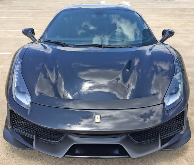
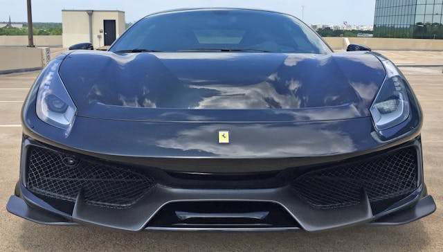
The Pista’s party trick is a new front fascia and a “domed” hood with massive amounts of negative area, turning the fascia into a bridge between the headlights. The contrast between the hood’s aggressive downward slope and the front fascia’s bridge above the negative area gives the sensation of an even longer and lower front end. That impression happens because the bumper’s center feature (a rounded form) visually connects to the lines of the hood’s negative area.
The fascia likely sports the same downforce benefit as the front wing added to the Lamborghini Countach of the Cannonball Run era. Since the airflow trickery continues further downstream, the Pista’s front end strikes an amazing visual balance between a heavy hood and a light, wispy bumper/diffuser area.
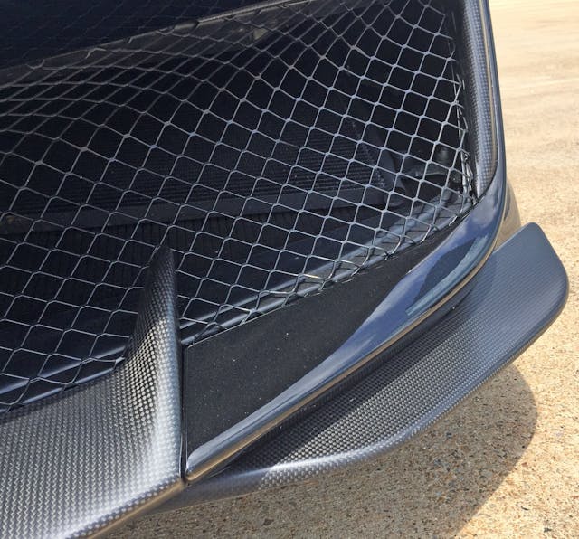
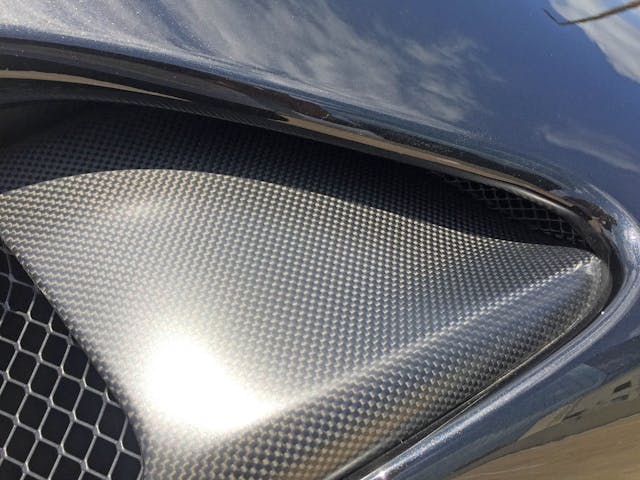
The carbon-fiber details give the appearance of a catfish’s whiskers (née barbels) that presumably benefit the Pista in ways other than tasting food before it enters its mouth.
Marketplace
Buy and sell classics with confidence
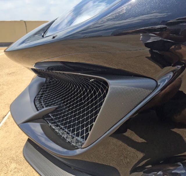
The carbon-fiber center section is logical, shooting backwards to complement the hood’s contouring. Both the carbon-fiber and painted bumper are sucked in considerably from the beginning of the bumper, giving the appearance of a mouth open wide to receive incoming air.
Perhaps the catfish analogy was premature, because from most angles the Pista more closely resembles an angry piranha. The angular carbon-fiber insert merges the grille to the painted bumper and has fierce, minimal lines of razor-sharp aggression.
The upper carbon-fiber insert logically terminates in the grille’s lower contour. Which is a nice contrast to such an outlandish carbon-fiber whisker—not to mention the wing at the corner.
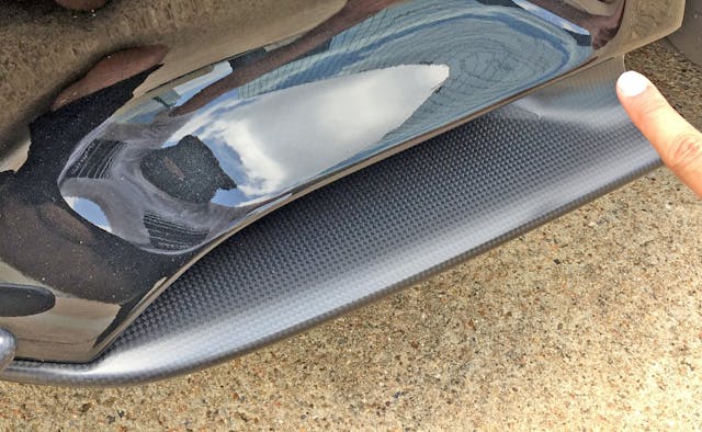
The aforementioned corner gracefully translates into a side duct (air curtain?) comprised of two sides of carbon fiber, two from the painted bumper. The contrast of hard lines (especially where I’m pointing) and soft curves give this space a muscular tone.
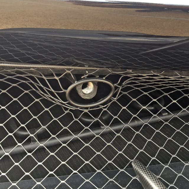
Conforming the grille to the contours of the tow hook (via metal grommet) is a nice touch.
Angry piranha face or no, the bumper strikes an elegant balance between sharp lines and soft contours.
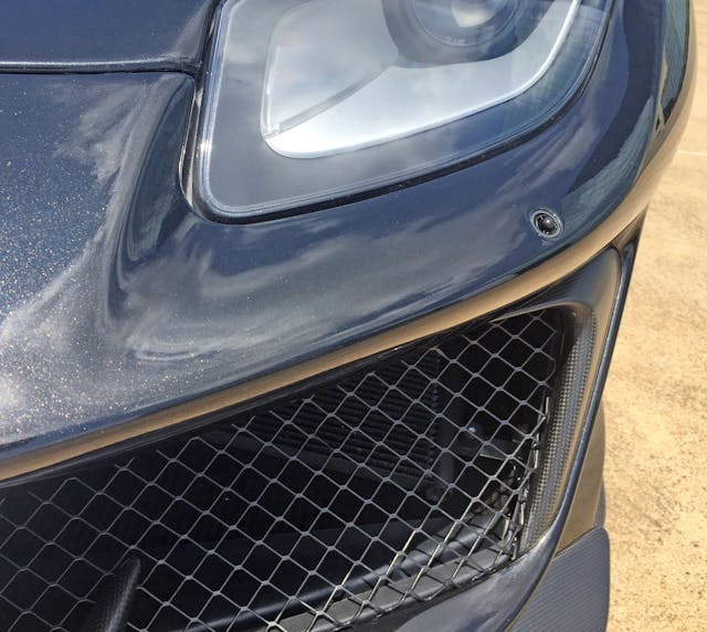
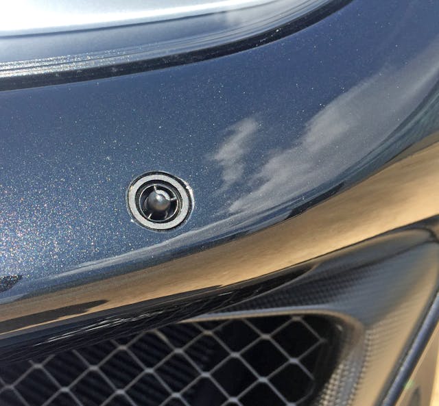
Exposed headlight washers are a throwback to a simpler time.
The headlight’s bumper relief recalls the 1998 Camaro—but in a good way. While the bumper whisker doesn’t necessarily clash, having it “borrow” the bumper’s headlight contours would continue its flow, allowing both components to share the same vanishing point.
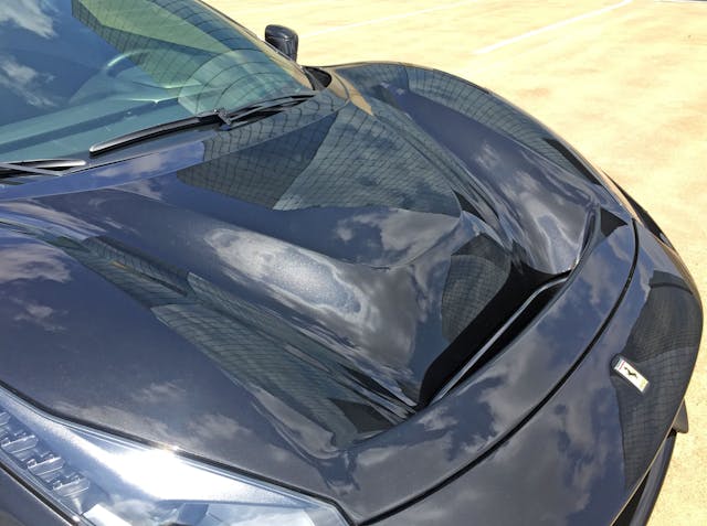
This “power dome” hood comes to life without actually doming the hood: They dug everything out around it instead!
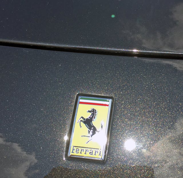
A boxy emblem matching a straightforward cutline. Even if Ferrari had a more radical shaped logo, I’d like to think they wouldn’t emulate the shape in the cutline like their competition (cough, Lamborghini).
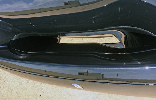
Not the easiest angle to capture, but the hood’s negative area does give you a straight shot of the concrete underneath.
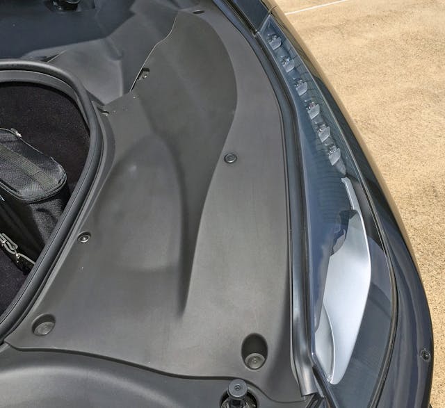
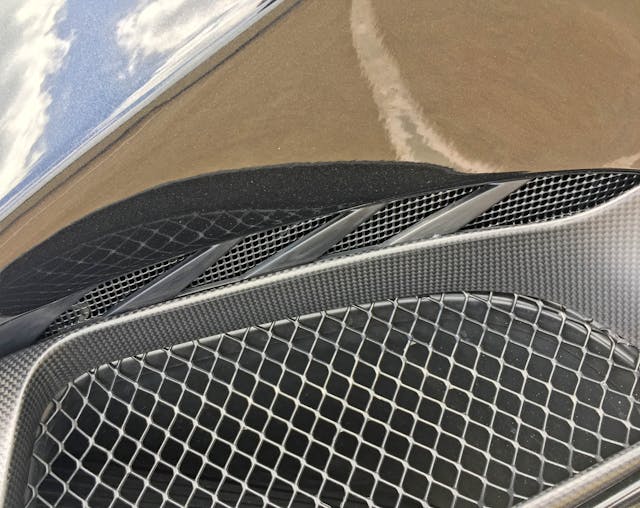
Opening the hood reveals more trim pieces and a rubber seal for the “frunk” storage area. Imagine how much larger this negative area could have been if Ferrari deleted the frunk entirely, going full McLaren Senna instead?
Kudos to Ferrari for spending the extra coin on this filler panel, which allows the painted hood to extend to the headlights. This cleans up the design by incorporating the hood’s cutline into the inner edge of the headlight.
It’s unfortunate that the horizontal hood cutline couldn’t end a little bit higher, matching the point where the lighting pod transitions from a headlight to a sweepy-black-plastic thing slathered over the front end. Wasted space, perhaps?
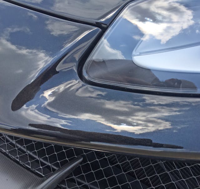
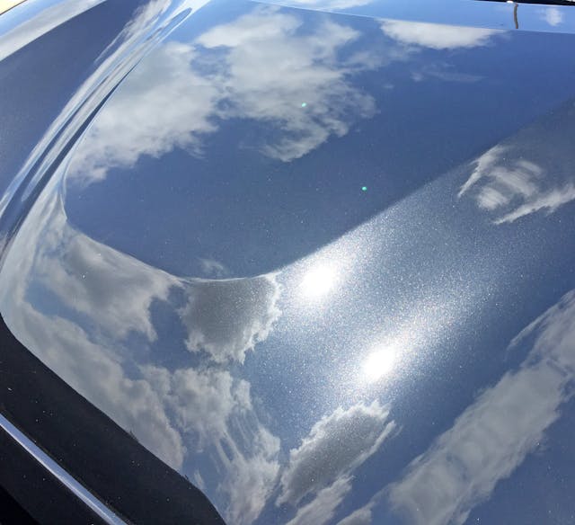
As witnessed by the cloud’s reflections, the hood bulge makes such a statement because of its hard bend surrounded by softer curves elsewhere.
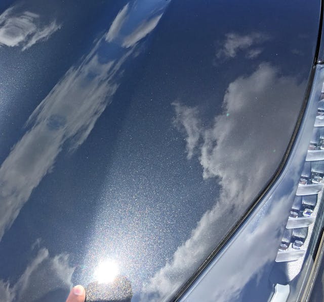
A soft bend denotes the transition from negative area to the conventional hood.
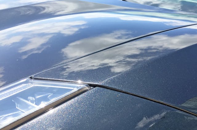
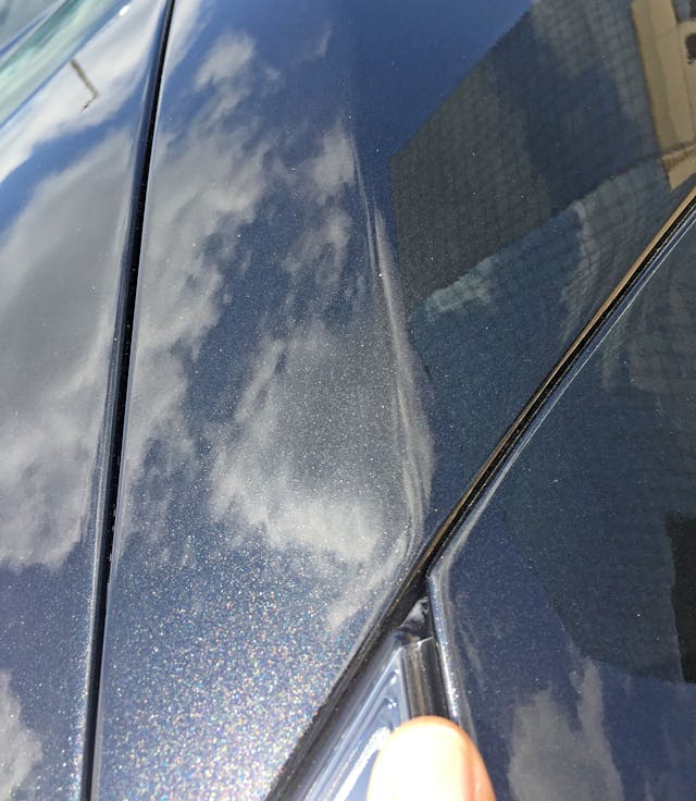
A hard bend creates the fender’s top-to-side transition. It’s harsh, and a stark contrast to the rest of the Pista’s hood details; a softer contour would make it feel less Lamborghini-like.
That aggressive crease certainly matches the headlight, provided such validation is needed.
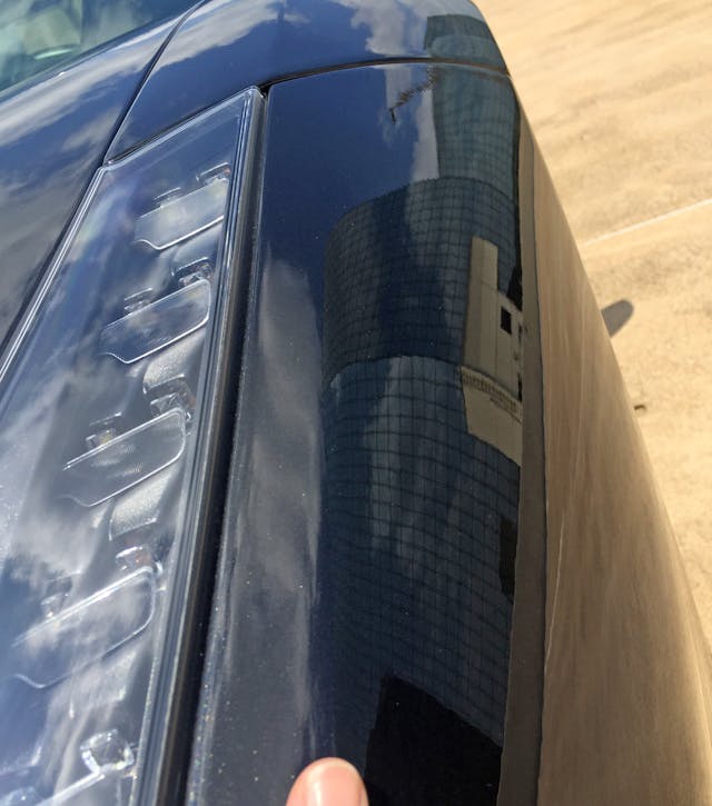
However, because the headlight needs no such validation from this section of the bumper, smoothing this superfluous curve out would clean up the design. Perhaps this bend exists due to aerodynamic necessity?
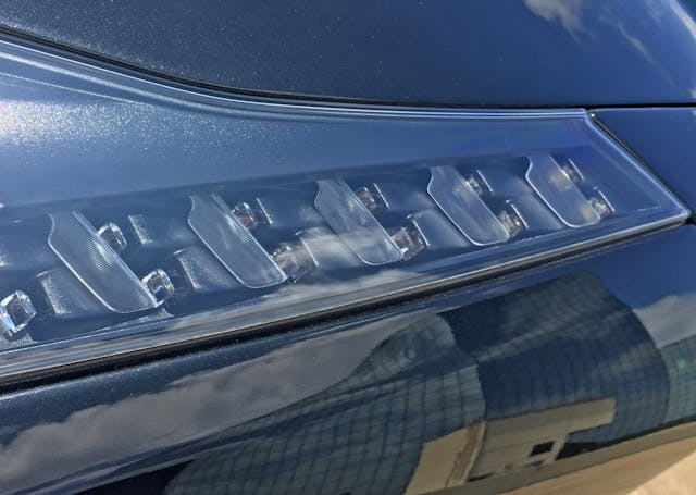
Deleting the crease would ensure that eyeballs remain glued to these LED eye-catchers that give the Pista an architectural lighting quality.
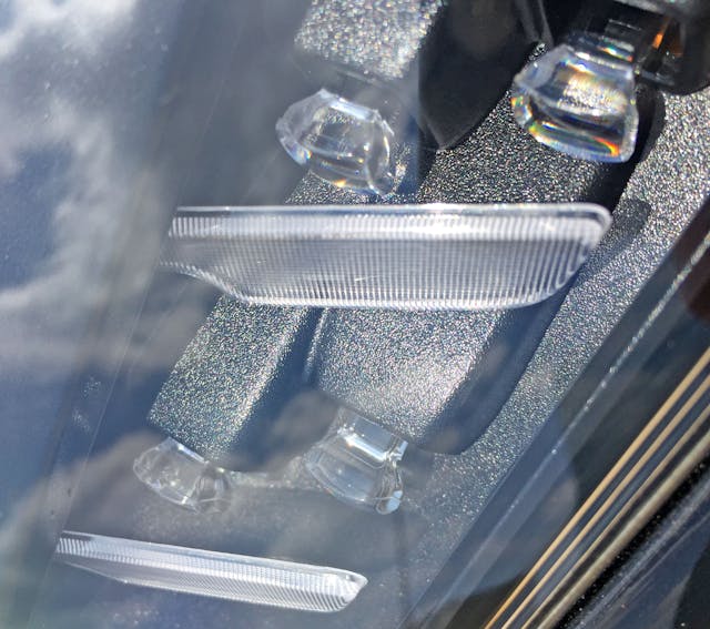
The LEDs come complete with diffusers sporting a textured plastic casting. There’s a certain purity in this raw, exposed design.
The eyeball portion of the headlight has a black plastic lid, which looks cheap in its rough casting. Speaking of low brow, you could drop a slice of bread through the outer bezel’s black-to-silver transition (right).
The bridge on the front fascia is far more evident from this angle.
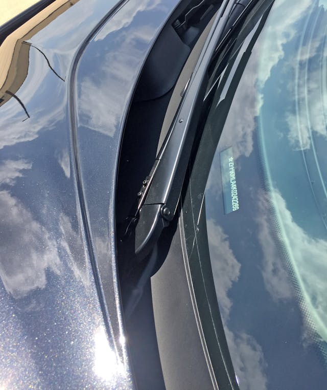
Perhaps this carve-out aids in airflow to the wiper arms (which rest in a tidy cowl) or perhaps it visually breaks up the hood’s flowing lines. If the latter, that’s a shame.
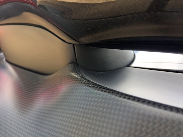
Maybe the cowl isn’t so tidy after all. This tacked-on fin likely reduces wind noise around the A-pillar, but it’s a poor showing.
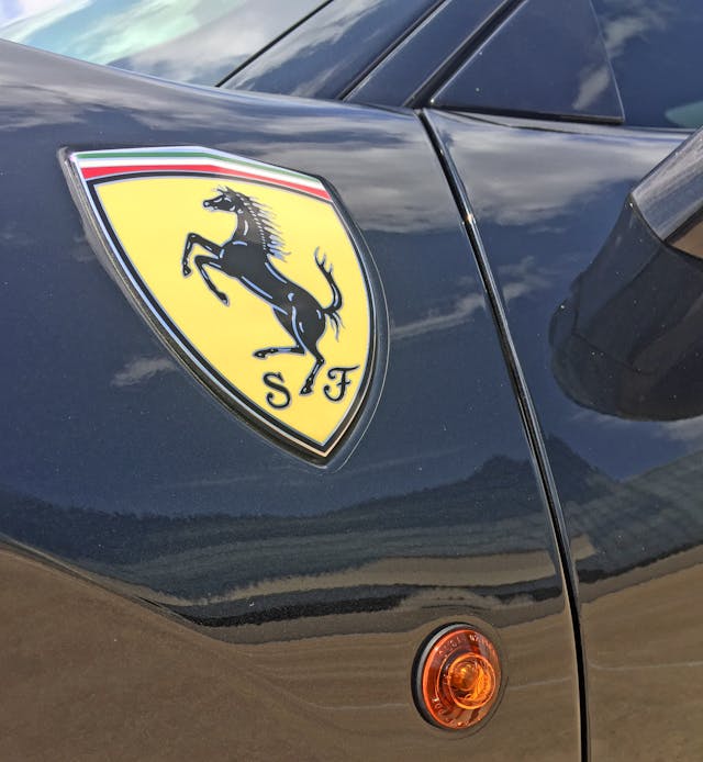
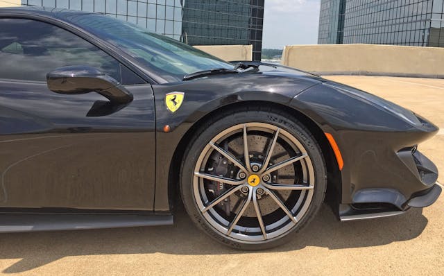
Ferrari crests are an option that harken back to Ferrari’s original front-engine vehicles with their long dash-to-axle ratios (i.e. the space between the front axle and the firewall). But this is a lot of badge for very little mid-engine real estate.
An emblem closer to the size of the modest side marker light below should be an option, especially considering the surface area commanded by the flattened wheel arch.
The Pista’s face is angry with a thin front fascia that’s chiseled and low to the ground (relative to most new cars). Look closer at its position relative to the front wheel: Compared to older mid-engine Ferraris, the Pista’s inflamed fascia sits higher off the ground. Yes, its elevation is negligible in this era of lofty CUVs and lifted trucks, and, yes, the arrangement is likely due to pedestrian crash regulations, but still— someone put an ice pack on this schnoz!
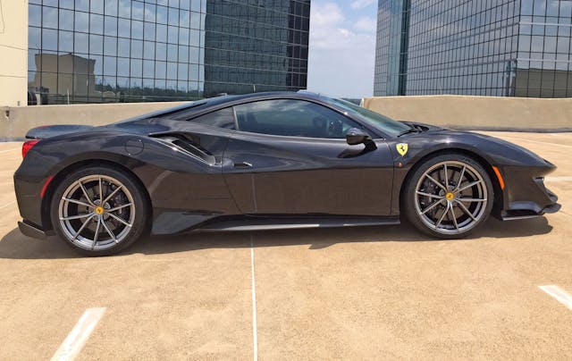
The dog’s eye-view shows a cohesive flow between wheel arches, cooling ducts, and the greenhouse’s rise/fall flow. The large amount of negative area across the rockers further cheats the eye into appreciating how low, chiseled, and muscular the Pista is between the axles.
The inflamed nose looks less so from a straight side shot, but the days of elongated, Testarossa-worthy front clips are long gone.
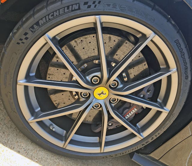
Five thin U-shaped spokes give the Pista a (presumably) light wheel with plenty of cooling for the carbon-ceramic brake rotor.
Much like the hood’s carve-out as it reaches the wipers, these bracket-shaped cutouts (which could, in theory, employ a smoother transition) shave a bit of unsprung weight but make the wheel visually busier.
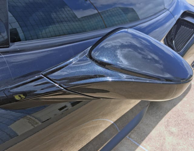
The fussy wheels are a stark contrast both to the flowing greenhouse and to the gentle door curves, which pay homage to the Ferrari 308. Even the sculpted side view mirror compliments the organic forms.
The mirrors, however, are ratted out as two-piece fraudsters by a cutline’s harsh slash: It’s a shame the functional cutline is poorly integrated, because it serves the noble purpose of folding when needed to save the mirror’s bacon.
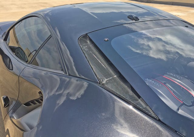
Unlike the fender’s juxtaposition of soft and hard transition lines (near the headlight), the roof sports a singular soft curve as it reaches the greenhouse. A very logical center cutout breaks the bend, adding a little surface tension and lowering the overall profile (a roof designed for racing helmet usage?).
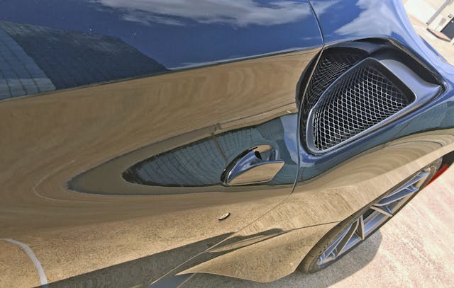
Unlike the aforementioned Ferrari 308, this door scoop contains a wispy door handle that’s an exercise in origami. While ergonomics are excellent, here’s hoping that bizarre shape minimizes the handle’s impact on air flow.
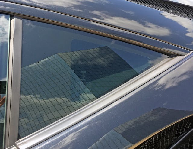
Yes, it’s a real piece of glass behind the door. Thank goodness cost-cutting DLO FAIL didn’t accompany with Ferrari’s decision to jettison Pininfarina’s influence.
The exposed door lock cylinder is unexpected but, perhaps, a welcome throwback. The rocker tucks far inside the body, allowing for a slick bit of horizontal paneling.
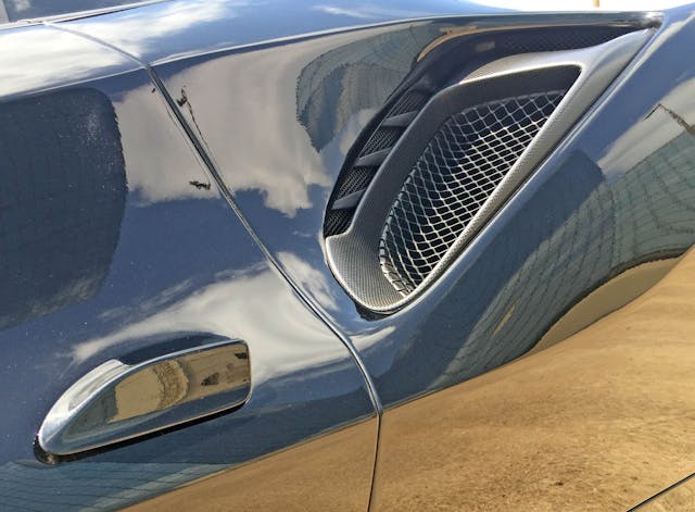
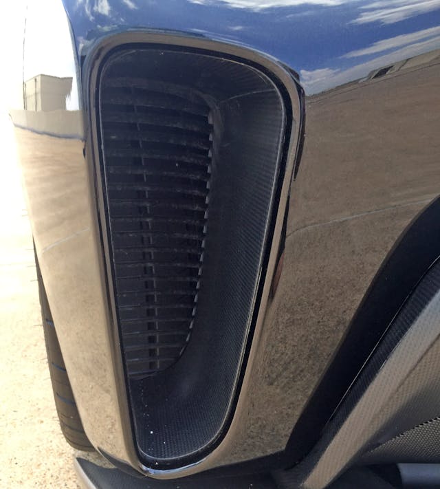
The scoop after the door mimics what we saw in the front bumper: a carbon frame around a delicate metal grille. Note the raised section at the edge, funneling air into … what is that?
Seen from a different angle, there are a lot of grilles encircling the main one!
From most angles these extra fins/grilles are normally obscured from your view. From here, it’s also clear how the door relief’s shape extends to encircle the cooling duct.
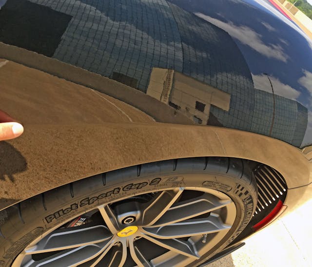
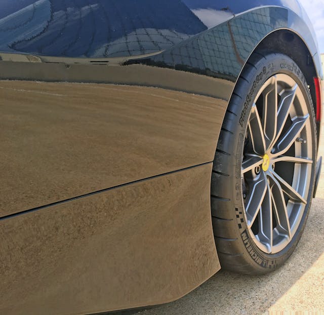
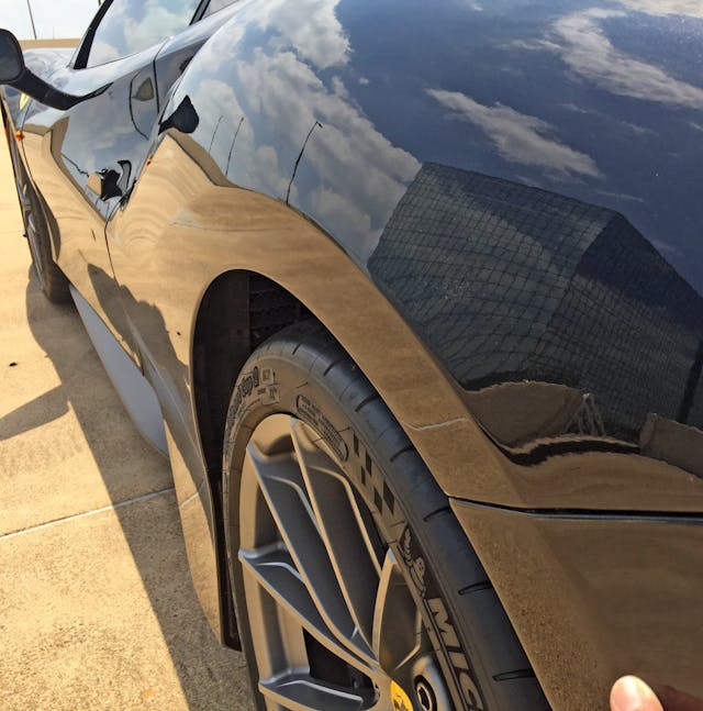
Perhaps one day we can be rid of these hard creases around the wheel arches—at least the Pista doesn’t conform to the trend of making the crease follow the tire’s round shape.
Like Superman’s cape flowing in the breeze, this sculptural wheel arch crease/quarter panel is a notion other car makers—no matter the budget, body configuration, or country of origin—should consider.
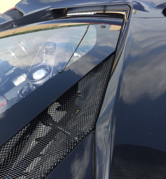
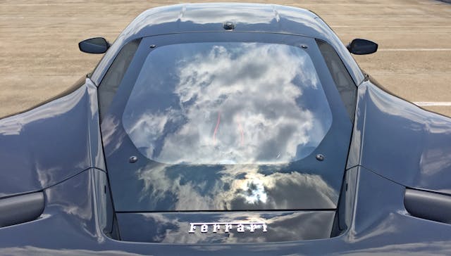
Speaking of sculpture, the 308-like carveout apes the greenhouse’s lower curve, which smoothly transitions to the engine cover. That cover and subsequent cooling grilles share a single shape as their boundary. While the antenna blob is par for the course, the round glass mounts are a bit of a buzzkill.
The quarter panel, quarter window, cooling ducts, engine cover, and even the rear spoiler sing a glorious, harmonious tune. Only the bumper’s lower diffuser gives a real indication of the Pista’s track-focused intentions.
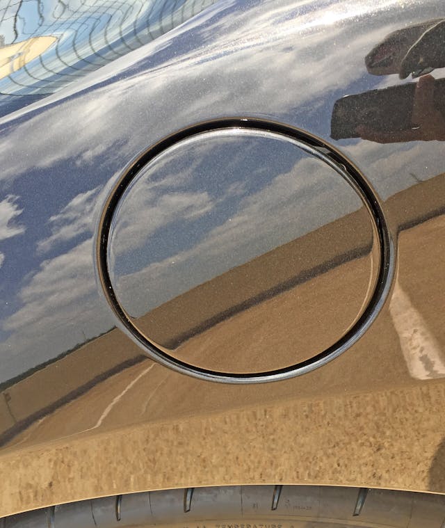
Someone took the time to ensure the fuel filler door wasn’t bent over the fender arch, or smeared across a muscular curve.
The quarter panel’s strong upkick subsequently drops down to meet the rear engine cover. That negative area (once again) turns into an eye-catching bit of aerodynamic trickery at the Pista’s posterior.
While the 308-esque scoop reference is valid, it’s certainly taken to an edgy, angry extreme. The flattened wheel arch reaches a conventional ending, contrasting with its radical birth from the door.
Flowing side contours similarly end against against a strong, vertically-oriented extractor.
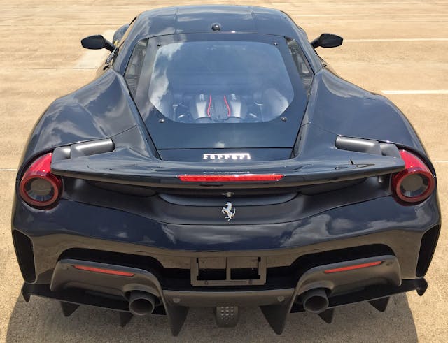
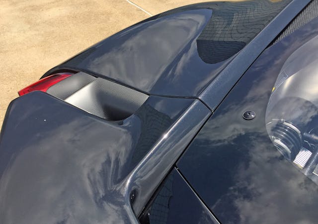
Note the body cutlines ahead of the Ferrari emblem on both sides: That’s the spoiler, which, surprisingly, extends farther back than you might expect. It’s a shockingly well-integrated, muscular package.
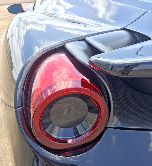
The spoiler’s upstream thrust (into the deck) is unexpected, but note how the cylindrical lighting pods and the adjacent carbon-fiber ductwork share the spoiler’s cutline … and how that line smoothly rolls down the body to share the curvature of the bumper’s vertical extractors.
Just like the front’s bridge over negative area, the Pista’s relatively flat spoiler becomes far more aggressive upon noting all the negative area carved out underneath. If not for the radical rear diffuser, this could have been a wickedly discreet bit of aerodynamics.
That said, the diffusers’ twin central arches complement the (painted) bumper’s curvature. Even the central high-mounted stop lamp (CHMSL) slots nicely between those arches.
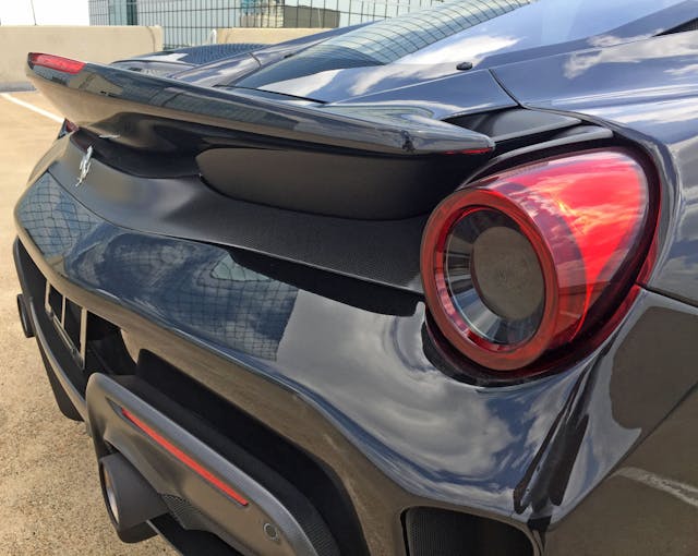
The vents nestled unceremoniously under the modest spoiler provide extra cooling while echoing the taillight’s cylindrical shape.
Of course, they are fashioned out of carbon fiber, with a finish worthy of the Pista’s asking price.
There is a shocking level of integration here, considering the number of curves, materials, and (presumably) technical necessities to keep a mid-engine, turbocharged, 211-mph Ferrari planted on the ground.
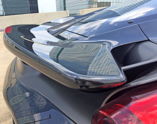
The Pista’s spoiler isn’t wholly integrated into the body; note the strong upward trajectory at its finale (where the CHMSL also lives).
On the other hand, the spoiler shares so many lines with the bumper and the quarter panels—is it really a strong upward trajectory?
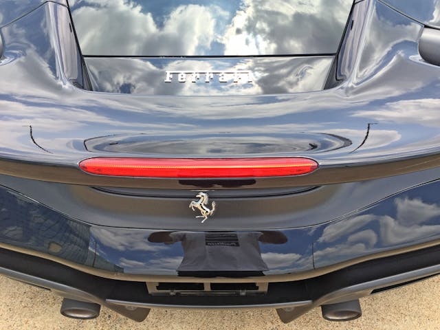
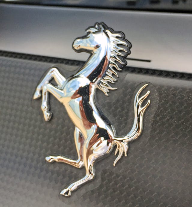
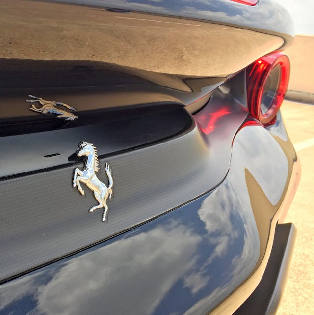
So much negative area was carved out, to the point of exposing the prancing horse’s head to incoming air.
While a smaller emblem would look cleaner, this could be a point of pride, à la the Camaro 1LE’s “flowtie” front emblem.
The spoiler’s “behind the scenes” trimmings have a natural transition from black plastic to carbon fiber, sharing lines to reduce clutter.
The integration felt logical just a few photos ago, but the red lights and carbon fiber feel quite avant garde from this angle.
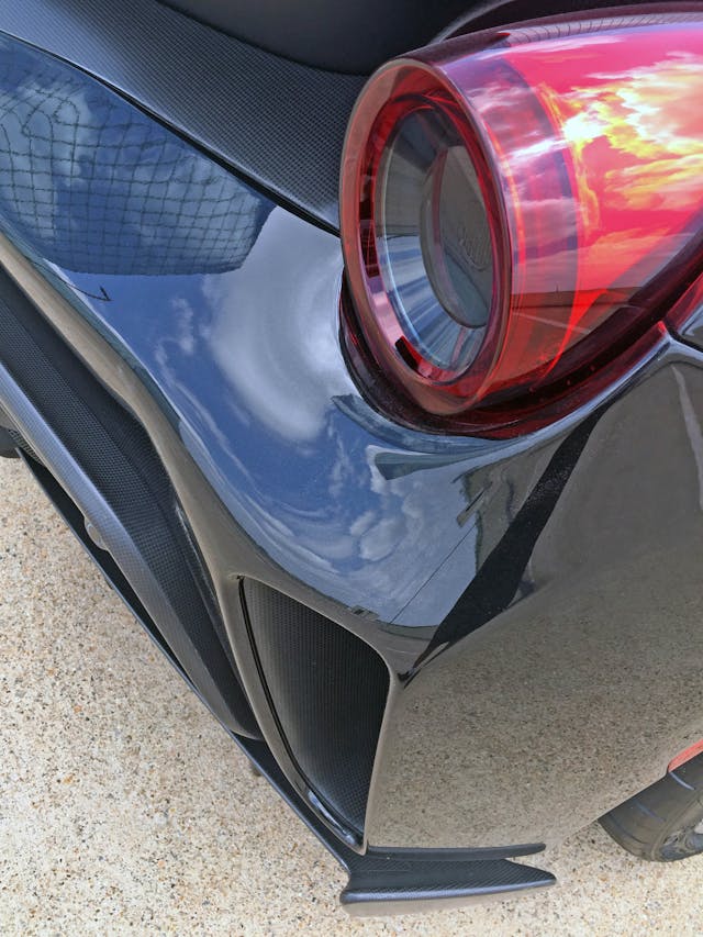
The (more outboard) carbon-fiber cooling duct matches the same circle as the painted bumper and quarter panel. Avant garde and radical indeed, but not reckless.
The bumper’s strong central bulge regulates the contrasting curves, though it looks a little chubby by Italian supercar standards.
The aforementioned vertical extractor’s outside line also influences the shape of the wing at each side of the diffuser.
Carbon fiber within the extractor further justifies the asking price.
The diffuser’s two larger vertical winglets (in the center) correlate to the outer and central points of the arch form above. The outer wing mimics the quarter panel’s ending form, while the inner is actually the genesis of the aforementioned arch.
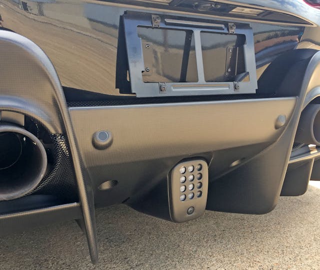
Nice carbon-fiber detailing on the arch, even if that sensor can’t be mounted flush to the panel.
Much like the spoiler’s shared lines of carbon fiber and black plastic, the exhaust influences both the carbon fiber and the mesh grille around it. The rolled edge on both materials is an unexpected touch, and is another detail justifying the Pista’s premium over the 488GTB, which features a flat mesh panel.
There are more sensors poking out of a perfectly elegant carbon-fiber panel, and the reverse light has mid-century-modern-style circular cutout panel obscuring the solid white lens. The arch’s downward curves not only add symmetrical flair to the splitter but also frame a license plate quite nicely.
The Pista offers plenty of high-dollar tweaks, but the 488GTB’s Italian design was an excellent foundation. What makes this track-worthy variant even more impressive is how designers forced themselves to design within the confines of the 488’s primary lines, forcing so many functional items to remain calm and quiet.
So subtle are the changes that many of these tweaks could, perhaps, find their way into the 488’s successor, the F8 Tributo. For now, it’s clear Ferrari doesn’t need Pininfarina for a stunning design; but it’s still a shame the marriage of design firm and automaker had to die. Logic be damned, Ferraris need that Italian coachbuilder’s name on their flanks, and General Motors products need Fisher Body carriages stamped on their rocker panels.
Thanks for reading—have a wonderful day!
