Media | Articles
Vellum Venom: 2017 Range Rover Autobiography
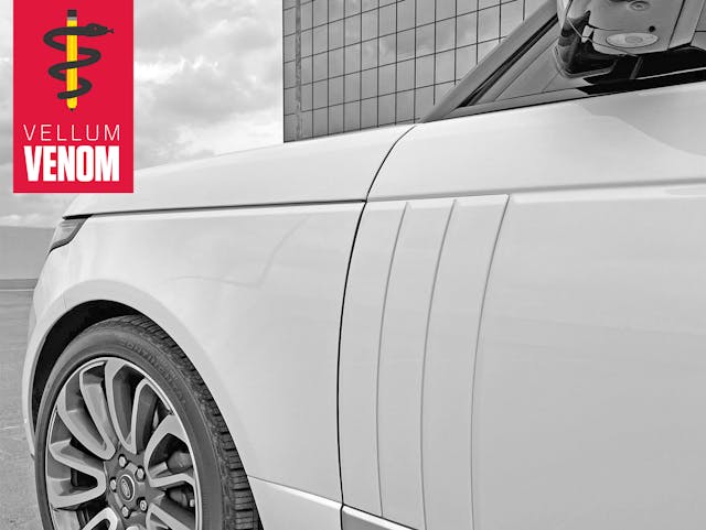
“The 4×4 was never intended as a status symbol, but later incarnations of my design seem to be intended for that purpose. I find the people who use it as such deeply unattractive.”
That’s what Charles Spencer King, creator of the original 1970 Range Rover, said in a 2004 interview about the popularization of the Range Rover. He’s got a point, but designers clearly have no choice in the matter: the motoring public embraces their creations as their collective own. Then a new generation of designers were tasked with shaping an off-road luxury icon into a modern, popular, and highly profitable vision of urban luxury.
Land Rover’s design team of late did a fine job ensuring the latest Range Rover embodies the past’s core design values, possessing the DNA of Mr. King’s trendsetting design. And that alone is worth celebrating, highlighting in a Vellum Venom analysis.
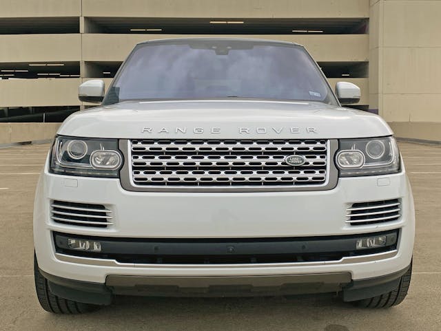
King might not appreciate the irony of his iconic 4×4 namesake photographed in an English brutalist playground car park, but it helps reinforce a recurring theme present; the Economy of Line ensures the Range Rover uses less clichés, creases, and body cutlines to achieve a more upscale, expensive design.
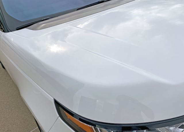
Yes there’s a skid plate-ish sort of panel at the bottom, but look at the cleanliness elsewhere. The hood’s lack of fender cutouts (i.e. side impact damage also mangles the hood) ensured Land Rover made the Range Rover true to the past, and more concerned with clean design over cost cutting.
Marketplace
Buy and sell classics with confidence
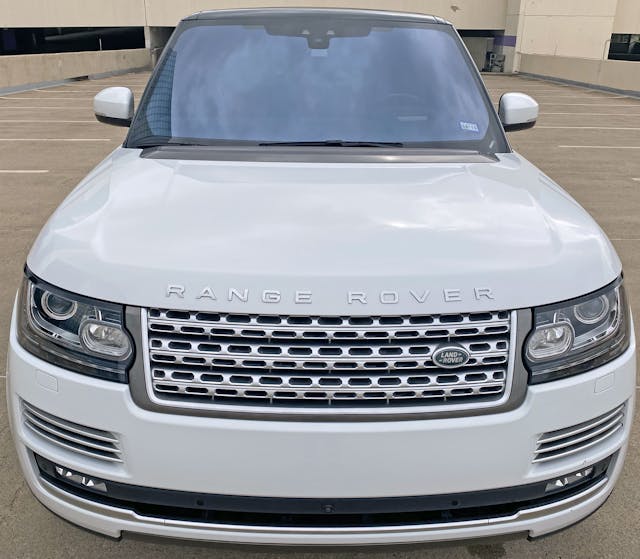
Textures presented here are bold, but note how each is effortlessly encased by the dominating hood profile, or the bumper’s complementary curvature.
Every element is gently compressed and condensed to let the bumper, hood, and surprisingly tall and cab-backward windscreen make a statement. It’s downright subtle, relative to oversized grilles/holes present on the BMW X7, Cadillac Escalade, Mercedes GLS, etc.
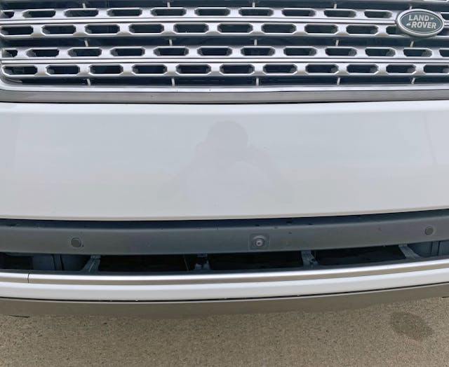
It’s shocking to see a luxury SUV with so much real estate dedicated to a painted front bumper. And make note of the camera/sensors mounted on a recessed black platform, visually melting away to nothing as you step back.
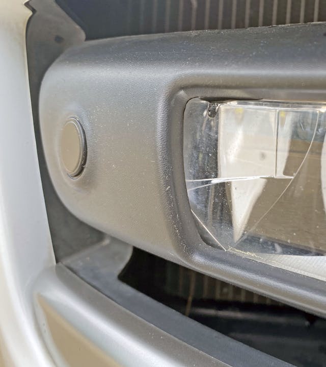
Not only is that black platform recessed from the bumper, the fog light is even further recessed.
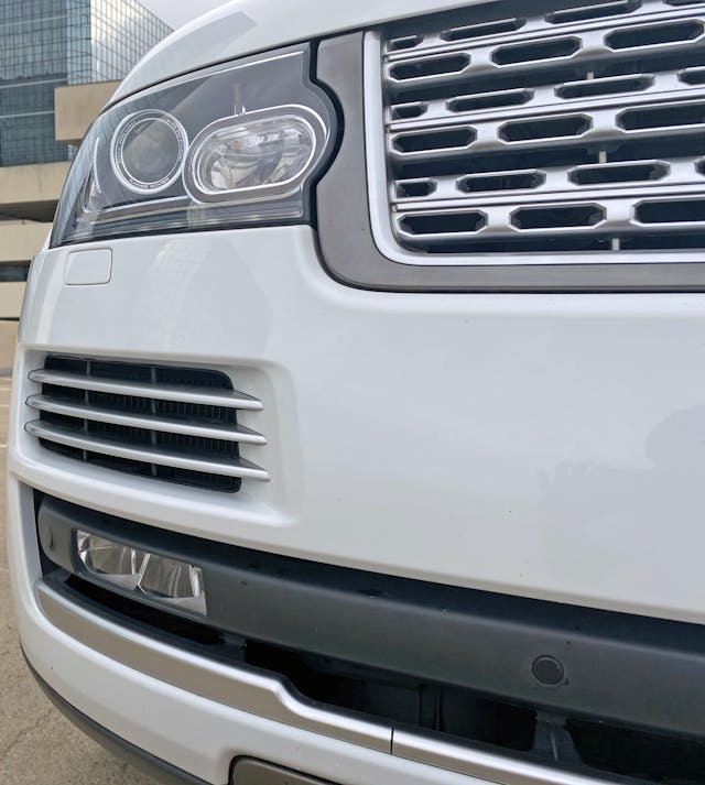
The tri-bar silver vents are similarly recessed, while the flush-fitting grille and headlights get the freedom to move to the leading edge. Even more outstanding is now everything goes to the same vanishing point: every line works in harmony; decades of Range Rover DNA must conform to a single end point.
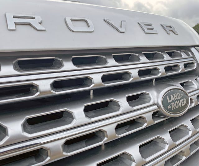
Elongated octagonal grille textures aren’t synonymous with luxury, but it certainly makes a statement. Finishing them in a silver so brilliant that these odd shapes almost overshadow the adjacent chrome strips is unique in this age of black grilles and oversized emblems.
Speaking of big emblems, the green Land Rover oval is small enough for the decklid of a 1990s subcompact. Of course the R A N G E R O V E R hood emblems are large, but they don’t look out of place since every example since 1970 has sported them.
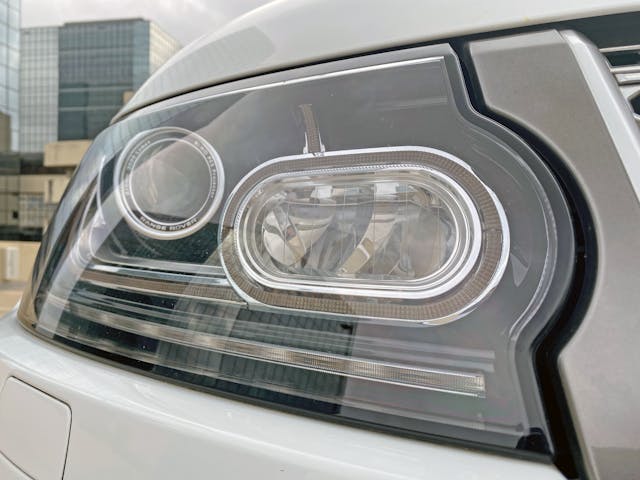
The headlight assembly conforms to the strong lines of both the hood and the bumper. Maybe it’s a little jealous, and that’s why the parking light oval pushes into the grille’s U-frame.
Perhaps without that push the front end is too boring in our era of vehicles with screaming faces?
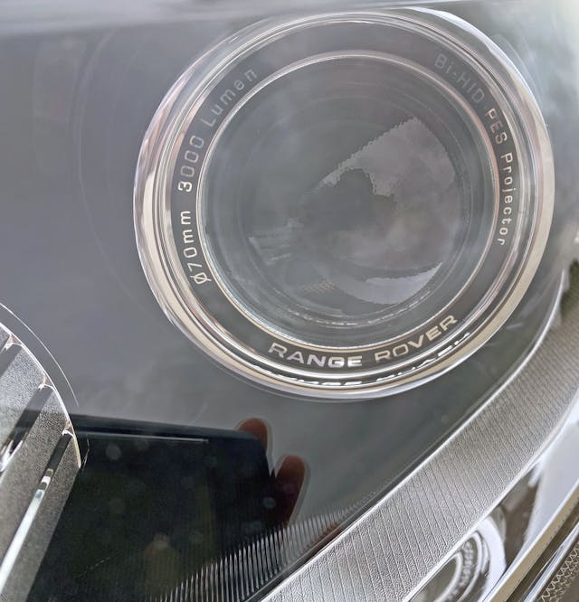
The HID projector lens has a chrome-accented ring worthy of Carl Zeiss branding, right down to the technical specs emblazoned a la high-dollar camera lens.
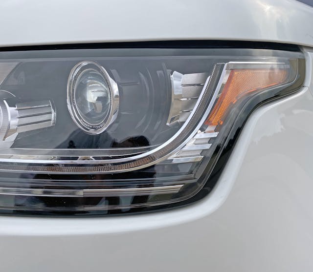
Range Rover’s elongated amber lights should have been their signature, but its genesis likely converged with Ford’s breakdown of the Premier Automotive Group: the 2011 Ford Explorer (a clever reskin of the bland Ford Freestyle/Taurus X) shares many a styling cue with this generation (2012) Range Rover.
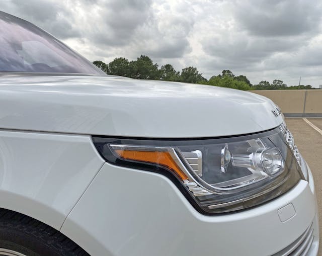
The Explorer also (seemingly) lifted Range Rover’s signature wraparound hood, albeit with less depth. Both sadly used the same bumper-to-fender cutline: it’s a harsh diagonal zag.
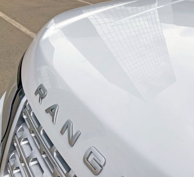
Ford (presumably) didn’t take Range Rover’s signature negative area cut from the center of the hood (note the high point at the hood’s edge). Thank goodness for that, as this hood contour is Range Rover DNA from day one.
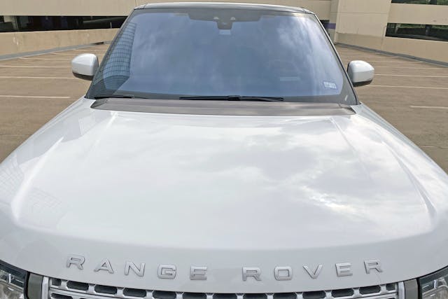
The negative area is far less prominent these days, but designers took the time to integrate the curves to match the vanishing point shared with most elements in the front fascia. The look is right, and it ushers a classic design into the era of aerodynamics and fuel economy.
But from some angles, the hood’s prominent carve-out accentuates the hood “tops” at each end. The second carve-out (closer to the middle) is another homage to older Range Rovers, perhaps there’s also another benefit in the next photo.
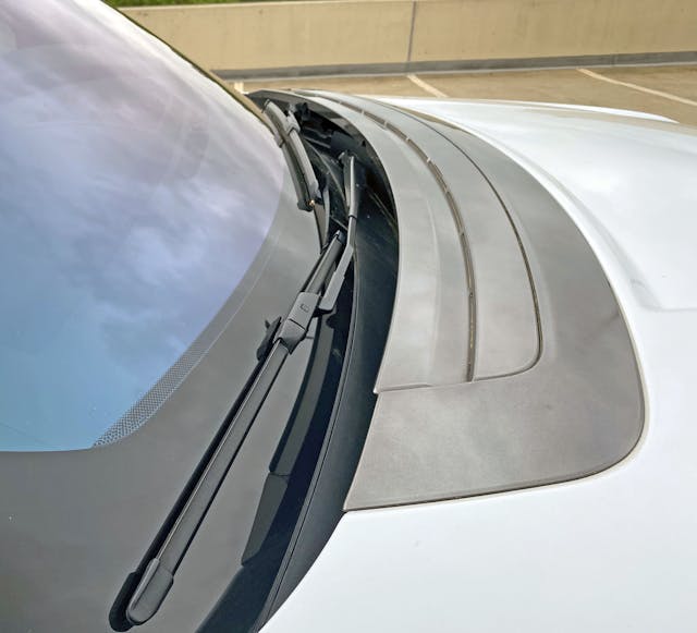
That second carve-out pushes back to a large gray panel sporting contours likely to route air around the cowl/wipers for maximum efficiency. Odds are that the gray panel also stores a pedestrian airbag for those unlucky enough to meet the front end under less auspicious circumstances.
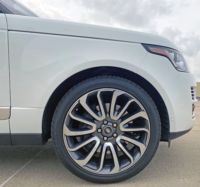
All complementary lines on the front clip meet a profile that elegantly sweeps upward and backward. The hood cutline is also a logical extension of the top of the headlights. This such a cleanly implemented design that the period correct faux wheel arch creases (beyond commonplace these days) seem unnecessary.
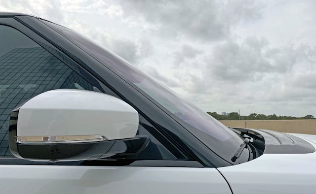
Range Rover’s signature blackout pillars get sleeker as time marches on. The speedy A-pillar does what no car-based, mainstream knock off can accomplish; a true cab-backward cabin where the A-pillar shares the same cutline as the leading edge of the front door.
The door mounted mirror’s base emulates the same quick, yet subtle lines. There was a time when this aesthetic was commonplace, not the exception.
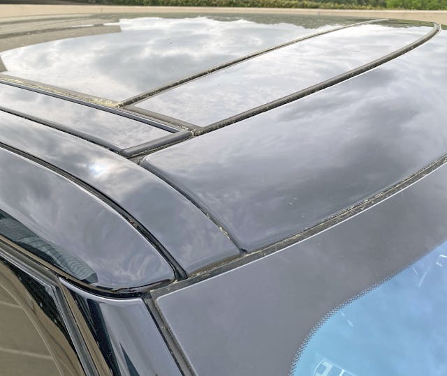
The black-out roof isn’t unique to Range Rovers, but with all these cutlines for rain gutters and a massive panoramic roof? Masking all this noise under black paint is mandatory.
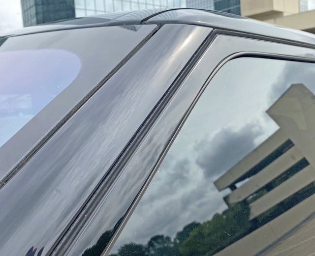
The A-pillar’s flat face translates from windshield to door in an homage to the ghosts of 4x4s past: not just Range Rovers, because so countless utility vehicles were designed with cost-effectiveness and ignorance of aerodynamic science.
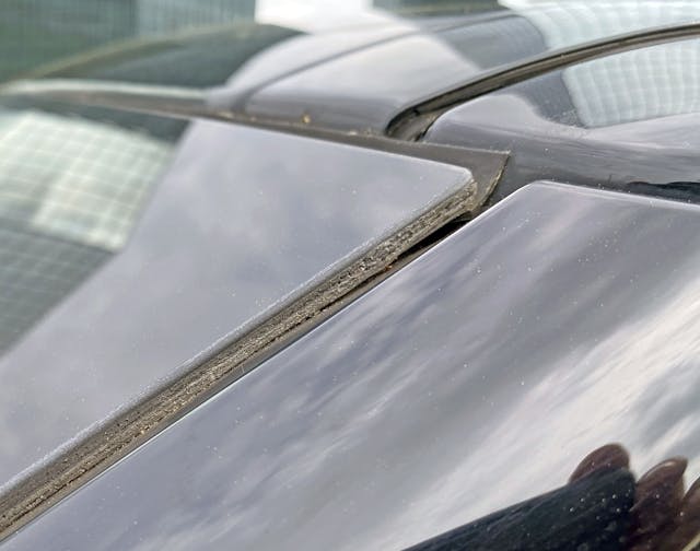
The windshield’s exposed rubber upper flap doesn’t make a sound at speed, but the quality of presentation leaves much to be desired.
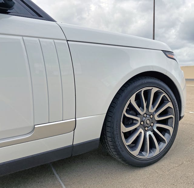
No such qualms with the sleek lines that sweep down the Range Rover’s body side. The hood’s cutline transitions to the door’s hard crease, and the door’s front cutline is perfectly mirrored by creases that (supposedly) smooth airflow down the body for a quieter cabin.
Shame about the counterclockwise wheel spoke rotation, as they should be clockwise to give the body a sense of forward motion.
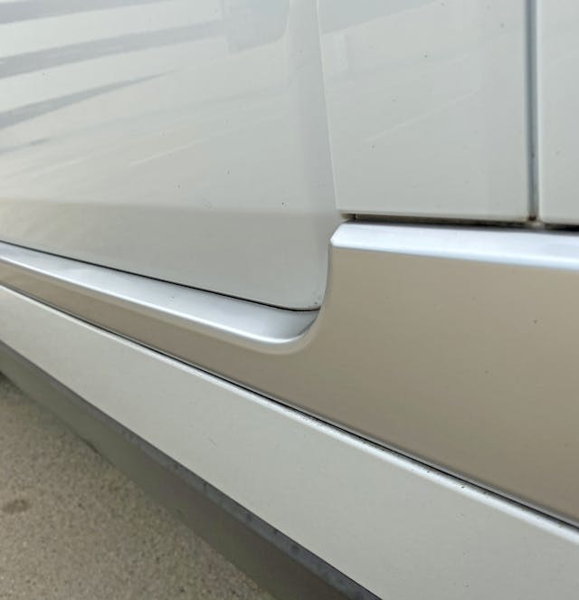
If one were to cut the sheet metal to see how the Range Rover’s cross-section (from top to bottom), the whole affair would be relatively flat. The lower door’s silver swoop actually fills in a recess, which is a pleasant change to the otherwise flat cross-sectional line presented.
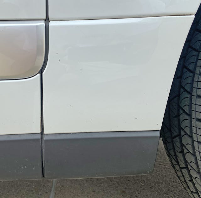
The black rocker panel covers do an admirable job to visually “thin” the body side, only coming into sight when up close and personal. The OCD in me wishes the silver swoop started it’s trajectory squarely against the front fender.
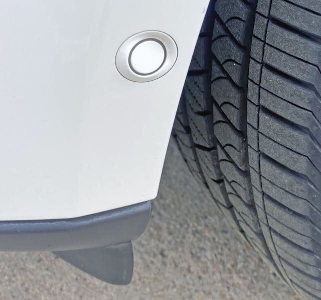
Speaking of OCD, the distance sensor in front of the wheel isn’t mounted flat against the fender. While this is likely due to performance issues, the urge to smush down the sensor for uniformity is quite real.
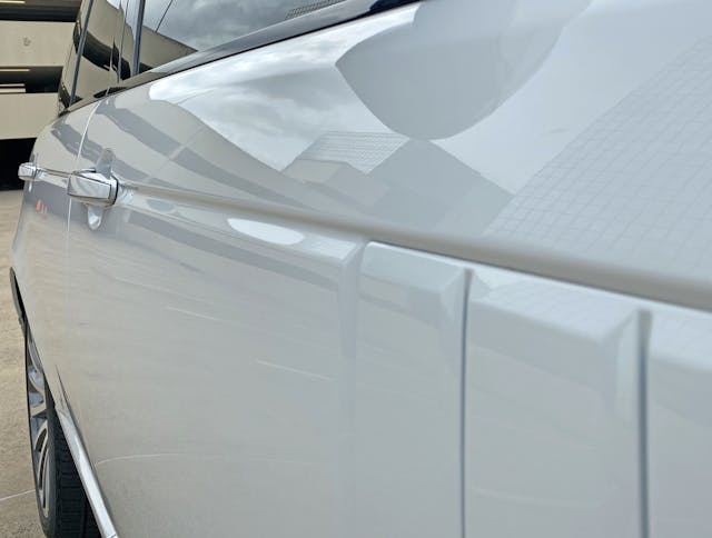
The hood’s aforementioned cutline not only extends down the body but includes the Range Rover’s chrome-rimmed door handles. It’s wonderful to see how they sweated the details!
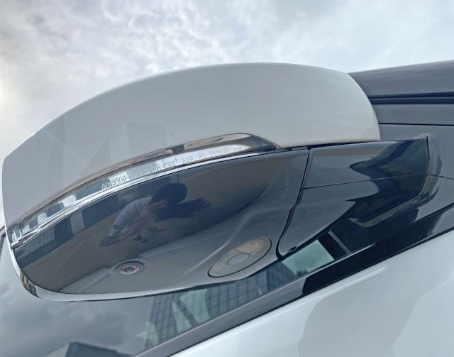
This assembly has a black frame around the mirror, but it’s brilliant black undertones reflect like chrome. And while the repeater light’s reflector slices into the body, shining like polished stainless-steel cutlery as it goes in.
The camera and puddle light are impossible to see while standing up, another hallmark of clean, modern design at all costs.
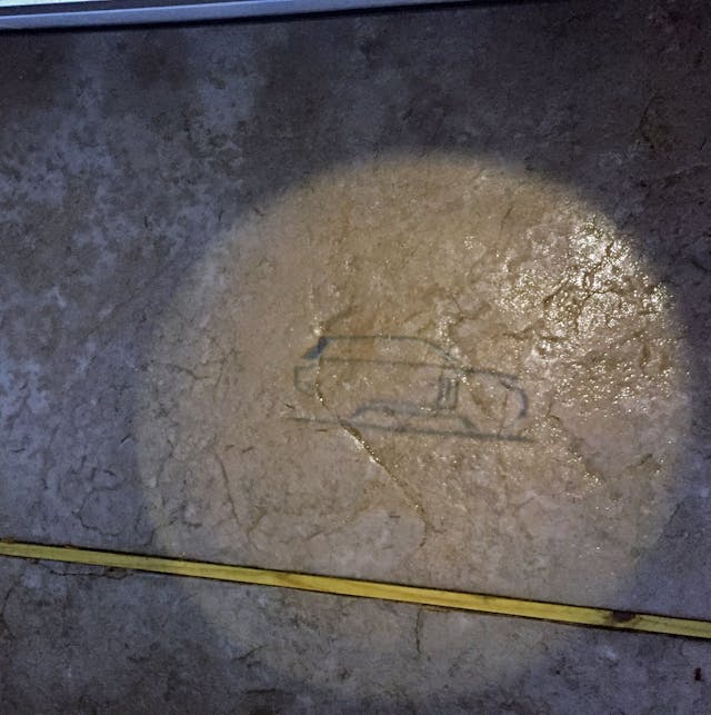
The puddle light looks like a designer’s initial sketch on vellum. Nice.
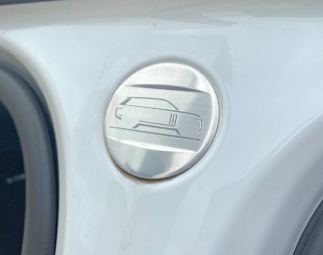
Open the doors and the same sketch is on a stainless-steel plaque. Very nice.
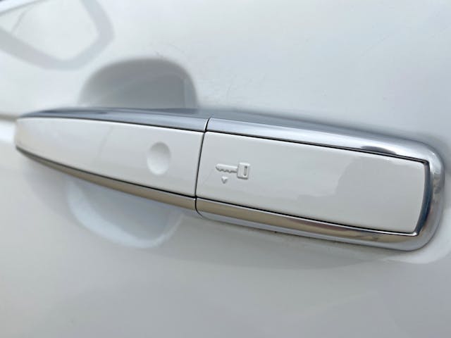
Graphic instructions for when your key fob stops working is certainly enlightened design with possible roots from (angry?) customer feedback, but it’s still a bummer on a body so expertly crafted to eliminate visual clutter.
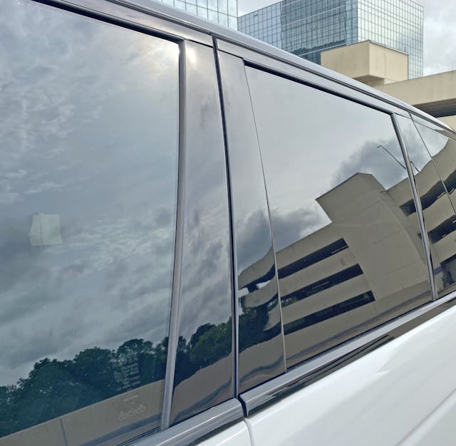
Like Range Rovers past, the blackout B-pillar keeps the eyes away from stodgy and upright 4×4 rooflines. And like the 2001-up MINI Cooper, the nearly flush fitting glass and highly polished trim gives an effortless, sleek profile to the greenhouse.
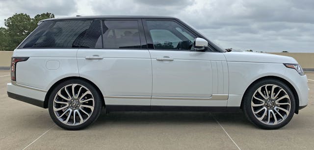
The upright B-pillar and cab-backward design are throwbacks but dig deeper and that long dash-to-axle ratio (i.e. the dashboard sits far behind the front wheel’s centerline) is also true to Range Rover’s DNA.
The C and D-pillars are sleeker than vintage Range Rovers (which were positively rakish compared to vintage Land Rovers), but it’s downright stodgy next to today’s Sports Activity Coupes.
But make note of how the both the hood cutline and the silver stripe terminate at the taillight. The stripe visually lightens the rear bumper by “pushing” upward to reduce bulk. The thick black bumper trim completes the visual weight reduction.
A well-proportioned body is good, but these details make it great.
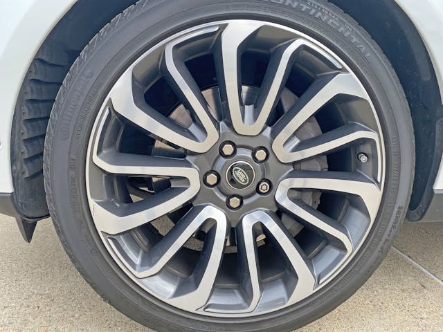
Directional wheels with spokes visually thrusting forward on one side but not the other (note how the spokes thrust counterclockwise elsewhere in previous photos) are shamefully par for the course these days. But at the Autobiography’s $140,000+ sticker price, is it too much to ask for a pair of wheels that are a mirror image of the other?
No matter, the 12-spoke pattern adds excitement via six dominant spokes and six smaller ones that take a radical path to the outer rim. Charcoal paint in the recesses also includes the flat plane housing the center/hub; this lets a unique design take the foreground while boring stuff like lug nuts and corporate logos take a back seat. Impressive.
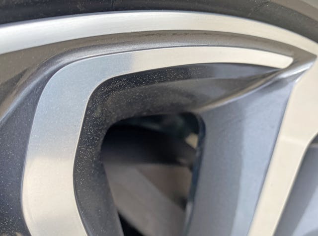
Here’s a close up of one of the six smaller spokes as it forms a complementary line with the outer rim. While the one-piece casting ensures it’s a frivolous design element, who cares?
Functionality is irrelevant on 4x4s clad with Autobiographical 22-inch wheels that rarely see off-road conditions worse than wet grass on a manicured lawn; embracing the reality with a radical design was the right move.
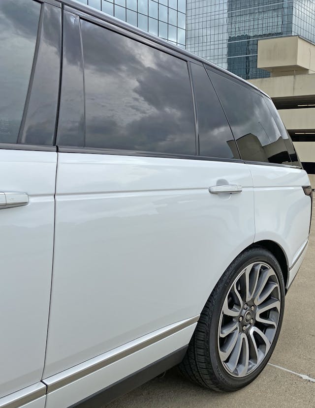
This is not the long wheelbase model, but the standard wheelbase makes for a rear door large enough for all but Maybach lovers: it’s a far cry from the narrow aperture of Range Rover’s original (1981) four door implementation.
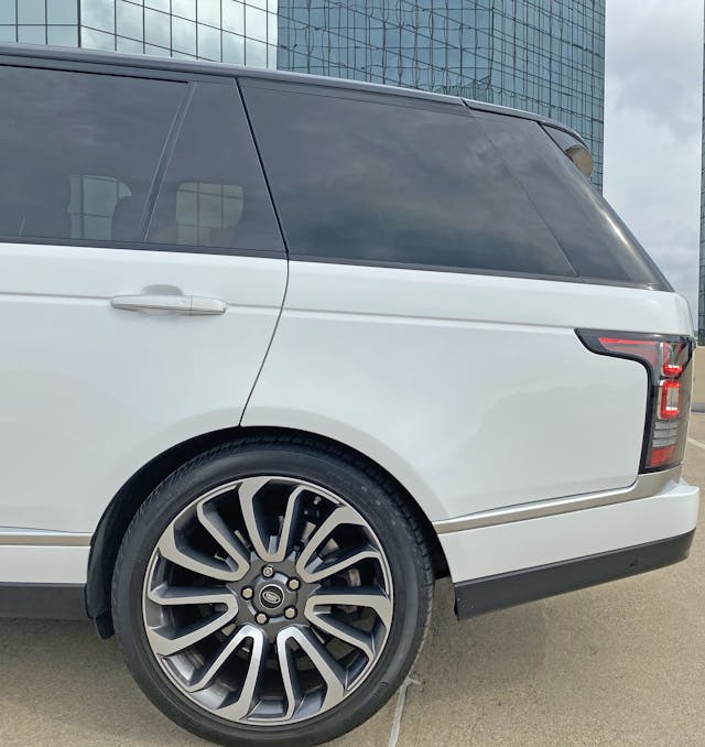
The wheel’s correct orientation on this side only improves upon an already impressive rear door design: cutlines cleanly push into the wheel arch, the daylight opening (DLO) remains an unobstructed straight line and the fixed vent window is cleverly flush-mounted.
Much like the front arch, there’s no need for the fake wheel arch crease, especially when the rear door must abide by it’s artificial-by-design demeanor.
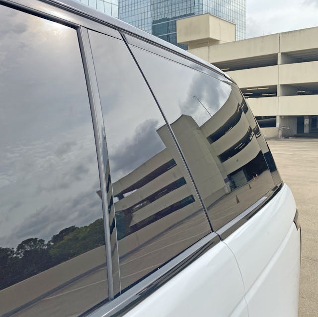
Back to the fixed vent window: these creations exist to allow the primary door glass to roll into the door without hitting a wheel arch. So it’s wonderful to see an example where it extends over the door’s metal frame, mounting flush to the next glass panel.
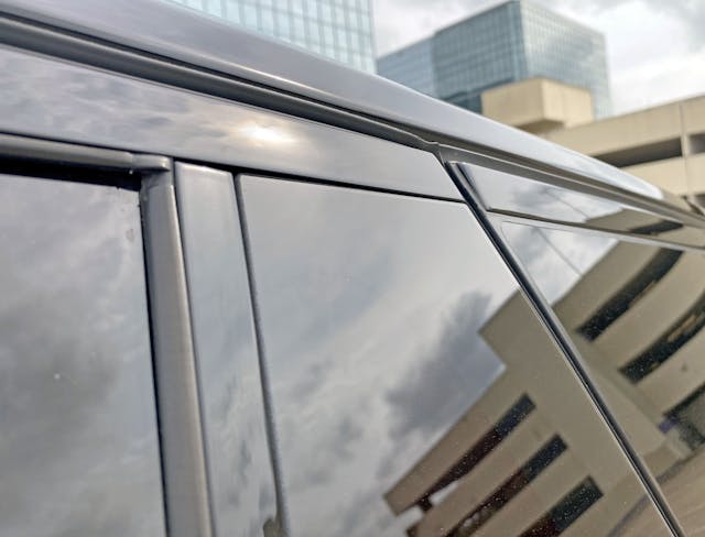
Much like the roof, all the black paint and tinted glass ensures you spend far less time looking at the DLO’s complex mating of glass, rubber seals, and black paneling.
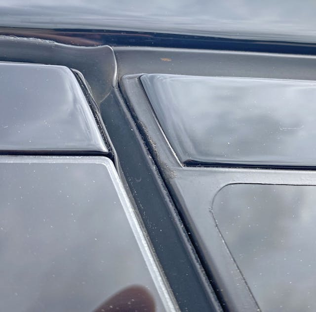
A tale of two seals: the oddly contoured bend for the door seal (top corner of the door) versus the stunningly perfect rubber pad encasing the side window and its corresponding black trim.
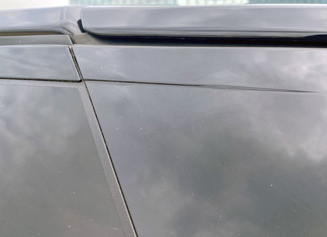
Like the lemon within a lemon bar, the side window (now seen on the left) is seemingly baked into a rubber batter before installation. Pretty impressive.
Less impressive is the transition from two panels (glass and black trim) into a single black panel to the right, complete with a character line mimicking the door.
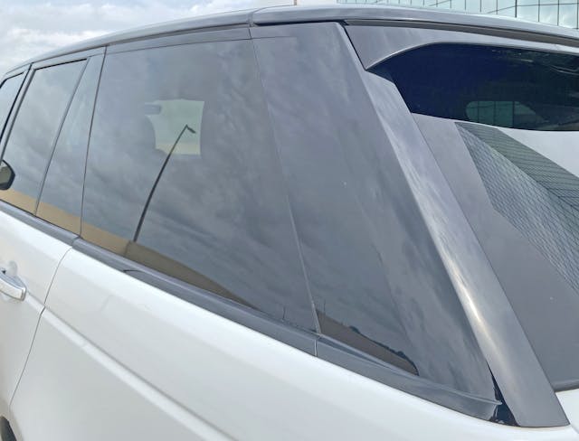
The transition ends more elegantly at the DLO’s bottom line. While it would have been nice to see a D-pillar cover made out of three parts to emulate DLO’s glass features, at least it’s painted black to ensure nobody sees the white body underneath.
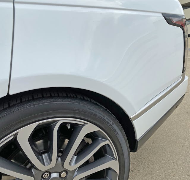
As mentioned previously, the body side’s silver stripe jolts upward to taper the quarter panel and visually thin the Range Rover’s posterior. While a common practice for modern SUVs, the rate of upward trajectory here is staggering.
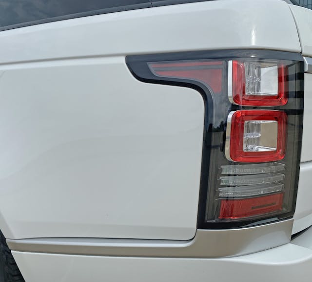
The silver stripe looks far more conventional from this angle. It emulates the taillight’s red extension and, like a slab foundation, provides the light with significant grounding to the body. Much like the front light, this extension likely shares the same ancestry as the Ford Explorer, but the Ford never benefited from the silver stripe’s upscale visual foundation.
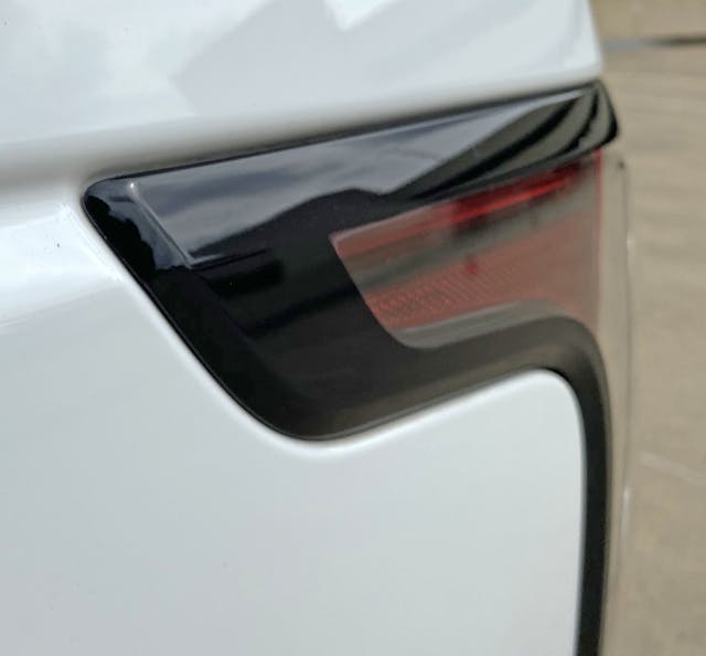
The thick black frame made sense on the front light assembly, as it broke up the bling between the headlights and the grille. While it makes less sense at the rear, the design cohesiveness is appreciated.
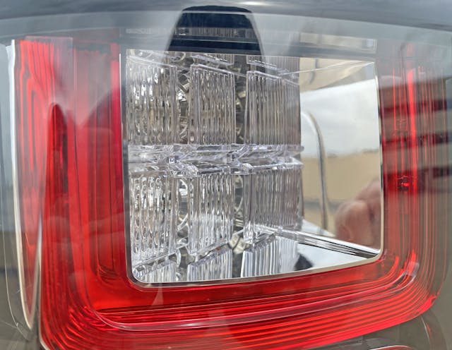
The brake light’s complex, squared-off texture is wrapped in a red taillight sporting its own chrome frame. Significant effort went into a lighting pod that looks simple from just a few feet away.
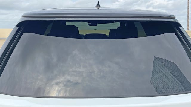
The upper half of the Range Rover’s rear hatch continues the roof’s blackout theme with black panels matching the rooftop and the D-pillar, and it even sports a blackout modesty panel/spoiler.
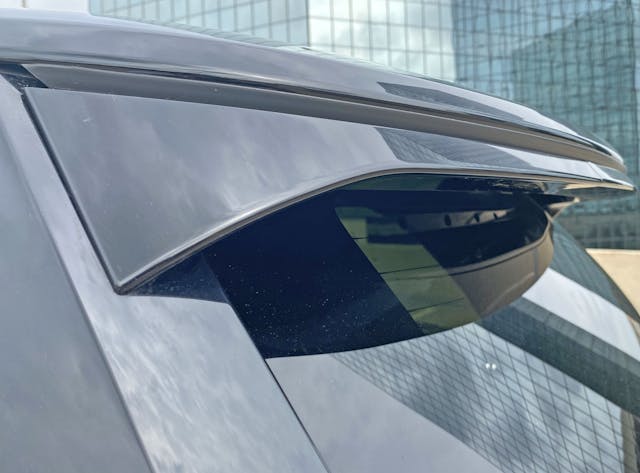
It’s modest for sure: providing visual refuge for the wiper arm, ensuring all the eyes see is an effortless black DLO. The rubber seal’s gap between the modesty panel and the tailgate should’ve terminated at the spoiler’s edge, however.
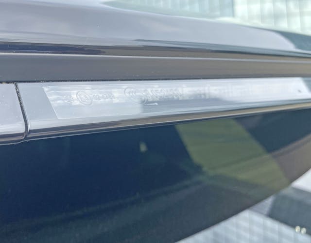
The mandatory center high mount stop light (CHMSL) effortlessly integrates into the black roof thanks to a smoked frame around a clear lens.
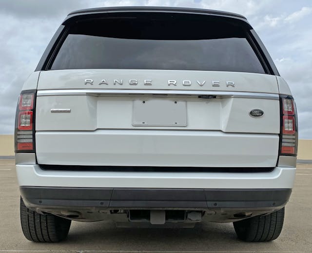
You’re hard pressed to see the CHMSL until it’s actually needed, which is beyond impressive. Finishing touches like this ensure the Range Rover owner spends no time fussing about unnecessary elements, instead soaking up the whole package.
And yet the tailgate is quite fussy compared to the original Range Rover: instead of massive amounts of negative area to conceal the split for their signature split doors, they added a non-functional silver mustache above the actual split line. The mustaches are a common trick to add texture to today’s massive posteriors, but it feels unnecessary when you have a legit two-tier hatch.
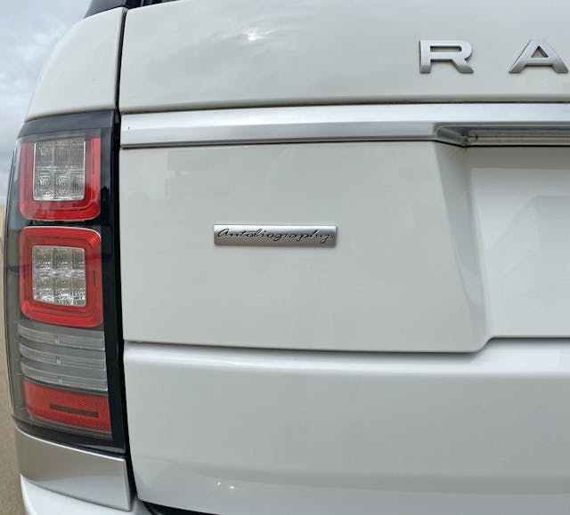
Both top and bottom ends of the tail light correspond to a bevel on the tailgate. The reverse lights (three bars) meet at the top of the lower tailgate. It’s a bit incongruous relative to the perfection presented elsewhere.
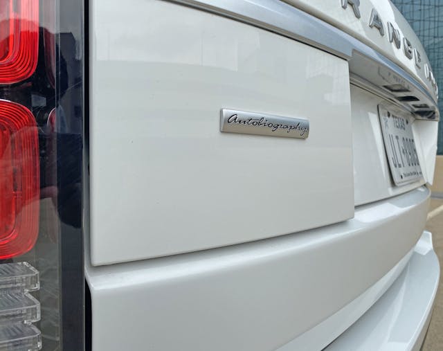
The “Autobiography” emblem ensures everyone knows this isn’t a run-of-the-mill Rover, but the name implies that ordering from its extensive options list ensures the owner can tell their own story from their selections. Sounds implausible at first, less so considering how rare items and unique combinations turns into provenance for classic car collectors.
That said, the recessed license plates lights leave almost no footprint, no signature on this autobiography (except when illuminated).
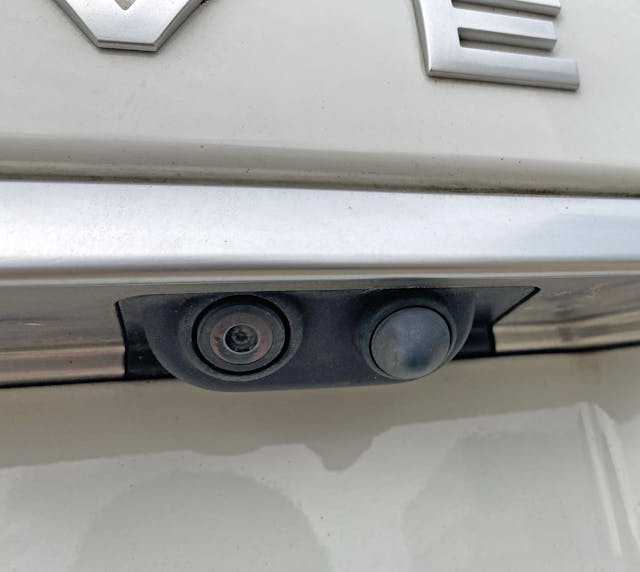
The same cannot be said for the highly visible backup camera, but at least there’s a handy tailgate release next to it.
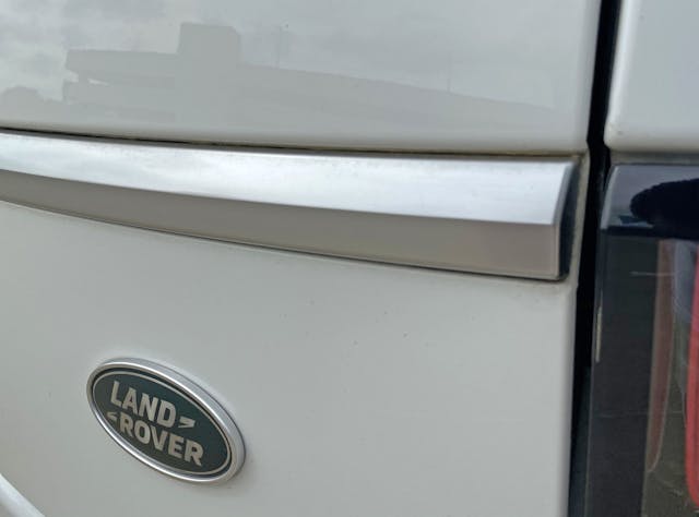
While the silver trim’s bevel matches that of the tail light, while it lives within a recess on the tailgate, something about its lack of purpose looks significantly cheaper than trim implementations elsewhere.
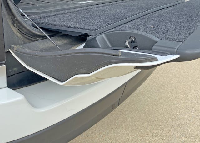
No matter, that signature Range Rover feature never left us. The flat loading floor/bench is quite handy, while the quality of the carpet nap is unmistakable in this era of mouse fur flooring.
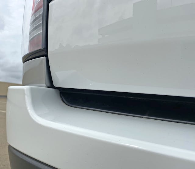
The lower tailgate’s inward bevel sadly doesn’t match the flat silver panel. Perhaps this is a function of the tailgate’s operation, but it still clashes with its neighbor.
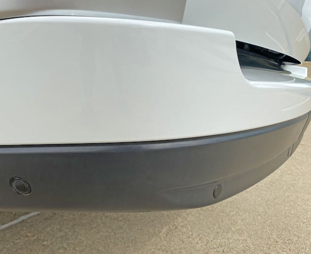
The thick black panel that reduced visual bulk along the side continues its mission at the rear, and does a fantastic job hiding the requisite distance sensors.
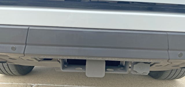
Same story for the receiver hitch and trailer wiring plug: as the subtle shadow (on the square cover) suggests, it barely peeks out of the black bumper and the underbelly paneling.

Speaking of, the underbelly does a fantastic job hiding the two exhaust pipes. Also note how, just like the front end, all shapes at each corner share the same vanishing point. Wrapped in this sheet metal veneer of minimalism, it’s clear why the Range Rover remains both popular for some and aspirational to most: it looks expensive without even trying.
Too bad about not making a tailgate homage to the original Range Rover: likely impossible considering today’s glass-to-metal body ratio is skewed heavily towards the painted panels. If they coulda bucked the trend with a few extra square feet of glass (which lowers the DLO) this would be the perfect example of modern minimalistic design with brand-authoritative DNA.
No matter, the design is light years ahead of its competition, cutting a path rooted in clean lines and impressive architecture: perhaps the Range Rover is to luxury SUVs what a McModern is to a gated community packed with McMansions.
Thank you for reading, I hope you have a lovely day.
