Media | Articles
Vellum Venom: 1993 Mazda RX-7 (FD)
So many famous automobiles bloat as they age. Not the RX-7. By its third (1993–95, or FD) generation, the Mazda was still a hard-edged, lightweight sports car, wearing a body that had grown just big enough to accommodate a twin-turbo-infused powertrain and near-luxury NVH engineering. More to the point, the RX-7’s newfound size ensured buyers paid a premium every time the taxman arrived in Japan. In the United States, the FD did something amazing: It impressed Americans hungry for power and prestige while keeping the spirit of previous RX-7s intact.
So let’s run this iconic sports car, another example of Mazda’s bubble-economy designs, over the vellum.
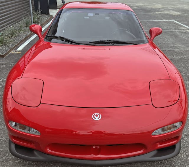
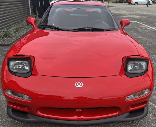
Hindsight can be troublesome: The rounded cutlines for the FD’s hood/lights/fenders/bumper really look like those of the C5 (1997–2004) Corvette. (The resemblance is so obvious that John Carfaro likely averts his gaze any time an FD rolls by.) That said, the C5 makes the FD RX-7 even more important to America’s car culture.
The FD’s is a beautiful shape, with a face that is relatable to Miata loyalists. . . and a perfect source of Corvette DNA.
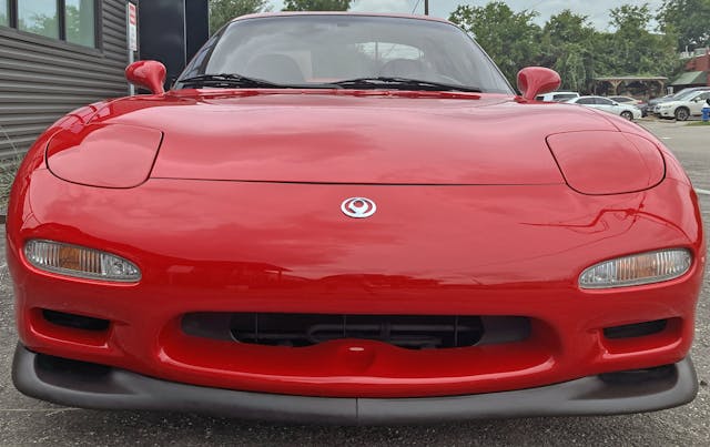
This is the track-oriented “R1” model, visually separated from tamer RX-7s by the larger front splitter. (And a swank rear spoiler out back.) The R1’s extra “visual weight” up front makes the FD’s fascia a bit more muscular, and further differentiates the fascia’s contouring from that of the most minimalist Miata. It’s kinda like underlining words in a term paper.
Marketplace
Buy and sell classics with confidence
Without it? The RX-7’s extra width, modest added length, and ever-so-slight haunches in the hood (above the wheel arches) would be harder to distinguish at a casual glance.
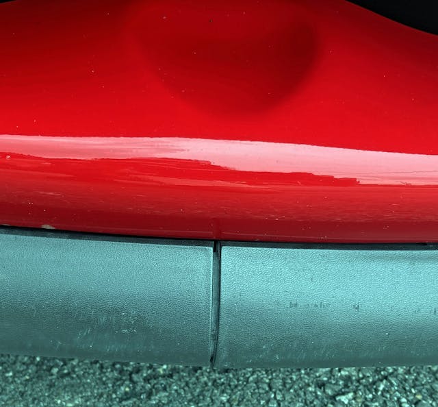
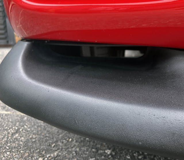
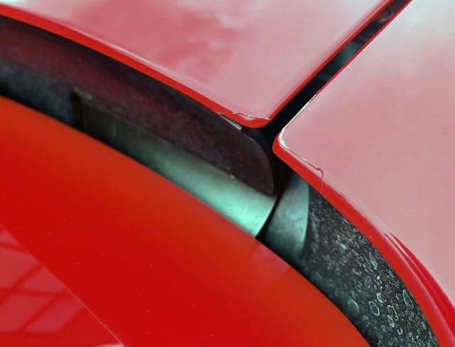
Apparently, that little divot in the bumper is meant to evoke the two rotors inside the FD’s Wankel engine. It’s a nice touch, and keeps your eyes from focusing on the gap between the R1’s two-piece splitter.
The bumper’s divot least tries to avert your gaze from that crack. But when new, the splitter was cheaper to repair; if you bashed-in just one corner, you didn’t need to replace the whole assembly.
While this signal light looks similar to that of the original (NA generation) Miata, it is a completely different shape. It’s also mounted on a bumper that’s longer and more “mature” looking than that on the baby Mazda roadster.
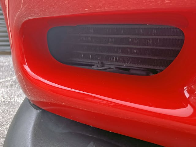
The R1s have an extra oil cooler, lending symmetry to the lower fascia.
The R1’s front splitter also routes air to the brakes. While not as well designed as a modern splitter, which would integrate proper ducting, at least it funnels air to the correct general area for a car with this level of performance.
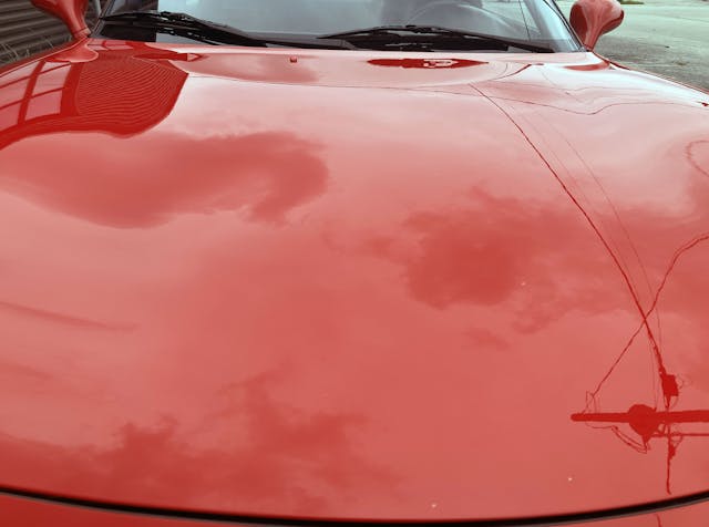
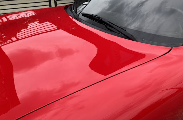
Back up top, note how the hood’s gentle curves only make ripples in the reflection of the clouds.
This could be a shot of the C5 Corvette, except surfacing of the Chevrolet is more aggressive. A Corvette designer would make those power lines bend harder into the car’s contours.
The Miata DNA is absolutely present, but the smoother contouring, organic cut lines, longer snout, and unique lighting pods make the FD RX-7 worthy of its premium asking price.
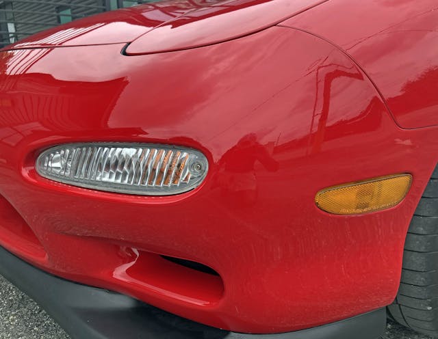
Note how the bumper curves outward in the center and how the bumper-to-fender cutline was also implemented in the C5 Corvette.
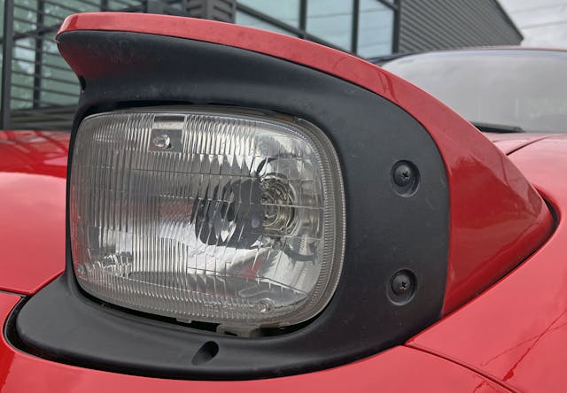
The level of customization over the Miata is clear when the headlights emerge. These are not a universal sealed-beam design, nor are they a recognizable shape, though they look a good bit like the rectangles present on a Chevy work van.
Had they been implemented on a universal scale, these stunning half-round/half-square headlights would have dressed up countless cars from this era. The slick plastic frame Mazda designed around this lamp is no slouch either.
Black modesty panels behind the headlight emerge when nighttime illumination is needed.
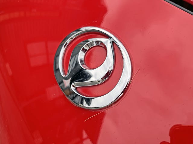
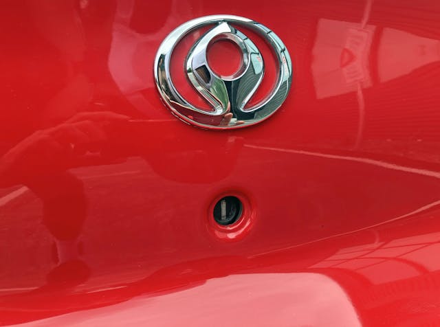
Mazda’s emblem representing “dimensions of wings, sun, and a circle of light” was originally a bit more angular. Then the clay modelers treated it to the same amount of surfacing given to the FD’s organic body. The logo kinda-sorta looks like the Khanda, but any parallel with religious iconography is generally discouraged in design studios. Perhaps that’s why Mazda’s website doesn’t mention this short-lived corporate logo?
The R1’s front strut tower brace is both functional and a representation of product design from the era. The 1990s were chock-full of global, regional, and local businesses putting their brands inside ovals. Among car-design geeks, Toyota’s three-ellipse version is probably the most memorable.
While the front of the FD’s hood has parallels to that of the C5 Corvette, the contouring on the rear of the Mazda reveals significantly fewer parallels.
While a sports car with a 0.31 coefficient of drag isn’t likely to set the world on fire, the FD is a small car with modest frontal area. The footprint extracts the most performance out of that turbocharged Wankel motor.
The previous generation (FC) RX-7 had a top-mounted intercooler with a hastily added hood blister, but the FD was designed with turbocharging from the get-go. Its short, steeply angled nose packages both a large radiator and an intercooler.
Much like the C4 Corvette, the FD uses a steeply angled radiator to lower its hood height—by a whopping 2.8 inches over the FC. The dramatic effect of the subsequent thinning of real estate above the wheels cannot be understated.
It’s hard to put into words the sleekness present here.
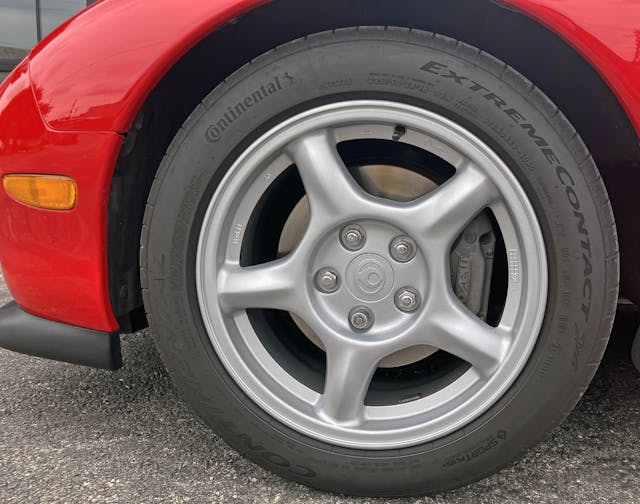
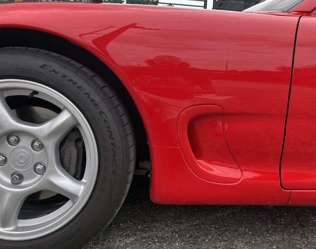
The simplistic, spine-in-spoke design of the FD’s 16-inch wheels works well with the body’s organic curves. Perhaps, in addition to the reducing weight, the hard carve-out for the hub keeps the wheels (and the rest of the car, by extension) from looking too soft and whimsical?
The FD clearly embraces the dash-to-axle ratio of rear-wheel-drive flagship vehicles, a configuration that allows plenty of space for an air extractor. This is another area from which Chevrolet drew inspiration, but Mazda’s execution makes the long dash-to-axle much smaller, lower, and less of a defining element in the fender.
Yes, this is a functional bit of kit: Air from the front bumper goes around the wheel arch and exits out this aperture. Nice.
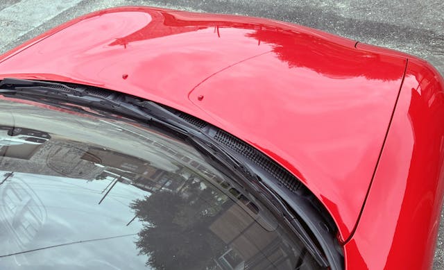
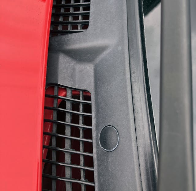
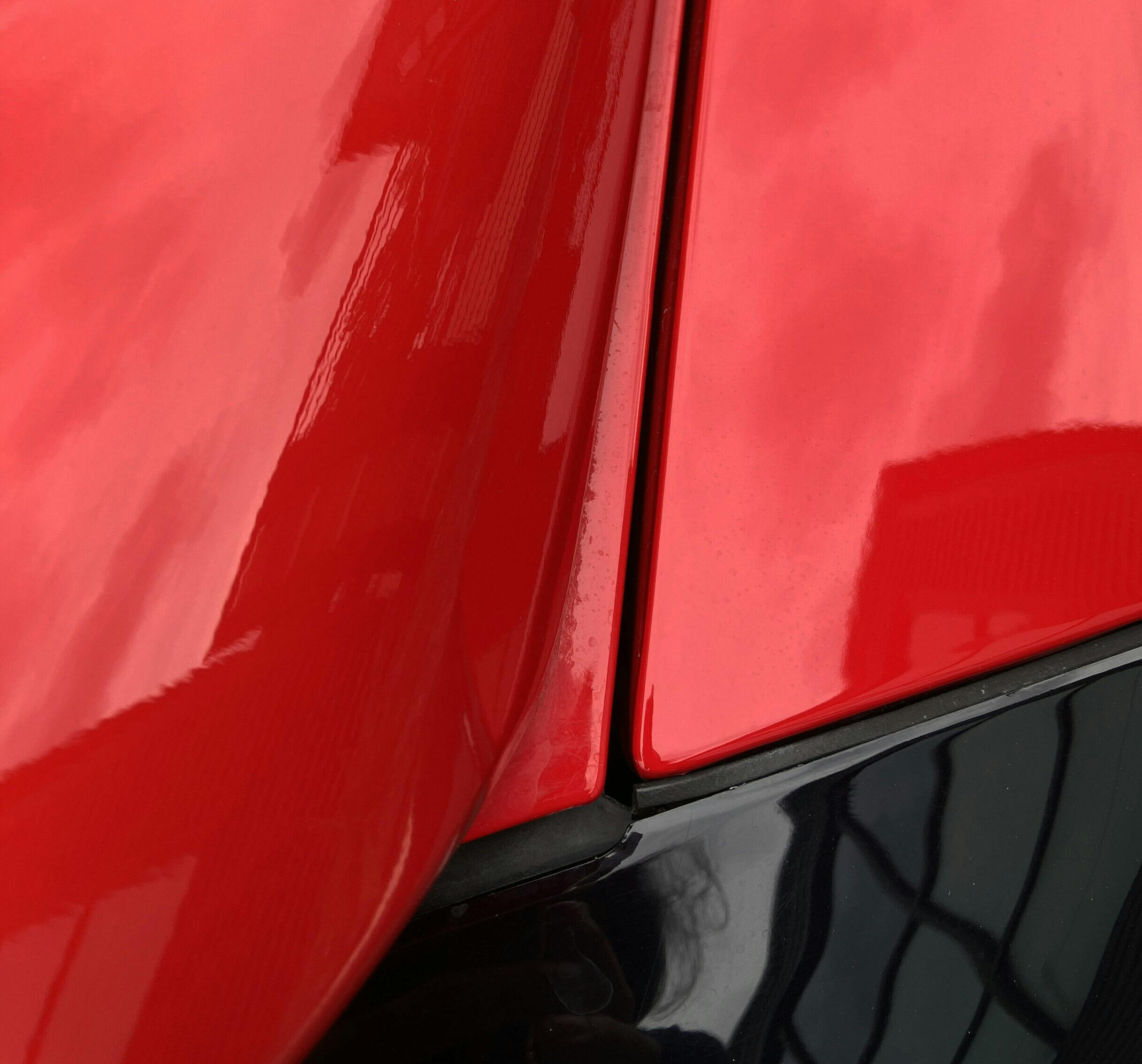
Cab-backward designs usually have less space for black plastic trim at the cowl and provide a delightful way to minimize “ugly” space for wipers and HVAC components, while yielding more real estate for a longer hood.
Much like the wheel hub’s hard carveout, these utilitarian elements in the cowl are shockingly angular on such an organic body.
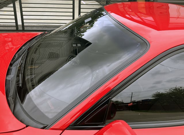
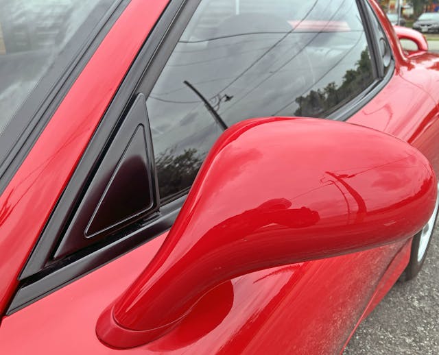
Impossibly thin A-pillars make all the difference in a sports car. The increasing thickness of A-pillars is a key reason why modern examples of the breed look clumsy and “slow” compared to their predecessors.
The body is so impossibly low-slung body (mostly) because of that tiny cowl. With such little need for extra size or height, the fender remains uninterrupted by the requirements of a hood (think modern Supra) or complex cutlines for tall doors and overly thick A-pillars.
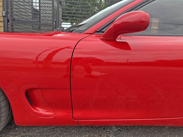
The door’s shark fin draws attention to itself with an embossed triangle. It feels unnecessary on such a curvy body, unlike the wheel hub’s strong statement of negative area.
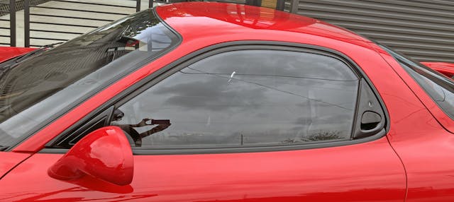
The large amount of glass and the thinness of the radically curved pillars ensure this tiny cabin doesn’t feel claustrophobic. There is very little space on the door frame for practical upright contours; the majority of this section is reserved for the A-pillar’s rake.
From this angle, however, the window looks significantly flatter. This shifting of perception is precisely why car designs must be refined in a 3D space; 2D renderings can never fully convey the drama of walking around a well-surfaced design. More to the point, the interior’s radically organic design often flows beautifully with the exterior lines, as seen here.
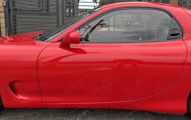
The lack of a door-mounted door handle further accentuates the speed present in the door’s cutline. Aside from the cut’s interference with the fender scoop’s lower blister, this is a flawless implementation.
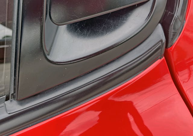
That’s one heckuva oddly shaped gasket to mount the belt line trim against the body and door handle. Not a bad thing—it’s impressive.
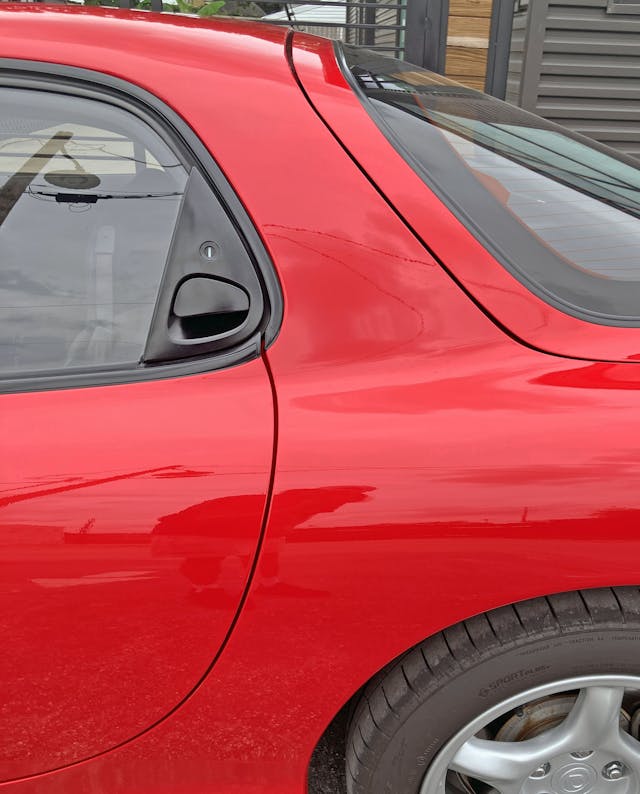
The intersection of beltline, roof trim, and door cutline is a bit “slow” and awkward. Considering all the visual speed present in the cutline of the lower door, it would have been nice to see the door cutline continue to the outer contour of the black roof trim.
Doing so would make the door cutline move with the same fluidity as the cutline for the hatchback, which flows over the FD’s taut body muscles. That’s the perk of placing door handles inside the daylight opening; they open up so much visual room on the painted body surfaces.
Suggesting the FD has a taut, muscular body is no overstatement. The FD has no need for the crazy amounts of surfacing present on modern cars with tall cowls: a few gentle curves across the body’s cross-section is all that is needed to make this modest-sized sports car a visual stunner.
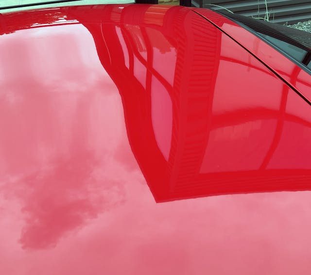
See how the building’s reflection warps in the middle of the roof? That ripple in the sheetmetal supposedly improved the FD’s aerodynamics. Unlike the radical “double bubble” of the 1996 Dodge Viper GTS, the bump did not improve headroom for the Mazdas’s passengers.
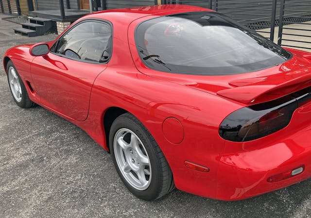
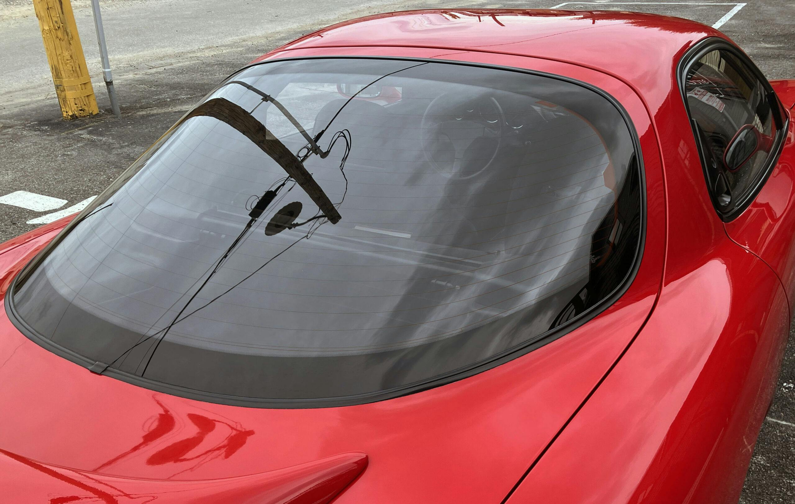
Much as the front end gives C5 Corvette vibes, the FD’s strong B-pillar, curvy hatchback glass, and the R1-specific spoiler suggest a miniature 1993 Trans Am. Except both designs were (probably) created independently, and the Mazda is significantly smaller and less swollen than the Pontiac.
A quick look behind the rear wheel and a fancy aluminum suspension control arm awaits. These parts weren’t cheap, even if it isn’t as radical as the exposed bits found on the NSX.
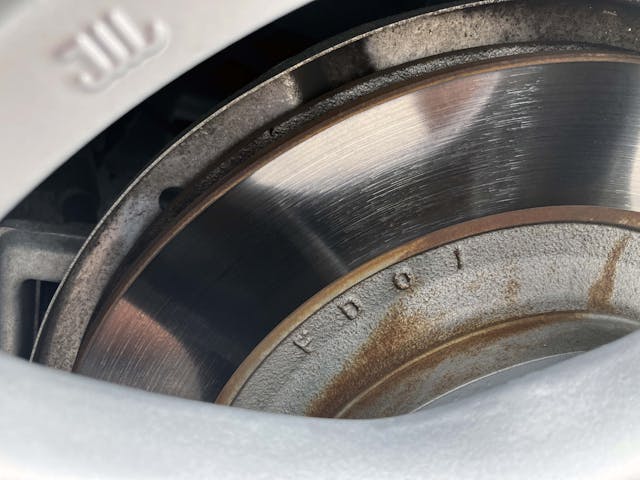
It’s probably no coincidence that these large rear rotors have “FD” stamped in them.
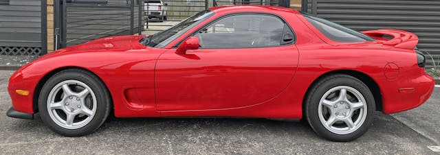
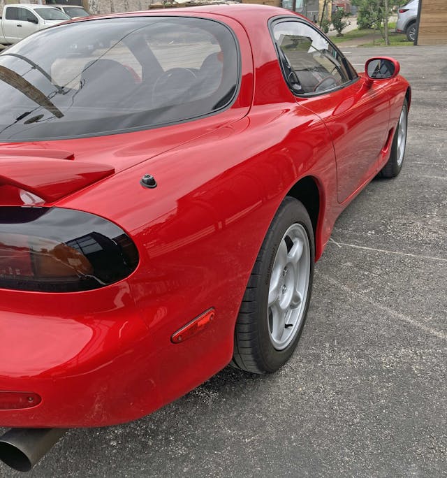
Much like the front ones, the FD’s rear overhangs are modest, making the body look as if it is shrink-wrapped over the wheelbase.
The strong shoulder line (curve, actually) present in the doors deliciously extends into the quarter panel.
Again, the 1993 Firebird references arise. But, unlike that car, the FD is so small that the gas filler door and the side marker light are very close to each other. The lack of a continuous bumper shelf provides another differentiating factor: On the Mazda, there’s an expensively contoured quarter panel running from top to bottom.
How contoured? Note the sky’s reflection on the bumper’s horizontal surface, and how it bleeds into that fancy quarter panel.
While it may not scream “minimalist” like some Italian Mazda doorstop from the 1970s, the FD is an organic implementation of design with the same level of restraint. Sure, there are expressive curves. But they spread long and wide across elements of the low-slung body and long wheelbase.
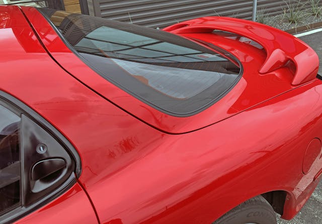
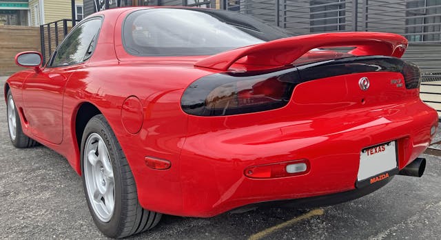
The R1’s spoiler gives extra purpose to the otherwise “soft” contours of the quarter panel and backlight.
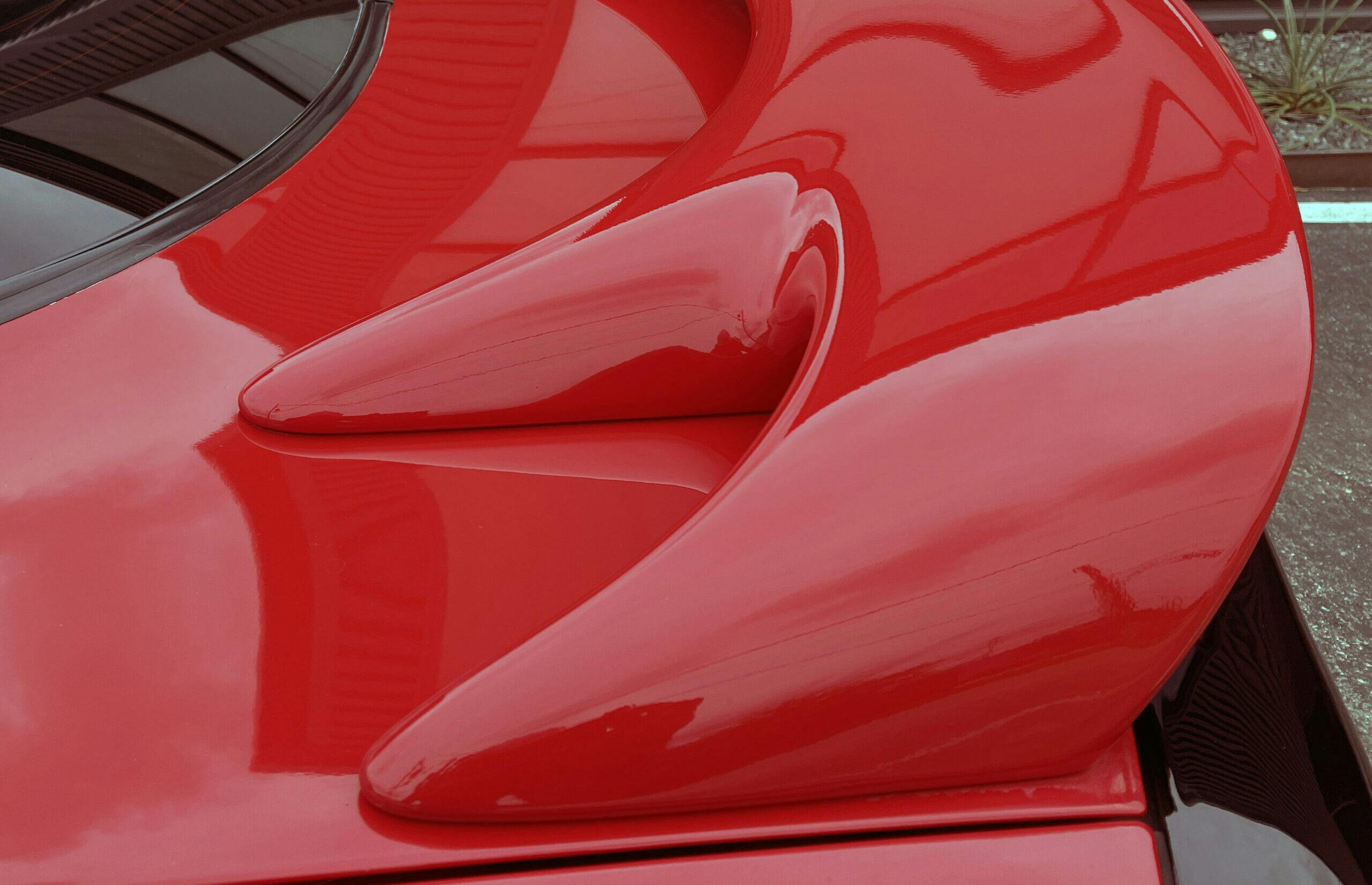
The R1 spoiler has a visually exciting claw-foot design with the inner “nails” sticking further forward than the outer ones. The irregular pattern wonderfully complements the FD’s radical lack of straight lines elsewhere.
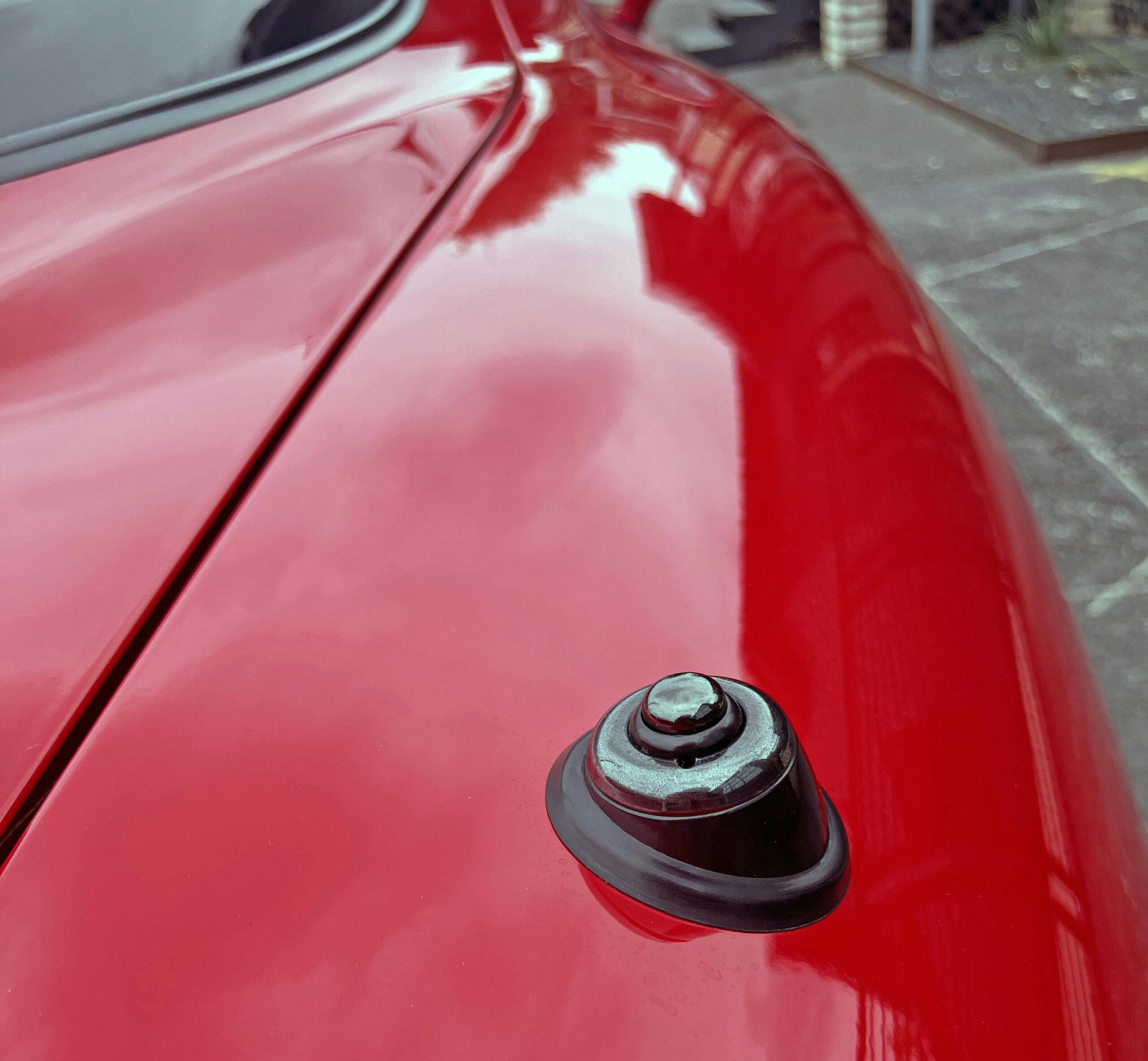
Well, no good design can exist without any straight line. From here you can see that the curvaceous hatchback still has a straight cutline for some amount of visual tension. Imagine this body with a modern (i.e. hidden) radio antenna; the change would only add to the curvaceous nature of the FD’s body. There’s a shockingly wonderful interplay between straight lines and soft curves, a juxtaposition illustrated best by the hatchback and the R1 rear spoiler.
Indeed, the quarter panel even has muscular ripples in a normally overlooked place. The reflections from the parking lot would look far more accurate if this were a flat panel.
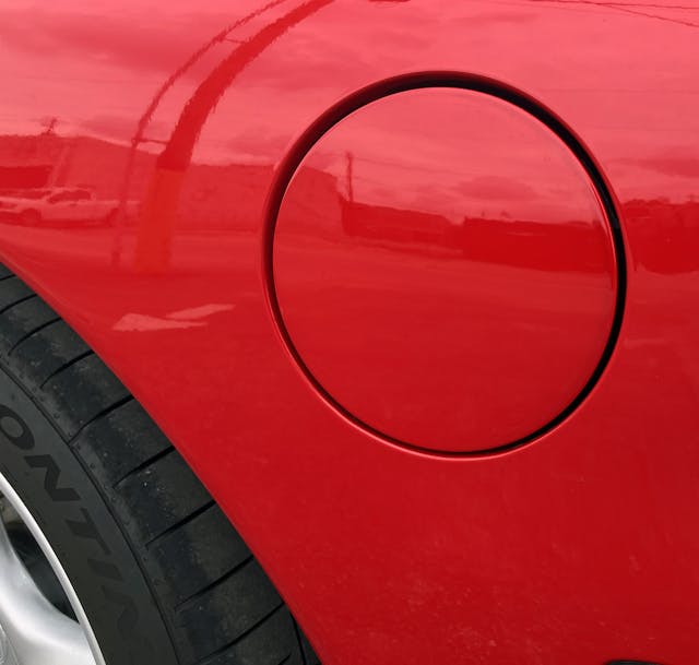
The fuel door, aside from being uncomfortably close to the wheel arch by today’s standards, is close to a perfect circle. The shape remains at this level of perfection from any vantage point (unlike the door frame above).
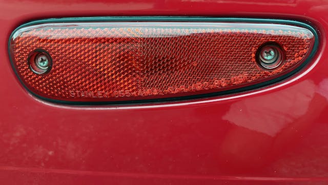
There’s probably no better example of the FD’s organic design than the rear side-marker lights. Surprisingly, this red, amoeba-like creature is affixed to the body with exposed screws, in stark contrast to the hardware-free look of the front light.
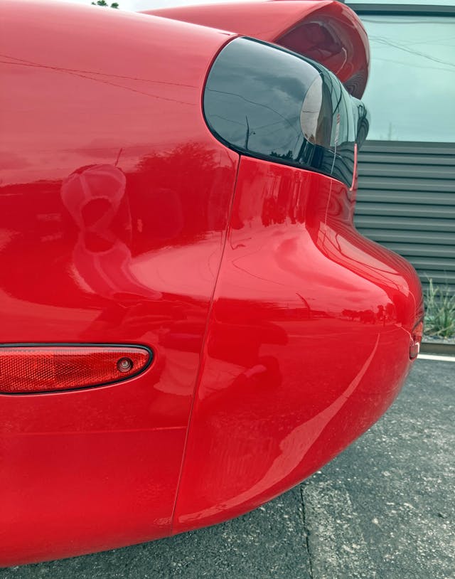
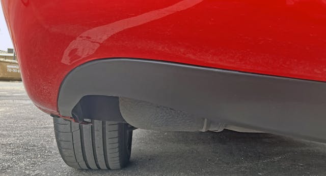
The sheer volume of upward trajectory from the lower quarter panel to the rear bumper is stunning to behold. Not only does it continue the FD’s curvy demeanor, it also ensures the body remains tight and taut.
The RX-7 embodies the notion of lightweight performance above all else, clearly nothing like the golf-friendly raison d’être of, ahem, future Corvettes.
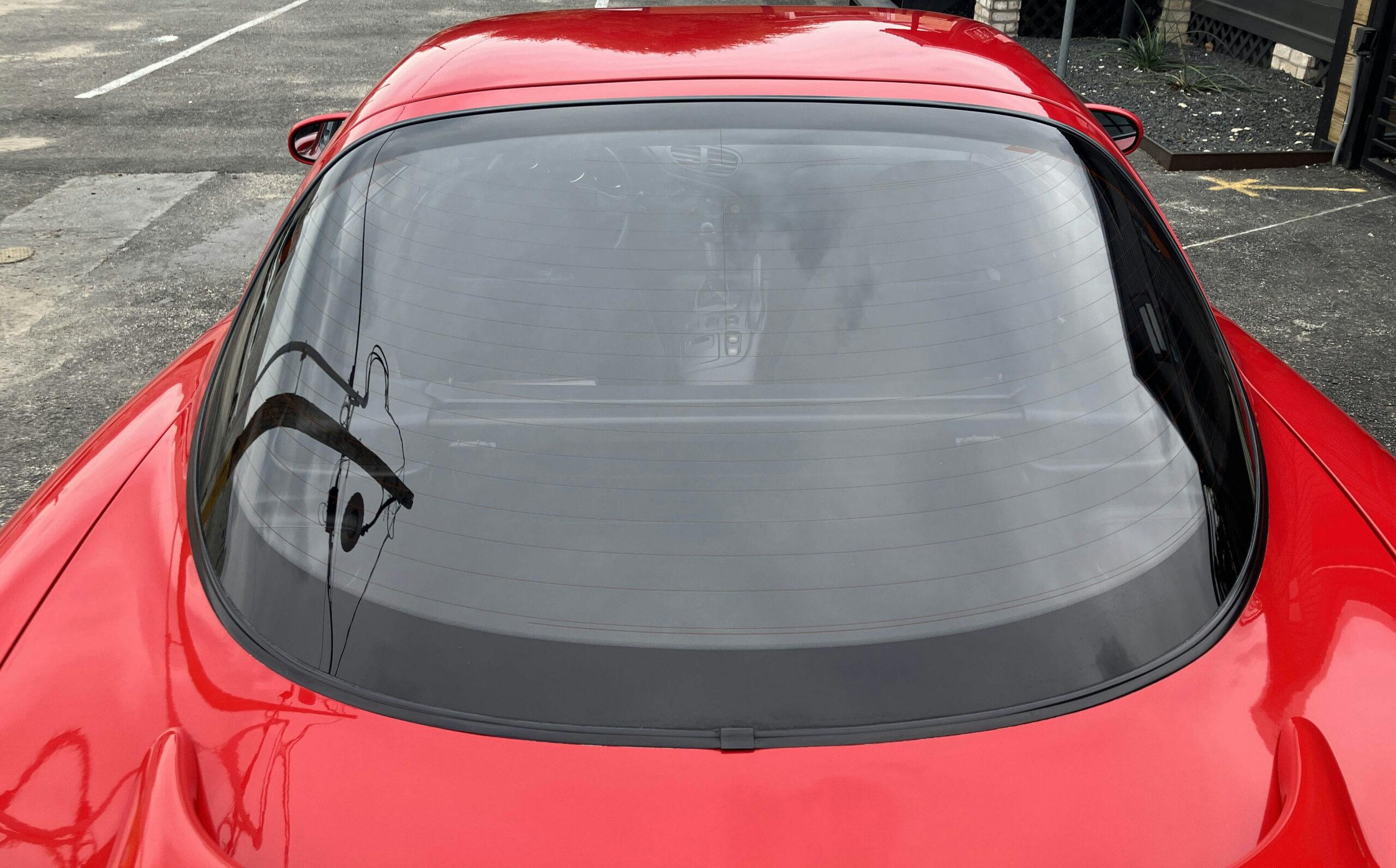
This hatchback musta cost big bucks—making a sheet of glass continue the inward trajectory of the B-pillar/door is no small feat.
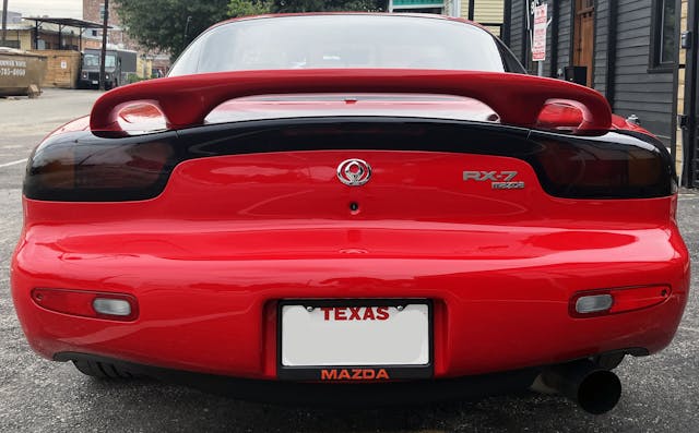
But you need glass with that much contouring to work with the insane level of curvature on the spoiler, bumper, and rear deck. Take the rear light bar, for example . . . looks pretty flat from this angle, no?
Yeah, definitely not. The light bar might as well be the sleek little Continental kit from a 1993 Lincoln Mark VIII, and the R1 spoiler capitalizes on its curvature. It’s all just so perfect.
Then there’s the rear bumper, bending the sky’s reflection in a huge arc from corner to corner.
The taillights bend inward at the corners (note the building’s reflection) and subtly extend the deck lid at the middle of the car’s rear.
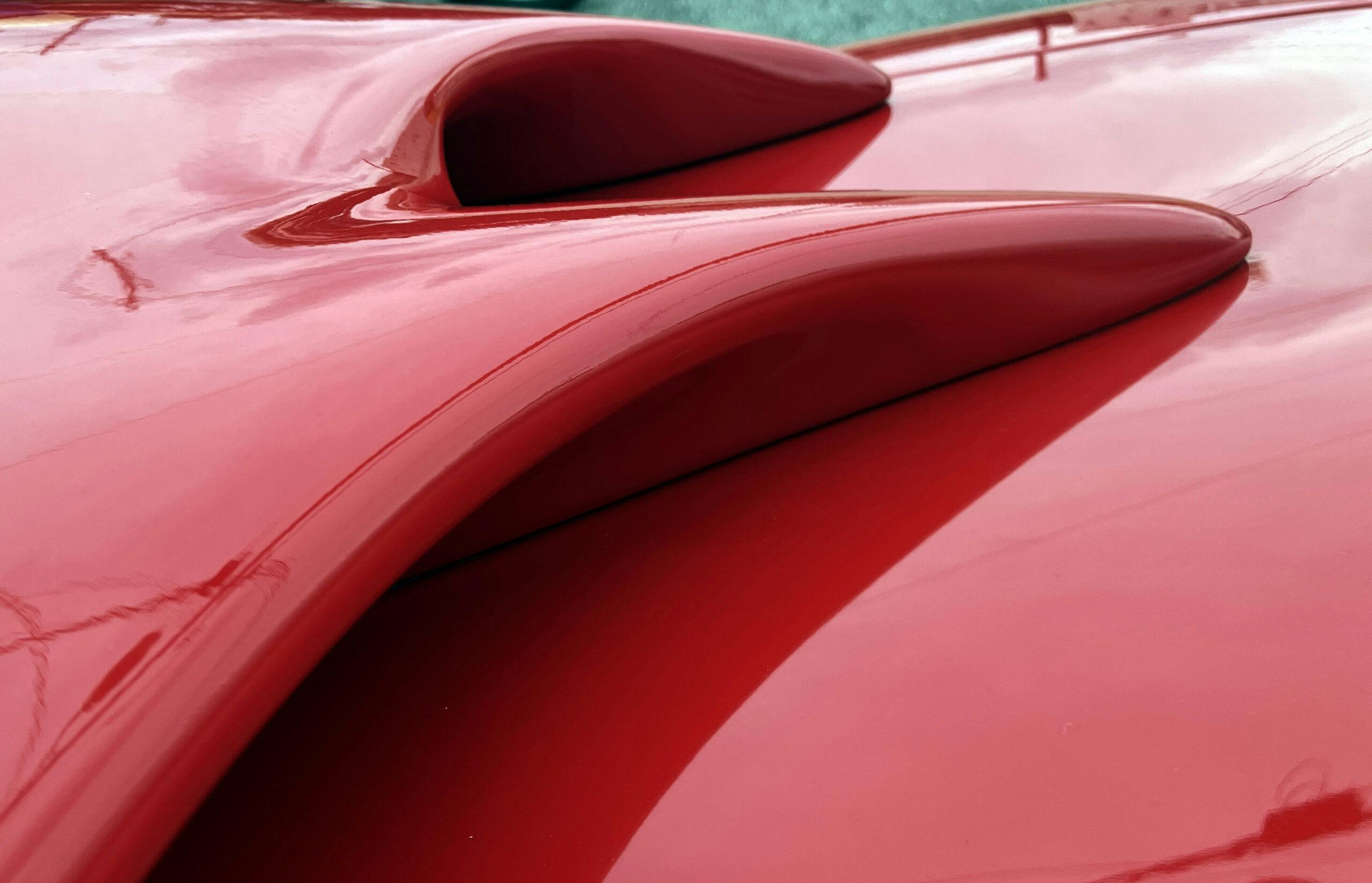
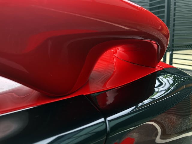
The inside of the R1 spoiler continues the organic curvature, looking here like a cavern.
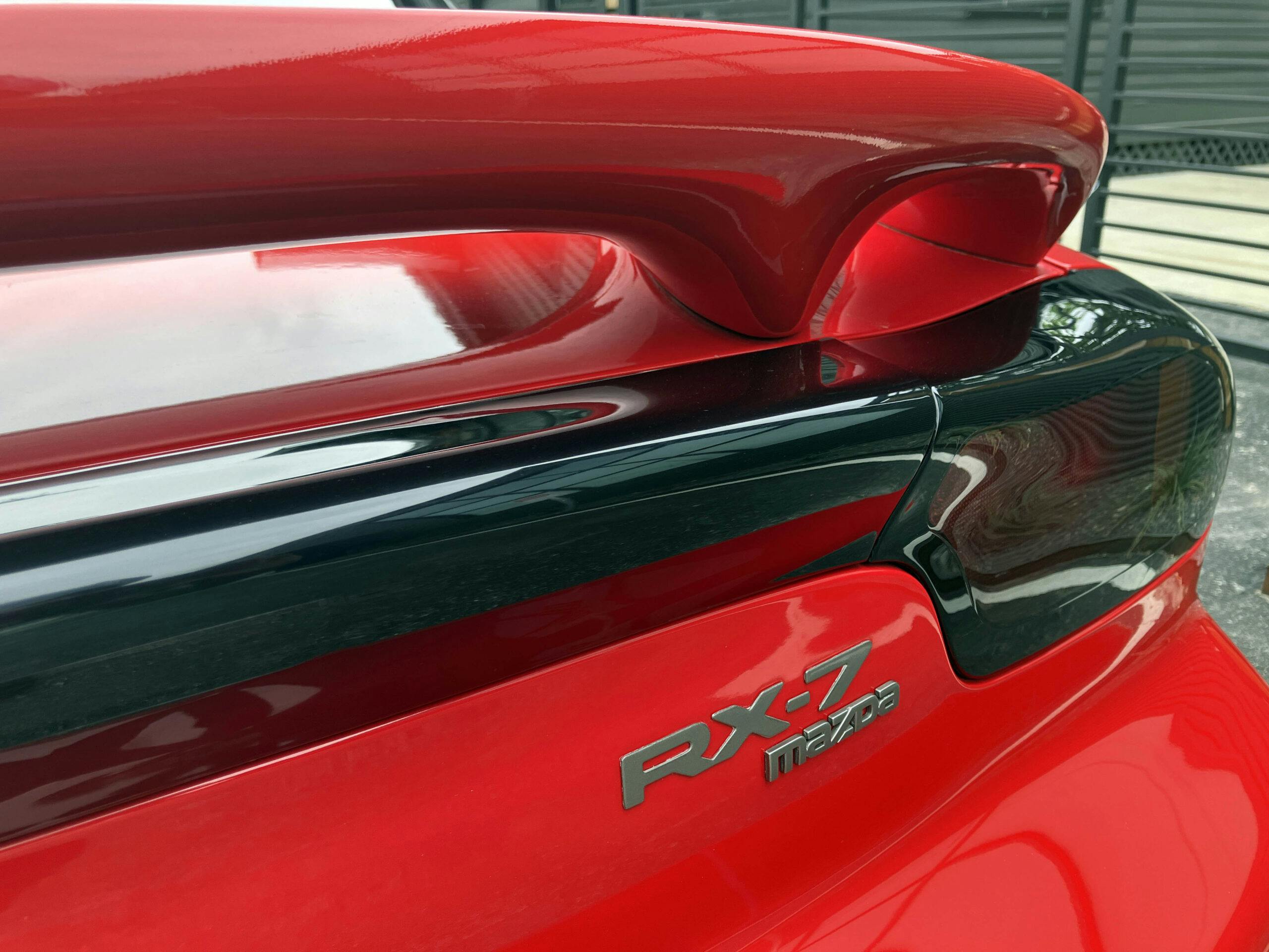
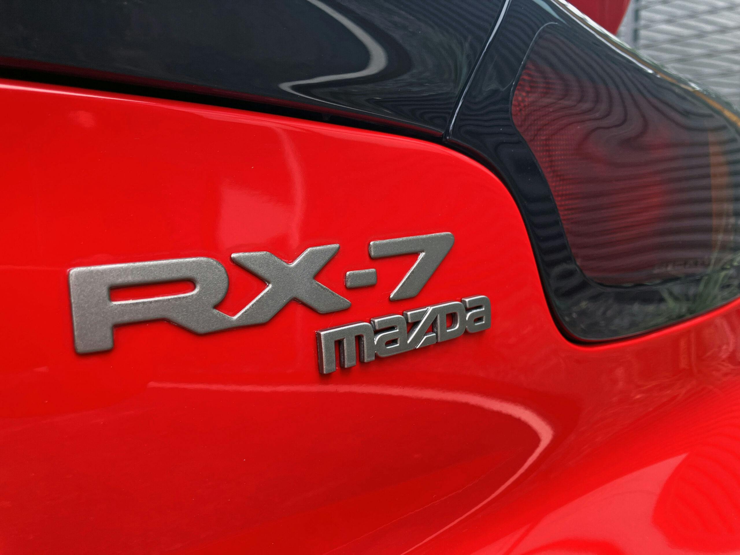
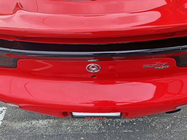
All these curves meant that conventional (i.e. linear) badge placement would look static and slow. The “Mazda” badge works with the lower end of the tail light, and the “RX-7” badge extends upward and inward . . . just like the light assembly itself as it dances across the rear deck.
Like everything from the Acura NSX to the Ferrari Testarossa, the FD worked hard to bury its red light behind a sea of black trim and a clear plastic shroud. This arrangement would become a stark contrast to the upcoming Altezza craze, something to which the RX-8, which replaced the RX-7, was not immune.
I cannot tell you how difficult it was to get a shot of the CHMSL in this blackout assembly. But there it is, ready to attack your retinas when needed.
The amber light is a bit easier to spot at a quick glance, only because it’s a lighter color than red. This level of concealment took some effort.
Note the shadows between the bumper and the Mazda emblem: The vertical element of the rear fascia is also heavily contoured. Adding to the impact are the door-lock bezels—they are bezeled, letting the body surfacing speak far more boldly.
Unlike the side markers, the rear reflectors/back up light is far less amoeba-like. But like the front signal light, each still needs one screw for attachment. Bizarre.
The bumper has an ever-so-gentle curve, preparation for a flat spot for the license plate.
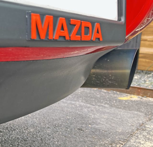
While the period-correct aftermarket exhaust is a bit much in terms of styling, it both accentuates the level of negative area present in the rear bumper and ensures a healthier Wankel engine. (Oh, and it sounds awesome.)
Not only does the rear bumper aggressively push skyward (in the side view), the black plastic insert curves downward as it transitions to the center, becoming more like a chin on a human face. Wow.
The center of the bumper looks like it extends two inches past its start on the quarter panel—just another reason why the FD is one seriously complex design. But complexity is relative, because the FD doesn’t scream in your face. This RX-7 is the antithesis of something insane like a McLaren Senna, even if both designs are similarly complex. It’s clear that Mazda designers worked overtime to ensure the styling was just as effortlessly complex as the high-revving Wankel engine under the skin. I walked away from this episode of Vellum Venom with even more respect for this vehicle.
Thank you for reading—I hope you have a lovely day.
Special thanks to Toby for providing this vehicle for evaluation.
***
Check out the Hagerty Media homepage so you don’t miss a single story, or better yet, bookmark it. To get our best stories delivered right to your inbox, subscribe to our newsletters.



























Love (still) this approach to discussing older designs. Would be interesting to see someone with big dollars try your revision suggestions (i.e., the doors playing off the scoops).
I find the odd Mazda badges jarring on the car, both for the image and being in chrome. I often like cars with spoilers deleted as well, but not sure the tail treatment on this would look right.
I’ll admit that I like the spoiler-less rear better, but it will look too soft/bubbly/organic for serious sports car guys.
A buddy of mine had the previous generation and had “POORSHE” across the top of the windshield due to it’s remarkable resemblance to the 944. These cars have always intrigued me, but never enough to buy one. I have driven a few examples of the previous generation and found them remarkably gutless for their ambitious redline. NA versions – the turbo version might be better – just like the 944 they imitated.
After riding in this one, yes, the sequential turbos are the exact opposite of what you experienced with the FC. Boost comes on quickly with the two turbos controlled by solenoids…its nothing like the FC or the RX-8 that came after it.
Absolutely love these cars. Got to drive a red R1 in 95/96. Never noticed the comparison to the 93 TA but it’s definitely there when you point it out. Fantastic write up!
Glad you see it too! It’s fascinating what you spot when you stop and force yourself to photograph the details of a car…any car, not just something as exciting and beautiful as an FD.
About the emblem, Mazda actually called it the “flame of performance”. It was supposed to represent the excitement that lies at the heart of all the vehicles they made, ensuring they were not boring to drive.
Unfortunately, it was known as the “toilet bowl” emblem by owners for obvious reasons.
Many FD owners replaced those with the “Efiñi” rotor shaped emblems used in other markets or later, the flying “M” used on the “99 spec” as it would be called on the forums.
And for a bit more trivia about the design, it was a friendly competition between Mazda of Japan and Mazda of USA (in California) and the California design was the end result. The Peterson Automotive Museum has the full size design study of the car that is split down the middle so it could show 2 separate designs.
Thanks for sharing, I didn’t know it was called the “flame of performance” and that makes it a little better. But yeah, it was a short lived logo for good reason.
I love FD’s. I much prefer the sunroof versions with the leather and upgraded stereo than the R1/R2 cars. Yes I know the R cars have a strut bar and second oil cooler and they are nice but are useless in the street. So I much rather have something that I can actually put to use.
I still think this is the 2nd most beautiful Japanese car of all time (Toyota 2000GT), and these are still relatively attainable. Excellent design analysis, I would only add more aggressive wheels to emphasize the sportiness over the organic curves. I suspect the FD will flllow the trend of the Supra and Skyline as gen-x comes into its buying power and longing for the cars of its youth.
I think we are less than a decade away from low mile FDs being six figure cars. Probably in the next five years, if I were a betting man.
Thanks for reading, glad you enjoyed it!
How much today an original one lhd in original conditions with low millage?