Media | Articles
Vellum Venom: 1992 Acura NSX
The world is rarely a fair place, and automotive journalism is rarely a safe space for all car enthusiasts. To wit, how many publications had an axe to grind when writing the ledes in their first-gen Acura NSX reviews? I recall numerous accusations of wanna-be Ferrari styling, occasional backhanded references to Honda’s historical portfolio, and even allusions to Japan’s history of unflattering small-car production. I don’t recall the same vitriol applied to a similar supercar wannabe introduced around the same time, though the Lotus-engineered Corvette ZR-1 coulda been knocked down a peg with a spicy reference to the Cosworth-engineered Twin Cam Vega. Indeed, the publications preferred a positive tone, sometimes portraying the Vette as the scrappy underdog.
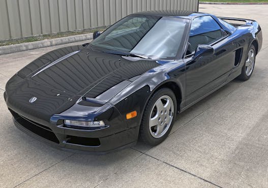
But this discussion isn’t about journalism’s empathy gap; it’s about righting the wrong of Honda Civic/Ferrari 348 references past. The Honda/Acura NSX was a revolution in mass-produced aluminum coachwork. It was beautiful to behold back then, and it is absolutely stunning now.
Perhaps “absolutely stunning” is hyperbole: The NSX doesn’t Cheshire Cat–grin like a Testarossa or moisten the pantaloons of minimalist-wedge devotees like the Countach. No face this understated is gonna appeal to every variation of exotic-car enthusiast, especially those who place prestige above all else. But for those who aren’t the 1990s equivalent of an Instagram influencer, note how most of the NSX’s lines are logically connected to the others. This is a seemingly mediocre smattering of design elements, but it is plastered onto the proportions of a low-slung, mid-engine, supercar chassis.
And yes, it works really well.
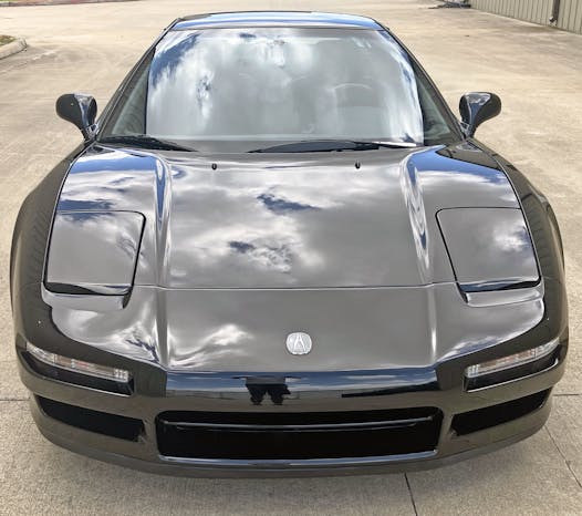
It coheres thanks to an abundance of restraint. Designers ensured harmony between the covered headlights, modest grilles, clear signal lights, and gentle contouring around the hood and bumpers. Very few lines share common vanishing points across the front end, but they are close enough to be assertive. (The approach never comes across as hyper or flashy, something that cannot be said of the 2002 redesign.)
Marketplace
Buy and sell classics with confidence
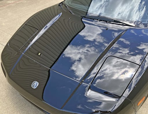
The emblem of mid-level luxury—a genre on the verge of utter dominance by Toyota’s Lexus brand—shall elicit mixed reviews in the aggregate of supercar buyers. Snobs will be haters, while the stealth-wealth crowd will embrace their new hero. So forget the emblem and get back to judging the machine on its merits.
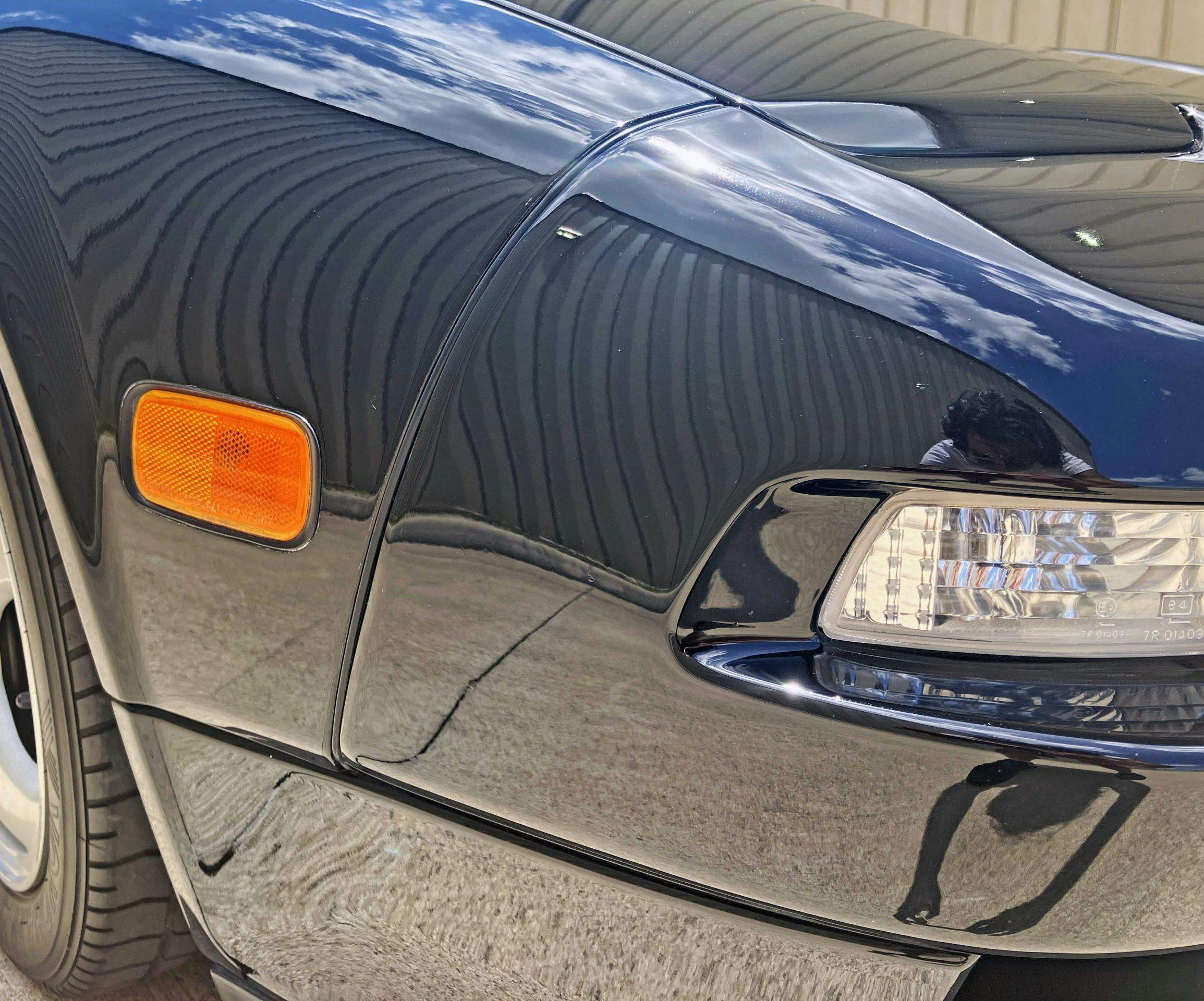
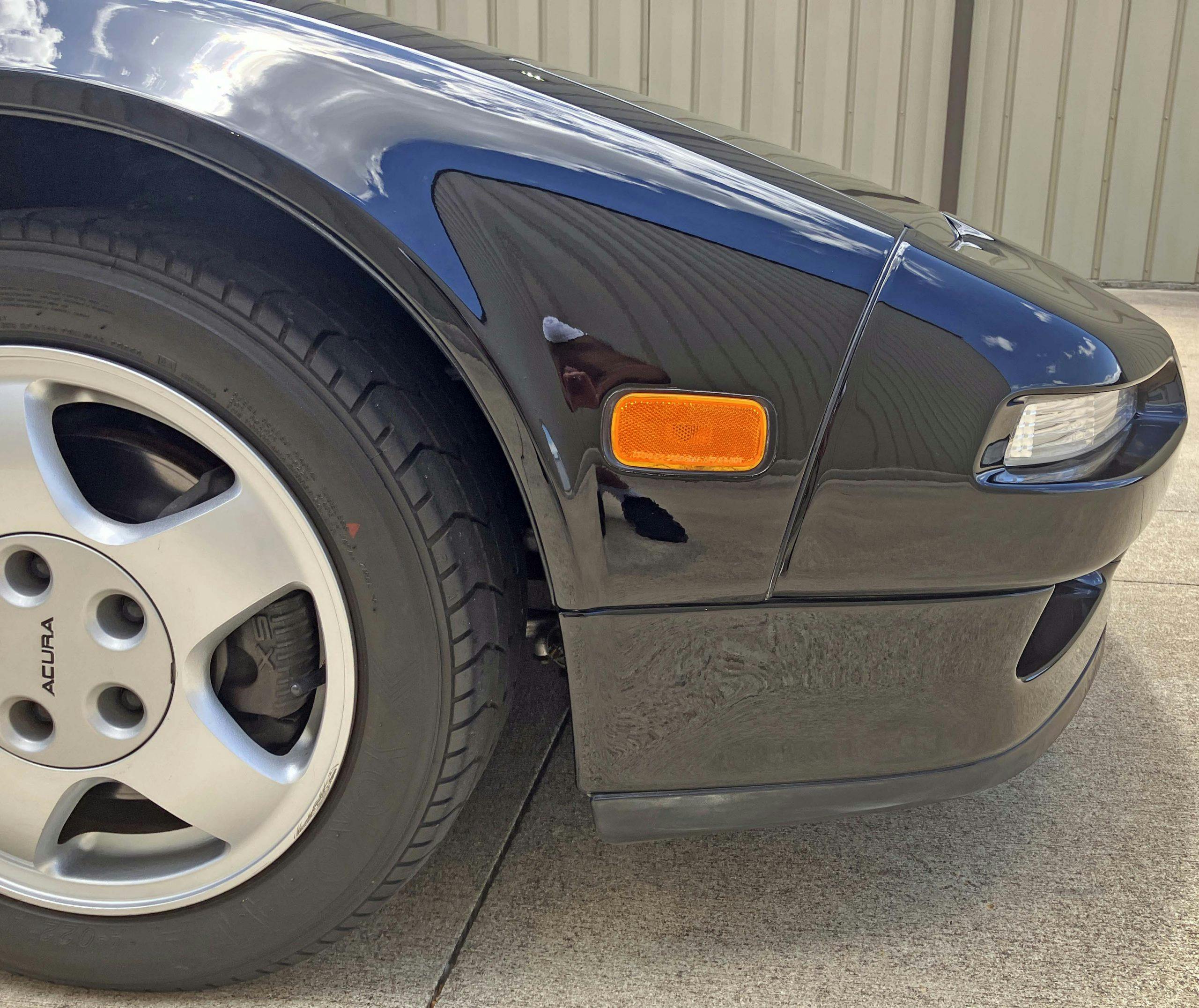
The horizontal lines of the big grille, the secondary (side) grilles and signal lights share a similar vanishing point yet are at different elevations for a more dynamic feel. This is in stark contrast to the face of the Ferrari 348, which integrated multiple design elements into a single line across the bumper. Both are fantastic executions, and the NSX’s chiseled-out signal lights give the fascia a charming grin from many angles.
Much like the Porsche 928 S4 before it, there’s a confident swagger in these recessed lighting pods. The only difference is that this is one of the most outstanding features on the NSX’ schnoz; it is fully eclipsed by the exposed, pop-up headlights on the Porsche.
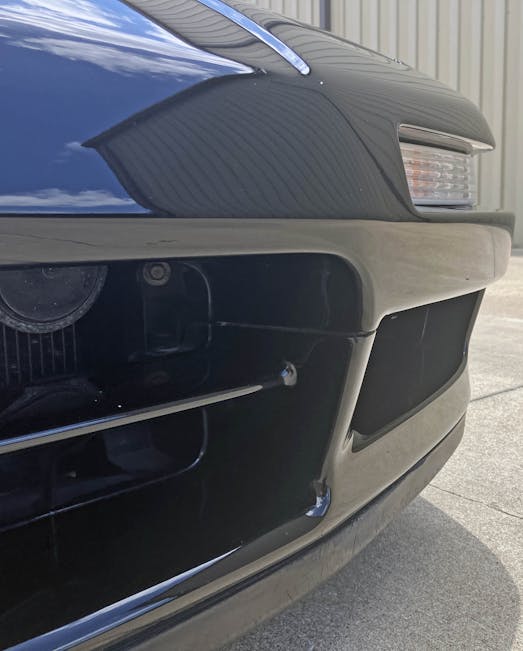
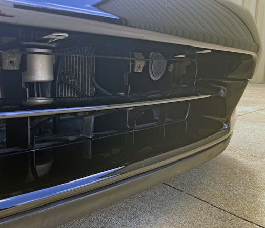
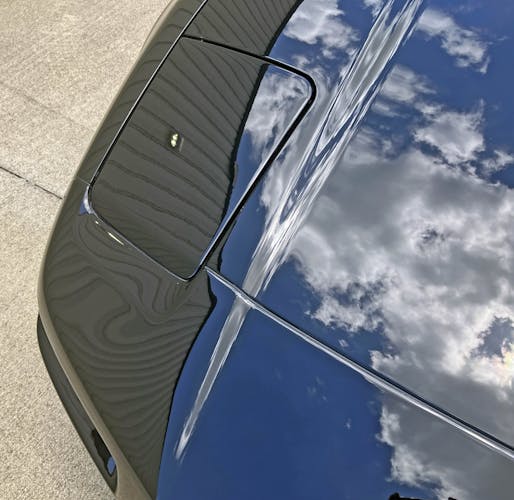
There’s a delightful “C” shaped access panel that bends into the cooling duct, disappearing from sight from most vantage points.
Visually speaking, it’s unfortunate that every functional bit isn’t masked with black paint, or a fine mesh filter. Then again, the heavily recessed license-plate screws are a brilliant way to add a front plate where mandated, ensuring there’s no need for drilling holes, installing a tow-hook holder, or tooling up a color-matched end-cap (as on the C4 Corvette).
That 928 S4 swagger/smirk is fully realized as the bumper wraps around the body, right down to the lower valance that extends the lines of both the bumper and the fender.
The hard, inelegant bend over the headlight assembly requires a carved-out contour on the NSX’s front bumper. This is a visual distraction akin to bags under the eyes of the stereotypical Hollywood starlet; perhaps the 1989 Mazda 323F did this headlight-to-bumper transition better. The Mazda went sleeker, sporting a front fascia with subtle contours that integrated the headlight door into the bumper’s overall form.
But then again: Step back and perhaps the headlight carveouts are a good thing, adding surface tension to a panel that’d otherwise look like that of every other car in its class.
Mid-engine proportioning and strong parallel hood contours aside, those headlights almost give the NSX the feeling of a super premium Nissan 300ZX (Z31).
They took a lot of visual weight out of the hood with these hood contours; the depression created gives the NSX more surface tension without adding significant complexity (like the integral ductwork on the 348).
It’s so pure, so subtle. No wonder the NSX’ detractors considered it boring (or some other cheap, catch-all adjective). But good design lets the vehicle’s proportioning shine above all else, and this character is the anthesis of the Ferrari 348’s relative brashness.
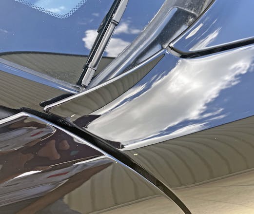
The intersection of hood, fender, door and A-pillar is elegant, but there’s a twist: The beltline’s contour (i.e. the line at the base of the glass) changes height in a masterful manner. Note how the hood is lower than the door, and the top of the fender makes that transition possible.
The cleanly rendered, five-spoke wheels have a strong outward bend from the outermost point of the rim. This is likely designed to clear the brake caliper.
A massively pretty caliper at that. Just look at the fancy casting with the NSX name in them! The bespoke design paying homage to the NSX brand is thoroughly appreciated at this premium price point.
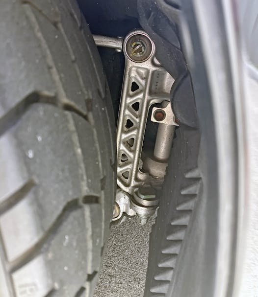
Speaking of bespoke—kudos to the designer that ensured a wheel liner didn’t obscure this. Like the control arms on a C4 Corvette when the clamshell hood is opened, the exposed, civil engineer–worthy casting of this support structure (for Honda’s signature double-wishbone deliciousness) is a long-forgotten reason why the NSX deserved endless respect for its enlightened design.
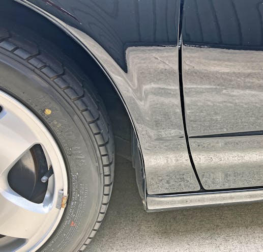
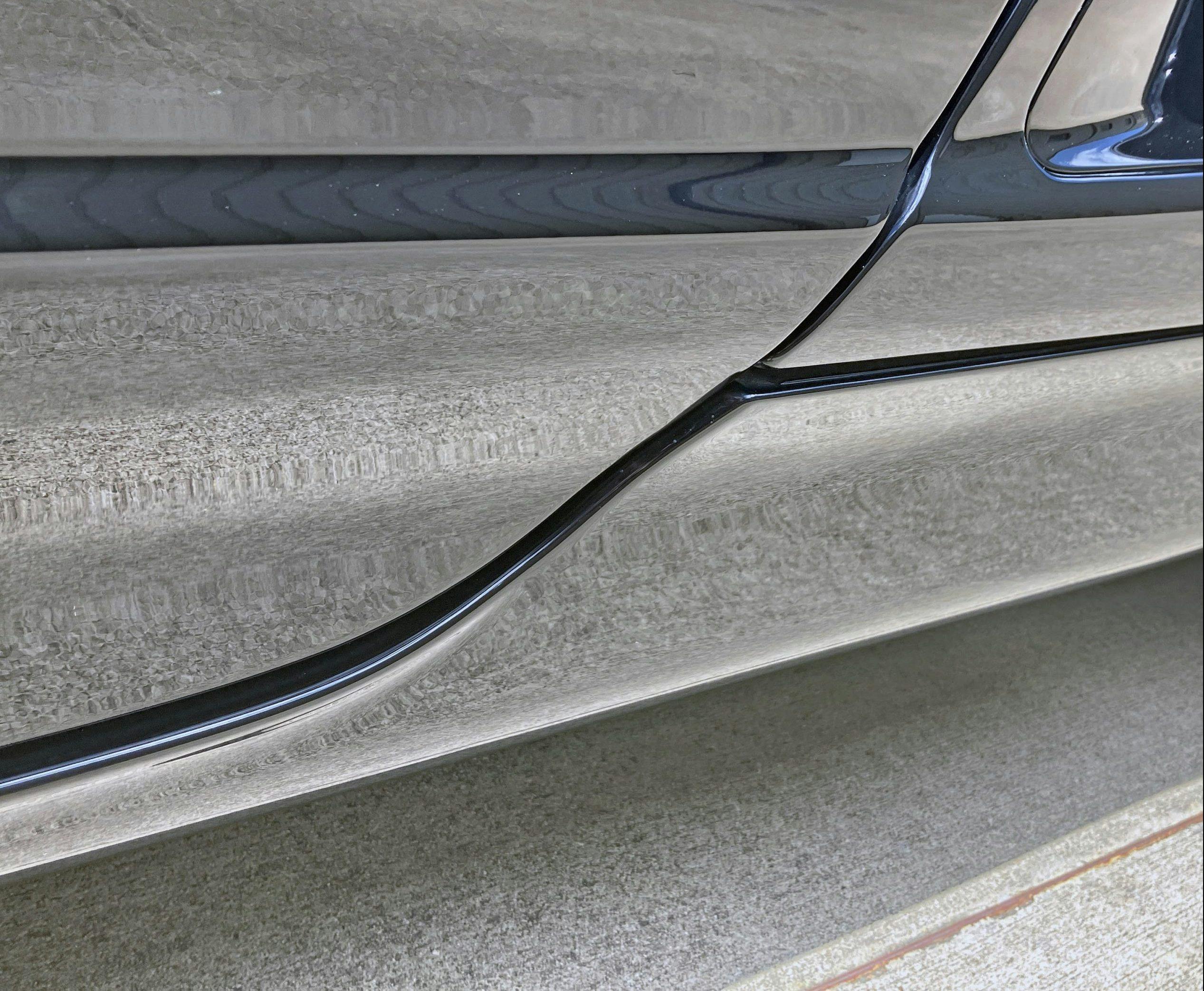
There’s nothing exciting on the other side of the wheel, unless the genesis of the NSX’s side intake scoop within the fender and the modest rocker panels float one’s minimalist boat.
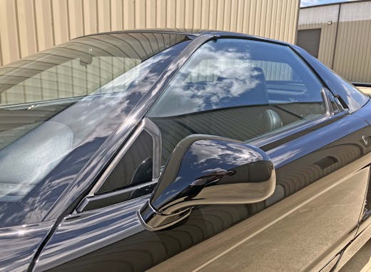
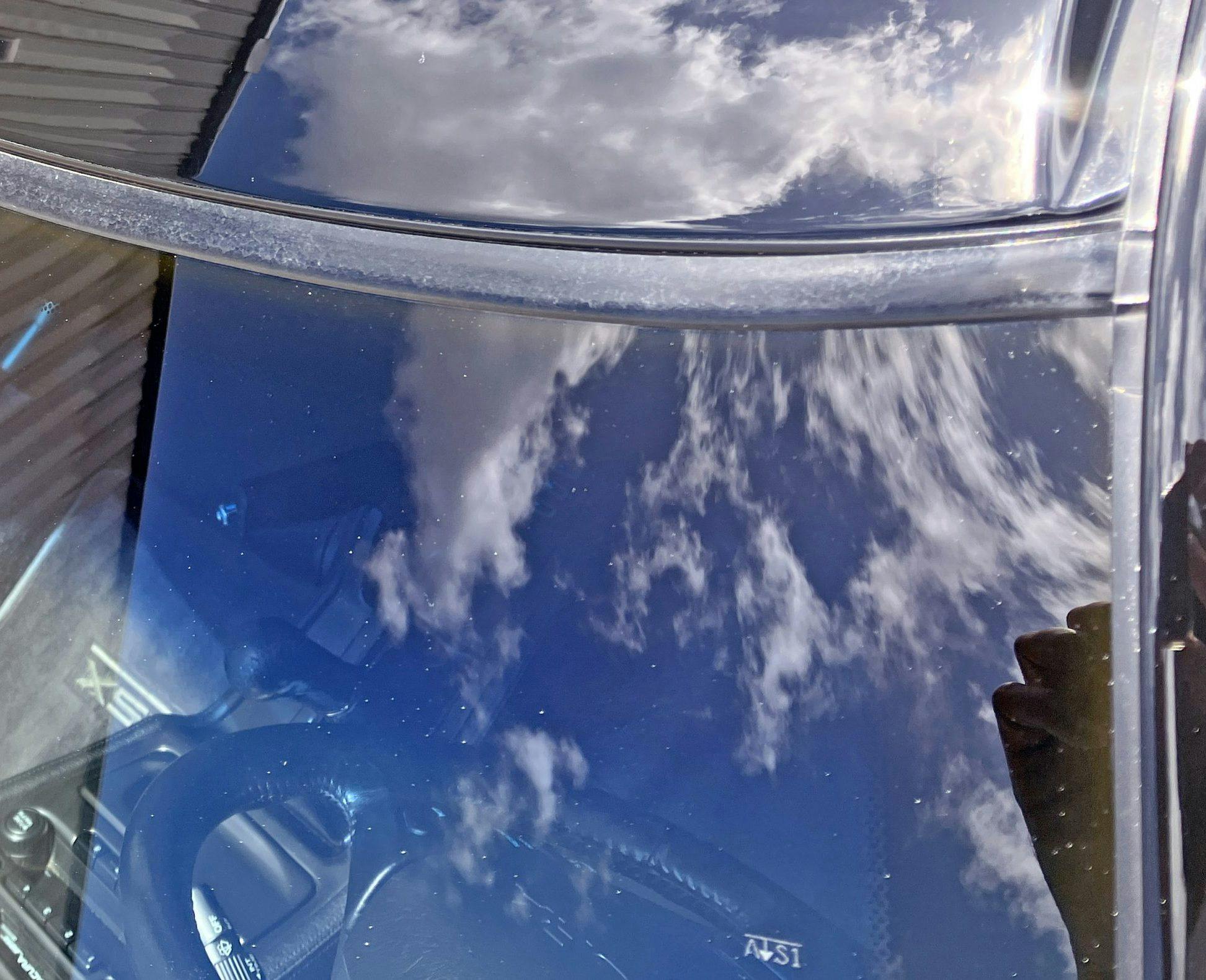
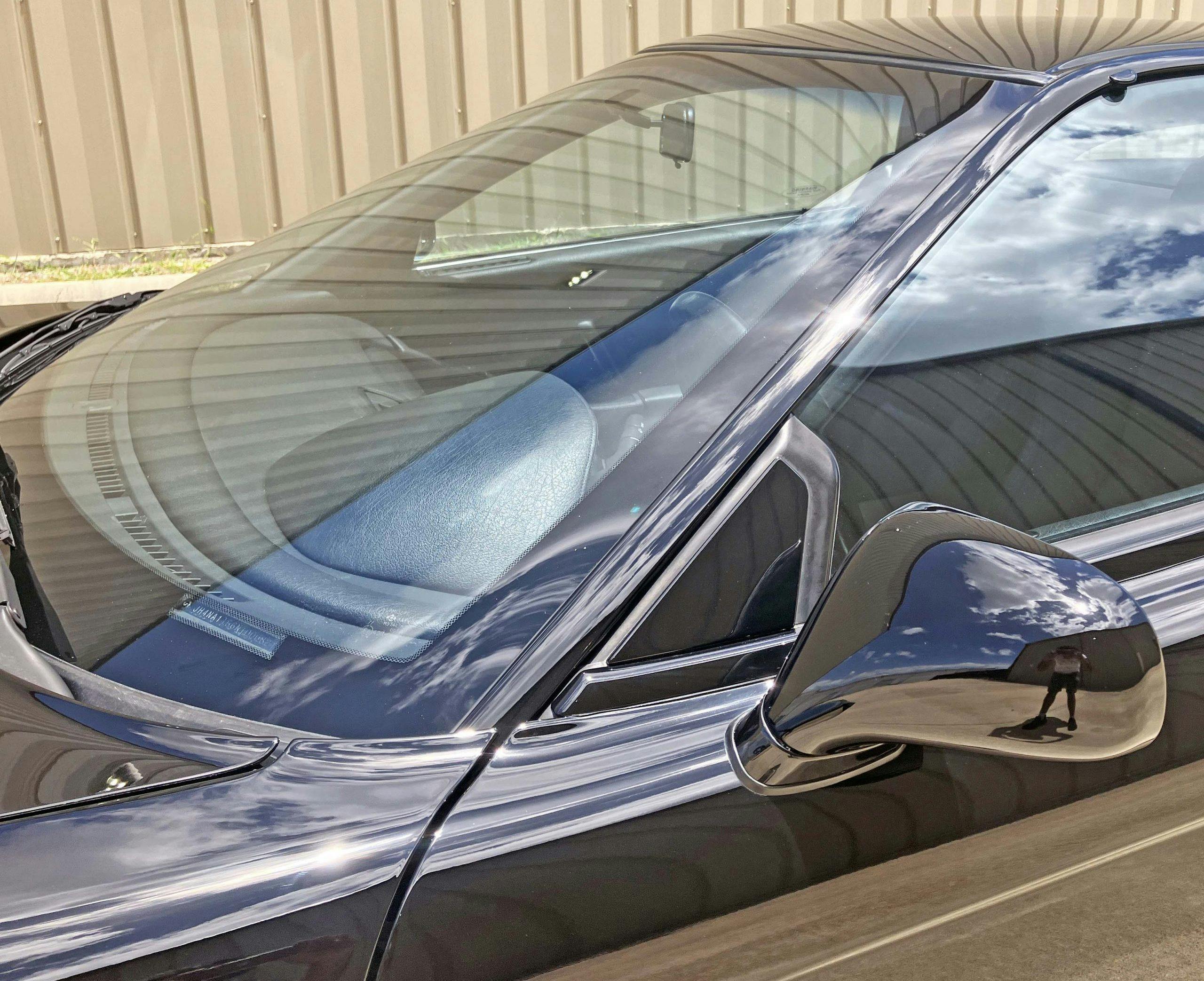
The windshield wraps around the A-pillar, providing a sleeker greenhouse than the Ferrari 348. The lines are fast and the build quality is effortlessly perfect.
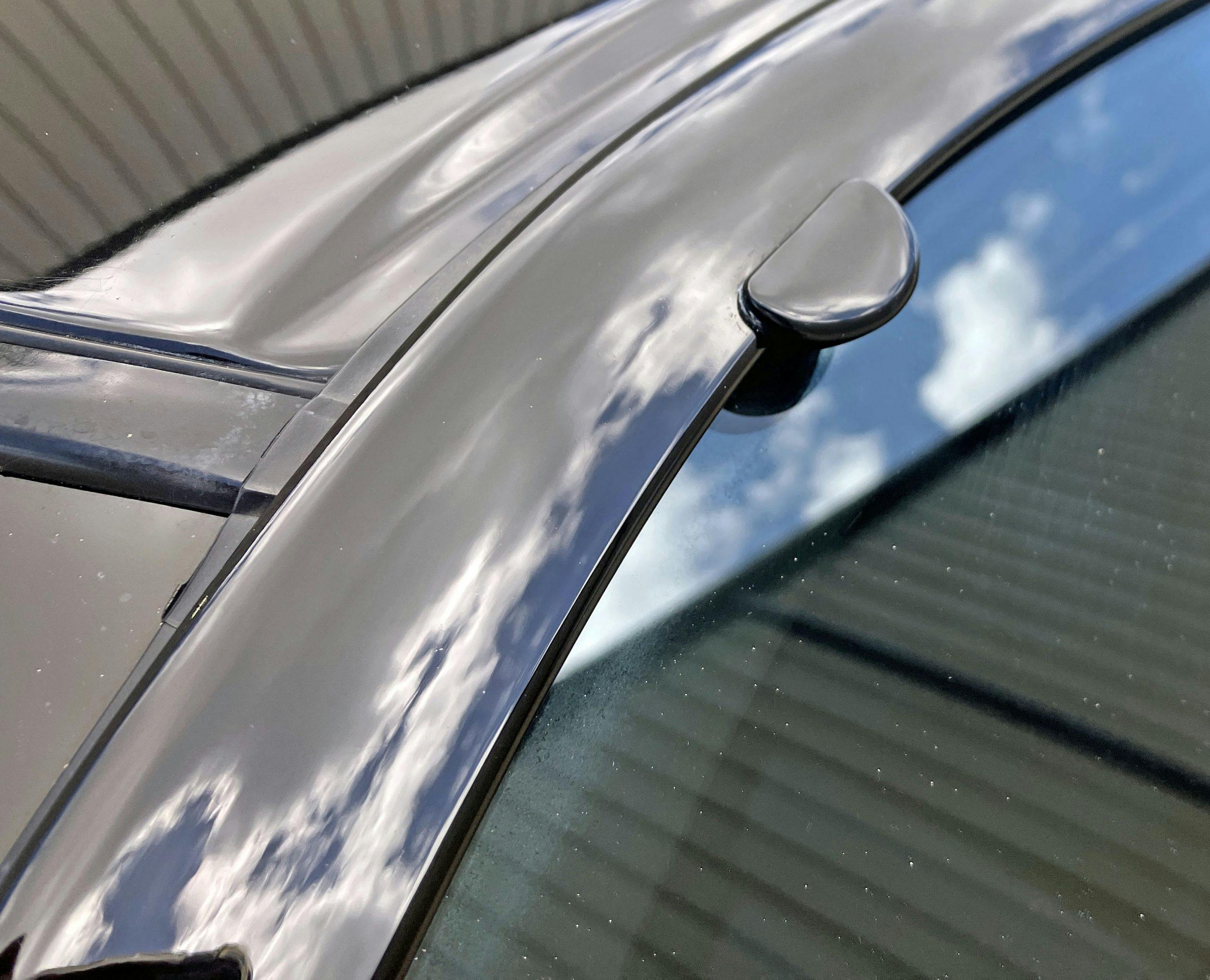
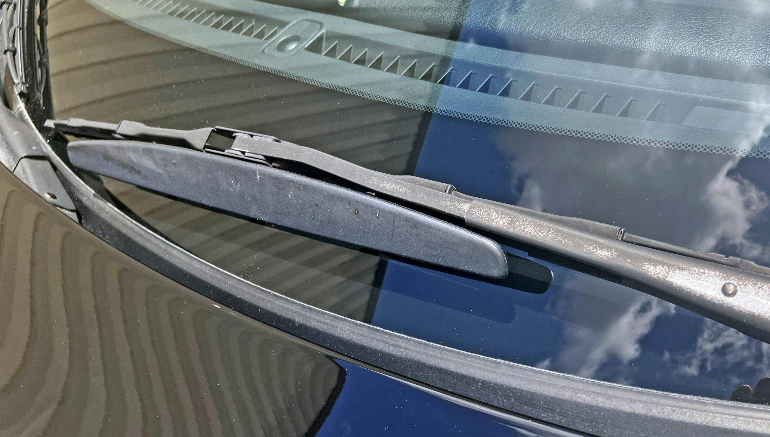
More to the point, the trim work around the windshield looks good enough to be an interference fit. The only warts around the windshield are items that age poorly on all classics from this era: window sealing tricks (the rubber bump for high-speed window closing) and wiper airfoils (for ideal downforce, wiping pressures at speed).
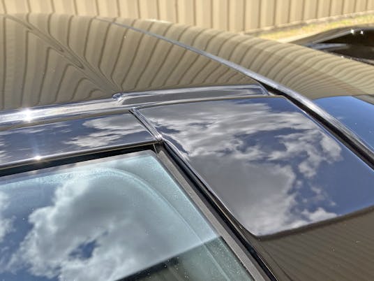
The NSX’s greenhouse is famously painted black, which was a notable diversion from exotic-car design of the era. While it visually hides bulk, it tragically hides the front and rear triangles that visually hold the door glass. This is a slick implementation that deserves not to get lost in the sauce.
Imitation is the sincerest form of flattery, and the fourth-gen Camaro Z28’s blackout A-to-B pillar (and roof treatment) is testament to the NSX’s enlightened design.
The NSX possessed an ideal glass-to-body ratio, and the roofline was almost as fast as the body beneath it. That’s no small feat, considering the long wheelbase and the body’s “speed” as it moves from a short front end to an elongated rear.
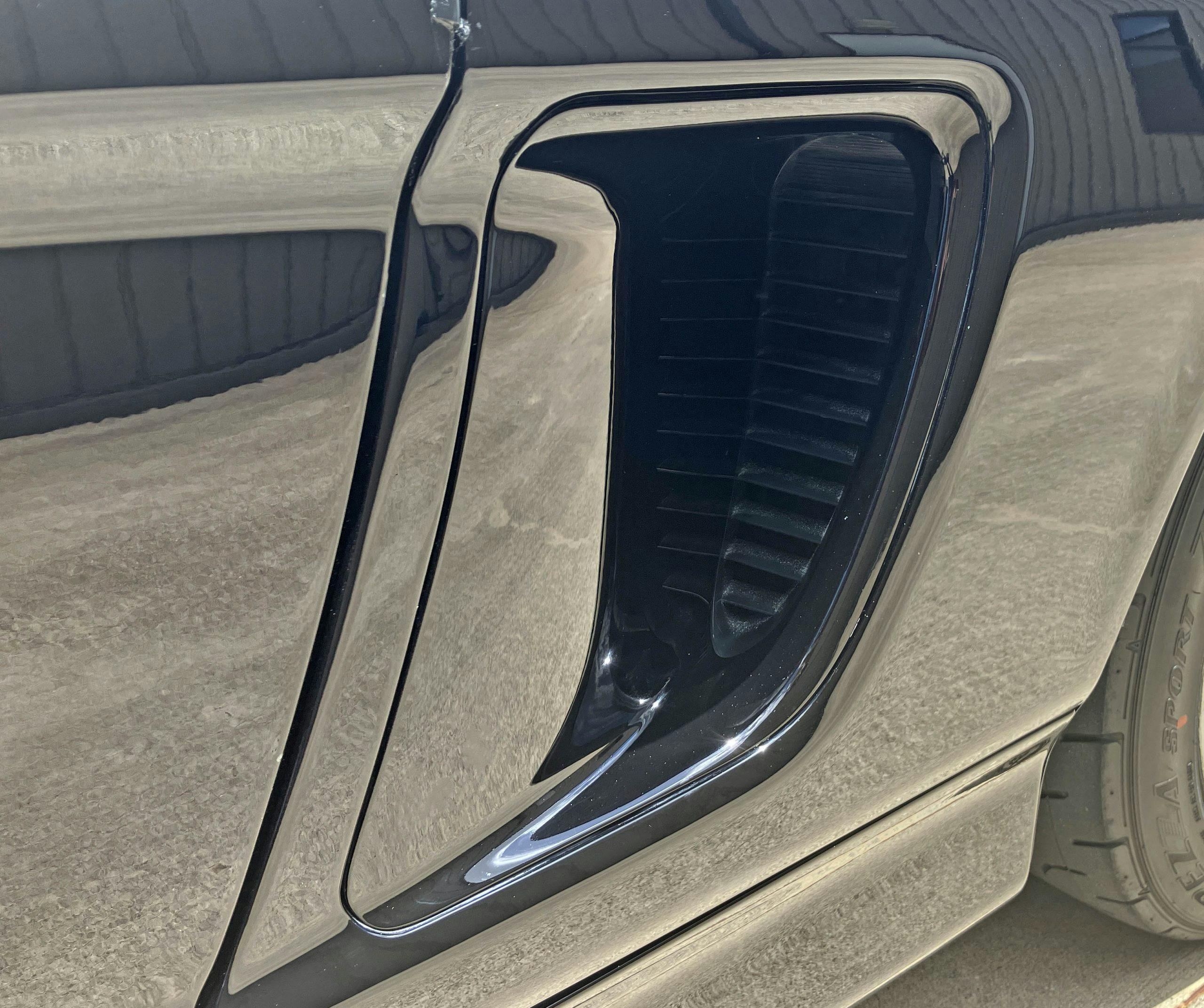
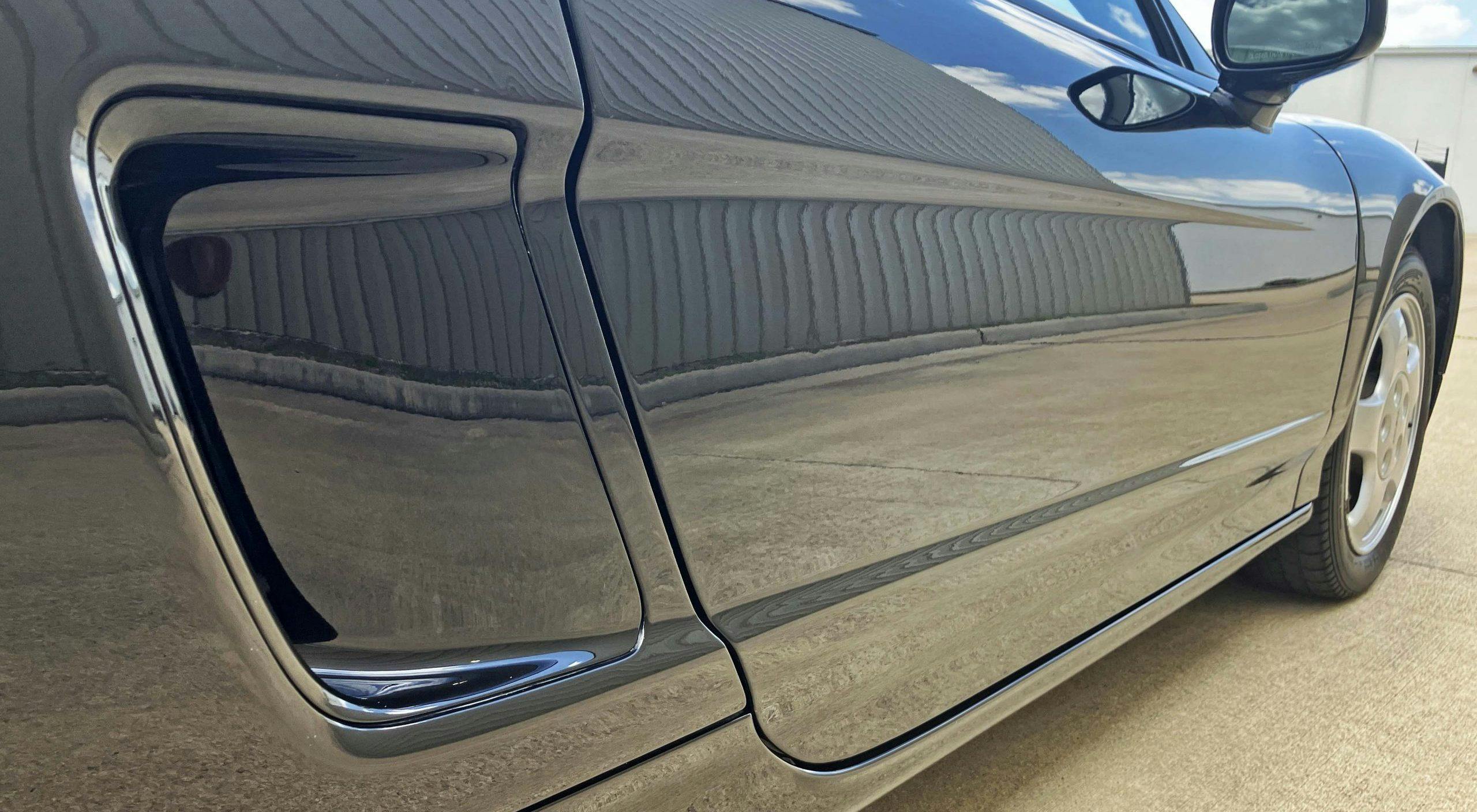
Note how the upward trajectory of the air scoop’s outward curve is matched by the curvature of the rocker panel as it passes the door. Step behind (third photo) and these two curves harmonize with each other.
Again, the most important element for a newcomer to the mid-engine supercar party (i.e. that scoop) is promoted without flash of the 348/Testarossa. Instead it features unfettered minimalist lines present in the rest of the NSX’s body, screaming without saying a word.
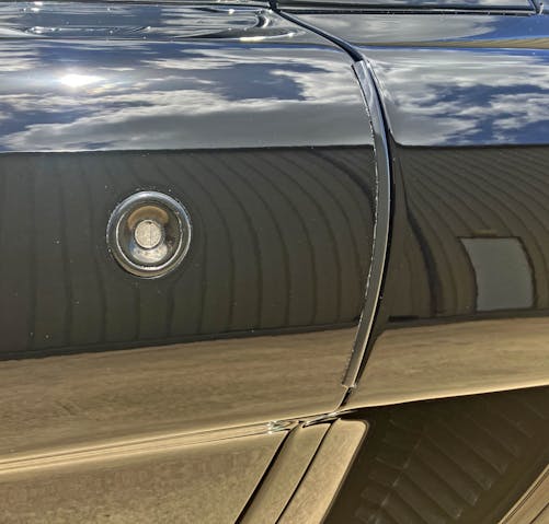
That said, door lock cylinders were an unfortunate addition for all vehicles of this era. A modern key fob upgrade would make the NSX’s side view an absolute gem of minimalism.
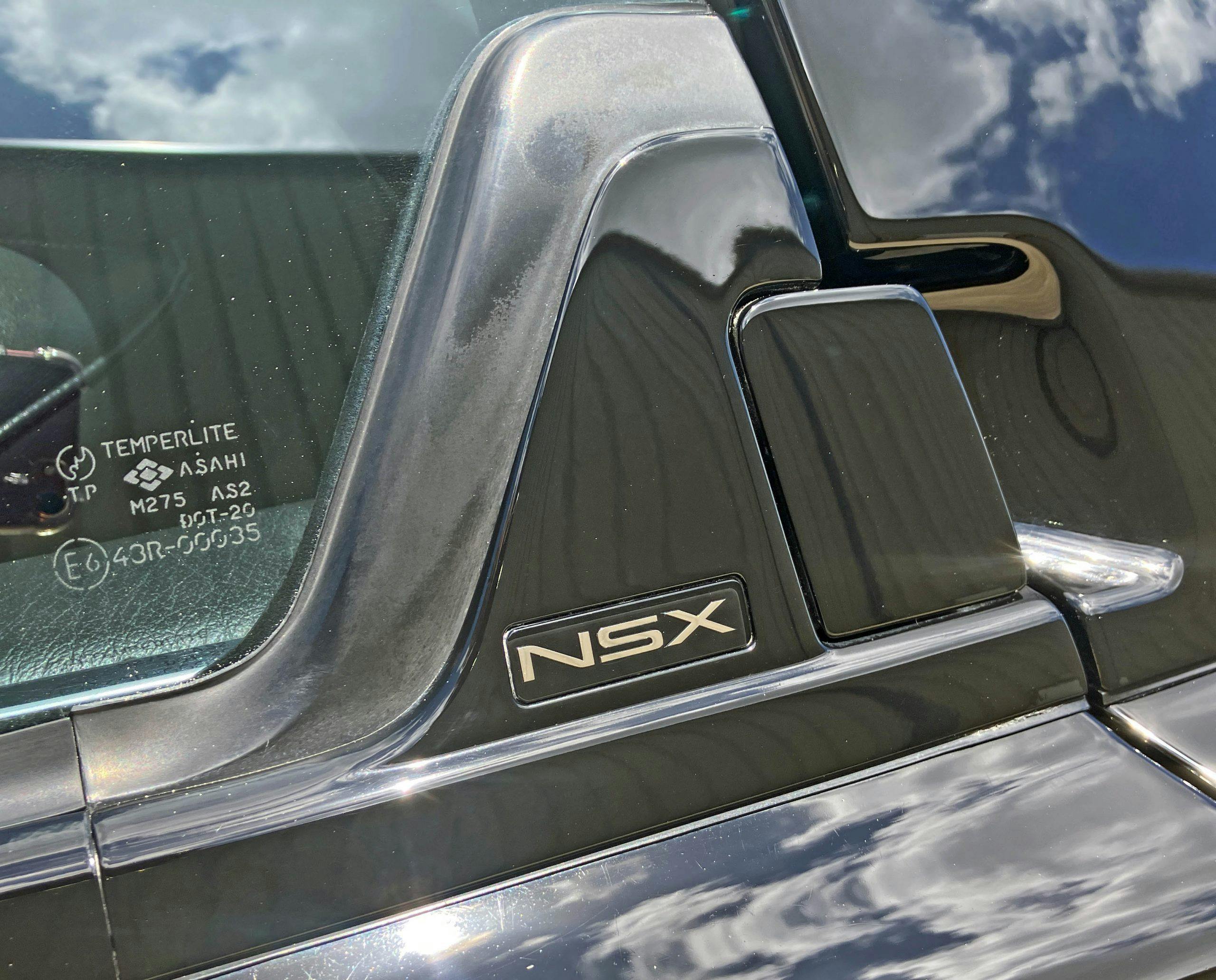
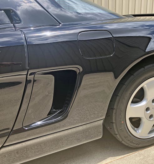
The only unfortunate amount of visual bulk are the inches between the scoop and the rear wheel. While the Testarossa works visually thanks to a massively large, square-ish quarter window that added a complementary line extension up top, the NSX has no such luxury. The huge rectangular gas door does the body no favors, as there isn’t a Ferrari-style buttress to house it.
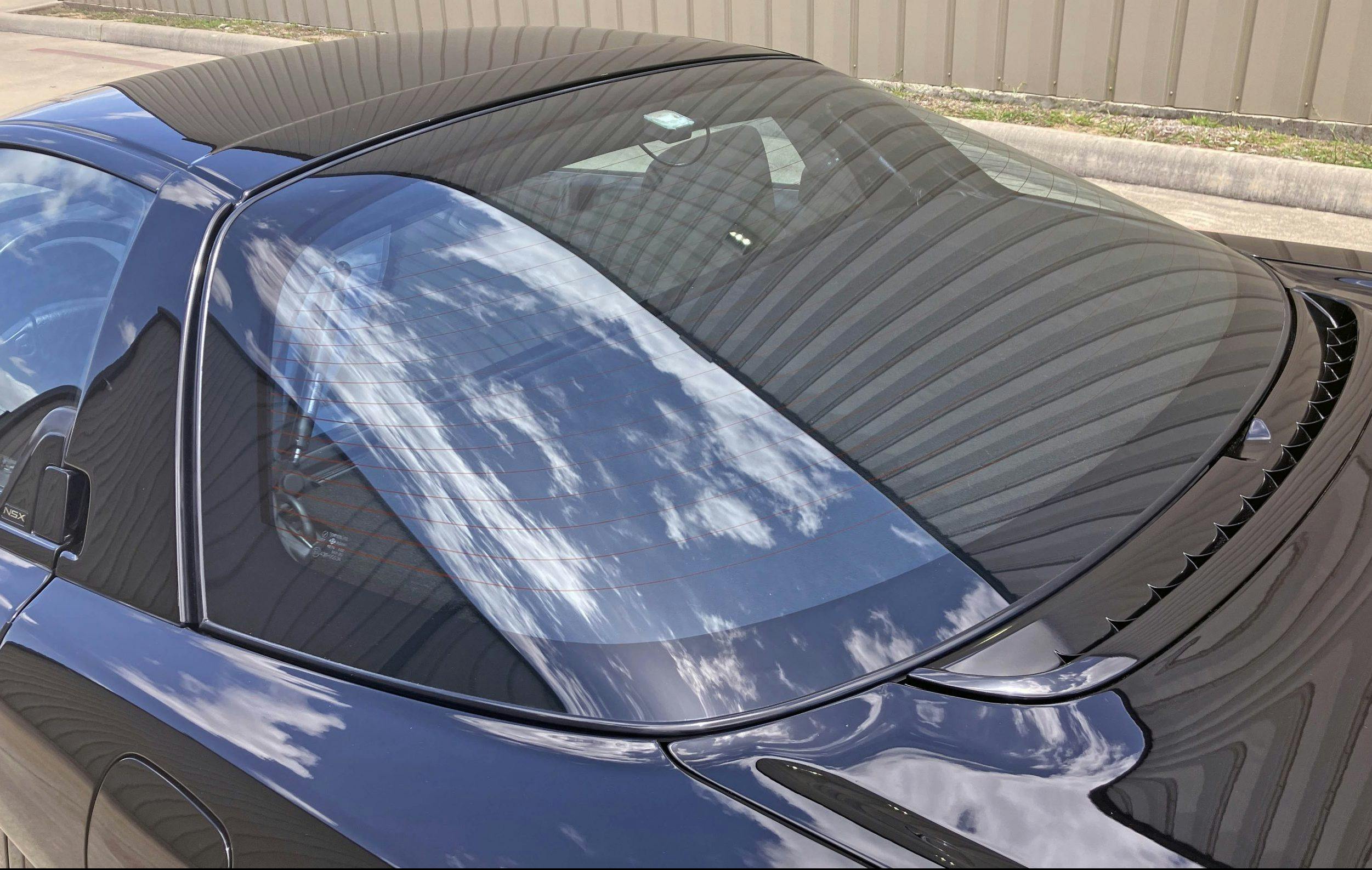
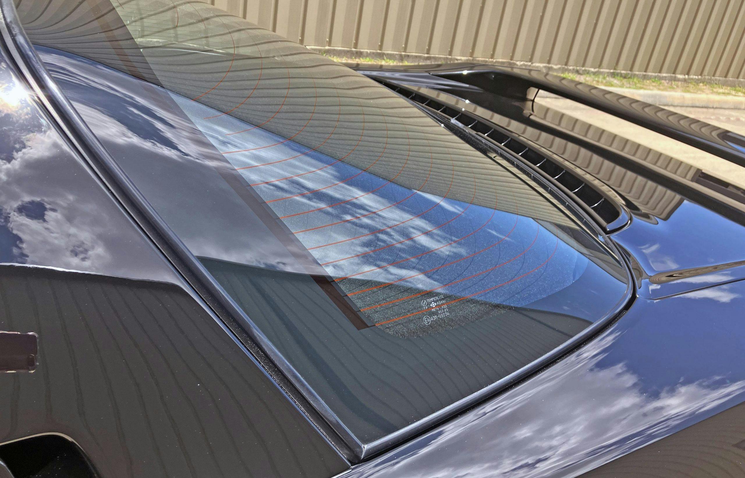
While the rear window is a beautifully designed (and assembled!) work of glazing, it is rather short in stature. In a perfect world, a slight reduction in wheelbase would make this glass truly fly down the body side.
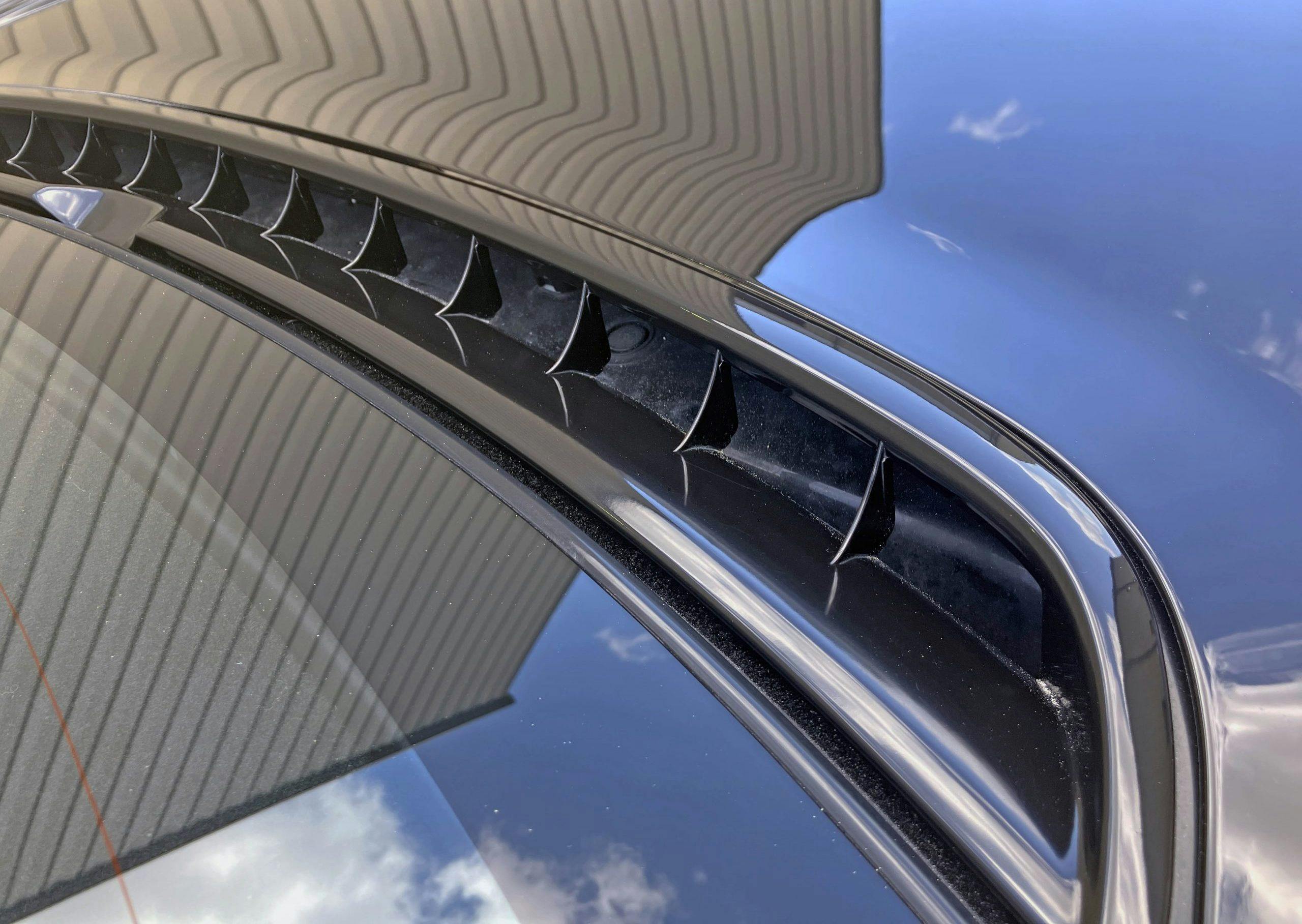
Look past the bits between the wheelbase, and the NSX’s posterior is a thing of minimalist beauty: subtle contours, no ornamentation, and enough functionality to cool a hot engine and keep a fast car planted on the road.
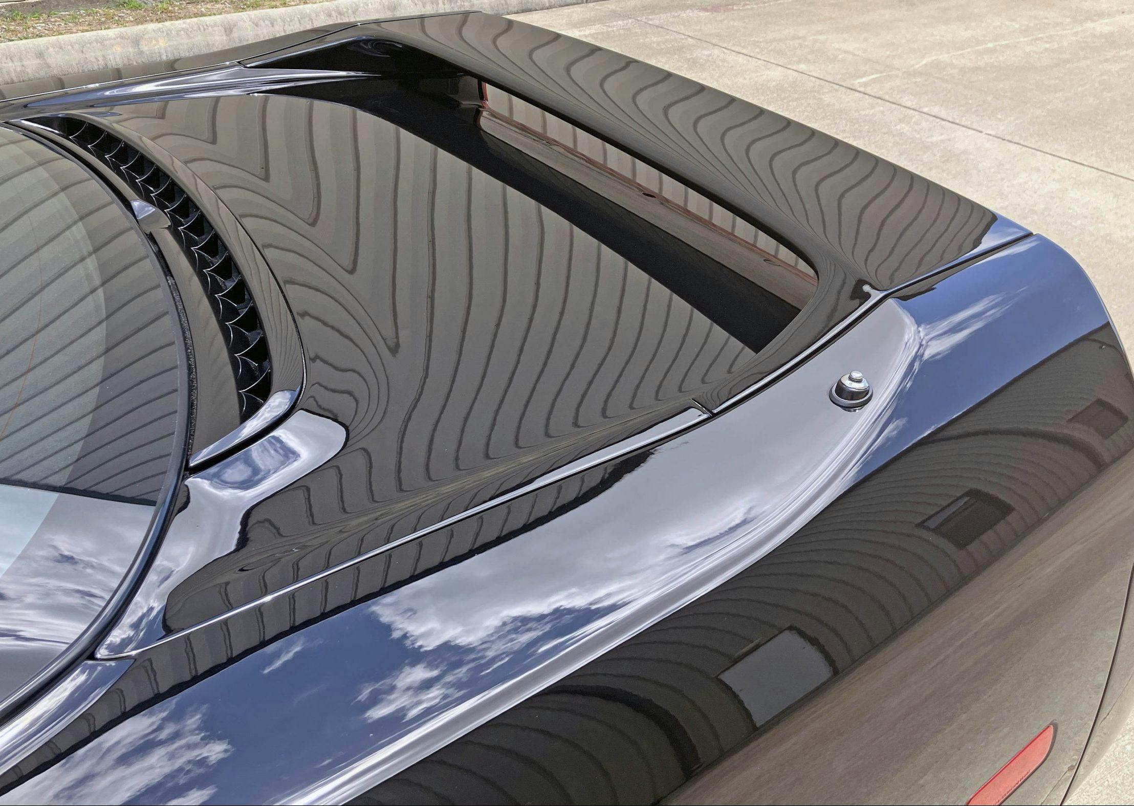
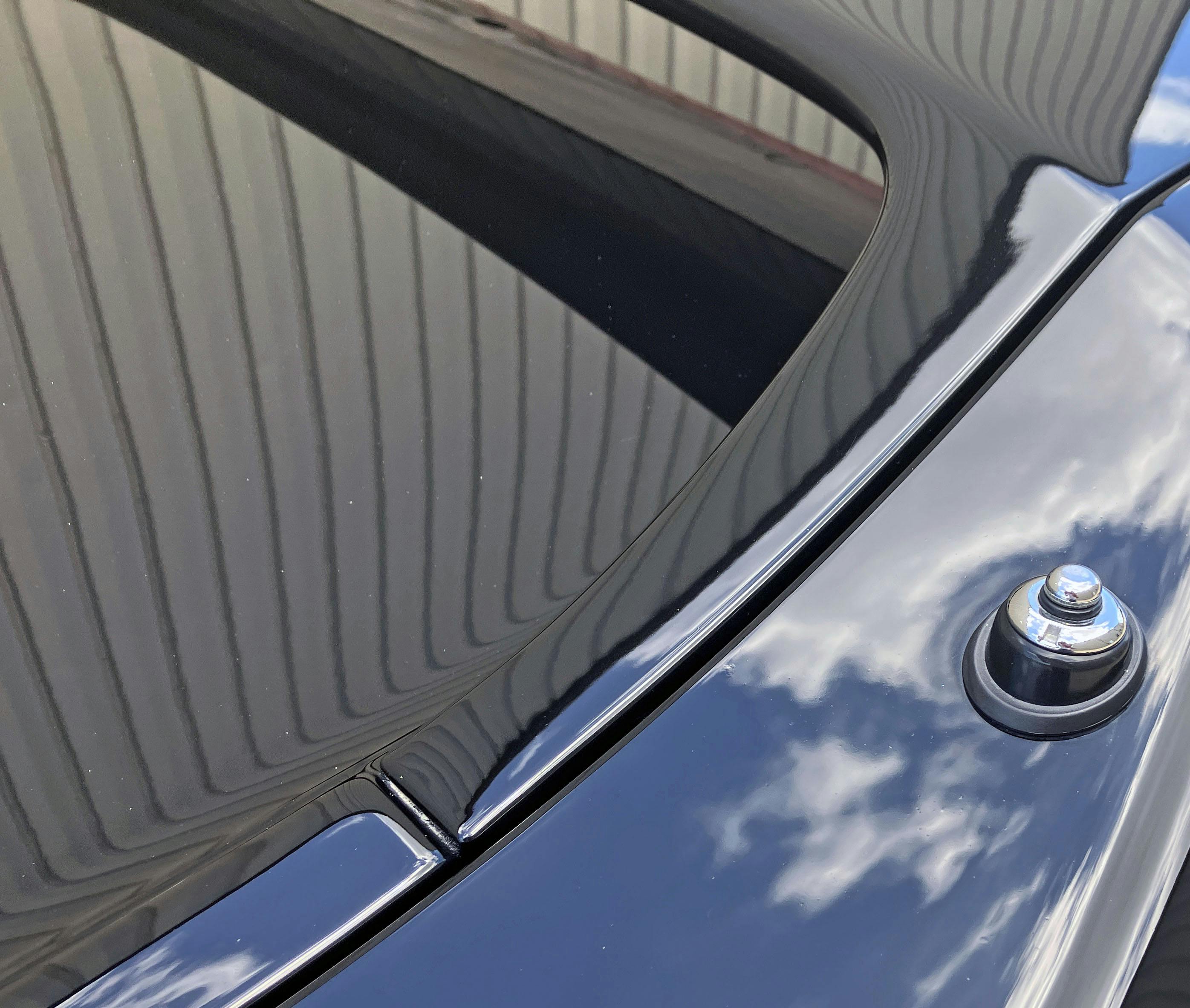
Unlike modern exotics with gaping holes feeding oversized engines and venting thirsty intercoolers, the modest V6 Honda mill only needs this air scoop (and the side intakes, of course) to provide thrills on par with Ferrari’s finest.
Considering all the bespoke engineering elsewhere (like the nickel-alloy ignition key), its surprising to see a run-of-the-mill chrome antenna. Considering the successes of Japan Inc. at the time, making a black replacement seems worthwhile and relatively simple to implement.
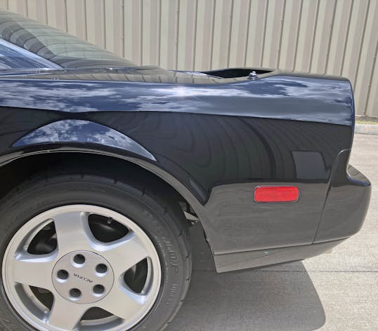
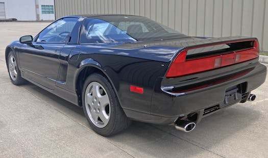
Perhaps the space between the rear wheel and the scoop is actually appealing, at least from an elevated three-quarter view. The “problem” presented from this angle is the NSX’s rear overhang: Compared to the 348, it might as well be an aircraft carrier’s flight deck.
Get down a little lower and the overhang feels right, as if it’s the natural extension of all the long body lines before. And perhaps the overhang is complemented by the spoiler’s integration into the quarter panel, only adding to the flow?
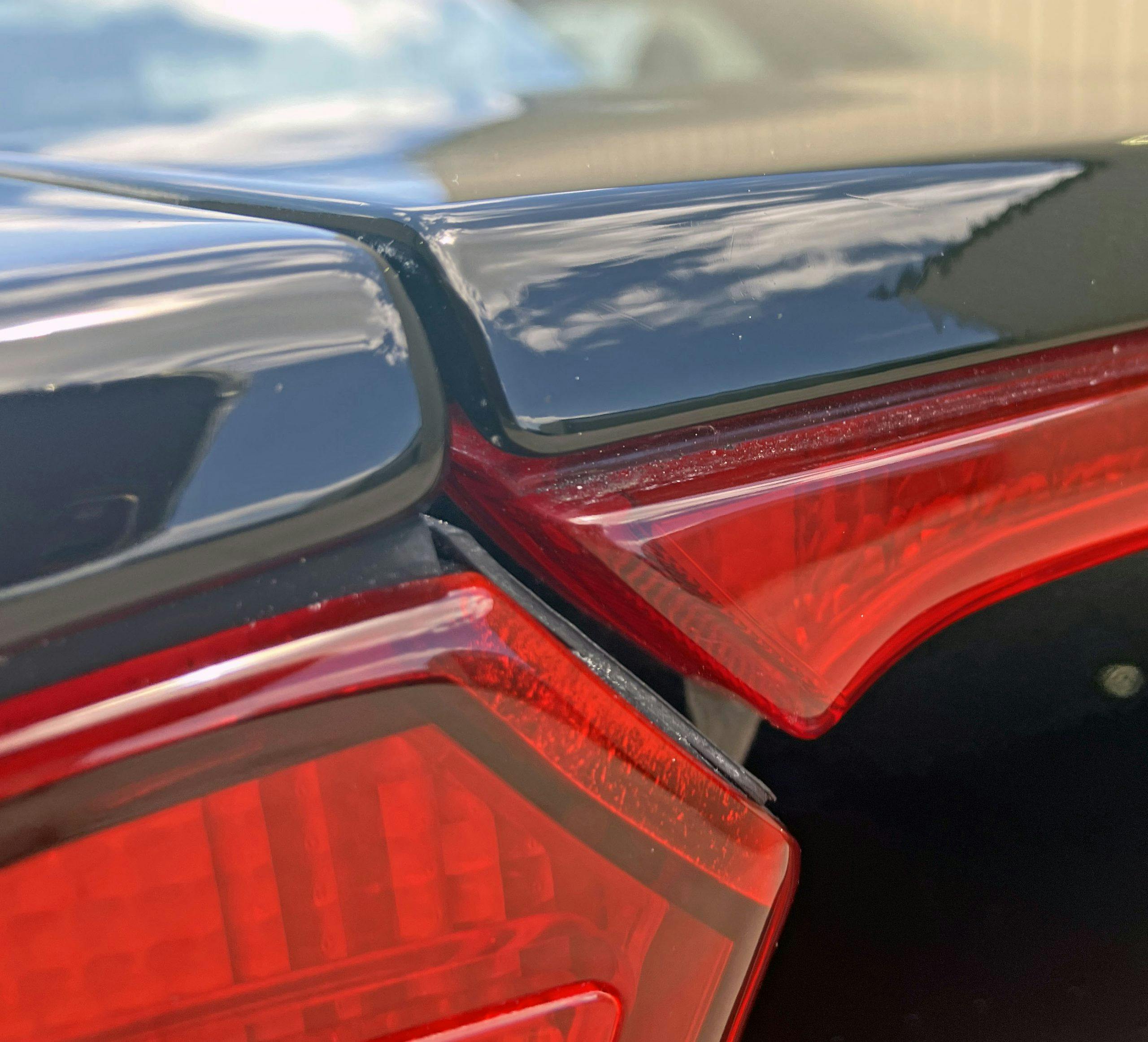
Body contouring is minimal but still present. There’s a gentle bend above the red marker light, and the lower valence dips strongly inward. The look presented does a good job thinning what would otherwise be a rather large posterior for a sports car.
Indeed, you could land an aircraft on that deck. While many newer mid-engine exotics allow the rear window to slide way back and allow for easy viewing of the engine, the transverse-mounted V-6 needs a shorter piece of glass and is hidden by a modesty panel.
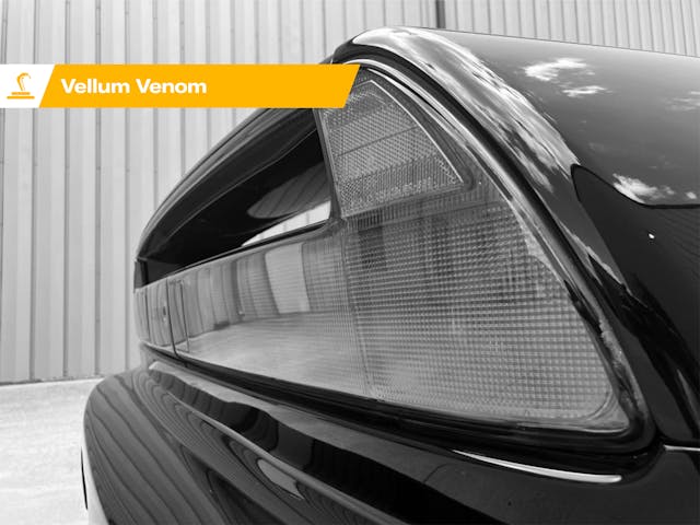
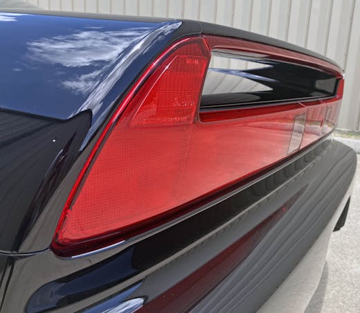
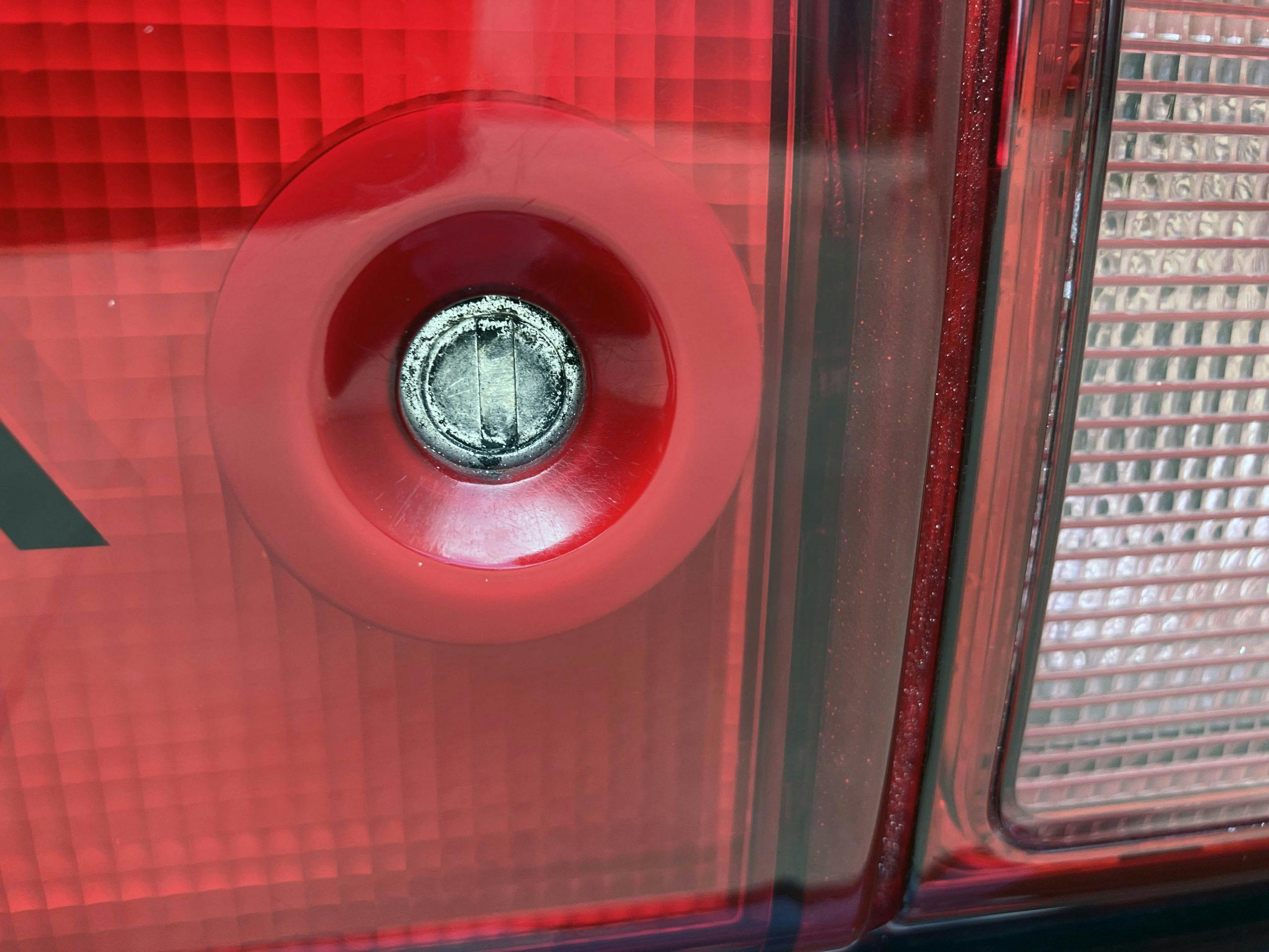
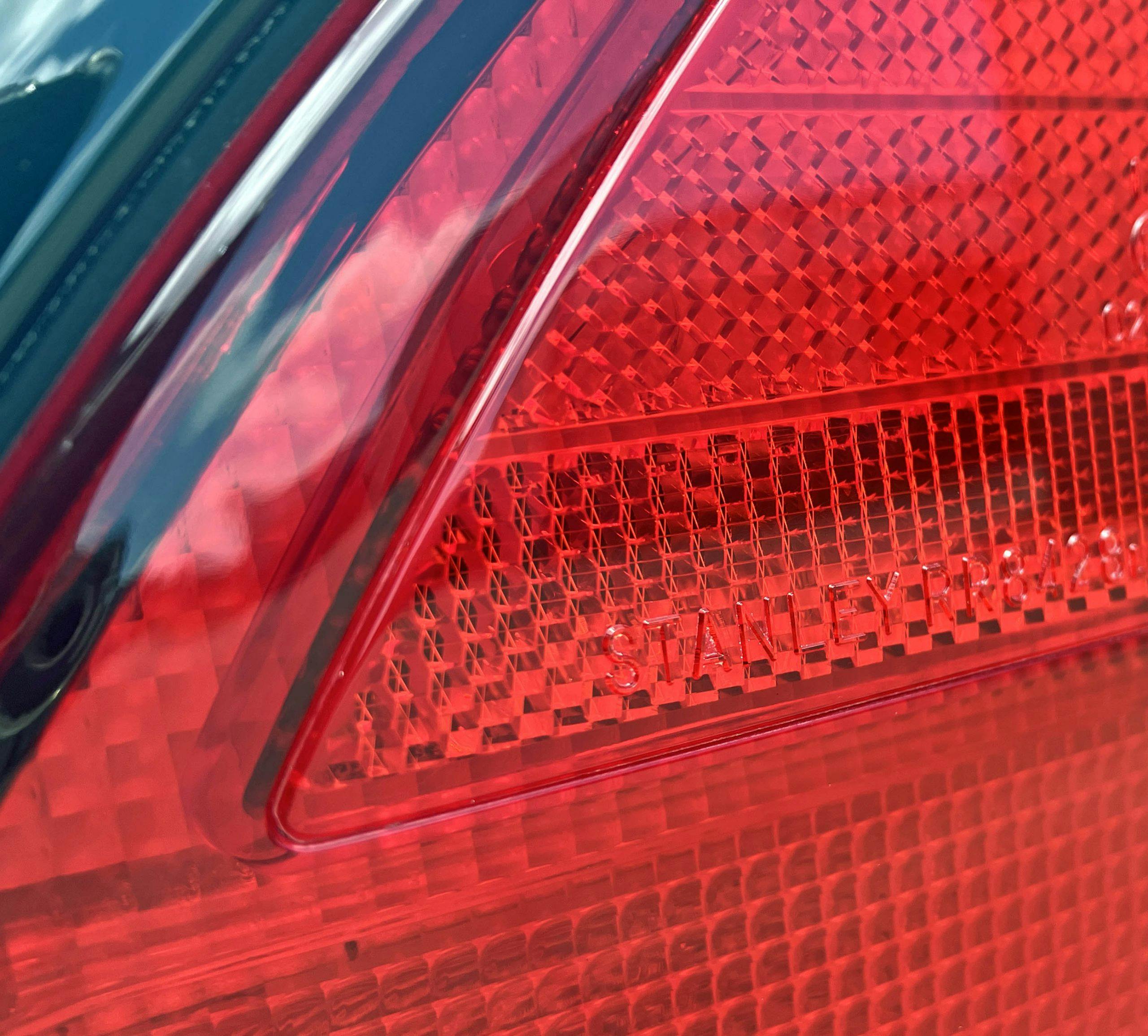
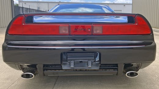
The NSX’s taillamp treatment is a natural extension of all the long lines present on the body sides. Even outstanding elements like the spoiler, trunk lock cylinder, and backup lights must play second fiddle to the pure expression of red plastic.
And what a great gig it is to be a backup musician for the taillight’s command performance. First, the reflectors are cleanly integrated atop the quarter panel. Then the clear backup lights have a red matrix that gives them a stained appearance (so they won’t stand out). Next up is the red lens attached to the bottom of the spoiler (to complete the loop). Finally the key hole is frenched into a matching center panel, complete with the Acura logo. It’s a perfect execution that’s also begging for a modern key-fob implementation to fully realize the designer’s vision.
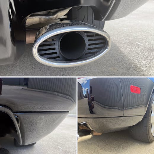
The rear bumper’s utterly conventional “shelf” lacks the creativity of the 348’s toned bumper, but its form complements that massive red lighting feature. The 2002+ model isn’t nearly as slick.
A seemingly unnecessary detail is the fussy nature of the oval sleeve over a round tail pipe. While this cheezy overlay likely ensures a leg’s freedom from exhaust burns, painting it black like most Ferraris’ would put the focus on the body. That said, the aforementioned lower valence that reduced visual weight at the side does the same thing from the rear view.
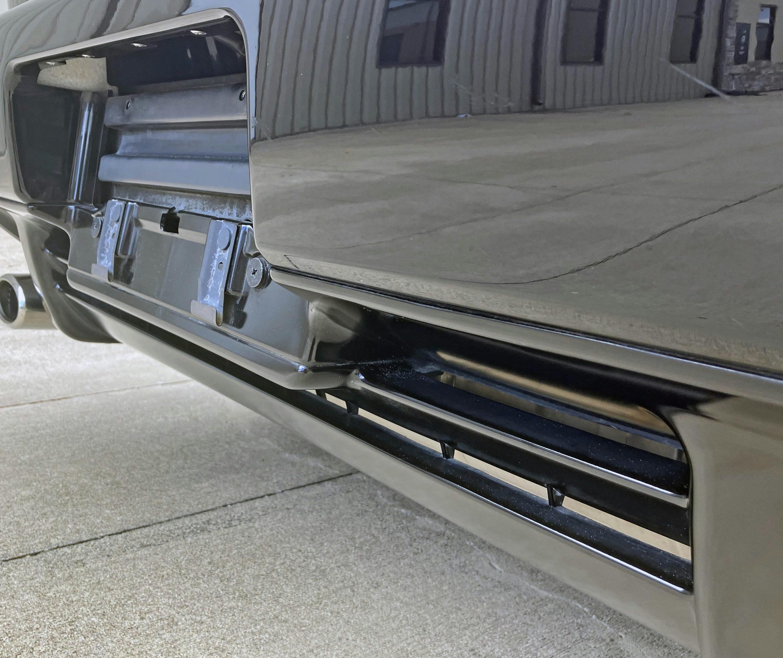
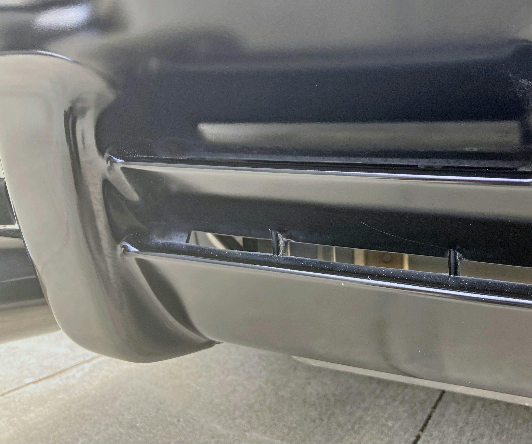
And the reduced visual weight is necessary, as the center of the lower bumper is surprisingly thick and static. Odds are that powertrain packaging constraints ensured the space between the exhaust pipes needed to remain a boring box, but the look still works with the long lines present just a few inches above.
These cooling vents (that double as downforce enhancements?) are downright invisible compared to modern mid-/rear-engine vehicles.
All the finessed performance, the nuanced NVH controls, and the trouble-free motoring experience present in the NSX is perfectly embodied in the unpretentious nature of its styling. It reminds me of the expensive but understated styling risks applied to the third-generation, pop-up headlight Honda Accord. (Which was an outstanding design when placed in a parking lot full of contemporary K-cars, Camrys, Maximas, and GM A-bodies.)
The NSX wasn’t a boring re-pop of a Ferrari 348, nor was it a derivative take on the top-flight Testarossa. It was a well-rounded stunter that deserved every video-game cameo its black roof and big red taillight could get.
As a machine, the NSX stood on its on merits. As a design, time has been extraordinarily kind to its subtle styling.
Thank you for reading—I hope you have a wonderful day.
