Media | Articles
Vellum Venom: 1990 Ford Thunderbird 35th Anniversary
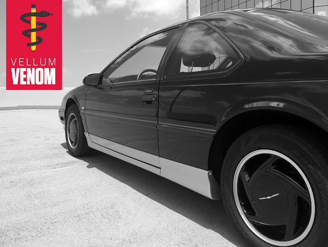
Ford’s plan to sell a BMW-influenced touring coupe at 1989 Taurus GL prices likely failed for three reasons: the resulting car was big, went over budget, and insert unoriginal statement about SUVs killing coupes. Not that Thunderbird owners knew this sad situation, but karma was unkind to both the MN-12 platform and the career of its creator, Tony Kuchta. Which is a shame, since this clean-sheet redesign sported premium car performance without the luxury of a global platform parts bin.
The low-slung, fastback’d, and high-tailed Thunderbird looked distinctly American, likely designed with NASCAR CAFE in mind: Remember that the range-topping Super Coupe’s staggeringly tall 2.73:1 axle ratio kept it from flying miles above its global competition. Cruiser gears aside, the sheetmetal was shockingly minimalist in the details.
Let’s see how little there was to the 1990 Ford Thunderbird, in 35th Anniversary guise.
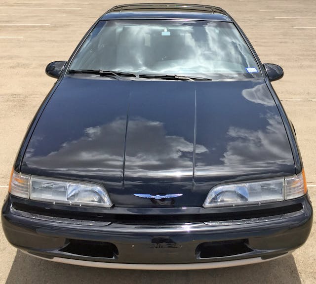
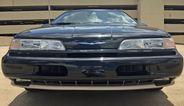
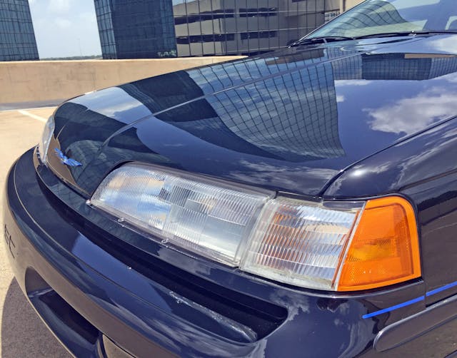
By 1989 there were few personal luxury coupes with even a trace of the upright, traditionally formal front fascias seen just five-or-so years before. However, the grille-free Thunderbird went to the next level in Super Coupe (SC) form, sporting extra cooling ducts so well-integrated they mimic the high-beam headlight (i.e. the inner headlight). It’s as if the headlight is a minimalist mid-century home resting atop the bumper scoop’s complementary foundation.
Aside from the harsh, angular hood bulge rising like a sandbar above the T-Bird’s tranquil lake of a hood, the SC’s minimalist schtick rings true, even with a plethora of ductwork and low-hanging fog lights. It’s a stark contrast to today’s sport coupes, with barn-door-sized facades with angry, gaping maws. There’s such a small amount of space that the cooling slot directly below the headlights (and above the big center scoops) is almost imperceptible on a black paint job.
Marketplace
Buy and sell classics with confidence
Remember that statement about selling “a BMW-influenced touring coupe at 1989 Taurus GL prices”? Keep that in mind when using this shiplap-worthy bumper relief to open the T-Bird’s hood.
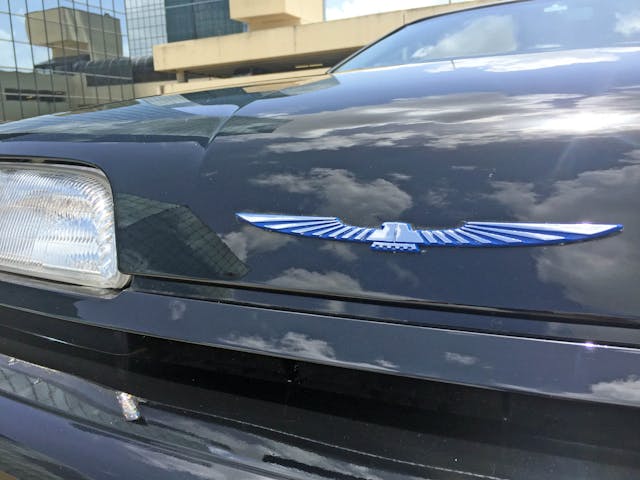
Also note that, once upon a time, a styling studio’s Color and Trim department dedicated significant resources towards the creation of a limited production offering: the 35th Anniversary edition sported Thunderbird-winged emblems on a medium blue background, not the usual semi-flat black. There was also a two-tone body treatment, though it’s very difficult to see with such a forward-thrusting, bullet-nosed face.
The aforementioned cooling slot below the headlights comes into full view here: Only the center section has functional cooling. Too bad about that … and it’s a pity the “SC” embossed bumper is hidden in states with front license plate mandates.
Directional slats in each cooling scoop are an unexpected treat from an era of computer modeling whose capacity pales in comparison to modern CAD systems.
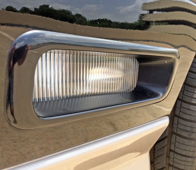
It’s unfortunate that the parts-bin fog lights need a black mounting plate to invisibly “fit” inside the valence. Then again, crawling below the low-slung nose to expose this flaw is far more involved than diagnosing the visual assault of a newer sport coupe’s big, swollen face (cough CTS-V coupe).
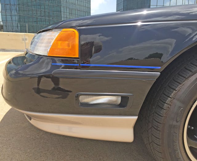
The turn-signal assembly fits well and complements the headlight’s curves perfectly, though its two-piece design clearly dates the Thunderbird. The long cooling slot looks timeless, thanks to a form that replicates the headlight’s horizontal line above and the bumper’s contouring below.
With modern-day build quality (peep that blue pinstripe), one-piece headlights, and a channel-free hood, the SC could be a poor man’s McLaren Speedtail.
While it’s important for a from-scratch redesign to differ radically from the previous model (the outgoing Turbo Coupe had a muscular hood bulge and hood scoop for its oddly-located intercooler) this hood “channel” visually slows the T-Bird’s sleek, streamlined, and scoop-free hood.
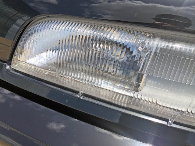
Almond-eyed cars of the 1990s aren’t exactly known for their stellar light output. Perhaps the lack of chrome plating on the low beam’s reflector is one contributing factor.
Luckily the curb-avoiding cornering lights—a luxury car mainstay since the late 1960s—soldiered on for higher trim levels.
The character line behind the signal light continues down the body, adding needed sheetmetal tension. The side profile also shows the headlight’s steep backwards rake and its convex curvature (as it nears the hood’s centerline) quite nicely, while the protruding bumper shows the bullet nose isn’t terribly pointy: The length of its overhang is what gives the impression of a small front end.
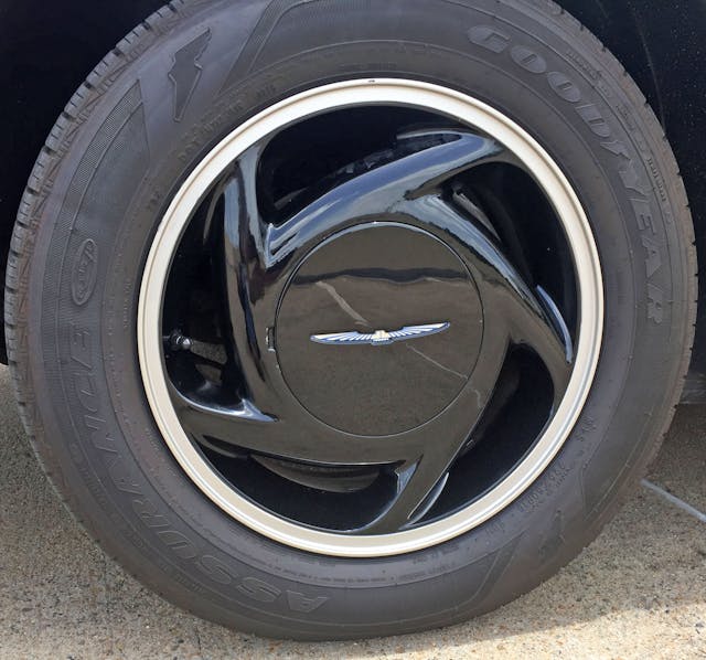
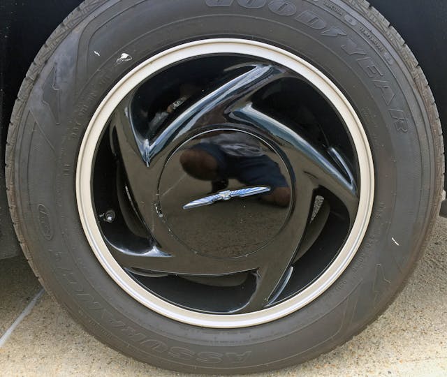
The 35th Anniversary’s silver-rimmed wheel treatment had its share of critics in its day, but makes sense in today’s world of blackout wheel/trim/emblem packages. While wheel caps (rather than exposed lugs) hail from a simpler time, note once again the blue background on the 35th Thunderbird’s emblems.
Too bad the passenger side wheels are “spinning” in the wrong direction. Using directional wheel spokes without designing a mirror image for the opposite side has unfortunate downsides when you see the composition traveling at speeds.
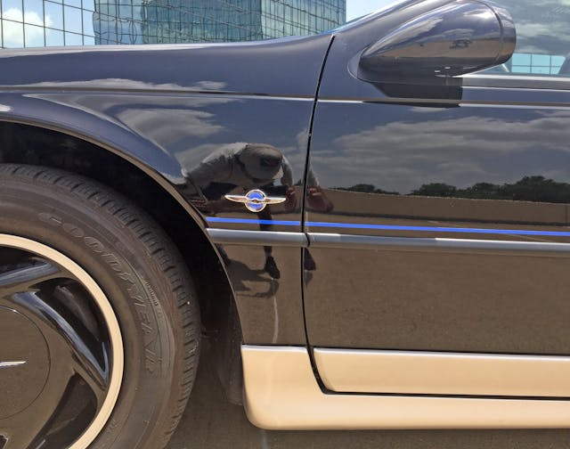
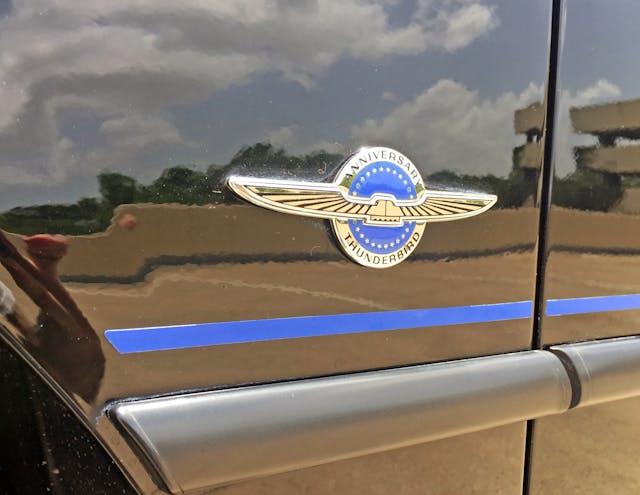
The wheel’s rotation improves once we return to the driver’s side and helps provide a break from the Thunderbird’s flat-faced panels: assuming the character line (top), blue Anniversary stripe/emblem, flat-black rub strip (middle), and rocker panel extensions aren’t enough distraction.
Unlike the freestanding Thunderbird logos, the Color and Trim folks opted for a black-trimmed ’Bird over the commemorative chrome logo. Perhaps the blue circle is enough to continue the theme?
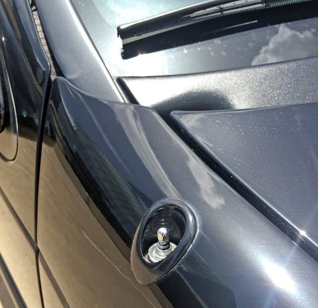
The passenger side fender gets a not-so-modern power antenna. While the antenna is at least recessed, this body is begging for an unit embedded in the rear glass, as seen in Fords of the late 1990s.
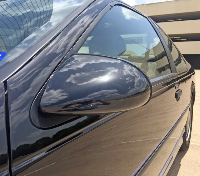
Panel gaps of this era were pretty large, but the T-Bird’s flat door pillars (and thus, its requisite thick windshield trim) were a significant change from the previous generation’s configuration, which featured doors that wrapped around the roof. This car’s teardrop side-view mirrors are significantly more bulbous than their surroundings: Note the mirror housing’s overlap against the straight line of the A-pillar’s weatherstripping.
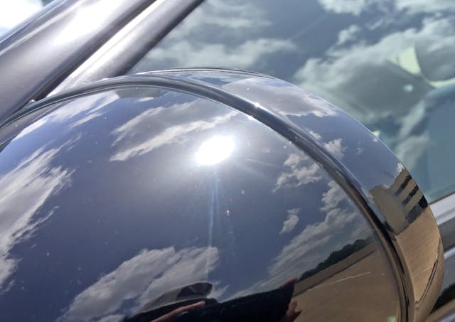
The mirror’s perimeter lip feels thick and slow compared to the rest of the body lines. Future products of this era (Mark VIII, Gen II Taurus) had a smooth mirror.
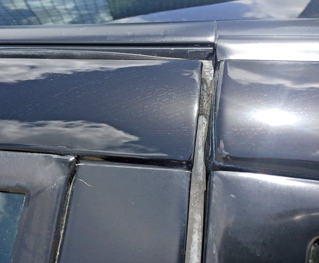
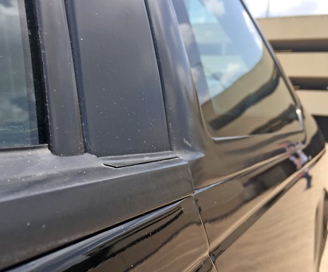
The weatherstripping divot (designed to ensure the window rolls up at high speeds) was standard practice for the era, but the massive black trim between body side and roof might be the result of contemporary body construction techniques. Even so, an overabundance of blackout trim (heavily implemented by all Detroit automakers) for high performance vehicles was still acceptable during the SC’s heyday.
Go outside and check out any late-model Ford Fusion as an example of a proper integration.
At least all this rubber keeps the oversized doors quiet at highway speeds: Big gaps and not-quite-flush fittings are definitely a reminder that we have upped our quality game since 1990.
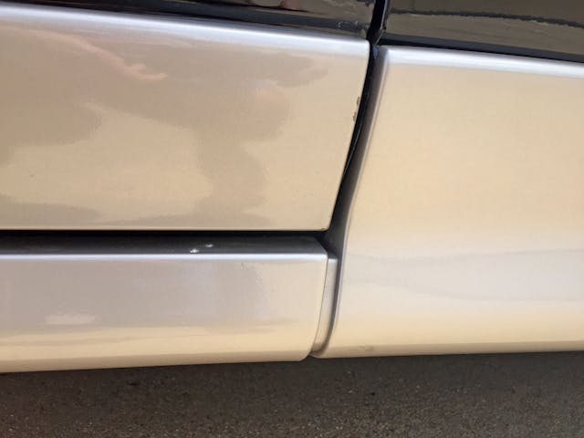
The gaps around the side skirts continue the “large and uneven” theme. At least the door cutline isn’t as flat as the body side’s nearly vertical cross-section. (Open the door and note the bodyside’s flatness).
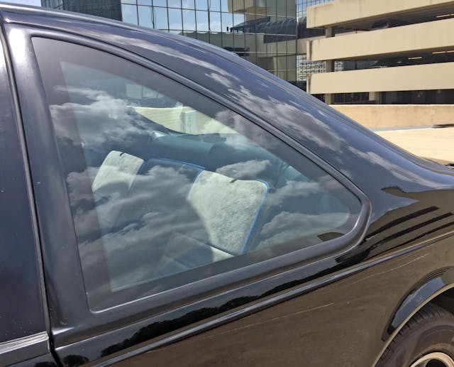
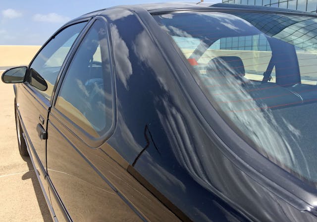
The blatant rip-off of BMW’s famous quarter-window Hofmeister kink (pictured in lower right-hand corner) proves just how badly Ford wanted to reprise a BMW 6 Series (E24) theme for the MN-12 platform. Maybe the homage is worthy, because most E24s face an uphill battle against the much cheaper Super Coupe on either the road or the track.
Also note the blue piping on the 35th’s unique seat covers: a respectable tie-in.
The daylight opening (DLO) has both a bottom runner (on the door) and a fully-flush quarter window, which forces a clumsy transition at the quarter window’s leading edge. Ford did better when the MN-12 transformed into the FN-10 Lincoln Mark VIII.
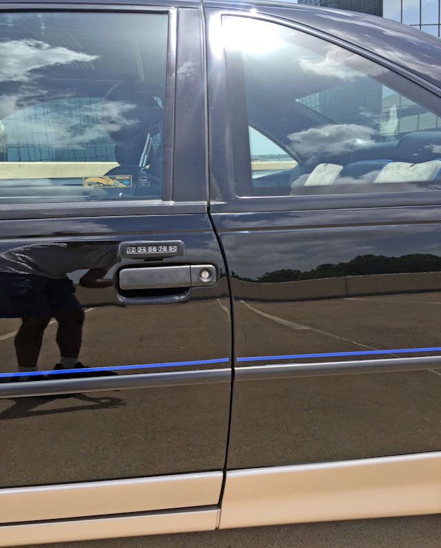
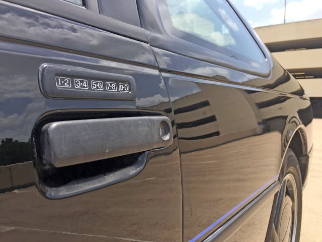
Ford’s (then 10-year-old) keyless entry system remains surprisingly relevant to modern-day FoMoCo fans. The lighted lock cylinder is remarkable for its integration into a pull-up door handle (also unusual in today’s world of ubiquitous pull-back handles) but the affair has an asymmetric footprint (the part where you stick your fingers) that feels unrefined, even if the integration of handle and lock is very sleek.
The SC’s tacked-on door applique blends nicely, even with the 35th’s eye-popping color choice. Can’t say the same for the titanium-colored gap between the two panels comprising the SC’s side skirts.
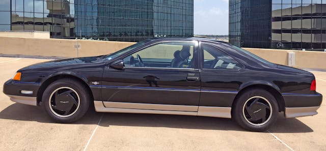
The SC has assertive lines, most notably where the Hofmeister kink naturally lines up with a small section of the wheel arch. This is how a rear-wheel-drive car flaunts its superiority to non BMWs the bevy of wrong-wheel-drive coupes recently released on GM’s W-body platform.
Remember how this platform was a failure in the eyes of Ford management? Note the generous dimensions of the rear seating area: It’s not easy carrying the torch from the long-gone days of families buying two-door vehicles while benchmarking Bavaria’s finest.
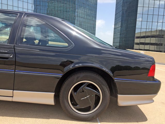
The SC’s unique ground effects accentuate the T-Bird’s monumental wheelbase and prodigious front/rear overhangs. The sort-of-ground-hugging side skirts and bumpers have mostly parallel lines that gently bend down (to meet the wheels) and venture up (to complement the bumper). Open this link to see an E24 in side profile in another browser tab: The Thunderbird diverged substantially from the BMW benchmark, especially in the doors.
Well-regarded Ford tuner Kenny Brown made a shorter-wheelbase version for SCCA-worthy motorsports, narrowing the gap between Thunderbird and E24. Sadly, the ridiculously fast roofline was out of proportion after the change.
The C-pillar’s long lines are somewhat muted by the body’s overall slab-sidedness. While this configuration is likely more aerodynamic than the preceding 1983–88 “Aerobird,” those earlier ’Birds boasted surface tension translating into more muscular haunches.
The T-Bird’s rear deck tapers from the Hofmeister kink’s highest point at a far less aggressive rate than does the E24’s. A taller rear end often improves aerodynamics (at the expense of low-slung style), and the T-Bird’s slippery 0.31 coefficient of drag against the outdated E24’s 0.40 Cd might prove that point … if you believe one data point makes an argument.
Perhaps proving the T-Bird’s subtle height increase, remember that this character line started at the front signal light … but ends above the tail light.
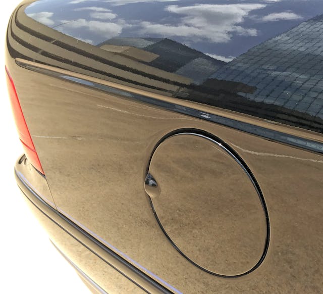
Ah, to live in an era when bodysides were clean and clutter-free, with plenty of flat real estate for a conventional fuel door that doesn’t need to be smeared over a bizarre contour.
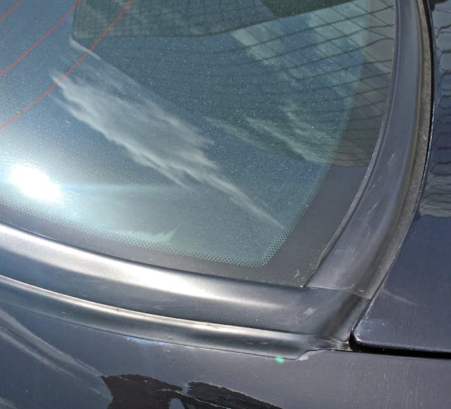
If only all the T-Bird’s rubber bits fit this well.
This long, fastback C-pillar may be another reason why the T-Bird has a 0.31 drag coefficient. Perhaps this is why every new aerodynamic sedan on the market has a similar design, much to the detriment of rearward visibility and trunk aperture size.
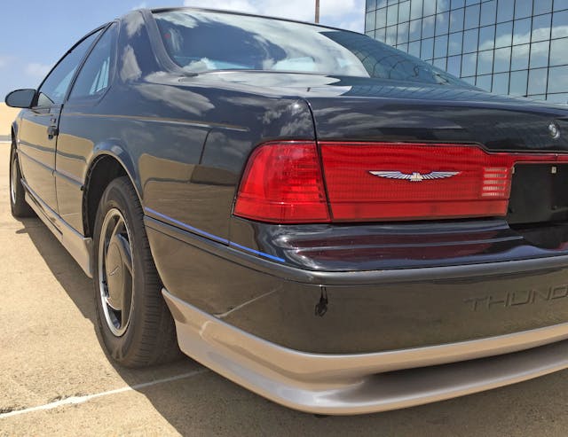
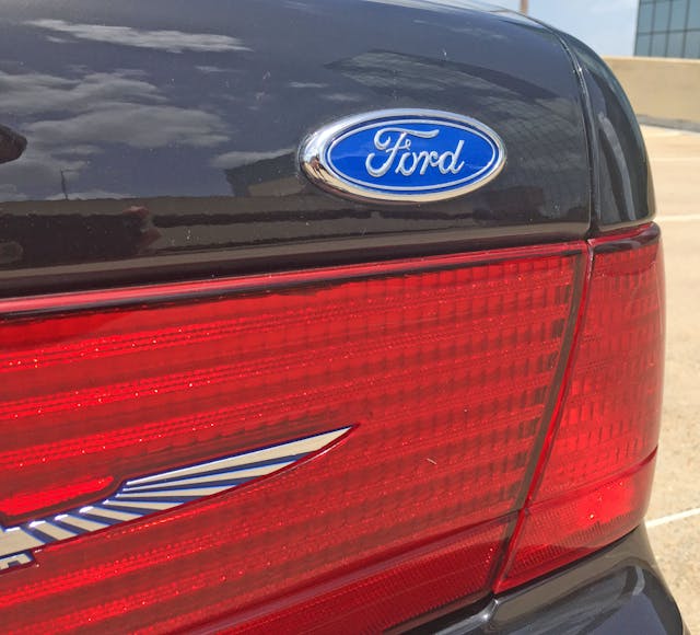
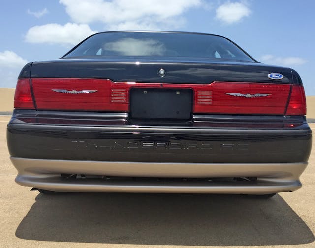
Small trunk openings weren’t a problem for this big ’Bird: Thanks to all that overhang, this deck lid is likely twice the length of a Chrysler 300’s. This adds visual presence, and clutter-free lines are only broken by a dip in the center section to thin out the heft of the corner-to-corner taillight treatment.
Considering these early ’Birds (1989–91) had non-functional red plastic on the trunk, adding a bit more red (easy, with no lights to engineer) to straighten out that line might look better, not boring. That said, the 35th’s blue-backed emblems combined with the blue pinstripe make a rewarding treat for the detail freak.
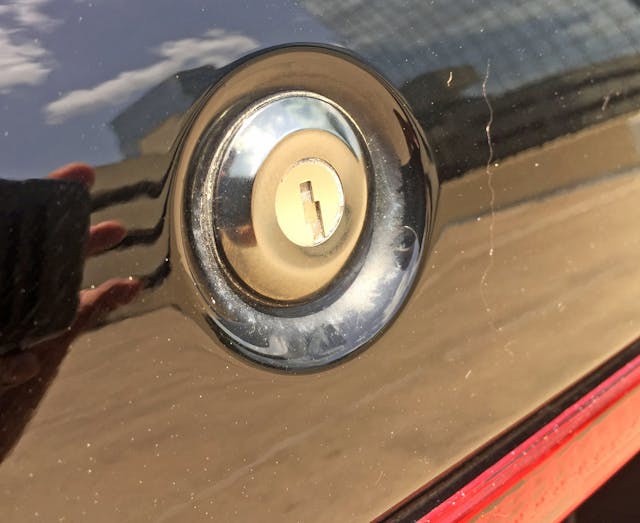
A lock cylinder mounted front and center is a logical and durable throwback, but this sleek body deserves a more modern touch.
Corvettes don’t have Chevrolet bowties, and both previous and subsequent Thunderbirds were free to fly their logo on solo flights. For shame!
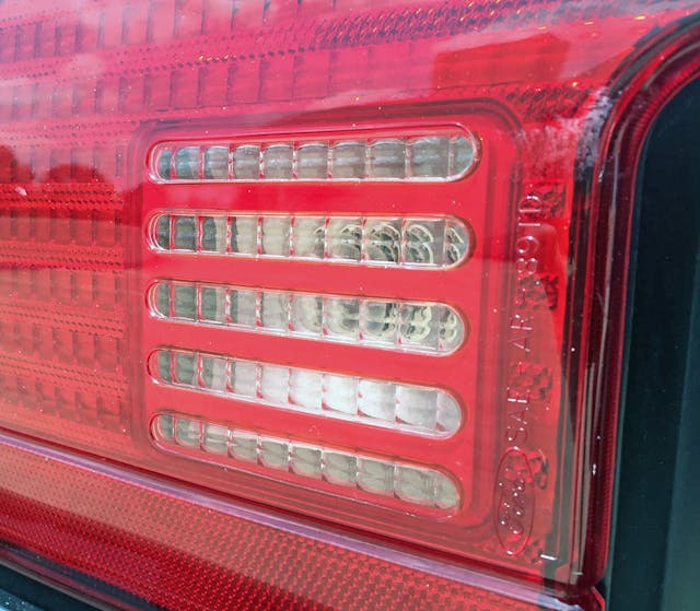
The red trunk lens is actually a two-piece affair. Perhaps one-piece luxuries were reserved for Lincoln Town Cars with good reason?
Well, something does light up in these assemblies: The cheese-grater style reverse light is not unlike the Fox-body Mustang GT of the era.
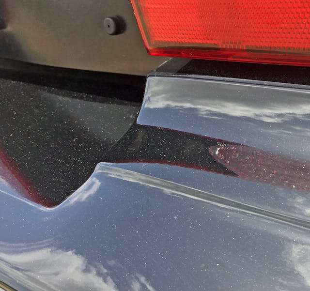
The bumper’s transition from matching the lights to matching the (taller) license plate is much like the hood bulge: surprisingly harsh.
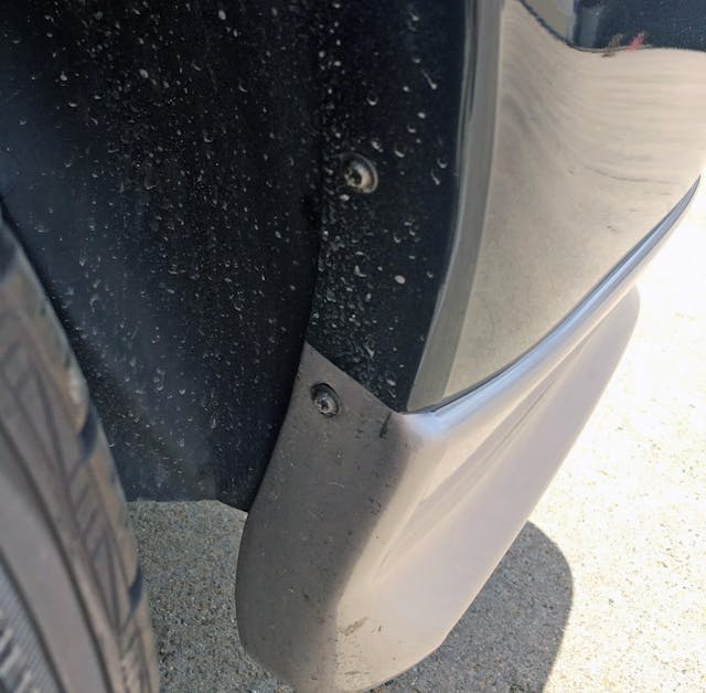
Exposed screws are a sign of the past, but modern bumpers with breakaway/throwaway plastic hardware are nothing to write home about. However, the 35th’s color scheme requirements must have been a significant change to normal bumper production on the assembly line.
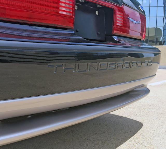
The SC’s unique bumper has several delightful layers: a subtle diffuser, several thicknesses of shiny black and titanium paint, a thick flat-black rub strip, and embossed lettering that sings to the enthusiast’s soul like a dollop of butter on a croissant sings to a foodie. Torque from a twin-screw supercharger is like butter, right?
While the functionality of this bumper diffuser deserves to be questioned, wouldn’t it be nice if such a subtle vent for underbody air were just as helpful as the radical ones seen in today’s machinery?
So many parallel lines, such well-organized space crowned by two aspirational emblems (not the one in the corner—sorry, fanboys) for maximum brand recognition. This Thunderbird’s minimalist form took the successes of the original Aerobird and built a seriously slick pair of wings in return.
While the long wheelbase and macho overhangs have their critics, these features ensured that nobody confused this luxury coupe/grand tourer for its Bavarian competition. Wouldn’t it be wonderful to say that once again about an American icon that isn’t a muscle car or truck?
Thank you for reading, and I hope you have a lovely day.













HI SAJEEV, I ENJOYED YOUR POHOTOS AND COMENTS ON THE THUNDERBIRDS I BOUGHT A 1989 T BIBD NEW AND DROVE IT 20 YEARS AND 350000 MILES ON THE ORIGIONAL ENGINE AND TRANSMISSION WITH NO MAJOR REPAIRS. THE HEAD GASKET DID GO AT THE END AFTER 20 YEARS OF GREAT SERVICE. I WILL LOOK FORWARD TO YOUR FUTURE ARTICLES!
Thank you for reading, John! I sincerely appreciate it!
I have the 35th edition Thunderbird SC. It has about 190,000 miles. I let sit (covered) for a few years. Big mistake. I think this car was meant to be driven. While sitting things/parts went bad. I have since restored the can and it as close to running like the 1st day I drove it. After 23 years I still love driving it.