Media | Articles
Vellum Venom: 1983 Aston Martin Lagonda

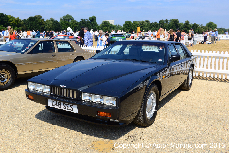
It’s likely you remember the first time you saw an Aston Martin Lagonda. Almost nothing prepares you for the moment, for the sheer audacity Aston Martin possessed to make a wedge-shaped luxury sedan whose only peer is the Lamborghini Countach.

I had a ringside seat to the restoration of this 1983 Lagonda. When I spotted its iconic coachwork seared into the circuit board of its gauge cluster, I knew one day I’d write about it.

Like a moth to a flame, I can’t stop looking at its stunning combination of luxury touches (that traditional Lagonda grille, chrome accents, long hood) and low-slung, supercar-like proportioning. It has more 90-degree angles than curves, but it works…from most vantage points.

The comment about proportioning might ring hollow, so here’s a shot of the grille with my hand for reference. Not pictured is the fact that I was on my knees to rest low enough to get this photo, a position was last reserved for my Vellum Venom on the Countach. But remember, this was supposed to be a superior alternative to a tall, stately Rolls-Royce.

William Towns’ famous folded paper school of design is evident in the power bulge hood, the slab-sided fenders and the upright front fascia. But “folded paper” is a bit misleading, as I’ve seen another designer associated with the term.
Marketplace
Buy and sell classics with confidence

But folded paper can throw you a curve, as a longer stare shows Towns’ intent to sneak a few bends into the design. The hood’s strong taper (note how the building’s reflection shrinks and grows in places as it reaches the front end) is one of the more forgotten Lagonda design elements.

The intersection of grille, front fascia and hood explain the concept of “folded paper” best, as it lacks all the curvaceous surfacing of, say, the 1980-89 Lincoln Town Car from this angle.
Since folded paper isn’t unique to Towns’ portfolio, perhaps we should refer to him as the progenitor of 1970’s minimalist design for the United Kingdom’s car scene, with a legacy as impactful to the country as the Brutalist architecture featured in London’s iconic Barbican Centre. (What I wouldn’t do to drive this Lagonda around the Barbican!)

The center bonnet crease has been a part of British motoring virtually since its inception, but the 1970’s wedge minimalism has reduced this center-hinged, aggressively-spined hood into a pair of recessed creases. That’s brutal, in the best way possible.

The chrome rectangles frame a multitude of lights, and none of them are the low or high beams. Since the Lagonda was designed in the 1970s, it was easy enough to source blocky-shaped fog, driving, turn (amber), and city lights (above the turns).


The city lights are in an elevated position, but their execution leaves something to be desired when you’re on your knees and examining from the side.

Achieving pure 1970s wedge minimalism was difficult back then, and the flush mounting and hidden attachment points for lighting pods that we expect these days simply were not possible for the cash-strapped company. Perhaps the later Series IV “six headlight” Lagondas did this better, but the sleekness of vintage lights under a clear cover cannot be denied.


One of the raisons d’etre of this design is the impossibly skinny front end. And that can only happen with pop-up headlights, as the Series IV Lagonda looks just a smidge taller in the face. Look at the size of conventional headlights relative to the fog/driving lights below: The reduction in frontal area from smaller exposed lights cannot be understated.

You never see the Lagonda’s bumper shelf from this vantage point. Note how the lower third is a relief, removing visual weight while providing a design that meets American bumper regulations of the era.

From a more expected angle, the Lagonda’s bumper relief provides necessary surface tension. Even though these are huge bumpers, they somehow look subtle and restrained with the rest of the body.


The bumper valance likely provides an aerodynamic benefit, and it further accentuates the Lagonda’s impressive amount of front overhang. Too bad you can only see it if you’re crawling on the ground!


Like most cars from the Malaise Era, the Lagonda had a hard time smoothly integrating the bumpers with the fenders. Body side mouldings (above the side light) are also curiously short, and the protruding side lights belong on a British roadster from the previous decade.

I know money was tight in the British Leyland era of UK auto manufacturing, but Aston Martin wasn’t part of BL and really shoulda bought some early 1970s, flush side markers from a fuselage era Chrysler. After all, they already raided the Pentastar’s parts bin for its 727 Torqueflite gearbox. (The Imperial’s cornering light would have looked great too, considering all the lights up front.)

But there are no such qualms with the blade fenders thrusting ahead of the front fascia. It’s perfection, especially when paired with the hard bend in the header panel and the chrome trim around the lights.

The hard bends and gentle curves here shows the power of refining a design via surfacing, instead of what Tesla did almost 50 years later with their blade-fendered Cybertruck.


But the references to a poorly-crafted flagship truck end quickly, as the Lagonda’s expertly surfaced hood contours change the front end’s demeanor depending on the viewer’s position. The higher up you go, the more radical the wedge design becomes.

Scale means everything to a Lagonda, because that tiny grille turns into a hood bulge that fans out, covering a huge amount of surface area.

But from this angle the hood bulge looks like a straight line. The Lagonda seems to relish its ability to trick your eyes into thinking it’s nothing more than a long wedge of 1970s minimalism.

William Towns wisely made the headlight covers replicate the straight lines of the fascia and fenders, while offsetting the boxiness with an assertive angle to match the hood bulge.


Of course, proportioning is what makes the Lagonda so special. Without such a long dash-to-axle and excessive front overhang, there’s no way this hood could look so futuristically luxurious, and that front end could descend so dangerously low.
And again, note how the higher up you go (second photo), the more the Lagonda looks like a cheese wedge.

Dropping that hood line so aggressively further accentuates the radical 1970’s wedge design, otherwise these blade fenders would look static and mid-century, like a 1961-69 Continental.

Maybe I was wrong when I said the Lagonda “has more 90-degree angles than curves” because there are way more gentle curves than right angles on its bodyside. Those wheel arches hug the tires with sincerity!

Just like the hood bulge, the fender’s downward slope is surprisingly upright from a standing position. But the body isn’t exactly “folded paper” as others may have you believe, as the hood bulge and the wheel arch contouring are downright curvaceous.


Luckily, cars from this time period have tiny cowls, so the area at the end of the hood and the beginning of the windscreen is just as minimalist as the rest of the vehicle. Only a hard bend at the end of the hood introduces the viewer to the wiper arms.

Not being able to make one-piece mouldings with custom shapes at the ends has its downsides when it’s time to restore a car. No matter, the fender again proves to us it possesses soft contouring around the wheel arch.

While the body is a radical design from the 1970s, the color-coordinated wheel design looks oddly reminiscent of the most expensive vehicles from the 1930s. Later Lagondas switched to modern alloy wheels, often in a mundane shade of silver.

Behind the wheel is that insane dash-to-axle, longer than the front overhang on many modern cars.

And all that dash-to-axle means that Towns was able to style a radically-slanted A-pillar. Even with all the real estate it takes up, the Lagonda is so long that the hood is still incomprehensibly lengthy.


The Lagonda’s Lamborghini-like demeanor comes into focus when seeing how the door glass and the flat windshield form an automotive greenhouse worthy of a cheese wedge. A really expensive cheese, presumably.

Too bad British craftsmen of the era couldn’t make a unique side mirror that fused with the black plastic triangle ahead of the door. Because that triangle is DLO FAIL, and it could be the first one ever put into production, all the way back in 1976!


While the windshield is worthy of the British phrase “near as dammit” to being perfectly flat, the side glass does have an aggressive inward curve indicative of tumblehome in the passenger cabin.

The transition from a greenhouse with ample tumblehome to a wedgy body happens with the aid of negative space. Nice.

It’s beyond difficult to make a radical B-pillar on a three-box sedan, and the Lagonda’s straightforward affair only proves the point.

Since this is a luxury car and not a Lamborghini, the roof pillars must remain somewhat upright. But the height and shape of the rear door (as it hugs the wheel arch) suggests rear occupants won’t easily glide in and out, as one can in a Rolls-Royce.


There’s no need to advertise with an emblem, as you know you’re hopping into a luxury car when you see a roof that upright, contrasted by its hard-edged contours and doors for the fuel system.


The rear door’s upkick at the end (to meet the quarter panel) is a solid rejection of the soft, rounded lines usually implemented to accomplish the same feat. But this adjustment isn’t aggressive enough to alter the size of the rear window, as Series I and II Lagondas have fixed rear windows like a 1978 Chevy Malibu sedan.

Frozen rear windows aside, the Lagonda truly reinvented prestige for the modern era of aerodynamics. It had the proportioning of a tennis court, low enough to the ground to suggest that Towns shrink-wrapped every element of the passenger cabin to ensure there’s no wasted space.

But Lagondas prove a most basic point: The cab backward school of thought clearly makes for a more prestigious vehicle. The proportioning is further enhanced by heavy contouring below the chrome strip at the bottom, as it visually lightens the body and lets you focus on everything above the tires.


Unlike retro-styled Rollers and the stumpy-butt Continental Mark series, the Lagonda pulled a premium bunny out of its hat by avoiding the long hood, short deck aesthetic. Instead there’s a long decklid with a gentle downward slope, which increases trunk space in what otherwise would have been a low, shallow trunk.

Just like the base of the Cybertruck’s massive single wiper blade, this sheetmetal wedge for the power antenna serves a purpose, but is a bit of a letdown compared to the hood. At least it has a downward slope that matches the contouring of the entire decklid.

As if it’s a carbon copy of the front fender, the rear fender has the same downward slope, long lines, chrome trim and an inappropriate, clumsy marker light.

There’s a smart-looking crease in the middle of the chrome trim, which adds a bit of surface tension to a part of the Lagonda that could have otherwise been undefined and lazy. The bevel also accentuates the “stair step” effect in the lower quarter panel, as it thins out and turns away from the camera.

From some angles, the rear quarter panel appears misaligned from the decklid. It doesn’t look as elegant as the extended fenders up front.

But that isn’t necessarily the case, as there is a significant amount of extension from the decklid. Also note how, just like the front, the decklid falls down to the ground a bit quicker than the quarter panel.

Much like the slender lights in the deck lid, the top and bottom of this lid is impossibly thin. The license plate is deeply recessed, which helps mask the size of the parts bin looking-license plate light assemblies.

Usually luxury cars revel in having massive proportions and labored details in a place where hands open and close a trunk (i.e. around the rear license plate/trunk lift), but the Lagonda again bucks the trend with a thin top and minimal amounts of chrome.

Much like the Hyundai Ioniq 5 after it, the Lagonda’s pixelated lenses with individual rectangles for each task (turn, stop, reflector, etc.) is as high-tech as its radical electronic dashboard.

Like the Lagonda’s front, the rear bumper doesn’t exactly integrate elegantly with the fascia and the blade-shaped quarter panel.

The “stair steps” seen in the side (below the quarter panel) strongly transition into the rear bumper. It’s more of the same concept: reducing visual mass so the rest of the body up north (as it were) looks lighter and sleeker.

There’s an exhaust tip at each corner, and a blank space where European-spec Lagondas have rear fog lights. It’s a shame they are too narrow to integrate the twin-tipped mufflers, as U.S. markets likely wouldn’t have minded a little chrome exhaust action on their ultra-pricey luxury performance sedan.

The center “bump” in the rear bumper is a modesty cover for some functional bit of the body. Odds are this was absolutely necessary to keep the Lagonda’s clean, minimalist wedge look from the outside.

While that bump at the base of the bumper looks ungainly on an otherwise restrained posterior, it also highlights the importance of raw geometry in minimalist wedge cars of the 1970s.

The Lagonda’s form looks like a spaceship from the distant future, designed with a singular purpose to move through space without ornamentation or pretense.

Modern art appealed to elites a century before Aston Martin built the Lagonda, and it took another 70 years for Geometric Abstraction to pave the way for a Lagonda-like automobile.
Cars were never ready for minimalist perfection until that magical time during the Malaise Era, when William Towns and his team elevated it to production-car status across the globe, in an automobile with an ergonomic cabin and a usable trunk—no offense to Marcello Gandini and the Lamborghini Countach.
While production was limited for a great many tragic and regrettable reasons, Aston Martin had the nerve to put the Lagonda into showrooms. It was an abject failure by most metrics, but it had a pure design, with the performance pedigree of a thoroughbred beneath the skin.
And that’s a moonshot worthy of acclaim, something all enthusiasts wish manufacturers would try every once in a while.
Thank you for reading; I hope you have a lovely day.
***
Check out the Hagerty Media homepage so you don’t miss a single story, or better yet, bookmark it. To get our best stories delivered right to your inbox, subscribe to our newsletters.


Find more values
Search for prices of other cars, trucks, vans and motorcycles


If you ever wanted a car that looked like a Seville and a Trans Am had sex…..here it is.
“I know money was tight in the British Leyland era, but Aston Martin really shoulda bought some early 1970s, flush side markers from a fuselage era Chrysler after they raided the Pentastar’s parts bin for its 727 Torqueflite gearbox.” -Aston Martin was never part of British Leyland.
Yup, I re-wrote that section to make my thoughts on tight UK budgets a bit clearer. Thanks for that.
I don’t think the author intended that to be read into the reference. I just saw it as a reference to the time when BL was at its nadir…as was the British car industry in general.
Yup, but it could be written better, so I gave it another go.
I remember the first time I saw one of these, in 1986. At first I thought it was a customized Chevy Caprice. Still not sure whether or not I like it.
I thought someone made a four-door version of KITT from the Knight Rider TV show.
“What I wouldn’t do to drive this Lagonda around the Barbican!” What happened to your article series cars and architecture, Sajeev? Talk about an awesome entry. There’s a guy in the UK who has like 30 Lagondas. I’m sure he’d lend you one.
You have a good memory, and yes, I should find a Lagonda and AirBnB a place at the Barbican. That’s a bucket list item, for sure.
We share the 2 passions in common. For example, one of my biggest regrets is not being old enough to see Max Hoffman Auto Showroom at 430 Park Avenue in Midtown Manhattan done by FL Wright. But Hoffman’s house by FLW still stands. Sounds like a visit in a burnt red Packard convertible should be on that same bucket list.
I agree!
I remember seeing one off Lovers Lane in Dallas around 1988. I had read a review in a car magazine at the time – can’t remember which as I had subscriptions to R&T and Motor Trend – and immediately spotted it on the street. I thought it was awesome and still do if for no other reason than being pure and uncompromising in achieving a clean and angular wedge shape for a luxury sedan. I know it was imperfectly executed and the fancy dashboard was a disaster, but it was cool nonetheless. It’s disheartening to see things up close and realize that choices are made is sourcing lamps lenses and marker lights and other parts from more pedestrian mass market cars in order to control cost. At the time I liked to assume that every part down to the last nut and bolt were bespoke, made just for this car. But hand made thinks are always imperfect. I’d like to see one completely reinvented with a modern drivetrain (and not electric please) and every detail executed in the finest materials. The wheels are perfect by the way. Any sort of random spoked alloy wheel would just distract from its simplicity. Nothing else will do.
Actually, I think this is the perfect candidate for electrification. It was always meant to be leading edge technology, and the silent operation matches the luxury cruiser theme.
If I have the funds, I’d love to have Chip Foose reimagine the lines. I have a car in my sights….
I remember when these were revealed. As a tried and true James Bond fan since the ’60s, I was flabbergasted that these were – gasp – Aston Martins! Such a departure from tradition! But I’m generally okay with bold designs, so I soon recovered – sorta. I’m with Bob Elton on my like it – hate it emotions. Depends on the day – and the angle from which I’m viewing.
I like that phrase “such a departure from tradition” as that’s generally the space I live in, as a fan of 70-90s cars.
Its a shame the Lagonda didn’t have the legacy of the Countach…every modern Lambo is clearly derived from that 1970s wedge! Then again, maybe it’s time for Lamborghini to depart from the traditions of the Countach.
It’s funny how design “legacies” stick in some cases and not in others. Take Ferrari. They’ve fielded nearly every look out there except SUVs (yes, I realize that’s an exaggeration). They’ve done sleek. They’ve done Coke bottle. They’ve done wedge several different times. they’ve done All Scoops and No Scoops, Fastback and Notchback, cab forward and rearward. And yet, nothing specific really says, Ferrari, except the prancing horse. Maybe their “legacy” is just the name of the founder itself, because darned near any design direction they’ve taken has been a success (and yes, I realize that’s also an exaggeration).
Ferrari has indeed changed for the times, their design legacy isn’t nearly as cohesive as Lamborghini (post LP400 Countach). You may be on to something regarding the badge being the biggest part of their design DNA.
I neither love it or hate it.
It looks like those side markers were added by Legal after Design was done with it. With that second set of headlights popped up, it looks like it belongs in a killer car or national lampoons vacation movie… I’d probably leave them down
I enjoyed this (Venom Vellum is a great series).
Younger me probably would have disliked the look of this. It’s grown on me, and maybe that’s nostalgia for more boxy/wedge design in a blob crossover world?
Pop up lights look sort of terrible when up, but they often do look goofy. Too bad you can’t do front end designs like this (or pop up lights) anymore. If they did a 2025 Lagonda that was just evolved from this design most people under 40 would think it was a fresh thing.
👍👍
Beautifully written!
Affirmed.
Maybe I need another cup of coffee (or maybe I’ve had too much already), but am I the only one who is imagining a shortened, 2-door (gullwing?), “personal luxury” coupe, in the profile view?
Would that become an awkward, intolerable, nearly-square wheelbase/track width ratio?
A two door Lagonda was made (no gullwing doors) but the shortened wheelbase really kills the look:
https://www.hagerty.co.uk/articles/news-articles/aston-martin-lagonda-unicorn-coupe-fetches-almost-287500/
But yes, a Lagonda can easily be imagined as a PLC because the cab backward design naturally lends itself to being a coupe. (Or two door sedan, if we want to get technical.)
A 2-door version does begin to take on the odd proportions of a ’70’s Dunham Coach Eldorado, doesn’t it, IMHO, either iteration has a much better aesthetic, than the the A-M Bulldog!
The Bulldog is a mid-engine super car, so it can’t possibly have the proportions of the Lagonda. That’s another car I would love to meet in person, I bet it looks like a British Countach.
Hmmm, ‘a shortened, 2-door (gullwing?), “personal luxury” coupe, in the profile view’ (made of stainless steel) would be a DMC-12 v2.0, wouldn’t it?
Touché! That thought crossed my mind, too. I was hoping no one would notice!
We can be assured, though, as with many desirable models created throughout their history, A-M could easily execute an impressive, hyperbolically-superior, state-of-the-art expression of the concept.
Thank you, I am glad you enjoyed reading it!
This still remains one of my favourite excesses of all time. I’ve met a few of them in London, and fall for these every time. The most beautiful bitch ever?… Surely they never treated anyone well…
One of our friends/customers that we met while racing in IMSA in 1986 bought one of these for his wife. The touchpad controls in the dash decided not to work after six months and about 1200 miles. He dropped the car off at our shop and asked if we would “take a look at it” to see if we could effect repairs. We also were doing work for a few folks that were employed in the aerospace industry near Palmdale, CA, so we thought that if we couldn’t fix the problem, maybe one of those rocket scientists could help. After spending a day and a half figuring out how to get the dash apart (A-M used a LOT of glue!) we discovered that those touchpads were obviously made on Jupiter or Uranus, because nothing we could locate would have sufficed. Even NASA-grade switchgear wouldn’t easily integrate with the sheer madness that Lucas had created. After sticking the dash back together, we advised the customer to ship the car back to New Jersey where he bought it and have the dealer fix it. We never saw the car again, but a few months later the customer came by in a new Bentley Turbo R. He seemed much happier, but his wife always missed her Lagonda.
The irony here is that A-M got that touchpad from a vendor near Dallas, TX. The replacement was relatively cheap for this particular Lagonda when it was being restored. If I recall correctly, this information is now easily sourced by Aston Martin for the 10 people interested in restoring Lagondas, but I assume they kept their cards close to their vest back when the car was new.
If we had only known…
I love Aston martin cars and most are very attractive looking. This one is not. It looks like a car someone might have designed from a block of wood for their derby car.
I ran a 1982 model as an everyday car for 16 years, I loved it, had in refurbished by Aston Martin, completely colour coded in BRG and new wheel, very costly!
As a teen, I first spotted one of these parked curbside on Park Ave, in Manhattan. It’s stunning design hides a very large footprint. It was nearly new at the time, and I asked the black capped chauffeur, who was standing guard, lest someone touch the black paint, what he thought of the car. In his impeccable British accent, he responded after looking around for his boss, “a truly terrible automobile.” Enough said. Perhaps Lucas embossed the car’s profile on the circuit board because a pentagram would have been too obvious?
First time I saw one of these was on the Isle of Wight. A shock to the eye…but for me, in a good way.