Vellum Venom: 1972 Saab Sonett III

Shall I compare thee to an American Muscle car?
Thou art Swedish, and designed for lighthearted play.
Plus V-4 engines aren’t a high-performance star,
But Wikipedia says your design was intended for the US of A.(record screeches)
Wait, this Saab is spelled Sonett, not sonnet. Enough of this pathetic attempt at poetry! Let’s get down brass tacks and see what makes the Saab Sonett III’s bodywork so radical, if a bit on the contrived side.

Perhaps you saw this sunny Sonett on Bring A Trailer, but I was lucky enough to borrow it at a recent 24 Hours of Lemons race. The Sonett made a distinct impression with wedgy, aggressive styling elements commonplace in 1970s concept cars. But its cab backward, fiberglass body was contorted to work with the front wheel drive chassis that underpinned the organically sleek lines of the Sonett II (which you can see in detail by clicking here).
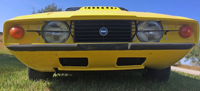
While the Sonett II could be the wrong-wheel drive derivative of a Triumph Spitfire, this third generation Sonett is jarring and painful to behold without the factory amounts of flat black to hide the sheer volume of undefined space on its front end.
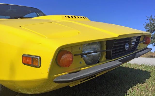
If the area ensconced under the hood was blacked out as the factory intended, the shadows would fake the eyes into thinking this was less of a reworked Sonett II and more of a C3 Corvette. Then again, why rely on blackout treatments to look sleek? If the driving lights, cooling holes and amber front lights were better integrated into their reserved space, the Sonett III would be both assertive and intimidating from this angle.
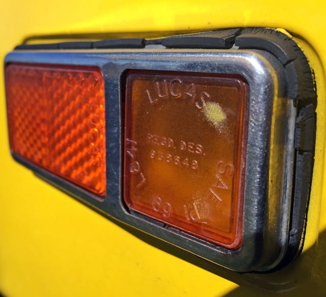
How many cars from Europe used these little Lucas-branded lenses? While they looked the part on a wedgy Aston Martin Lagonda, they clash with the rounded lights around the corner.

Another Lucas light, screwed into the fiberglass body without a care in the world. Would have been nice to see this mounted flush (flusher?) to let the wedgy front end truly breathe.

If you read the Bring A Trailer listing, you know this example has been raced, and still shows the some battle scars its earned along the way. Off center headlights and cracked grille aside, its a shame Saab didn’t make the header panel (i.e. the yellow body) match the angular lines present in the grille’s form. The grille’s corral is Mustang-like, and matching those forms woulda made the front clip beautiful.
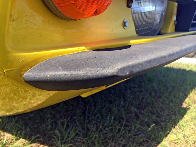
What an amazing time it musta been to design/approve/create bumpers this sleek, angular, and utterly useless in a crash. The leading edge’s flat spot is the only form of protection, in that it keeps 1-mph impacts from mashing the otherwise streamlined bumper into an unappealing mess.

Never having seen this emblem in person before, it lacks the character of other Saab emblems. Is this 1970s minimalist, post-modernist styling gone too far?
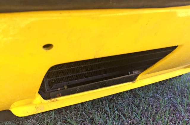
Thanks to the generous overhang and that wedgy front nose, the lower air intakes are almost impossible to spot from normal viewing angles.
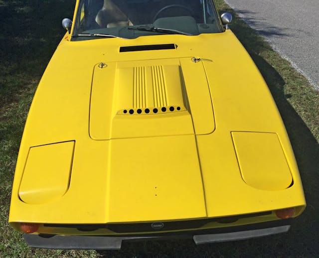
Because of the disproportionately small hood, a hood bulge that’s yellow instead of flat black, and a long front end with a distinct lack of contouring, the Sonett’s front end looks visually heavy. The hodgepodge placement also offers no real “home” for the covered headlights to latch on to. (Ignore the central emblem holes, as this race car wears either the wrong grille or bonnet.)
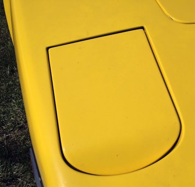
The lack of a home for the headlights is exacerbated by the fact they dip into the body for no apparent reason.
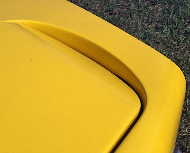
The rounded form this dip creates is like jamming a round peg into a square hole. The pop-up mechanisms were deleted from this example so we can’t see a Sonett with its “eyes” open…sorry about that!
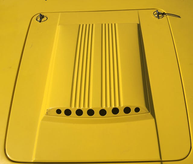
The tiny hood is attractive enough, provided someone doesn’t paint over the black scoop and drill extra cooling holes for track use. It’s only when you step back and see just how small this body part is relative to the rest of the front end when the design’s intentions become…questionable?
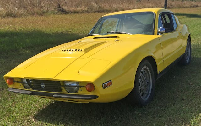
But step back, ignore the cutlines for features like lights and hoods, and the Sonett III looks like a muscular, cab-backward sports car. Except, with front-wheel drive underneath, it’s misleading the viewer.
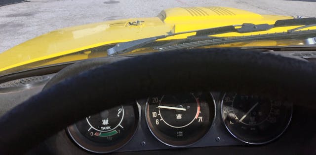
The hood bulge misleads in the same manner, or perhaps it’s the perfect pairing to the unique V-4 engine note?
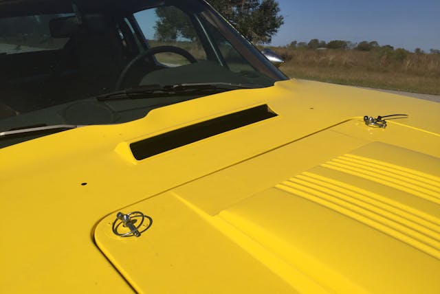
The cowl (i.e. the space between the hood and the windshield) is shockingly thick for a front-wheel-drive vehicle. I bet even the Ferrari 250 GTO has a shorter cowl than this Saab.
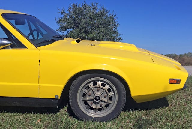
I didn’t take a photo of the V-4 engine with the front clip removed, but most of the engine is under that hood scoop. Dynamically speaking, that puts a lot of weight on the wrong side of the axle. Compromised sports car much?

The one-piece front clip has the added benefit of removing unsightly cut lines, much like C1, C2, and some C3 Corvettes. The end result is a hard bend at the edge which lets the hood bask in its plateau-like flatness.

Even with the engine in a difficult location, Saab managed to chop off a lot of visual weight with this hard inward bend where the fenders meet the front end.

Alloy wheels of the 15″ variety (Cromodora style?) were rather rare in the early 1970s, but Saab sprung for hoops worthy of a Porsche 914 likely to prove a point about the Sonett’s prowess. Too bad this example is missing the center caps, which were unbranded and quite low-key.
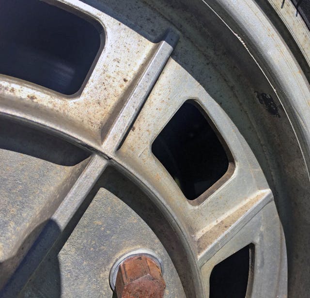
The disc wheel’s reinforcement webbing almost has an Art Deco, Chrysler Building feel to them.

Quick release fender bolt aside (remember accessibility is paramount in a race car) the Sonett’s side profile is visually thinned by the black rocker panels below the yellow paint.
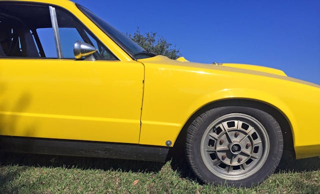
Step further back and that black paneling makes the Sonett III far more sporty and lets the eyes focus on the long dash to axle and cab backward design.

Classic sports cars need not worry about adequate HVAC flow or any other modern concern. Thank goodness for that, as the Sonett’s cowl is suitably sleek and minimalist.

Old-world craftsmanship has its place, but modern windshield bonding techniques clearly have a styling and aerodynamic advantage.
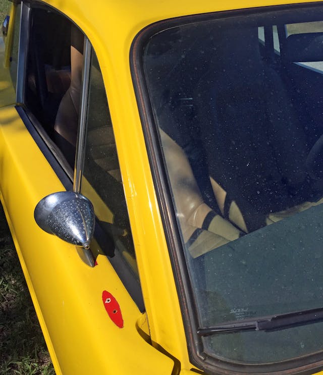
That A-pillar is sleek and swoopy enough to pass for a Ferrari Dino, but the relocated side-view mirror (moved in accordance with the interior roll cage) suggests this example used to be a fine shade of Resale Red.
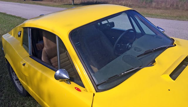
The fast roofline and tall windows give the Sonett’s cabin an open yet hunkered down feel, but the relocated mirror visually slows things down.

The driver’s door proves you need speedy side view mirrors mounted closer to speedy A-pillars.
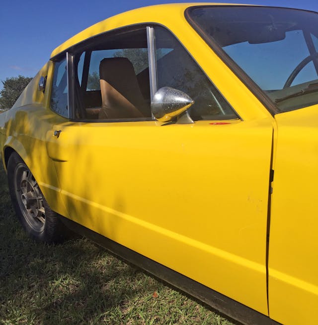
The Sonett’s doors are extremely low and the black rockers are rather thick. It all makes for a body that looks about as tall as the greenhouse. This 50/50 relationship is in stark contrast to modern vehicles, where the glass to body ratio is more like 1/3.
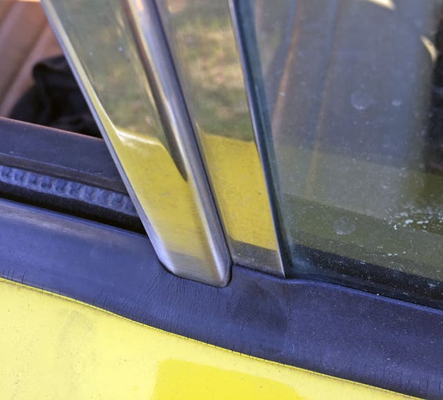
Glass fitment sure has come a long way since the Sonett’s day.

Even with dated assembly techniques, note how the arc above the glass shares the same vanishing point as the fastback roof.
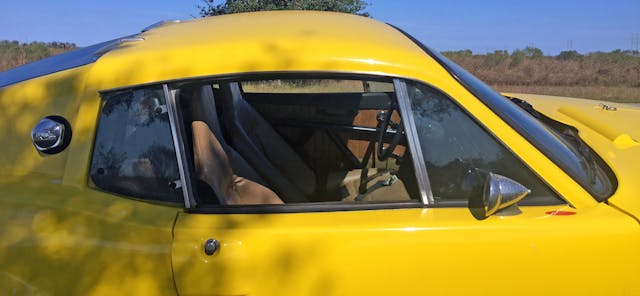
It all makes for a roofline that’s appropriately sporty.
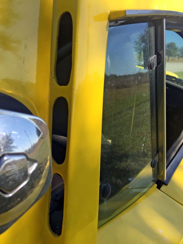
While the quarter windows tilt out for ventilation, Saab deemed these cut-outs necessary for this non-air conditioned sports car.
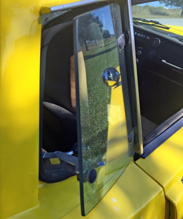
That really looks like adequate ventilation for such a small cabin and doesn’t detract from the overall design.
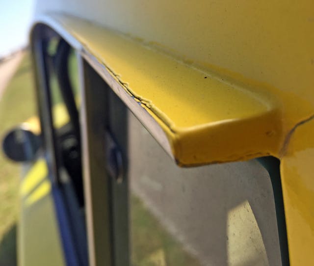
Exposed drip rails of this size certainly make cheap paint jobs look even worse.

The pentagonal fuel cap rests uncomfortably close to the B-pillar, but comes as no surprise considering the size and placement of features on the front clip.
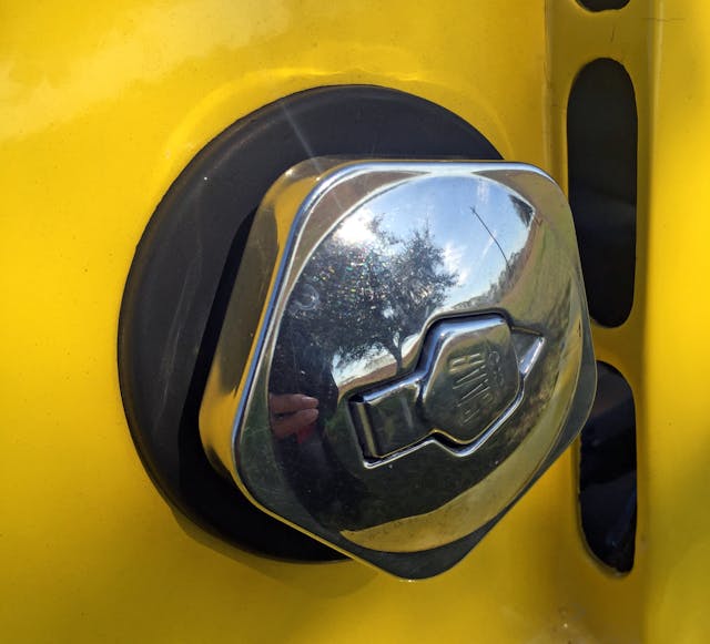
This elegant design deserves more visual oxygen to breathe on its own. Its location on the Sonett II (atop the rear fender’s hip) was more appealing, but this element in the Sonett III’s design makes it feel like a famous supercar: the Ferrari Testarossa.

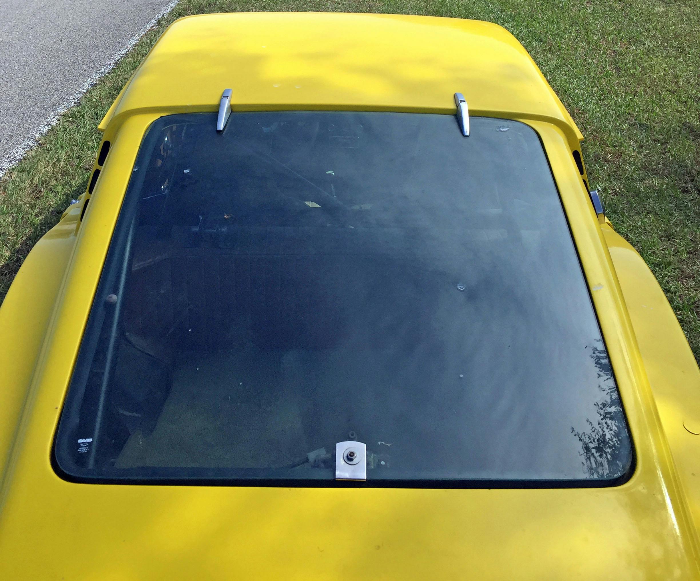
Sadly the roof has two distinct heights (and widths), and the lack of a smooth transition means the rear glass has to pick one height.
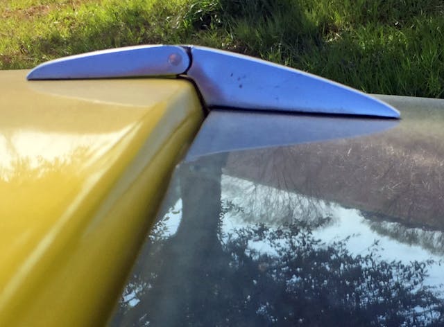
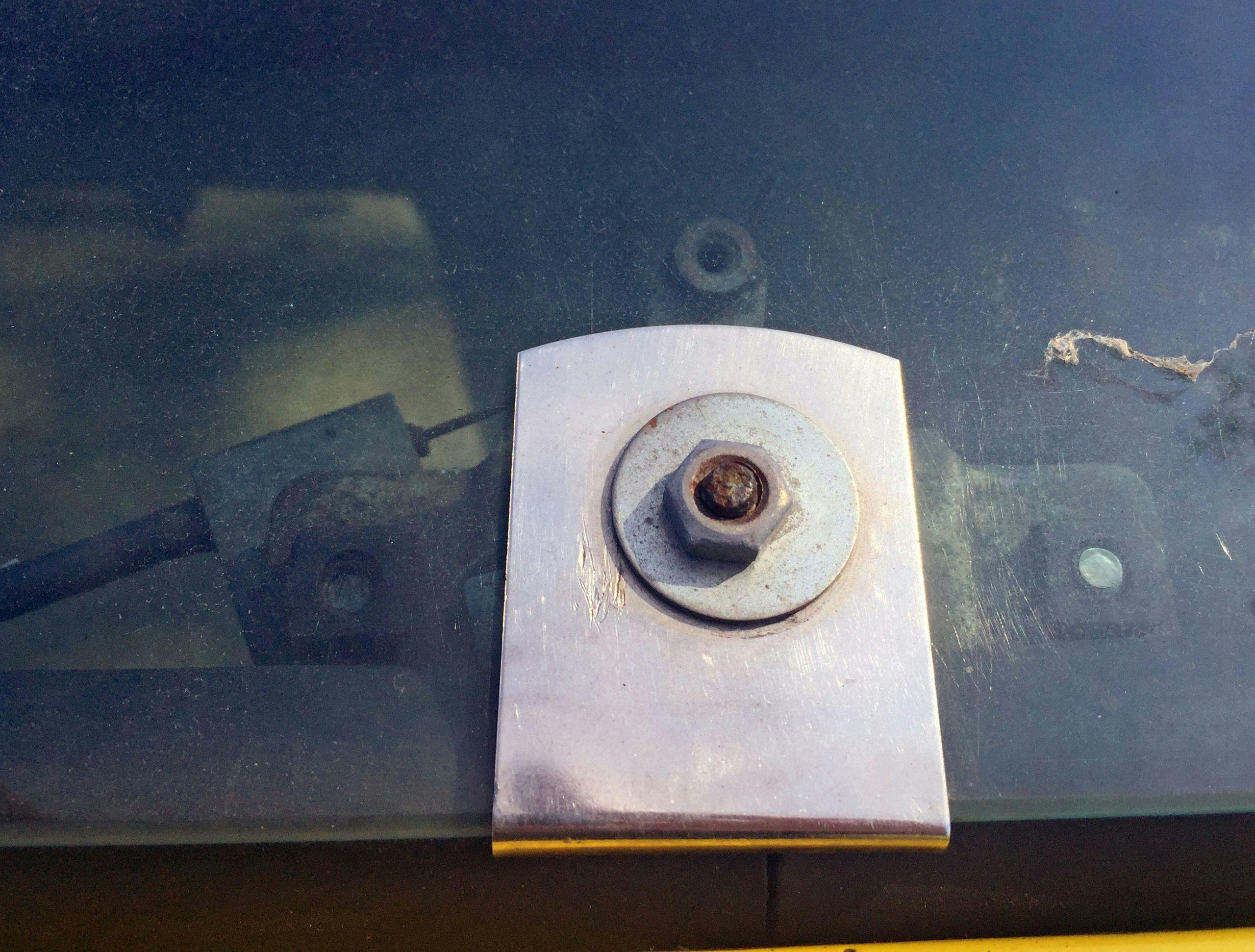
Too bad the rear window hinge couldn’t also pick a side. Then again, the elevation change makes for a clever design workaround.
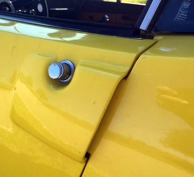
The streamlined, body-color door handle is slightly marred by the exposed door lock cylinder.
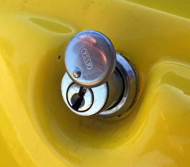
But the contrast of post-modern, 1970s wedge design with old-world hardware and engineering is always charming.

Speaking of engineering, this must be the most Corvette-like design to ever utilize front-wheel-drive underpinnings. That massively long hood is just dying for a Jaguar-like inline six-cylinder engine, and rear-wheel motivation.
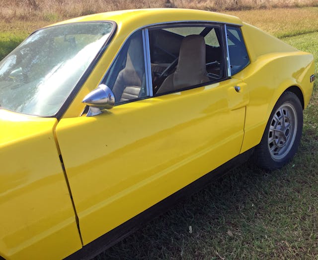
The door scallop and fender haunch almost have a 1965 Ford Mustang quality about them.
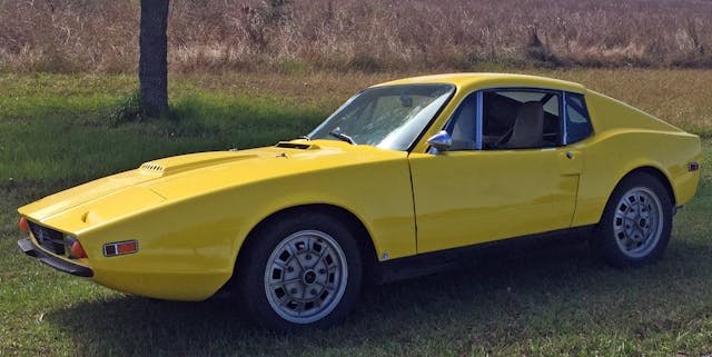
What you see may not be what you get under the skin, but at least the III’s take on modern 1970s design language has a nice blend of hard edges with a flowing character line across its midsection.

The squared-off quarter window, fast C-pillar hatch, and strong fender haunch look great and feel like a 1970 Mustang fastback. But the Ferrari Testarossa vibes are still strong.
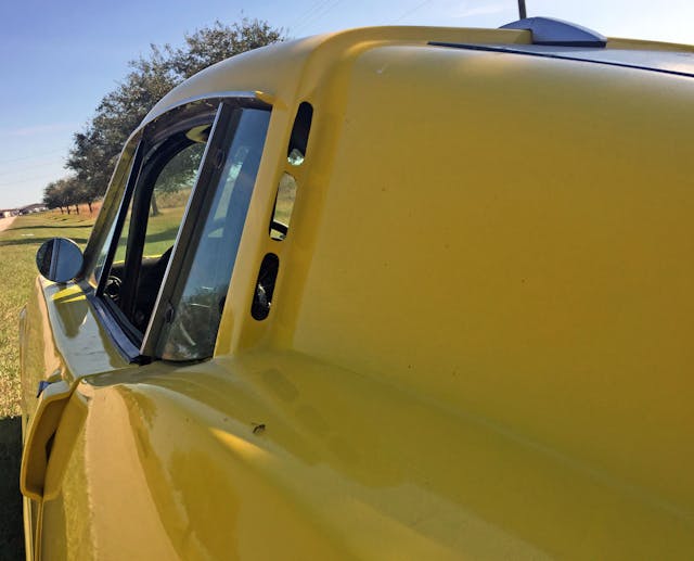
Perhaps the cabin vents give it a Ferrari Berlinetta Boxer vibe, but the fast lines combined with a stoic greenhouse is very much the stuff that made the Testarossa such a sweetheart.
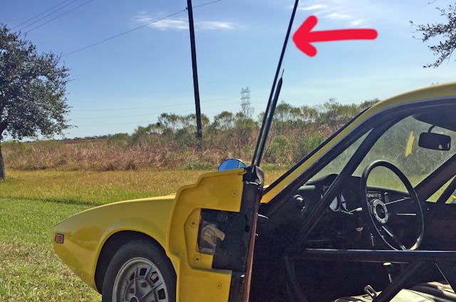
Perhaps a little too stoic, as Saab hadn’t embraced curved glass just yet.

The black rocker panels once again do their job, even if the rear quarters don’t need to look as thin and sporty as the front.
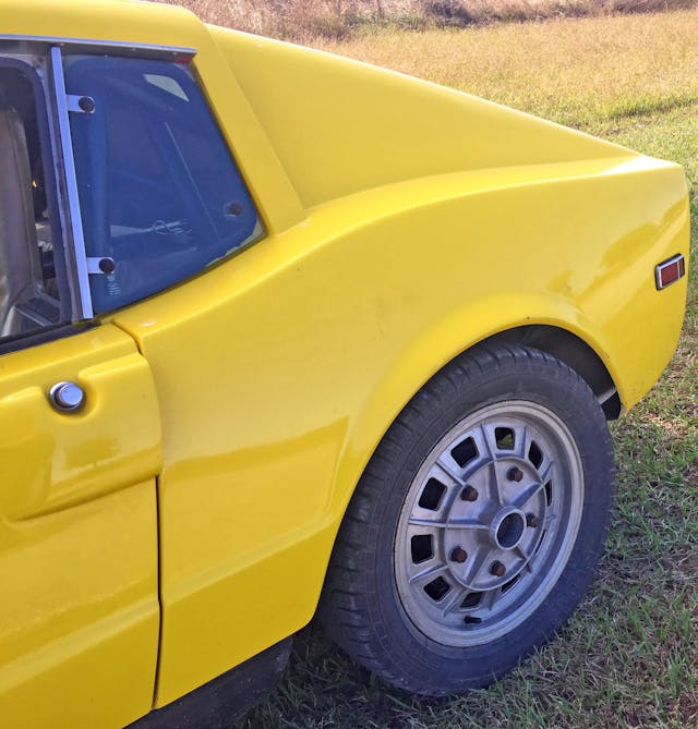
The Sonett is a pastiche of Ford Mustang with a bit of what made the Testarossa so famous, including those angular side marker lights.
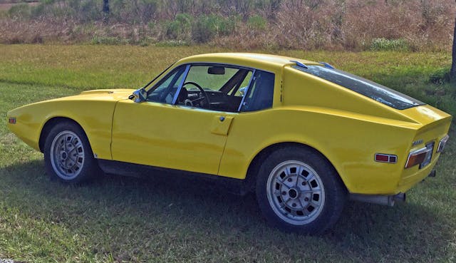
The kammback rear-end treatment is almost as radical as the wedgy front snout.

The massive rear glass hatch certainly adds an element of practicality to what would otherwise be considered a purpose-built sports coupe, with the fast lines to prove the point.

I know I am making too many Ferrari Testarossa references here, but the similarities do exist. While the Testarossa is more horizontal, the Sonett added a more aggressive downward curve to the same general theme.
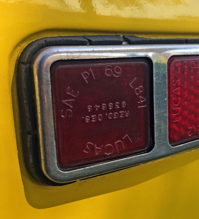
The rectangular Lucas lights look better on the beefy posterior than on the wispy front fender.

The lack of a rear bumper and blackout inserts (both of which are seen here) make this race car more purposeful, but less visually appealing. Without those finishing touches, the rear lights and oversized emblem look like elements looking for a home.
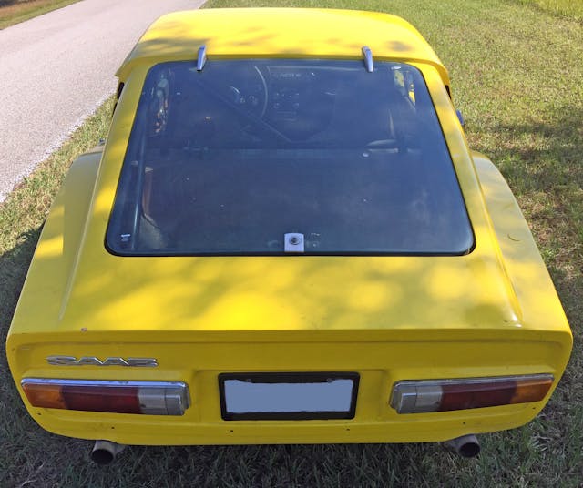
The lack of black paint and a rear bumper is less of an issue from this angle, where the kammback rear makes for a hard bend that makes a strong distinction (i.e. a shadow) from the Sonett’s horizontal surface.
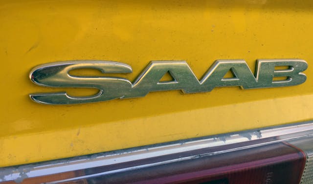
Makes me wonder if an emblem this large on the front woulda helped Saab sell more of these wee-beasties back in the day.
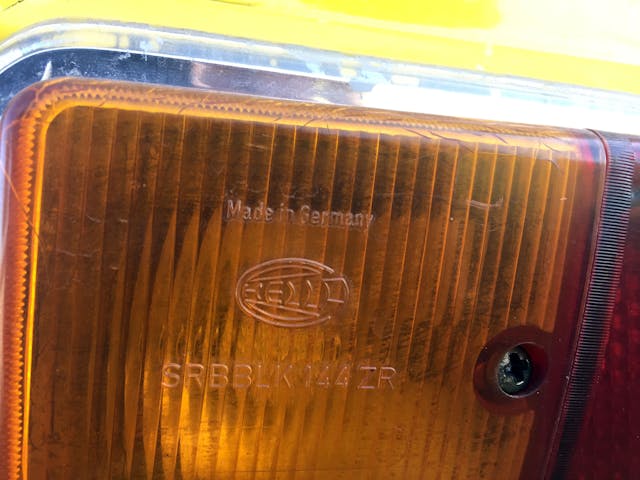
Hard to believe that third-party lighting pods often dictated the designs of older cars, right down to the need for exposed fasteners.
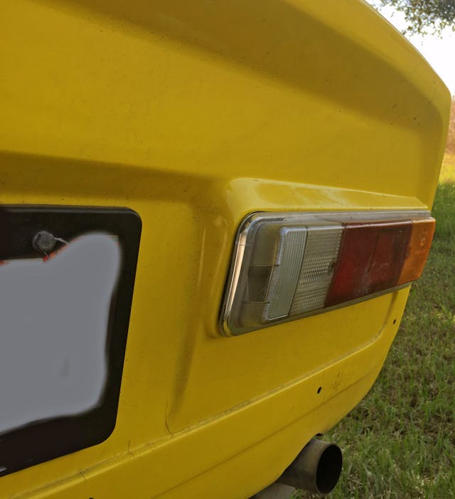
Presumably, the kammback tail needed these height extensions to accommodate the Hella tail lights. Which is kind of a shame, compared to the flat (flatter?) nature of the Sonett II.

The taillights do have an interesting taper to them; thicker at the backup light and thinner at the amber signal light.
One place the Sonett III clearly excels over its curvaceous predecessor is the functionality of its rear glass hatchback (aftermarket nut on this example notwithstanding). This is both a race car and a grocery getter, albeit for a small family on a diet.
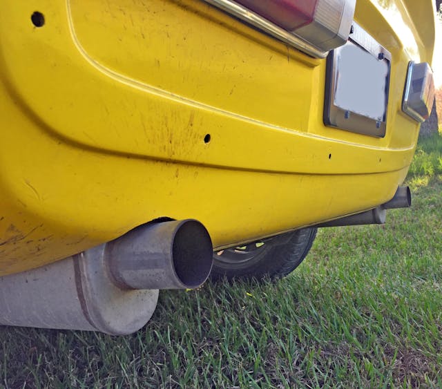
Dual exhausts are suitably sporty, and I wonder how much a replacement rear bumper is for these cars…if you can even get one?

No matter, the Sonett stood the test of time…even this example. It certainly looks cool, has an impressive 0.31 coefficient of drag, and make the requisite mechanical sounds to match the exhausts’ sporting intentions.
But the Sonett is a severely compromised design. Remove this example’s one piece hood/fender/front fascia and it’s clear the Sonett’s styling is running a bar tab its chassis architecture cannot pay. Or perhaps it cannot pay the tab in its entirety, as this Saab was competitive in SCCA races against its British competition. And it likely did a good job as a halo vehicle for Saab’s USA dealer network. Which might just be the best thing about the Sonett, especially the wedgy form of the Sonett III.
Thank you for reading, I hope you have a lovely day.
