Media | Articles
Design Professor: What the Jaguar Type 00 Gets Right and Wrong
I don’t envy the people in charge at Jaguar.
The brand may have top billing in its parent company’s name, but by its own management’s admission, it’s so far proven nothing but an expensive liability.
In many ways, this storied British icon’s current predicament reminds me of Alfa Romeo’s. Both brands are motoring legends with a heritage to die for, but whose halcyon days predate the Moon landings. As a result, they mean the world to thousands of enthusiasts and collectors the world over… yet nothing at all to new car buyers who, for the most part, remain utterly oblivious to their existence.
But while it seems not even Stellantis really knows what to do with Alfa Romeo, JLR’s management is now done with half-measures, and its bold new approach to the Jaguar problem is one Emperor Nero would have approved of: Burn everything down and ignore the screams.
Now, I have to admit that I was just as puzzled as everyone else after watching the video in which Jaguar announced its controversial rebrand, which looked like a perfume ad and felt just as vacuous and insincere.
Marketplace
Buy and sell classics with confidence
But what matters in the end in this business is the product, and even though the Jaguar Type 00 concept car leaves me with more questions than answers, I get what Jaguar’s designers are trying to achieve and why. So, let’s break down the Jaguar Type 00, possibly the most divisive design in the brand’s history, and see whether there’s genuine substance behind the pastel-colored facade.
The upcoming all-electric Jaguars, whose design the Type 00 previews, are set to move dramatically upmarket compared to the outgoing models. Having realized that to keep chasing Jaguar’s long-standing ambition to become a British BMW only meant throwing good money after bad, its management has now set its sights on a smaller, much more rarefied market. However, Jaguar’s offerings must make the strongest possible visual statement to have even the slightest chance to play at this new level. The kind of people the marque is aiming at have it all and have seen it all, so they will be tempted to join a new club only if it offers something they can’t find anywhere else.
And I must say the Jaguar Type 00 definitely delivers on this count, even if it does so with all the subtlety of a punch in the face. Love it or loathe it, the new Jaguar concept car is the definition of a “statement vehicle,” recognizable a mile away and looking every bit as expensive as its makers intended.
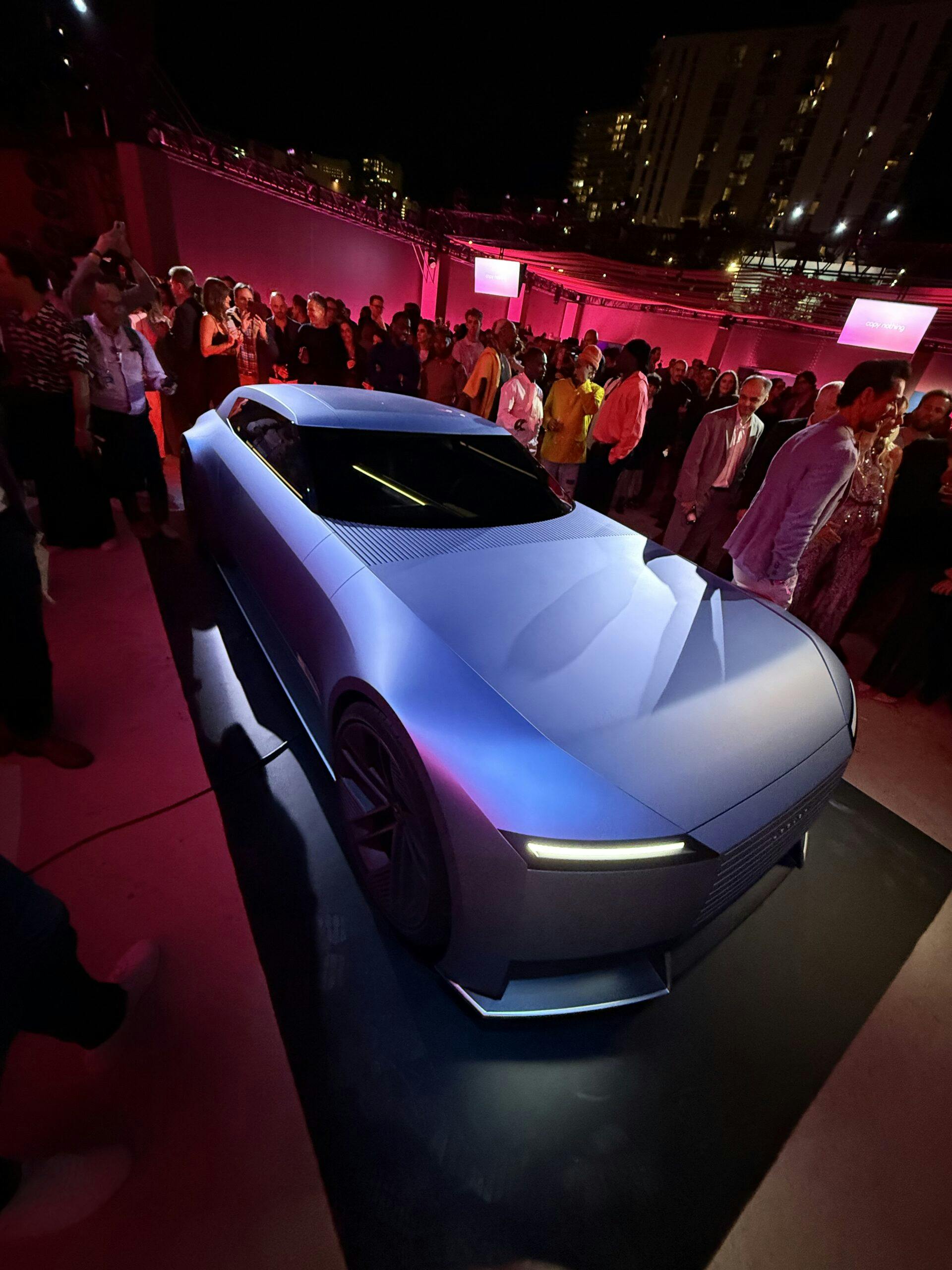
Jaguar’s designers achieved that by playing a game almost as old as the automobile itself. It may guzzle electrons rather than the good ol’ dinosaur juice, but the Jaguar Type 00 concept’s proportions hark directly back to the days when more speed meant packing a larger engine. With enormous wheels, a preposterously elongated bonnet, and a squat, low roofline, the new Jag has cartoonish, exaggerated proportions straight out of a car designer’s deepest imagination. And it has one hell of a road presence as a result.
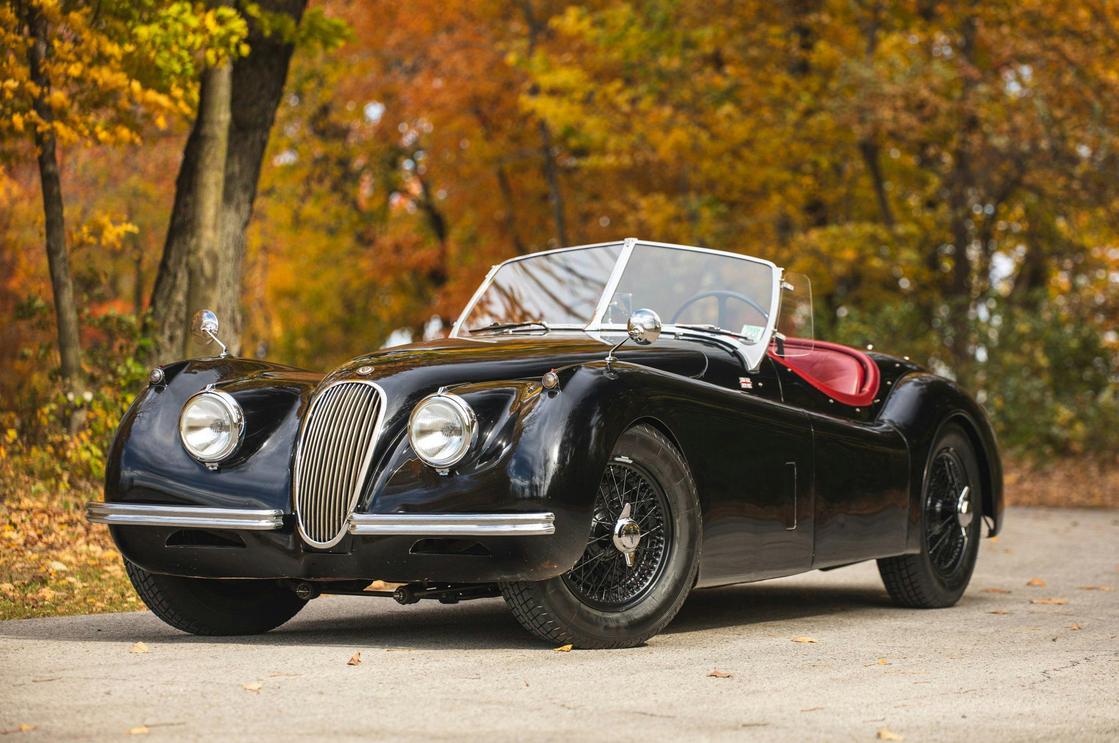
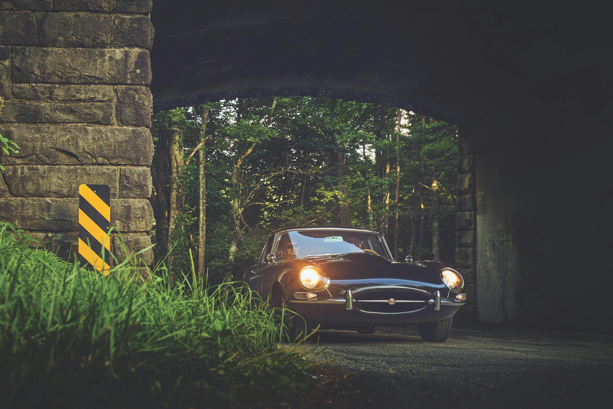
Jaguar, of course, is no stranger to overtly long noses. But while cars like the XK 120 or the E-Type were sexy, svelte-looking homages to the cult of speed, the Type 00 is an unapologetically ponderous, imposing beast. The voluptuous curves and overall sense of dynamism that have long been associated with Jaguars are gone, replaced by the kind of visual heft one would much rather expect from a Rolls-Royce or a Bentley.
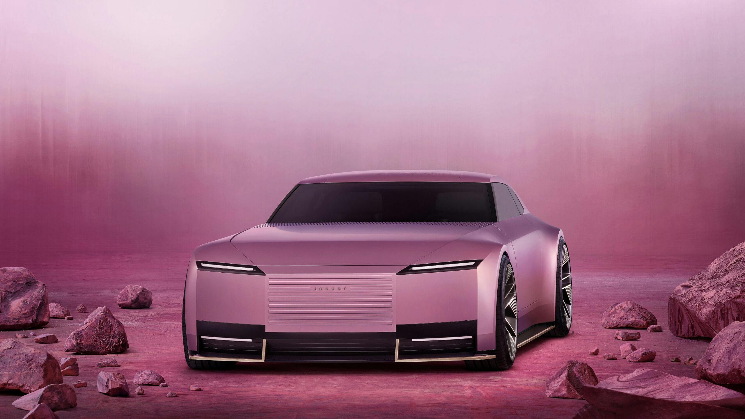
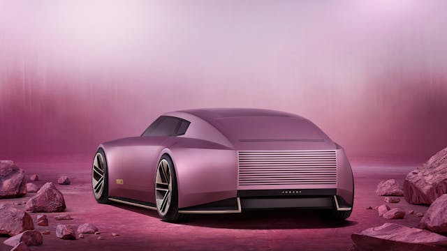
This effect is primarily due to the new Jag’s tall, sheer, and unbroken side surfaces. The whole composition is minimalist to the point of starkness: just two character lines break the tall bodysides, and the overall surface language is the most brutal I’ve seen in a long time, Cybertruck aside.
The Type 00’s large, unbroken surfaces and pin-sharp edges seem, to my eye at least, a throwback to the early days of 3D digital modeling in car design. I don’t know if that was the Jaguar designers’ intention, and it certainly won’t be to everyone’s taste, but I can get behind the idea. I just wish the execution wasn’t so inconsistent; some areas, like the rear quarters, appear to be very expertly sculpted, but others, like the upper edges of the windscreen pillars and the awkward way the car’s nose tapers ahead of the front axle, look as if they were modeled late on a Friday afternoon.
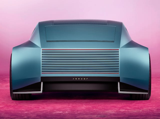
After the proportions and the sculpture, the last ingredients of an automobile’s design are the so-called graphic elements: the windows’ contours, lights, and grilles, right down to the shutlines between the body’s various components. This may be my favorite aspect of the Type 00, as I like how Jaguar’s design team identified a simple graphic theme and exploited it in a coherent and rather original way.
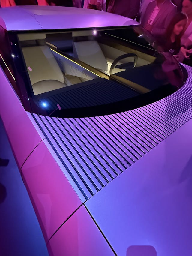
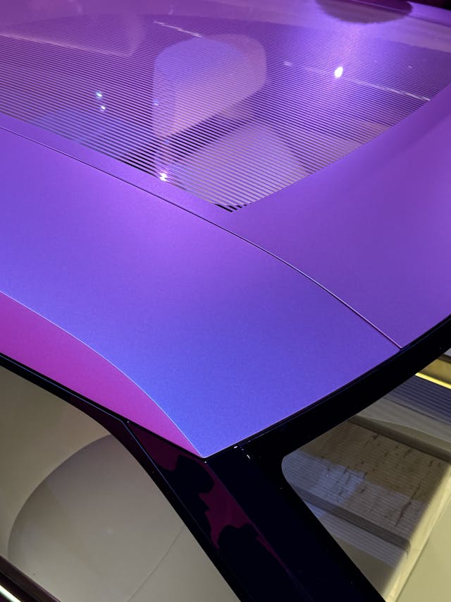
The Type 00’s rear end features a tall stack of parallel slots, whose upper and lower elements double as taillights. The same theme is repeated at the base of the windscreen and continues on the upper surface of the dashboard, creating a nice continuity between inside and outside. I also love how the same concept is applied to the panoramic roof, which has been painted over, leaving just tiny parallel slots for sunlight to filter through. Nice touch!
However, I’m much less enamored of the clumsy, ham-fisted way Jaguar’s designers treated the Type 00’s front end. Kudos to them for not putting in a fake grille, but what’s in its place may well be the poorest substitute ever imagined. By far the weakest part of the design, the Type 00’s front end simply looks unfinished and unresolved, as if the team found itself suddenly out of time and had to finish the job no matter what.
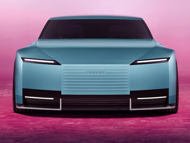
Jaguar’s new direction ultimately leaves me cold, yet I can’t help but applaud the company’s management and design team for having the courage to challenge everyone’s view of what a Jaguar should be. The Type 00 is far from a design masterpiece, but if it had worn a badge like the Rolls-Royce or even Cadillac, people likely wouldn’t have felt anywhere near as strongly about it. In fact, I could see something like the Type 00 becoming a coveted status symbol among the most privileged members of our society, as it’s got such a unique look.
The trouble is that the Type 00 isn’t the car that Jaguar will actually put on sale in 2026.
Here’s the take from Michael Quinn, grandson of Jaguar co-fonder Sir William Lyons: “When you first see the car up close it is a real ‘wow’ moment as its side profile has real presence. I love the impression of speed it creates and its wide stance, but the road-going version will have to achieve some practical compromises and for that impression we have another wait.”
Quinn is right on the mark. Jaguar’s future now hinges on how much of the Type 00 concept’s undeniable “wow” factor will make it through to the production model. If Gerry McGovern and his team get that right, Jaguar may have a fair shot at sticking around for years to come, despite the naysayers. But if they don’t, if their bold vision gets watered down too much on its way to the showroom floor, I’m afraid we’d better all get used to speaking of Jaguar using the past tense only.
***
Matteo Licata received his degree in Transportation Design from Turin’s IED (Istituto Europeo di Design) in 2006. He worked as an automobile designer for about a decade, including a stint in the then-Fiat Group’s Turin design studio, during which his proposal for the interior of the 2010–20 Alfa Romeo Giulietta was selected for production. He next joined Changan’s European design studio in Turin and then EDAG in Barcelona, Spain. Licata currently teaches automobile design history to the Transportation Design bachelor students of IAAD (Istituto di Arte Applicata e Design) in Turin.


Licata- While maybe I shouldn’t say anything , not wanting to be ‘that’ way , I wrote very much the same thing a couple of hours ago before reading your analysis. Perhaps that is a good sign in the keep your fingers crossed (old spelling) category. You can see the potential even if somewhat veiled, yes?
I see worse here than the things Ford did styling wise. Not Ford was this bad but just corporate.
So much for “copy nothing!” Superimpose a series 1.5 E Type Coupe on the new 00 (preserving aspect ratios, of course) and both the height to length aspect ratio and the ride height is identical. Obviously the wheelbase and beginning of the glasshouse are very different, but the overall size has the exact aspect ratio.
Jag designer:
AI: design new EV, Atlantic blue 2005 Chrysler 300, more Bentley, more posh, gimmick roof. Crossfire rear. Jaguar badges. Render.
ah… done! Let’s go have lunch.
It looks like a 2006 Sema Dodge Magnum custom. Truly dreadful design. Where did this stupid idea come from that designing and ugly but different car is “brave”? Designing a radically beautiful, Jaguaresque car would be brave and daring. Put your best designers up against the best from the master and his design team. This is just lazy. Talentless, terrified and narcissistic designers, who lack the guts and ability to continue Jaguars history of beauty.
It’s embarrassing how much coverage this is getting. There isn’t even enough there to call a “design.” It seems to be a hastily modeled 3D shape rendered with early ’00s video game software. I mean, is the picture of the car in a crowd an actual photo of a real physical thing in a place that exists? If so, why does it look so fake?
Between that and the almost belligerently stupid ad about nothing, this is feeling like a hoax.
It looks more like it was designed to chase light cycles in the Tron, the rendering looks that old.
It’s not good enough for Tron. This looks like it was rendered on a Playstation 2. The design seems very unfinished.
Mark, JW, and Gary, I agree. This seems to be an amalgamation of what you get when a group of Chrysler/Benz (Crossfire team) and Tesla (Cybertruck team) “designers” all go out on a bender together on late Thursday evening and come back in to work massively hung-over at 3:00 pm Friday afternoon only then to realize that “Oh crap!” the final design art/storyboards must be completed by 5:00 pm.
It’s hideous. It looks like a full sized Hot Wheels car, with all the odd proportions involved in that. And the lack of any kind of exquisite surfacing on the outside make it look cheap, not high end.
Honestly this wouldn’t have looked out of place as the Sark’s car in the 1982 Tron movie, the surfacing looks that old.
It’s all wrong. Kill it with fire. It’s an abomination.
What the Jaguar Type 00 Gets Right and Wrong:
Nothing. And everything.
Let’s see if the “people” catered to in the infamous ad can carry the brand. I wouldn’t touch that abortion with your_____! Fill in the blank.
Duesenberg aspiration, Borg execution.
Hey, I think I’ve figured out the new logo!
They got tired of hearing us say Jag-wahr, so they hope that we’ll pronounce the new one as JaGYoo-ar.
Damn Redcoats.
Jaguar’s design language peaked in 1961. 63 years later I’d like to cut them some slack, but I can’t. This thing is puerile.
Compared the fully executed concepts that Cadillac has done, the Sixteen, Ciel, and Elmiraj, to this.
Excellent point, Ronnie. Those were fully realized, and iconic designs.
It’s an updated Chrysler Crossfire! Now with an even uglier front end… 🙂
It was definitely designed by the Lee brothers, Ugg and Home. Ugg Lee did the majority of the body, but Home Lee did the grill.
To add: Aerodynamics of a brick, driver’s visibility of a submarine.
I like the sides. The front is too tall and blunt. Reminds one of the ugly fronts on RRs after the BMW take over. The rear chop-off is not as offensive, but I really question putting the lights so far from the outer corners. Rear sideswipe coming?