Media | Articles
VW CEO vows to re-simplify infotainment controls, screens
Despite their intelligent interior packaging, friendly driving dynamics, and sensible price tags, many of Volkswagen’s latest products have failed to wow in one key area: infotainment.
In a recent interview with CAR magazine at the 2022 Los Angeles Auto Show, VW’s CEO Thomas Schäfer admitted that the company’s notoriously frustrating, touch-sensitive displays and slide controls have failed to meet expectations. He made it clear that fixes were in the works.
“In this rush to create these vehicles to be quick off the mark and so on, the team had come up with different ideas,” Schäfer told CAR. “We’ve got feedback from customers, we’ve [got] feedback from clinics, and from journalists … They say, “You know this is not good. You’ve got to improve this.”‘
The system in question is known as MIB3, which VW announced in July of 2020. It’s currently featured on models such as the ID.4 electric SUV, the Golf GTI, and the Golf R, and introduces modern amenities like wireless CarPlay, standard USB-C ports, emergency stop, and “partially automated” driver assistance from 0 to 95 mph.
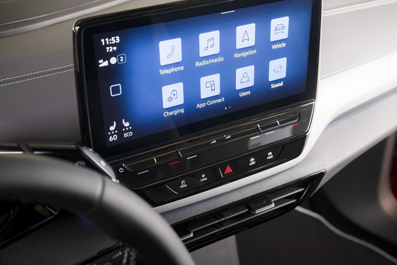
It also introduced capacitive sliders to adjust stereo volume and cabin temperature. (In contrast to dials or switches, which respond to physical manipulation, capacitive controls respond to the touch or swipe of a finger.) Fitted side by side in a single groove below the main touchscreen, these sliders aren’t illuminated. Are you increasing the fan speed or cranking the stereo volume? In the night, it’s nearly impossible to tell until after you’ve swiped.
Marketplace
Buy and sell classics with confidence

We’ve had more than a few run-ins with the MIB3 system, and most have left us frustrated. Associate managing editor Grace Houghton puts it plainly:
“I though you could only get road rage while driving … until I met the Mk. 8 GTI. While sitting in a parking spot in the full sun, I accidentally shut off the entire climate control system. Had to consult the owner’s manual in the glovebox to turn it back on.”
MIB3’s central touchscreen also features an unintuitive menu structure, hiding useful and frequently used features behind several (sometimes redundant) submenus.
Complaints about the system grew so loud that VW’s board began to convene monthly to check the progress on the fixes.
Relief should arrive soon, according to Schäfer. “The new 3.0 software is coming now,” he said. “It will not be the [fix for the] sliders and hardware, but the software will be a tremendous step up in the next few weeks.”
Illuminated sliders will follow, set to arrive in the next 18 months or so.
The sliders aren’t the only one of VW’s new-fangled features to draw the ire of customers and a subsequent fix from the manufacturer.
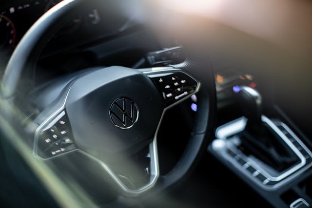
Earlier this fall, Schäfer announced via LinkedIn that VW would bring real buttons back to its steering wheels, replacing the existing (and often infuriating) touch-sensitive controls. In his interview with CAR, he hinted that a new Tiguan will be the first vehicle to feature the new steering wheel. The current Tiguan debuted in 2016, and the next-generation car is expected to arrive sometime in 2023.
The steering wheel buttons may be en route, but changing something as complex as the infotainment system when you’re a multinational conglomerate like VW is not easy.
“With a company our size, to change [the sliders, buttons, and infotainment system layout] into something completely different is a monumental task,” Schäfer admits. “You have to change 100 tools and so many suppliers globally.”
Tough or not, change must come. As Volkswagen races to fill out an electric portfolio for the coming decade, getting the infotainment right—from slider to button to touchscreen—is pivotal.
Check out the Hagerty Media homepage so you don’t miss a single story, or better yet, bookmark it.







It’s interesting that, correctly and wisely, cell-phone use and especially texting while driving, are both foolhardy and illegal in most places.
Now, with all the modern electronica of entertainment, navigation, passenger compartment climate controls, AND some basic automotive displays, all combined onto a single screen; the question is — what’s the difference?
I know that I sure as hell don’t want to fiddle about with nested menus, etc.
ESPECIALLY while driving.