Media | Articles
12 of our favorite retro digital dashboards, part one
We’ve been reminiscing about digital dashboards. It’s thanks to the customizable screens in the VW ID. 2all, which allow you display cool retro graphics from Volkswagens long gone.
For now, the ID. 2all is a concept, albeit one that previews an all-new, affordable electric car, due in Europe come 2025. We hope the retro displays make production and inspire other manufacturers to follow VW’s lead.
In the meantime, here are 12 digital dashboards from the 1980s and ’90s. Our shortlist was rather long, forcing us to focus on a dozen of our favorite production cars. Stay tuned for volume two, which may include a few concepts …
Aston Martin Lagonda
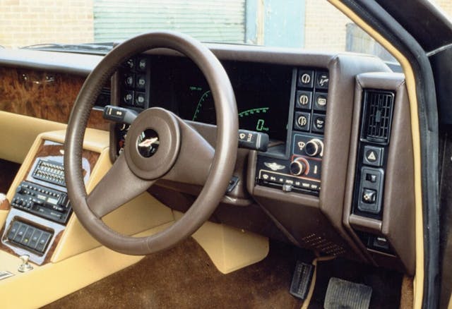
The Lagonda (Series 2) was the first car to be launched following the 1975 takeover by an American-Canadian consortium. Designer William Towns and chief engineer Mike Loasby led the project for the four-door super-saloon, which debuted as a prototype in October 1976.
Its advanced electronic instrumentation with graphic and digital solid-state displays were developed in conjunction with the Cranfield Institute of Technology, with Loasby reportedly influenced by touch-sensitive switches during a visit to the National Semiconductor HQ in California.
Marketplace
Buy and sell classics with confidence
The electronics proved to be its undoing, with only 16 cars built during the first two years of production, forcing Aston Martin to relieve Cranfield of its duties in favor of Dallas-based Refoy. The gas-plasma display made way for digital instrumentation, followed by cathode-ray and Vacuum Fluorescent (VF) displays.
Nissan 300 ZX (Z31)
The Nissan 300 ZX optional Electronic Equipment Package would top many people’s list of the best digital dashboards. Because it’s Japanese, there’s a good chance that everything will still be working, even in 2023.
The speed was displayed both digitally and as a colorful bar chart, with the system also monitoring fuel, temperature and voltage via bars or digitally, depending on the function. Its tachometer was a particular highlight, especially on turbocharged versions, where the display indicated rpm plus boost.
To the right of the steering wheel were a pair of digital dials showing acceleration or instant fuel economy on the left, and a compass on the right. Almost everything was digital, right down to distance to empty and climate control temperature, which made the analogue odometer look comically dated.
Fiat Tipo DGT
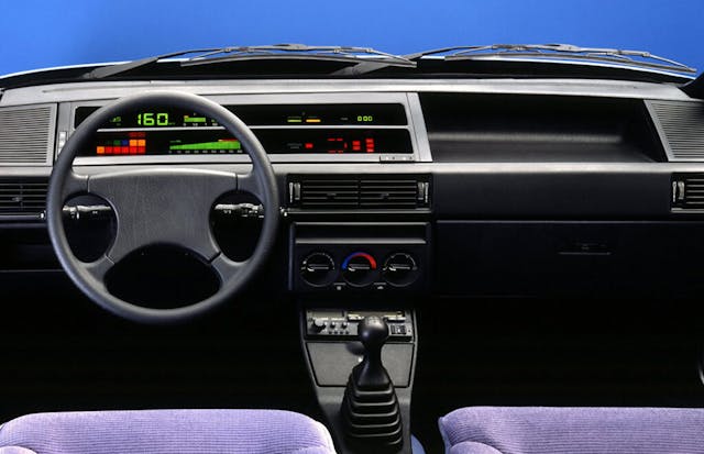
You can leave your jokes about Italian electrics at the door and admire the majesty of the Fiat Tipo DGT dashboard. We love the simplicity and clarity of the layout, along with—praise be—rotary dials and proper switches for the heating and ventilation.
We had seen digital instruments before, but where many manufacturers adapted existing instrument binnacles, Fiat went further by creating a bespoke dashboard for high-spec versions. Note the horizontal slots, which shrouded the digital displays to ensure they could be seen in bright sunlight.
Chris Goffey wasn’t a fan of Fiat’s digital display. In a 1990 Top Gear review of the Tempra, he said: ”With the SX version you get a rather garish electronic digital dashboard; personally, I’d prefer the simple analog instruments of the base version.” Ouch.
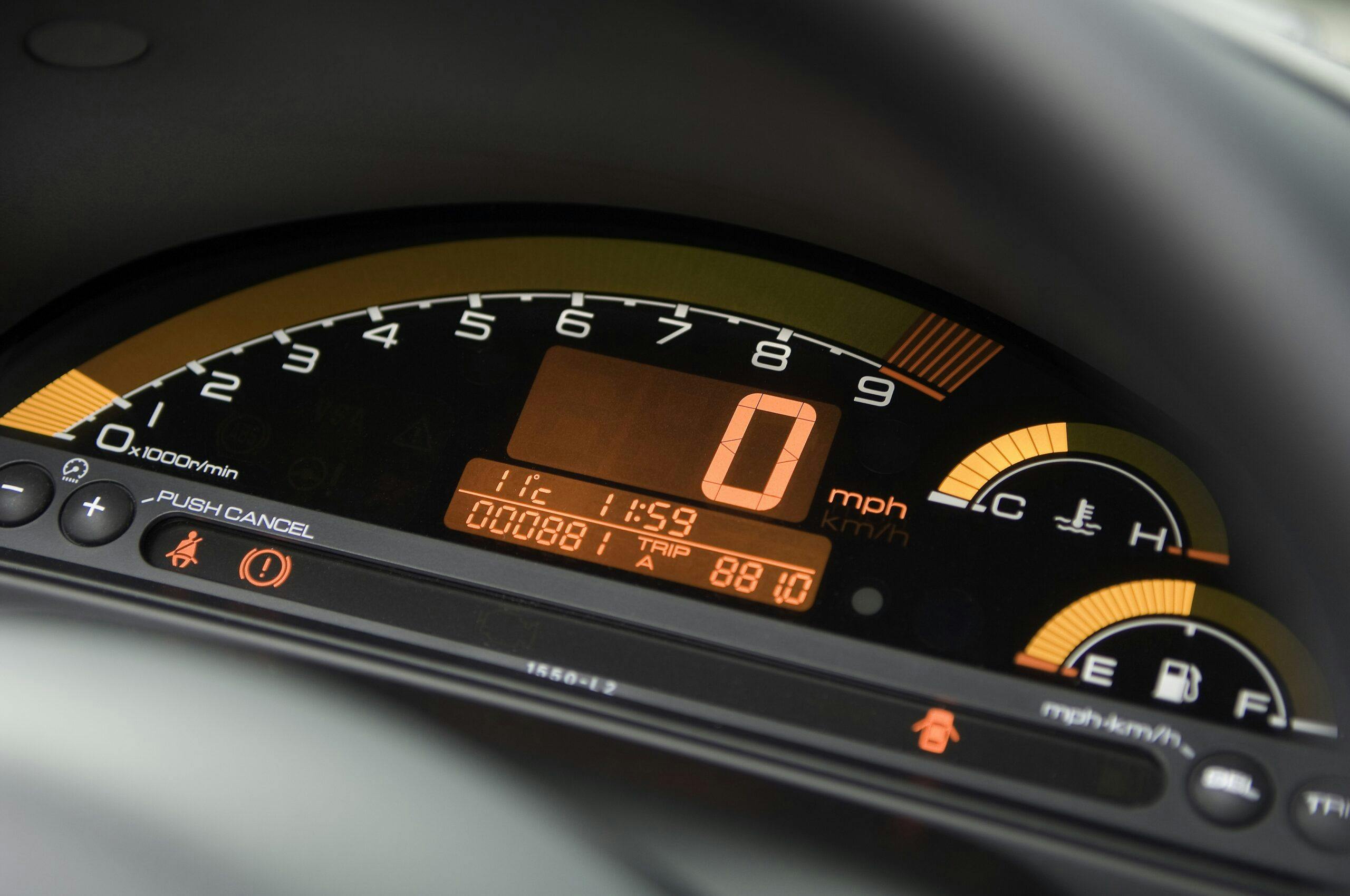
Honda S2000
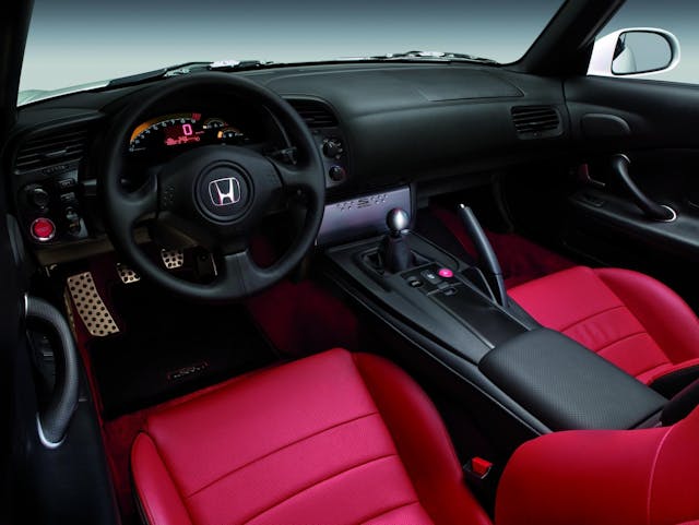
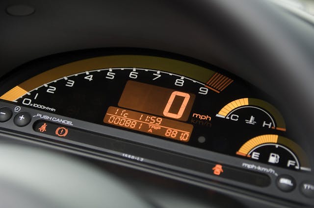
The S2000 wasn’t the first Honda to boast a digital dashboard. Earlier examples include the City Turbo II and the third-generation Accord in its domestic market. Yes, the one with the pop-up headlights, to create a double whammy of nostalgia. Maximum RADwood points available.
Alongside the Insight, the S2000 delivered digital joy to a new generation, arriving just before the turn of the millennium. It’s dominated by a sweeping rev counter with the red zone set at 9000 rpm, and the temperature gauge and fuel tank alongside it.
We like this line from Richard Meaden: ”I’d forgotten about the digital dashboard—what motoring journalists before my time would have quaintly described as ‘Tokyo by night’—and it’s lo-fit whiff of Atari or Texas instruments. In an age of retina displays and OLEDs it could look embarrassingly dated, but to be fair the instrument pack still looks surprisingly good and works well.”
Renault 11 TXE Electronic
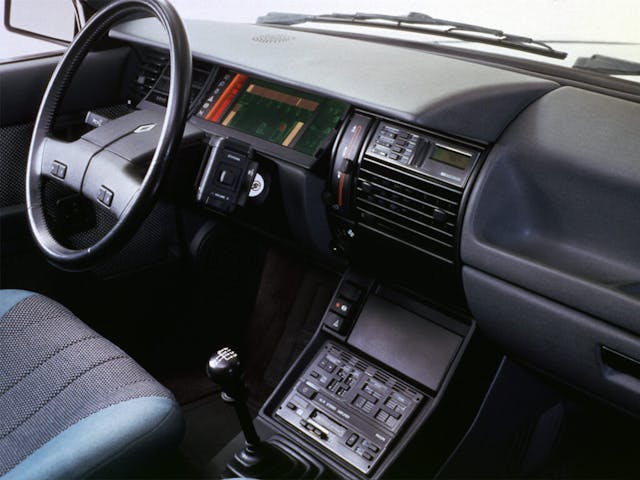
The Renault 11 TXE Electronic was the first European car to be fitted with a voice synthesiser, beating the Maestro by one week. We suspect Nicolette McKenzie, the actress whose voice brought the Maestro to life, would have something to say about that.
The button for the synthesizer was located alongside the digital dashboard, which featured a horizontal rev counter, digital speedometer and other information.
Jon Bentley had a play with Richard Benneworth’s 11 TXE Electronic at the 2018 Hagerty UK Festival of the Unexceptional. The digital man sounds like Charles from the 2022 comedy Brian and Charles.
Corvette C4
We’ve reached the midpoint of our trip down digital dashboard lane, and it’s occurred to us that a lot of these retro delights remind us of the Tomy Racing Turbo game from the 1980s.
Our minds are probably playing tricks on us, but the Corvette C4’s digital instruments take us back to those wasted minutes on the Tomy, which Argos described as “simulated driving fun.” Eat your heart out, Kazunori Yamauchi, aka Mr. Gran Turismo.
Unlike the Tomy, the C4 Corvette was pretty radical, becoming the first car to offer an electronic instrument cluster with three LCDs as standard. Everything you needed to know was available in an instant, until it wasn’t, at which point it became a pain to fix, leaving the driver in the dark.
Citroën BX 19 Digit
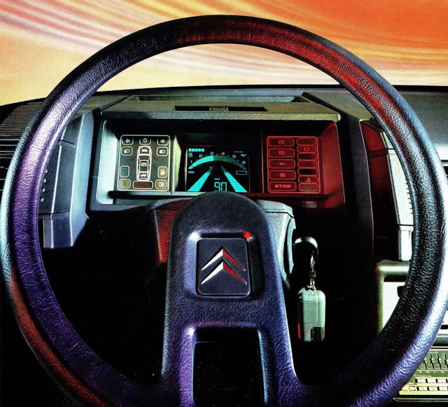
The Citroën BX 19 Digit was based on the BX 19 GT with what was dubbed a “super-electronic driving console.” Just 3000 were built for France and nine other countries from September 1985.
Our cup of eccentricity runneth over with this display of single-spoke wheel, satellite controls and digital instrument panel goodness. Note the digital and graphic display of the speed, along with what Citroën called an “engine overspeed warning.” (That’s rev counter to us.)
According to a press release from 1985, “electronics will be closely linked to the progress of the automobile for a long time to come. With this version, the BX reconfirms its modern image, and finds itself once again in the limelight of innovation.”
Cadillac Allanté
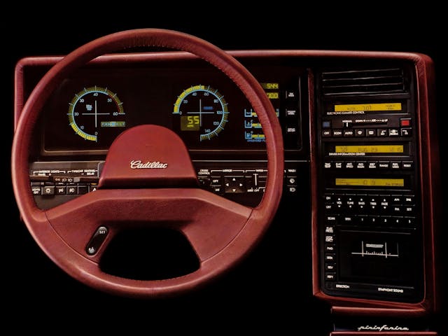
Remember the 1986–93 Cadillac Allanté luxury convertible? Using Boeing 747s, GM flew parts 4500 miles to Turin, where they were assembled into car bodies, trimmed and painted, then flown back to Detroit, 56 at a time, for final assembly. Few projects of the period were more extravagant.
The standard equipment was as indulgent as the build process, including an electric folding hardtop with three glass windows, Italian leather upholstery, a 4.1-liter V-8 and a four-speed automatic transmission for effortless boulevard cruising.
Even the LCD instrument panel was fitted as standard, although all-analogue gauges were available as an option if buyers were concerned about the Italian electronics. They needn’t have worried; the digital dashboard was the work of the Japanese company Yazaki.
Subaru XT Turbo
The Subaru XT Turbo featured one of the coolest digital displays of the 1980s. Why limit yourself to a basic digital speedo and rev counter when you can have something much, much cooler?
As an option, the XT Turbo featured a pictogram of a car flanked by “pavements” illuminated by boost and tachometer gauges. It was like a cross between Tron, the aforementioned Tomy Racing Turbo, and Lotus Turbo Esprit on the ZX Spectrum. A little 4WD icon was illuminated when you engaged four-wheel drive.
Allow Jason Cammisa to guide you through the (many) finer points of the Subaru XT. It’s the future we wish we had.
Buick Riviera
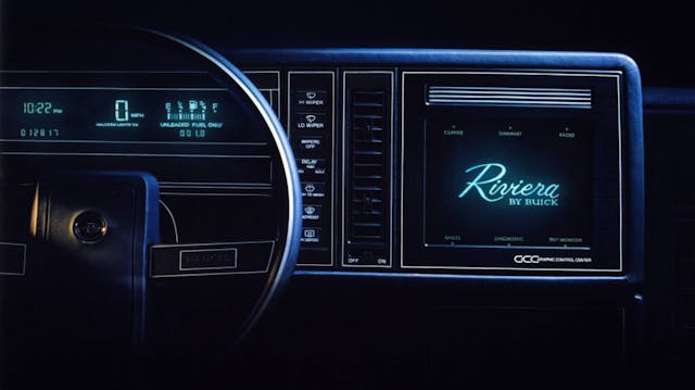
If you find yourself getting annoyed with a touchscreen in a modern car, you can unleash your fury on GM’s Graphic Control Center, which used a cathode-ray tube (CRT) with a green and black screen and was the first touchscreen available in a production car.
The system found its way into the Buick Reatta, along with the Oldsmobile Toronado as the Visual Information Center, but was dropped when users found it onerous and distracting. When Popular Mechanics reviewed the 1986 Riviera T-Type, it said “it violates the First Commandment of ergonomics – you must take your eyes off the road to make any adjustments.”
It was a false dawn for the touchscreen, but Buick pioneered tech that wouldn’t become mainstream for another decade-and-a-half.
Vector W8
Doug DeMuro called it “the craziest supercar ever made”, and although we’ll leave that debate for another day, the Vector W8 had one of the best digital screens of the 1980s. Just 17 customer cars were built, along with two prototypes.
There were four buttons, which enabled the driver to scroll through four menus: Main, Performance, Performance (again), and Chassis. As the name suggests, Main was for the primary functions: fuel gauge, speedometer and tachometer. Chassis was a bit misleading, because it let you know if you’d left one of the doors open!
The W8’s creator, Jerry Wiegert, wanted the Vector to exude the look and feel of a jet fighter, so he used aerospace switches and displays throughout the cabin. DeMuro was right, the W8 is the craziest supercar ever made.
Vauxhall Astra GTE
In 16-valve guise, the Mk2 Vauxhall Astra GTE was one of the most powerful hot hatches of the early 1990s, with its Cosworth-developed 1998cc “red top” engine producing 156 bhp. This alone should have been enough to tempt tearaways out of their souped-up Golfs, Escorts and 205s.
It had another ace up its sleeve in the form of a digital dashboard, which featured four gauges, a tachometer and speedometer. The digital speedo was famous for failing to keep up with the driver’s pace—something that affected other cars of the era, including the Audi quattro.
Speaking of which, should the Audi make our second list of digital dashboards? Let us know in the comments and feel free to nominate your favorite for inclusion.
***
Check out the Hagerty Media homepage so you don’t miss a single story, or better yet, bookmark it. To get our best stories delivered right to your inbox, subscribe to our newsletters.
Via Hagerty UK




Just doesn’t compare to analog….
The Riviera digital dash is the only one I could live with. The others are way to “gimmicky” to look at every day, would get old fast! At least the Riviera digital gauges are simple and clean.
As far as touch screens, I hate them in cars. My wife’s 2013 Escape Platinum has way too much on the screen and controls aren’t exactly intuitive. I only drive it once or twice a week, and often find myself looking away from the road for some kind of control. Just too distracting! I know why current makers like them — everything can be switched electronically and there is no need to have special controls for anything, just bring up a screen that controls relays for everything. Same reason they are pushing all electric cars. The technology has caught up enough (mainly battery tech) that it’s not hard to get enough range adequate for most people, though long distance trips are still a problem. Manufacturers don’t care about the environment that much nor that the government is pushing electric cars. The bottom line is electric cars are much cheaper and easier to build, which means more profit for them.
A good example is the McPherson strut. It’s just adequate as far as suspension, but caught on rapidly due to reduced cost. Only low cost cars use it now — higher priced cars use a hybrid strut suspension with double A arms and a steering knuckle, they just replace the separate shock and spring with a strut. A true McPherson strut system just has a lower control arm and the wheel pivots on the strut. But it would have never caught on if it didn’t save money. Electric car platforms are the same. It’s much cheaper and easier to build an electric motor than an internal combustion engine.
How many times have we heard manufacturers use the term “cockpit” in reference to their dashes? Marketing guys trying to make you think you’re in an airplane. Well, the Vector absolutely pulled it off! It’s got the feel of a fighter jet of the era. Well played, Mr. Wiegert, well played. 🙂
Don’t forget about the 1981 – 83 Chrysler Imperial. The display was pretty rudimentary, but it was advanced for its time. It even had readouts for MPG and distance to empty.
Whatever you think of digital displays, it has made these cars more fun to look at now.
Finally an article where the 80’s Camaro Berlinetta dash might get some love, but alas no.
2003 Nissan Altima replacement dash lights – any suggestions?
I just hate digital dashes! I guess I’m just old and old school.
I put a digital instrument panel in my twenty three year grandson’s 70 Fairlane. He loves it.
I like electronic-driven instrumentation as long as the display is in an analog format, and especially despise touch-type displays/controls (like Tesla). Controls need to be tactile so that they can be located/activated via “muscle memory” without looking away from the task at hand (which is driving).
You forgot to tell the readers about the Corvette that had a 85 MPH speedometer. And it had a polarized display that you couldn’t see if you were wearing sunglasses. My wife’s 2013 Malibu does the same thing. The first time the screen went blank, I had visions of taking out a loan to get the dashboard fixed. It didn’t show up again until I removed my shades.
My vote is definitely for the Nissan 300 ZX but how did you miss mentioning the “G” meter to the right of the cluster? Fondest memory by far of the “voice commands” was when I loaned the car to a friend to take on his honeymoon. He was a nerd & “re-burned” the voice chip in my car to mostly X-rated commands before he gave it back! “You going to buy gas or push me asshole?” / Shut the f’in right door… ect. Completely unexpected and hilarious. The guy I sold that car to was sold before we ever got out of the driveway & I kind of wish I still had it.
49 Mercury is the dash of my era. Ah, but then I’m showing my age!
My ’91 Allanté has the digital dash which I’m in the process of replacing with an analog dash due to deteriorating pixels. On a side note, the Allanté did not have an electric folding hardtop.
The Fiat looks bad ass imo.
I own a 1962 Chrysler 300, I really thought I would have seen my dash here for sure!