Media | Articles
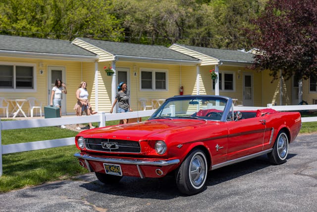
Why the 1965 Mustang’s Design Will Never Go out of Style
April 17 marked 60 years since the Ford Mustang’s public debut at the 1964 New York World’s Fair. The original pony car immediately became a pop-culture and automotive phenom, and it remains one of the most impactful cars in history. We’re celebrating with stories of the events surrounding the Mustang’s launch, the history of the early cars, and tales from owners. Click here to follow along with our multi-week 60 Years of Mustang coverage. -Ed.
On the cover of its January 6, 1967, issue, TIME magazine featured not one person but a whole generation: 25-and-unders. Approximately 76 million Americans were born over the two decades following the end of WWII, and by 1966, people aged 25 and younger had become a demographic force to be reckoned with. This new “baby boomer” generation was closely observed by their parents, market researchers, and the state, yet it seemed hardly any of these elders truly understood them.
Well, anyone except Anthony Lido “Lee” Iacocca, who had just given them exactly what they wanted.

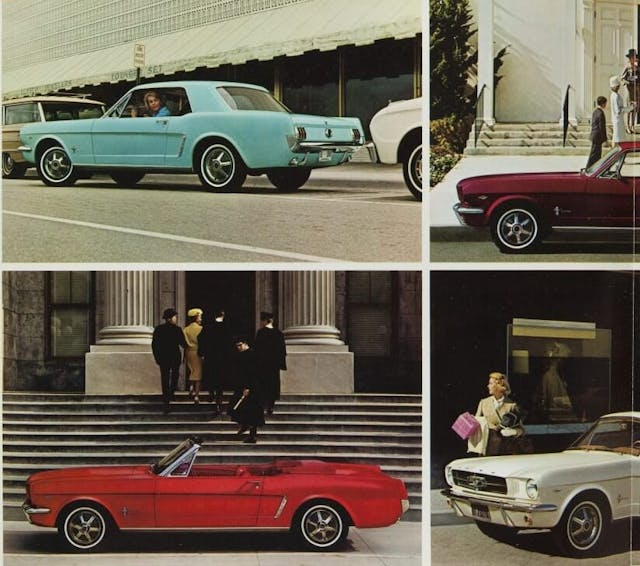

By the beginning of 1967, when TIME put the Mustang’s target demographic on its cover, Ford had already sold well over a million Mustangs. Of course, not every one of those buyers was in their 20s. However, as the old auto industry adage goes, you can sell a young person’s car to an older person but you can never do the opposite.
Many more Mustangs have since followed, and although most are rather handsome, none seems to have quite the same enduring, almost universal appeal of the 1965–66 original. It simply looks, for lack of a better word, “right.”

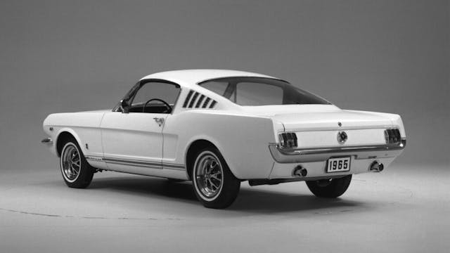
A design like this occupies an elusive aesthetic sweet spot, as difficult to express in words as it is to achieve in the metal. Yet it is immediately apparent to the eye. Few car designs hit that mark, much less projects like this one.
I’ll elaborate: The stories that we car buffs love to celebrate often involve bold, daring designs stemming from the unique vision of larger-than-life individuals. Yet the Mustang’s origin story couldn’t be more different from that romanticized ideal. An extensively researched corporate project that can’t be credited in its entirety to any single individual, the Mustang’s design wasn’t out to innovate or polarize. The roots of its enduring appeal are much more subtle. Brilliant execution had more to do with the car’s success than with the idea itself.
Marketplace
Buy and sell classics with confidence
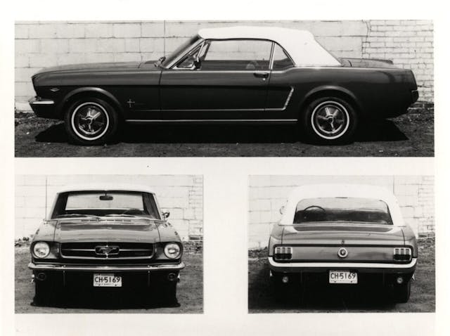
Design work on the Mustang commenced in late 1961, under the direction of Ford’s newly appointed design vice president, Gene Bordinat. By then, Detroit’s stylists had all but left behind the previous decade’s decorative excesses to embrace simpler volumes and large, unbroken surfaces. With its pin-sharp lines and sheer surfaces, the Mustang fit right into this mold, leaving proportions and detailing to set it apart from anything else in its price range.
To make the “Special Falcon” (as the Mustang was being referred to during development) a car that, in the words of Joe Oros, Ford’s head of car and truck styling at the time, “would look like fun,” Ford’s stylists gave it the proportions of a European sports car. That meant a long hood, short deck, and a hop-up on the rear fender to give the Mustang a slightly crouched, ready-to-pounce stance. It has a trim, lean volume whose deftly modeled surfaces have just the right amount of crowning to take away most of the severity such a boxy shape might otherwise evoke.
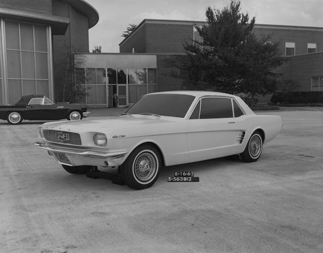
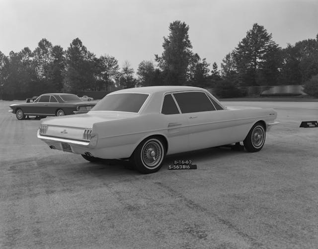
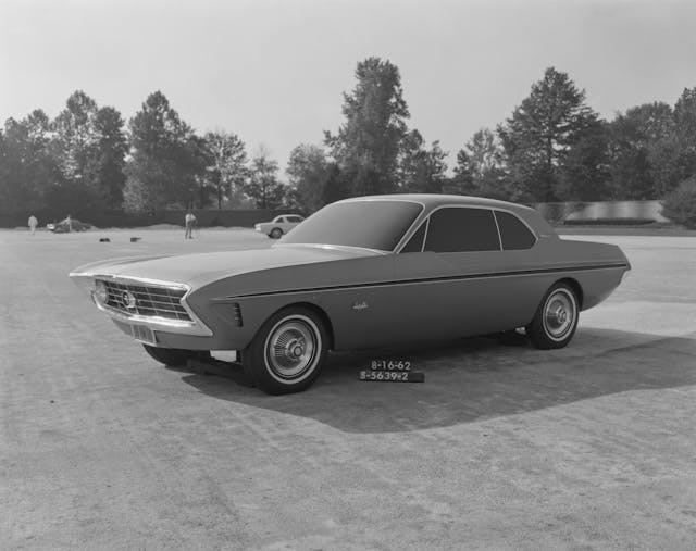
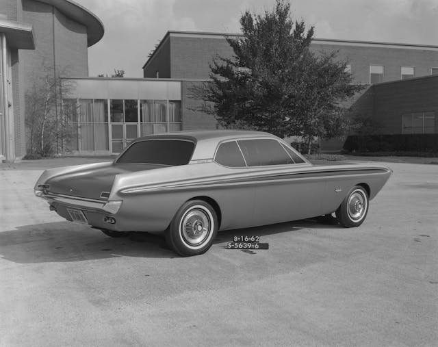
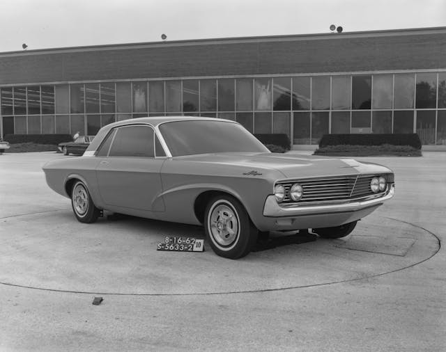
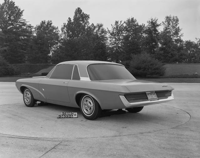
The mission to give the Mustang the appearance and character of a much more expensive sports car was then completed with particular details. Note the the nerf-blade front bumper and the now-iconic large “mouth” above it. The latter was inspired by period Ferraris, while the idea of fitting a big die-cast emblem inside it came from the large trident badge found in the Maserati 3500 GT‘s grille. Interestingly, the design department’s original intention for the Mustang’s signature side scallop was to feature a functional intake to feed air to the rear brakes. However, since the additional ducting required would have added about $5 per car in production costs, it became a merely decorative item. Similar cost reasons also led the six individual taillights initially envisioned by Ford’s stylists to be grouped into two bezels.
Still, a neatly executed design and a perfectly timed launch can only go so far in explaining the original Mustang’s staying power. In fact, I believe there’s one more aspect of its design that, although rarely discussed, has been key to making it such a perennial favorite.
As Oros recalled years later, “We talked about the sporty car [referring to the Mustang] not being too masculine, too macho. It had to appeal to women as well as to men. We agreed that it had to be sporty and personal, that young people would enjoy driving it.”
That decision is what sets the original Mustang’s design apart from the ones that followed. The car looks dashing and sporty even in its most basic form, and the effect is care-free and unintimidating. Even in its hottest, “Shelby-fied” GT350 spec, the first iteration of the Mustang has a purposeful look rather than an outright aggressive one.
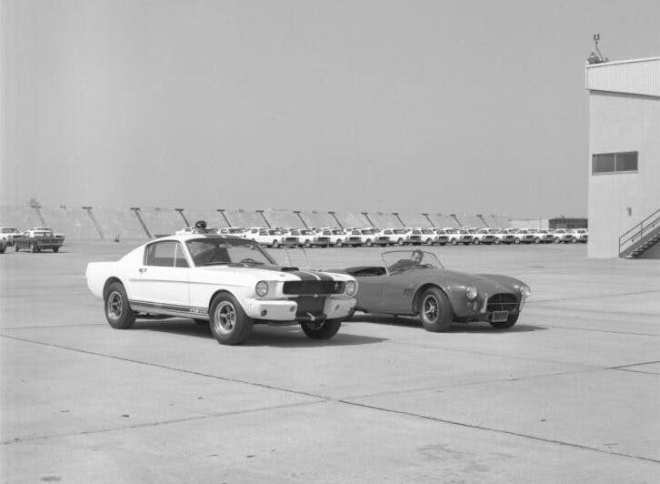

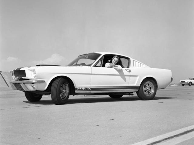
As we all know, it didn’t stay that way for long.
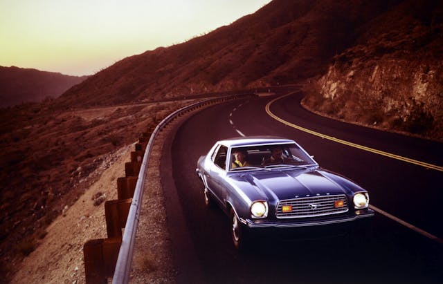
Caught up amid Detroit’s late-’60s horsepower war, the Mustang put on muscle and a whole lot of fat in the space of a few years. Although that resulted in some genuinely epic machines, the Mustang’s customer base ended up shrinking year-on-year, until Ford reversed course with Iacocca’s “little jewel,” the controversial Mustang II.
The current Mustang is the best ever made by every on-paper metric, but it, too, represents much more of Bunkie Knudsen’s vision of the model than Iacocca’s. There’s nothing wrong with that, mind you, and things probably could not be any different, especially in a world where pretty much every car and truck is styled as if it’s out for blood.
Still, there’s something to be said about a design that not only remains just as coveted now as it was 60 years ago but looks like it will be for the foreseeable future. Despite being very much a “design by committee,” the original Mustang is also the definition of a design classic. On the one hand, it epitomizes the era for which it was conceived, yet on the other, it is utterly timeless. Just as timeless and universal is the message the car radiates. Whether it’s a straight-six on hubcaps or a loaded 289 Hi-Po, a 1965–66 Mustang always looks like a good time.
And who doesn’t like a good time?
Matteo Licata received his degree in Transportation Design from Turin’s IED (Istituto Europeo di Design) in 2006. He worked as an automobile designer for about a decade, including a stint in the then-Fiat Group’s Turin design studio, during which his proposal for the interior of the 2010–20 Alfa Romeo Giulietta was selected for production. He next joined Changan’s European design studio in Turin and then EDAG in Barcelona, Spain. Licata currently teaches automobile design history to the Transportation Design bachelor students of IAAD (Istituto di Arte Applicata e Design) in Turin.
***
Check out the Hagerty Media homepage so you don’t miss a single story, or better yet, bookmark it. To get our best stories delivered right to your inbox, subscribe to our newsletters.






65-66 Mustangs are the source DNA for sure, but they have a of-there-time cuteness about them.
The 68 & 69 Mustangs (and their design differences) are more of the mental image and personality that the 2005+ Mustangs are based upon.
Peel the Brougham off the Mustang II and it has 65 in it. Fox body not so much stylistically, but in intent. However if they hadn’t done the 5.0 that story likely plays out very differently.
I am curious if we get a retro-fox body era at some point.
Those proposed concept Mustangs have a lot of fail in them, and also a lot of Avanti???
Retro Fox-Body Mustang? Please, no! That would be as bad as if they made the ‘Stang into an SUV or something – oh…wait…
As someone.who was there (albeit as a car fan kid), allow me to offer a comment…
Yrs, the 65-66 looked great.
but by ’67, the design, as handsome as it was 30 months before, had become bland, primarily because it had become so common.
The 67-68 had the same basic design, but had a pleasing bit of muscle on the bones. Losing the slab sides gave it the look of a performance car.
The ’69 took it a bit further. I’m not a fan of the ’70s as I have an aversion to the phony front headlight vents…I’d rather have the (heretical to some of the Mustang faithful) 4 lights of the ’69 than faux vents.
Long overshadowed by the “original” and the later performance models, the 1967-68 just might be the most “Mustang” of the herd.
I wish I had not sold my 69 Mach 1 thinking marriage was the financial priority, ARG! To build one is on bullet list at age 70
I would agree that the 65/66 just looks like a good time.
Nothing ever stays the same, in design or otherwise. Having said this though, good design is based upon fundamental principals of how we see the world and the forms that exist in it, and why they are either attractive or not so much. Having a under graduate degree in design, of course studies delve into what these aspects are, but suffice it to say, most know a good design when they it, and the original Mustang and the iterations that followed all tried in their time to embrace what the genesis of the original held. Suffice it to say though, that all Mustangs until the S550 were based upon platforms shared with other vehicles. The S550 was the first iteration to have its own unique platform designed just for its single use. This was also true of the Coyote engine, although it has seen use in other Ford vehicles.
It is argued by some like Jay Leno that the first design is the best. In this case the classic shape is just right and has wide appeal. That Lincoln Mercury Studio design would have not become the classic this car became.
For a lot of folks – like me – who came of age around the time of the Mustang’s debut, its design evokes the era. The original isn’t particularly gorgeous, for several reasons, yet it’s endearing and desirable. In context, the Sixties were cranking up, a Presidential assassination required entertaining distractions, new music had arrived (which has also stood the test of Time), and Viet Nam had yet to decimate so many of us. To my eye, the ’67-’68 is more attractive, and the ’69 – except for the fake quarter scoops, which the Boss 302 avoided – has the most aggressive & exciting styling. I’ve owned several generations over the years, and have rarely not had a Mustang in the “fleet”.