Media | Articles
Vision Thing: Cluster lighting, Norman Doors, and Spam in a can
“Do I drive, or am I driven?
Do I break, what I’ve been given?
Take a walk, turn, talk
Or crash and burn” – The Sisters of Mercy
One evening recently I had dinner with a retired automotive suspension engineer. Over exceptional mussels in garlic sauce we talked shop for several enjoyable hours. Afterward, upon starting my Ferrari Mondial to drive home, its instrument panel remained stubbornly unlit. Bugger.
Marketplace
Buy and sell classics with confidence
Everything else was fine—warning lights, headlights and the HAL9000-style self diagnostic panel next to the gear lever. With the lateness of the hour no clear path to a roadside repair in sight, I crept home using my ears as a rev counter (no issues there) and other cars on the road as a speedo.
The following weekend, after checking the fuse and finding it to be okay, I spent a couple of evenings alternating between deciphering wiring diagrams and wondering how much cash it would cost me for an auto electrician to chase down the fault.
Then, the next morning, a moment of clarity. Doesn’t the Mondial have an instrument dimmer? Check the owner’s manual—indeed it does. There is an unlabeled black knob, above an identical unlabeled black knob for the trip reset. Trying to turn it clockwise revealed it couldn’t rotate any farther. So I turned it counter-clockwise. The instruments became bathed in dim green light. Bullet well and truly dodged!
I know exactly how this happened. The fuel gauge is, well, an approximation to be generous. It does work, sort of, but even when full only reads three quarters of a tank. So I’ve started resetting the trip odometer on every fill-up. I got these identical knobs confused, which is an indicator of bad design, but when was the last time you turned anything counter-clockwise to increase it’s value?
In the days when car stereos had knobs for tuning and volume, you didn’t need the manual to tell you turning clockwise moved you up the frequency range or allowed those outside the car to enjoy your music. It’s an established heuristic; you know it immediately by looking at an object how it operates. Same thing with heater controls, whether they’re rotary or sliders. Right to increase heat or fan speed, left to decrease.
Seems simple enough, no? But if you look around at the objects you interact with every day, the Ferrari Mondial instrument panel dimmers are far from the only oddities. Failures are everywhere.

My satellite television remote control has a back button (labeled with a left pointing arrow) to the left of the big home button (labeled with a house icon). The home button does exactly what you expect: it brings up the interface for the TV guide, recordings and so on. You might naturally assume the back button would take you to the previously visited page. Twenty-five years of web browsing has hard-wired this into our brains. But what it actually does is close the whole interface, taking you back to whatever program you were watching. It drives me bonkers. Every. Single. Time.
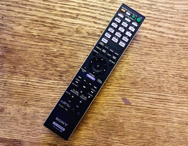
Want to see a real usability horror show? Take a look at any Sony remote control.
One of my jobs when I was in the car design studio was the supervision of a pair of hard models that were being made for pre-launch build up. Totally indistinguishable from a real car, they each took nearly a year to put together. That meant daily trips to the model operations department to see how things were progressing, check fit and finish, and chase up any wayward parts. The build area was a glass booth in a corner of the workshop that was entered by a door with a pull handle on it.
As the placards indicate, this was a push door. Even though I knew it was a push door, I’d still keep trying to pull the door open. No matter how many elbow jolts I suffered, the heuristics of a handle subconsciously indicated to me it should be pulled. There is a name for this phenomena: “Norman Doors,” named after (but not by) Professor Don Norman. Regular readers will remember him from my article about the BMW XM.
Norman’s frustration not just with bad doors, but rather interaction failures with all sorts of everyday objects. It inspired him to write his seminal book, The Design of Everyday Things. In it he stresses the importance of:
The interplay between technology and people to ensure that the products actually fulfill human needs while being understandable and usable. In the best of cases, the products should also be delightful and enjoyable, which means not must the requirements of engineering, manufacturing and ergonomics be satisfied, but attention must be paid to the entire experience, which means the aesthetics of form and the quality of interaction.
Interaction! Is this not the joy of owning and operating a classic car? Those pleasurable feelings we get from a press of the throttle that creates an immediate response from the engine. The mechanical movement of a shifter as it moves through up and down the box. These experiences are important in creating an emotional bond with our cars. More than that, they involve us in the activity of driving—an enjoyable, interactive feedback loop of safely controlling a vehicle as it progresses down the road. The car is constantly communicating with you, telling you what it’s doing; a lightening of the steering to indicate a loss of grip, or a baulked shift to let you know you rushed the gearbox there, Mario.
Modern cars eliminate much of this critical feedback. Advanced suspension controls exert an iron grip on roll and pitch. Thick sound deadening quiets road noise and tire squeal (and crucially outside noise). Meaningless-acronym safety systems keep the whole thing shiny side up and undented. In some respects these are objective improvements, particularly when it comes to safety. But the consequence is that we’ve been reduced to little more than passengers controlling velocity and direction, pawing at touchscreens in an often-vain attempt to navigate several sub-menus just to adjust the cabin temperature.
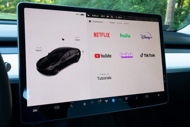
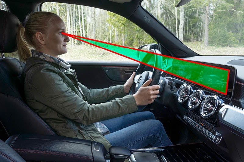
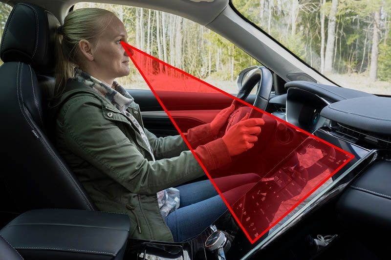
Interior designers and User Experience/User Interaction (UX/UI) designers love touchscreens. Adaptable and context configurable, they allow a simplifying of the instrument panel, a lower part count, and slick animations that make the machine seem more human and approachable. The issue: As secondary controls have migrated to the touchscreen in an effort to declutter car interiors, not only has the feedback loop been broken by the removal of any tactile response to an input, drivers need to divert their attention from the road to visually confirm the inputs they’ve made, taking eyes off the road and onto the iPad glued onto the dash top.
We are starting to see some pushback; a recent study by a Swedish consumer magazine tested driver response times for a variety of touchscreen based tasks in different cars against a rather analog 2005 Volvo V70. The V70 travelled the shortest distance by some margin, because the driver is operating on muscle memory and haptic responses, negating the need to look at what the hands are doing. A more situationally aware, fully engaged driver, as part of a complete control “system” is a safer driver. Sound a bit like something a pilot might say, doesn’t it?
Funny enough, Captain Chesley Sullenberger (probably the most famous pilot alive) once said, “when we assign technology as the doer and the human component as the monitor, we’re doing it backwards. Humans are inherently poor monitors.” He goes on:
I think that would make sense based upon the experience we have had in commercial aviation. I think that would help, up to the point where people think that no matter what they do—no matter how distracted they become, no matter how impaired they are—that technology will save them. I think it’s unlikely that even Airbus-style protections can save people from themselves if they really feel like they’re invulnerable and they aren’t actively engaged as skilled, alert drivers.
Captain Sully made these remarks in comparison with automated flying systems and their relevance to advanced driving aids and autonomous cars, but having an appropriately engaged operator in charge of a any vehicle is not a new debate. It goes back to the space race and the gestation of Project Apollo.
When Apollo was being conceived in the early sixties, the previous Low Earth Orbit programs of Mercury and Gemini had reduced the role of the astronaut to little more than a passenger. This was partly because a lot of the engineering knowledge inside NASA came from guided missile programs, where the flight was controlled by a guidance computer. But the near disaster of Gemini VIII proved the importance of a skilled pilot with hand on the stick, especially as Neil Armstrong and Dave Scott fought an out of control spacecraft with a stuck open thruster.
As the technology and systems were scoped out and developed, debate raged within the administration as to how much control the astronauts have over not one, but two spacecrafts (the CSM and Lunar Lander). But the space race was political as much as it was technological, and the Soviets relied almost totally on automation for its space flights. In the book Digital Apollo – Humans and Machines in Spaceflight author David A. Mindell describes the Russian approach as, “a cog in the larger machine of the state, taking individual initiative within heavily prescribed constraints of ideology and authority.”

The first man in space, Yuri Gagarin, was not even a test pilot. He was merely a junior fighter pilot with a mere 230 hours in his log book. His Vostok space craft did have manual reentry controls, but they were blocked by a combination padlock, the code to which was placed in a sealed envelope only to be used in an emergency.
This was total anathema to American ideals of individualism and heroism. No self-respecting alpha male test pilot would allow himself to be merely “Spam in a can.” In the end, with over six successful lunar landings, not one was automated … even though the Apollo Guidance System was capable of carrying out a landing without pilot intervention. The precedent was set by Armstrong on Apollo 11, which would have almost certainly aborted due to a computer overload had he not taken manual control.
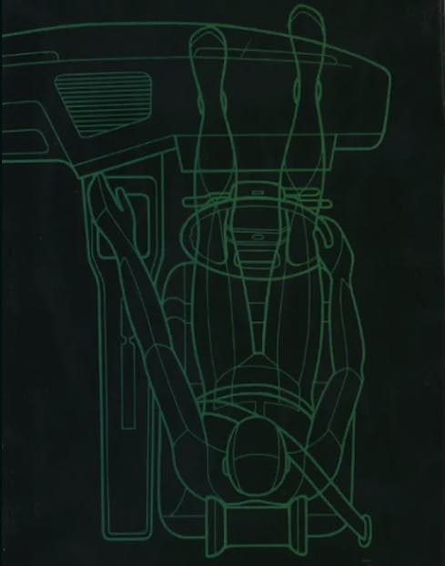
So here’s the issue: Too often, design overlooks the human element—not only how we use things, but how easy and intuitive they are to use. Humans are emotional, irrational, impulsive creatures. If something is awkward and confusing to use, we get frustrated and detach from it.
Make it pleasurable, tactile, and logical to operate, and we’re going to engage with it on a deeper emotional level. Take my Mondial—now I have illuminated dash lights again, and I’m it makes me all the happier to take that evening dose of vitamin F.
***
Adrian Clarke is a professional car designer, earning a degree in automotive design from Coventry University and a Masters in Vehicle Design from the Royal College of Art in London. He worked for several years at a major European OEM, and in the ’90s his daily driver in London was a 1979 Ford Thunderbird.







I was once able to suit up in a real Mercury Space suit like John Glenn wore.
I had seen the video of him pointing at his dash. I never under stood till I wore the suit.
The dash had mechanical non lighted gauges and if you wanted to read them you had s light in the glove around the area of the fingernail.
The capsule was filled with oxygen so this battery light prevented spark issues I would assume vs a lighted gauge.
We have come a long way,
That’s ingenious and terrible at the same time! Obvious the perils of having a pure oxygen atmosphere inside the capsule would be realised in the tragedy of the Apollo 1 fire, but but those early pioneering flights obviously required some lateral thinking. I’m heading to the US soon and going to KSC. Can’t wait.
Yes Apollo 1 was the undoing. Once Chafed wire and a sealed door doomed our guys. That changed soon after and never has been an issue since.
The KSC is nice but so much of the space program is spread around the country now. To see much of the history you would need many stops.
Even here in Ohio we have several of the space used capsules in museums.
If you have time travel to the Museum of the US Air Force in Dayton Ohio. It by far is one of the best aviation Museums in the world. It is amazing the things they have. I went to the Smithsonian in DC and was disappointed at what they had. Yes they have some significant things but the shear mass of history in Dayton is way beyond what they have in DC.
Where else can you see a SR71, B2, F117, F22 and a YF23 all in one room. Best I know this is the only B2 on public display.
Want to walk through Air Force One? they have 4 of the large planes and several smaller Jets. They have the Kennedy 707 from Dallas and the door frame is still modified for the casket.
Wow thanks for this, the Smithsonian was definitely on the list, but I may have to revise my plans. I’ve never been to DC so that’s still on the agenda, but I’m visiting for three weeks so I should have time to get to Ohio.
As far as your knob goes, if you think of it like a valve, lefty loosey should give you more. Perhaps it is automotive controls that are backward
I’ll spare everybody my normal tirades about stupid touchscreens and the move to automate the driving experience…. but I will say this. In my line of work, they have a thing called human factors where how the interface looks, how it feels, how easy it is to operate and intuitively understand, and how distracting it can be is all factored into the equation. I am quite certain automotive engineers are aware of these same concepts and have elected to ignore them. The consumer is dazzled by the touchscreens (they are getting put on everything including %^&*@ refrigerators), and if I pay a lot of money for my car, I want my touchscreen to be bigger and have more junk on it than the other guys… I suspect it is the consumer that is driving this very unsound way of designing car interiors, and not the designers. Of course I generally blame the ‘average’ consumer for why cars are increasingly becoming boring and soulless contraptions, why TV sucks, why I quit listening to broadcast radio years ago…
There is certainly an element of that, and consumers don’t always know what is best for them. I once had the opportunity to try out a Bloomberg finance terminal, and it has probably the worst UI I have ever seen. Functions and information are accessed by entering command lines, windows don’t scale, the color palette is akin to a ZX Spectrum and the whole think has an 8bit feel.
When I questioned this I was told that the traders liked it because mastery of the system effectively was essentially an alpha badge of honor on the trading floor. Go figure.
If something is to be operated by a human (or at least with a human aboard), there should be close study of human interfacing at the design stage. Lives and safety are more important than function. Long ago, I was in the printing biz, and we had one specific press in our shop that, during manual cranking in a cleanup process, necessitated bending over the machine by the operator. On two separate occasions, long hair was caught in the press! Fortunately, one didn’t have to assume that particular position when the machine was running. But it was certainly not well thought through during design phase to think that the human operators might not have long hair that they neglected to fasten out of the way.
And I’m with snailish in that I will refrain from a tirade against touchscreens and attempts to automate everything – my thoughts are likely known to regular readers of the Hagerty Community pages. Suffice to say, not everything is “progress”.
Adrian’s stuff is great as usual. Thanks for this.
While I seldom comment on articles like this, I must say that this is extraordinarily well written and thought through and should be mandatory reading in any university course on industrial design, whether it is automotive design or any other kind of product design. Indeed, it is surprising that we have not seen comments like this before, so kudos to the writer here….As an aside, I wrote a book about Raymond Loewy, the father of Industrial Design (“Lancia Loraymo and the Loewy Logic of Industrial Design”) and Loewy had a theory called MAYA, “Most Advanced Yet Acceptable,” when he designed a product, and it is still a good approach to consumer goods, and I think this writer would agree.
Yes, Loewy was pretty on the money when he said that, and I would absolutely agree it’s still a good approach to all consumer products. I think too often car design, because it’s so specialized, has a slightly blinkered approach. The studios don’t always look at what’s going on elsewhere or learn the lessons of the past. The BMW i3 & i8 were brilliantly realized, forward thinking attractive designs but despite what designers such as myself think, they were a step too far for the market.
And they weren’t the first by any means: Chrysler Airflow, Porsche 928 and the Ford Sierra are a few more that spring to mind.
I’ll have to grab a copy of your book!
Even though we know knobs and buttons can be remembered and you can muscle memory your way through something while keeping your eyes on the road we seem to be obsesses with screens everywhere. So called safety systems make some people lazy and staring at a screen is not good for paying attention what is going on the road. But progress, screens for everyone and everything. No wonder few new cars are exciting me anymore.
It’s somewhat fortunate (but still less than ideal) that safety systems have proliferated at the same time as touchscreens. Imagine drivers taking their eyes off the road without lane keeping or emergency automatic braking. It would have been carnage.
Part of the problem is that OEMs are in a features arms race. It used to be that power operations of the mechanical functions of a vehicle was seen as a luxury. Now that’s all covered so it’s increasingly about digital convenience. Your competitor offers an OLED touchscreen? Well you’d better as well or customers will cross the road. I do think the tide is turning albeit slowly (because of the way digital systems have to be rated and the costs amortized over the long term, we’re stuck with them for now).
I move back and forth between a number of vehicles many of which are a mass or should I say a mess of tech Nannie’s with frustrating screens, as I try and turn off as many as I can. It is frustrating enough to deal with tech and screens as well as attempts to integrate Apple Microsoft and google into a singular functional work tool.
My greatest pressure is driving home in my vintage ride (when not suffering from the earliest tech attempts). Simple satisfactory, engaging and so much more economical not to mention a high degree of human design integration.
I think the question designers should be asking themselves is “is this an appropriate use of technology; am I adding to or taking away from the quality of the interaction and experience?”. Something like CarPlay is an absolute gamechanger, so much so I paid £500 for a box of tricks so I could add it to my Range Rover.
But yes, badly integrated features and systems jar and can be invasive.
Much of the screen deal is as much to do with simplicity of construction and weight.
A simple screen is replacing a number of mechanical points of failure. One screen works for all of it and to be honest they are damn reliable for most. GM for example is using LG to not only build but design their screens. They are the industries best. Many big names have always been hidden in the dash with radios and equipment.
They at one point were looking to just offer a screen and eliminate the radio and audio head unit. With most people with Smart phones they believe if they just offer the amp and speakers the phone will take over the entertainment. This eliminates cost and weight. Not sure that will ever happen but it is a consideration.
The flexibility of the screens are endless so they are not going to go away.
What I do wish they would expand is Heads Up Displays. I have owned a number of these and they are great. You keep your eyes on the road and they can today supply a number of things from speed and RPM to directions for GPS. For me the Hud replaces much of my dash as I neve look at it.
Even in my GMC it will show me pedestrians in the fog and what the speed limit is on the road I am on.
The right combination for new vehicles is a mix of both touchscreen and hard controls. Give the appropriate systems the right controls. Something like climate which is usually set and forget, but may need instant adjustment, should be tactile knobs. Same for demist. But settings that don’t require constant adjustment or have a more granular settings can be on a screen.
When the Velar was launched I got to borrow a First Edition overnight, which had every single option, one of which was HUD. My immediate thought was, why doesn’t every car have this?
Unless the touch screen is being used to change the driver ‘assistance’ system’s settings.
Thank You, Sir….have been trying to pinpoint the abhorrance I have to “new” cars….they simply aren’t cars, at all, and have no excitement, no sex appeal, no connection to the act of driving at all…still love my 2001 911, and got it just in time before everything bacame an arcade.
Oliver Blume needs to hire you ASAP to salvage VW‘s EV’s!
I’ve not tried one yet, but by all accounts they’re really bad. To the extent that reliance on VW systems has been pinpointed as a significant risk factor in the Porsche IPO.
Even though this article is mostly about automotive design, I’m a tad surprised there is no mention of Apple.
I generally try to avoiding referencing Apple, because I’m a bit of an intellectual snob and when writing about good design constantly mentioning them seems cliched. That’s not to say they don’t take design very seriously, because they absolutely do. I mentioned my pain on using a Windows 10 laptop after years of MacBook Pros in an earlier column, but if it’s of interest I could write a piece about what exactly it is that they get (mostly) right.
Are you listening, Subaru? The iPad like controls on the 2022 Outback are a GIANT driver distraction. The irony is that the Subaru “Eyesight” System calls you out for not looking at the road while you hunt through three layers of screen just to turn off the seat warmers, adjust climate or do other mundane things that used to be just a tactile button click or rotary knob turn away. It sucks what little joy there is out of piloting what is otherwise a fine transportation appliance.
First order of business should be to familiarise yourself with all the controls in the vehicle. As a dealership technician one of the big frustrations was checking out systems that ” were not working” only to find it was operator error. I have an owner manual from a used car that was traded in and it’s still shrink wrapped. As one factory school teacher once said “there are millions of people who can drive a car but very few can operate it”
The has to be the first time I’ve seen a quote from The Sisters of Mercy.
I totally agree with this article as I type away on my iPad. I currently drive “older” Toyotas, 1991 MR2 and 2006 Tacoma. No such large screen displays exist in either vehicle. I don’t look forward to the next replacement to either of these as current cars and trucks have these god awful tablet screens slapped on the dashboard.
Give me the old school tactile feel of selecting controls or twisting of knobs. Too much to ask???
I drive a 2001 Honda Accord daily, and have a 2002 WRX for fun, and I too am dreading the day that I have to move into a “modern” car. I hope some enterprising car manufacturer starts to offer “throwback” editions of new cars that do away with all the screens and cameras and nannies and go back to knobs and tactile buttons, throttle cables, and *maybe* just ABS for those of us that like to actually drive.
I have a Mazda 3, and the gauges are buried so deeply under a visor that it is impossible to read them during the day. The heater controls are so tiny, complicated and so low on the dash that I have to pull off the road to change anything. The GPS system is impossible to figure out and the radio has three different ways to accomplish most functions, all of them complicated. Why can’t cars have a simple 5 button preset for stations, like the old days?
Your are preaching to the choir. There is so much bad design in the world. Menus and multiple interfaces have no place in an automobile. Great article.