Media | Articles
Vision Thing: Is the XM concept a sign of BMW’s downward spiral?
Is the XM BMW’s Metallica by Metallica moment? Is this the point forward from which everything turns into a creative and aesthetic affront to the masterpieces that came before? Are we seeing an indicator that a vocal subset of fans should accept that BMW’s best is already behind it? Possibly.
Of course, before we get into what is subjectively and objectively off with the XM concept SUV, let’s dive into some history. By the early 1990s, BMW was suffering from the “same sausage, different lengths” problem. The 3, 5, and 7 series were essentially the same design, just sized differently. Recognizing they had designed themselves into a corner, enter stage left Chris Bangle, as head of BMW design in 1993. Having made his name with eye-opening 1993 Fiat Coupe, Bangle took the BMW house style cultivated over generations by Paul Bracq and Giovanni Michelotti and promptly threw it out of the studio window. Although he was head of design when the Z3 (designed by Joji Nagashima) and E36 3 series (Erik Goplen) appeared, the first BMW to truly bear his fingerprints was the E65 7 series, with its controversial “Bangle Butt” (the design was based on sketches by the man who ultimately replaced him, Adrian van Hooydonk), followed a year later by the E63 6 series.
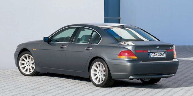
Bangle didn’t invent the term “flame surfacing,” but he was influenced by the Deconstructivist buildings of Frank Gehry. In fact, BMW figured out how to stamp complex compound curves in metal in one pressing, and it became the thing he is most known for, apart from wrecking years of BMW design heritage. Although Bangle retired from BMW (and indeed car design) in 2009, within the Vierzylinder his disruptive influence is still being felt. Although his cars were not universally adored—I personally find the E60 5 series on the right wheels extremely pleasing and modern, even today—the fundamentals were right and they had a clear direction. The direction BMW design seems to have gone since? Straight down the toilet.

Adrian van Hooydonk replaced Bangle as head of BMW group (including Rolls Royce and Mini) design, but beneath him BMW itself has been going through chief designers at an alarming rate. In the last four years the automaker has churned through three before settling on the incumbent, the promoted-from-within Domagoj Dukic, who has been with the company since 2010. This turnover suggests a company at war with itself over its design direction; addicted to revolution and disruption over the quiet authority and evolution of the pre-Bangle years. The XM’s confusing identity is a visible manifestation of this inner corporate turmoil.
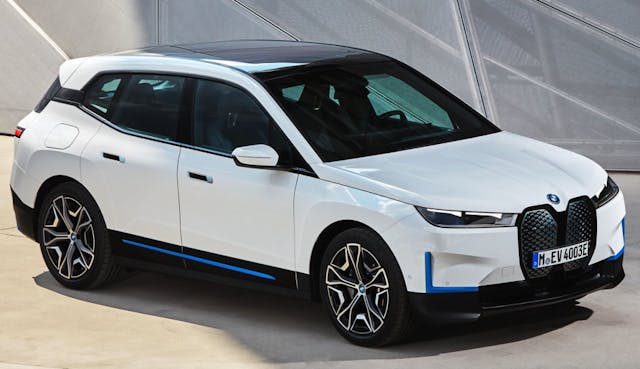
The iX was clearly warning us what to expect with the XM—the ominous violin sounds before the actual act of horror itself, but that doesn’t make it any less shocking. BMW pushed back against online criticism online of the iX, an act of hubris that backfired spectacularly. Doubling down, BMW has wheeled Domagoj Dukic out for a number of interviews with lifestyle publications in an attempt to intellectualize and defend these designs; the inference therein is that if you don’t get them then you’re simply not design literate enough.
Marketplace
Buy and sell classics with confidence
What the XM certainly is, is deliberate—what the Quandt family, and Adrian van Hooydonk hard-headedly believe is the future of BMW. The XM is not a promising concept executed badly, compromised by the wrong platform or cost cutting; it’s a symptom of a company unwilling to listen to voices outside the echo chamber. This is a hell or high-water vision of the direction those in power want the company to take. It’s easy to look at the oversized grille, imposing size, and brutal surface treatment and come to the conclusion it will appeal to markets like China, Russia, and the Middle East, but what’s relevant here is Bunkie Knudsens old adage about not being able to sell an old person’s car to young people. In other words, what are the young people into?
When I was a design student, Audi was where it was at. Its combination of technology, innovative lighting graphics, and the stunning-looking TT, A2, A5, Q7, and R8 (all subsequently worsened in their sequels) meant all the kids were always sketching Audis. Now more than a decade later, the internet has resulted in mainstream cultural and design curation moving away from its traditional homes of art galleries, museums, and books to an online milieu; a digital postmodern obsession with an Eighties flavored retro-tech future that never actually existed.
When us Gen-Xers got our hands on the cultural levers, our rose tinted glasses looked backwards to our youth, sanded off the rough edges, put it all online and decided it was cool. Call it the Ready Player One effect. It’s one of the reasons I’ve never watched Stranger Things, as I refuse to have the Eighties repackaged and sold back to me by people who weren’t there, haven’t read a page of William Gibson, and didn’t experience the Armageddon-shaped downside of the decade.
As one wag quoted on Twitter back in 2013, “unless you’re over 60 you weren’t promised flying cars, you were promised a cyberpunk dystopia. Here you go.”
This is how we ended up with the XM. Sketched by young people fed a steady diet of context-free Bladerunner GIFs, pixel art, and Spotify synthwave playlists. No wonder it looks like a low polygon tank.
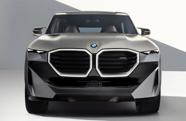
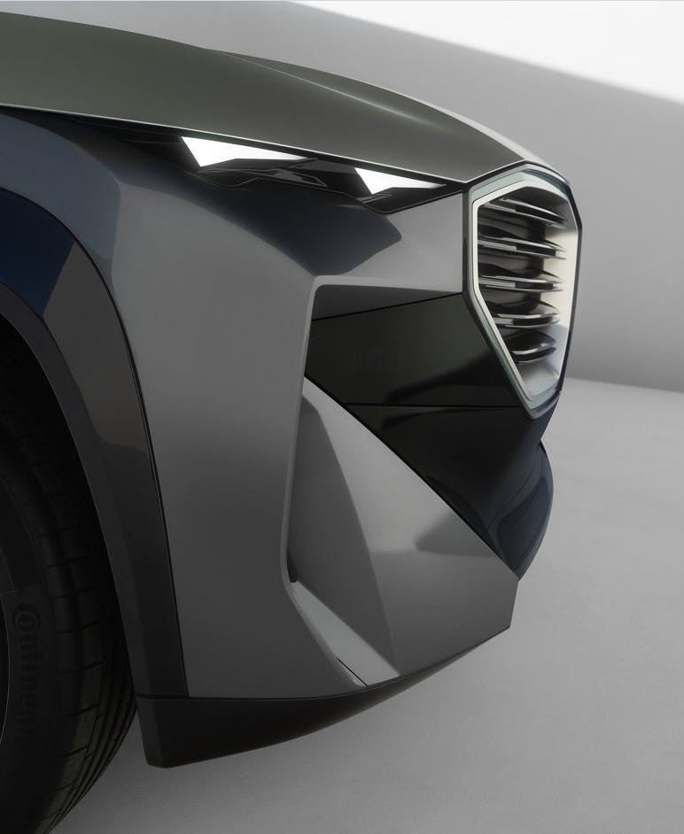
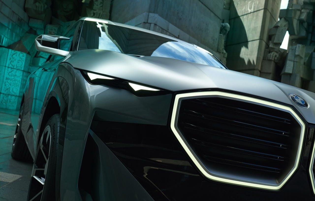
But influences alone cannot atone for all the XM’s sins. BMW says the oversized grille and “techy” small driving lights are important for the Down the Road Graphic (DRG). In that case, why are the grille and the lights so out of proportion to each other? It looks like it’s squinting. Part of the DRG are the headlights—you can’t see them in the press photos but the actual headlights are hidden behind the black plastic graphic, lower down either side of the kidneys. So at night, the full illuminated DRG will appear completely different (and even worse, as if that were possible).
None of the lines on the front of the car have any relationship with the others. There are triangles, odd four-sided shapes and sharp corners all over the place, none of it making any visual sense. No feature is sympathetic to its neighbor. The panel under the daytime running lights is incredibly twisted. This isn’t good design, it’s bad surfacing. Also when viewed from the front there is very little “tumblehome”: the inward cant of the A-pillars towards the center of the car. This makes the whole thing look slab-sided and top-heavy.
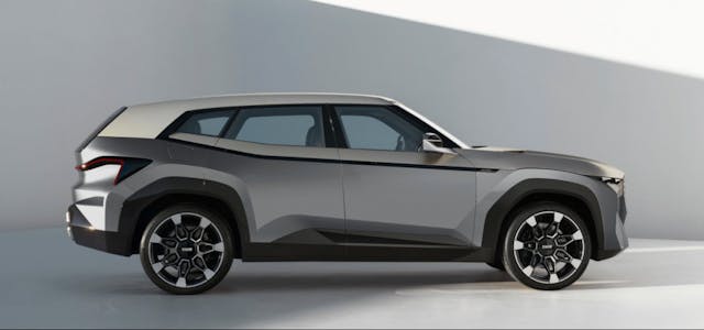
Moving to the side view, the wheel arch flats are comically oversized, badly shaped and as consequence make the wheels appear too small—ironic considering they are 23-inch hoops. Worse still, the rear wheel arch flats are bigger than the fronts, which makes the rear wheels look lost in all that bodywork. The cant rail above the side glass is too thick, further heightening the sense of top-heaviness, and the C-/D-pillar is equally divided between glass and metal; it looks too static and heavy. Extending the DLO rearwards would look lighter and more dynamic.
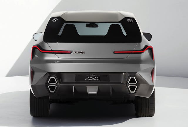
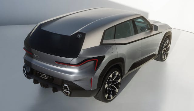
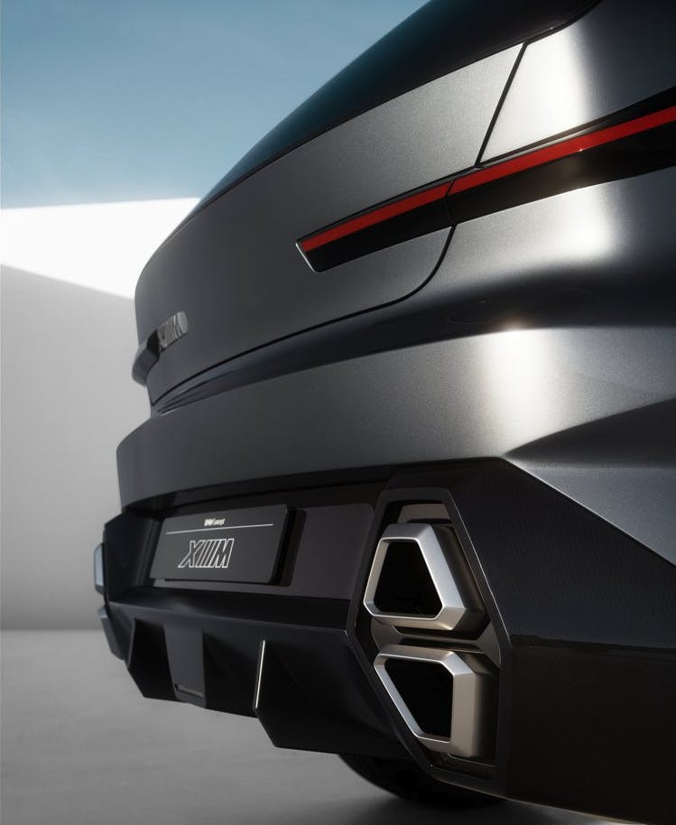
The rear is just a fat knot trying to tie all these disparate surfaces together. The stacked vertical tailpipes make the rear look pinched and narrow, and if you must point out in every video the twin roundels in the rear windshield are proof of the direct line between this car and the M1, then to quote a line from another tragedy, “thou doth protest too much, methinks.”
In his book Emotional Design: Why we love (or hate) everyday things, Professor Donald Norman makes the case that our relationship with an object is initially determined by our visceral reaction to it. Are we attracted or repelled? Things we like the look of are more likely to have a positive emotional impact on us, and in turn we are more likely to engage with them.
Think of it like this. I can cook you a meal, and it could be the most wonderful thing you’ve ever tasted (not likely, there’s no beginning to my culinary talents). But if I chuck things on the plate without any care or attention so it ends up looking like a literal dog’s dinner, you’d never know how good it is because you wouldn’t want to taste it.
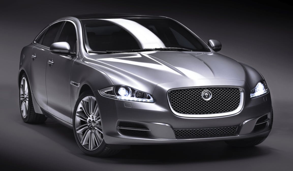
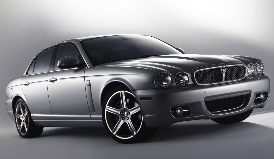
Good design is not about being bold and challenging for the sake it. The 2010 Jaguar XJ was bold, because it had to be. Jaguar’s retro style had become a millstone around its neck a new direction became necessary. It totally blew people’s preconceptions of “what a Jaguar should look like” out of the water. But it was still a terrific-looking car, just different to what we were used to. BMW seems to think it can get away with purposefully challenging designs if it shouts loud enough about the substance in them.
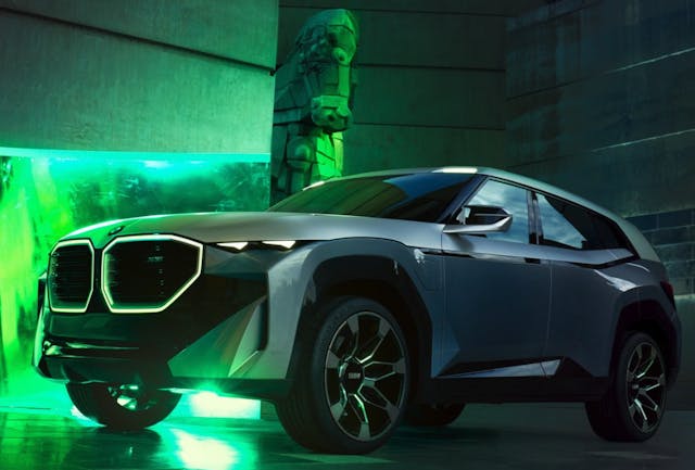
The problem is, there is no substance to the XM—it’s all noise and fury—completely unrelated to BMW Motorsports and its storied circuit racing history. If BMW had an off-road racing heritage then maybe we would be willing to cut some slack. But it doesn’t. So we won’t.







Spot on with the commentary and analysis, yet no one listens… We might know down the road how the company’s unwillingness to respect their past will impact their future… One thing is sure though, I cannot get anywhere near purchasing their new line, it is down right repulsive.