Media | Articles
Vellum Venom Vignette: A Century of mis-proportioning?
It’s amazing how many luxury automotive brands made the transition from their iconic cars to the more profitable, high-volume world of sport utility vehicles. Be it sedan to SUV, or sports car to SUV, the formula is well known: Designers pick out the most important bits of their brand’s DNA, then slap it across the tall body sides and upright face of a utility vehicle. The Porsche Cayenne is almost a collectible vehicle at this point, and even Ferrari got it right. No matter how we may feel, an SUV is an inherently desirable vehicle on its luxurious, aspirational proportions alone.
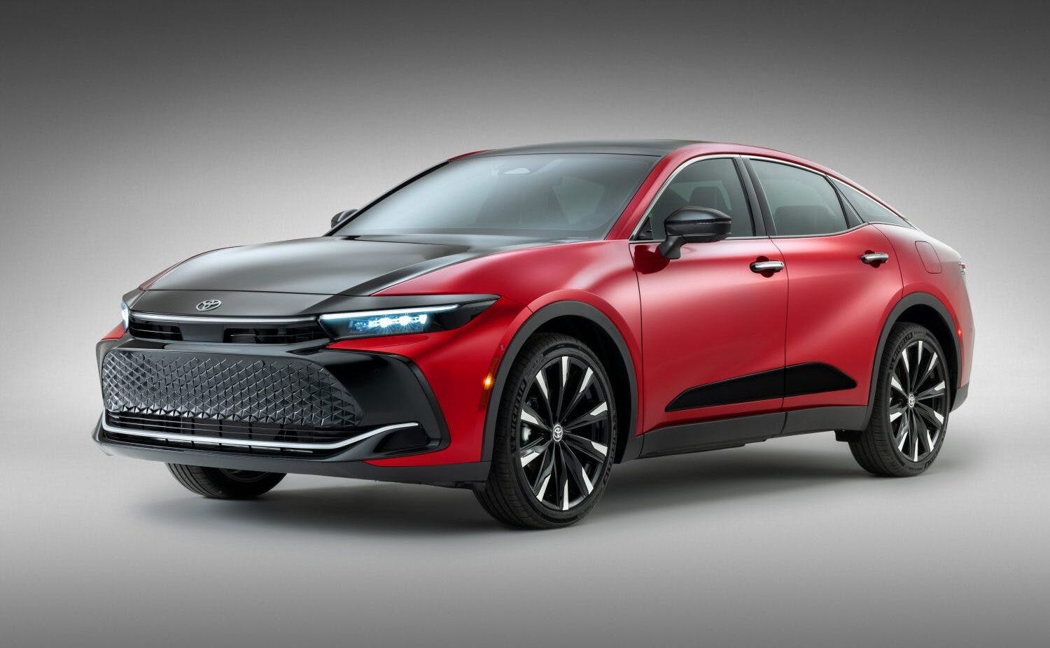
That’s a bitter pill to swallow, but at some point the lines between the machismo of a cab-backward SUV over those of the glorified, passenger car–based CUV (crossover utility vehicle) get blurred. The cab-backward stuff is what really sells to this elite demographic, and that’s why it’s sad that Toyota didn’t get the memo. Both its Crown and Century models went from being the Japanese Cadillacs to CUV-based oddities. Before we discuss the all-new 2024 Century, let’s see what Toyota did with the Crown.
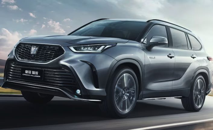
Although the Crown Vellfire luxury van has the gravitas of a Cadillac Escalade, it’s still clearly a narrow people mover like the Mazda MPV we had stateside. The other Crowns are either a fastback CUV or a rebadged Toyota Highlander. Not exactly the greatest start to high-end sport utility, but let’s remember that Toyota Crowns were usually an “of the era” design that fit off-the-shelf bits into whatever the vehicle needed to be to suit the market. That was never a problem, because for decades the Century was positioned above the Crown, having no peer elsewhere in the Toyota lineup.

The SUV blockification (technical term) of the famous Toyota Century should include a rear-wheel-drive architecture, complete with a longer hood to make way for a V-12 engine, or maybe a hybrid V-8 in modern times. Long, clean lines accentuated by more chrome than any other Toyota car on the planet would sweep back from that impressive powertrain, with a tall greenhouse elegantly rising above in the time-honored tradition of luxury SUVs. This is how Toyota succeeds with a luxury SUV, in the same vein as Porsche, Ferrari, Rolls-Royce, Bentley, and even Aston Martin have with their own SUVs.
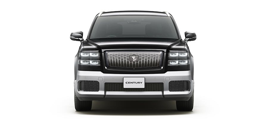
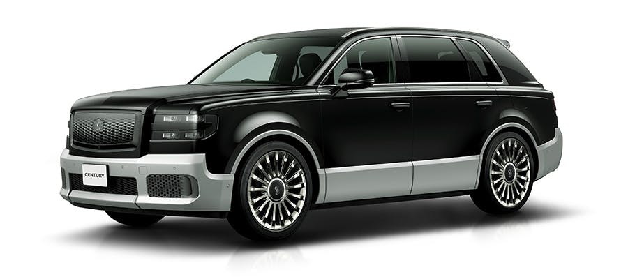
And they almost made it work. The Century’s massive grille, turbine-style wheels, and understated body surfacing are hallmarks effectively transferred from the famous sedan to the new SUV. The headlights sport an external shape that works well with the current sedan (which is still in production, for now), but the lower chrome cladding made way for a complementary paint color in the transition. Not ideal, and the face looks a bit like a Cat Eye Silverado with LED headlights from eBay Motors. But that’s merely a North American-centric reference. The bigger problem are the overhangs that cling tightly to the massive wheels, in a most CUV-like manner. Uh-oh, is this actually a CUV and not an SUV?
Marketplace
Buy and sell classics with confidence
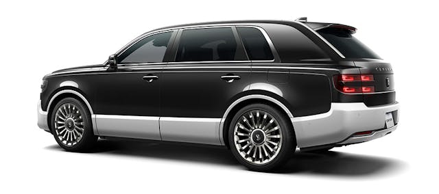
It’s all very Rolls-Royce Cullinan in aspiration, if not in execution. Yes, the taut, understated body surfacing is appropriate for a luxury vehicle. But its size and proportioning do the surfacing an extreme disservice. Imagine these lines on the proportions of a Toyota Sequoia, for example. That said, words take a long time to get the point across, hence why a picture is worth a thousand of them. Or in this case, two pictures.
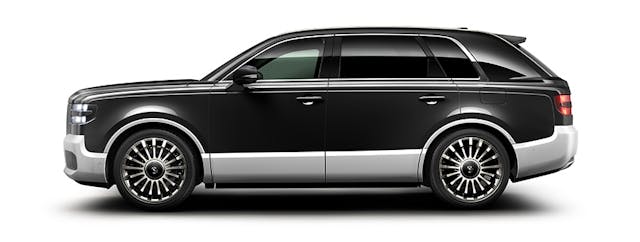

The proportioning is off. Way off.
This clearly isn’t derived from the third-generation Century car platform (as one does to make a Camry into a Highlander), nor is it the aforementioned Sequoia. The latter was never intended for markets outside of North America, but it woulda made for a Century that possesses Rolls-Royce–killing road presence. And this is precisely why cab-backward designs still exist in our modern society, as they simply look more prestigious.
Proportioning is likely the most important part of car design, and there is correlation to the concrete slab of a house: Do both wrong and everything afterward becomes less of an estate and more like a McMansion. The short dash-to-axle is the Century’s biggest proportional flaw, and instantly puts it in the McMansion category of luxury items. Then there’s the significant dogleg curve in the rear door that looks positively pedestrian, contributing to a passenger cabin more interested in providing CUV-like space over top-dollar style. Compared to the Roller and the Century sedan, that C-pillar looks far too much like any mainstream Toyota product: It should be further inset from the rear wheel and more upright for a more coachbuilt, limo-worthy appearance. That rear door is huge; it can afford a little trim on the back end.
Finally, take a look at how the leading edge of the Roller’s quarter window looks more like that of a train, as it’s intended to give the rear seat passenger an experience not unlike transport via luxury rail. This has been a hallmark of chauffeured motoring, from the likes of Rolls-Royce, Mercedes-Benz, and a certain American brand with an in-house coachbuilder.

Thanks to Fisher Body and Cadillac, we know this experience is easily designed and replicated with yesteryear’s cab-backward luxury coupes, as it made the Cadillac Fleetwood Series 75 a fantastic limo for many decades. Perhaps I am too much of a purist in limo designs, but no matter, I’m wondering if this thing is actually front-wheel drive…
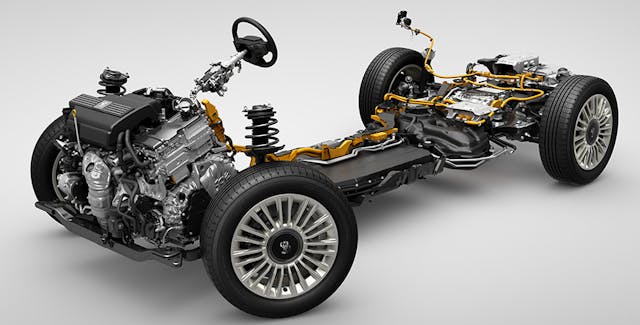
Aw heck, look at that sideways engine. This Century is based on the aforementioned Camry/Highlander platform, right down to the transverse-mounted V-6 and hybrid powertrain. (But don’t take my word for it.) So it isn’t nearly as bespoke as its sedan sister, and it also means this is a CUV, not a proper luxury SUV. And it needed to be a cab-backward SUV, as the market already spoke on this matter.
Sadly, this Century is out of proportion by design. Even worse, Toyota had a perfectly good chassis in the Century/Lexus LS sedan. It’s a safe bet that a cost-benefit analysis was performed, and Toyota chose to class up its current CUV platforms instead of making a proper luxury SUV with traditional cab-backward design.
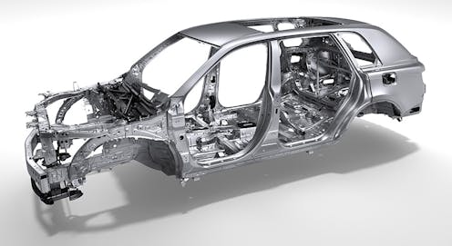
The stripped unibody presented above shows just how short the dash-to-axle is on this platform, but perhaps there’s a business case for tighter dimensions that ensure easier parking on the cramped streets of many Southeast Asian cities the Century calls home. But that theory falls apart when recalling that the intended owner of this vehicle is being chauffeured, and is not the driver. Instead consider the efficient hybrid powertrain’s ability to fall in line with Toyota’s Beyond Zero initiative. With headwinds like that, it’s no surprise that the Toyota Century became a boring crossover.

But what if we didn’t care about any of this green-washed, bean-counted hooey?
My dear friend David Houston, a talented auto designer I met as a student at the College for Creative Studies, loves to improve OEM designs on his personal Facebook page. He was kind enough to let me use this before/after image, as he was rendering this at the same time I was typing this very article for you wonderful folks.
David’s rendering is a properly proportioned Toyota Crown SUV, not a compromised CUV. It is far more authentic to the DNA Toyota has crafted for decades with the Century sedan, as it’s the same DNA Rolls-Royce retained for its SUV. He added more dash-to-axle real estate, darkened the lower body cladding (so it draws less attention, cough, Pontiac Aztek, cough), but kept everything else on par with the production model. (Note that the revised image was longer, and had to be shrunken down to fit in the same space as the image from Toyota.)
The work David put into the Century is likely what this vehicle needed, as yesteryear’s Century was less ostentatious than a Caddy or a Roller, but clearly a big step up from any other Toyota. Or any other Asian automaker, for that matter. But that was likely never in the cards, so this is nothing more than a sad moment in automotive history. The legacy of cab-backward flagships is likely coming to an end, as making a limousine out of a crossover-utility vehicle was the right move for a corporation with the size and scope of Toyota.
***
Check out the Hagerty Media homepage so you don’t miss a single story, or better yet, bookmark it. To get our best stories delivered right to your inbox, subscribe to our newsletters.




The collector car game is a funny one. In the beginning, all cars were grocery getters and people movers, and the interesting ones became collectible. Then you have a collector market, and manufacturers are trying to create off-the-shelf collectibles, but they have to deal with the fact that most car buyers are pretty bland and want the modern version of the station wagon – just a neat one. There are only so many styling cues you can throw at the SUV before they start looking like a prior example, or before the styling starts cutting into functionality – which is a big no-no since you are still trying to sell six figures of these things every year. Probably why all of the real collectibles are pretty much the same cars that were the collectibles thirty years ago
I don’t know if manufacturers are ever interested in creating off the shelf collectables, unless its a specific trim level like the Silver Anniversary + Pace Car limited edition madness that happened in 1978 with the Corvette.
Making a whole car for collectability sounds difficult and unprofitable. This vehicle, in particular, is clearly designed for rich folks in Japan/SE Asia that like to be chauffeured around. While they will likely be stored in a nice garage and preserved, that’s more about appealing to the person in the back seat, not about being saved as a collectable.
1) This is a pretty thought-provoking article, and I hope some folks at Toyota are paying attention to David’s re-design, which is quite nice.
2) I kinda like the 2023 Crown Platinum “fastback CUV” – with that grill, it looks like I could use it to shave with. Drive it? Nah.
3) Since I think “luxury SUV” is essentially an oxymoron, and couldn’t afford one even if I liked them, I only read articles like this one to learn technical terms like blockification (thanks, Sajeev).
I am sure a lot of folks at Toyota did exactly what David did, except they dedicated weeks (maybe months) to the proposal before getting shot down. A cheaper to make SUV that fits in their Beyond Zero initiative makes sense on a balance sheet, that’s for sure.
SUVs: ugly, gas-guzzling (when truck-chassis’d,) accident-inducing, vision-obstructing, even when parked; abominations.
Is anyone surprised that most vehicle/pedestrian “accidents” are due to large vehicle size and inherently poor outward visibility? Check the stats!
Overall excess height, with equally high beltlines are just recipes for spatial/visual errors.
OK, the heat’s made me even crankier.
Thank you for writing this piece. It was a concise breakdown of a specific luxury design theory I never new I wanted to know! All of the points you raised have occurred to me in the past but I never put them together before.
I am honored to help you put this puzzle together. Go forth and analyze cars in the wild! (Wild streets and roads, I guess)
None of those designs appeal to me, and the mail-slot greenhouse on the re-imagined illustration is even worse. Big SUVs are emblematic of the me-first portion of society: between overly large, overweight and ungainly vehicles, people focused on their phones instead of driving, and the inabiity for traffic and pedestrians to see around them, I loathe being in a city or even many suburbs.
I’m with you, Steve.
It’s certainly not just the city where they are lumbering opacities.
How many times do we see these huge vehicles with only one occupant?
It really IS “me first”.
Looks good to me Rhapsode. Nice to see that a car company still exists that isn’t loosing it’s way. I’m guessing the A pillar leads into the front wheel for more rigidity. I’d say this heavy car designed to pile on the miles needs it. As mentioned, this is made for the passengers. Ok, let’s go ahead and make the rear doors big enough so they can easily get in and out as well. As for the “re-proportioned” version. Looking at the front door size I’d guess it’s driver-less. I love Hagerty so let’s protect that authoritative voice.
It looks like a luxury design to me in that it is fairly boring.
Why is the ‘S’ even in the label of these things? What ‘sport’ is involved in a 2 ton 4-door light truck with a full steel roof? Maybe the ‘S’ refers to ‘suburban’? Luxury-sport-utility vehicle is a rare double- oxymoron. I’ve always called them by their Aussie name: ‘Ute’-for-utility vehicle. I own a factory supercharged one- but it’s NOT ‘sporting’ by any rational definition.