Media | Articles
Vellum Venom: 2023 Chrysler 300C
Chrysler designer Tom Gale once said in an interview that taller tires were key to the success of the original Chrysler 300. He then inadvertently let the cat out of the bag, going into detail as to how the wildly popular sedan had the presence of a Bentley because “the 300 is deceptively tall, and we disguised that with larger wheel openings and larger tires. But we also raised the beltline so that the roof looked chopped. The cars always looked relatively low even though they were deceptively tall.”
Deceptively tall is right, and the Chrysler 300 is one of many reasons we now have a dying crop of sedans with worse outward visibility and significantly less utility than crossover SUVs. It appears the sins of 2005 are revisited in 2023’s final run of this iconic family sedan, so let’s run the vellum over a 6.4-liter example of the breed.
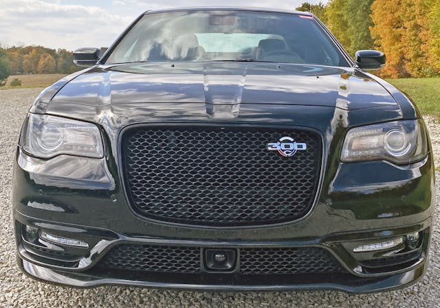
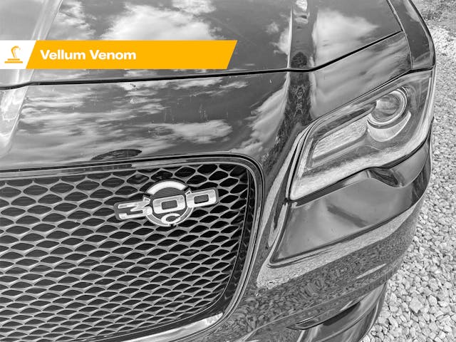
To some extent, the Chrysler 300 lost its trademark swagger once every car sported a nose just as swollen as this. The generic texture of the grille doesn’t help the inability of the 2023 model to stand out in a crowd, either. This honeycomb is in stark contrast to the massive egg-crate texture of the original, which also benefited from the lack of a similarly textured hole below the grille.
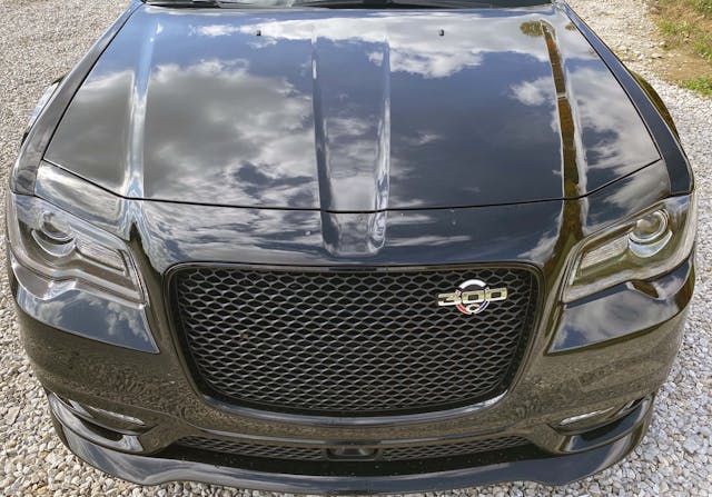
Stand up and behold the 300C from an elevated position and the redesigned fascia of the 2011+ model makes sense. The grille is bold and the headlights are squinty. The front-splitter effect of the bumper draws your eyes up and to the grille, while the reverse mohawk in the hood ensures the space above the grille looks visually lighter.
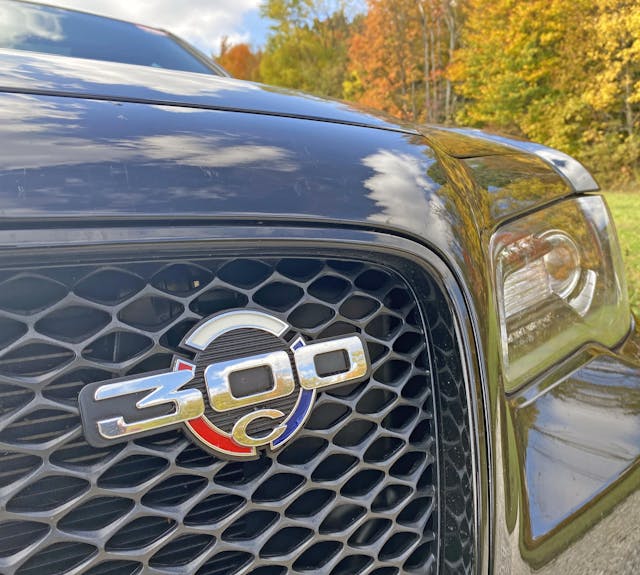
The retro graphics are a nice throwback to the Chrysler 300 J, but this one is unfortunately tucked away in the upper corner of the grille, unlike yesteryear’s gunsight grille design.
Marketplace
Buy and sell classics with confidence
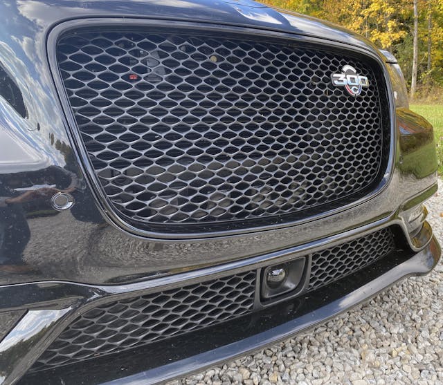
The lack of a bold texture for a Chrysler “letter car” is a bit of a missed opportunity. Much like 1980s American performance cars wearing understated charcoal gray trimmings and Sacco Planks, the 2023 300C might be too understated for its own good.
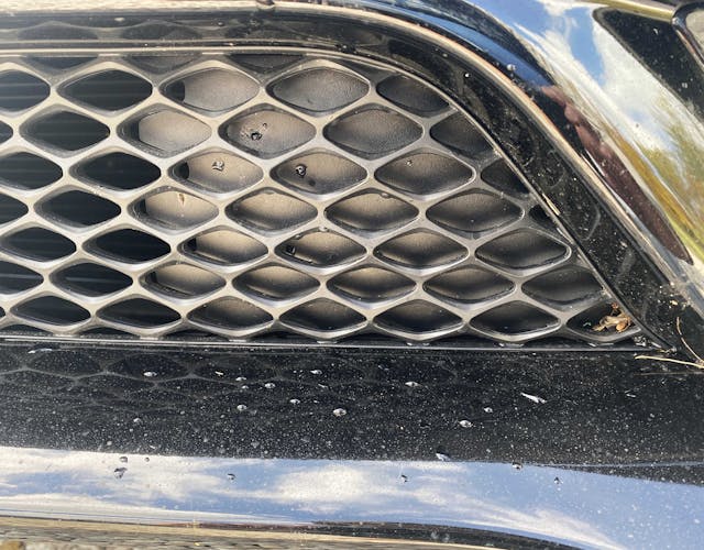
At least this final example of a bold Chrysler sedan has a grille texture that is never blocked up and eschews artificial texture. The parts that don’t need cooling are blocked off from behind.

And the “seeing eye” of the cruise control sensor is framed by both a thick border of plastic and negative space; designers did not even try to mess with the understated grille texture. Perhaps a design like this would make a great frame for the 300 C logo within a gunsight grille?
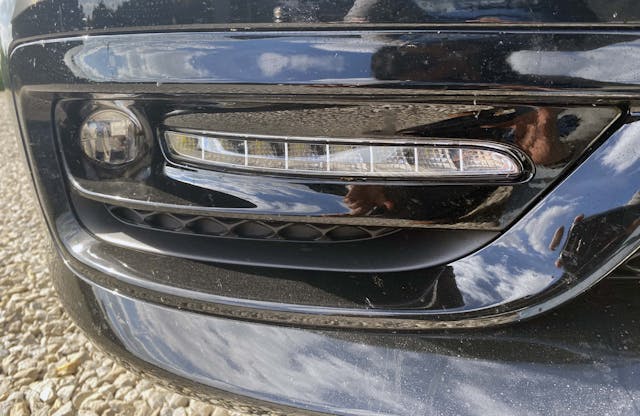
The bolder, round fog lights on the flat face of the 2005 Chrysler 300C really helped accentuate the headlights and balance out the radical egg-crate grille. This generic 2010s statement of non-functional performance styling cues on the 2023’s bumper waters down the original vision and leaves a bland aftertaste.

It’s refreshing to see a grille that doesn’t try to incorporate technology like proximity sensors for parking, as their omission keeps the texture from getting murky and complex.
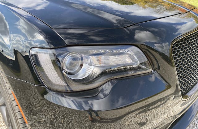
While the 2005 model had design elements (like headlights) conforming to a flat-faced bumper, the redesign has headlights that try to become a more evolved surface. That might sound like a word salad, but bear with me …
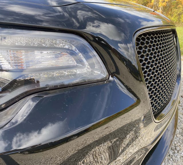
Here on the inner contouring of the headlight, the Chrysler 300’s bumper extends from the headlight to the face of the grille. It’s a refinement that’s light years ahead of the 2005 model, which had a crude stair step in the same location and a bumper shelf that slowed down the visual speed of the front end. The elegant surfacing looks great on this monochrome 300C, but the lack of a shelf hurt other 300s that still had chrome trim where the shelf once lived.

The outer contouring of the headlight is met with sympathetic rounded forms in the bumper. The integral side-mount reflector has a hard contour, which becomes the genesis of a strong fender crease.
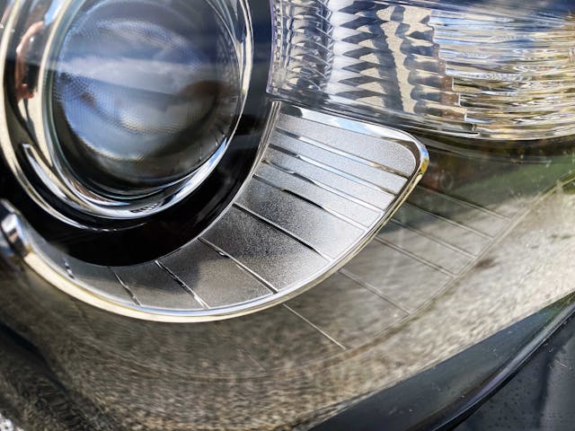
While the subtle transition from the round headlight projector to its chrome bezel is pretty clever, the pattern doesn’t match that of the ribbed turn-signal lights next to it. Another complementary bezel of black plastic that matches the chrome one is clever, but it’s too subtle: the jeweled lights of the 2005 Chrysler 300C, deeply set into the car’s bumper, were more memorable.

And the panel gap where the fender, headlight, and hood meet is clumsy. This is far less elegant relative to the previous generation Chrysler 300.
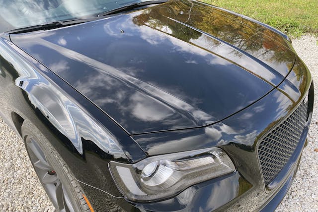
But it is hard to argue with the cool factor present in a fender crease that’s almost as aggressive as that iconic grille design.

That fender crease does accentuate the strong power bulge in the hood, more so than same feature in the previous generation, with its softer curves.
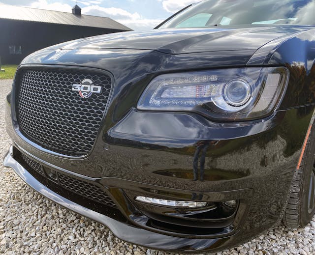
The one perk to all this extra surfacing over the original is that the current 300 looks far more sinister. And not just the 300C; even a Pentastar V-6–equipped model looks this good. (The same can’t necessarily be said about V-6 versions back in 2005.)

And like most modern vehicles, the 300C has creases that awkwardly disappear into nothing. I reckon it is because vehicles are too tall, too much like rolling billboards: Extending the lines here and there gets your point across. To some extent, this feature would improve the original, 2005 model, as it looked boring and unfinished from many angles.
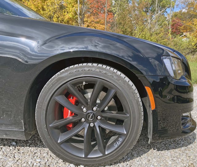
From the side you can see the redesigned 300 has a much smaller face than the outgoing model, but with similarly large fender flares. This makes the 300 look more aggressive than it really is, or just the right amount of aggressive, when you consider the 6.4-liter engine powering this 300C.
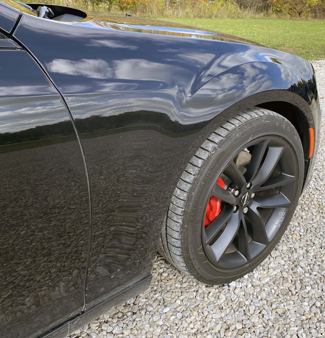
Perhaps that smaller face also accentuates the 300’s long dash-to-axle, which is clearly a million times cooler than that of any other sedan in its class. (Dodge Charger stablemate excluded.)
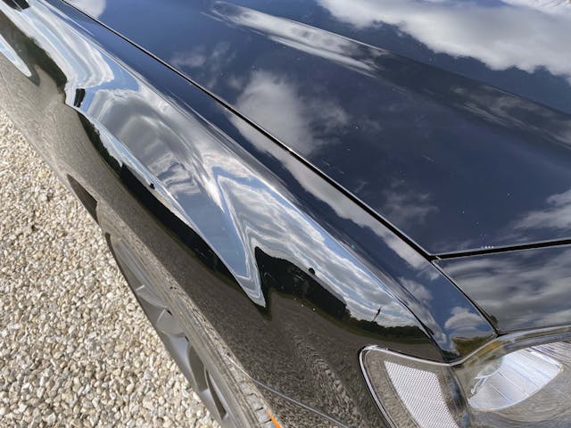
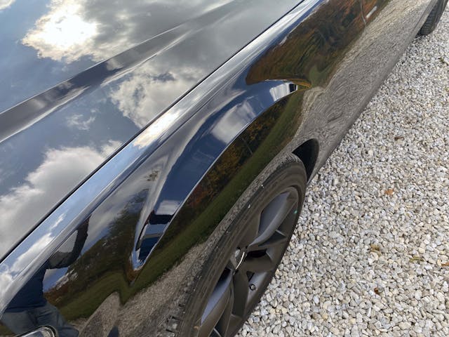

Adding to the decadent dash-to-axle is that long, sweeping fender crease. It goes from the headlight to the base of the A-pillar in one fell swoop.

The wheels, while beautiful in their organic simplicity, prove the Chrysler 300 was an entry-level luxury car on its best days and a rental-car special at its worst. These particular forgings have the requisite depth (the hub is sunken relative to the spokes) to be the former, but it isn’t priced like a BMW M3 for ample reason.
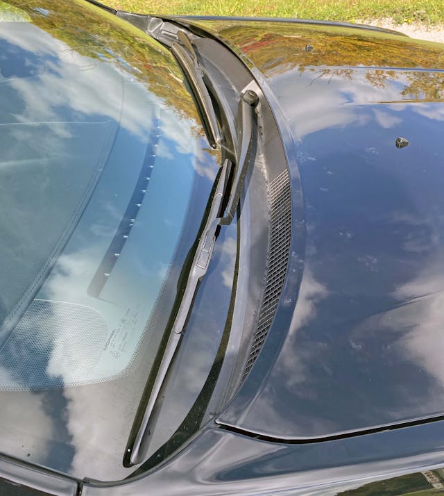
The wiper/cowl area is short and harder to spot at a glance, as you’d expect with a cab backward, long dash-to-axle design. The steep rake from the (higher) hood to the (lower) windshield suggests this area was crafted with pedestrian-friendly design in mind.
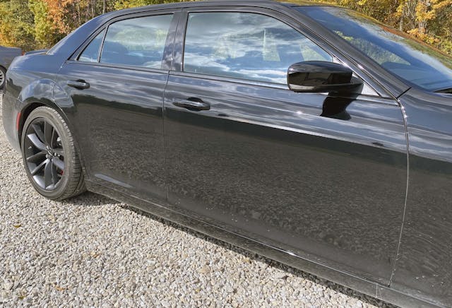

The rear-wheel-drive (i.e. long dash-to-axle) proportioning really shines in the 300’s pillars, as that impossibly thin A-pillar belongs to anything but a space-efficient crossover utility. The sideview mirror has assertive angles and a bold repeater indicator light but tucks away perfectly in a black plastic triangle within the DLO.
The front door is almost exaggerated in length, but this car has more of a coupe flavor than its counterparts from Asia and Europe.
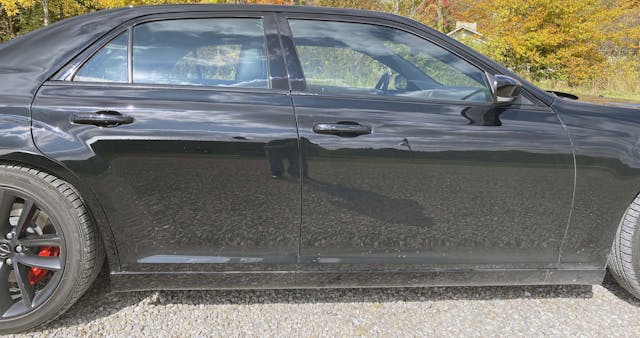
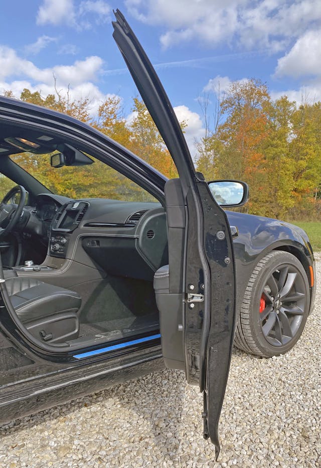
The B-pillar, while static and upright (like all vehicles in this era of head-curtain airbags), has just enough tumblehome to look less like an SUV or CUV, more like a vintage muscle car.
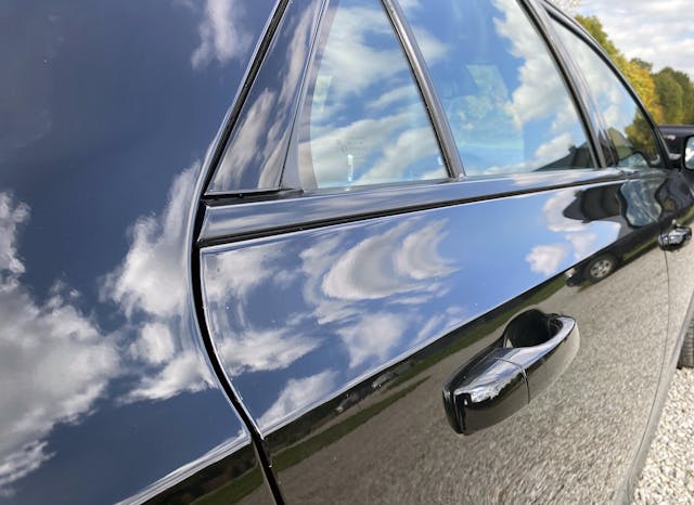
There’s a strong character line a few inches below the DLO, and it’s absolutely needed because the 300 gets even taller in the back (and needs something to break up all that height).
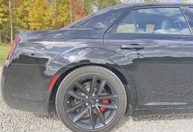
All things considered, Chrysler did a great job keeping the 300 (looking) as trim and low to the ground with its use of horizontal lines and modest surfacing. While not technically a shoulder line, the crease in the C-pillar that turns into the top of the deck lid is absolutely gorgeous and is a nice homage to the 2005 model.


The rear wheel arch is a bit troubling, however. Its thick shape cuts deep into the contours of the rear door, unlike the smooth forms presented in its brother, the Dodge Charger. Perhaps most of the issue is in my head, as I have a particular Avenger haunting my car designer soul.
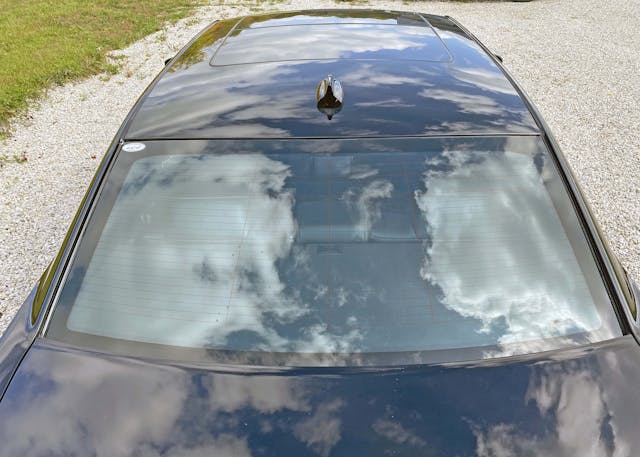
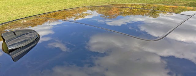
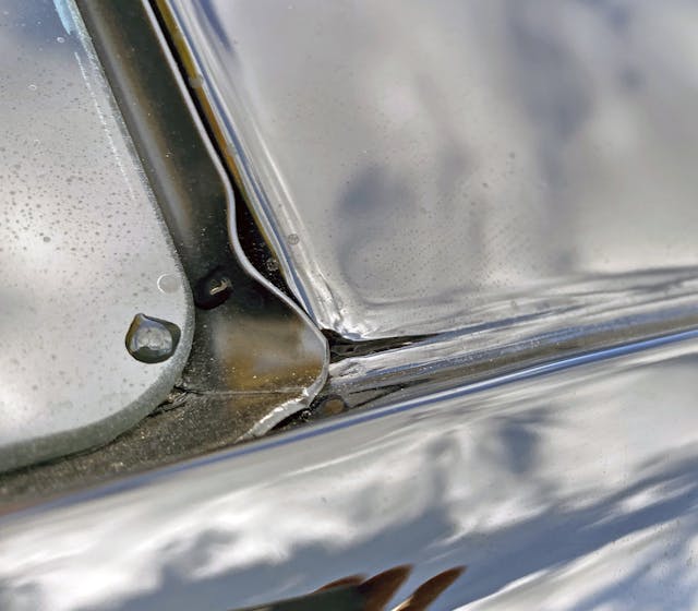
The minimal contouring of the roof (save for cutlines for a fancy moonroof on this 300C) accentuates the long, luxury-sedan lines of the Chrysler and is a good way to save money. The exposed rain gutter isn’t as pretty as the extra plastic strips of other sedans in its class, but I generally prefer its minimalism in a low-visibility area. Can’t give the same kudos for the lasagna noodle–like rear window seal, however.
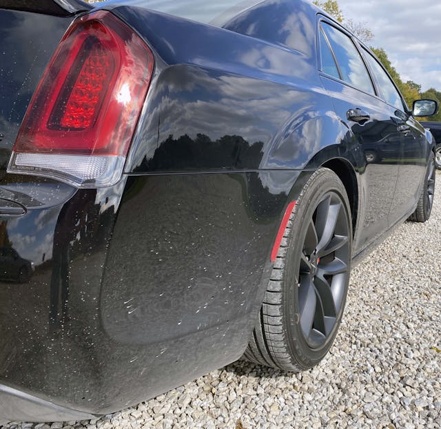
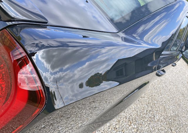
The transition from the aforementioned character line and the shoulder line is harsh and angular, which has implications for the taillight. But it is another throwback to 2005, ensuring the Chrysler 300 has a design DNA like so many other American icons of our past.
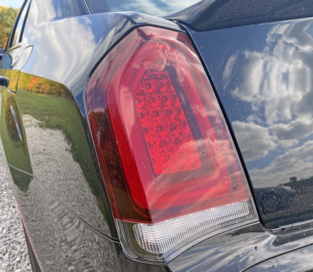

The redesigned 300 eliminates the smiling rear-end treatment created by the original’s curved rear deck and rotund rear bumper. This is produced by implementing the bends in the quarter panel and rear bumper as design limitations of the rear light. The downward force pictured here gives a contrasting frown to the bumper. It’s a little fussy, in a Malaise Era Chevy Monte Carlo way, but eliminates the under-surfaced issue of the previous generation.
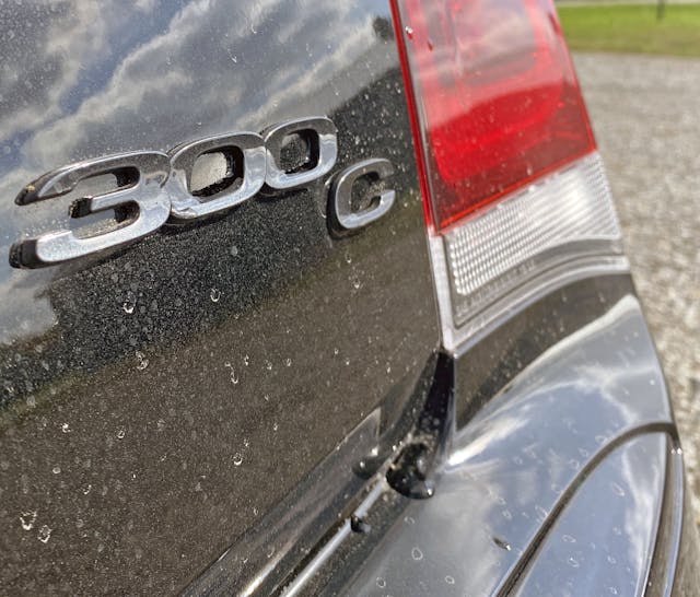
There’s a certain harmony that comes from a bumper that’s directly influenced by the outer contouring of the light, and a trunk emblem that naturally steps down from model name to trim level to reverse light.

The Aston Martin–like emblem Chrysler chose after its bankruptcy never resonated with me, as there was something special about both the Blue Ribbon and the Pentastar before it. All that recognition was lost forever, so that’s probably why I like it better in a morbid-like black finish on the decklid’s otherwise unadorned center section.

Unadorned is right, because Chrysler did a fine job integrating both a push-button trunk release and a rear camera within the CHMSL at the top of the decklid. To some extent, perhaps the designers didn’t leave themselves much of a choice.

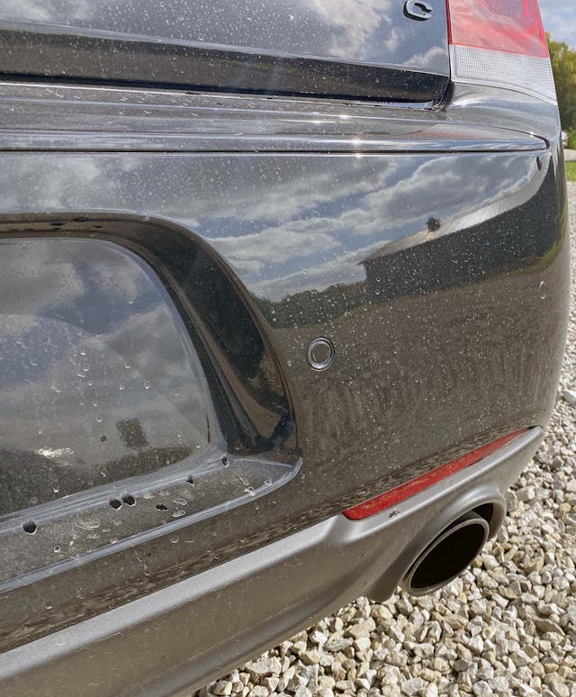
Just like the original, Chrysler opted to put the license plate mount in the rear bumper, leaving an acre of underutilized space in the trunk above. It’s a nice change to the usual “trunk plate” seen on today’s Camry and Accord, but it looks unfinished compared to the heckblende-equipped trunks of the Charger, Sonata, and (Kia) K5. I’d personally like to see C-H-R-Y-S-L-E-R spelled out on the back to fill in some space—and to be proud of this once-famous brand, and the founder behind it.

The lower bumper sports a matte plastic insert with arches around the exhaust, sized appropriately to match the wheel arches on the body side. The integration of the reflector lens into the insert’s outer boundary with the painted bumper is a common trick for modern cars, one that is both clever and beautiful.
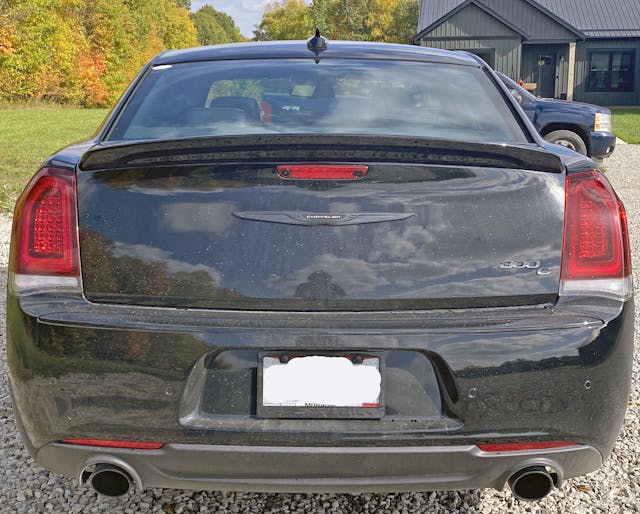
The ducktail spoiler is a wonderful touch, adding much-needed visual excitement to the 300’s tall and flat-faced posterior. But it’s all relative, because this butt clearly received hundreds of hours more surfacing time from Chrysler designers than the same area of the 2005 original: The decklid is toned and muscular, and the 2022 bumper tries hard not to have a big-faced smile anymore.
It works, as the 300 now has a cocky smirk instead. Be it a Pentastar or 6.4-liter Hemi, anyone who has driven Chrysler 300 knows it’s pretty darn fast. Pick a fight with one and you know that trunk is absolutely giving you a victorious smirk, because it knows who won the race. While it’s a shame that family sedans are an unprofitable genre deemed unworthy for most automakers, at least the Chrysler 300 made a splash in 2005 and went out with a helluva bang last year.
Thank you for reading; I hope you have a lovely day.
***
Check out the Hagerty Media homepage so you don’t miss a single story, or better yet, bookmark it. To get our best stories delivered right to your inbox, subscribe to our newsletters.


I think the 2023 300 C is a bit of a missed opportunity, style wise. They tried to style it for the boy racer crowd, but that’s not the market for these cars. Chargers and Challengers for that. I would’ve preferred a chrome grill with more classic texturing and something other than flat black interior.
The hyper-detailed analysis is interesting and fun, but I had to Google image photos of the whole car to put things in context. Also did the same for a 2005 since there are many comparisons here (hint hint).
My wife has almost no interest in cars, but the 300C is the rare exception; whenever I’m in the market for something new she always asks “what about that cool blocky one?” and I know just what she means. I showed her images of the new one and the original after reading this and her reaction was “they kind of smoothed over what made the original so cool.” Notwithstanding the hundreds of hours designers spent over the years refining the car’s individual elements, I pretty much agree.
In hindsight, I indeed shoulda posted some 2005 300 photos. Sorry about that, I will keep that in mind for the next Vellum Venom.
Lovely story about your Dad’s 300C.
I got my 2006 Hemi C from Chrysler HQ in Canada in 2006 when they sold off exec and show circuit cars directly in those days, my neighbor was an exec there at the time and got it for me. It now has 70,000 miles and my wife steadfastly refuses any notion of selling it. The styling is still interesting a decade and a half later, not something that can be said for many cars of this vintage.
An underappreciated aspect of these cars is the great job the engineers did on the use of interior space, which is vast. With the 60/40 rear seat down you have a huge area to work with.
I thought they weren’t making these anymore
have a 2006 SRT 300, and a 2023 300C. LOVE THEM BOTH. interesting how the vehicle evolved. I traded in a 2016 5.7 with performance upgrades – loved it. interesting that the 2023 is very similar to the 2016 especially in the interior. Sad to see this type of vehicle go away.