Media | Articles
Vellum Venom: 2022 Hyundai Ioniq 5
The cubic arts (as it were) pioneered by Pablo Picasso and Georges Braque may be enjoying renaissance thanks to the rebirth of retro 8-bit graphic design, witnessed in the popularity of Minecraft. The game has inspired countless people for countless reasons. Perhaps it inspired me to borrow a Hyundai Ioniq 5 for a week and drive it to the architectural mecca known as Columbus, Indiana, and write a snazzy little piece about the intersections of automotive design and architecture.
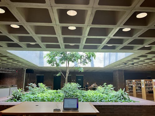
To put building and car design into words and photos was both challenging and enriching. Columbus’ public library was a great place to get the creative ball rolling. Under cover of a waffle-like, 8-bit grid of poured concrete, I made something that you certainly must read.
Except not yet, as we must first rake this particular electric Hyundai over our vellum.
I once said that the Ioniq 5 was the byproduct of Pablo Picasso watching Robocop and saying, “I can make a car out of that!”
The jarring angles, cubist elements masquerading as automotive components, and metal-toned accents certainly evoke a particular law-enforcement official from Detroit’s dystopian future. (And I’d buy that for a dollar!)
Marketplace
Buy and sell classics with confidence
But this is a compliment, unlike that time I suggested the 2012 Cadillac CTS coupe is what happens when an AMC AMX gets beaten by Pablo Picasso’s ugly stick.
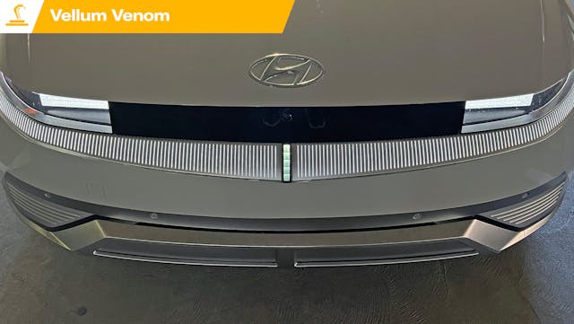
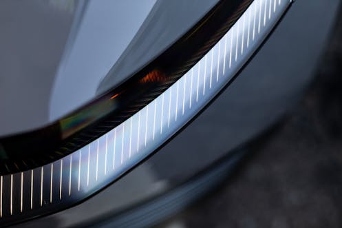
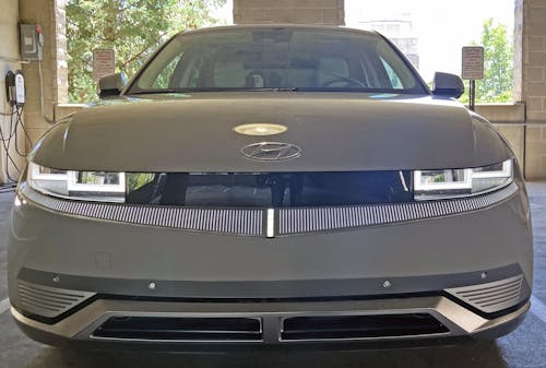
To wit, the Ioniq 5’s Down the Road Graphic (DRG) is delightful at dusk (parking lights, bumper lights) and when charging (the center indicator gauge in the bumper) is almost breathtaking.
Indeed, Hyundai truly did its homework, endlessly refining this car’s shapes and elements. The Ioniq 5 is certainly busy, but note how the side of the bumper has a hard line that ends where the hood bulge begins.
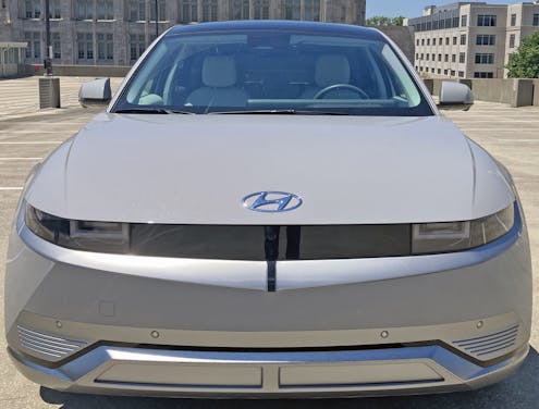
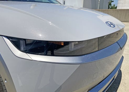
The flat nose looks less so, thanks to the two-wedge shape: one in the lighting/charging meter below the headlights and another created by the hood, headlights, and front bumper.
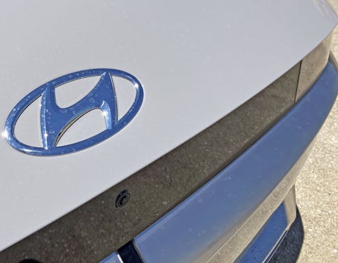
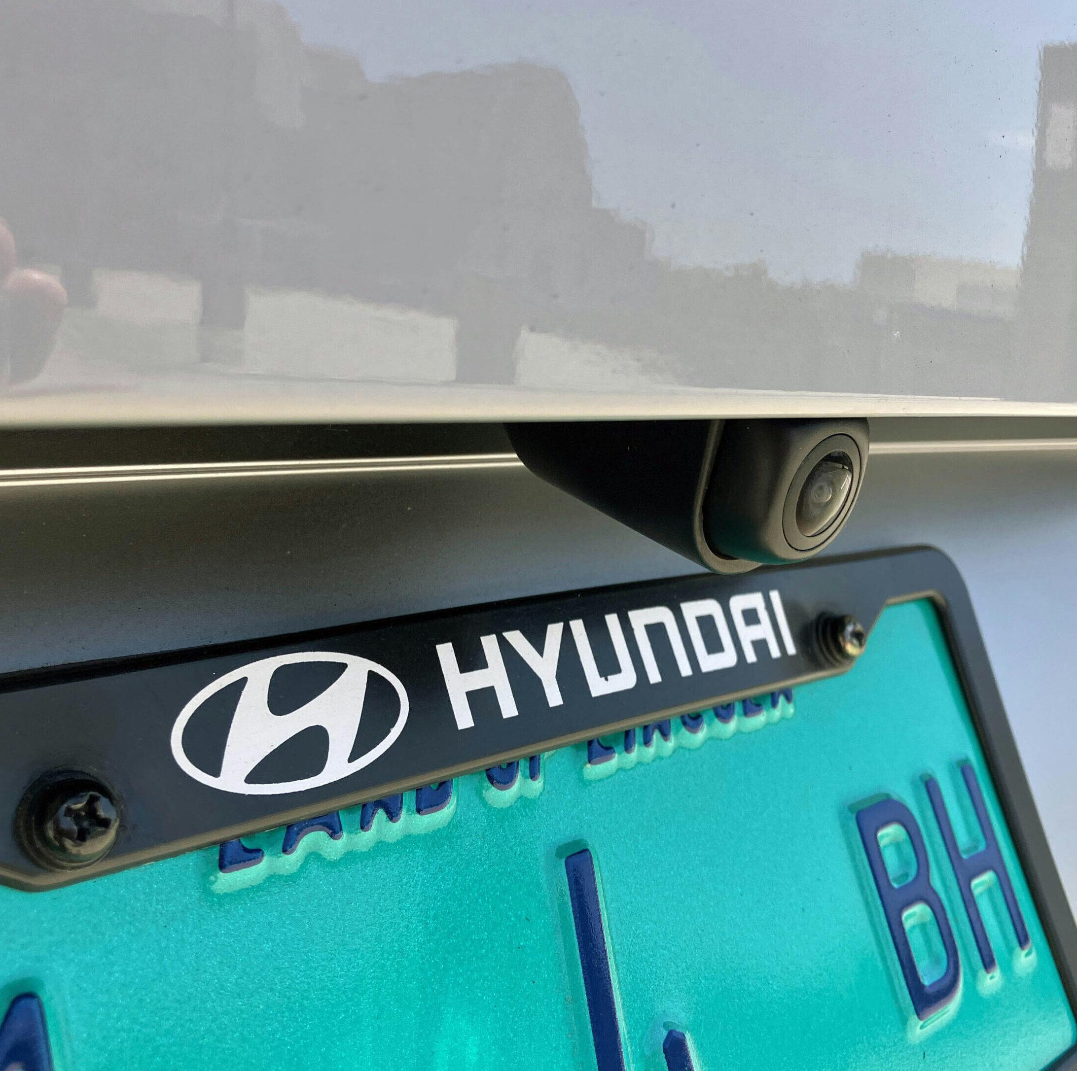
Make no mistake, the Ioniq 5 is as flat-faced as a vehicle can get. The grille feels like architecture, while round elements feel mandated by a corporate mothership unaware of the ramifications of its actions: rounded Hyundai emblems, parking sensors, and cameras hurt the overall theme.
Side note: designers made a unique “five dot” emblem for the Ioniq brand, and it’s found on the steering wheel. The graphic means “H” in Morse code, but Hyundai’s corporate boffins clearly didn’t see the appeal. Instead, the exterior received the traditional “H” oval for maximum recognition.
To be sure, that’s the right move for corporate branding, but the oval H has no place here: even owners are ripping it off, replacing it with something more appropriate for the designer’s initial vision.
Goofy oval badge aside, the strong wedge presented by the Ioniq 5’s bumpers makes the body feel less like a nerdy crossover and more like … a dorky 3-D sandbox video game that’s made AutoCAD into a mainstream experience?
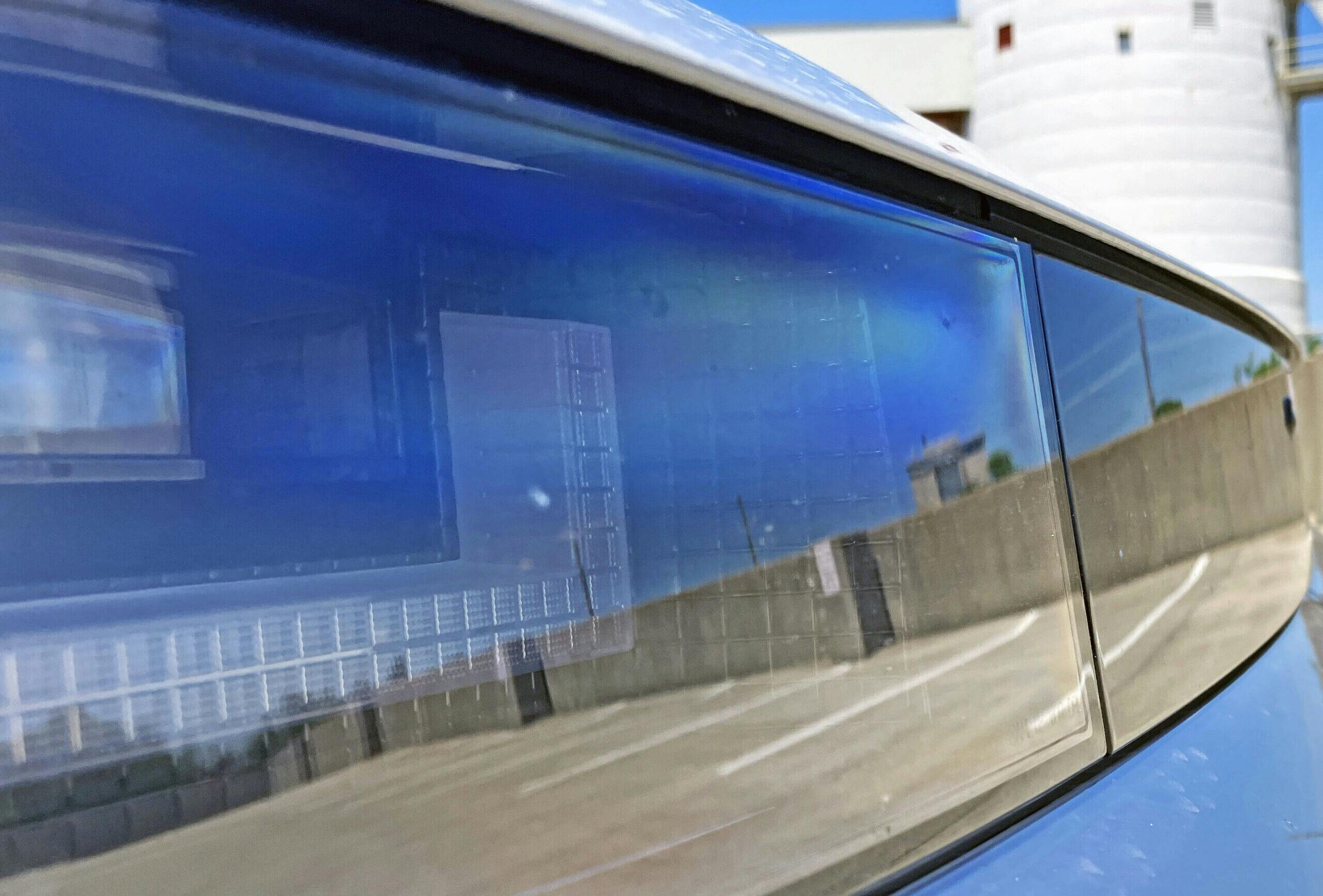
Apart from the airflow-management bubble, the headlights are probably the best example of the Ioniq 5’s pixelated Minecraft experience.
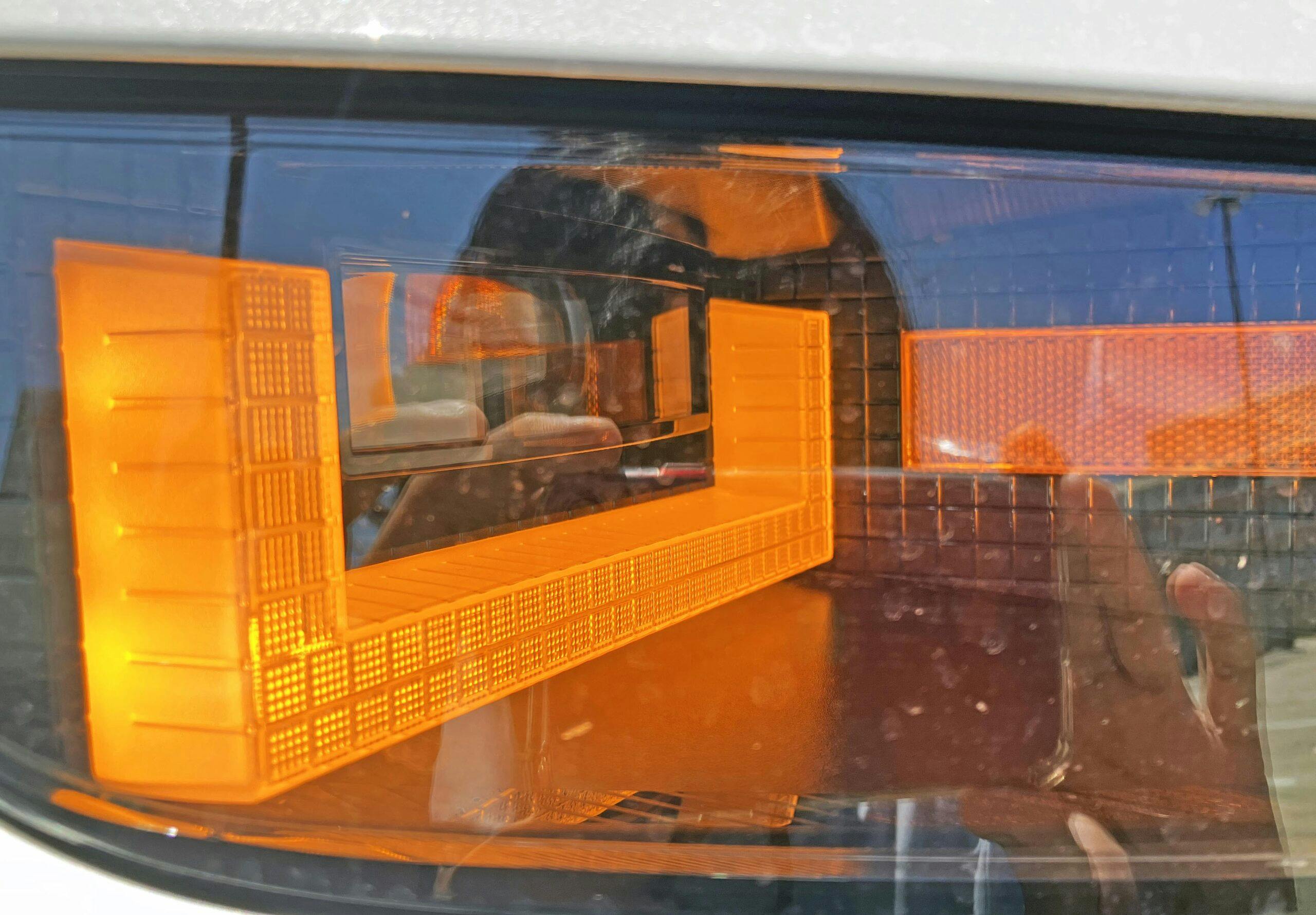
The side marker is positioned within an 8-bit grid, between the low- and high-beam headlights. This is some master-level Lego-building skills.
The 8-bit lighting pods within each headlight have a brick-like texture at their top, with a smooth, Toblerone-like texture on the sides. But one of the coolest things is how the bricks are clear when off, white when on, and amber when serving as a turn signal.
The blend panel between the headlights is also 8-bit bricky (technical term) behind its smoked plastic case, with a bold sphere for a forward-facing camera.
What I wouldn’t give for a square camera lens … if such a thing were possible.
Is it just me or does the high-beam look like a flat-screen TV? It’s these parallel constructions that make the Ioniq 5 such a joy to behold.
While the “grille” is a bit dull and shallow, it works well with the headlights … much like the black rectangle grille present in the original 1975 Hyundai Pony.
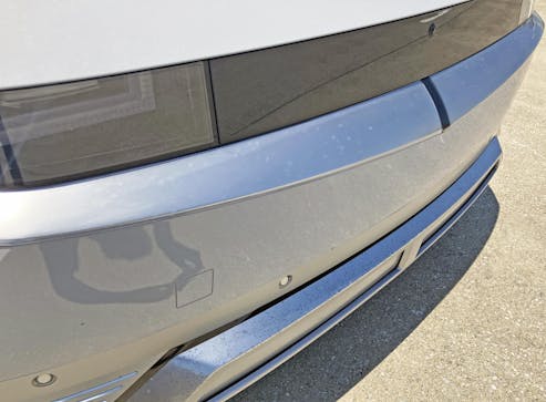
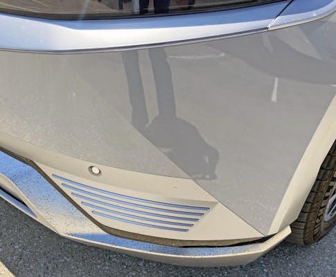
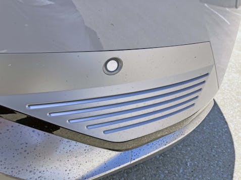
It’s always been cool to be understated: Plug the Ioniq 5 in for a recharge and the seemingly pointless black bar on the lower grille gives a flashing light show, ending in five “pixels” to show a full charge.
The light filter within the pixels is also made up of square textures, adding another layer of complexity in something so seemingly basic.
I hope more vehicles dump their fake grilles for sci-fi slashes and slots. They are different, and possibly a tad more aerodynamic to boot.
Again, what I wouldn’t do for square sensors and cameras!
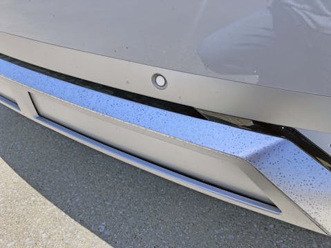
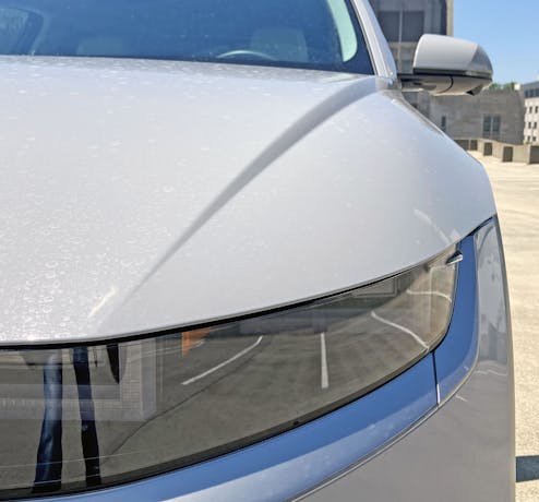
Pardon the dirt accumulated as I commuted in this rig, but also note how splotchy stains produce a unique texture on the iridescent paint used in the lower valance.
The front end’s wedge shape transitions into elegant curves and muscles down the hood.
Much like the Kia Soul before it, this impressive South Korean sports the same clamshell-type hood normally seen on Land Rovers. The benefit is that the hood/fender cutline moves down the fender, which gives a far more expensive appearance from many angles.
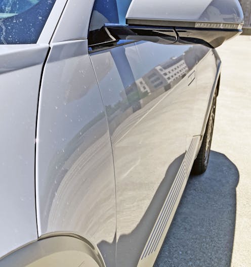
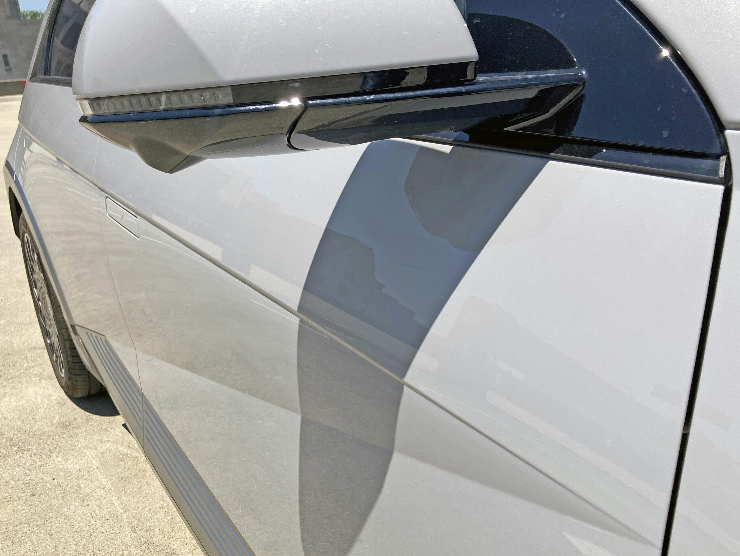
Unlike the Soul, the Ioniq 5 has a Mini Cooper–esque slash separating the hood from the cowl. It doesn’t quite match the veracity of the slashes found down the side: If only the hood’s cutline could extend down/back far enough to integrate with the slashes in the doors.
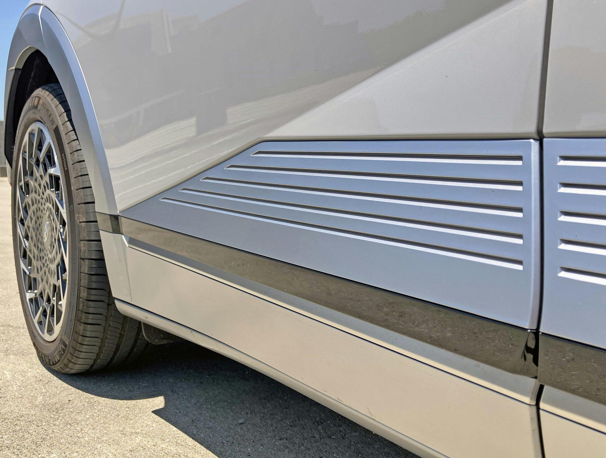
At least the huge slash on the doors has a soulmate in the “transitional” slash found on the side of the front bumper.
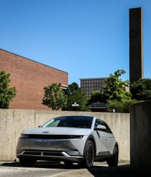
As seen in this photo from my essay of Columbus, Indiana, the two slashes (here, bumper and door) sometimes look like a perfect pairing. Depending on your vantage point, they have perfectly parallel lines.
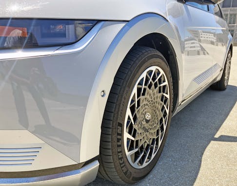
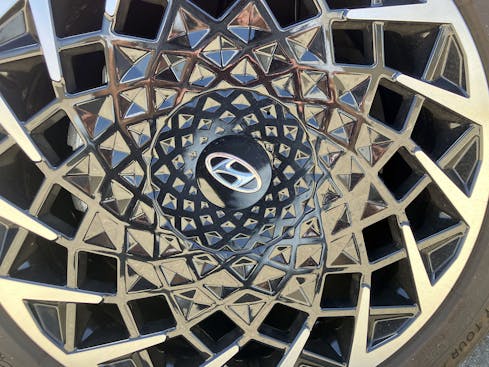
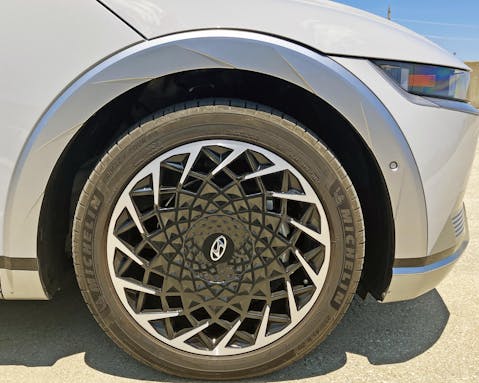
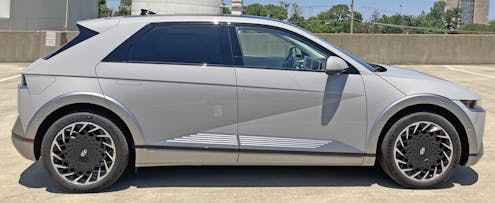
Hyundai’s kaleidoscopic wheel design looks like it was expensive to render, but it hides the integral hub cap rather perfectly. This is an unexpected move from a brand once associated with value above all else.
Combined with the stair-stepped wheel arches, these rims do a fantastic job translating the body’s hard, stabbing lines into round forms needed in a wheel.
There’s a surprising contrast between the angular body lines (mandated in this part of any car) and the cosmetic slashes added elsewhere.
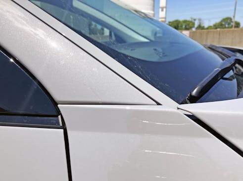
That “Mini Cooper” line has no place on a body this angular, looking more at home on a VW New Beetle. While the Ioniq 5 generally has a nice balance of straight and soft lines, this one fights with every line after the A-pillar.
Oh yeah, that’s indeed a slashy A-pillar. The cowl and hood contours are aggressive, but the horizontal plane at the top of the hood looks a bit clumsy as it nears the pillar.
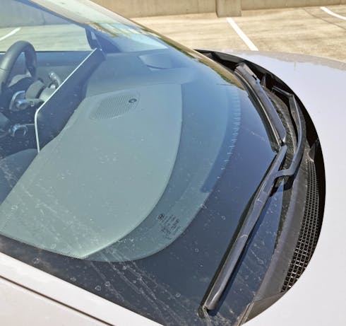
Tidy, pixelated cowl venting and wiper arms that don’t draw attention to themselves. Nice, but I kinda want some 8-bit homages stamped into the wiper arms, too.
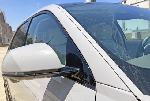
The daylight opening (DLO) does its job properly: A black triangle starts it off, elegantly holding the front glass and the sideview mirror.
The trim piece against the windscreen looks like an afterthought, but odds are it’s necessary to mass-produce the Ioniq 5.
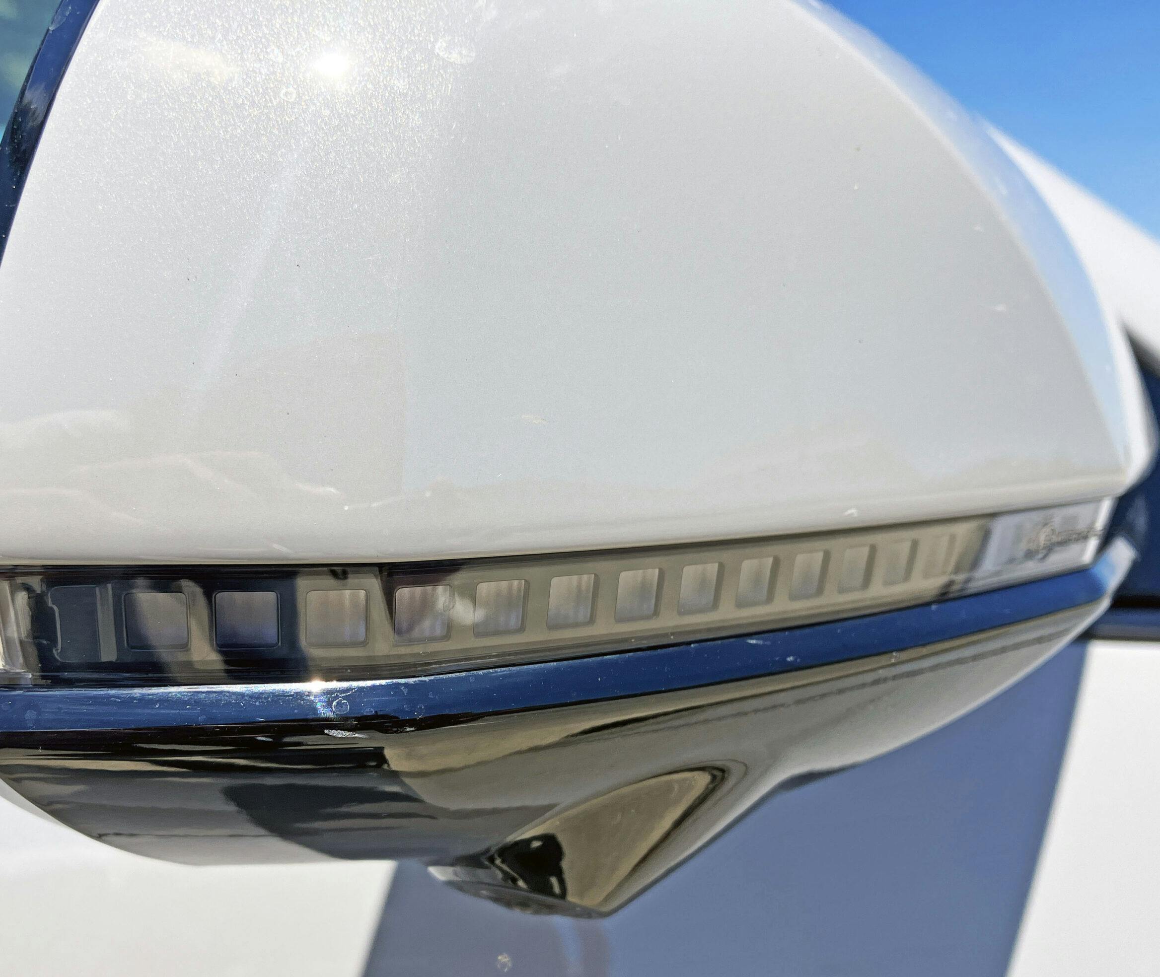
Note the hard edge on the mirror’s skull cap. It’s evocative of the crease in the hood bulge. This is what makes a cohesive design more delightful, less boring.
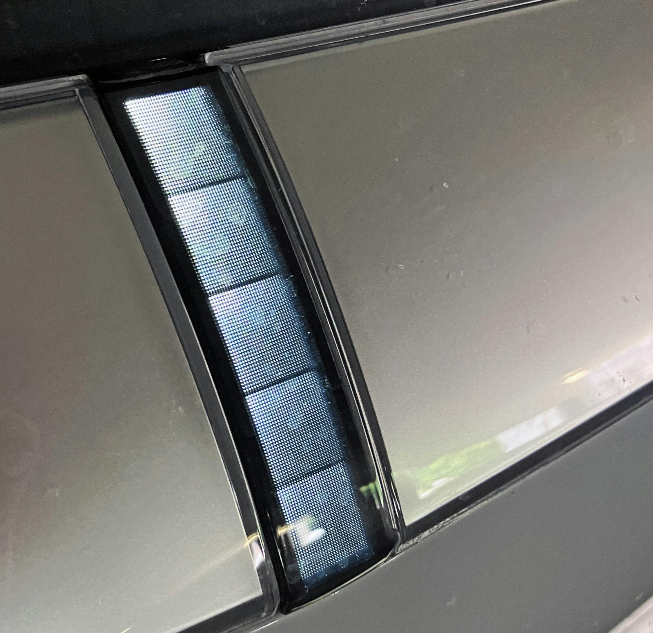
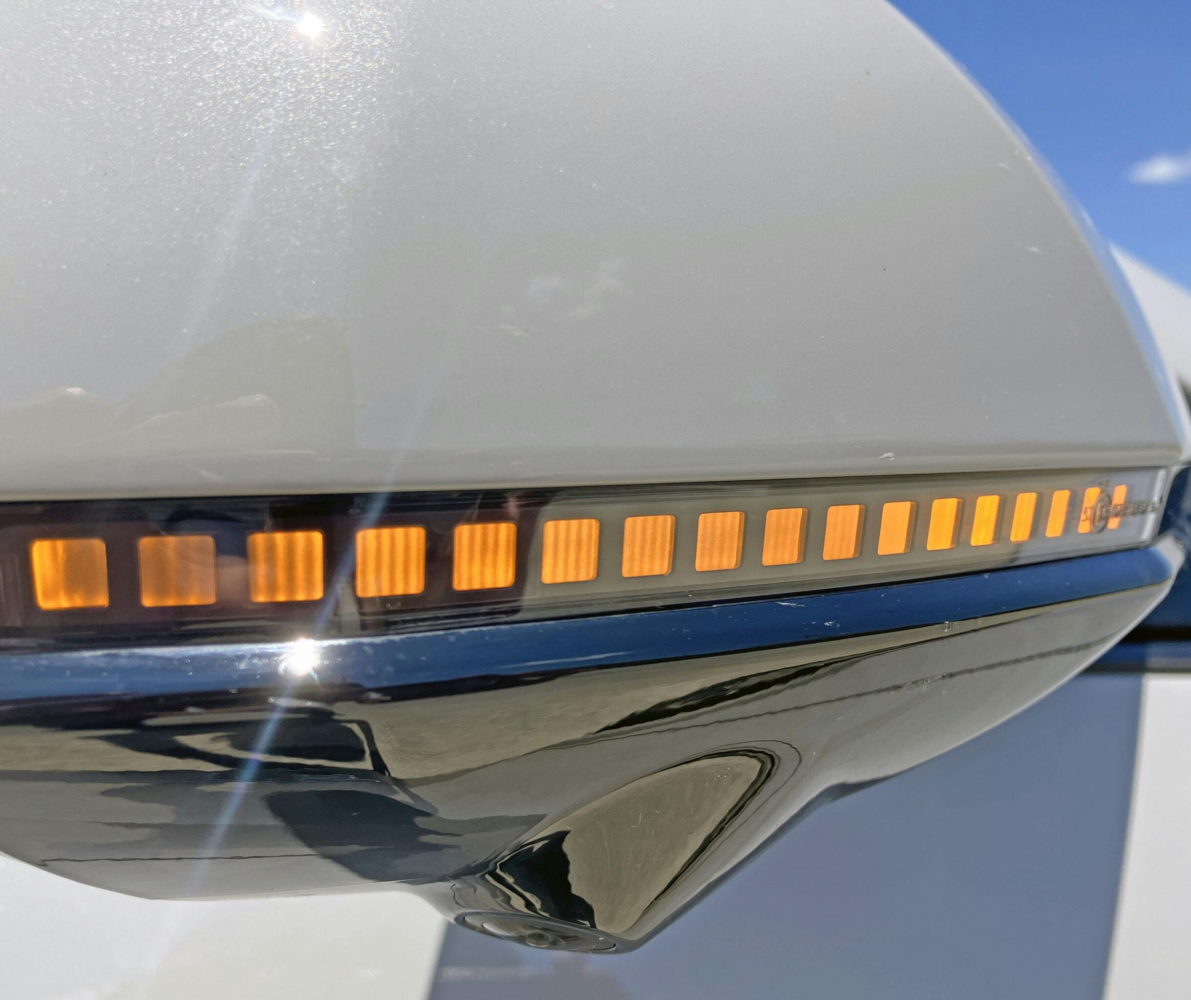
Speaking of cohesion, the sideview mirror’s repeater lights mimic the 8-bit signal elements in the headlamp assembly. Kind of a shame the headlights lack these clear lens in a black frame type of design.
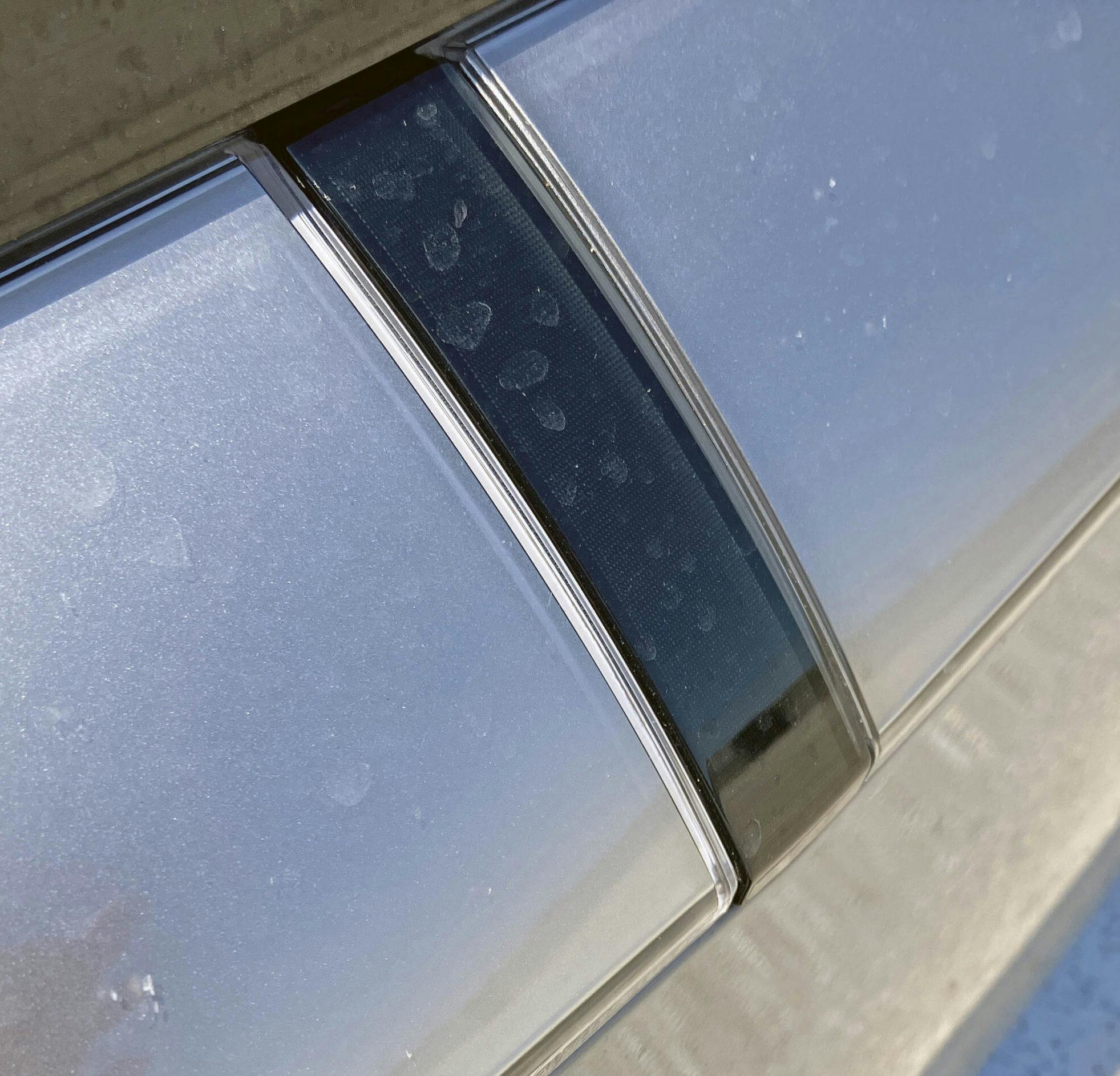
Power-actuated door handles are such a silly EV cliché, but this Hyundai won’t sell for anywhere near the price of an OG Excel. At least designers put a square relief in the center, and Hyundai Corporate didn’t turn it into a round logo.
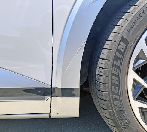
The same treatment that makes the lower bumper look cool also helps the door bottom. I like the 1980s metallic interior-design motif … it takes away from the malaise I feel when looking at the average CUV at this price point ($40K–$50K).
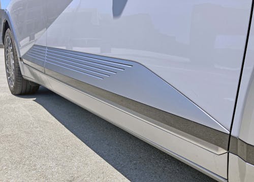
The lower’s geometry and iridescent paint is a nice complement to the front/rear door’s aggressive slash.
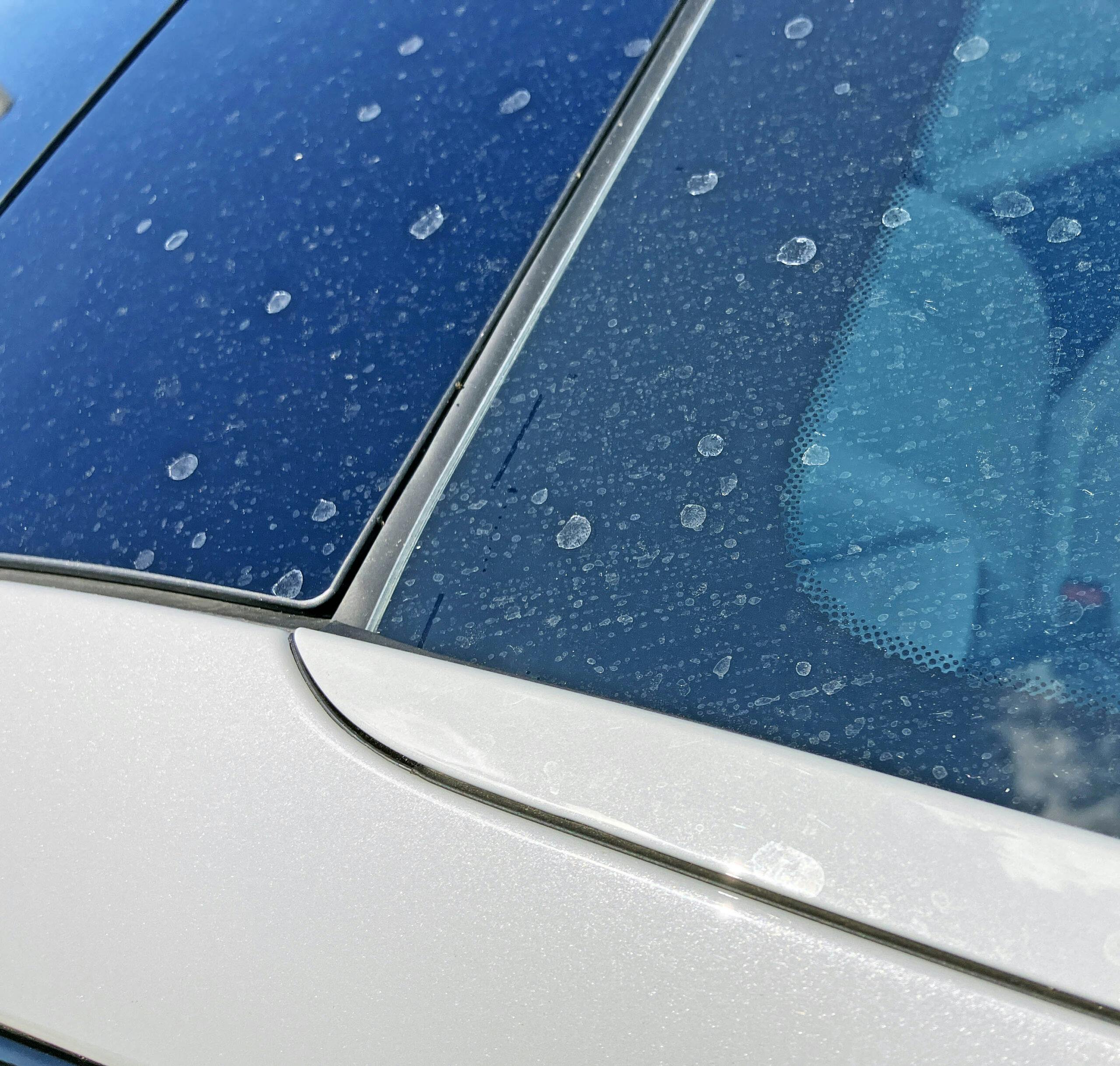
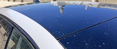
One-piece glass roofs are par for the course, but it would be nice if some 8-bit graphics were ghosted onto it. Compared to the rest of the Ioniq 5, this spot is a touch boring.
Speaking of boring, don’t all these slashes take away from the fact that this is a ho-hum crossover SUV? The massive wheelbase certainly provides for a fantastic amount of cabin space, cargo space be damned.
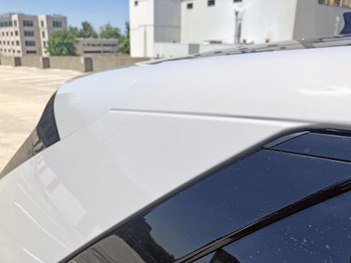
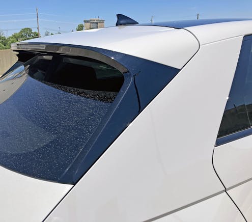
Why this crease in the C-pillar exists is beyond me. At least it makes for a fun transition between the sleek pillar and the sculpted hatch.
I am sure that Hyundai’s designers didn’t look at the Dodge Omni/Plymouth Horizon and say, “Wouldn’t that be awesome on our Ioniq 5?” But they shoulda!
The end result is taut sheetmetal, assertive cutlines, and the sporty profile of a hot hatchback from the 1980s.
The clumsy yet somehow perfectly integrated side-marker lens draws your eyes away from all the other cubist elements. This genuinely, truly could be a still-life scene from the likes of Picasso.
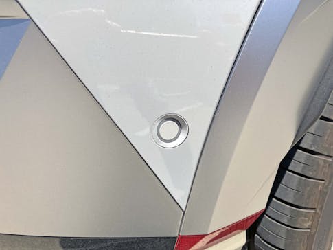
Oh my goodness, my kingdom for a square sensor! Or a triangle … or anything but that!
The Omni/Horizon–infused quarter-panel looks just about perfect for a charging door placed at its zenith.
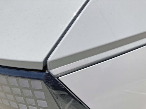
While the hard bend at the end of the quarter panel (i.e. the vertical shadow) makes sense elsewhere along the bodysides, it becomes a bit busy after adding the cutlines for a charging door.
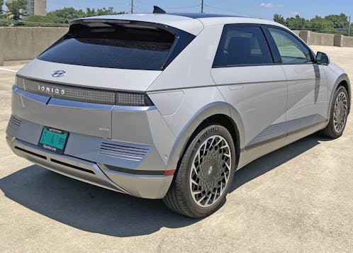
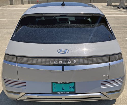
There’s a lot to process from this angle, but it’s still a delicious take on cubism. The rear integrates with the front thanks to a curved panel below the taillights—complete with little black strip—and the slots at each corner of the bumper.
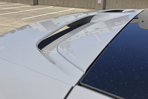
Hatchback spoilers are almost mandatory these days, and this one sports a ton of black paint to mask its massive footprint on the body.
At least Hyundai sliced a fair bit of heft out of the black panel, adding a bit of surface tension to an otherwise bulky component.
The strong center panel inside the spoiler was an unexpected surprise, though its elegant, sculptural form looks a little too integrated—it’s not cubist enough to belong on an Ioniq 5.
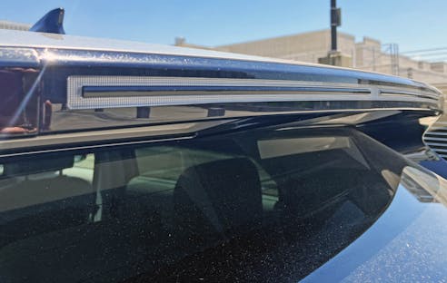
The spoiler’s integrated CHMSL (center-high-mount stop light) is less cubist, more of a tribute to geometric abstractionism. Picasso may not adore it, but Mark Rothko would gleefully have a friend stomp on the Ioniq 5’s brake pedal so he could see it illuminate.
The Omni/Horizon analogy really makes sense when zooming up close on the Ioniq 5’s aggressively raked rear hatch. My apologies to Giorgetto Giugiaro, but it’s clear from here that Chrysler’s designers made a better rear-quarter panel than what he penned for the 1975 Hyundai Pony.
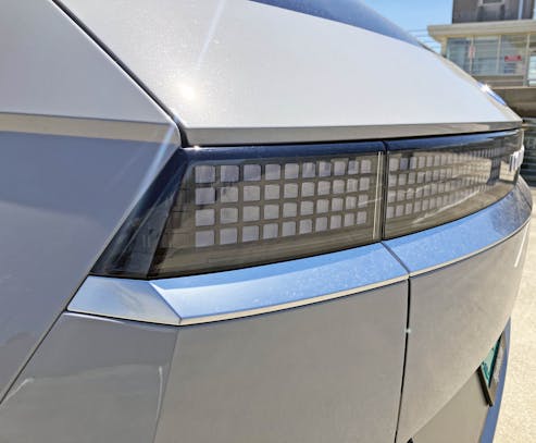
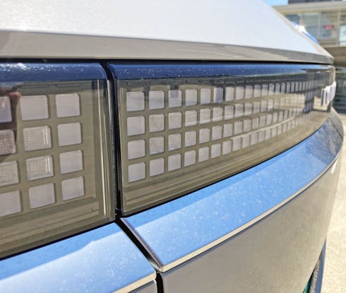
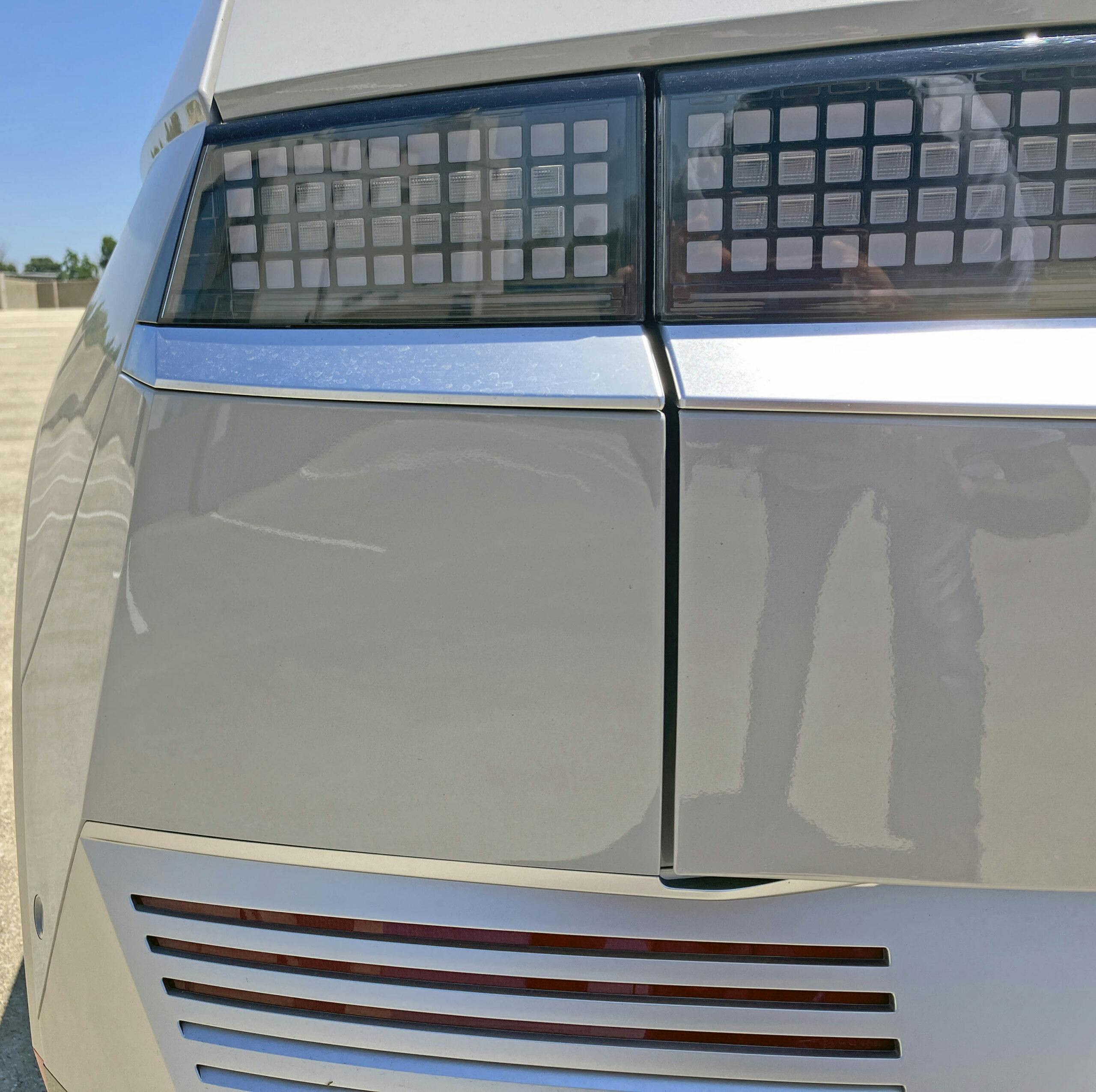
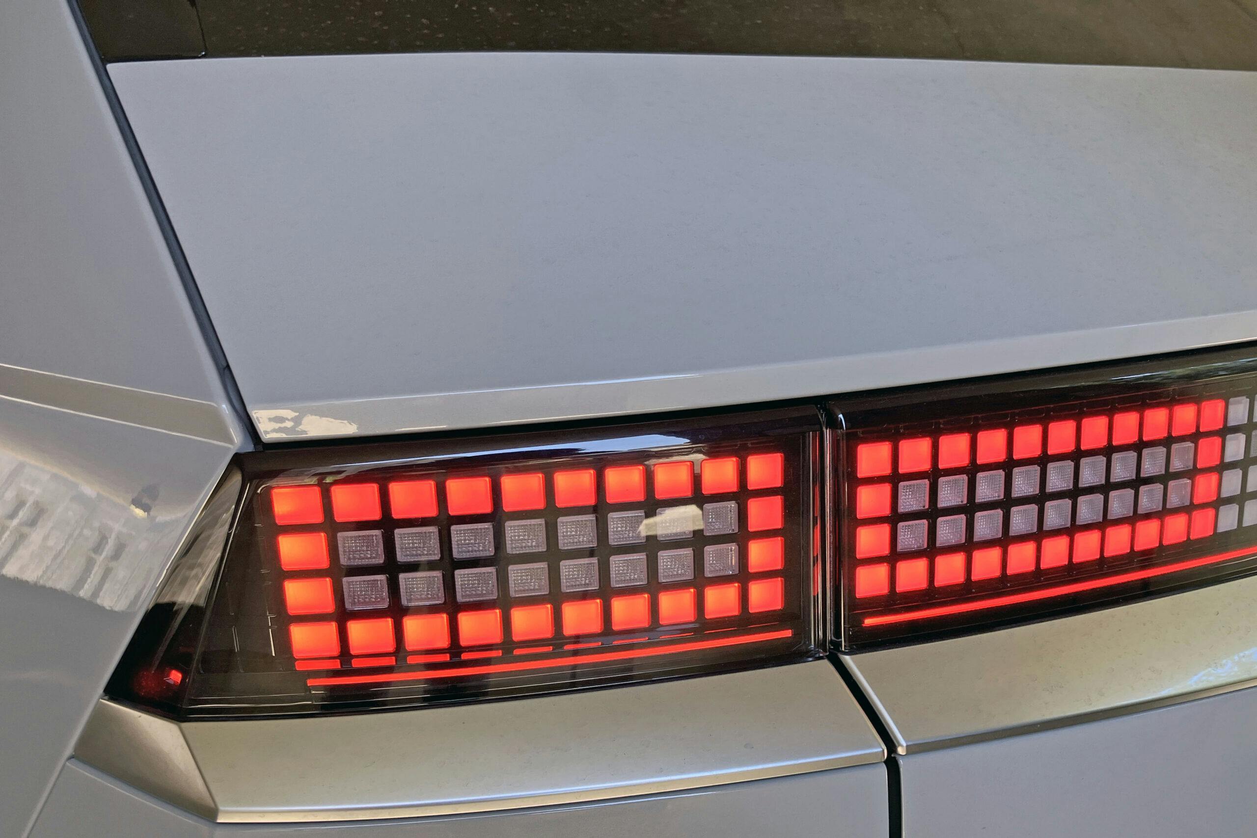
The fastback (as it were) hatch really accentuates the hard-nosed, upright lighting pods with 8-bit texturing. It’s fast, unexpected, and yet somehow classically elegant: Is this peak automotive cubism?
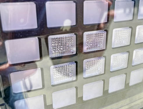
Frosted squares give off softer, diffused light for tail-light duty, while the beveled, shiny lights in the center have the clarity to be a proper “OMG STOP” light.
But wow, doesn’t it all just come together like no other lighting assembly ever? Even the hatchback’s cutlines look perfect, as they fully integrate between the frames of the 8-bit pixels.
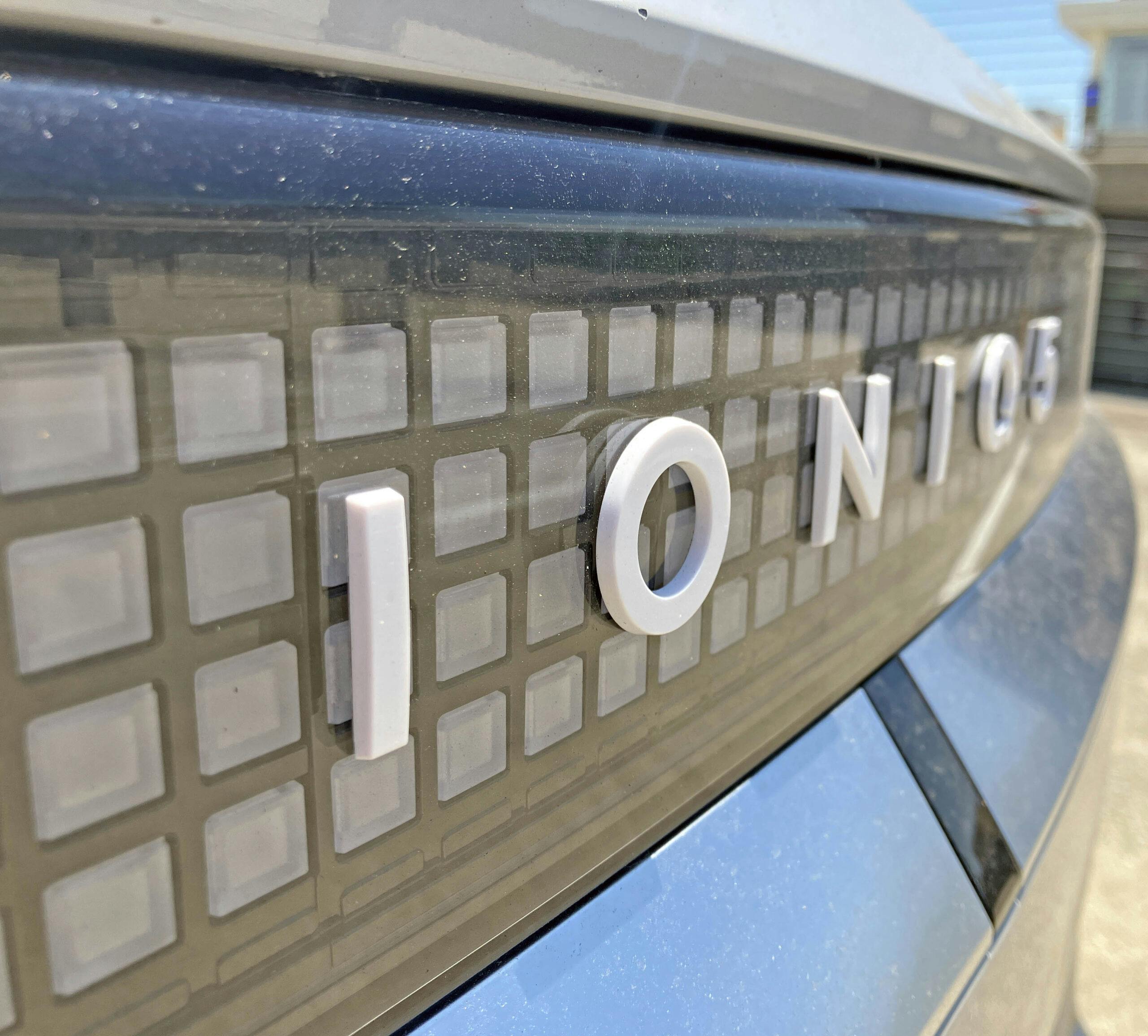
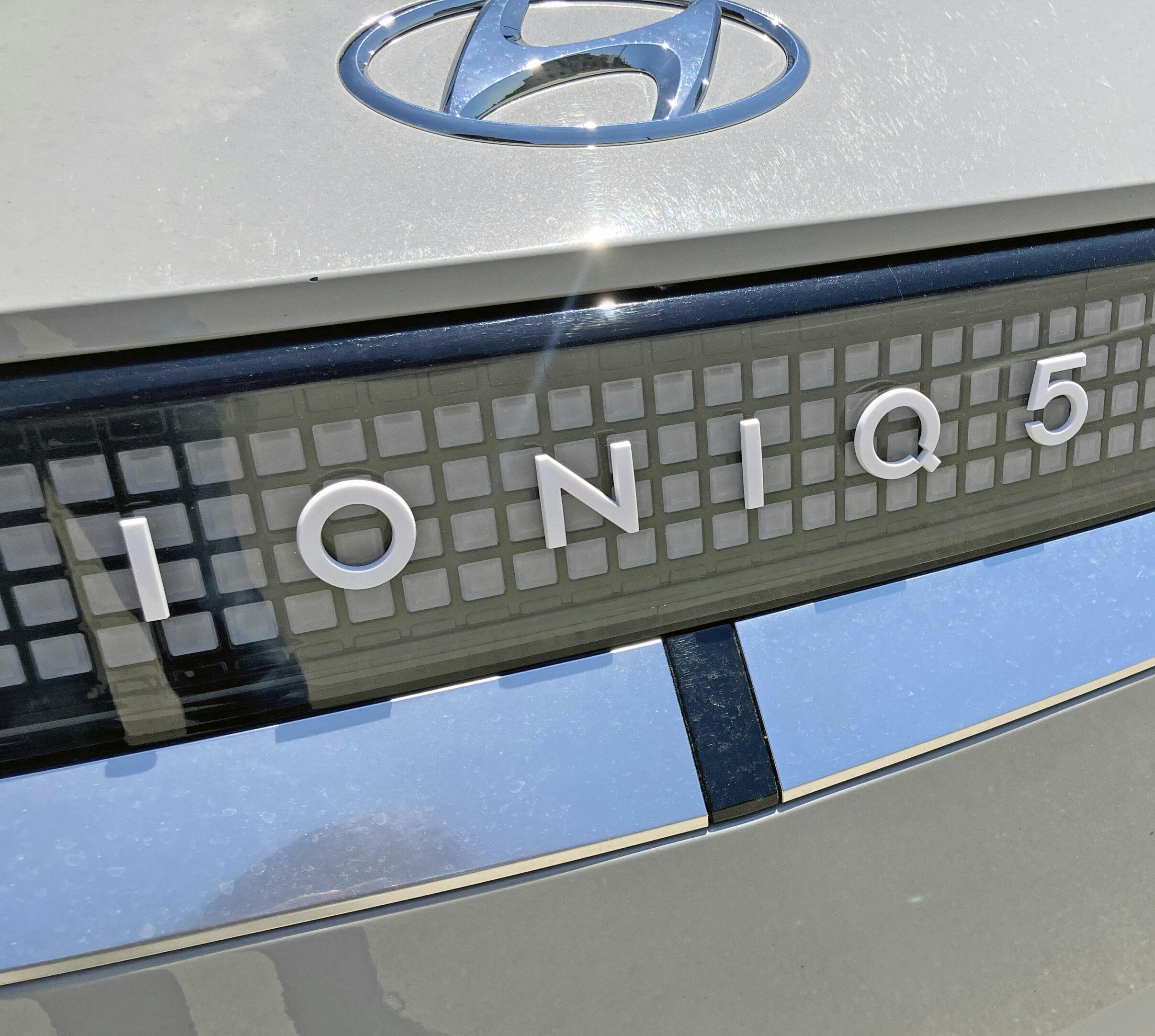
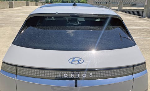
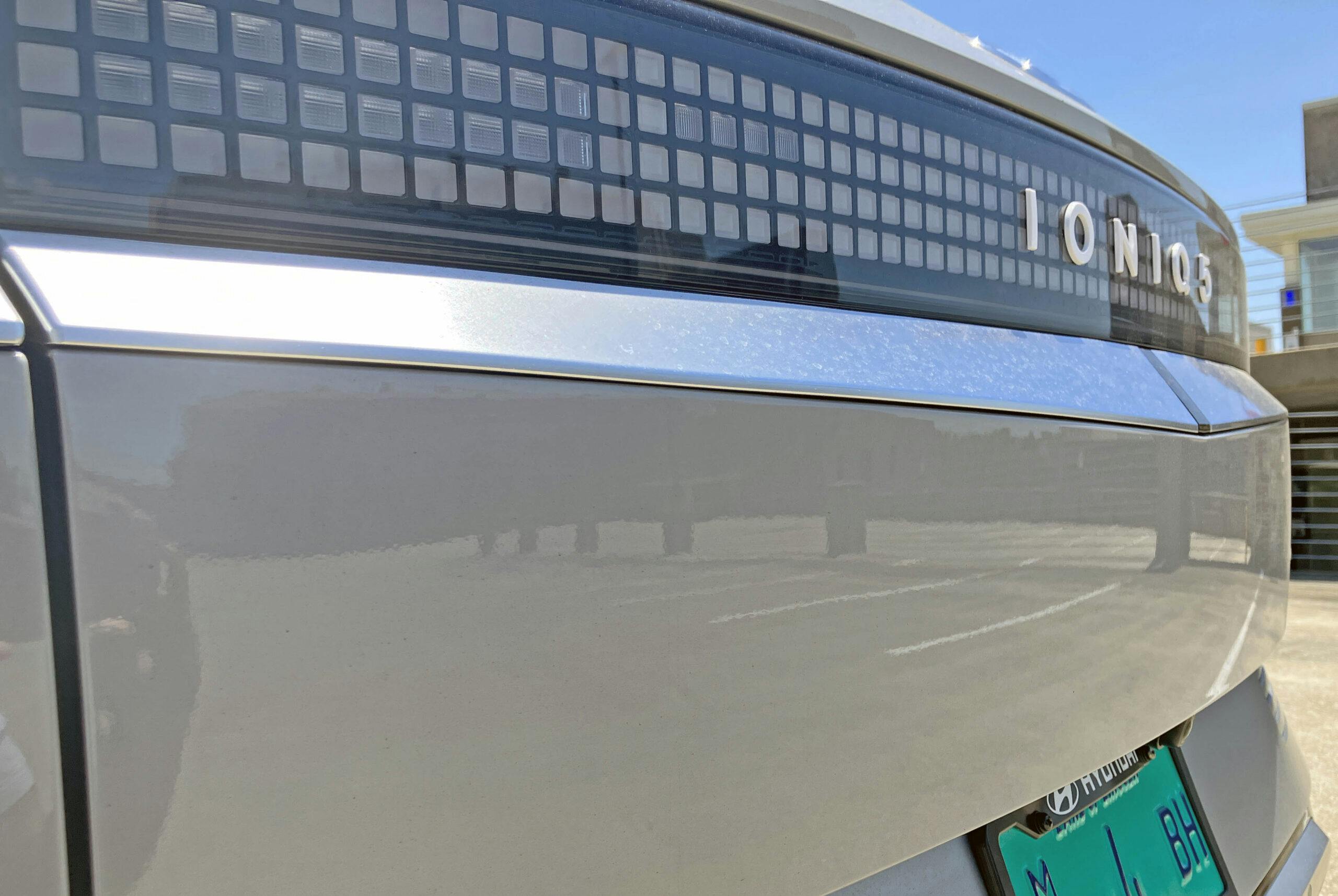
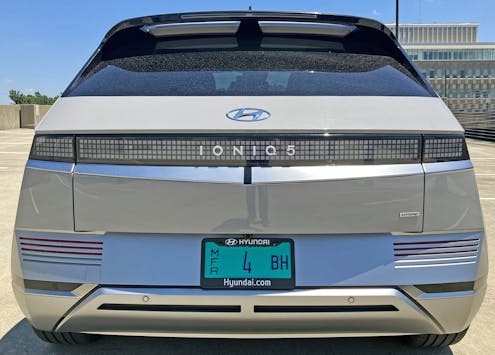
Much like the Porsche Taycan before it, these full-length taillights are the perfect home for bold lettering affixed across the center panel.
Unlike that high-dollar EV from Germany, the modest South Korean eschews integrated emblems for glued-on, external plastic lettering. The Hyundai oval still has no business here, and unfortunately the black dash below the lights doesn’t replicate the charging status, like it does on the front bumper.
Sure, it’s mostly a rolling tribute to cubism. But the curved hatchback glass fits well with the curved panel below the taillights. And they both give credence to the curvy nature of the same part below the front grille.
These big curves make sense and blend well with the whole package, unlike the Mini Cooper–cutline at the cowl.
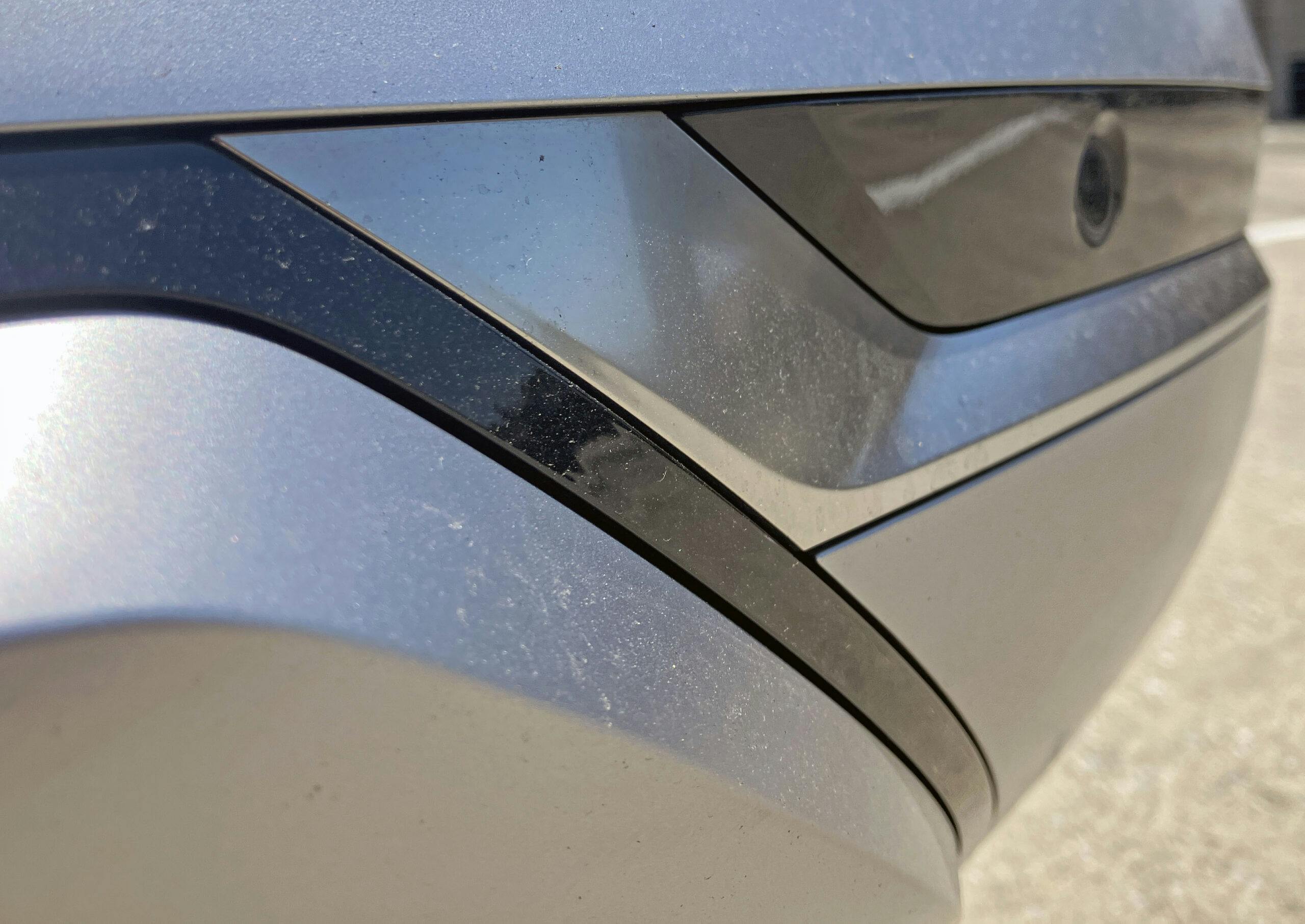
The cubist-worthy edging and 8-bit pixelations combine with the soft, gentle curve present in the tailgate to make an absolutely delicious contrast. But seriously, we need square camera lenses!
The top three slots are also red reflectors, an arrangement which suggests the front slots should have been filled with LED accent lighting to follow suit. Well, provided Hyundai could make it road-legal in every country.
That said, the nicely integrated access door for an assembly bolt (or tow hook?) below the slots is also a decent integration.
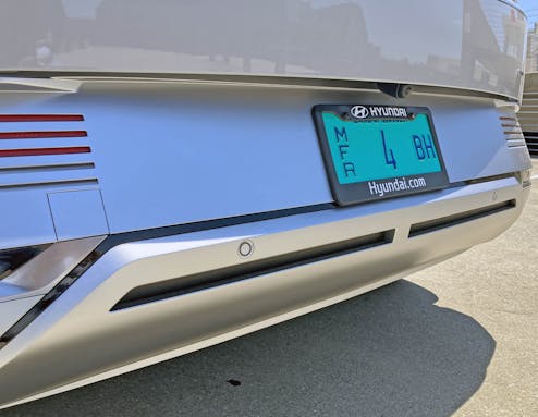
What’s hilarious, and somewhat unsettling, is how the rear bumper is mostly behind the hatchback’s door.
While the leading edge offers reasonable protection in a rear-end impact, this level of cubism means rear-end impacts will get pricy if the offending party lacks insurance and smacks the tailgate.
Up close, the flat-planed, forward-thrusting rear bumper makes more sense and avoids giving the tailgate the appearance of overbite/buck teeth.
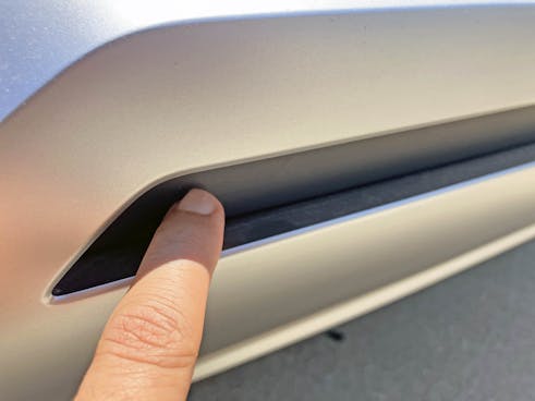
I can’t tell if this panel is an open/closing active aerodynamic tweak or if its job is simply to match the front bumper.
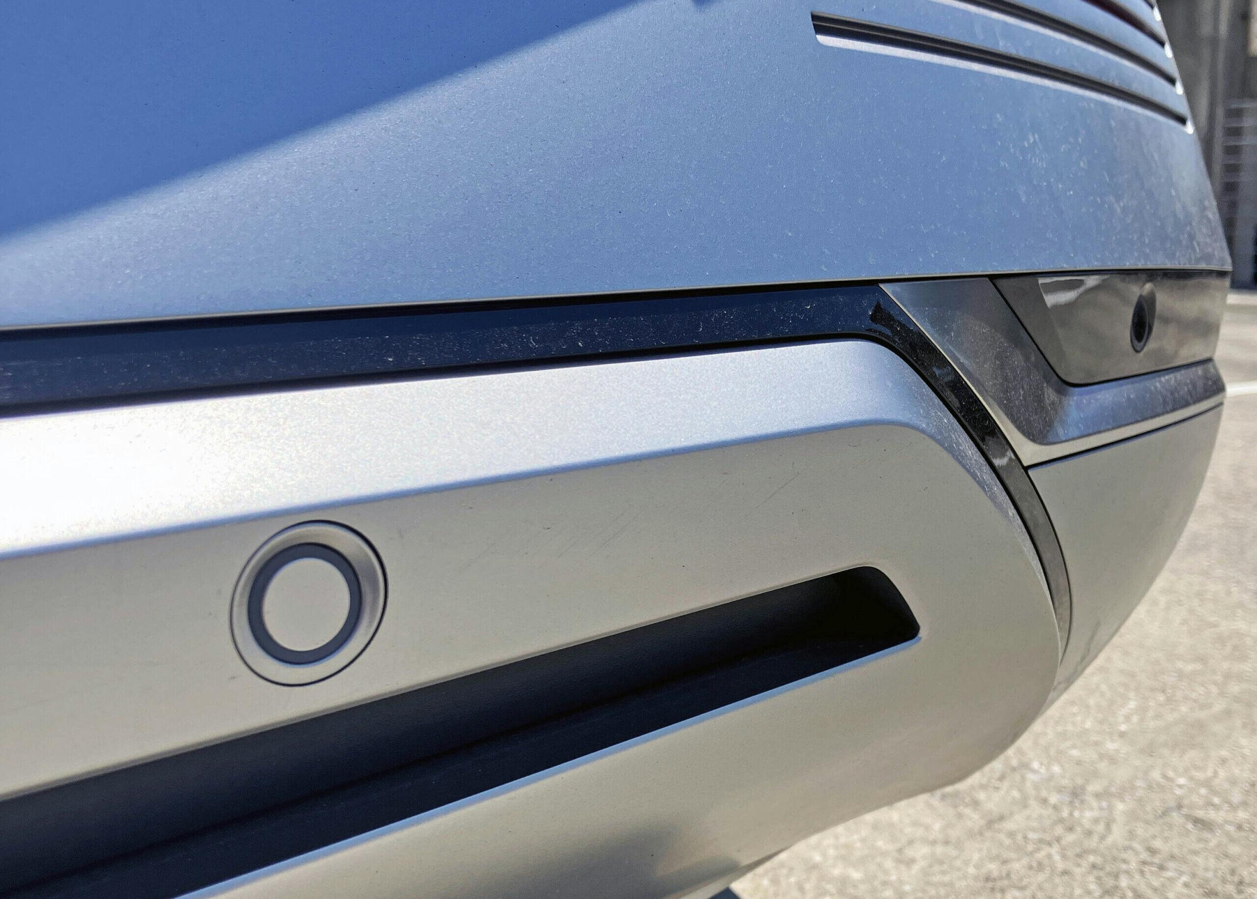
The round sensors make a fair bit of sense with the rounded, downward slope of the polished black insert present in the rear bumper.
Said insert also makes the rear bumper look like part of a Star Wars stormtrooper mask: Another cubist element that sports a fantastic blend of hard edges and soft contours.
From an elevated position? Witness the curved hatch.
From a lower view? Looks almost flat and angular! There’s something delightful when a vehicle’s appearance changes this drastically depending on your height.
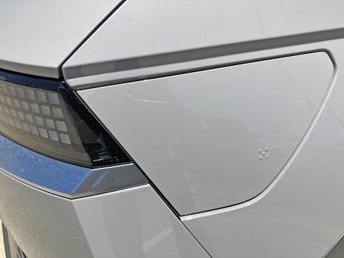
Push the charge door on its five little squares (external) and you’ll actuate a little black button inside, next to the Ioniq 5’s charge port. Above the button, which does double-duty as an open and a close button, is a series of squares showing charge level.
The button sharing is ingenious, almost minimalistic in nature; and square charge meters are just what you’d expect from the Ioniq 5.
Everywhere you look, there’s a little bit of surprise and delight in the Ioniq 5’s exterior design. And it is something you can’t fully experience in a test drive, as the interplay between the blend of hard/soft forms only shows its true colors after you’ve witnessed it through the gradations of light available throughout the day.
It’s always different, much like the multiple viewpoints presented in cubism’s finest works. And being this different is wonderful, as both the car and the art do a fine job integrating themselves into any environment.
Thanks for reading—I hope you have a wonderful day.
(And go read the Ioniq 5 + Architecture article, if you haven’t already.)
Check out the Hagerty Media homepage so you don’t miss a single story, or better yet, bookmark it.
















Not particularly interested in this car, but I enjoy Sajeev’s take on things enough to read this article right through.
And that means a lot to me. Thank you again for reading.
Ditto on the articles ! How about putting the round camera and sensor lens in the center of a Fratzog or Pentastar?
I was very excited when I found out you were sampling this car, and I was not disappointed by your write-up. It was highly thoughtful, and–like always–brought to light a number of elements I didn’t realize were there. That front 3/4 view wherein the diagonal lines are parallel is [chef’s kiss].
One thing I also didn’t realize until reading this was that the IONIQ 5 a lot closer to the Jaguar I-PACE than I’d thought (long wheelbase, low-and-wide-looking, wheels pushed to the corners of the vehicle), although this looks far better IMO.
As for Hyundai itself, I think it needs a similar logo revamp to Kia. This isn’t the first Hyundai to be both original and exceptionally handsome, but their awkward, curvy, elliptical emblem kind of ruins it. I’d like to see them redesign for something more modern. Their designs deserve it.
The I-Pace reference is spot on, and to be honest, it’s probably closer to a Jaguar than your average Hyundai!
Yeah a Kia-style logo refresh is definitely in order. Let Ford have their oval, everyone else needs to ditch it.