Media | Articles
Vellum Venom: 2021 Kia Soul

Hard to believe we’re nearing the 20th anniversary of that fateful journey to South Korea when Michael Torpey sketched what eventually became the Kia Soul. Apparently inspired by a boar wearing a backpack, Torpey’s vision and every subsequent re-think remained true to the original concept. Quoted as saying he had “only a week or two to sketch, ” Torpey suggested this “probably contributed to something fairly pure coming out of it.” Considering how long this vehicle survived and thrived, considering how little it has changed since its inception, he was likely correct in that assessment.
But there’s something more to every Kia Soul than a mere mammalian vision, as it possesses the same economy of line (and often the same minimalist notions) found in a Range Rover. So let’s get into what makes the perennial backpacking boar such a visual treat.
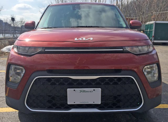
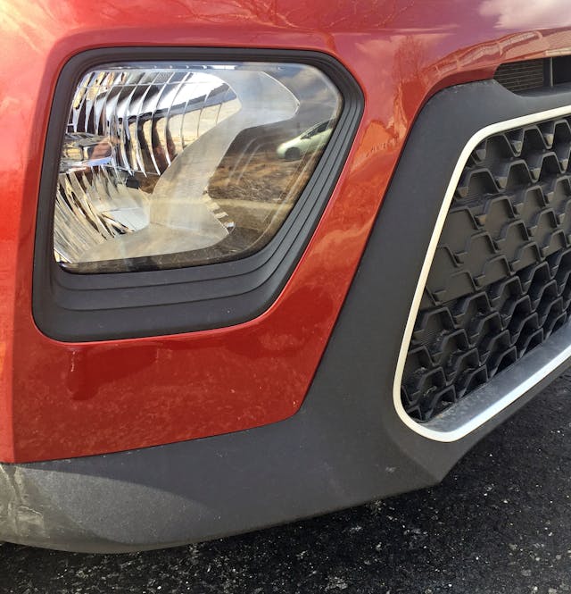
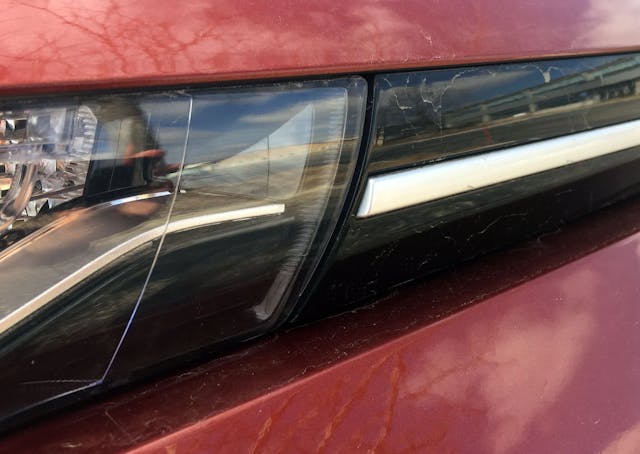
The third-generation (2019+) Soul adopts the now-commonplace notion of wearing sleepy-looking park/running lights up top, with massive headlights mounted inside the front bumper. Thank the Rolls-Royce Phantom VII for starting this trend, and give Kia kudos for making it both affordable and adorable. Note how the headlight’s outer bounds match that of the bumper, while the inner lines complement the lower grille.
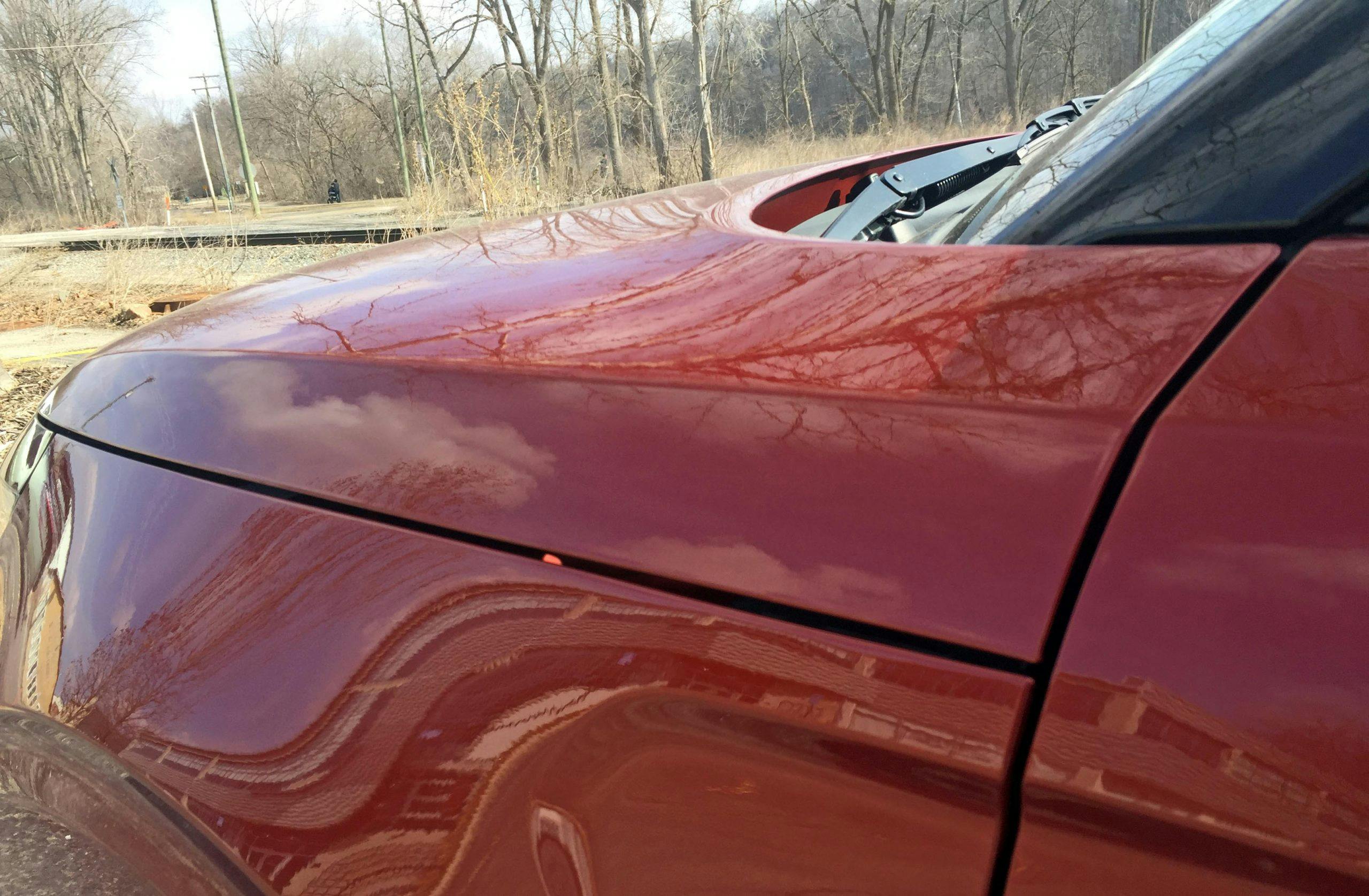
Aside from the massive grille—seemingly mandatory these days for ICE-powered autos—the Soul exhibits a strong number of horizontal lines, giving the feeling of substance and presence to an otherwise demure vehicle. And the clamshell hood is rather unique at any price point—more on that later.
Note the three rings of black plastic around the headlight: Kia wasn’t content with a boring trim ring of planar plastic, instead opting for a texture reminiscent of a robotic tree trunk sacrificing its life to give the Soul’s headlights a little more passion. Look closely in the headlight and those “tree rings” are inside the assembly, too.
Marketplace
Buy and sell classics with confidence
It’s probably a good thing the tree rings aren’t present in the bumper’s valence (or grille frame in this case) as there’s a fair bit of unpainted surface that needs less texture to convey its message, especially the pointy bits at each corner of the grille.
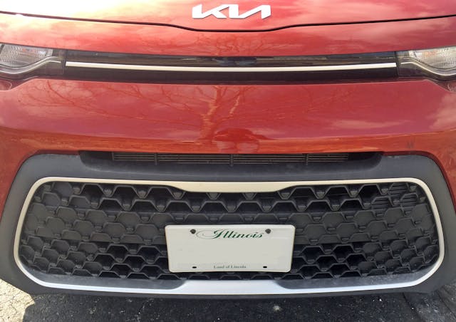
The unadorned, untextured cooling hole between bumper and grille is a bit unfortunate. More on that in the next photo, but at least it’s almost invisible to the casual onlooker.
Here’s the bad part, instead of having a completely open grille, the Soul has a reinforced center section with a solid texture. There’s probably a wholly-valid reason for this (involving the bumper’s structural bits behind it) but it would be nice to have the same open texture across the whole grille and delete the cooling slot above it. (Higher trim levels have a more expensive, “Hot Stamping type” grille with a more open texture.)
Then again, look at the hidden access door nestled inside the grille. See the little triangle that’s even smaller than the Soul’s trapezoid grille texture? That’s pretty cool.
What’s decidedly not cool is the implementation of Kia’s signature “Tiger Nose” grille. Sure, it’s perfect to give a formerly-downmarket brand a stylistic boost for sedans and CUVs alike. But like slapping the blue oval on the front of a modern Mustang, the Soul has too much swagger to truly need this bit of branding kit. The silver grille frame looks like an afterthought, even more-so than the Kia Bongo’s implementation.
The sleepy-eyed Soul is a shot of slowed down, Chopped and Screwed Hip-Hop music in today’s fast-paced world of electronica. The design is consistent from end-to-end, and the color-matched header panel (the part above the lights) looks more expensive than any vehicle with a conventionally designed face.
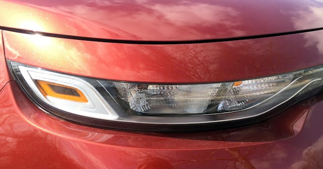
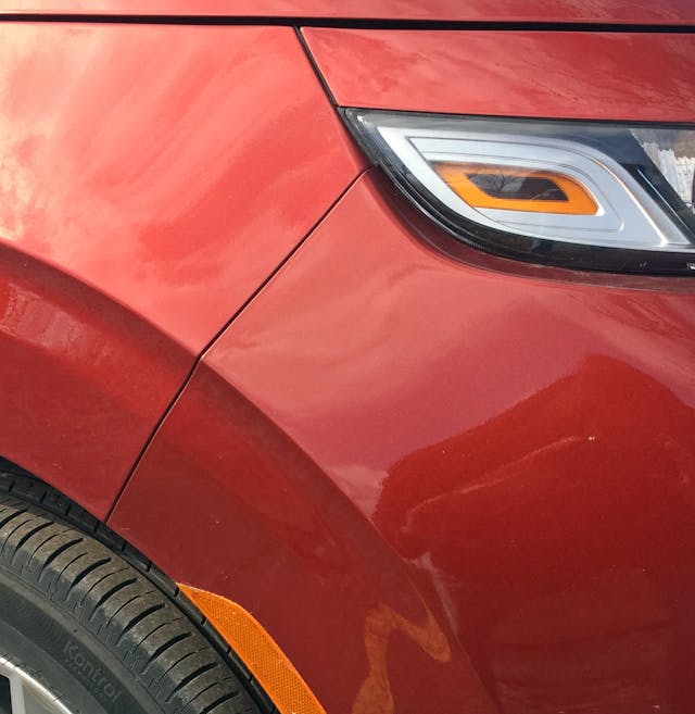
While the “tree rings” around the headlights are pretty clever, the bright silver homage around the side marker light stands out for all the wrong reasons. Paint it black, or just match the look of the adjacent lights.
And do that because those lights look futuristic, expensive and so very unique at this price point. Tooling around town with the parking lights (left side) illuminated is quite the treat, especially when rolling up behind a flat-booty pickup (finished in a highly reflective color) at a stop light.
The lighting pod’s internal sliver streak is emulated in the connecting panel between left and right lenses. While both silver bits vary wildly in thickness, this seems necessary to draw a visual connection from afar. (Perhaps the mismatch is acceptable up close for this reason.)
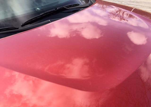
Like reading the rococo script on a Cadillac Fleetwood Brougham d’Elegance, Kia’s latest logo is a bit obtuse at first. But as a fan of modernist notions challenging convention, I personally love it. Can’t say the same for the sag in the hood’s cutline to accentuate the emblem; it never worked on the Lamborghini Aventador, but we continue to be punished for automakers’ insistence in prioritizing real estate for their emblems.
While this taut, understated negative era doesn’t extend nearly as far forward as a Range Rover, the parallels between the Soul and the beautiful Brit start to surface.
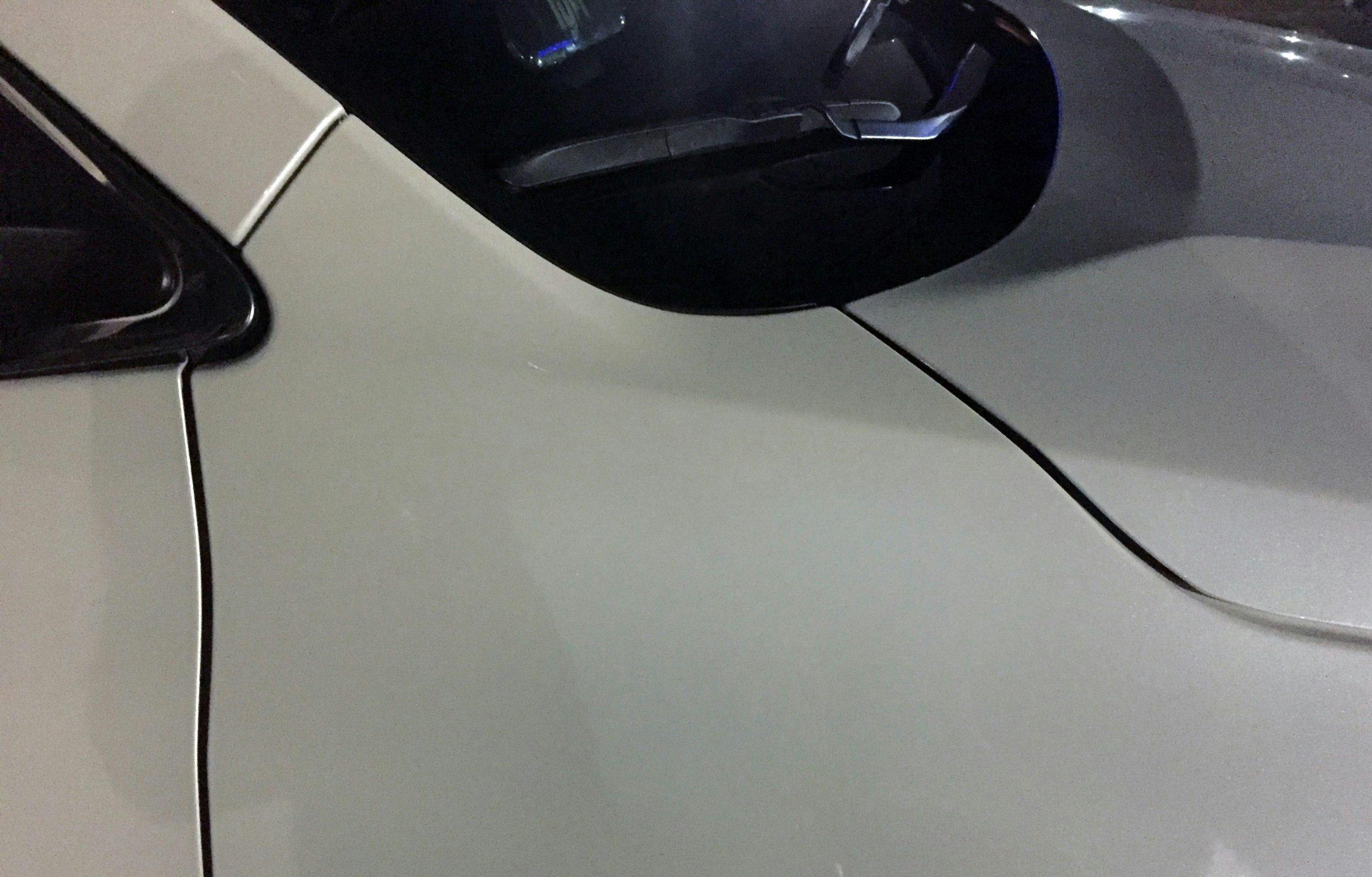
The connections to Britain’s finest off-roaders is evident in the hood’s lower cutline (resembling a clamshell), and the blackout roof pillars. The nearly invisible nature of the angular A-pillar is another hallmark of Land Rover, and it gives the Soul a far more expensive demeanor for the utterly-average bones that underpin its coachwork.
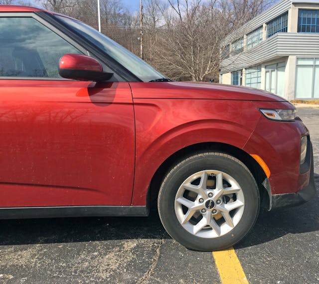
Parked by itself, sometimes you forget that the Soul’s dimensions are truly tidy. But those wheels fill the wheel arches quite well, and they are only 16 inches in diameter. Real estate is limited to the fact that the obligatory fender carve-out (a swoosh resembling a grille vent) is crammed between the clamshell hood’s cutline and the wheel arch echos. It’s not a good look, and it needs to be deleted.
Considering the clamshell hood’s shape/location, the fender-to-bumper meeting point, and the concentric textures inside the light, is this what Land Rover designs if they sold something for less than $20,000?
Yeah it’s just a crossover, but it looks both elegant and unique for such an appealing asking price. While not every Soul sports this clamshell hood, Michael Torpey’s 2006 concept has it. Therefore kudos must be handed to the current Soul for keeping the original’s DNA in its design.
Even the wiper arms nestle within a logical nook behind the bumper with restrained intakes for the HVAC system. The tall, upright(ish) windshield offers plenty of visibility, but the wipers are always out of sight.
Aside from the obvious parallel to Land Rover’s famous “clamshell shutline” hood, having the hood extend to the front door/A-pillar eliminates the ugly tumors atop front fenders when they are forced to cover the same real estate. Compare the Soul to something like a Toyota Highlander, and also note how a cutline and a hard bend in the Kia’s hood keeps it from looking bloated or bubbly.
But still, again, the carve-out in the fender has no place on the Soul. It fights the flow and serves no purpose. Kia should go full Land Rover and do a more angular, integrated carve-out … or refrain from stamping this part of the fender.
Wheels this small (16″) are a treat on battered Michigan roads, and their split five-spoke design with a hub sporting a knock-off spoke homage are both subtle and exciting at the same time.
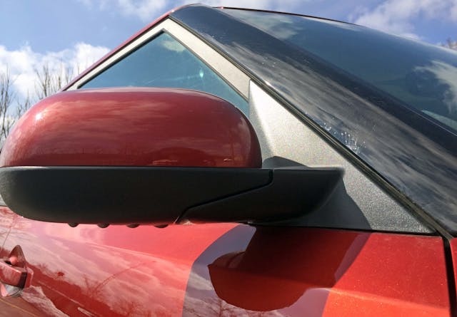
Back up to the A-pillar, and the blackout treatment forces the eyes to look elsewhere. The sideview mirrors have a painted skullcap: a nice touch.
If only they were at bit more angular to match the rest of the roofline? Hopefully this glass is cheaper to produce because of interchangeability with another Kia product.
Both the A- and B-pillars are quite boxy and angular, though not upright enough to please G-wagen and 4xe purists. No matter, there’s a similar spirit present in the Soul.
And that black rain gutter in the roof? Pure Land Rover perfection!
Not having seen the original “Boar with a Backpack” rendering (why must you forsake me, Google?), I presume the Soul’s upright roof with a narrowing DLO (daylight opening) as you go across the body gives the impression of a stylish backpack hugging a hiker’s back.
While the B-pillar is pretty forgettable, that’s a good thing: someone cared enough to spec the Soul with blackout window trim, and the architectural influences here contrast with what’s coming down the (roof)line.
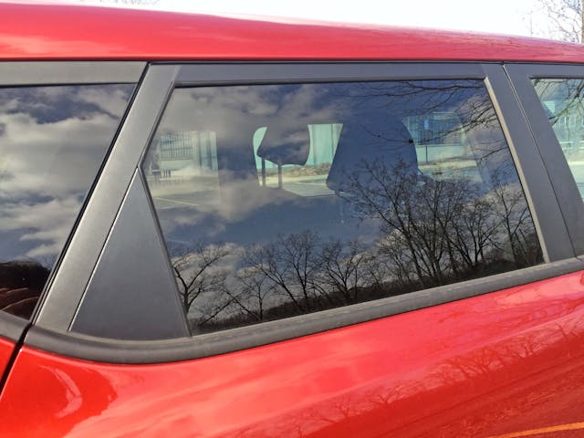
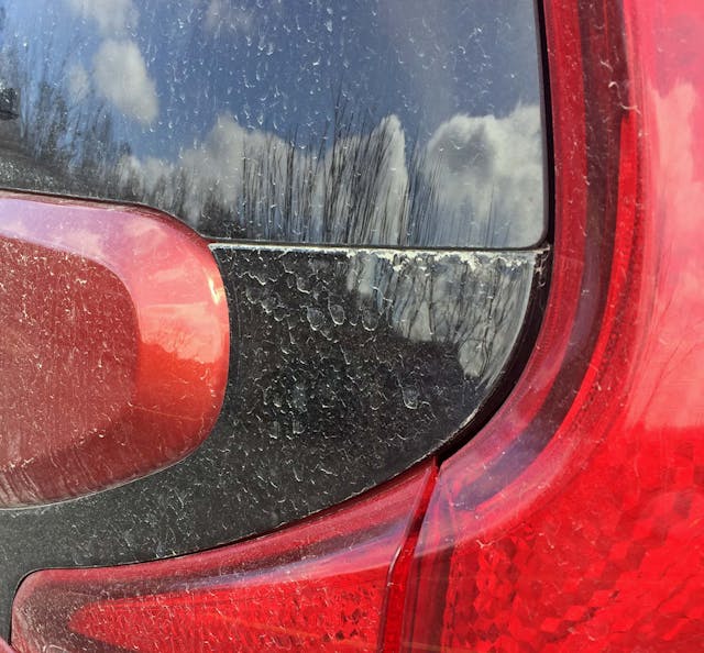
Cheap cars always have these black plastic triangles in the window frame, as fixed panes of glass are out of the question. I didn’t check to see if the rear glass rolls down in its entirety, but let’s hope that’s the case.
I normally rail against DLO FAIL, but cars at this price point deserve some slack. Except for the Soul, which deserves accolades above all else. Unlike other, far more expensive vehicles with a black cheater panel to extend the DLO to the end of the body, the Soul utilizes an actual piece of glass with a stylistic frame (of both plastic and rubber) to enclose the window like a reflection pool … reflecting whatever happens to be in your line of sight.
The added texture inside the logo is another excellent touch. Clearly someone, or a group of someones, went all out to make the Soul a cooler design than its asking price suggests.
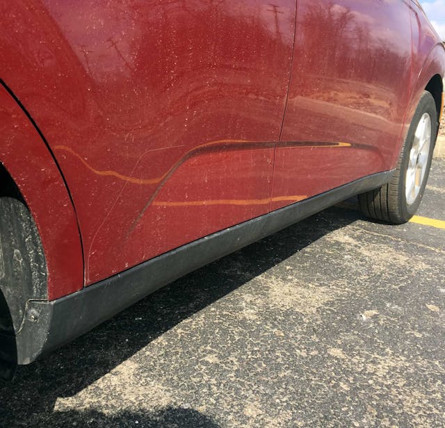
Unlike the carve-out in the fender, this bit of negative area in the doors adds necessary tension to a tall, narrow CUV. Without it, the Soul would look flabby. Also make note of the wraparound rocker cover, another nice touch for this price.
The wheel arch echos are far more invasive at the rear, making little logic when smeared across the rear door. It’s hard to style a vehicle this small, and it’s a difficult balancing act to add exciting (as it were) contouring to ensure you don’t make another Scion xB.
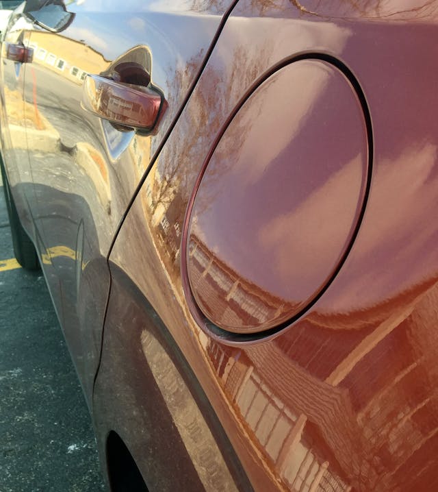
Speaking of smears, the folks at Kia Design got lucky ensured that the gas door wasn’t draped across an overly complex contour. Many more expensive vehicles can’t make this happen.
The upright D-pillar is accentuated by the vertical taillight clusters, ensuring you’ll have less apprehension when loading boxy items into the Soul’s modest frame. CUVs that actually carry cargo is a lost art these days, so more kudos are in order.
Note the ever-so-slight shrinking of the DLO as it moves from the B- to C-pillar. (It’s probably easiest to see when use the sheetmetal crease below the DLO as a reference point.) Add the angular pillars, the fender carve-out and the vertical D-pillar, and everything works in harmony with the Soul’s side profile. And while the lower carve-out adds surface tension, perhaps it also looks like an ungainly dent that just happens to dance across the body in harmony with the fender’s swoosh.
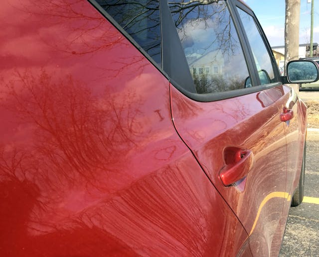
The hard bend between the DLO and the door handle marks a transition from softer curves (below it) and the angular pillars above it.
Even though the Soul looks angular and upright, there’s an ever-so-slight amount of tumblehome (i.e. glass curvature) present to remove a reasonable amount of visual weight from the roof.
The D-pillar’s upright, cargo-friendly demeanor makes sense from this angle, as the hatchback is mostly vertical: ready to haul as many dorm-sized refrigerators you and your roommate can throw at it.
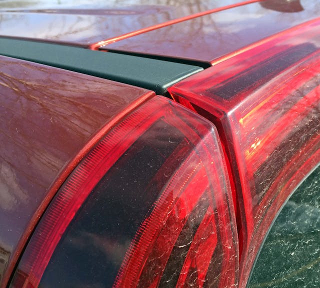
This third-generation Soul has a heckblende that not only extends from corner to corner, but also pinches inward like the claws of a crustacean. While older Souls were anything but forgettable, this look keeps it from looking less like a builder’s van and more of the quirky cargo hauler of Michael Torpey’s original vision. Or are those lower appendages more of a boar’s tusk?
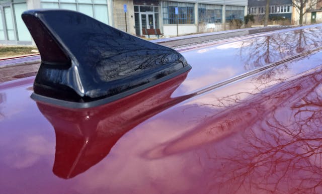
Roof contours and the fancy antenna are par for the course these days, no matter the price. The black paint suggests that color matching was not possible at this price, and hopefully nobody cares about that!
The black rain gutter is still the stuff of Land Rover dreams, and the perfectly flat layout of all elements makes for reasonable quality control. (Considering how many things pictured here are moving and/or collecting rain water.)
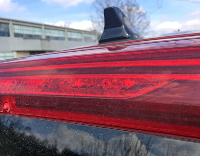
Heckblendes affixed to the top of a hatchback are darn good at hiding CHMSLs. Sure, it’s a shame the entire red lens can’t illuminate when you tap the brakes, but that’s likely too expensive and illegal (too much light for other motorists at night).
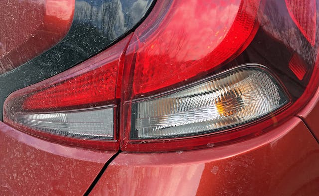
The taillight’s claws/tusks effortlessly integrate the backup and turn signal lights. Even the bumper and hatch cutlines are sympathetic to their purpose.
While it’s unfortunate the hatchback’s window stops at this horizontal line, it’s beyond acceptable to transition to solid plastic with a sub-$20,000 asking price. Also note how both the taillight tusk and the center panel (painted body color) have strong bevels to keep them from getting bubbly and chubby.
Those bevels are kinda necessary with the new, oval-free corporate logo. Older Souls had a very flat posterior, but this subtle contouring makes it look less like a Kyle Smith van.
Much like the bodyside, the Soul’s lower hatch sports a hard bend that denotes a significant change in topography as you cross the equator.
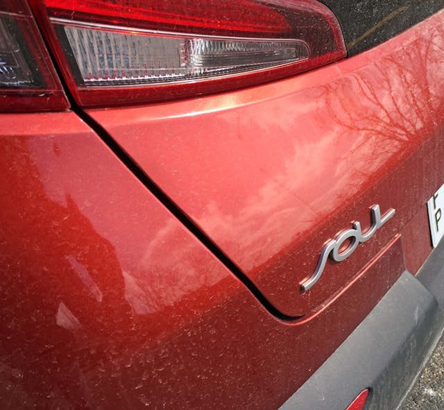
The Soul’s emblem design is radically different from Kia’s new logo, mostly because it’s actually legible at a glance. Which is great, but the bumper gives mixed messages: perhaps that swoopy line in the bumper transition from side-to-rear serves an aerodynamic purpose (as noted by the dirt line accentuating it), but the swoopy clashes with the tough-looking insert/lip below it.
The insert has a texture that somewhat resembles the front grille. Except it’s not nearly close enough to provide a sense of cohesion in the design of both bumpers.

But the sum of all parts is one helluva “cute ute” for an admirable asking price. Yes, it’s not as beautiful as a Range Rover, or any Land Rover. But that’s not the point, as the Kia Soul offers elevated design language for the masses.
From the rear’s expansive heckblende, the clamshell hood’s decadent horizontal cutline, and the side’s radical quarter window treatment, it’s clear that Kia took Michael Torpey’s initial design and gave it an unbounded future. Or at least a bright future, as the Soul survives (thrives?) in the U.S. while competitors like the Nissan Juke/Cube and Scion xB failed.
That said, I regret not meeting Mr. Torpey in my first year at the College for Creative Studies in Detroit. He just graduated, was getting local media accolades with his gig at GM at the time, and every professor gushed about him. Safe to say his presence was strong in our studio, and now he is sorely missed by many in the design community. It’s beyond clear that people are the soul behind the vehicles we drive, love, restore, etc. and Michael Torpey had a portfolio we can all appreciate.
Thank you for reading, I hope you have a lovely day.
