Media | Articles
Vellum Venom: 1930 Studebaker Commander 8 Victoria
In many ways, the Roaring Twenties of this and the last century are similar. Both eras are fully immersed in consumer culture—today’s Amazon isn’t quite yesteryear’s Sears catalog, but the kernel of an idea remains at the core. That’s why, almost 100 years later, tall wagons like the Mercedes Benz GLC AMG sports-utility coupe can draw parallels to a 1930 Studebaker Commander 8 when fitted with the sleek, 2-door Victoria body configuration.


I hear you shout “Heretic!” from the rooftops. I understand the sentiment, but please lay down the pitchforks. Both near-luxury vehicles have coupe attributes and sleek deck lids from their respective eras. Heck, both are even available with running boards. (Yes, really.) That could prove luxury and practicality had serious style at the end of the Roaring Twenties and now in 2024. To find out, let’s pull this Victoria body Studebaker Commander 8 from the Hagerty Learning garage and run it over the vellum.

Look close and it’s clear this Studebaker is a cut above your average Ford Model A. This Commander sold for $1,515 when new, and the Model A started at around $500.
Sure, the bumpers are similar and there’s a two-tone paint job (for now!) like a nicer spec Ford. But look at the grille, especially the teeth: The texture points to a premium offering, right down to the “8” logo in the headlight bar, four headlights, and prestigious details we will showcase.

But before we go there, let’s marinate on coachbuilding in the 1920s: Exposed fenders were still part and parcel of roads of the day. Upright grilles that rest atop the frame were standard fare. We were still years away from the Cord 810/812, and looking at that vehicle in detail shows how far cars like this Studebaker needed to evolve to turn into a modern car.
Marketplace
Buy and sell classics with confidence


Starting at the top of the grille, the Studebaker has a stylish but not ostentatious hood ornament/radiator cap worthy of a mid-level luxury vehicle. The outer circumference elegantly transitions into a winged appendage at the end of the cap. It’s perfectly middle-class fancy, because it isn’t a boring cylinder like most (all?) caps for a Model A.

Now this is a premium part! The radiator insignia employs three colors in a metal emblem, and the white color could be implemented using cloisonné techniques. The three levels of metal under the color give the emblem a more expensive feel, clearly worthy of a manufacturing business that had been around for 78 years when this Commander was new.


The fluted grille texture indicates this Studebaker is no entry-level ride. Producing teeth like these aren’t needed for making a functional vehicle (like the exposed radiators of the Model A/T) but they are a clear indicator of a finely crafted machine. And this implies the craftsmanship extends beyond the grille, into areas the customer can experience when behind the wheel.


This was the second year of available 8-cylinder motivation for Studebaker’s Commander series, and this bolt on (screw in?) emblem to complete the headlight rod ensured everyone knew you were two cylinders better than other Commander pilots. It’s an exquisite casting in person, with the “8” looking like a 3-D infinity symbol.

A brilliantly polished, egg shaped access cover likely lets the owner start the motor by hand crank if the electric starter fails to operate. Its presence complete with flathead screw both signals to onlookers that this car has an electric start, but that owner can get down and dirty if needed.


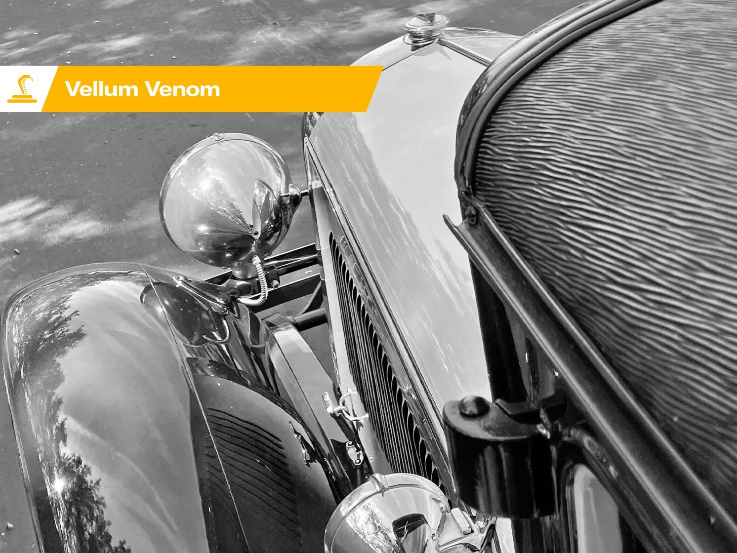
The ornamental bit at the top of both headlights complements the stylish radiator cap, but the real sign of performance are the thin and thick textures inside the glass lens. The thick texture sticks to the middle of the headlight, ensuring a brighter beam down the road, while the thinner stuff below and above fill in other areas without blinding people/horses. This kind of engineering paved the way for matrix LED headlight technology, and likely made driving at speeds above 30mph far safer than designs from just a few years before.


If only I was alive when this Commander was a new body style, because I don’t know what makes its intersection between body and frame any better or worse than cars in its class/era. But the way the fenders drape over the frame like a marshmallow inserted into a chocolate fountain? That’s beautiful no matter what generation you hail from.
Part of the charm of pre-war designs also comes from the interplay of cosmetic body panels and functional mechanical bits. It takes very little change in one’s vantage point to go from a flowing chocolate fountain of a fender to a thin wafer of chocolate offering meager protection from the elements for the front suspension, brakes, and wheels.


The twin beam front bumper was likely more than adequate for the road speeds of the day, complete with a single leaf spring providing a reasonable amount of flexibility. Chrome makes it beautiful, but the curves make it functional. And its certainly prettier than the painted plastic bits and reinforced waffle textures we find in modern bumper systems!


The fender offers a similar level of functionality and practicality, as its complex curvature is made approachable by bolt-on construction. With any luck, an accident will take out only one of these parts, and its only a few minutes with a wrench to resolve the issue.


Aside from realizing this Studebaker is actually three (not two) shades of brown, the side view of the hood looks drastically different depending on your vantage point. This is something you see on a regular basis in Vellum Venom reviews, but it feels more significant when a vehicle’s forms are more rudimentary rectangles and circles, and less like it was carved out of a bar of soap.


An exposed central hinge is par for the course for the 1930 model year, but hood vents are about as timeless as it gets. The radical color change from yellow-brown (top) to green/gray brown (side vents) is another element of higher dollar pre-war cars that we will likely never see again. They really knew how to roar in the 1920s!


Looking at the hood/engine compartment from the back gives the viewer an impressive slate of forward thrusting lines. Sure, the coachwork came from horse drawn carriages, but the powerful momentum these lines (many of which share a common vanishing point) project makes it clear this vehicle moves on its own power.
Exposed headlights with their characteristic bullet shaped posterior are part of the forward momentum, as it’s clear this body drives fast enough at night to need a beam of light guiding the way. The expertly groomed wiring harness poking out of the back is another lovely touch.


While the hood latch looks like a standard part for many cars of the era, it’s quite elegant on its own. Someone could enjoy this latch even if it was not functional, but the protective triangular boot for the corner of the hood suggests this era still didn’t make cars as perfectly as future generations did.


Wood spoke wheels are probably a mixed bag of emotions for the enthusiast. They are beautiful in their shape and texture, which presents a strong contrast to the external rim and the internal hub cap. But wood has pretty much left the chat, as cast/forged metal spokes of various formulations have proven it to be far more durable and flexible for unique designs.
The hub cap’s minimalist “S” logo is basic compared to the ornate logo on the radiator, but perhaps hub caps of this era were stamped with rudimentary shapes due to the limitations of technology at the time?

The Studebaker’s long cowl accentuates the hood, pushes back the cabin, and gives the same feeling of length that a freight train has at speed. What you see here is why we love cab backward designs for rear-wheel drive vehicles in our modern world.


The exposed bolts seen in the last photo make a lot of sense when looking up close. And it’s better to have it down there, as the alternative would ruin the sleek curve of the front fender and running board combination.


The cowl-mounted lights certainly add a more posh feel than cheaper vehicles of the era. There’s a chrome hoop around the cowl, with a brass mounting arm for the light. The tidy wiring that matches the front headlights suggest this work was done by the same folks that made this Victoria body, but I might be suggesting that only because such attention to detail is lost in our modern times.


Coachwork can be a misleading term, and everything from top shelf Talbots to the most basic of horse drawn bread vans needs some amount of “coaching” to make their bodies. But whomever came up with the three-color scheme for this hard crease and tapering form (let’s call it a mountainous region) where the cowl meets the A-pillar is closer to the Talbot.
Sure, it’s just paint over some man-made terrain on a moderately lengthy cowl. But it takes this Studebaker to a higher level of car design.


Take your victories when you can because flat glass makes it difficult to make a sleek A-pillar. No about of custom coloring can change the fact that the Studebaker looks more like a trolley from this vantage point, but the deep eyebrow over the windscreen does a nice job hiding the wiper blades. While some coachbuilders had the audacity to lay down a flat piece of glass for a sleeker A-pillar, I don’t think anyone came up with idea of internally mounted door hinges until a few years after this Studebaker was made.


Speaking of flat glass, the Studebaker’s doors have absolutely no tumblehome for that reason. Probably a good thing, as the cabin is pretty small, and likely not just by today’s standards.
But where it lacks contouring, the triple brown Stude gives us a padded roof with an exciting texture added to the mix. Well, exciting to someone writing about it in the year 2024, as I’ve never seen such a design in cars made in the last 70-80 years.

Yes, but the whole car is exciting from this vantage point. Because when you add up the forward thrusting lines, tri-color coachwork, pointed headlights, upright pillars and textured roof, you are transported to a time when manufacturing and its inherent wealth creation was on the rise. A meteoric rise, in fact.
And what a helluva ride this Studebaker musta been at the end of the Roaring Twenties! The moment I hopped onto the running board for this photo, I went back to a time when young people left the farm for the big city. They made a name for themselves in city commerce, danced to hot jazz music by the likes of Kid Ory, wore stylish flapper dresses and tuxedos, dined on Oysters Rockefeller, surrounded themselves with the hottest Art Deco trends, and saw this exact imagery before speeding off to exciting new places at 40+ miles per hour. Sounds pretty conventional in future times, but these are the things that their ancestors, and their family “back home” couldn’t even comprehend.
What a time to be alive…with forward thrusting lines, baby!


Back to the Studebaker’s roof pillars, specifically the B and C pillars. The B-pillar is expectedly upright, because of the flat, square door glass. But it would also look silly if someone threw a curve in it, as the A-pillar is carriage-grade perpendicular to the ground. The only curve comes from the aforementioned “mountainous region” which clearly adds some style to an otherwise drab and functional sheet of metal.


But the C-pillar has a delightful little downward curve, which is mirrored in the quarter window. And that curve is complemented by a rain gutter, and the delightful integration of the yellow-brown into the window frames ensures this is a premium vehicle of the era.

The hood lines are too short to covet like a Duesenberg, but it evokes similar imagery for a far more attainable price tag. (The Duesie was at least six times more spendy in 1930.) The “mountainous region” adds tension to a long slab of sheetmetal, and visually separates the greenhouse from the rest of the body. Doing so forces the eye to pick on one element, and my eyes naturally go to the darker greenhouse with its yellow-ish accents.
It’s a clever trick, but there are two features aft of the C-pillar that give expensive car vibes for all the right reasons.


The first party trick of this modest rear end (relative to the long nose for the eight-banger up front) is an easy access spot for golf clubs, single use grocery plastic bags, spare parts, a small subwoofer, or anything a working professional of the era might need (but doesn’t want on the other side of the bench seat where they reside).


This feature was commonplace on premium vehicles of the era, and utilizes what would otherwise be wasted space. It’s great to see it make a comeback in the “gear tunnel” found in the Rivian R1T.


The next bit of premium flair was optional on many vehicles of the era, but the Victoria body configuration almost mandated it for owners needing an occasional extra passenger or two. We’re talking about the rumble seat, and the stylish aluminum(?) pads you walk on to get into the rear passenger compartment.


Sitting is believing, as the rumble seat is beyond comfortable and quite a delightful way to thrill an extra passenger or two. Legroom is decent for this 5’10” tall design critic, but that headroom can’t be beat. Safety concerns were realized a few decades later, but its future as a floor-mounted folding seat for station wagons in future decades was cemented.
But still, this design eliminates the trunk, which causes issues for cargo and the spare tire. Victoria bodies with rumble seats are clearly not for everyone, but then again, this car catered to a newfound market of upwardly mobile Americans. Yuppies if you will, provided a reference from the 1980s applies to the 1920s.


Having a sleek, low-slung posterior looks sporty from many angles, and it seems to be a hallmark of the Victoria body style. It’s pretty on its own, but the transition to the high roofed greenhouse via 90 degree angle is something we will never see again in a sedan for good reason. This body looks far cooler with a roadster roof like this particular Commander.


Then again, the Studebaker’s retractable (removable?) rear window gives the open air feeling one gets with a modern truck and its movable rear window. And doing so with wood trim and three shades painted across several layers of sheetmetal is downright appealing. Said appeal may fluctuate depending on the quality of person(s) in the rumble seat, but it’s still a great design idea that’s lost to time.

The “H” pattern in the Studebaker’s rear deck was born for a dual shade paint treatment, but I wonder if this high relief body stamping also reinforces body panels that regularly see the weight of a human trying to enter/exit the rumble seat.

Even if not, that dark brown “H” does a fantastic job hiding the cut line for the rumble seat door. It gives this mid-market vehicle a little bit of big dollar coachbuilding flair. While the rumble seat forces the spare tire to the rear, most vehicles of this era had at least one spare tire mounted externally. And only super prestigious vehicles had a dash-to-axle long enough to support a second and third spare tire. One will do for the modest-ish luxury of the Studebaker Commander’s more practical proportions.

It’s fascinating to see a car of this size and shape (i.e. not a Duesenberg) that’s survived without losing its functional rear tire and access steps in the name of sleeker lines to create a minimalist hot rod. With these in place, we are reminded how functional these now whimsical designs truly were in their era. They served a purpose as ergonomically designed carriages for their intended users.


The spare tire itself rests on an impressive bit of kit to keep it firmly planted on the body, no matter how bad the roads might be at speed. There is beauty in those brown arms that flow out of the body, as that stamping possesses muscular forms that clearly give strength to the entire subsystem. And that strength ensures the tire’s real estate is safe from encroachment from the chrome bumpers.


But these chrome bumpers are a wonderful mix of beauty and functionality: twin spears of chrome delicately balanced by black metal mounts/springs that ensure the shiny bits do their job in a collision with one of those “jays” who dared to cross the road wherever they please.


The lack of integration in the light, license plate, fuel door and exhaust pipe is a sign of the times. Streamlining was coming, and it will be beautiful. But the raw purity of this is like a spoon of unprocessed honey: it shows how car design went deeper than the skin. Or perhaps there was very little design consideration at all? Take your pick on that.


The rear light may not be integrated into the Studebaker’s body, but it certainly was the product of some design considerations. I assume red lights weren’t universally known as a message to stop, so spelling it out on the lense is a great idea. The letters wrap around the red bullet light, and the whole affair is elegantly crafted from front (metal face, bright screws) to back (metal loom over the wiring).

While coachbuilding had yet to evolve into an integral part of the car-making process (think Harley Earl and the Y-Job) it’s nice to see how a mid-market player like Studebaker brought an extra dash of style to the genre. The mountainous region on the body sides are a treat when painted in multiple colors, while the deck lid’s brown “H” feels like durable ornamentation. They produce desire, but in a world that lacked fully paved roads and babied cars on short term leases.

It’s hard not to fall in love with cars from the Roaring Twenties after sampling this 1930 Studebaker Commander 8. There’s something heavenly about the optimism present in its color choice, the extra body contouring and the vinyl roof fitted to its sleeker Victoria body style.
Its design may look dated today, but the details presented in this Vellum Venom would not be found in the same manner in a Studebaker from the previous body style. The Roaring Twenties musta been a hoot for many folks. But this Studebaker proves you didn’t need extreme wealth to enjoy the lifestyle it implies.





It was pointed out by someone in print that todays SUV models are generally the size and shape of a 1940’s sedan.
They said that as cars go smaller the sale of these larger models and trucks took off. American like the space and utility of larger model. Also we have the space to use them vs many part of the world where the cities are short on space.
What I like of cars of this era was there were so many of them being made and so many trying to be different. The age was where shapes were done by imagination not wind tunnels and plastic.
Some cars took risks and failed while others stayed the same.
There was no retro styling and it was all original. Design of this era was exploding not just in cars but furniture and architecture.
Up till the war ar, design and industry were all one.
“It was pointed out by someone in print that todays SUV models are generally the size and shape of a 1940’s sedan.”
I am not in print, but that’s something I already sorted out with a spreadsheet:
https://www.hagerty.com/media/design/vellum-venom-vignette-just-call-a-crossover-a-car-already/
Not the story I saw but you did a very good job comparing.
When I saw the other story it was something I never considered and it just made sense.
Even back in the day people used their sedans much like trucks, even in the 60’s my father hauled plywood on the roof of his Chevelle. Imagine doing that today most cars would suffer permanent damage.
Recently I was doing a story on my neighbors 1948 Jeep panel. The 47 Jeep wagon was the size of a sedan, could seat b3 rows and was the first steel wagon sold in America. It even hot 4×4 in 48 as an option.
It was like the pattern of the first SUV.
This car is more deserving of your attention than a lot of the modern stuff out there
My golfer friends will start chanting ‘one of us’ every time a pro golfer chunks a ball. As soon as I saw that paint run in that yellow trim I started chanting ‘one of us’
A lot of 20s cars look good because it seems as though a lot of attention was paid to proportions, and to masses. Early on in car design, the radiator became centered right over the front axle, allowing the front of the fenders to define the front of the car.
By the late 30s, when streamlining became the vogue, designers floundered when it came to proportions ad mass. but when they were good, they were very good. Look at most LaSalles.
Detailing on early cars, 20s and 30s, was also often very good. Cars were expensive, and had to look it. Hence the beautiful emblems.
“the white color could be implemented using cloisonné techniques”. The fine cracks in it are near proof that this is the case. There are indications in the photo that the other colors were too. As an undergraduate, I did several items in cloisonné and did a bit of research into Russian religious cloisonné items.
That Studebaker’s design is fantastic. So much thought into so many design points here. Great article.
Very good article on a very good car. Having said that I feel bad pointing out how important it is to proofread what you’ve written before publishing your work. It’s a small mistake but it stands out instantly. I’m referring to your 4th paragraph where you mention that the car has “4” headlights. I see two, or did I miss the other pair?
Sorry to be a nitpicker.
I believe he includes the running lights on the side of the cowl.
I have to disagree. The first sentence of paragraph 25 mentions the cowl lights so the author knows they are not headlights.
I didn’t know that Victorias had rumble seats.
Well, I saw one at a show last Sunday. This one was a model A Ford. But, yeah, all the model kits in the 60s put them only into roadsters.
l didn’t either. The listings of body styles l have of 1930 FD (eight cylinder) Commanders shows a 2 passenger Coupe, a 2/4 passenger Coupe, and a 4 passenger Victoria. It would seem logical that “2/4 passenger” would denote a 2 passenger car with a rumble seat. The Victoria listing shows no such option.
By the way, at this time, Studebaker promoted itself as the world’s LARGEST maker of 8 CYLINDER ENGINES! Think about it : NO Chrysler or Buick 8’s were made until the ’31 model year, and Auburn, Nash, Hudson, and La Salle just didn’t make enough to top Stude’s volume.
Enjoyed the article, a pity you did not take it for a drive! I suggest you “ruminate” rather than “marinate” or you might find yourself in a pickle!
Nice to point out that every decade had vehicles unique and praiseworthy. The classic era, 20’s to mid 30’s are often thought to be boring and slow by those unfamiliar, yet there is refreshing simplicity and amazing beauty. My father restored a 1921 Hudson, a 1930 DeSoto and a 1929 Chrysler all of which were capable of 70 MPH, (Dad proved it often!). The adrenaline surge is the same driving the Chrysler at 70 Mph as driving a new vehicle at twice that speed, it all boils down to running near max available output.
Excellent review for both style and substance…
JHS
Thanks for the article. Design and style has declined in many areas from the perspective of some of us. Appreciate that many of those beautiful cars from years past have been preserved. History is important.
Plenty of pictures to show what a pretty car it is, but does it have an engine? Would have been nice to see it.