Media | Articles
Opinion: French Design Deserves Better than the Citroën SM Tribute

It never ceases to amaze me how some seemingly unimportant circumstances of a person’s childhood can end up defining the trajectory of an entire life. For example, I’m sure that sparking a lifelong passion for automobile design in his son was the last thing on my dad’s mind when he chose a Citroën as our next family car in 1985… Yet here we are.
My dad’s BX already looked like a spaceship to me, even though I didn’t yet know I had Marcello Gandini to thank for that. But what struck my young, impressionable mind like a lightning bolt was my first encounter with a DS sometime later, at the back of our local Citroën dealer’s used car lot.

Eight-year-old me could not believe such a wondrous thing existed, let alone that it had been built so many years before my time. Enough years, in fact, for it to become an old clunker that nobody seemed to want.
Well, nobody but me. From then on, I was hooked on Citroëns for life.
Thus, given my penchant for anything on four wheels that’s low-slung, teardrop-shaped, and French, Stellantis’ recently unveiled “SM Tribute” concept car is a Cupid’s arrow aimed straight at my heart.

Or, at least, it should be. If my somewhat mixed feelings about it are anything to go by, that arrow must have landed somewhere off the mark.
Mind you, I’d much rather live in a world where cars look like the SM Tribute than the crossover hellscape we currently inhabit. It undoubtedly makes a powerful visual statement and sports some genuinely delightful details. Still, the end result’s lack of finesse is painfully apparent in all the images where the SM Tribute appears alongside the 1970s original.

Now, if the SM Tribute was a production car or had any real chance of becoming one, its designers could hide behind the need to meet current safety standards. But they can’t. All the SM Tribute will ever be is a static display model, so there’s no real reason for the comparison between it and the 54-year-old original to be so unflattering. Yet it is.
But why?
As always, our analysis must start with the vehicle’s overall proportions, which can make or break a design. In this regard, the design team took full advantage of the fact they weren’t tied to an existing platform’s hard points and thus remained remarkably close to those of the classic model.
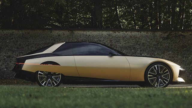
The SM Tribute is only marginally longer (+1.2 inches) and taller (+0.7 inches) than Robert Opron’s original. The balance between the front and rear overhangs appears to be similar, too, and despite the cabin’s volume stretching a little more towards the front due to the steeper angle of the windscreen, the car maintains the cab-rearward setup of the SM.
Yet, despite sporting a set of massive 22-inch wheels, the SM Tribute still manages to look chunky and heavy compared to the original. The proportions may be similar, but the SM’s grace and panache are gone.
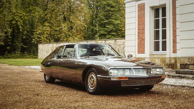
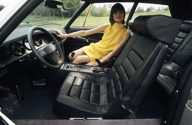
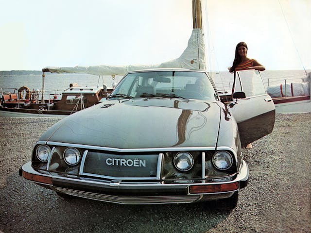
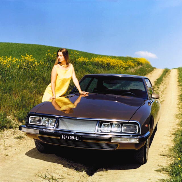
Like other Citroëns designed under Robert Opron’s watch, the SM is relatively simple in concept but subtly refined in its execution. Just like the DS that spawned it, the SM is a genuine “teardrop” design. It tapers towards the rear not just in profile but also in cross-section, and the rear track is considerably narrower than the front to accommodate that.
This, together with the concealment of the rear wheels, was done for aerodynamic purposes. But that rearward taper also played a critical aesthetic role on these classic Citroëns precisely because of the absence of the rear wheel arch opening. As these cars narrow towards the rear, the length of those unbroken side surfaces appears somewhat disguised when observed from the front three-quarters.
Instead, the SM Tribute has been designed much like any other contemporary sports coupé, with a nice square stance and large wheels filling up their big arches. There’s nothing wrong with that, of course, but it does make for a slightly awkward look if you then cover up the rear wheels.
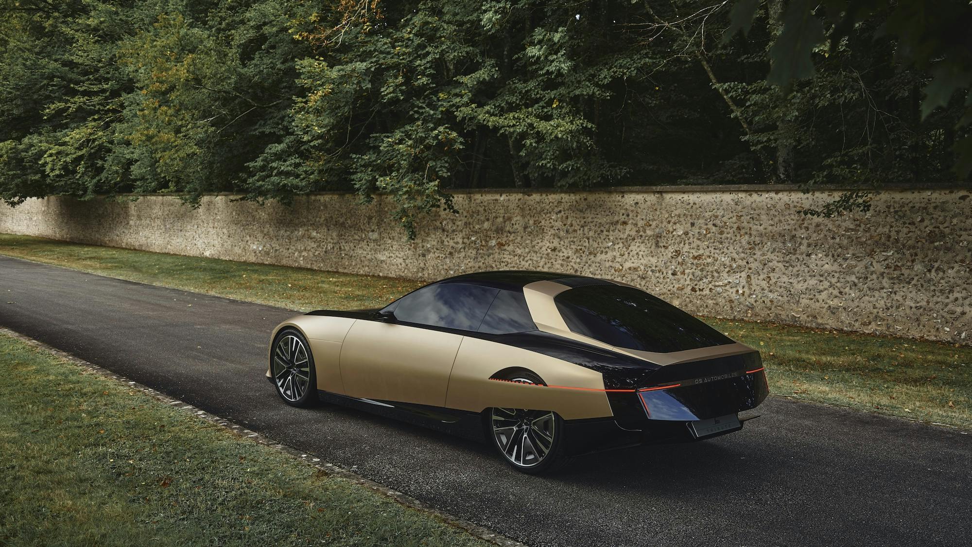
While on this subject, I’ll concede that opening up a hole in the rear fender to “break” the cover and expose the upper part of the rear wheel is a nice touch. It won’t be to everyone’s taste, but it is a very unique, recognizable graphic element nicely tied with the rear end’s sharp, minimalist lighting signature.

On the SM’s broad body side, there are two long character lines (the term car designers use when referring to the lines and creases on a vehicle’s body that serve no purpose other than an aesthetic one) that create a contrast between light and shadow to visually “slim” the car down. Not so on the SM Tribute, whose side surfaces are clean and unbroken, which makes them look taller and thicker than they are. Again, that is not a problem in itself, but it contributes to the newer car having a somewhat “chunkier” look compared to its ancestor.
Marketplace
Buy and sell classics with confidence
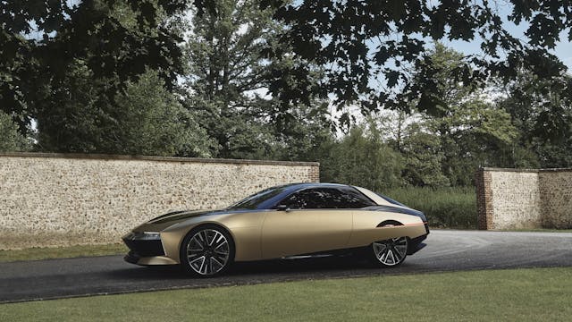
The SM Tribute also appears to have been styled as if it had a main volume (the parts finished in glossy black) and an outer skin (those finished in matte gold) that partially wraps around it like a foil. The idea is not new, as it was pioneered by BMW with its 2009 concept Efficient Dynamics, which previewed the i8 hybrid supercar. The problem is that the SM Tribute’s whole concept hinges on this contrast. Imagine it painted all in one color, and the entire idea falls apart.
Call me a purist now, but there’s a reason why Battista “Pinin” Farina famously had his prototypes painted in a drab single-stage medium gray. Sure, all cars have colors that suit them best, but a design must “work” regardless of paint finish.
Still, if there’s one thing from the SM Tribute that I’d love to see on future production cars, it’s that gorgeous front light bar. In general, the front end is by far the most convincing part of the design, even if, again, it too relies on the car having a two-tone paint job for maximum effect.
The SM Tribute is neither a masterpiece nor a disgrace, but merely a half-baked attempt at nostalgia bait that’s got all the staying power of an ice cream cone in Death Valley.
Like it or not, the original Citroën SM was the ultimate expression of a company with a bold, original, and confident vision for the future of the automobile, executed by a company that was not afraid to pursue it. Now, that’s something I’d really like to see making a comeback.

***
Matteo Licata received his degree in Transportation Design from Turin’s IED (Istituto Europeo di Design) in 2006. He worked as an automobile designer for about a decade, including a stint in the then-Fiat Group’s Turin design studio, during which his proposal for the interior of the 2010–20 Alfa Romeo Giulietta was selected for production. He next joined Changan’s European design studio in Turin and then EDAG in Barcelona, Spain. Licata currently teaches automobile design history to the Transportation Design bachelor students of IAAD (Istituto di Arte Applicata e Design) in Turin.


Find more values
Search for prices of other cars, trucks, vans and motorcycles


Masterful, Matteo. I always learn something from your pieces. Never knew that the so in-vogue two-tone inner/outer skin can be traced back to that BMW concept in ’09.
Dear Matteo,
I must concurr in most aspects of your review or comment on the SM Tribute ” concept” …Me too, I’d like it in one color, with better character lines… a,d I really do not see the need for opening up the rear fender…Why change it ? It made the original SM much more elegant and added to the aerodynamics of it … why change a design that was – evento todays standards- far ahead of it’s time and competitors … if any existed. I’m not a fan of the rectangular steering wheel on the SM Tribute … but : what a nice idea they kept the original seat design…. hopefully they will be as plush and comfy in the new ” SM”… I have already seen pics of the inside cabin of the concept new SM … but I don’t remembe what the headrests look like… they do not need to be that bulky … but theyu should be efficient and comfy… Hopefully the design team will scour the internet for all comments made on the Tribute SM and made changes to this concept … which will make it less chunky, more elegant and closer to the 1970’s design…. Sa Majesté … / or ” Sport Maserati” as its initials were … please make a smashing and stunningly beautiful comeback !! A Citroën passionista… having owned near to 16 different Citroën( BX, ZX? Xsara, Xantia, C5’s, and actually …a C6 (which to me is the last real Citroën limo Citroën ever produced..). after that… The DS 9 …well… I like the car… I test drove it (360 HP AWD in E-tense option)…it flies over the road, has much power… but… I miss that special “Whaaw” factor that other Citroëns (used to) give me …
There has been a flurry of articles on this subject both here and in Europe over the last few weeks.
As an SM owner for the last 30 years, I find that your comments are exactly, precisely on point, probably because you are a designer yourself. The other articles I have read about this are trite, trivial, superficial, and miss the mark. Nice work Matteo.
The back half in the side view looks like the Fuego.
Exactly what I came here to say. Even down to the use of 2 colours, black and body colour. Maybe they asked AI to design a French car?
To me the idea of doing a ‘hommage’ to such a forward-looking car is nonsense. The SM was all about the future, a true successor in my mind is something new, fresh and wild, not a remake of the superficial aesthetic features of a 50 year old car. In terms of execution i find the wheels way too big, which in turn makes the wheelbase appear shorter. Typical current PSA confused and bewildering graphics make it look so fragile and insecure. I would rather not comment the interior which it seems they didn’t even bother to make into the physical model. Just overall a half-baked attempt at milking Citroen’s heritage while also not having the guts to put the badge on it, why the DS Automobiles brand exist at all is one of the all time secrets for mankind.
I would agree this doesn’t grab my attention like the original. I think the biggest crime here is the interior. That is a fail for me.
So where is the picture of the of “most convincing part of the car”, the front end?
Exactly what I came to say.
The page layout folks should really read the copy, or, if the author is going to call out something specific, then tell them to make sure it’s shown.
I am in full agreement, this is a cartoon pastiche, just like the 2010 Camaro was a Hot Wheels caricature of a 69 Camaro. The giant wheels do it no favors since a lot of the bulk comes from making the body tall enough to cover those Dubs, which look like a Chip Foose restomod. Going to more period correct 16″ wheels would have made the whole thing lower and sleeker, like the original. I’m also not convinced about the peekaboo rear wheel treatment, that just feels gimmicky and misses the point of a smooth aerodynamic expanse
Soooo, no picture of the front lightbar?
I’d just like to be able to buy cars such as this tribute or the Buick concept made in the past year or two. Rather than be upset about this proportion or that arch or opening, I’d focus on the lack of true interesting cars we have to choose from in general.
Amen. Take away the tribute comparison and this is a fine and very original design.
I immediatly thought ‘Renault’ rather than ‘Citroen’ when I saw the first photo. Well, at least it was French. I’d much rather see a re-issue of the classic SM itself — still beautiful and still ahead of it’s time! Thanks for the insightful article.
The engineering may be interesting and while the “tribute” SM looks better to than the original, they are both FUGGLY.
Brings to mind the old saying – “Beauty is in the eye of the beholder.” Same for this rolling sculpture. I sure love mine!
“I’d much rather live in a world where cars look like the SM Tribute than the crossover hellscape we currently inhabit.”
“Yet, despite sporting a set of massive 22-inch wheels, the SM Tribute still manages to look chunky and heavy compared to the original.”
DESPITE??? The 22s are a big part of the reason it looks “chunky and heavy”!
But the biggest reason it looks “chunky and heavy” is because of the high beltline and slitty windows that every vehicle has today. Compare to the original.
C’est la vie
” If it aint broke don’t fix it” applies here!