Media | Articles
Car Design Fundamentals: Wheelbase, overhangs, and the crucial side view
In the studio, designers rarely draw a straight side-view perspective for presentation (they look a bit static and boring) but they are nonetheless essential for sorting out proportions and overhangs. The side is the first view we practice when learning to sketch cars, and it is (relatively) the easiest to master. Or as Daniel Simon once said to me, when you have the side view nailed “it’s half the rent paid.”
Why is this useful advice? You can’t really think about the front and rear of your design until you understand what the side is doing. With only one side of the car to worry about, you need not consider whether the perspective looks correct. Designers have an intuitive feel for wheelbases, the distance between the centerlines of both front and rear axles, and overhangs (the front or rear length outside of the wheelbase).
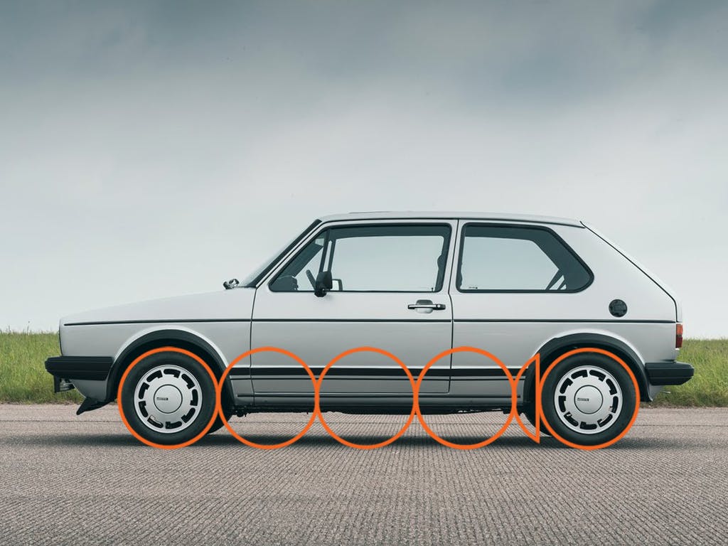
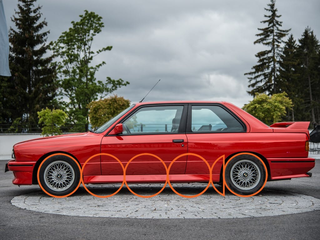
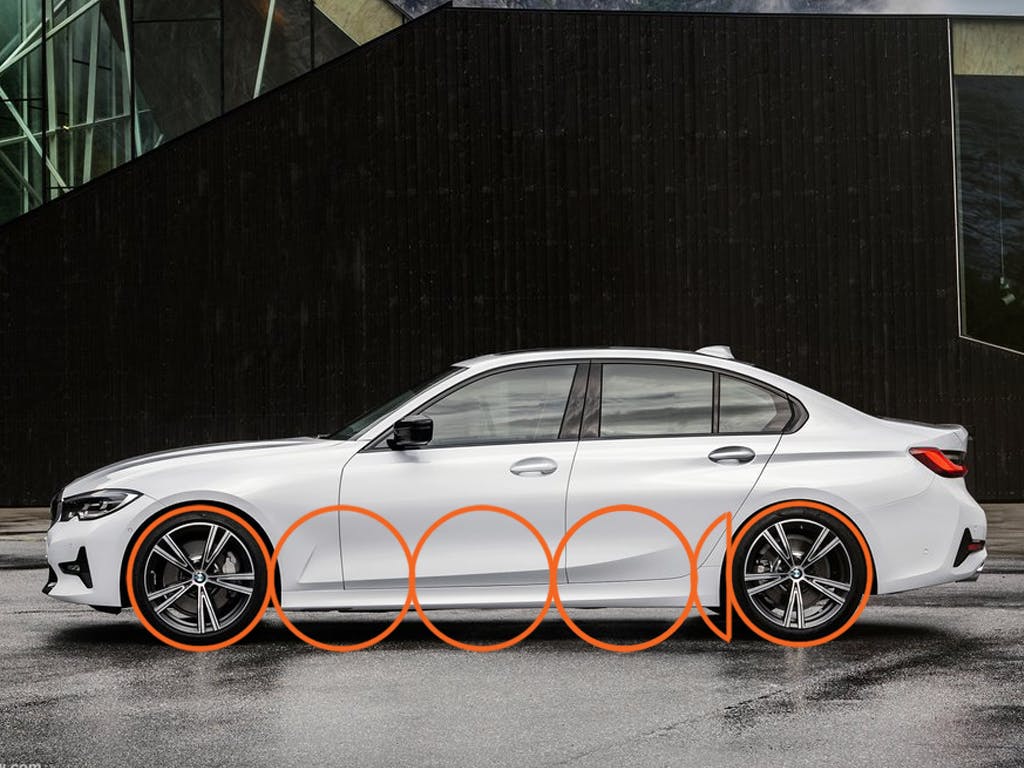
There is a direct relationship between wheels, vehicle category, driveline type and overhangs. Put simply, the approximate dimensions of the car can be defined as multiples of the diameter of the wheels.
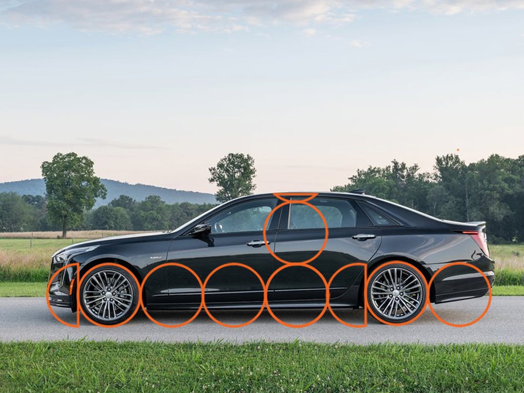
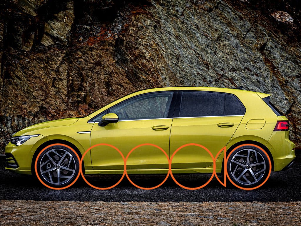
The smaller subcompacts and compacts (Euro B & C segment) have a distance between the wheels of between 3 and 3 1/4 times the wheel size.
For Intermediate (Euro D segment) cars it’s about the same, but because these cars have slightly larger wheels and tires (and therefore a larger rolling circumference) the actual dimensions are larger. The proportions remain the same.
Marketplace
Buy and sell classics with confidence
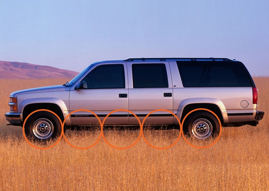
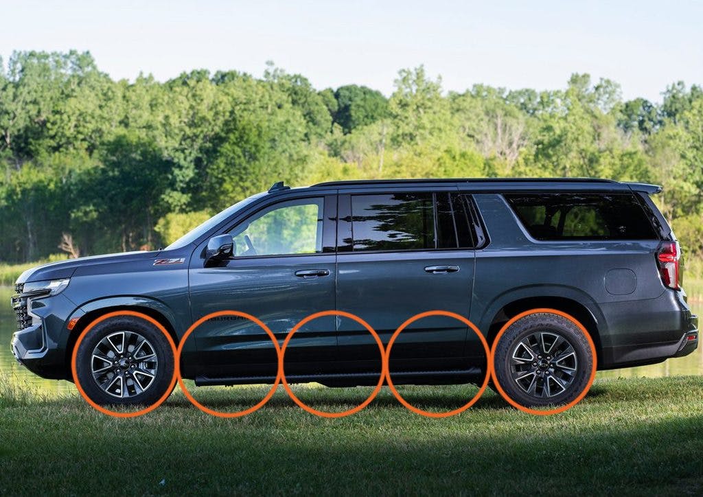
Believe it or not, for large SUVs the proportion is only about 3 times the wheel diameter. But this segment has a much larger wheel/tire diameter, which in turn increases the wheelbase. Also, this category usually features longer overhangs to accommodate larger engines, transmissions, transfer cases, and so on up front, with people or cargo in the rear.
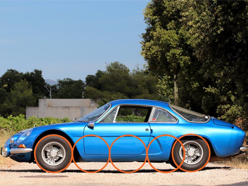
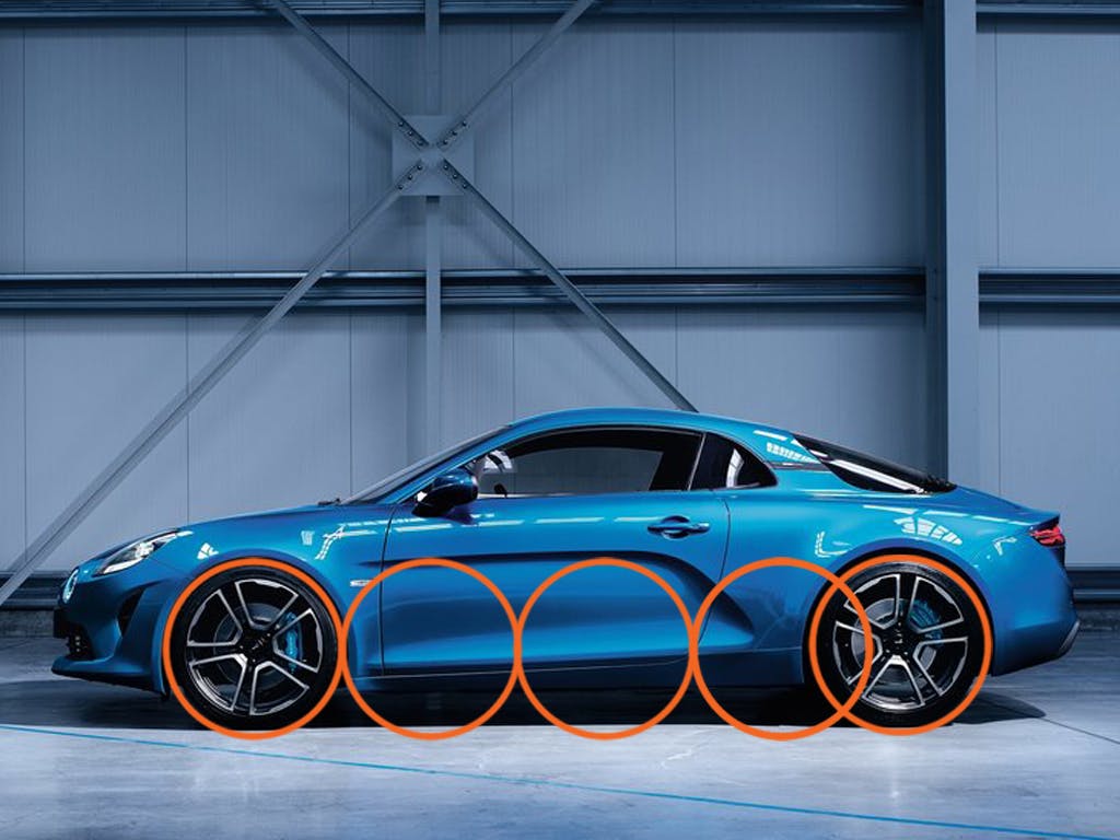
I’ve deliberately included old and new models of the same car—the Alpine A110—in the above images, so you can see how the relationship between wheels and wheelbase has remained constant over time. Good proportions are universal, whether it’s a classic or modern car.
In the earlier articles about A- and C-pillars, we talked about how overhangs vary dependent on driveline type. FWD vehicles have a longer front overhang to package the drivetrain, and a shorter rear. RWD vehicles have a shorter front overhang and a longer rear. In older cars a lot of the extra length was in the overhangs, hence the old gag: What’s the difference between American and European cars? A foot of styling …
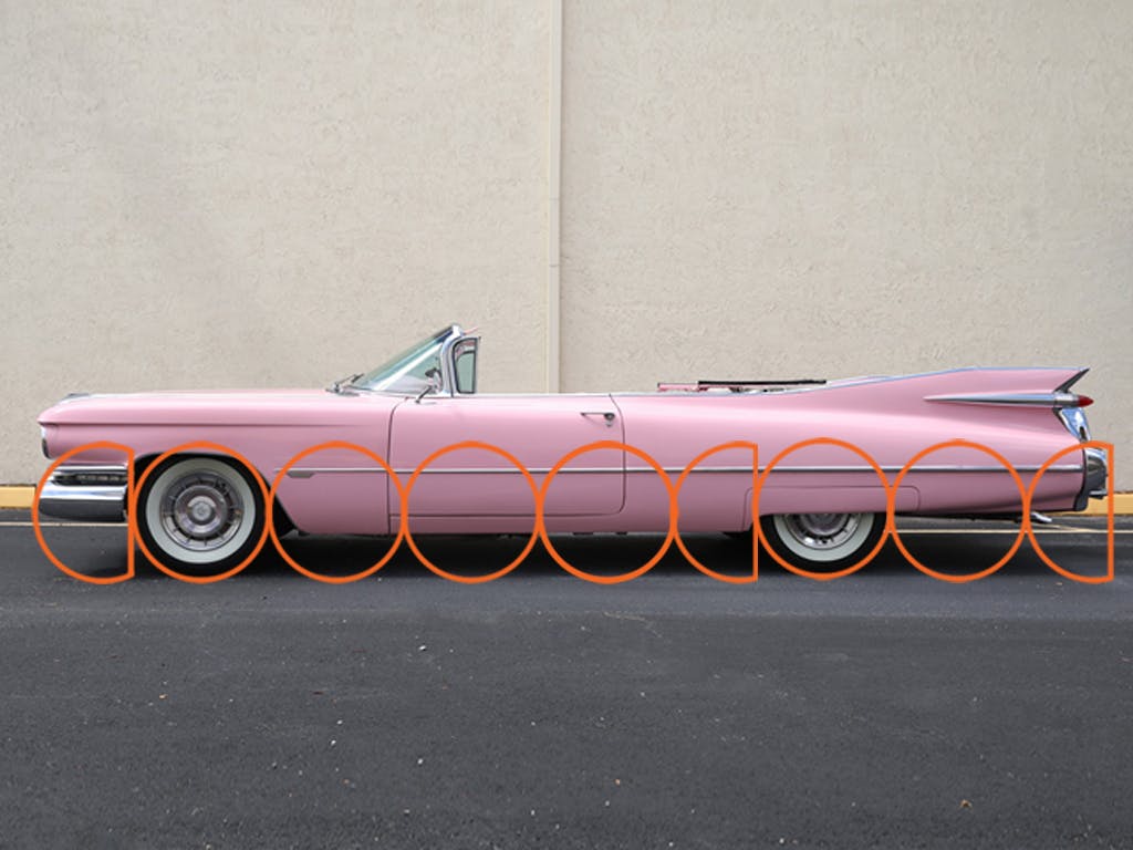
With that in mind, compare two full size Cadillacs: the glorious 1959 Eldorado and the flagship 2016 CT6. You can see proportionally the distance between the wheels remains the same, about 3 3/4 wheels. But the overhangs, well, clearly time marches on for better or worse.
The rear overhang on the ’59 is massive, at 1 3/4 wheels, which is way bigger than normal. You’d never be able to do something like this today, but it works on the Eldorado because the rear wheels are partly hidden, so you don’t place them on first viewing. Secondly, there is a lot going on visually at the rear, which detracts from the sheer amount of metal used there. Note how the bodyside is very sculpted and tapers towards the rear, reducing the visual weight. Then there’s the glorious tailfin diverting your attention away from the position of the rear wheels. The large front overhang helps to counteract the rear by balancing the bodywork along the wheelbase.
Harley Earl insisted his designers laid out orthographic plan style drawings (front, side, rear views) of their cars before modeling them. MisterL—as he was affectionately known—could not draw, but his successor was a trained illustrator and thought differently. Bill Mitchell considered the car as a whole, something that should make sense as you walked around it instead of considering the front, sides and rear as individual elements. That approach is as valid today as it was then.
The need to carefully manage aero demands has led to the corners of a modern car to be much more rounded. This is known as plan shape and refers to the amount of curvature present when a car is viewed from above. Designers use this to their advantage to hide or reduce the visual impact of overhangs, especially at the front.

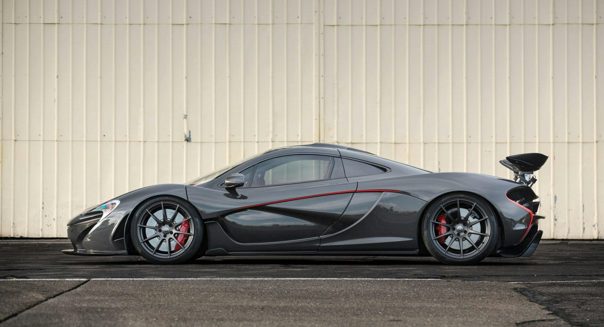
Seen from above, the McLaren P1 has a lot of plan shape; McLaren made a big fuss about how airflow management shaped the bodywork of this car. It has a very large front overhang; but here’s the thing.
Compare the two images above: on the left is a flat orthographic view, on the right is still a side view but it has much more perspective. If you don’t see a difference, concentrate on the curvature of the rear spoiler: note how the yellow P1’s wing shows a strong curvature, while the gray P1 looks (almost) like a straight beam is affixed to the body. The perspective view (right) is representative of how the human eye sees the car in real life. That’s because the image’s overhangs appear much reduced and the bodywork much tauter.
The other main ingredients to making a side view look correct are visual weight and proportions, and that’s where we’ll turn our focus to next time.
