Media | Articles
The Nissan Z Proto concept looks even better up close
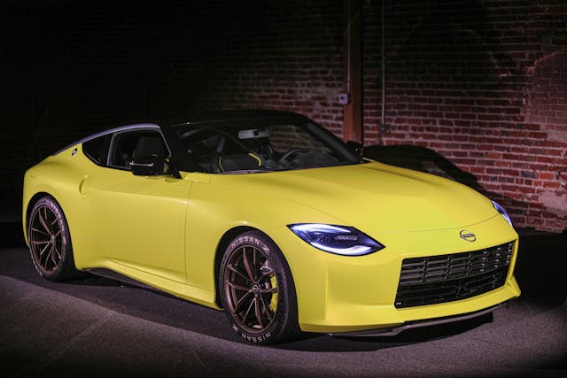
The latest installment of the Nissan Z is just around the corner. In our best look at it yet, the recently unveiled Z Proto had everyone here talking about the new design direction for the sporty rear-drive coupe. Nissan recently offered us a first-hand look when the Z Proto concept made a pit stop in Los Angeles, with a few caveats. The hood had to stay closed and it was strictly hands-off, but even with those restrictions there was plenty to glean about the future of the Z. Seeing a car in person can produce a very different impression than what comes across in photos, so here are my favorite design details after getting up-close and in personal with the Z Proto.
Overall profile
I’ll be the first to admit that the 350Z is not my cup of tea. The 370Z stands out as a much more ambitious design with more radical curves. Even though the 370Z has been in production for a decade, it still looks good, but the Z Proto blows it out of the water. This concept is more understated than the 370Z and yet more evocative of the elegant lines of original S30 Z cars like the 240 without looking too retro or derivative.
The rear haunches of the car suggest a hint of Jaguar or Aston Martin, which is appropriate when you remember that the 240Z was frequently compared to some of the best European designs of its era. That silver accent along the roofline? It’s a stylized katana—a totally unnecessary and yet perfectly integrated bit of flair that makes a design special.
The grille
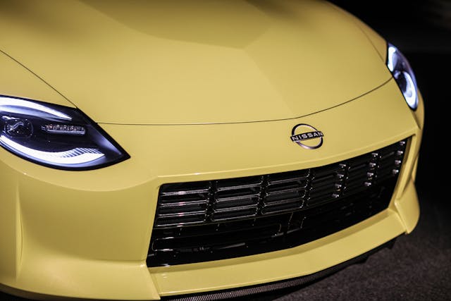
The biggest point of contention among Z lovers is this rectangular grille, which is reminiscent of the original save for the large bumper in the middle. Many critics feel this new interpretation is too simple, but in person, it works. The elongated, rounded rectangular shapes of the grille insert add texture and are echoed in the center vents of the HVAC system as well as the taillights. The headlight design, too, is a nod at the S30 and the tunneled look of the original Z. Also note the subtle lines in the hood.
Door handles
The large, vertical door handles of the 350Z always looked out of place, and while they’re improved on the 370Z, they still draw a lot of attention to themselves. The Z Proto’s handles, conversely, are flush and painted in body color. Much neater.
Marketplace
Buy and sell classics with confidence
Interior
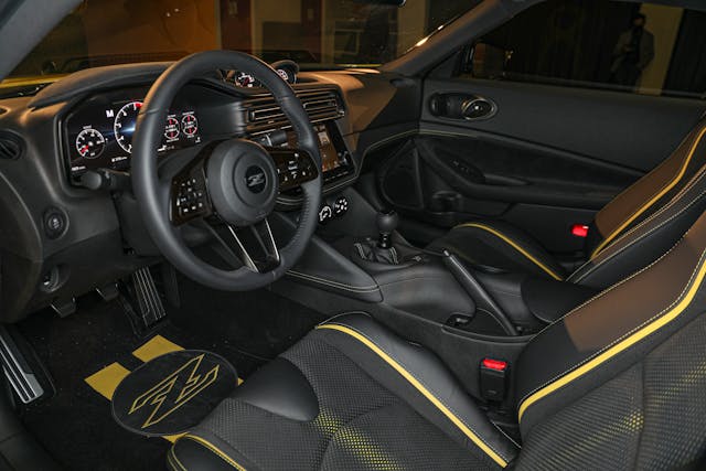
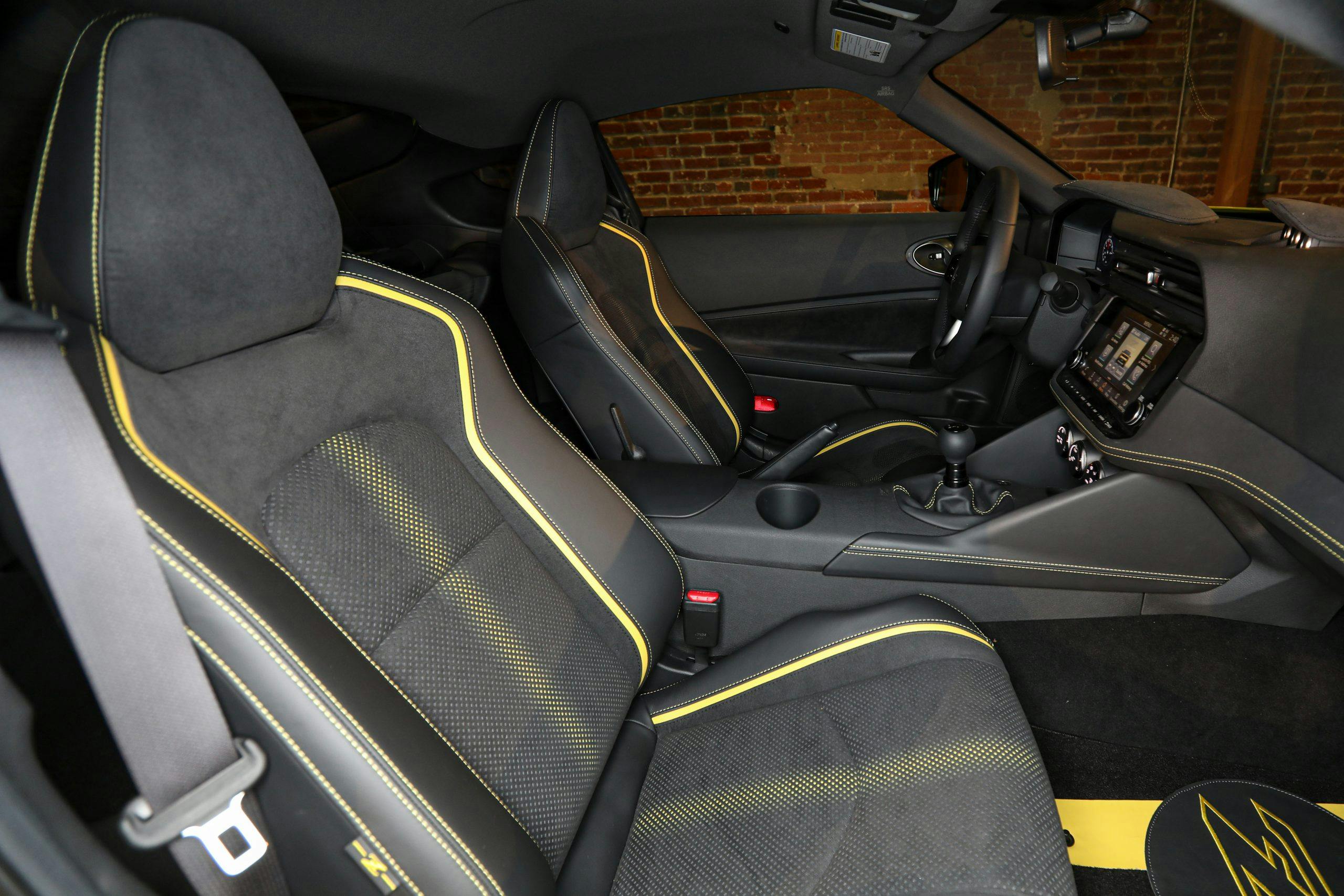
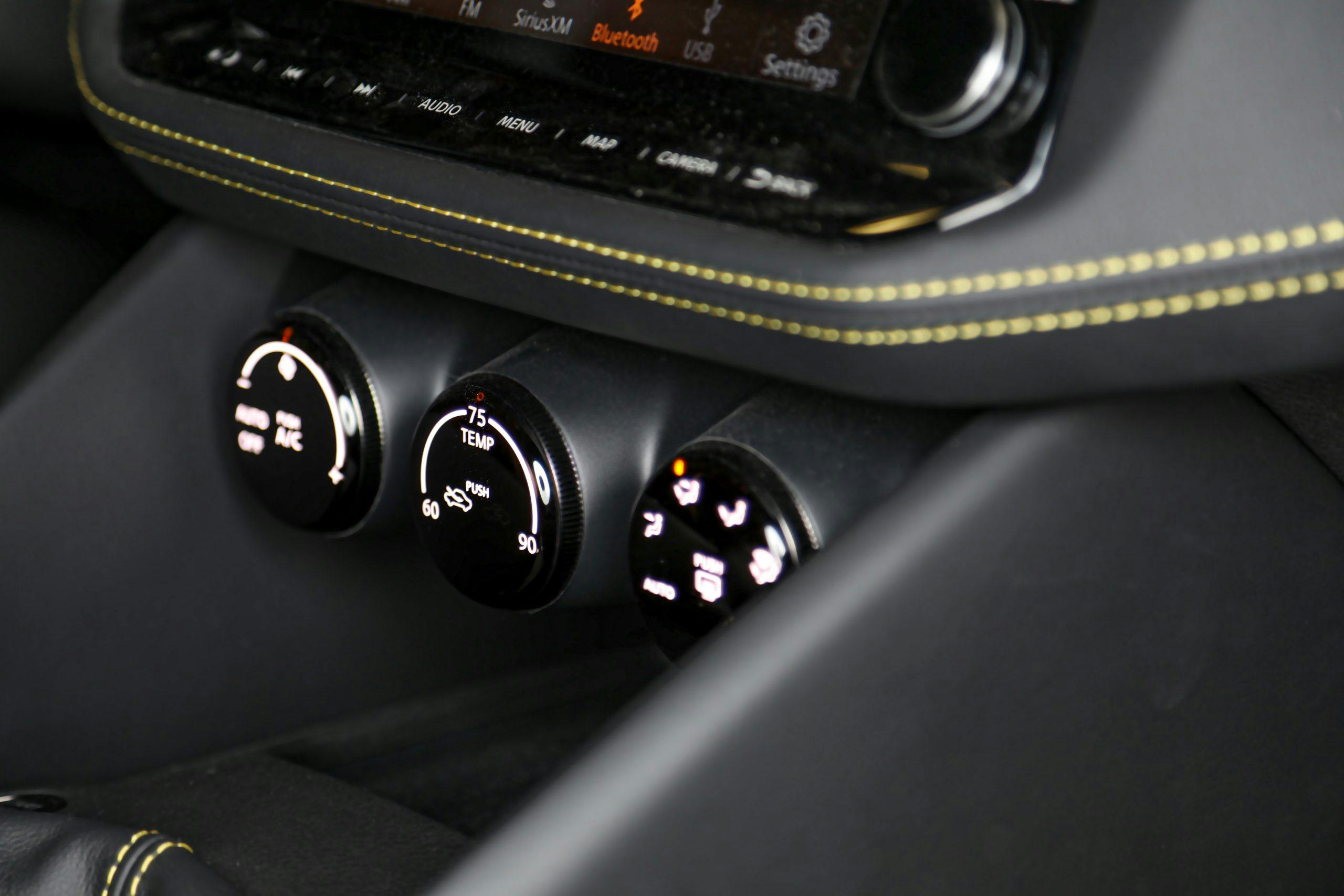
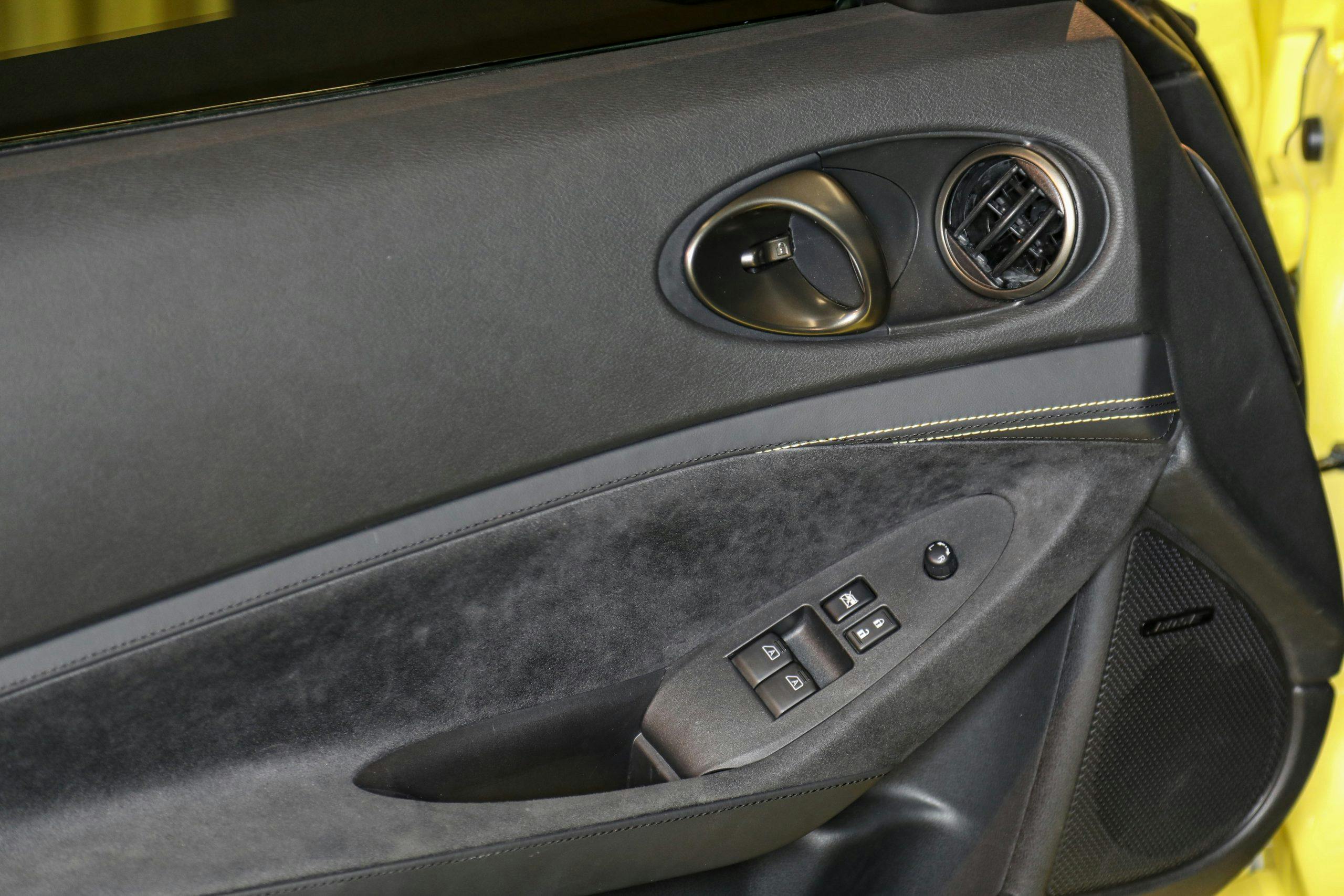
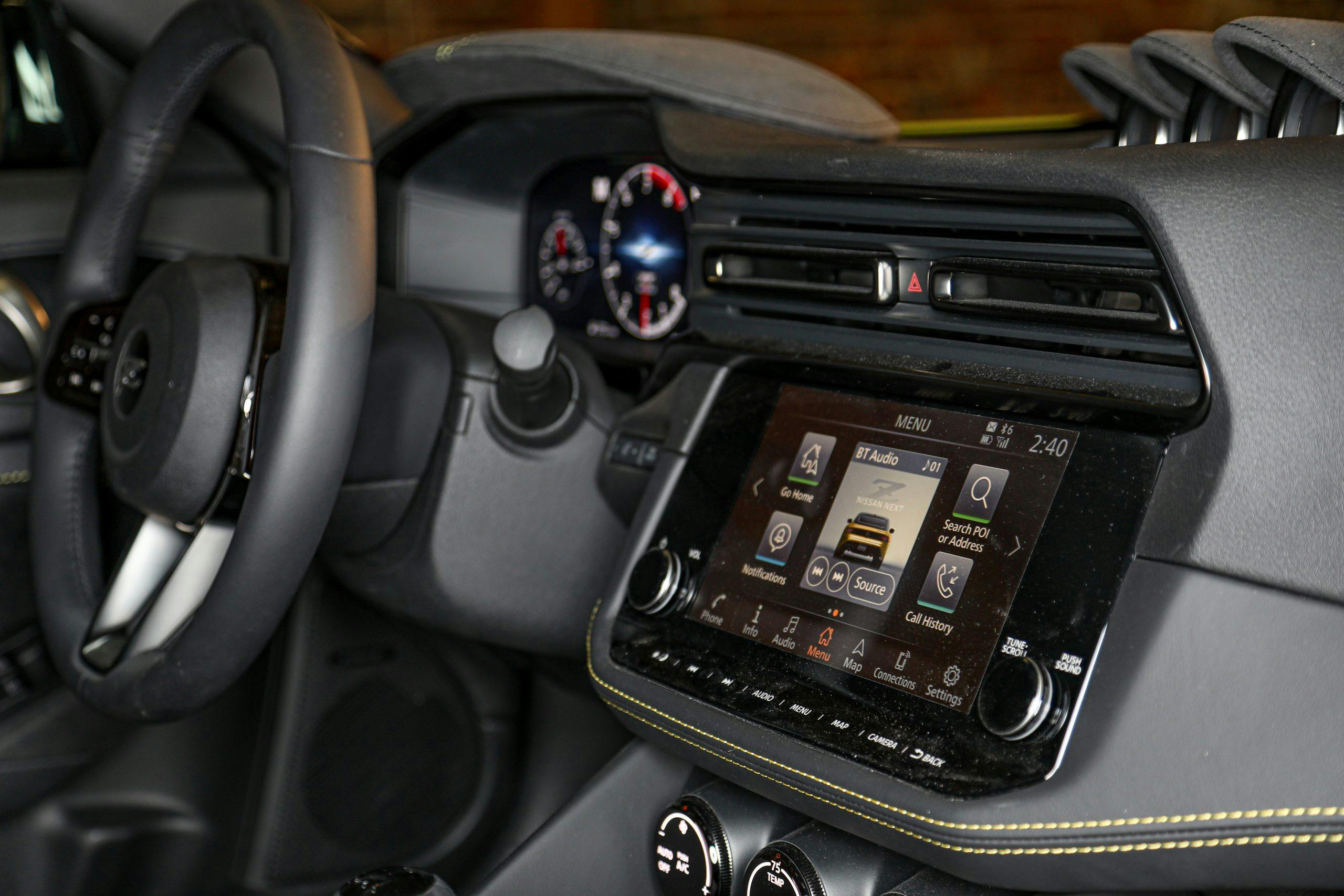
The Z Proto’s interior, like its exterior, is a great blend of classic and modern. There is a trio of driver-facing gauges in the center dash, just as there were in the original 240Z, and there’s a large but not overwhelming touchscreen positioned above three physical HVAC knobs. As mentioned, the center HVAC vents are elongated, rounded rectangles, but I really liked the placement of the outer vents, located in the door handle housing.
Badging
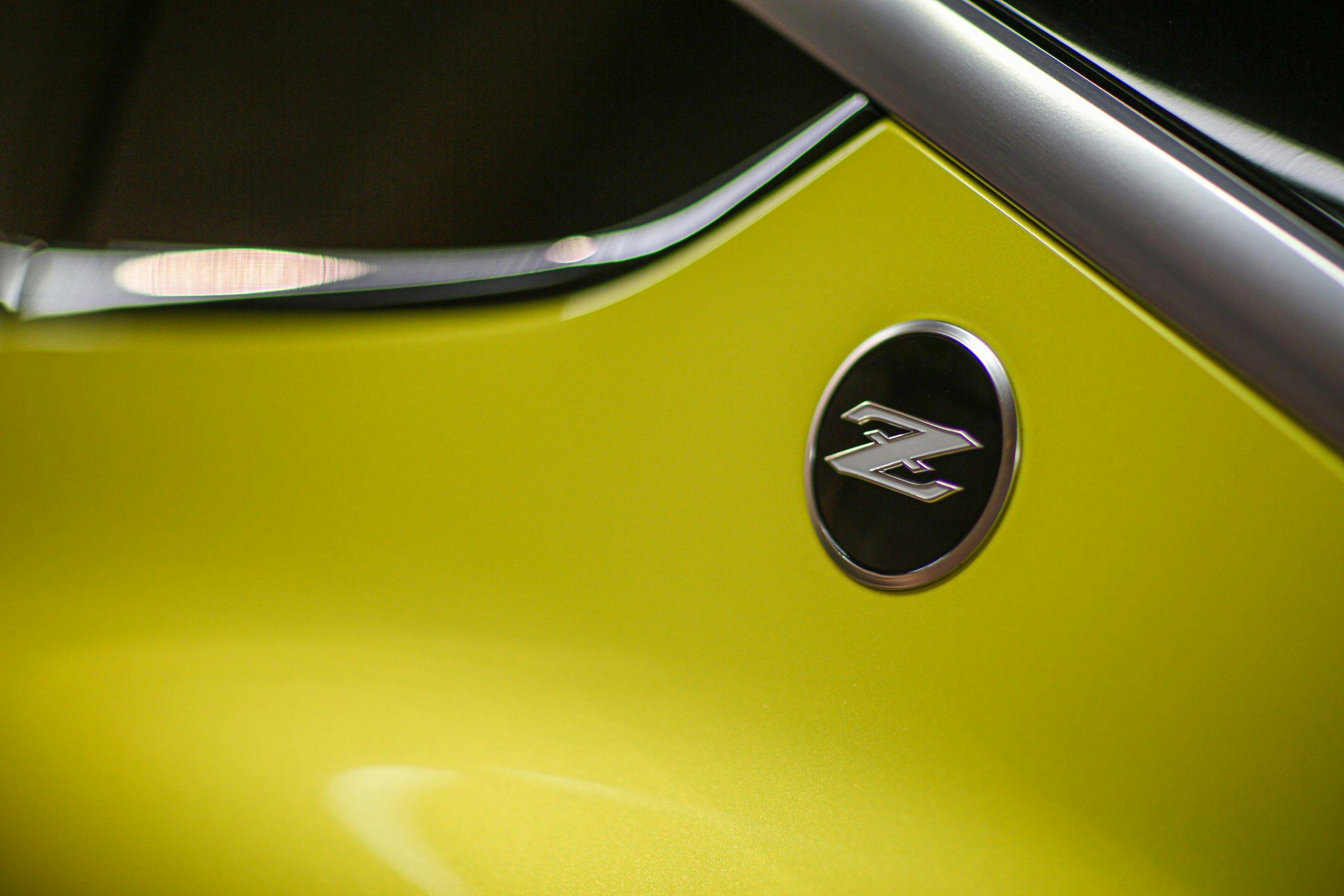
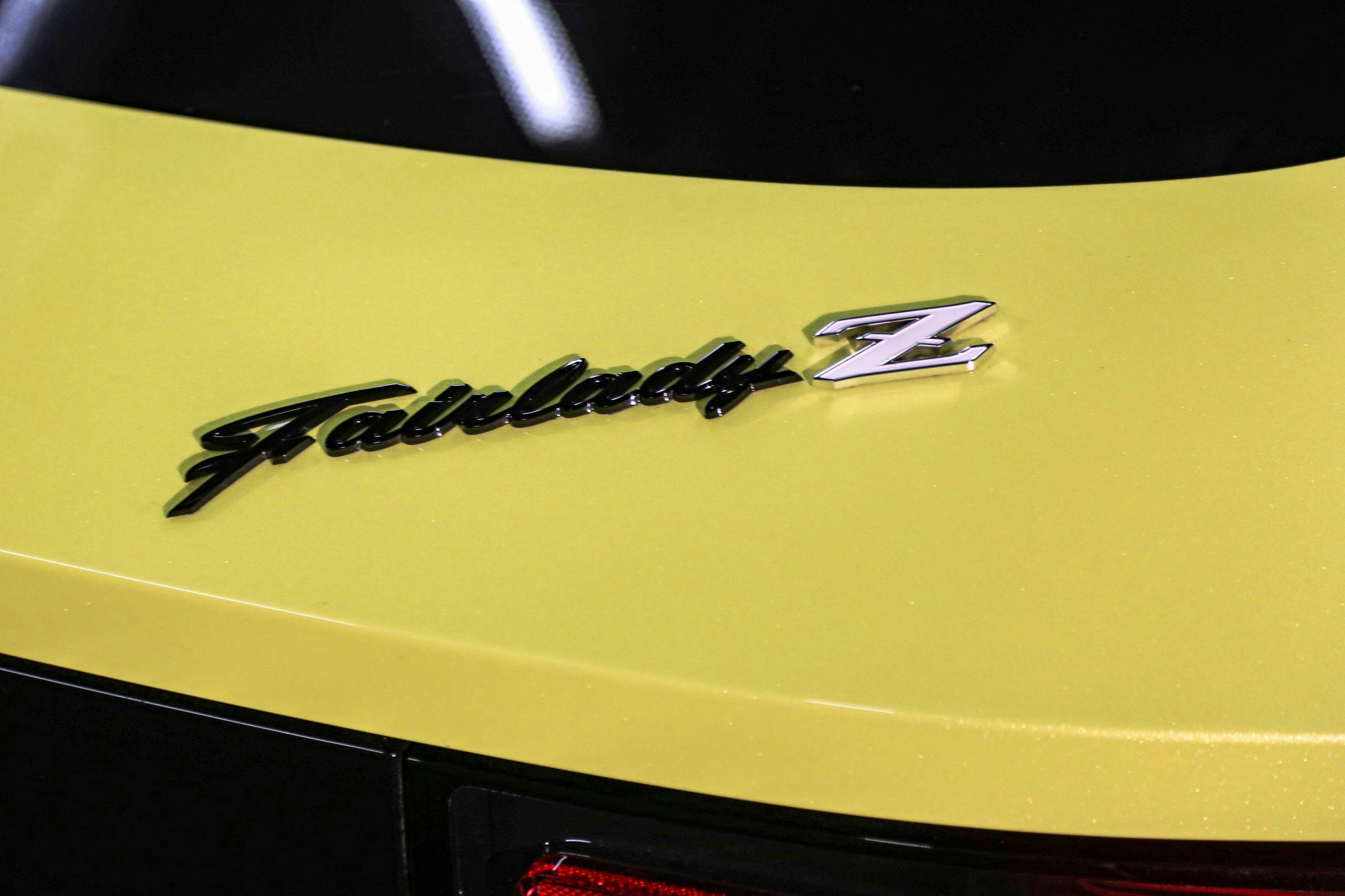
While the Z was known as the Fairlady in Japan, it never wore that badge in the States. The inclusion of the badge is a nice touch for Nissan loyalists, although we won’t lose sleep if it doesn’t make the cut for production. The C-pillar “Z” emblem, on the other hand, is something that should absolutely remain.
Nissan would not clarify just how much of the Z Proto’s design would make it to the finished production car, which will likely be badged as the 400Z. The final versions may not wear such a striking color, for starters, but the bones of this concept surely will make it to the real-deal Z that we’ll see in the showroom. That bodes well for both longtime Datsun/Nissan enthusiasts and newcomers seeking a relatively affordable sports car with a storied heritage.
