Media | Articles
Design Analysis: First generation Ford Mustang (1964½-1973)
Editor’s Note: this analysis primarily considers the 1964½-1968 Mustang
Regardless of whether you measure success in terms of sales, accolades, fans, buzz or the competition’s response, the first Mustang was an undeniable success. It was the perfect car at the perfect moment for an American generation itching to hit the road and discover freedom. Now, it may seem like a cliché echoed in thousands of auto ads since, but at the time there were no cars that were marketed and linked so specifically to youth than Ford’s Mustang.
The design brief for the Mustang was simple, requiring that five objectives be met:
- Seat four and have bucket seats
- Include a floor-mounted shifter
- Weigh no more than 2,500 pounds (1,100 kg) and be no more than 180 inches (4,572 mm) in length
- Sell for less than $2,500, base price
- Have multiple power, comfort and luxury options
While the initial concept was a mid-engine two-seater, management wanted the production Mustang to be a four-seater because the original Thunderbird (a two-seater) was seen as a sales failure. Whether Ford considered building a mid-engine four-seater is another question, but based on the target base price, it seems this was never a real option because the Mustang depended so heavily on stable-mates for its floor pan, architecture and hardware to minimize cost.
That the Mustang is an American invention cannot be argued; however, much like the Corvette, its styling was heavily based on European cars. According to the Mustang’s project design chief, Joe Oros, “I wanted a Ferrari-like front end, the motif centered on the front — something heavy-looking like a Maseratti [sic], but, please, not a trident — and I wanted air intakes on the side to cool the rear brakes. I said it should be as sporty as possible and look like it was related to European design.”
Marketplace
Buy and sell classics with confidence
And if considered honestly, there is a fair amount of Maserati 3500GT in the Mustang’s front fascia, yet the Mustang cost roughly a quarter of what the Maserati cost. You could also bring three friends along for the ride. And if you only took one, it had a rear bench seat, in case.
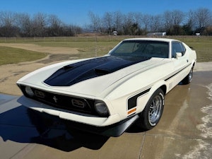
The Mustang’s proportions are pleasing but not revolutionary in any way. It has a well-documented long hood/short deck commonplace to performance cars of any era that are front-engine, rear-wheel drive. The real genius of the Mustang is that despite the fact that the door is centered almost perfectly on the wheelbase (thereby allowing space for a rear seat and some ease of ingress/egress) the car still manages to look like it’s all engine and front end.
This is accomplished by providing a visual line-break in the form of the rear fender’s C-scoop. It stops the eye and divides the car into thirds: two-thirds for the front, one-third for the rear. Additionally, the C-pillar’s angle mimics the C-scoop’s and helps to reinforce this visual break.
The Mustang’s surfacing is clean, simple and elegant, occasionally making use of recesses in order to emphasize details (headlights, grille details, taillights) and give a more upscale, designed appearance. Details, with the exception of the C-scoop, are limited to the front of the car in order to give it more emphasis and visual weight. This also reinforces Ford’s assertions that the Mustang was a performance car.
Ford’s clarity of message and design with this product was of such a high level that it is still astounding. The Mustang was a car designed to maximize your enjoyment of life and it didn’t matter if you couldn’t afford a top-shelf V-8 or not, all trims of this car were quick, sporty and let you enjoy freedom with your friends. The democracy of the Mustang is what makes it so intrinsically American.


