Media | Articles
What makes good car design? An industry insider peels back the studio curtain
Hello there! My name is Adrian Clarke. I am a professional car designer, earning a degree in automotive design from Coventry University and a Masters in Vehicle Design from the Royal College of Art in London. While I was there, one of my tutors was J Mays. (He used to bring in doughnuts.) I worked for several years at a major European OEM before the pandemic knocked the world into a cocked hat. In a previous life, in the Nineties, I daily drove a 1979 Ford Thunderbird while living in London.
If, when you think of a car designer, what comes to mind is a fellow in funky glasses dashing off a few arty doodles of a car from on high, armed with an edict to “build this!” before returning to look at classic wristwatches online, that image is only partly true. I’ll leave it to the reader to decide which part. Reality is messier. It takes hundreds of talented people to turn an arty doodle into something a customer can actually buy and drive. But how does that happen? Why do some cars look terrific and some look like the crumpled up box the car came in?
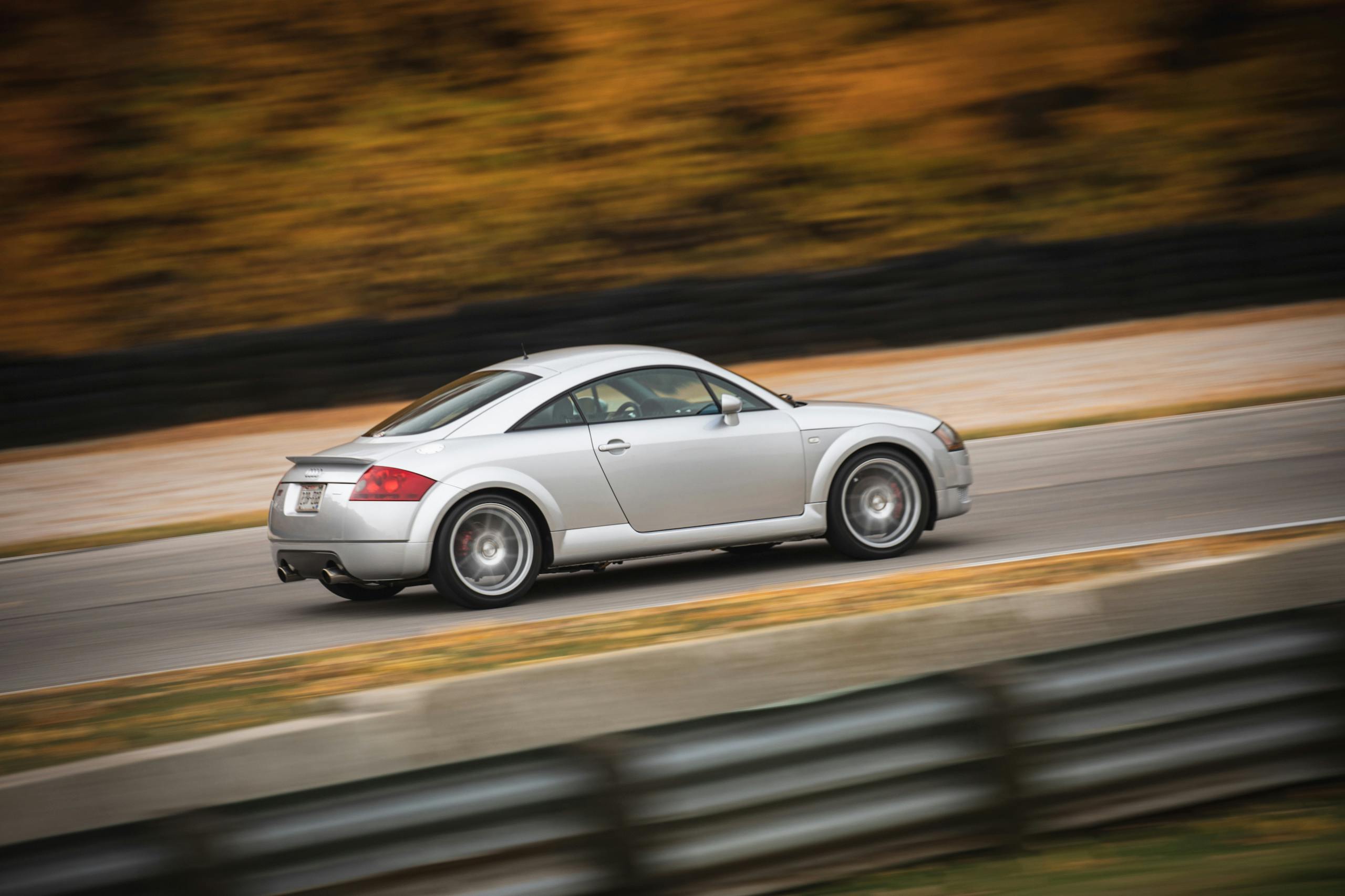
When we talk about car design, we are talking about a specialized form of product design, with a bit of fashion and sculpture thrown in. If you want to draw a designer’s ire, call them a stylist; these people spend years creating a design, then tweaking it to the satisfaction of managers, board members, various engineers, parts suppliers, and marketing wonks all doing their very best to have their own way. Win this fight and you get an Audi TT. Lose and you get a Pontiac Aztek.
A great design creates an emotional response, making the owner think the manufacturer put thought and care into this expensive collection of parts. Premium manufacturers mostly strive for a family resemblance—features and callbacks that represent a house style cultivated over generations. More mass-market manufacturers prefer instead to make their vehicles stand out within the target segment (hello Nissan Juke) or follow trends (like the current rage for flying C- and D-pillars and blacked-out roofs). Think of it like this: you’ll recognize something from Hugo Boss whether it’s a suit or a pair of boots, or say a pair of shades from Prada. You won’t know where someone bought an item of everyday clothing, be it from Gap or Forever 21, but it will be similar to what everyone else is wearing that season. “On trend”, to lean on on awful phrase.
Not all customers like the same thing—if they did, this business would be a lot easier. But “creativity is subjective!” I hear you cry, “it’s all in the eye of the beholder!”. Except that’s not really true; assemble a bunch of car designers in a bar and pretty soon you’ll have a consensus about what cars are great and those that should never have left the sketchpad.
Marketplace
Buy and sell classics with confidence
So now we know what makes a great design, how do we go about creating one?
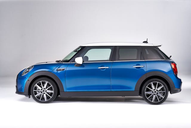
The following things are necessary: The right platform, great proportions, good stance, strong feature lines, and considered details—each one building on the other in turn. If the platform is wrong, everything else will be wrong. Given the minivan platform basis, no amount of facelifting could save the Aztek: it was doomed before the first clay model was milled. And if you’ve ever wondered why the current range of Minis look like a small bag carrying a large bag’s worth of groceries, it’s because they’ve been stretched to fit over a platform shared with front-drive BMWs, which are cars from the next size up.
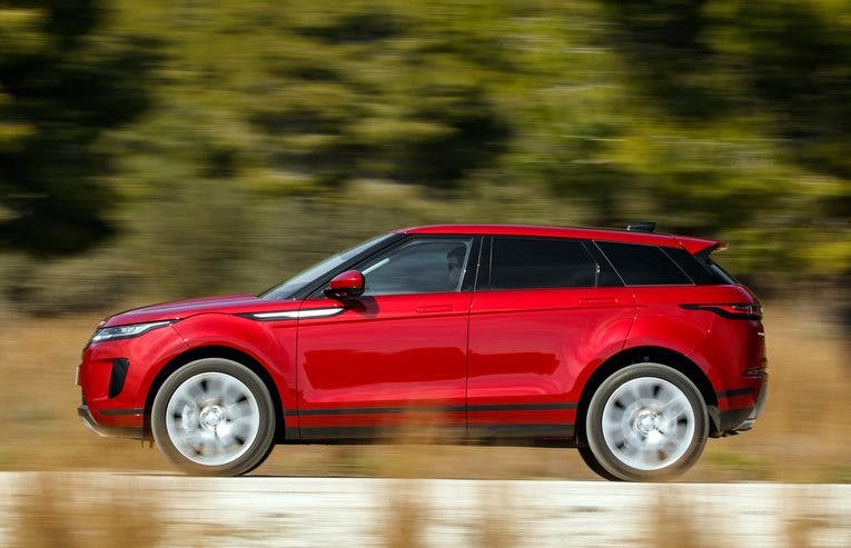
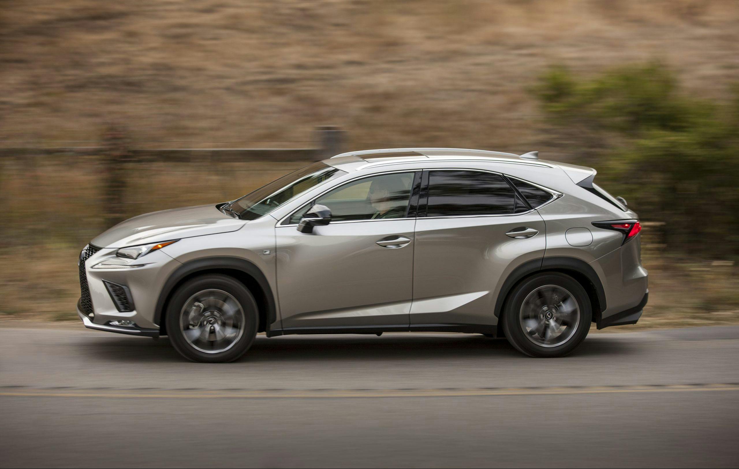
Coupe crossovers look ungainly because they’ve got the raised stance of off-road ruggedness, with the low roof of sportiness and style—two opposing ideas fighting over the same sheet metal. Many hours will be spent at this stage churning out simple clay models with no details until the basic outlines of hood, passenger compartment and trunk (if there is one) look right. Don’t put a long hood on a FWD car for example, because they’re more about maximizing the room for people and stuff. Likewise you wouldn’t put a short hood on a RWD car, because it would force the noisy oily bits into the passenger compartment. Creating a new urban runabout? Make it more upright because getting in and out while juggling a handful of Starbucks and pastries is more important than high-speed stability. Something more practical and family orientated? SUVs and station wagons should look like they have enough space to separate squabbling children or can hold the contents of a successful afternoon touring antique shops. Shooting brakes and fastback wagons should look speedy enough to make the dog vomit, because their raked glasshouse ensures nothing else is fitting in the back.
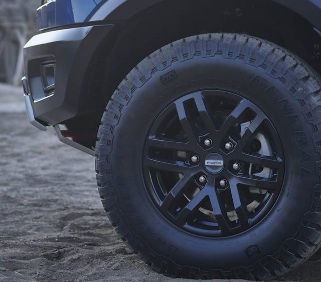
After you’ve nailed the proportions, stance comes next. How does the thing sit on the road? Wheel size and wheel to wheel arch relationship are crucial to making a car look stable and planted, and not like it’s bouncing around like a Tamiya buggy. If you haven’t got the room to pull the wheels out and give your bodyside a touch of wheel arch flare, then give your wheels some dish.
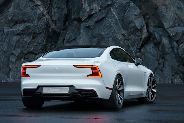
Don’t make the wheels too big for the sake of looking good (like all parts of design, nuance is key). A senior designer once commented on one of my sketches that “it looks cool, but you’ve over-wheeled it a bit!” Even in the initial creative part of the design, you need to keep it realistic. Wheel spokes should never protrude outside the wheel rim. It looks knock-kneed, but under-wheeled makes the rims easy to damage.
Once you have the overall volumes and stance, you can start to think about the surfaces. Feature lines, or the bones of the car, help to define the outline of the body and enable the sheet metal to hold its shape when stamped. Done well and the result is subtle curvature and tension with good highlights. Go crazy, adding lines that go nowhere and serve no purpose and the bodywork looks like it’s gone ten rounds street parking in New York before leaving the showroom.
Lastly come the graphical elements, like lights, grilles, apertures for aero or cooling, exhaust tips and any trim pieces. How you combine these at the front is really important in establishing the car’s face. Manufacturers put a lot of effort into this: I once came up with a new front graphic that was well liked, andI was promptly asked to come up with more variations of the same theme. Like The Dude’s rug, these elements tie whole car together and provide visual interest, something alluring to look at. But they need to be used subtly. As Coco Chanel said, take off the last accessory you put on.
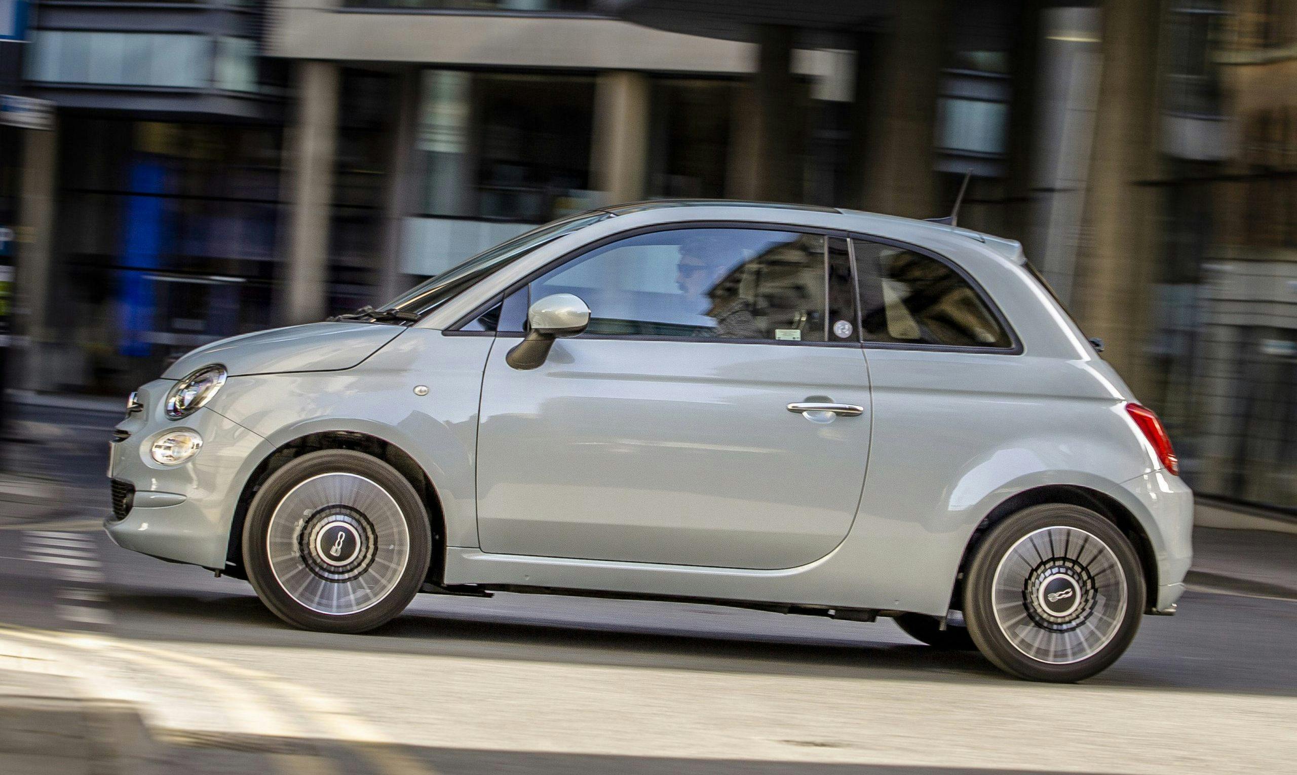
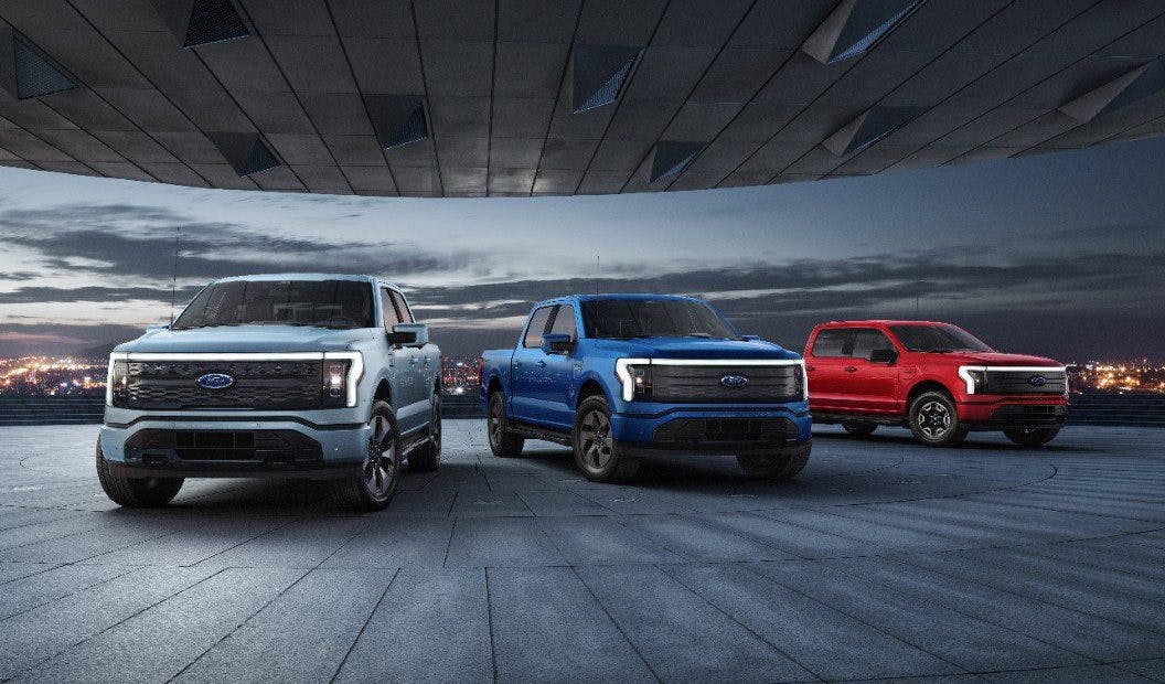
So, a great design will make sense visually, be logical and useful to its intended purpose, and make its owner feel good about purchasing it, using it and being seen in it. Great cars have an inherent sense of rightness about them, that like pornography is hard to define but easy to spot. They also need to be seen in context. The Fiat 500 sold well in Europe because it has bags of emotional appeal and is perfect for bustling European cities. It fared terribly in the U.S. because enhanced passenger room wasn’t one of the option packages. Stick one on the interstate and it looks ridiculous. The new F-150 Lightning is confident, modern, unashamedly American, and its toned-down grille treatment make it arguably the pick of the range. It’s going to look terrific gliding silently through heartland U.S., but less so threading its way through an English country village.
That’s a solid overview of the ingredients for good design, but just as important is how these main aspects tie into the overall look of the car. In the next article, we’ll look at how a designer comes up with those flashy sketches, and what it takes to turn them into reality.

