Media | Articles
Light Show: Designing the Cadillac Lyriq’s fresh face
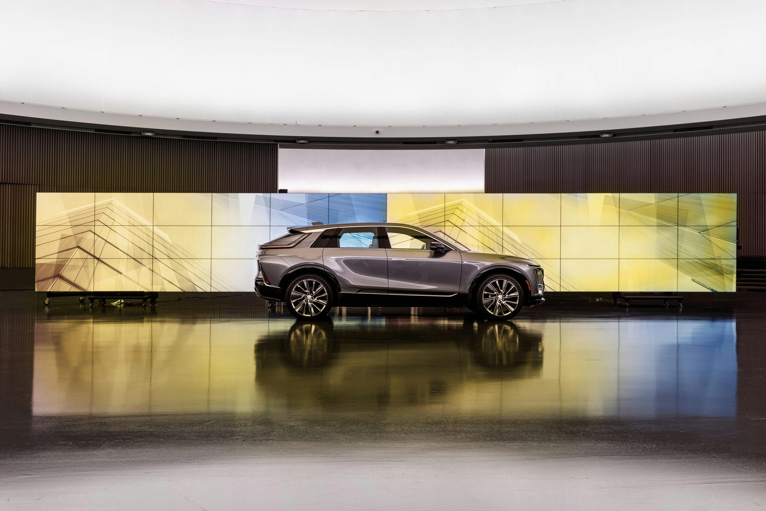
Enthusiasts often poo-poo SUVs as high-riding, joyless cash cows for the unenlightened mainstream. The SUV before you, however, deserves a second look—and not simply because it’s a handsome preview of the Cadillacs of the near future. This angular, LED-festooned electric family-hauler bears a weighty mantle: Translate traditional Cadillac values into the zero-emissions era.
First revealed in August of last year, the Lyriq was bred to found a dynasty of luxury EVs, and the freedom given to the design team says much about the importance of this vehicle to GM. Add to the clean-sheet design brief the innate flexibility offered by the electric Ultium “skateboard” platform, and the chaps over at Warren, Michigan, faced a once-in-a-lifetime opportunity.
We took a trip over to General Motors Design Center—one of 38 buildings on a 710-acre campus that was designated a National Historic Landmark in 2014—to talk to the people who sketched and scraped the Lyriq from paper to clay to production-ready spec.

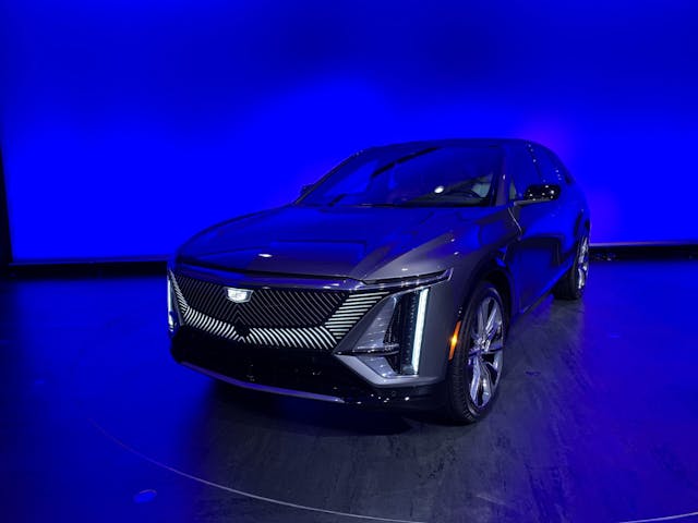
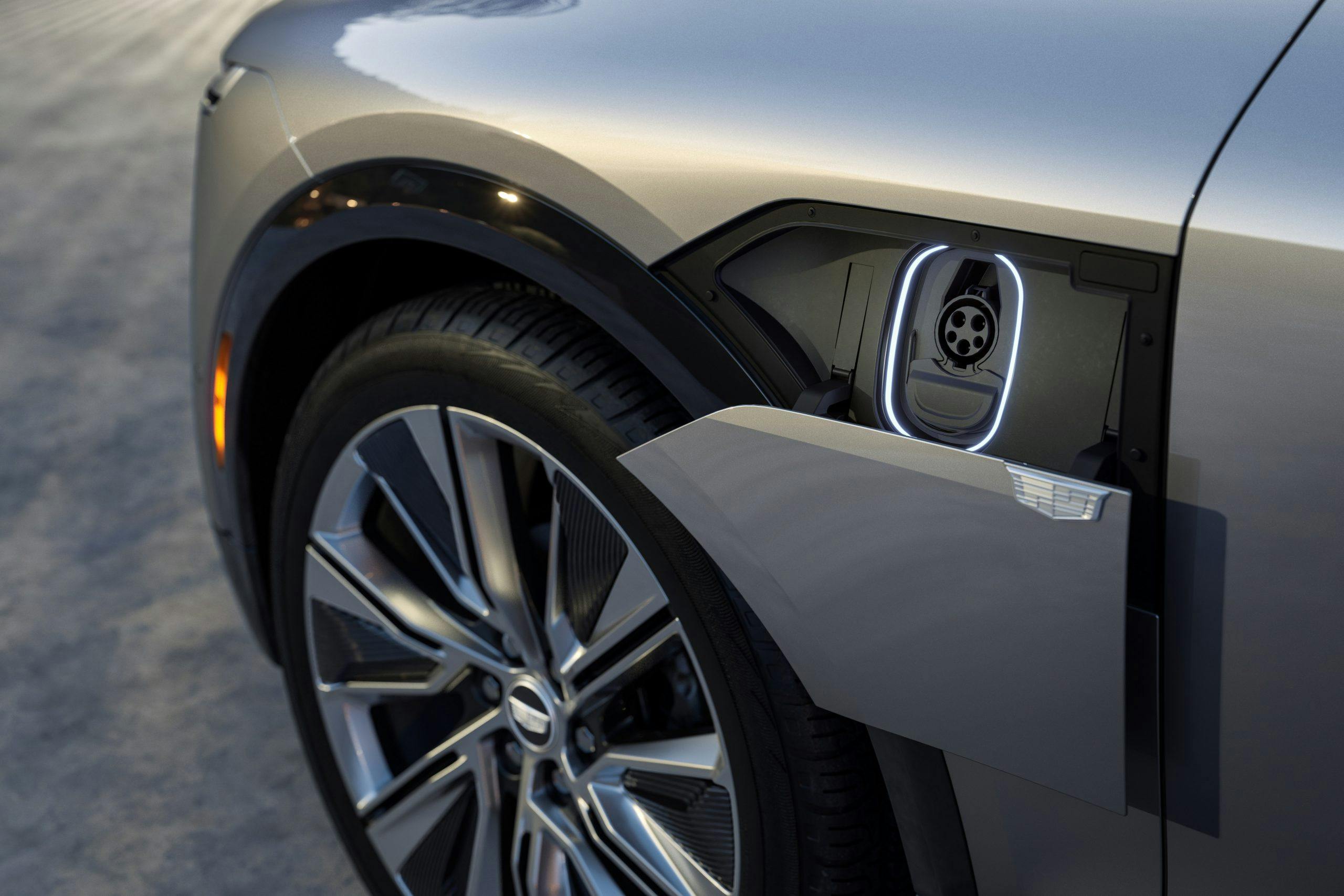
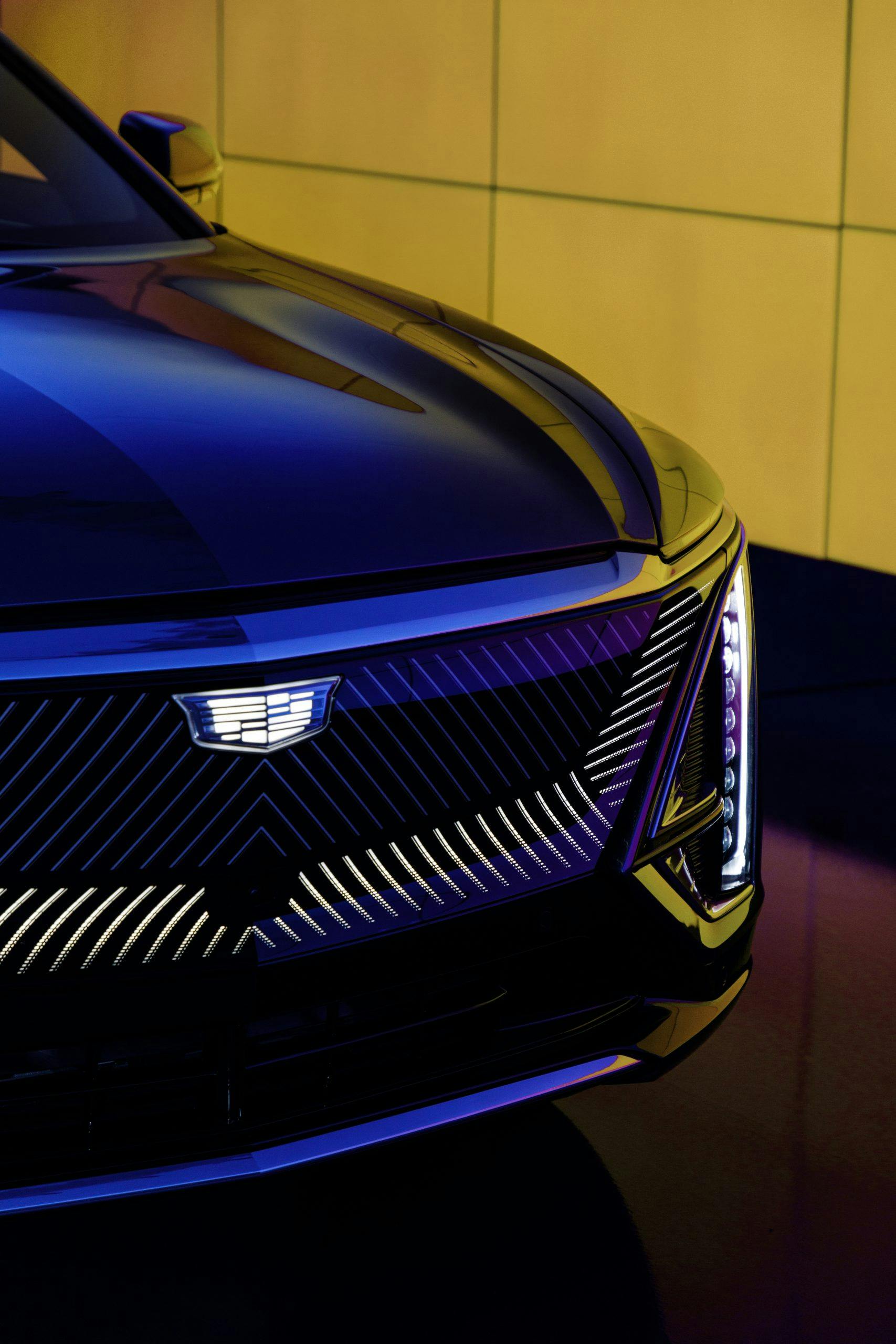
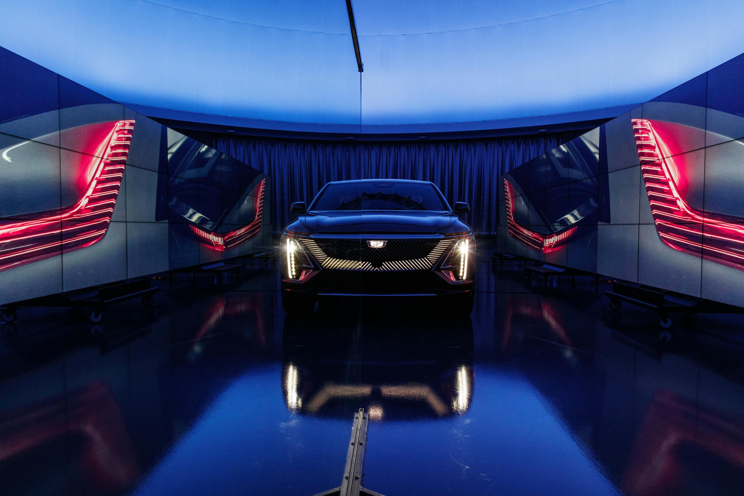
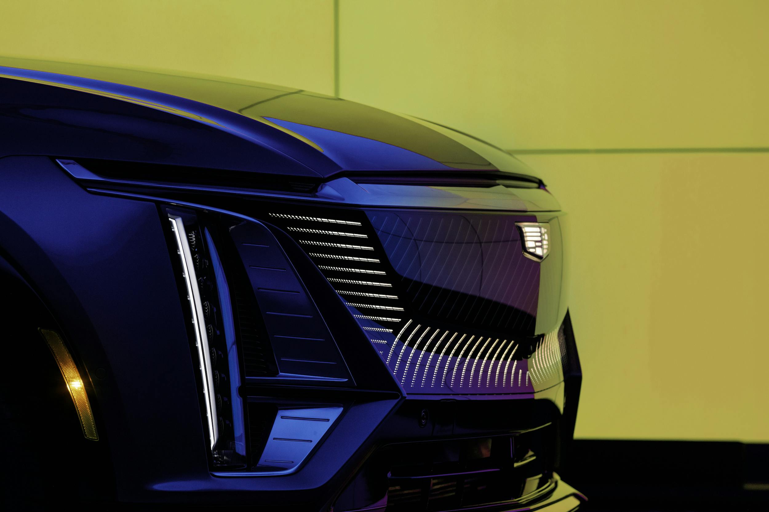
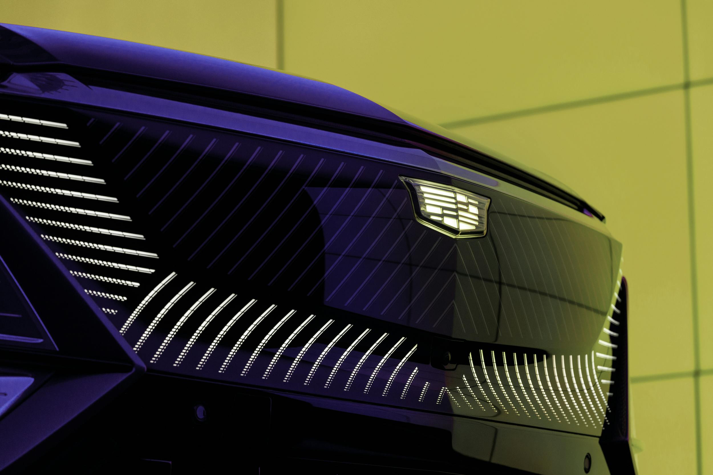
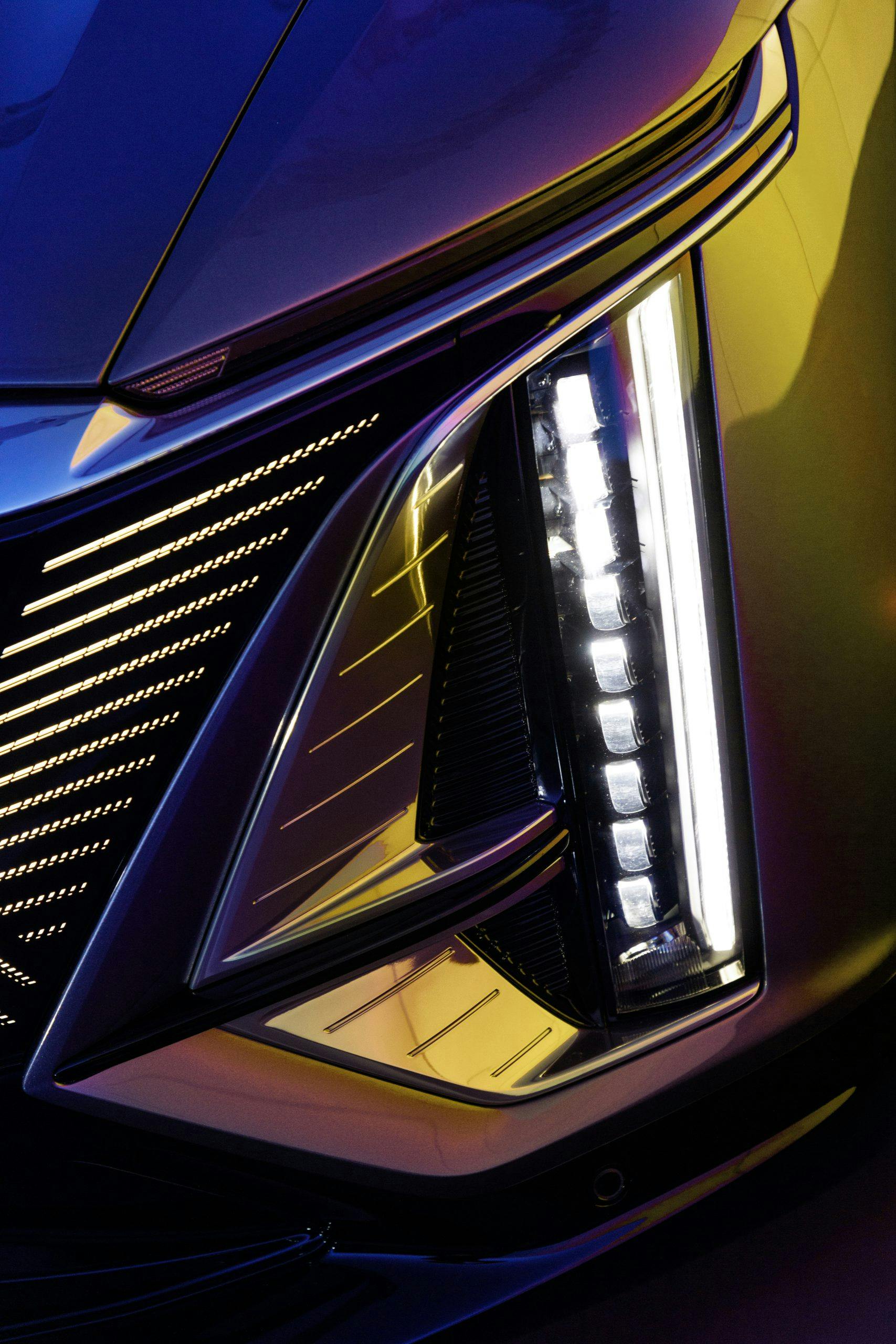
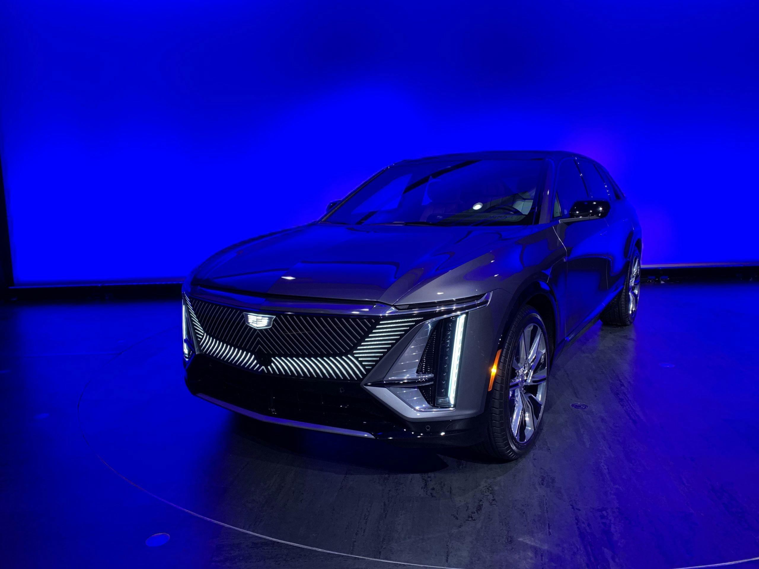
“Lighting is to an EV what rumble is to an ICE [vehicle],” says Candice Willett, an advanced lead designer with Cadillac specializing in choreographed experience and lighting. Light is the new chrome, sure, but the 736 LEDs on the exterior of the Lyriq serve a deeper purpose than bling: convince the customer that a near-silent car is reacting to them. When you’re holding the key fob within a 15-foot radius of the Lyriq, it will visually “wake up” to your presence. The lighting sequence starts in the Cadillac crest, runs around the laser-formed slashes in the polycarbonate grille, trails across both amber turn indicators, and waterfalls down the vertical “headlights.” There’s a different choreography when you leave the vehicle. A bit “extra”? Yes, but arguably appropriate for a brand that built its reputation on glitz.
“We didn’t want a dead-front vehicle,” Willett explains, in what sounds suspiciously like a jab at the unadorned snub noses of Tesla’s vehicles. (“Dead-front” is a technical term for a switchboard with no live electronic components on its front.) GM’s design team put an immense amount of time and effort into the Lyriq’s LEDs. It fell to Dan Schmeckpeper, the lead designer of exterior lighting at Cadillac, to work with GM’s suppliers to commission new, 15-mm-wide “slimline” lighting components to realize the trick sequence that his team wanted.
Marketplace
Buy and sell classics with confidence

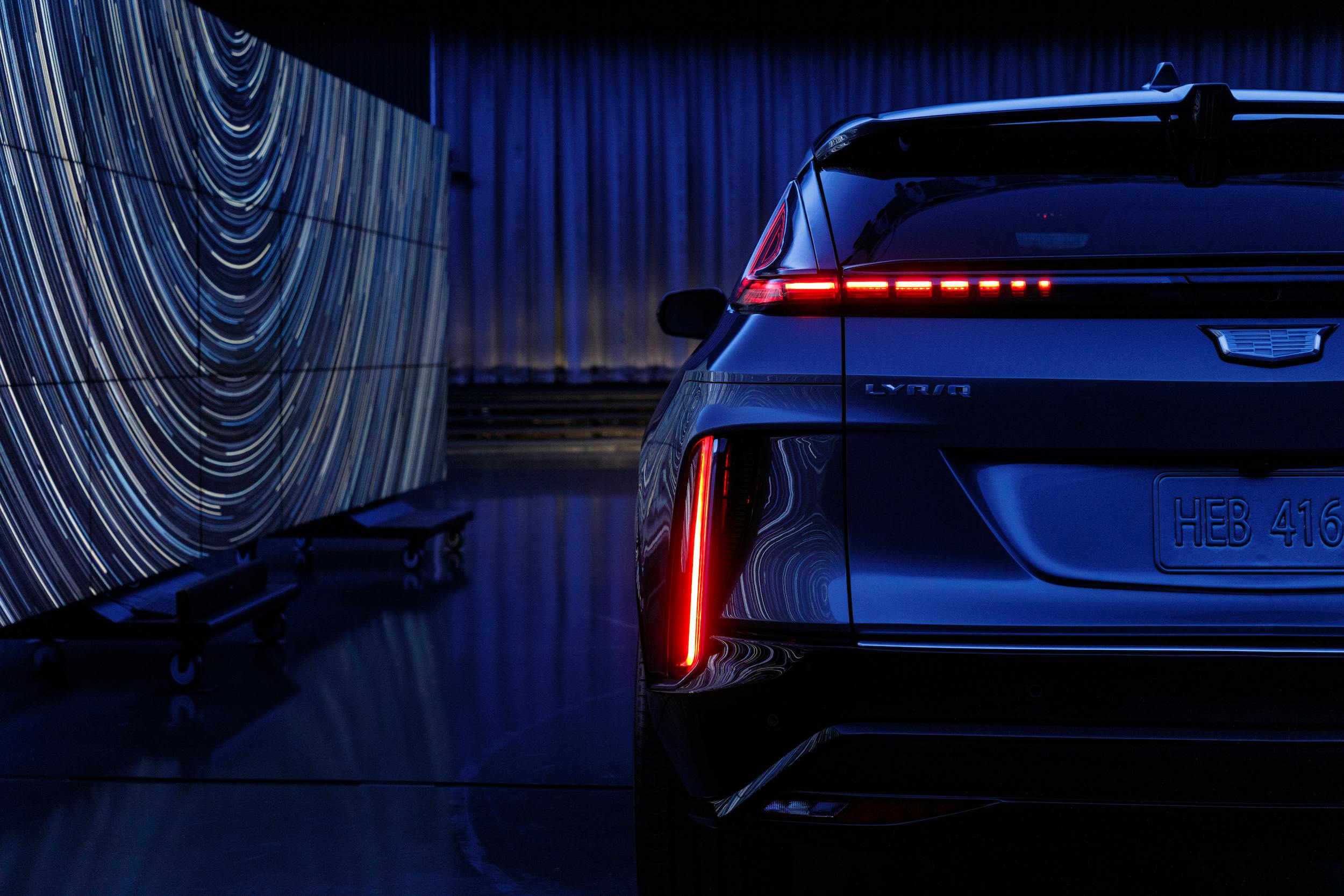
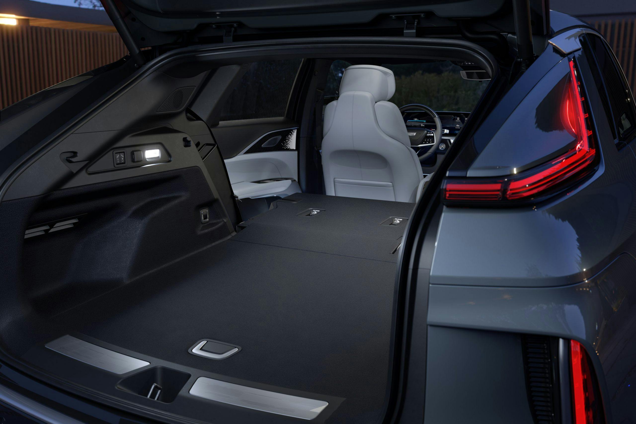
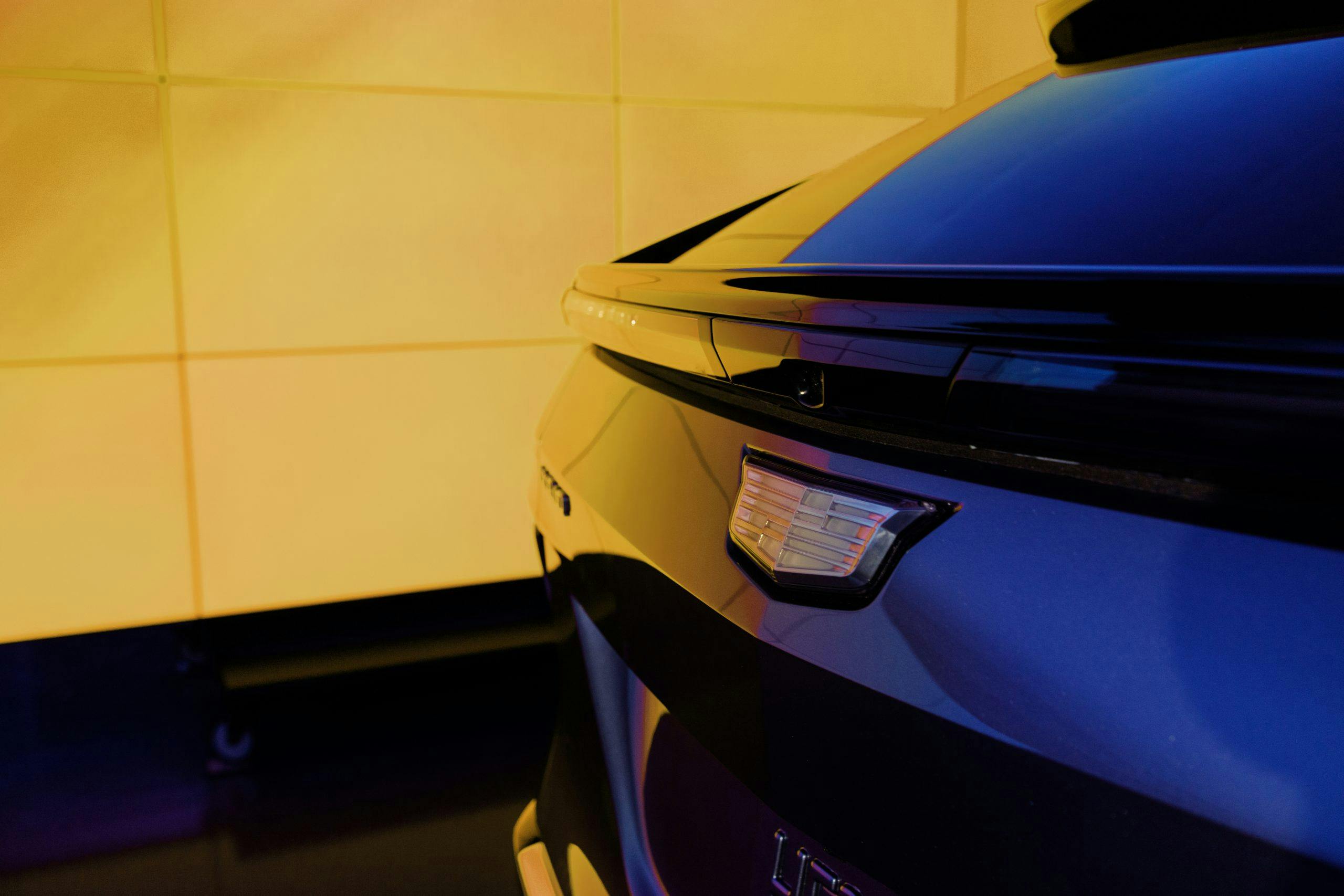
Willett and Schmeckpeper may have had great creative freedom with the Lyriq’s snazzy lights, but they also have to work within the constraints of safety regulations—both in the U.S. and outside, since Cadillac’s building the Lyriq in one global specification. As most classic-car enthusiasts will know, turn signals are one of the major differentiators between the U.S. and Europe: stateside, signaling turns with a red light is a-okay, but across the pond, a blinker must be amber. Standing behind the Lyriq, you can also spot this peekaboo taillight—glamorous, yes, but mandatory to satisfy a particular rule about the visibility of brake lights from different positions around the vehicle.
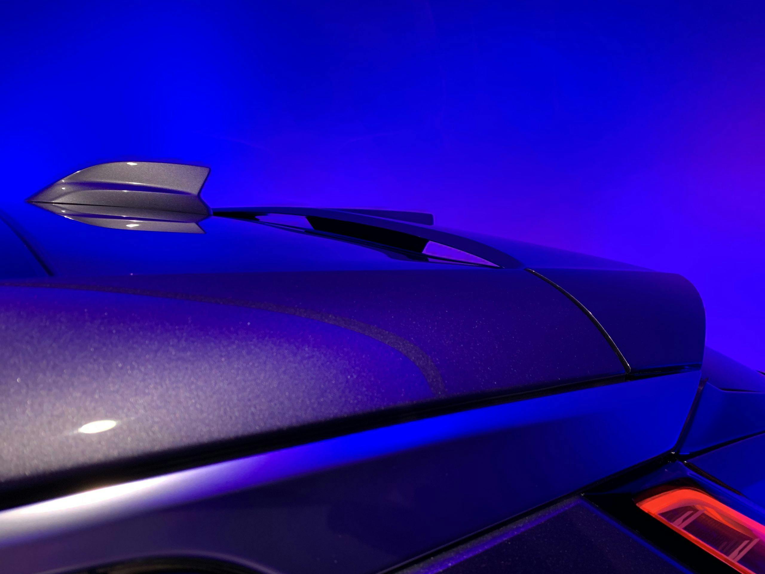
Brian Smith, the director of Cadillac exterior design, runs a finger over the rear fender of a prototype, production-spec Lyriq. He points out how the strong horizontal character line “melts” over the top-center of the SUV’s wheel; he’s particularly proud of that bit of surfacing. Walking around back, he takes a moment to talk about the Lyriq’s flow-through roof spoiler, which is more than an edgy design cue. “It looks like an SUV, but it behaves like a sedan in the wind tunnel,” he says. “The air flows under it and then is picked up by the trip edge here along the rear.” He traces a thin black lip that lies atop the horizontal taillamp and protrudes just slightly. The steep rake of the rear glass, combined with this bit of aerodynamic trickery, also eliminated the need for a rear wiper.
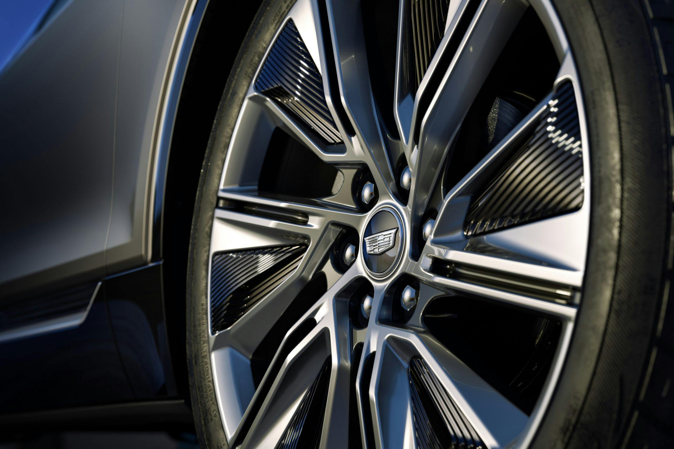
Other aerodynamic-dictated decisions are evident in the black plastic spats on the 22-inch wheels (which account for a .10 Cd reduction), whose texture is picked up along the coves of the rocker panels and next to the headlights.
Certain lines on the Lyriq would be nearly impossible on an internal combustion vehicle. Even though the front drive unit in GM’s Ultium skateboard platform is relatively tall and narrow, it’s still shorter than a combustion powerplant and all its accompanying paraphernalia. Fun fact: GM’s powertrain engineers redesigned the front Ultium drive unit three times, morphing it from short and wide to slim and upright, to accommodate the design team’s vision. Look at the low cowl, which sweeps around the base of the windshield and flows directly into the beltline. That’s a design win, enabled by the redesigned powertrain. The wide, light-catching “shoulders” of the Lyriq are another gift from the Ultium architecture, which allowed the design team to push the wheels aggressively outboard and beyond the plane formed by the glass of the greenhouse.
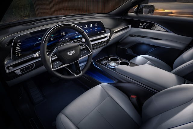
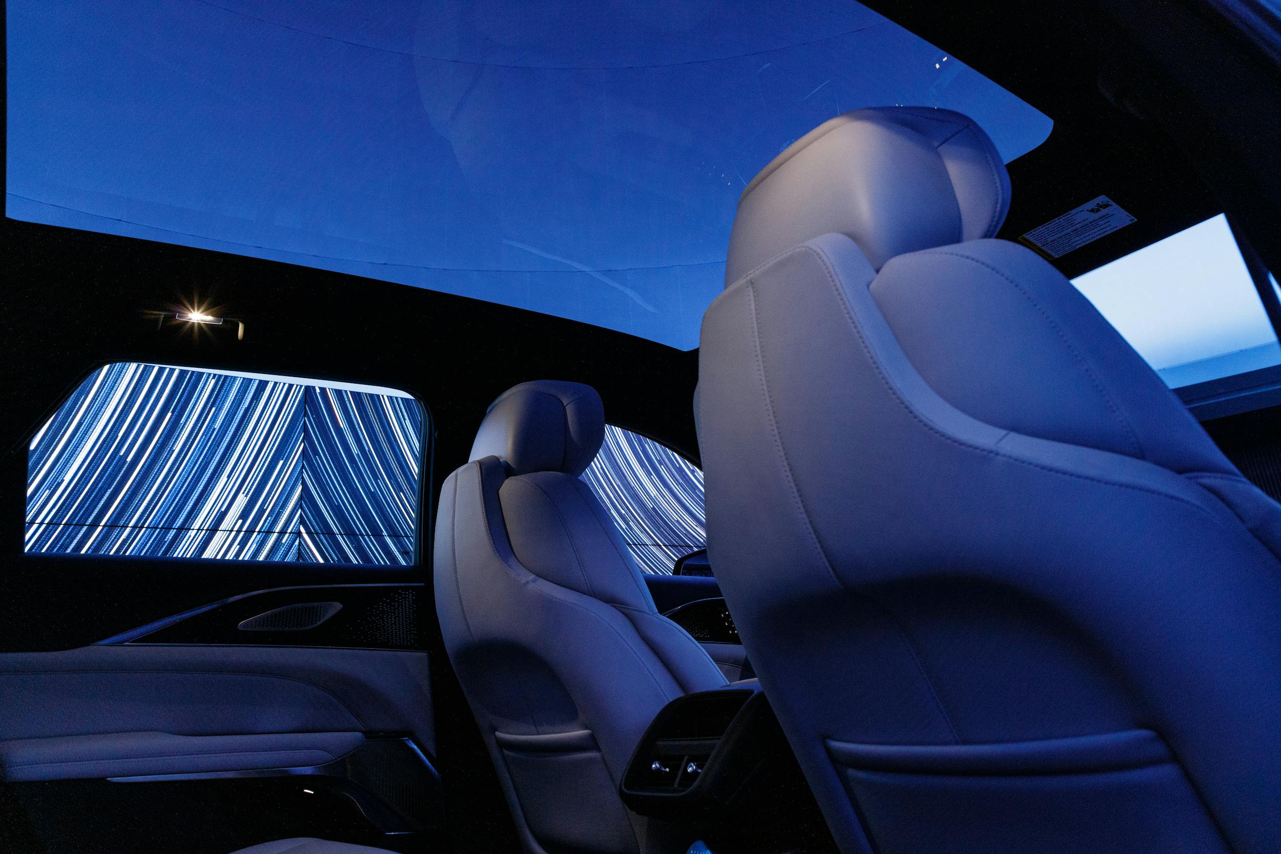
Chat with the interior designers, and there’s even more reveling in the freedom of a BEV skateboard architecture. First off, no transmission tunnel! Instead, the Lyriq gets a lovely, leather-lined purse-stashing spot, and a graceful center console. Josh Thurber, manager of Cadillac’s exterior design, explains some of the psychology of car interior: “First read” encapsulates the first impressions a customer gets when sliding into the cabin, dictated by things like the A-pillars, the silhouette of the dash—in the Lyriq, elegantly simple—and the shape and size of the infotainment screen. The last, in the Lyriq, is a 33-inch affair curved around the driver, encompassing both instrument panel and infotainment screen. The general look is similar to the display in the the 2022 Escalade, but the Lyriq’s 33-incher is truly one single LED screen; its big, body-on-frame brother hides three separate OLED displays behind one pane of curved glass.
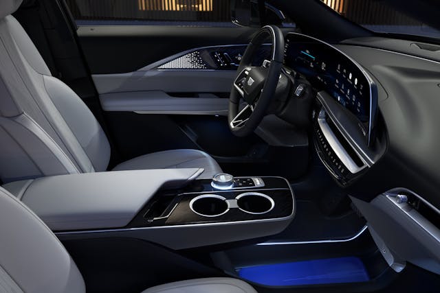
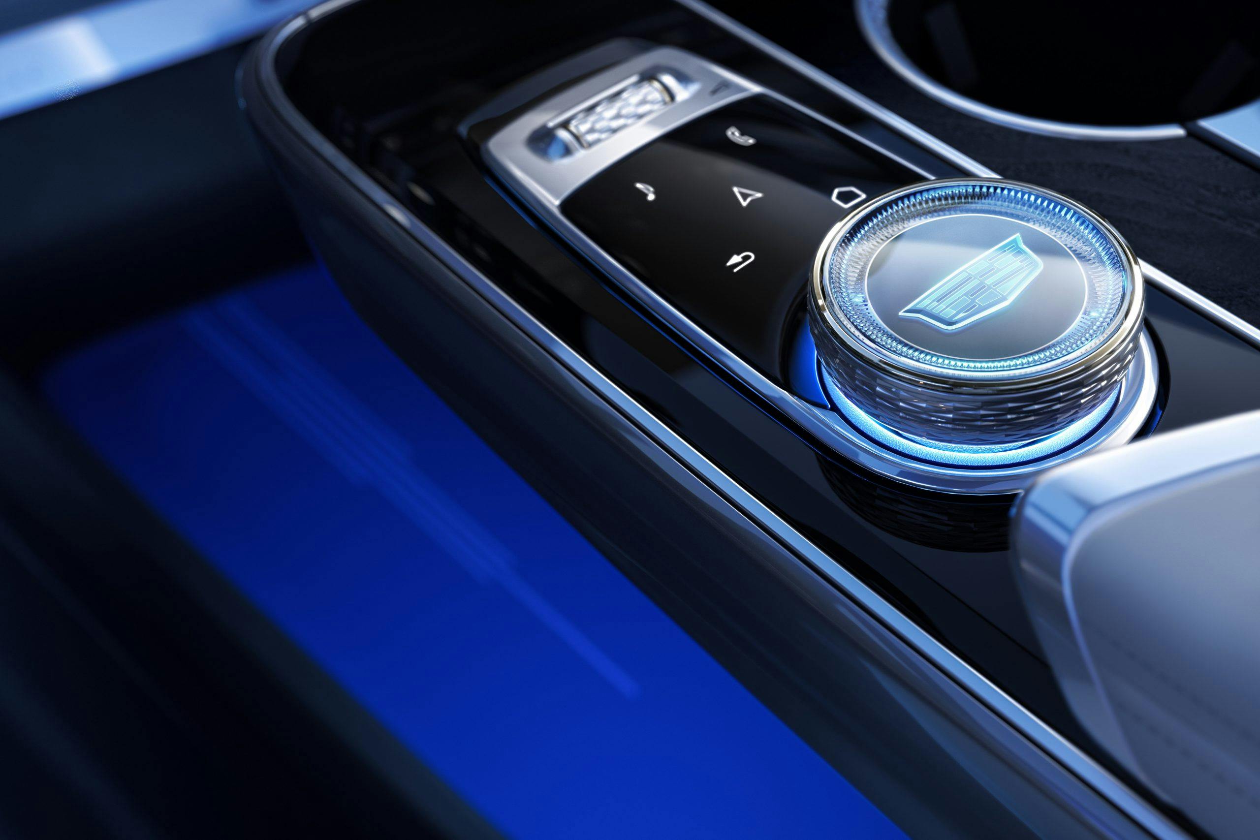
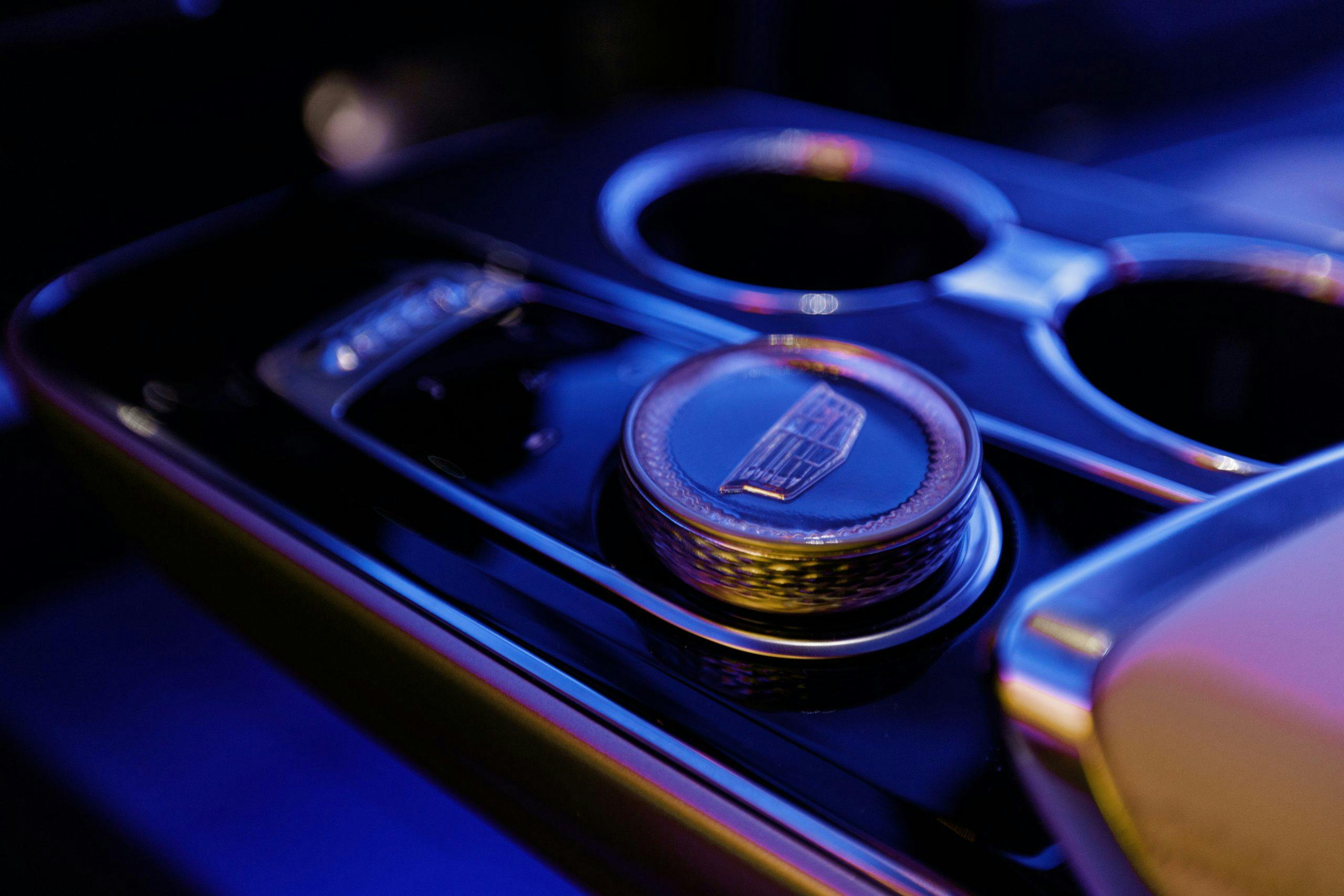
Most “second-read” features are textural: the knurling on the knobs, for instance. In the Lyriq, that same pattern is picked up on the rims of the cupholders, which share a center section that lowers at the press of a button to accommodate the handle on a coffee mug. “Third-read items” are things you might not notice until “weeks later,” says Thurber, “maybe when you’re cleaning it.” We gamed the system, and peered around until we noticed the angular contours on the covers of the seatbelt anchoring points. Slick.
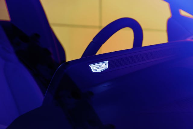
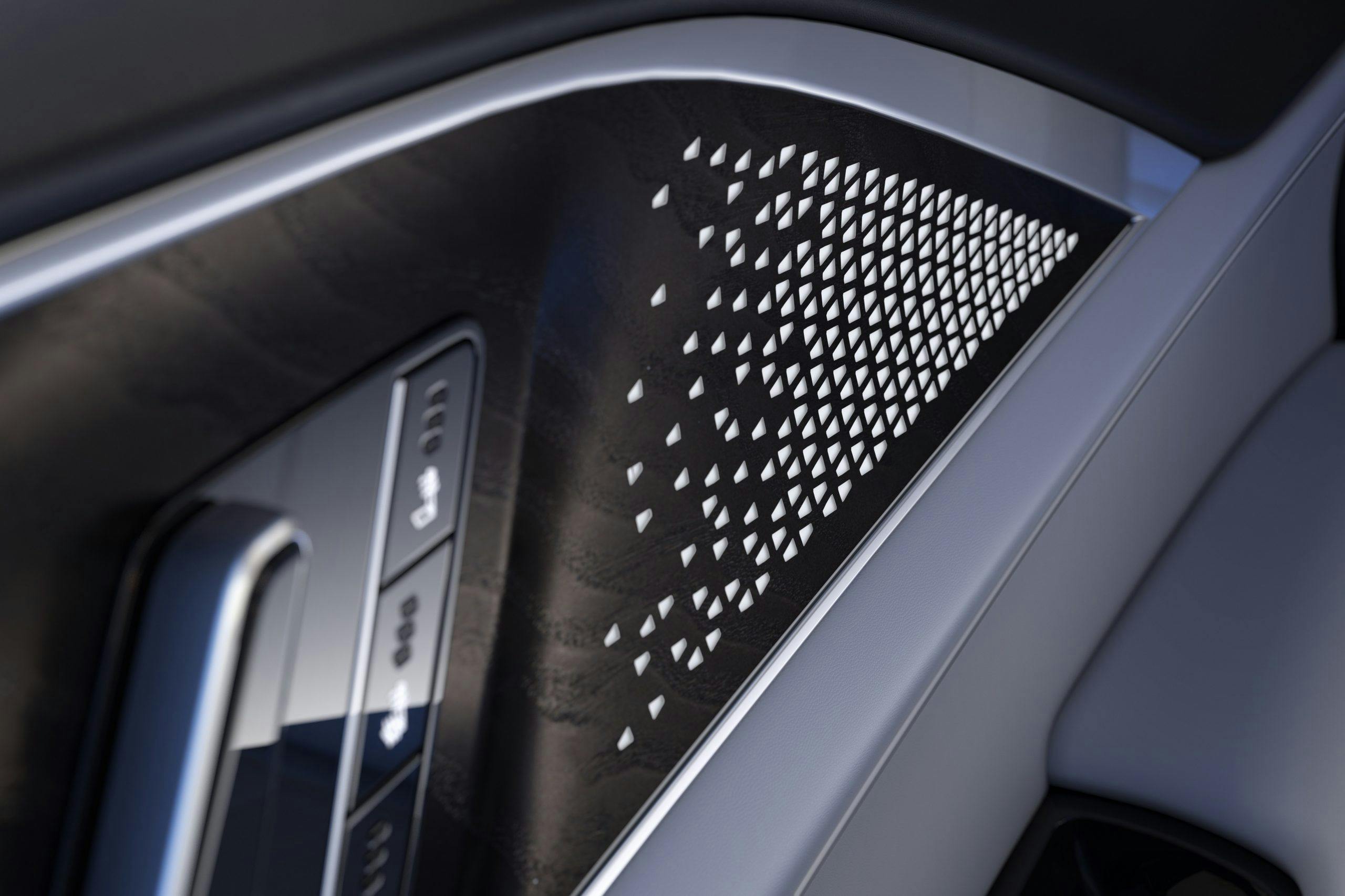
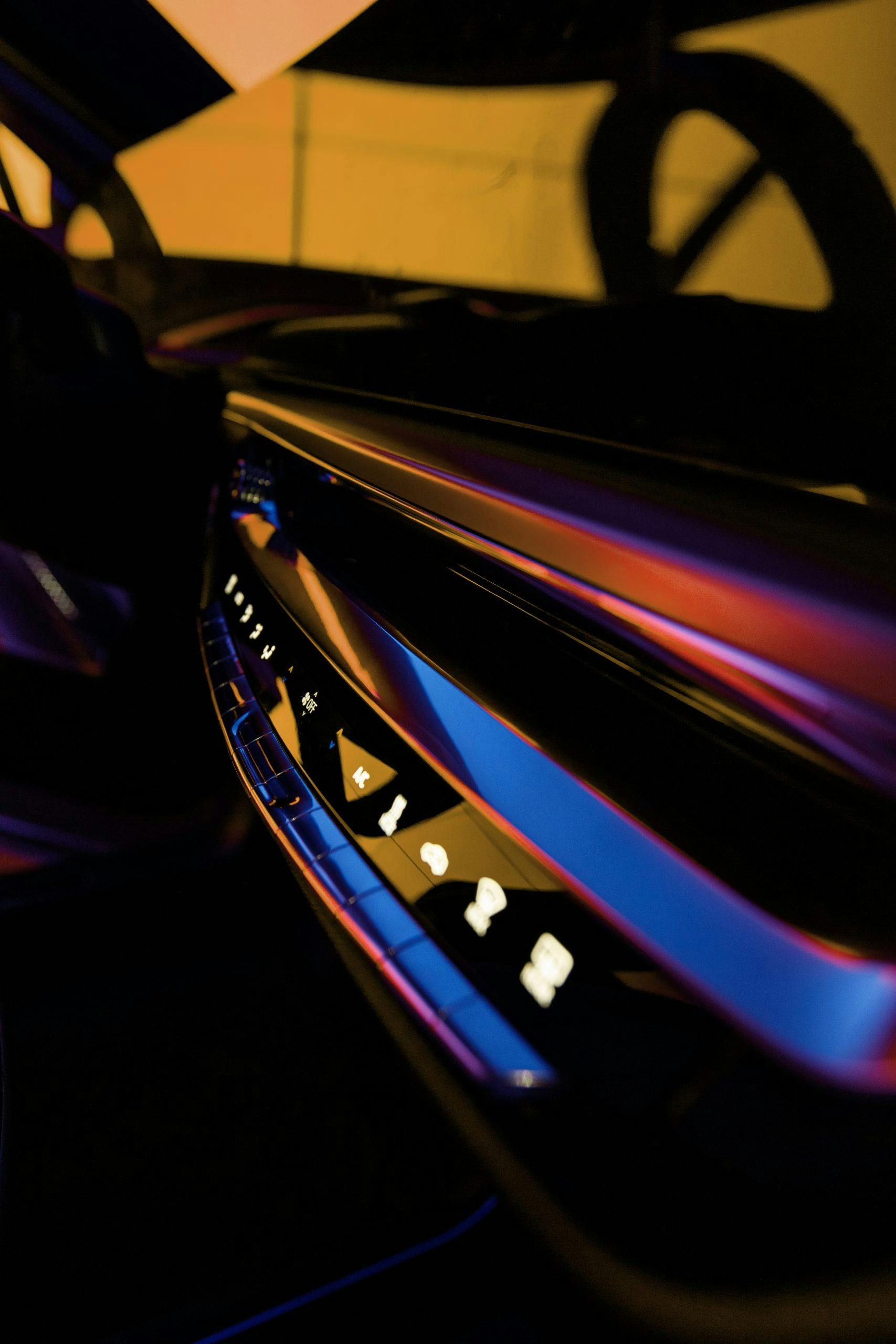
Cadillac has clearly taken pains in the Lyriq’s interior to bridge traditional, analog controls with flashy haptic ones. Entire days in the design process are dedicated to buttons and dials, listening to the different clicks and feeling different actions. Some analog controls were relocated from their traditional places in the Lyriq, such as the seat controllers. To allow for wider, more comfortable thrones, Cadillac moved the adjusters from the seat sides to the door panel—which is an LED-backlit affair that wears a flashy, laser-etched texture reminiscent of that on the grille … and in the ventilation pattern on the back of the dash-mounted screen. Naturally, someone also found room for a light-up Caddy crest.
Comparing a show car with its production-spec counterpart often prompts disappointment. How the mighty have fallen and such. The Lyriq has changed remarkably little. The poster child of Cadillac’s electric revolution seems to have truly benefited from the freedom (and the trust) granted by GM to its designers. The enthusiasm of these creative people, who worked through a pandemic to finalize this vehicle from the confines of their home offices, bodes well for the success of their electric brainchild.



Are the vertical line lights supposed to span the entire length of the dash on entry or half way?