Media | Articles
How are cars designed? Our industry insider peels back the studio curtain
Hello there! My name is Adrian Clarke. I am a professional car designer, earning a degree in automotive design from Coventry University and a Masters in Vehicle Design from the Royal College of Art in London. While I was there, one of my tutors was J Mays. (He used to bring in doughnuts.) I worked for several years at a major European OEM before the pandemic knocked the world into a cocked hat. In a previous life, in the Nineties, I daily drove a 1979 Ford Thunderbird while living in London.
Welcome back! Now that you’ve read the first article in my series on automotive design, you should now have a solid basis in the fundamental ideas behind what makes good car design. This time, we’ll see how these creations actually come into being.
To start, the head of the studio gives their team an idea of what they want. If the subject in question is a replacement model, the process kicks off about a year after the previous model was launched. This gives companies plenty of time to overanalyze why buyers bought or didn’t buy the vehicle. Did it look too aggressive? Not aggressive enough? Did it fit in with their expectations? I’ve seen all kinds of feedback from customers, one of whom was upset because the car didn’t prominently enough show the manufacturer’s name —presumably a life or death issue when you’re keeping up with HOA standards. A good designer stores all this data on their mental hard drive, left in the background for future use.
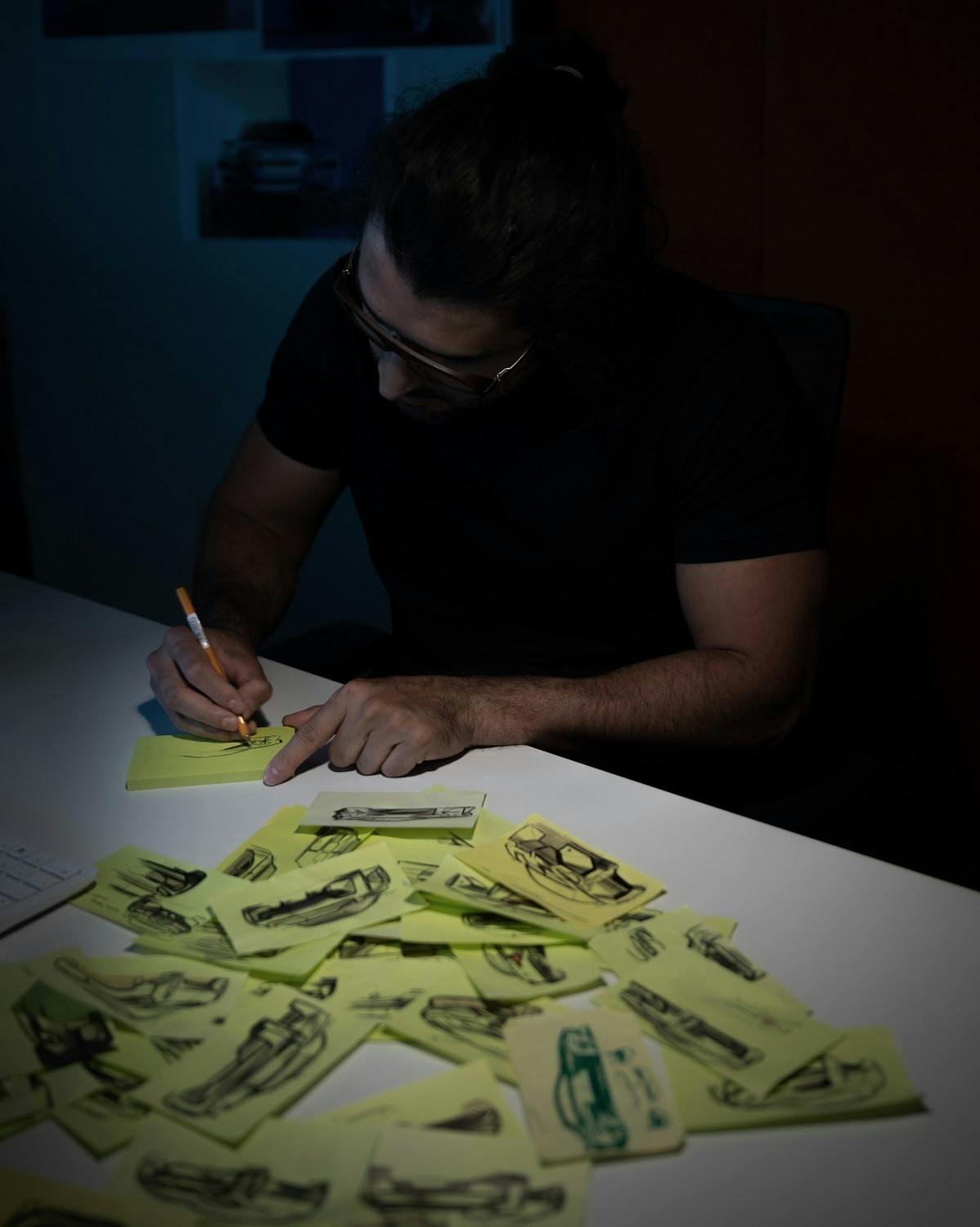
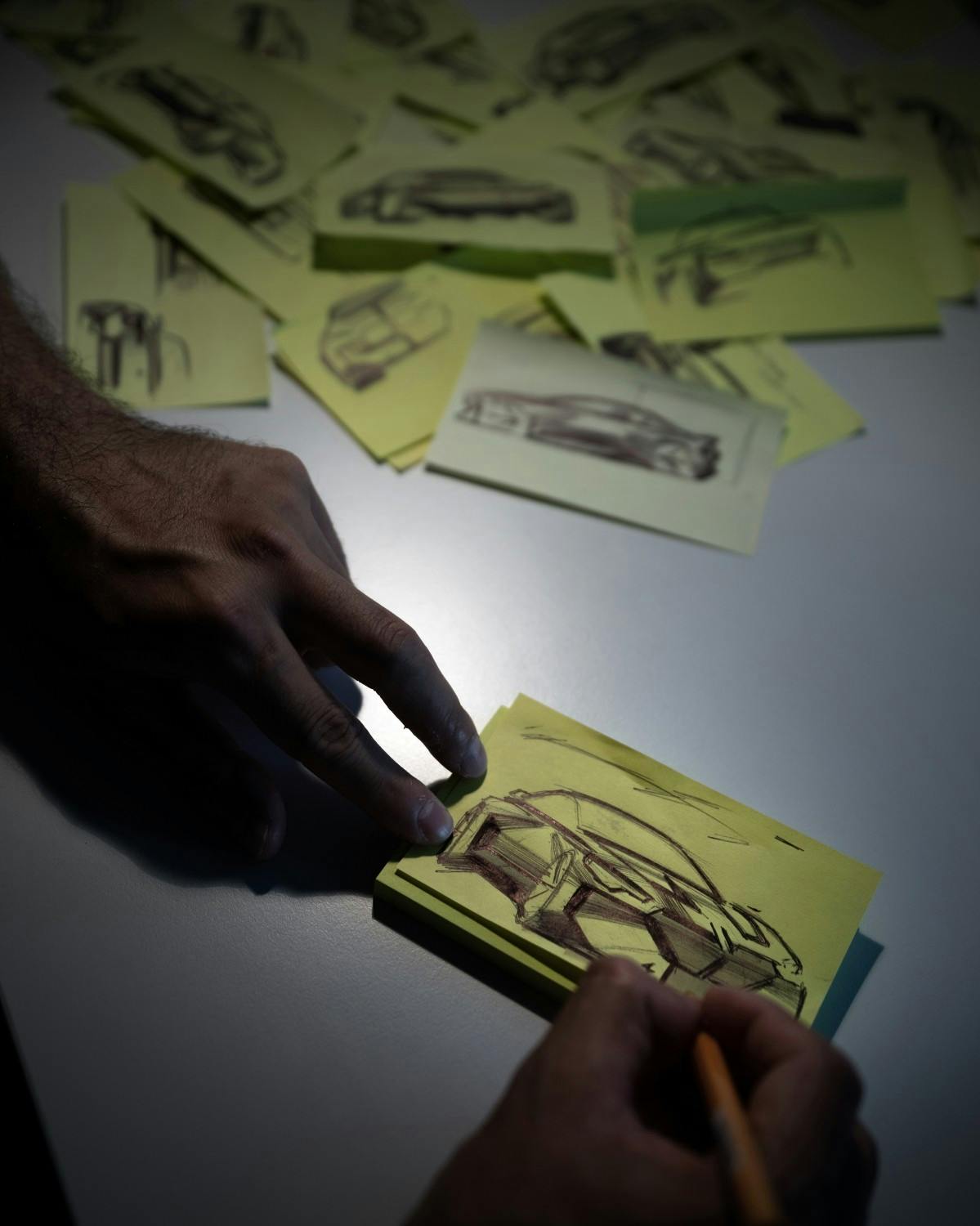
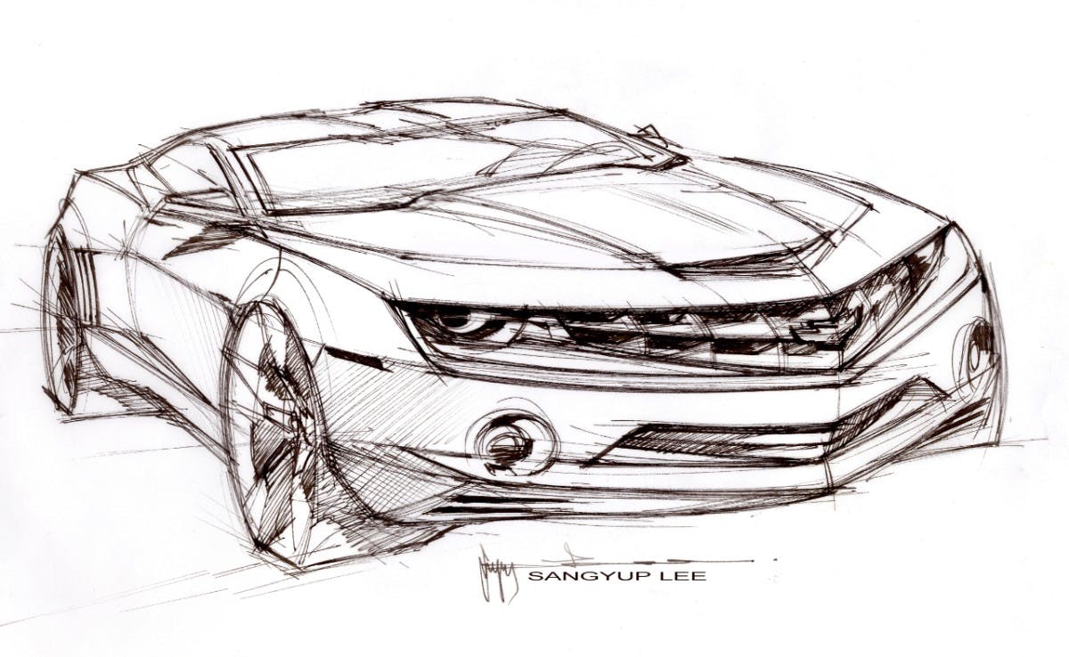
The start of a new project is the most open and creative phase of the design process. It’s usually the younger, junior designers (normally a couple of years out of grad school) who come up with most of the initial sketch work. I was always sketching (provided I wasn’t in meetings arguing with suppliers or engineering leaders several pay grades above me) or flat on my back on the studio floor prepping a model for review. People mock these so-called “mood images” as being fancy designer nonsense, but they are great visual shorthand for capturing impressions and themes you want to convey. I would spend a week or two churning out quick ballpoint “thumbnail” drawings, just a couple of inches in size with only a few lines, filling up sheets of A4 paper with ideas until I found something I liked. Then I’d do something slightly bigger and more detailed.
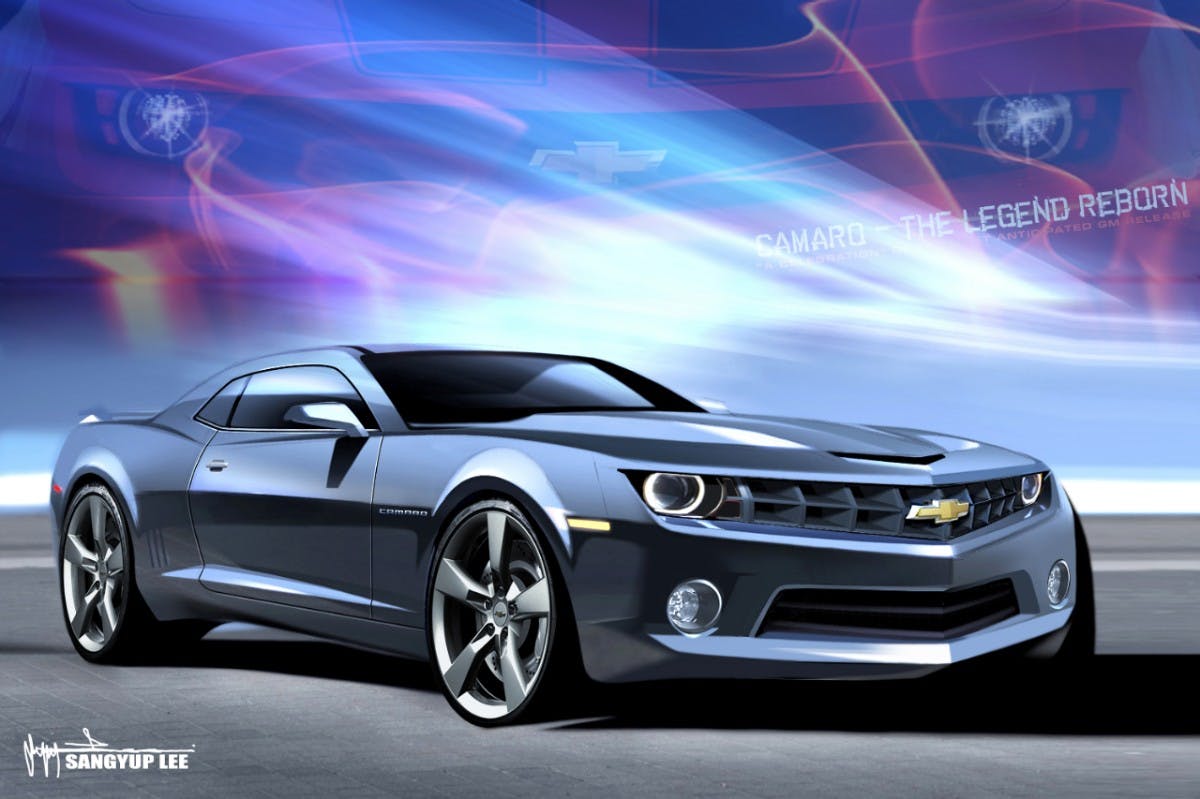
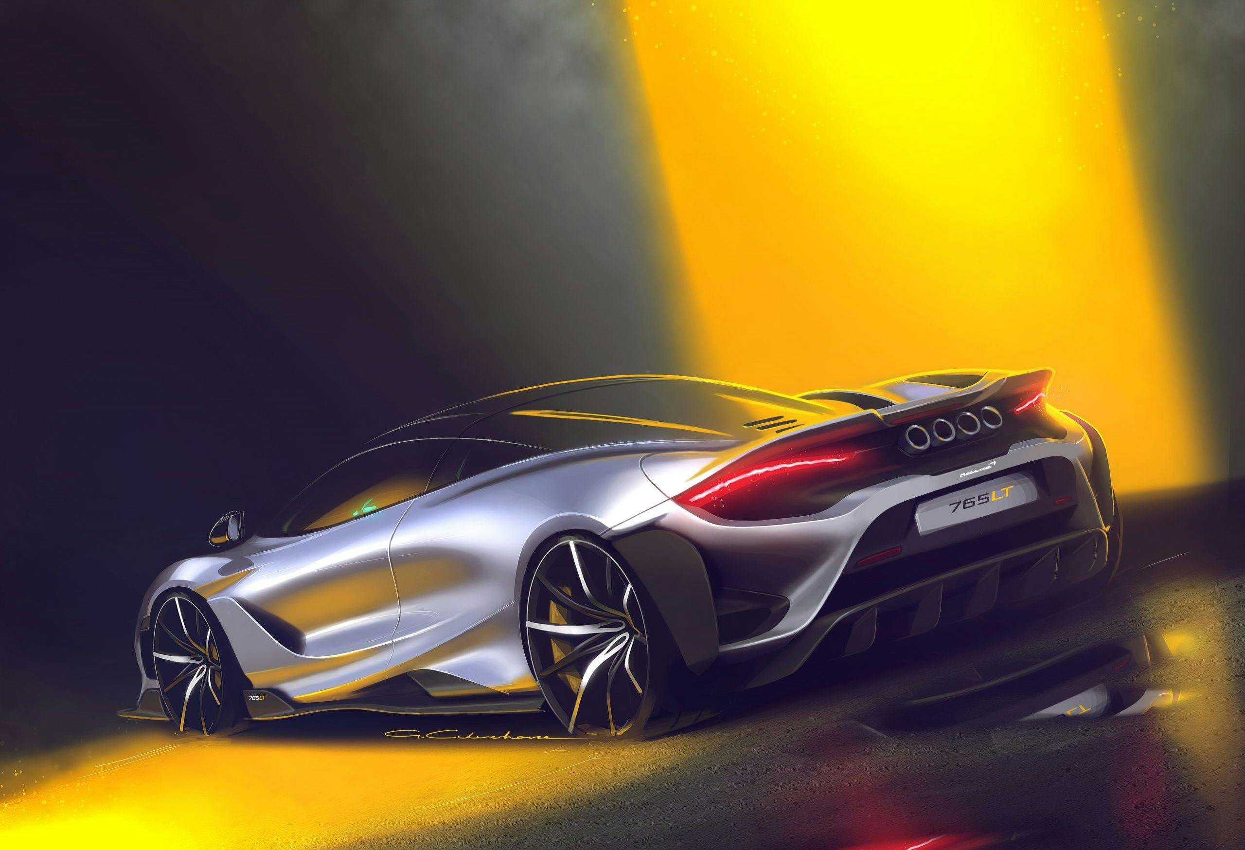
Designers have their own individual styles and inspirations that come through in their work. A design manager can look at a board of work and know who has drawn what. When a designer has narrowed down their idea, the next step is to produce more detailed sketches (or renders, if you want to sound like a pro) in Adobe Photoshop. Adding in details, color, shading, reflections and shadows brings the design to life and jazzes up the presentation level so it’s suitable for review.
It’s at this juncture where a common complaint arises: “Designers sketch everything with gun slot windows and 30-inch wheels, that’s not realistic!” Yes, and we know that. But remember—this stage is about selling the idea and its themes. It’s sizzle, not the steak. Engineering decisions around particulars like wheelbase, track, body in white hard points, aren’t likely yet set in stone, and even if they are, a designer does not need worry about them at this stage. Like any creative process, it’s about starting out loose and unconstrained before getting down into the weeds. You can’t edit a film before you’ve shot a single frame, or mix your record before you have a killer riff. Designing cars is no different.
Marketplace
Buy and sell classics with confidence
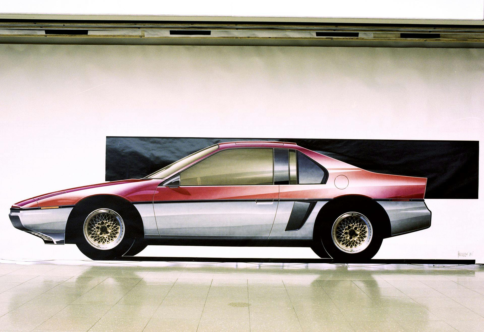
The renders you are used to seeing today are all produced digitally, but perhaps you’ve seen the amazing analog renderings from back in the day. Those were all done in chalk, pastel and markers on colored paper, the loss of which is something that traditionalists lament because of the intangible artistic quality imbued by this traditional way of working. The reality is that digital renders are quicker, cleaner, and more flexible when massaging the sketch (i.e. make the wheels bigger!), churning out variants (the same sketch with five different front facias, or side views with different wheel rims) and correcting mistakes. Even professionals get it wrong sometimes.
Once a wall of renders is up, a design manager or, depending on the size of the studio, senior design manager reviews them. This person identifies renderings with potential, picks out favorites, and if nothing knocks their socks off they request another round of work. You might get singled out to argue for your design; once I suggested repositioning a replacement vehicle as a different kind of car altogether. (Out of that came the ultimate, withering “great idea, but no” response from the head of the studio, though my line manager loved it.) Design sketches released as promotional hype for an upcoming model reflect the final design, except with slightly bigger wheels, and they are created in an artsy style. You rarely see these development sketches, because manufacturers want to keep ideas in their back pocket possible use in the future.
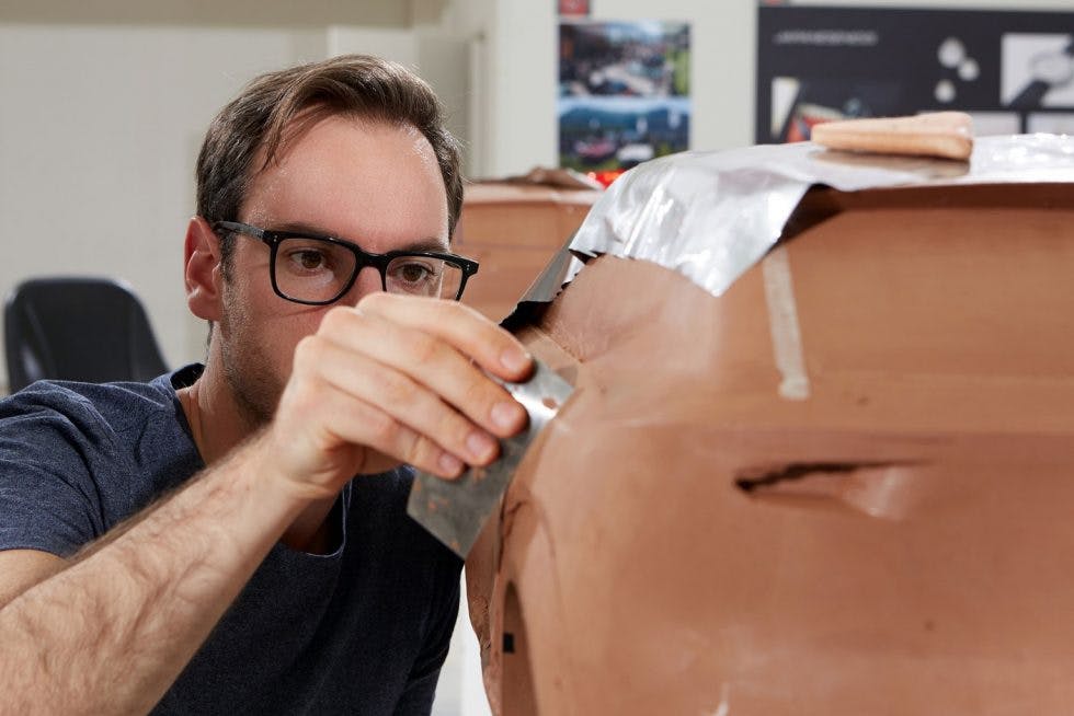
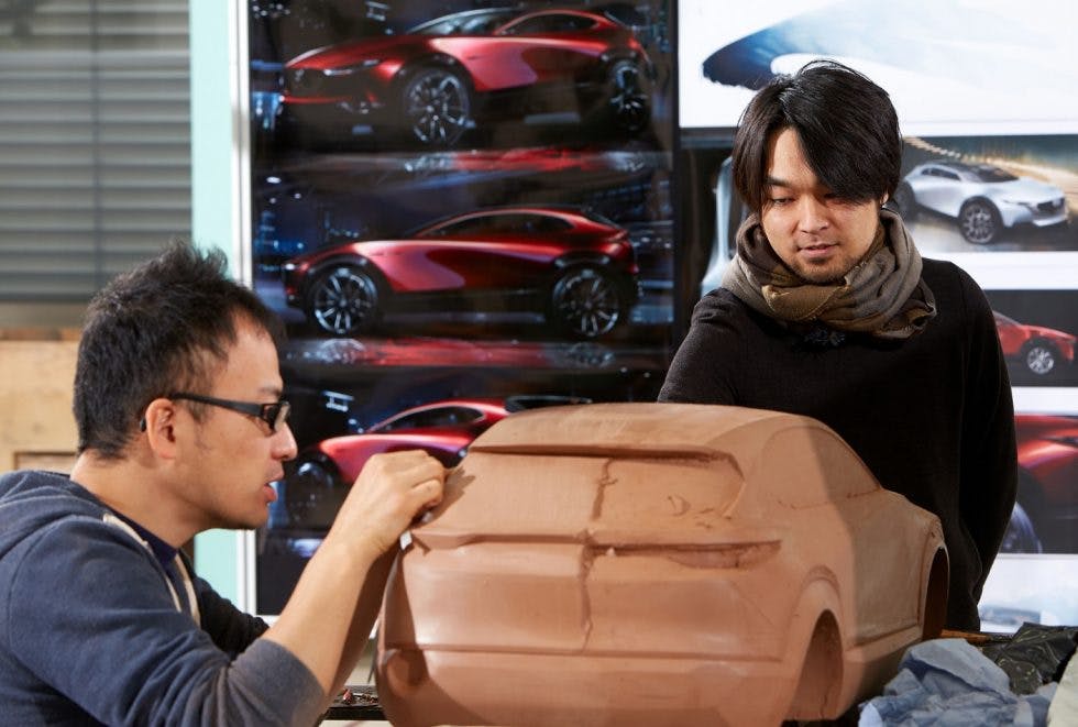
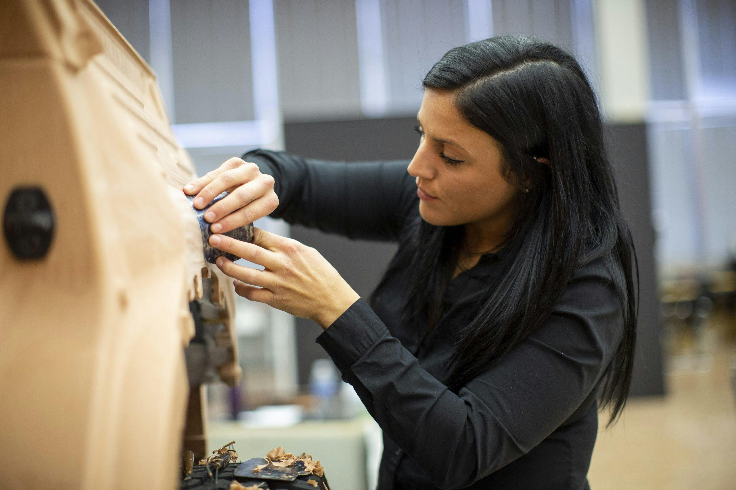
Once a handful of prospects are selected, the next stage is the move into modeling. Clay, digital, or more likely both, are created by clay sculptors and CAD modelers working in Autodesk Alias. (We’ll cover this in a later article). The clay models are usually between quarter and eighth scale and made by hand, but some may go to full size if it truly wowed management. A lot of this depends on the size of the studio, not to mention the resources and time available.
Tight communication between designers and modelers is key in figuring out the transition from a 2D drawing to a 3D model. How does this surface work? Can we get more tension in this line? Add a bit of height into that grill, or lower the roofline at the back a touch? It’s a two-way process with the designer bringing the aesthetic sensibility and the modeler’s practicality and creative problem solving skills. Designers use tape directly on the clay surface (usually long after the clay people have gone home) to try out different lines, and get a feel for what works. It all helps guide their thinking.
Once the models are completed there are more reviews involving more people. The beauty of small clays is they can sit out of the way in the studio and be viewed by any designer at any time, so there is lots of scope for “constructive feedback.” Digital models can be placed alongside current vehicles, competitor vehicles, and dropped into different environments to see how they look. They also provide the base data for milling a full-size clay when required. A ton of tinkering happens between these reviews, and the senior designer is more than willing to come along and ruin your hard work. Certain things I knew would absolutely not fly with the boss, no matter how good they looked, because they didn’t fit in with his vision for the brand. It’s wasn’t even worth the effort to try.
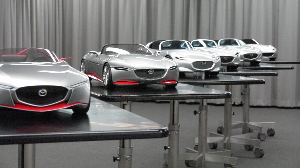
Eventually, after a lot of back and forth including involvement with the chief designer (normally the person fans know by name, or who is featured in marketing videos), an overall favorite will emerge from this slightly chaotic process. Think of it like a corporate battle royale in miniature; there can be only one winner. That final theme will then be worked up into a full-size clay model.

So, your design has been picked and turned into a full-size clay! What’s next? Now, a design manager is assigned to shepherd this thing toward its final outcome. We are still very much in the creative stage—details like light graphics, grilles, vents, feature lines, bumper shapes, exhaust openings are completely up for grabs. Loads of different ideas are mocked up onto these models. If chassis hard points become fixed, they can be incorporated into the model or a new one is milled. It’s not unusual to have multiple full-size models of the same car on different wheelbases, for example, to ensure that extra 50 mm needed for more legroom isn’t going to completely mess things up.
A final design is born after several months of tickling, taping, swearing, standing around, pointing, scraping clay, and wheeling models into the sunshine or pouring rain. This product represents the design vision—an idealized version of what is required. A master recording.

In the following the next couple of years, a lot more work will to transform this design into an actual production design. Next time in our series, we’ll look at the various roles in the studio that make the design into a functioning, buildable, road-legal vehicle.

