Media | Articles
Vellum Venom Vignette: Avoiding the Jungle of Frontover Accidents
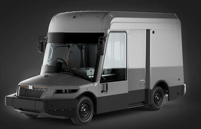
While not surprised, I am disappointed in how the United States Postal Service’s (USPS) new delivery vehicle has been mocked by car enthusiasts and the general public. Sure, it’s pretty ugly by the standards of the modern automobile. But the design of this Next Generation Delivery Vehicle (NGDV) is actually thoughtful and intelligent. The design centered around the needs of a diverse group of people, and Oshkosh expertly crafted a bespoke delivery vehicle to fit the bill.
But the NGDV shouldn’t be so unique, as its design addresses the growing problem of forward visibility and the senseless deaths it causes in suburban settings. Since Vellum Venom is a car design column, let’s bring it back down to the product level.

From a styling perspective, the NGDV is ugly on proportions alone. There is way too much roof height, and possibly not enough macho-ness in the tiny engine compartment. From a rear three-quarter view it looks like a triangular Toblerone chocolate bar that someone bit off the top.

But there’s more going on: note the hard bend and transitional panel between the roof and side panels. Not only does the back end slant like the old Grumman LLV before it, there’s a strong taper in the body side. That taper allows natural light and shadows play a game with the body, creating an architectural quality magnified by cut lines which make panel replacements easier.
The gray trim indicates places of high traffic, where anything from loading docks to obstacles on the street can mar the surface. Putting gray trim around the back “hoop” of the rear door might be unnecessary given USPS’ wardrobe requirements, but it provides both cohesiveness and a handy place to plop in lights, and sensors/cameras. (The latter ensures these bits won’t detract from the Toblerone-esque design.)
Marketplace
Buy and sell classics with confidence
Now is a good time to mention this Vellum Venom article was inspired by a quick scan of the NGDV’s official spec sheet. And doing so ensures we learn why the final product looks so controversial.

The aforementioned insanity of the NGDV’s roof height comes from mandates on the seating, standing, and ingress/egress of “95% of the operator population.” That includes employees ranging from 4’11” tall women up to 6’2″ men. Which explains the overall height, but that bizarre windscreen and hood is likely formed from the following requirement:
“The vehicle shall provide an unobstructed view from the 5th-percentile-female and 95th- percentile-male reference eye locations to a point 2.1m (83 in.) forward of the forward plane at the intersection of the ground and centerline planes.”
This excerpt from the spec sheet is not easy to digest. More digging was needed to learn that the “centerline plane” is an imaginary line that splits the steering wheel into two equal halves. That sounds like a very short distance, so let’s put this visibility challenge to the test: I own truck that I believe to have good visibility, and there’s a tape measure and movable object just a few feet away from it.

Perhaps I misunderstood the assignment, but I doubt I’m too far off: Look at the last photo of the NGDV, as the dashboard has a tumor-like bulge where the gauge cluster rises up to a shockingly tall steering wheel.
Even if my truck was the 1993-97 Ranger with the not-swollen front fascia, there’s no way I could see that wheelbarrow parked 83 inches away from my steering wheel. I only saw the wheelbarrow’s back handles after propping myself over the steering wheel and pressing my head against the headliner. Doing so was not comfortable, and it still generated a failing grade as per the NGDV’s guidelines!

Even if I got this completely wrong, the problem of frontover accidents from front blind spots is real. NBC did a disturbingly insightful demonstration with children to prove the point, but local news organizations knew the truth many years before. The imagery is terrifying, even more so when overlaying an imaginary yellow line (as per my test with the Ford Ranger).
I saw the issue firsthand when sampling a 2024 Cadillac Escalade for my 25th Anniversary special report. Seeing anything right in front of this Caddy was impossible, and that’s stressful for a journalist who’ll get in hot water if they bump into something in a six-figure SUV they do not own.

But that fully-loaded Caddy has a front facing camera, with a “dip” in the screen to ensure I see everything between me and the silver Honda Accord at the stop light. Too bad this technology ain’t cheap, and I suspect it will fail after 10+ years of vibrations and heat cycling.
I haven’t seen the NGDV in person, but there’s no doubt the short/sloping hood, droopy windscreen, and bloated dashboard presented in pictures minimize its front blind spot. In turn, it reduces driver fatigue (which I experienced when parking that Escalade) and will save lives in suburban settings. The latter is something Amazon is learning the hard way, and that’s unfortunate for individual and society alike.
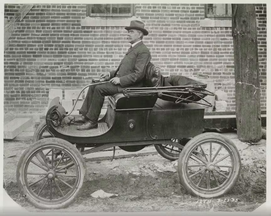
I reckon no American production vehicle made after the Curved Dash Oldsmobile has a driver sitting this high and mighty over the dashboard. It’s proof the NGDV is a wonderfully designed vehicle. You could make an argument that the “one-bite into a Toblerone” shape is also well styled, as it worked around the USPS’ packaging constraints with ease.
But common sense design shouldn’t be just for fleets of delivery vehicles. Using logic can make modern vehicles safer without the crutches of cameras and pricey TV screens. You, dear reader, need to appreciate Industrial Design just as much as the artistic world of Transportation Design. You need to applaud the NGDV, and demand its attributes for non-fleet vehicles.
Beauty fades, but good design is forever. The NGDV is indeed a beautiful machine, and now you know why.




I wouldn’t necessarily call it ugly… more non-standard proportions. Definitely an example of form following function.
For a purpose built vehicle like this styling is not a factor, but public vehicles styling already has taken too many hits.
Here is the we add all these safety things but yet we hold few responsible for their action the greatest reducer of accidents. They drive distracted, drunk and recently several people were killed by a stoned driver.
People just need to be responsible aware of their surroundings.
I have a vehicle now that wants to steer stop and warn me about everything but a Deere. Works sone times false signals other times. Cameras every place but I still use the mirrors and look before I back up.
These things that are made to help I feel make drivers less aware and responsible to their surroundings.
It is a utility vehicle. The beauty is in the unapologetic styling. These things will make great camper conversions down the line.
Trucks used to have more of this to them, but we as consumers prefer the pretty trucks (i.e., 67-72 C10). The small companies seemed to lean harder into the utility over style mode as well (International). This is one of the interesting things when looking at Studebaker, so much struggle between design and frugal utility compounded with economics of scale. Yet Coupe Express, Bourke Coupe in 53, crazy bullet-nose, and the R-series trucks are good looking (often less-so after refreshes). Even the final Daytona looked decent though almost none were made –certainly not ugly compared to the Chevy II of that moment. The earlier Lark on the other hand… has mixed reviews.
Great article that makes many good points. Alludes to the truth of why some of the safest cars have such a high fatality count (physics wins and the giant SUV didn’t see you before it ran you over).
Having worked on commercial vehicles my entire career, I find the design beautiful. I find beauty in something being designed for purpose, putting function over form. Utilitarian vehicles need to perform a job, and everything else is secondary.
Imo, they absolutely nailed the brief on this design. Garbage/recycling trucks and school buses should get similar front-end designs. Or at least we should embrace the cabover as the default design.
I read a comment on social media that said “It’s friend shaped!”
Sanjeev, when I started reading your article I thought tou were going to end with recommending that they go back to the drawing board and come up with the correct answer which would have been the 1970’s Jeep based vehicle the USPS had before they adopted the current mail truck in the 1980’s. As ithe Jeep was durable, long lasting, parts readily available, Four wheel drive, and easy to see out of. Say nothing for a design that has been in production since the war, so we know how to build them.
Nah, when you have to make a vehicle for a huge variation of potential employees, you look back to the Curved Dash Olds…and you demand nothing less.
DJ’s(i.e “the Mail Jeep) were never or hardly ever 4×4 or 4WD, they were RWD.
Based on my local driver full power full brake box to box.
We need Brembos!
Yup that is how they do it around here too, though to be fair full power isn’t that much.
Our guy had a full throttle 1-2 shift in the neighborhood. Local constabulary, unimpressed by this walked over from the adjacent park where his kids were playing and inquired about time savings vs risk. A good laugh, but we all know our postal person is unsafe.
The Amazon folks in the goofy Rivian vans must get tons of complaints. They creep around, in comparison.
I think the main problem here is the fact that the grille/headlight design doesn’t harmonize with the rest of the body – give it a less angry 80s style van face and i think the overall vehicle would look great.
You brought up a very good point. If the headlights were bigger and stood up from the body, the whole design would look friendlier. It would be appealing like a Nissan S-Cargo. Well, a very, very large S-Cargo.
You can defend the NGDV. I couldn’t care less about its “styling”(and, I drove an ISUZU Reach for far too long, on my former job). To tell me to “applaud the NGDV, and demand its attributes for non-fleet vehicles” is ludicrous. Therefore, I must conclude Sajeev Mehta is no automotive enthusiast, at all. And should probably not have his brain droppings associated with this website.
I find the “Vellum Venom” title insufferably pretentious too….
The 60’s era Jeep mail vehicle was not 4 wheel drive, and many of its components (like the frame) were not as robust as the CJ’s.
In my area they are using small panel vans. That seems more useful and less ugly.
Back in the 80’s, my sister-in-law used a ‘74 Chevy Vega to deliver mail on a rural route in our old hometown. Just pulled the back seat down and headed out. She isn’t still delivering mail but has retired and moved to Florida. After all those years she loved the Vega. Over close to 40 years, she has driven practically every kind of car, truck, SUV. The Vega died of rust infestation and lingered behind the shed in the backyard as did many old Vegas.
ugly? how ’bout them amazon ev delivery boxes??? talk about disproportional
I’m so glad they’ll be losing mail and packages in a new $60,000 ugly heap as opposed to the old paid for LLV’s…..progress.
What? Literally everyone agrees the LLVs need replaced as they are incredibly long in the tooth. It doesn’t matter how “paid for” a car is if it doesn’t get the job done.
The needs of a postal worker have changed, and this vehicle is designed with more modern needs in mind. If anything, new trucks might help prevent lost mail rather than make it worse.
Working with a shop who picked up and dropped off Canada Post postal vans for tires and repair up here in Canada, the Ford Transit vans were both horrible for visibility and too low for most users. I think the USPS made a good decision with this unit. However, I don’t think they needed to get gender-specific with their requirements – there are many 4’11 and 6’2″ humans… just sayin’