Media | Articles
Car Design Fundamentals: Graphics and DLO
In the last article we looked at proportions and visual weight, and how these two elements make a car “look” right. Once these are frozen, the next stage is to improve or massage a vehicle’s side view by altering its graphical appearance to reduce its visual weight, improve its stance, and to make the daylight opening (DLO) appearance look more cohesive and dynamic.
When designers talk about graphics, we discuss the impact of various features (wheels, wheel arches, lighting, trim pieces, pillars, feature lines, shut lines, grilles, exhaust tips, spoilers etc.) have on the subject’s overall appearance. Features form a large part of a design’s identity. When used carefully they add a great deal of depth and interest to your design. If they are ill-judged or overdone, they can ruin it.
When we first look at a vehicle, the first thing we see is the painted bodywork. As our eyes move around our visual cortex processes the raw input from our optical nerves and makes associations based on color, separation, contrast and recognition; those black round things are the tires, the silver parts the wheels, those clear panels are the glass, and so on. Manufacturers will play with color, trim pieces and feature lines to trick our eyes and subtly alter our perception of what we are seeing.
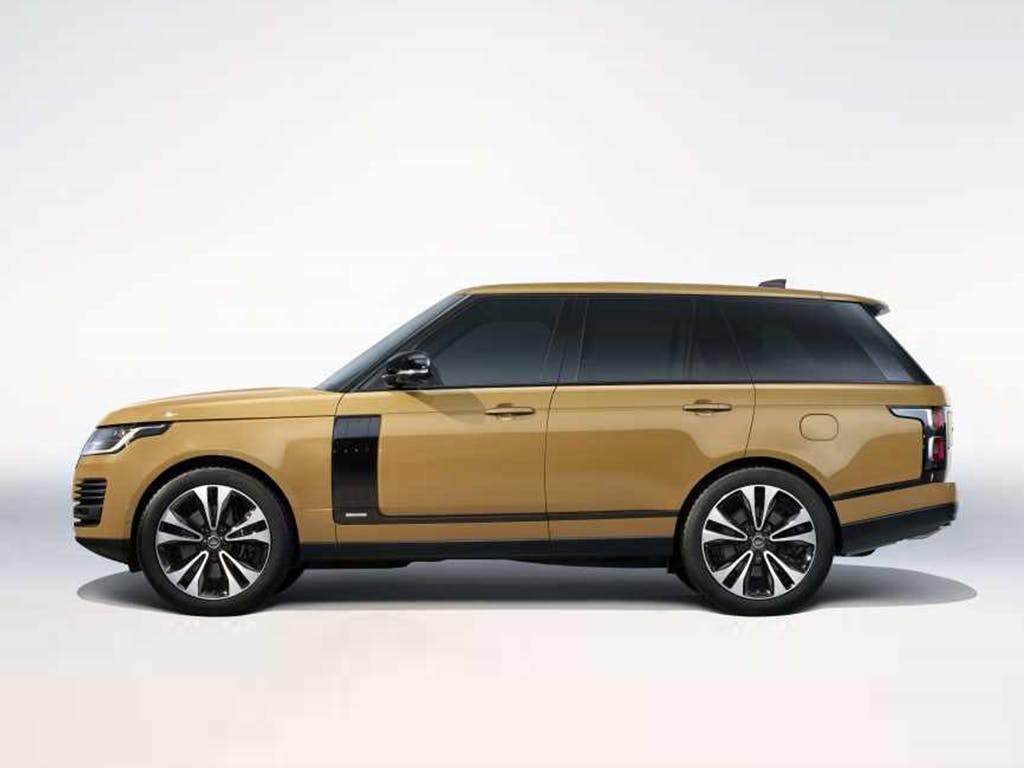
The most common area these tricks are applied to is the DLO. Blacking out the pillars will (along with privacy glass) alter the shape of the DLO, merging with the side glass to look more cohesive, make the vehicle look longer and more upscale, and in some cases create the appearance of a floating roof.
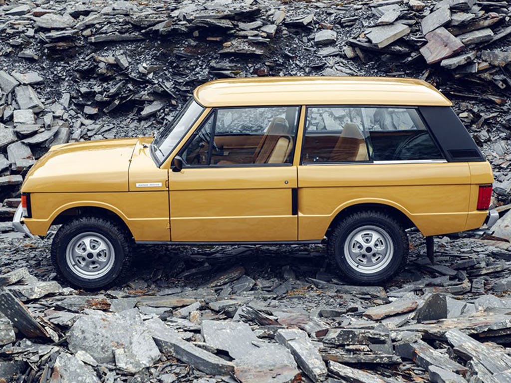
This isn’t a new idea. Although very early Range Rovers had a body-colored C pillar, it wasn’t long before it was covered in black vinyl and the door pillars painted black. The Range Rover floating roof was born and is still a key brand identifier today.
Marketplace
Buy and sell classics with confidence
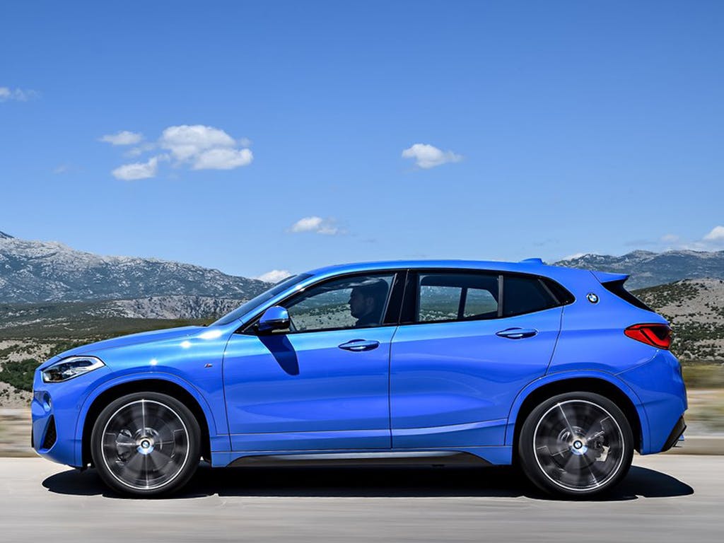
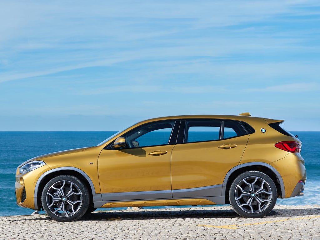
Because of their sheer bulk, it’s especially important with SUVs and CUVs to manage the appearance of the side view. Ideally the bottom line of the rocker should line up with wheel centers—this reduces the height of the body side and the increased ground clearance looks ready to tackle some serious off roading. But a raised floor means a higher step to entry, and it is bad for aerodynamic efficiency. Because of this, the lower rocker line has started to creep lower, resulting in a heavier, sagging appearance. (See BMW X2 above)
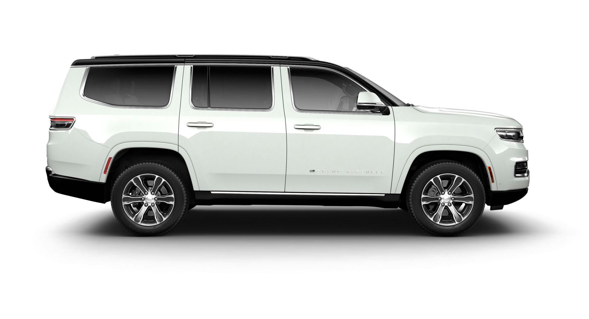
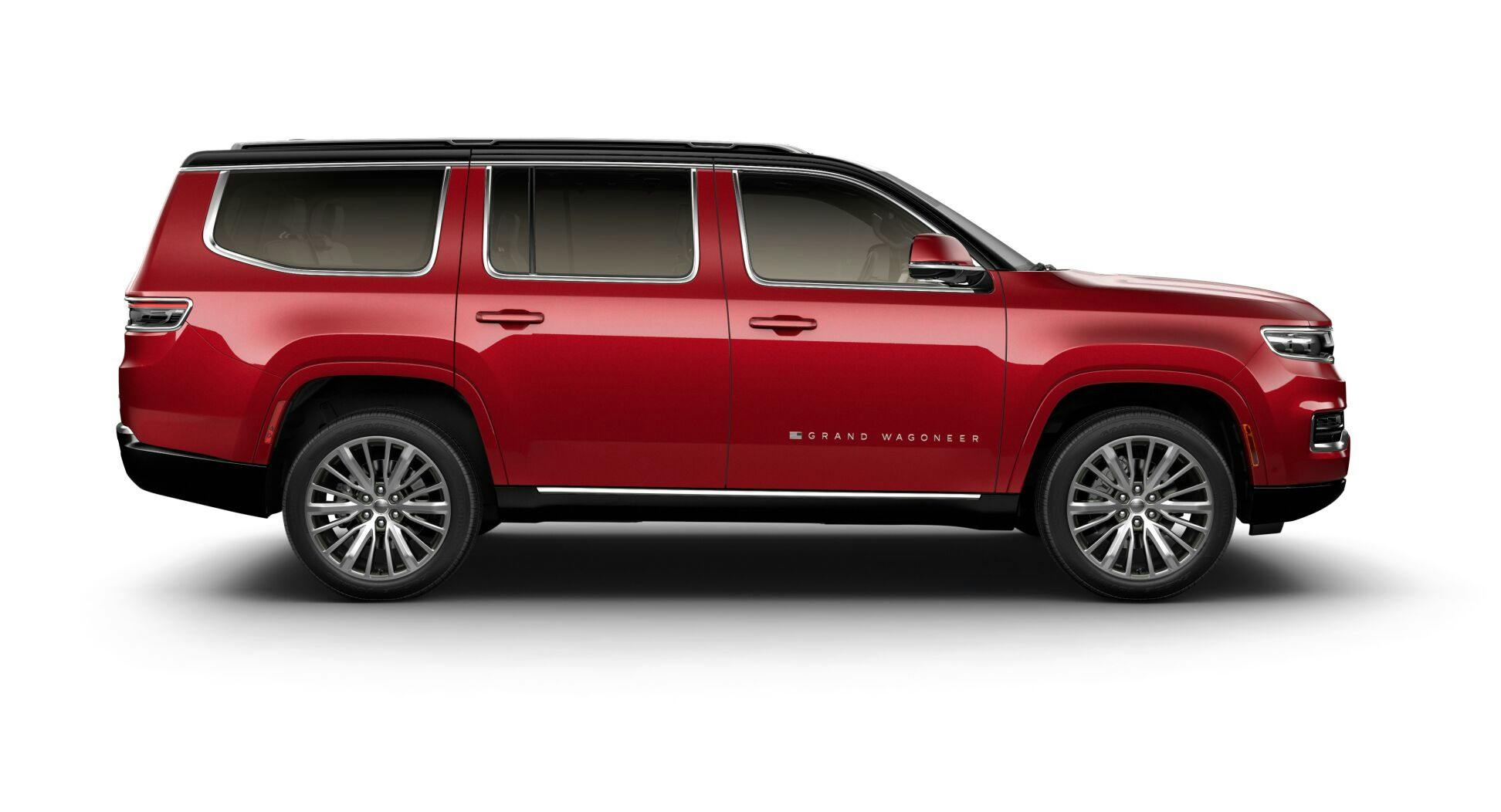
You can see the sag on the 2022 Jeep Wagoneer and Grand Wagoneer; all the bodywork below the wheel centers is colored black, helping to hide it and to blend it in with the wheel arch openings. But this car commits a huge visual sin; the pillars are body-colored—which breaks up the DLO and makes the side of the car appear bulky. The chrome trim around the side windows doesn’t help—in fact it draws attention to it. The overall effect looks cheap on an expensive car, because it’s something cheap cars used to do to save money.
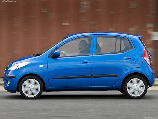
The wheeled penalty box above is a 2008 Hyundai i10, the very definition of a car for the parsimonious. Notice the lack of black paint on the B pillar. On sub-sub-compacts like this, the Bill of Materials is everything. You never see this nowadays, because no one wants to look miserly, even if they are.
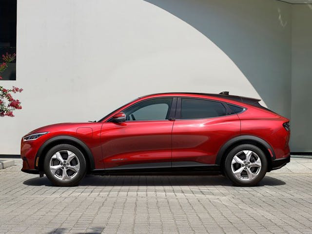
In addition to hiding a cars lower rocker line, black paint can also be used to alter the look of roof profile. On the 2021 Ford Mustang Mach-E, the painted cant rail dips much lower than the actual roof, which is black and extended rearwards to become the spoiler. You see the body color first, you read that as the shape of the volume, not noticing the profile is actually higher and straighter towards the back of the car. This has the side benefit of better aero efficiency and increased head and cargo space. The Mach-E also uses the lower cladding trick described earlier, but extends it to the wheel arch flats, making the wheel arches look bigger and reducing the visual weight of the body side. (This makes the standard car on 19-inch rims look a bit under-wheeled.)
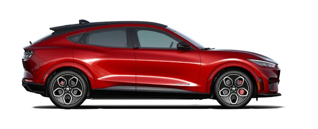
The only way to get the 20-inch rims is to go for the GT version, which retails for $18,000 extra. It isn’t accidental that the biggest, often best-looking versions are the most expensive ones. Marketing departments absolutely love making the best wheel options and appearance packages optional extras.
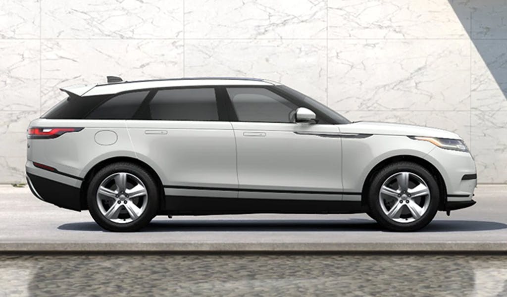
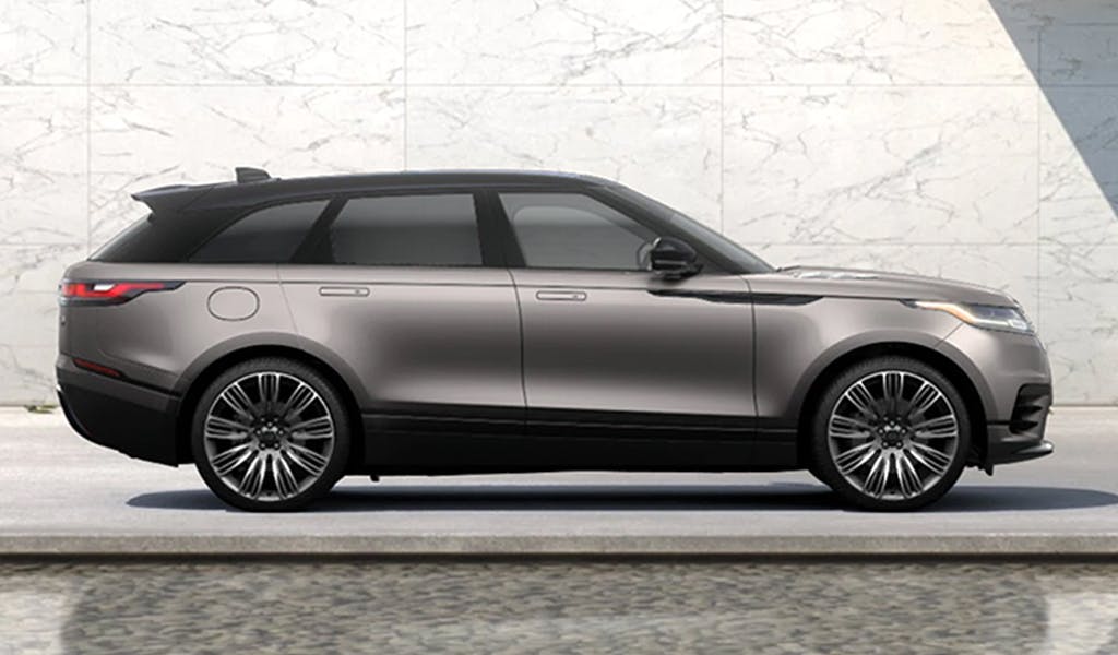
Back to our old friends at Land Rover. The Velar was lauded for its stunning looks, but all the models you see in the media are specced up to the eyeballs. The more prosaic models don’t have quite the same impact. The difference between the two pictured is about $9000.
If you caught my livestream you’ll know that one of my design pet peeves is black wheels (about the only car they work on for me is the OG L316 Defender). Why the dislike? You totally lose the wheels in the wheel arches, losing the contrast that is important in defining the graphic of a car. My old chief designer hated them as well, so we’d only ever present a model with them on when absolutely necessary. But he recognized customers liked them and as an optional extra they generated a lot of revenue. One of the most important things that a designer must do is to separate personal from professional taste. This is relevant to graphics or anything else in automobile design.
Now you know about DLOs, and that about wraps about this little series, Car Design Fundamentals. I hope you’ve enjoyed it, but don’t worry, I’ll be back with more design articles. I look forward to hearing your feedback, and if you have design things you’d like to read about, tell me so in the Community below!


I like this website, where you can see how cars design will change. And the comments.
I myself have an interest in how the technik is working or only bad working.
I have a lot of good ideas and suggestions for developments.
Great article! Would love to see more examples.
On the other hand, I do not agree about the DLO of the Wagoneer. It sure looks old-fashioned, but I think that is precisely the point. Nowadays, every car has blacked out B-pillars, so they do not look upmarket anymore. When I see the Wagoneer DLO, I get the designers are onto something, whereas in the i10 it just looks mundane and careless.
Looking massive I think also is the point of the Wagoneer.
In general, I see parts painted black to deceive as a cheap sign of bad design, and makes me look down on the car.
For example, if you get to paint the rocker panels body color and still get the visual height and weight that you wanted, that is commendable.
I do agree on black rims. Maybe with a colored circumference can do in some cars.