Media | Articles
Vellum Venom: 2002 BMW M5 (E39)
Hi there. My name is Sajeev Mehta, and this is Vellum Venom. Using my experience as a transportation design student and my decades studying everything else about cars, I will trace the history of the classiest car designs and show you the visual artistry and the painstaking technique behind the car designs you already love.
For this first Hagerty-hosted episode of Vellum Venom, let’s visually dissect the E39 5-Series BMW, commonly considered to represent the peak of BMW’s design language. Why is this particular Bimmer still so handsome, 25 years after its debut? Let’s take a look.

The regular BMW E39 was no styling slouch, but the power dome hood, taut fenders, and signature “angel eye” headlights (in later models) were missing…something.
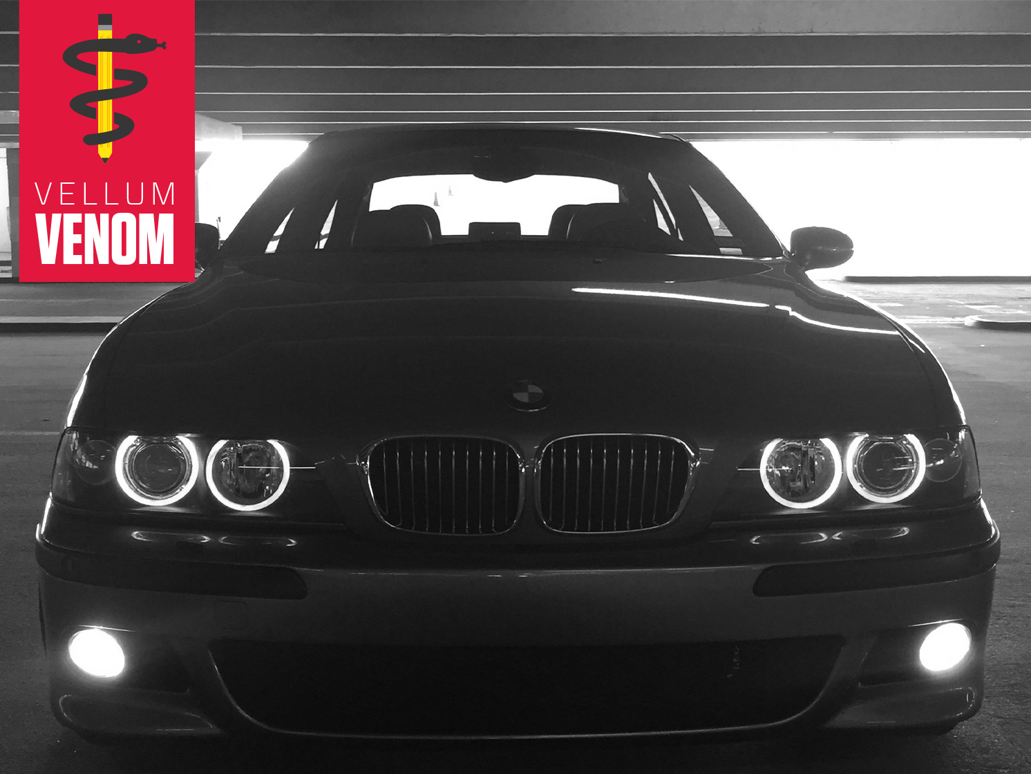
The M5’s gaping maw of a bumper was radical(ish) for its time. Complemented by the subtle wings in the lower air dam and those oval fog lights (unique to the M-series line), it tastefully signals the performance of an M-series.
Marketplace
Buy and sell classics with confidence
But fashion is a trickle-down affair: this bumper was repurposed for later iterations of the E39 540i Sport. Truly a sign of things to come, now that M-Sport packages are available on every current BMW.

Note how the kidney grilles perch atop the power dome hood’s plateau, resting in the bumper’s carved-out bed. Such a forward-leaning hood would never make production today, likely due to insurance repair concerns; it’s far cheaper to replace a bumper, instead of a bumper and a hood.

Modest, straight lines are paired to muscular bulges, and BMW styling elements (four round headlights, kidney grilles, etc) logically fall into place.
Sadly, the inspiration for that “angel eye” aftermarket headlight craze lives in a cheap-looking black bucket. The front signal vs. side marker interplay is jarring, too.

Yet the two amber lights make sense at this angle.
The deep chin bumper, domed hood, and the fender’s surface tension contribute to a package worthy to house an M-series BMW.
While possibly inferior to a body-color treatment, the black bumper rub strip is likely by design. It’s a remnant of urban practicality, and keeps those massive parking sensor dots away from your attention. Function can be raw, and raw can be pretty?

A close-up view of the bumper’s assertive air dam and the M-series-unique ovoid fog lights shows its sporting intentions. Too bad the plastic block-off plate to the left is disappointingly crafted by today’s standards.

With the matching amber circle out of view, this amber wedge makes sense against that tightly stretched front fender. It starts a strong undertone that visually speeds an otherwise boring sedan body.

There’s even more tension from this angle, with a family resemblance to 5-ers of the past: this amber wedge is within spitting distance of the E34 5-series signal light’s shape, but integrated into a headlight assembly.

Perhaps the biggest reminder that the E39’s blueprint dates back to the mid ’90s is the strong “shelf” or “step” between bumper and front fascia, made more obvious by the sacrificial body color strip between bumper and headlight.
It’s inelegant—but remember that production cars always have assembly/collision repair compromises. We can’t all drive minimalist Aston Martins.

Be it a 3, 5, or 7-series from this era, the long lines creating the hood and headlights ensure everyone knows you bought the Ultimate Driving Machine.

Headlight washers have come a long way from these exposed units. At the time, integrated pop-up “doors” were just a few years away.

Disregard the fact that the M5 in these photos has been modified slightly, with a lowered stance, Brembo calipers, and deeply dished rear wheels—even the stock M5s look appropriately purposeful, muscular, and aggressive from this angle.
The 3D-effect, chrome shadow paint on M5-unique split spoke wheels truly make an M-series car from this era stand out over the base E39.

Such a signature look, marred by laziness: too bad that wheel emblems aren’t forced to install one way after mounting/balancing fresh rubber, ensuring correct orientation with an M-series logo.

The deeply dished rear wheels’ negative area accentuates the fender’s tension. The fade in, fade out, character line was necessary to avoid a hard edge on a terrible location.
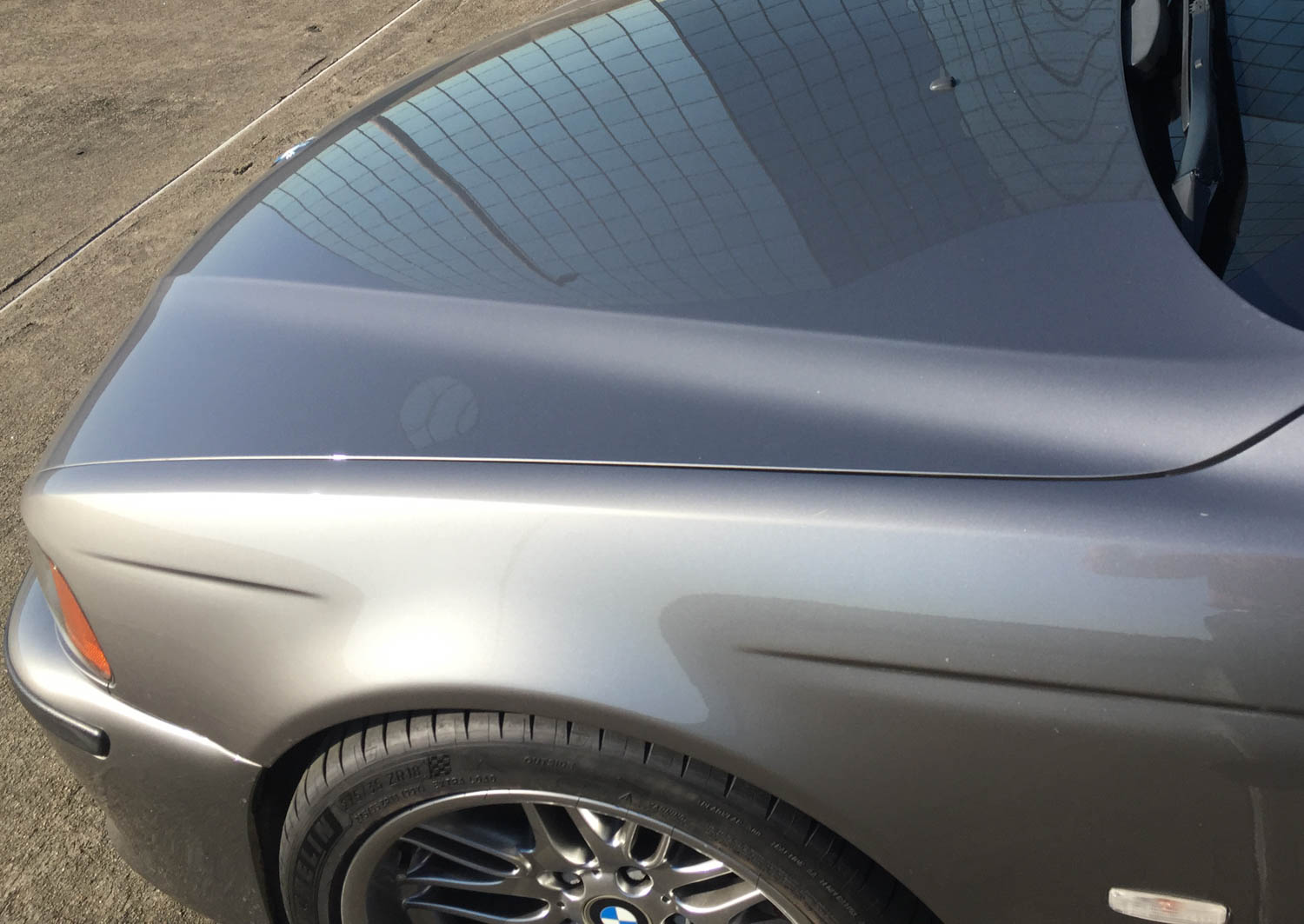
Combine muscular fender, subtle wheel flaring, and that domed hood for another example of the E39’s timeless brilliance.

Simply clad fenders and front doors—a purposeful (black) yet subtle (thin, chiseled) protective moulding with a rather obvious frame for an M5 decal. It’s a far cry from the current model’s fender-mounted cosmetics, tall cowl height, and aerodynamic design quirks.

Another perk of a low cowl height? This bizarre mismatch of fender with hood and DLO (Day Light Opening) and A-pillar isn’t nearly as awful as it is in so many modern vehicles—but this slow-moving transition from front to side helped set a dreadful precedent for automotive design.
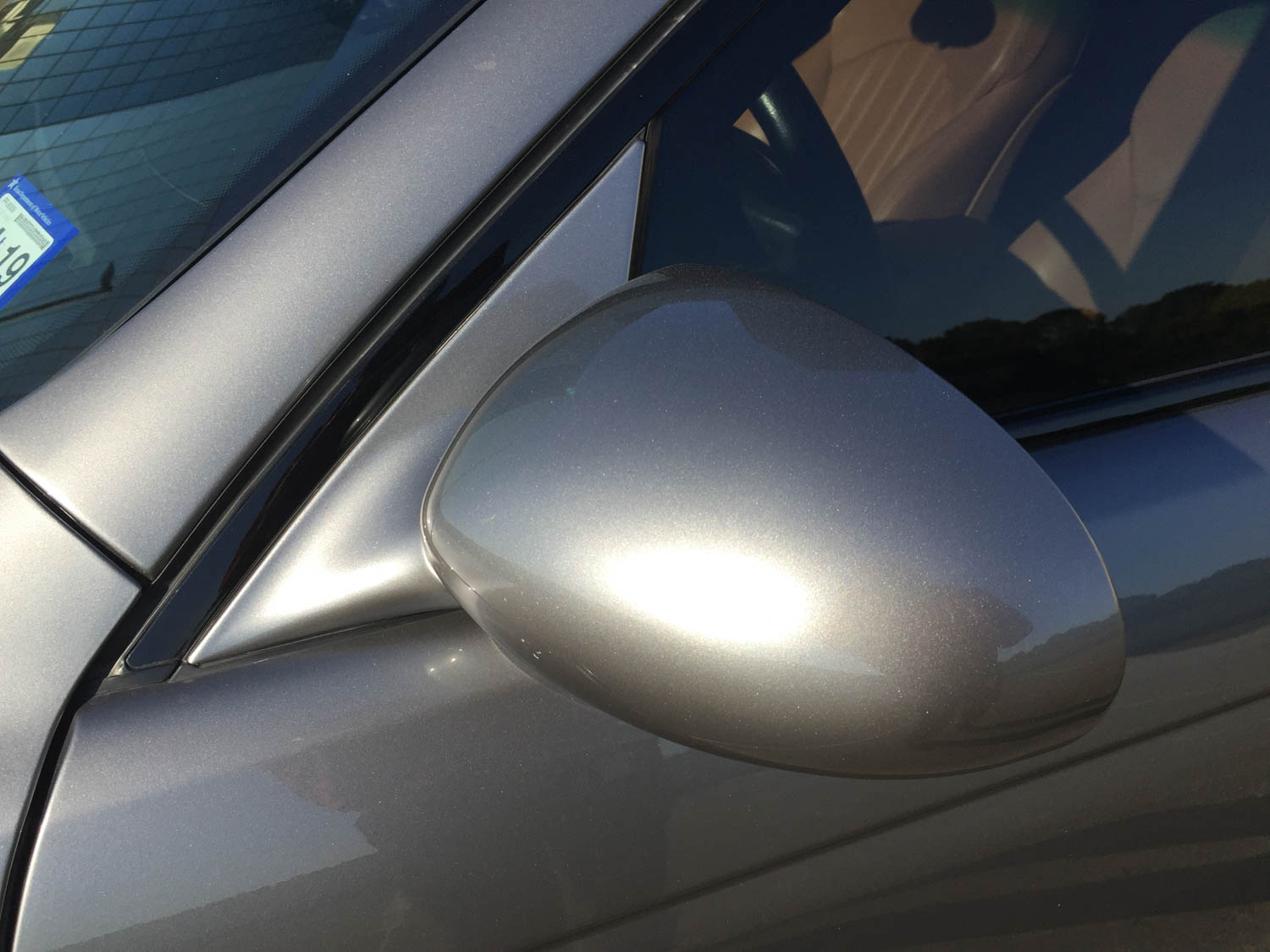
Sure, it woulda been nice to lower the A-pillar an inch closer to the ground. This is still a tidy intersection of fender, pillar, door, and side-view mirror by anyone’s metric. And there’s no DLO FAIL.
Wait a minute—what’s DLO FAIL, you ask? Simply stated, DLO FAIL is when a design team’s daylight opening won’t make production, resulting in glass replaced by plastic “cheater” panels.

Beyond the classic sedan profile: an elegant, flying sweep back of A-pillar, a gentle B-pillar lean with slow, natural transition from flat roof to C-pillar.
No jarring lines, and plenty of light available from this prodigious greenhouse.

The glass line flows down and backward in the classic Hofmeister kink, signifying a rear-wheel-drive platform in the BMW tradition. While the rear door doesn’t shadow the wheel arch’s natural form, notice how much of the door occupies the same plane as the wheel.

Not the easiest aperture to cross, but perhaps we should make sedans like this again, forgoing wannabe-CUV practicality?

From proper proportioning to integration of every element with an economy of line (i.e. only several long creases running parallel to the ground) this could only be a pre-Bangle BMW.

That lack of Bangle’s hallmark flame surfacing ensures a conventionally-shaped fuel door with just enough body curvature to keep it from being a boring rectangle.
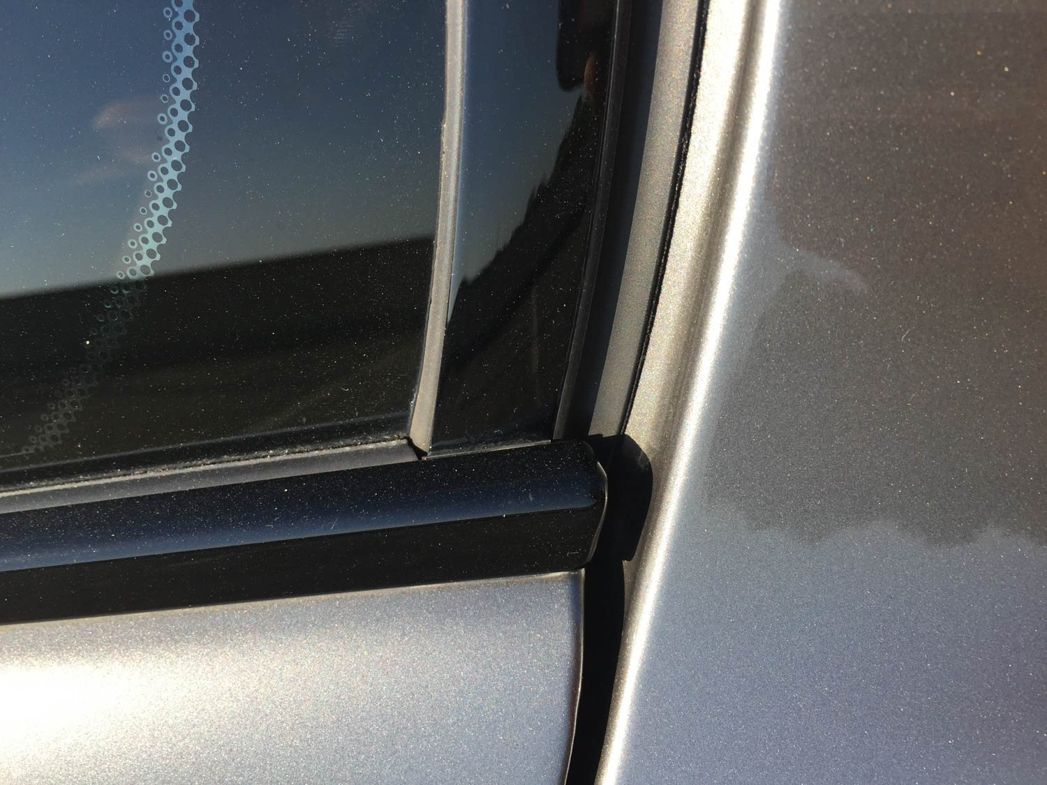
While BMW’s shadow line trim masks the problem, the slow and clumsy transition from side-to-bottom of the DLO is saddening.

Note how the body curves inward to meet the DLO, which logically continues into the C-pillar. It’s a natural flow accentuating the subtle tumblehome of the E39’s roofline.

The same logic applies to the hard crease from the front fender, past the doors, and into the quarter panel. This creates a natural, ergonomic point for the door handle.

When roof rack mounting points are so tightly constructed, they’re probably cooler than a nonfunctional trim in the same space.

Air gaps between rear windows and the roof are commonplace these days, but did you see them frequently when the E39 was new?

The gap up top complements the subtle decklid lip as it pauses to give the rear glass a little smooch.
The logical cutline from trunk to quarter panel would be inexcusably boring today.

The adhesive-backed spoiler might improve performance (as if), but its rearward curvature is too aggressive for the boxier deck lid. The bizarre transition at the trunk’s corner is a rare lapse of judgment.

Center high mount stop lamps (CHMSLs) used to live (and die, through baking) under a carpeted parcel shelf? Almost forgot about that.

There’s no substitute for a dished rear wheel nestled perfectly inside a taut quarter panel.
And is that another unique bumper, ensuring the M5’s distinctiveness when viewed both ahead and behind?

That same hard line with a soft curve not only complements the natural space for a door handle; it also does an admirable job showing off the transition from red to clear lens.

These redesigned, crystalized lights—added after a mid-model facelift—show how the E39 aped fashion trends: perhaps a bit much for a sedate sedan with roots in the early 1990s?

The four side-marker LED bulbs are a bit blunt in their implementation, considering the canvas size of all that chromed-out red.

Much like the front, the transition from quarter panel to rear includes a remarkably static vertical line.

Remember the body line that started at the front fender, went through the door handles and into the quarter panel? It follows the light around to the trunk!
Such logic makes for a clean, welcoming sight while walking around any E39.

The trunk lock cylinder lives in an unfortunately exposed, downmarket location.
And there’s something odd going on with those parking sensors.

Assuming the sensors are in the most efficient location, deleting this character line woulda been a better idea. Anything is better than hitting each other!

Unlike the trunk lock, the requisite tow hook enjoys a hidden door. And that M5 bumper has the right amount of muscle around those chrome exhausts to ensure this is never mistaken for a German taxi—unless you’re taking a ’Ring taxi, that is.

Note the shadows present from that hard line and soft curve. The interplay between sharp bends and gentle, light bends are what separate the subtle from the loud.

While the black rub strip is a bit overwhelming, the E39 M5’s design remains clean and subtle, with the right amount of performance boisterousness.
From the logical body panel transitions and the elegant curves of its practical greenhouse to bespoke bumpers with enough negative area to put sports cars on notice, the E39 M5 covers all bases without visually screaming at the top of its lungs. We’d be immensely lucky to see this design aesthetic come back soon.
Vellum Venom will return; if you have suggestions for a car on which we should train our lens, please let me know in the forum discussion!
