Venom Vellum: 1972 Continental Mark IV
In my thirteen years of Continental Mark IV ownership, I’ve grown to believe that badge engineering is acceptable—at least when a face this stunning is selling the goods. Ford and Lincoln tried the strategy again 34 years later, when the (then new) Fusion-based, Lincoln Zephyr/MKZ hit the streets in 2006. Here’s the kicker: The Lincoln-Fusion had a unique interior to accompany each badge; the Mark IV was essentially a Thunderbird with a different beak and a rounder butt. Perhaps time heals all wounds, however, because a 2000s-era, wrong-wheel-drive sedan will never turn heads like a Mark Series on its 49th birthday.
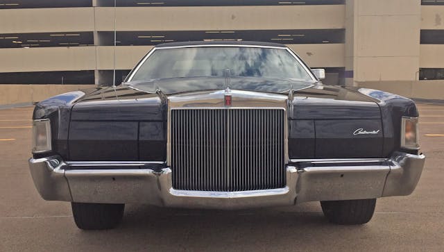
Covered headlights give the Continental Mark IV a clutter-free demeanor, letting the eyes focus on that grille and the tapered, sculptural front bumper. It’s a logical yet radical rethink of the DNA forged by the outgoing Continental Mark III.
While a far cry from a Porsche 911’s heritage, the Mark IV’s front clip proves that design DNA inspires future generations; the look influenced Lincolns well into the 1990s.
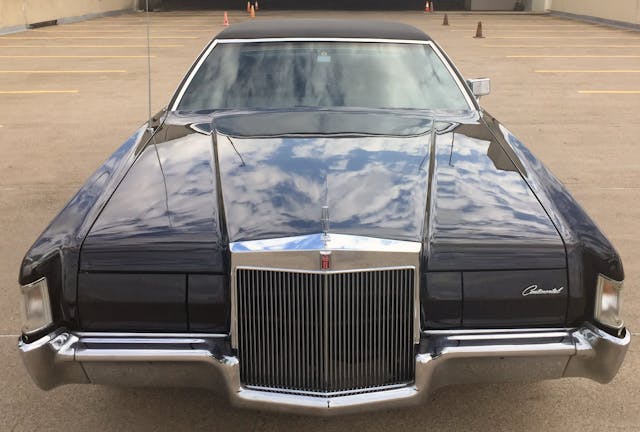
DNA and all that nonsense is great, since the Ford Thunderbird influence stops with the Mark’s clean face, blade fenders, power-dome hood, and radically tall grille.
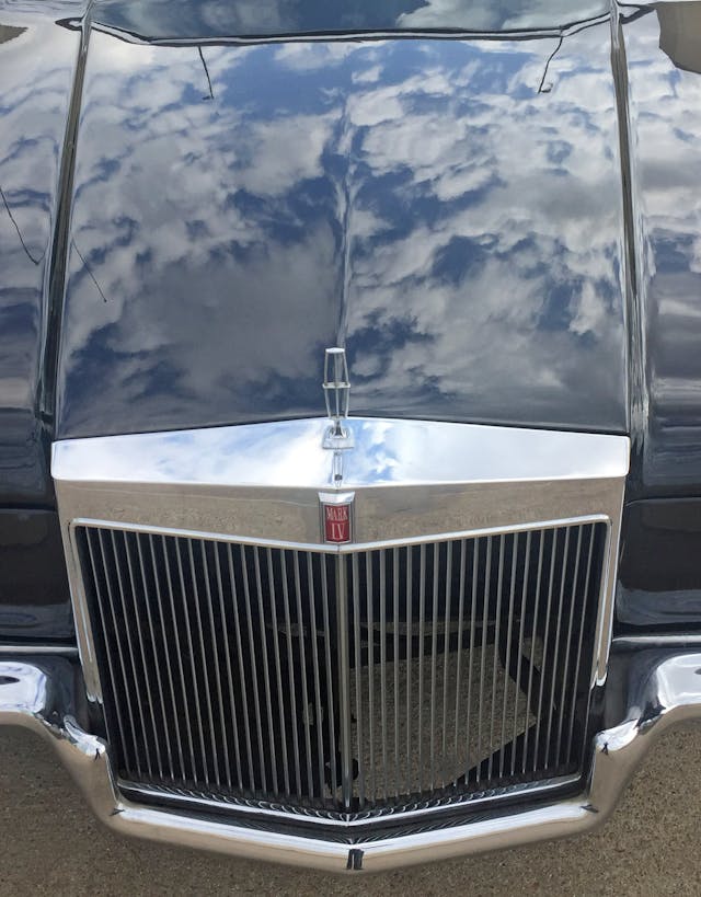
This 1972-only front clip sports, for lack of a better phrase, a floor-to-ceiling grille, an architectural element nestled behind a rail-thin chrome bumper. The power-domed hood logically begins from the grille’s chromed bevels, thus creating an air of exclusivity without resorting to the more assertive grille/hood textures seen on Cadillacs of the era.
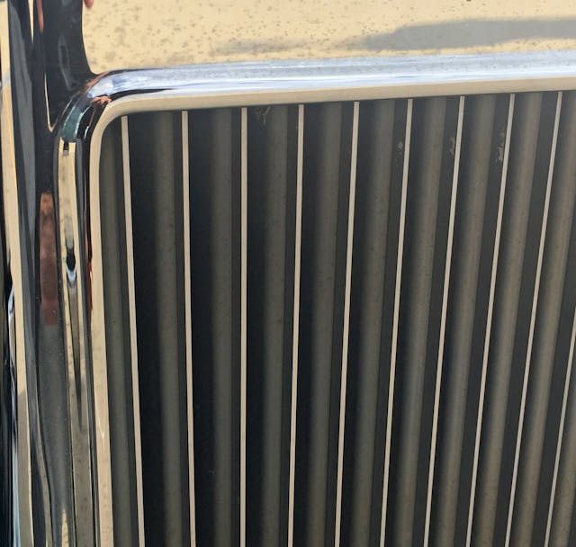
That’s not to say the Mark IV’s grille is just a bunch of flat planes. This rim makes the transition from grille shell to grille teeth both logical and packed with surface tension.
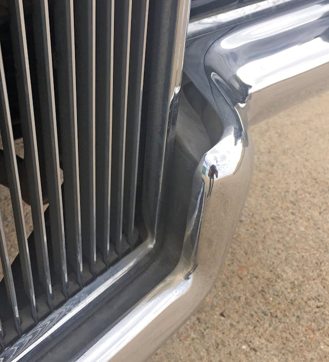
The bumper protects the grille from absolutely nothing upon impact. While this Mark came with the optional crossbar, I removed it shortly after taking ownership.
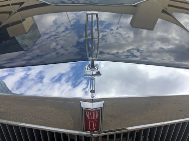
Here’s a better shot of the aforementioned planes/bevels, ending at vanishing points far to the left or right of the body.
Hey man, that’s a nice shot. This delicate hood ornament made its mark on Continentals for 12 more years.
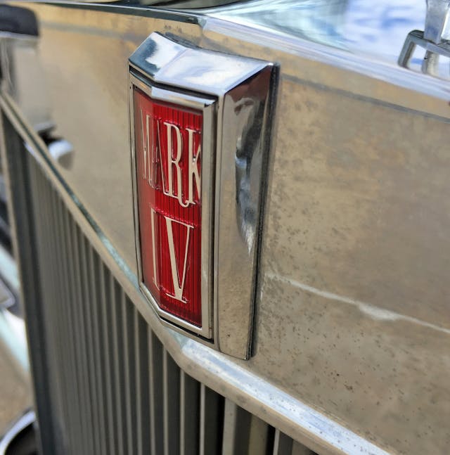
The Mark III’s beveled, scarlet emblem lost its Continental star (hence the hood ornament) when transitioning into the Mark IV but gained a thick metal frame so that it rests at a different plane than the grille. The emblem’s rimmed negative area makes a snazzy little black pinstripe, too.
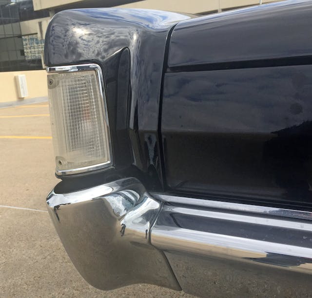
The sculpted chrome bumper is a three-piece affair: Corner end-caps emulate the trajectory of the blade fender, extending their shape downward and inward (underneath the body).
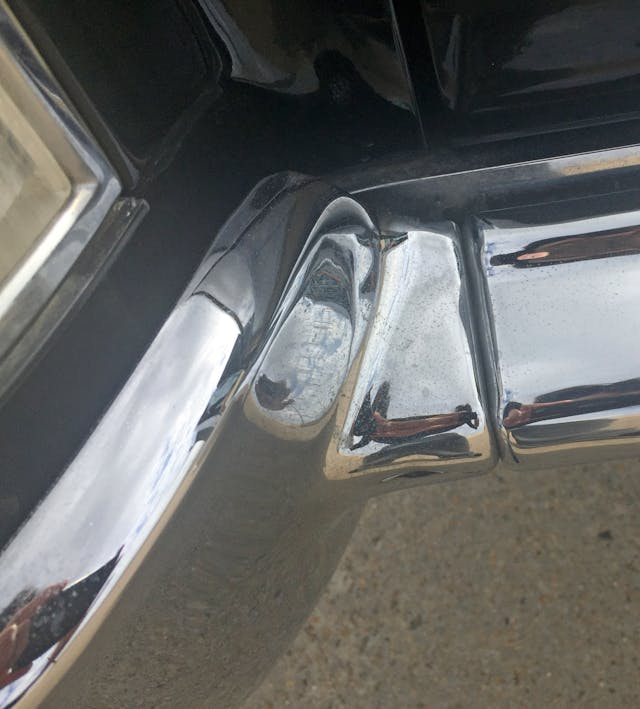
The bumper’s cutline doesn’t use the hard transition between the fender blade and the horizontal stretch, but at least the current cutline does match the headlight doors.
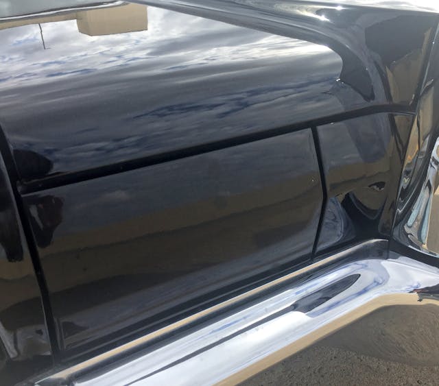
For the younger readers out there: Lincoln chose a more Audi-like path in the wake of Cadillac ostentatiousness. Sleek, minimal designs inspired by the suicide-door Continentals got even cleaner with the advent of covered headlights.
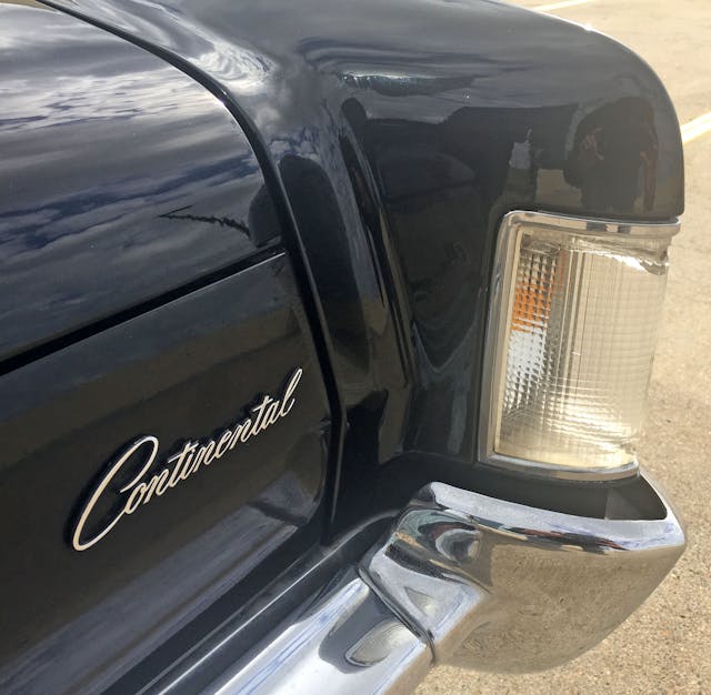
The obligatory Continental script emblem rests above a gentle bend that creates a “V” shape across the front fascia.
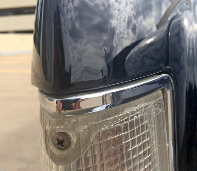
Sadly, it wasn’t until 1973 that Ford switched from exposed screws to mounting bolts inside the body.
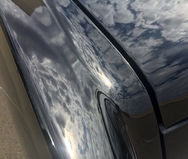
Notice how the fenders extend several inches ahead of the fascia: All this expensive metalwork gets crunched in the smallest of collisions.
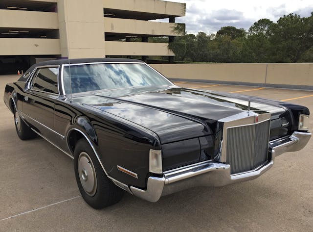
It’s miles away from a slab-sided 1961 Continental, but the Mark’s blade fenders definitely display brand continuity.
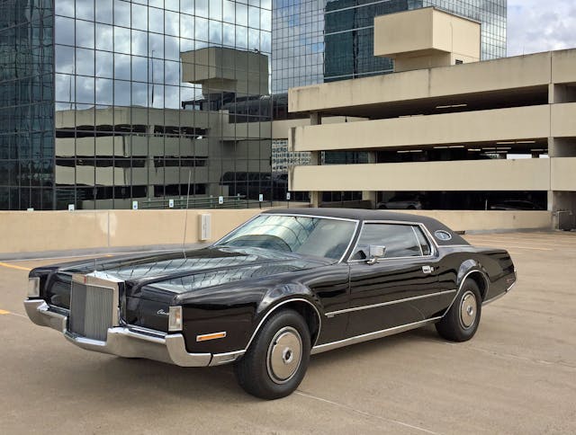
Those long, decadent fenders paired with the thrusting grille/hood make the 1972 Mark IV utterly unique. Downstream lies the problem: A problem of Thunderbirdian proportions.
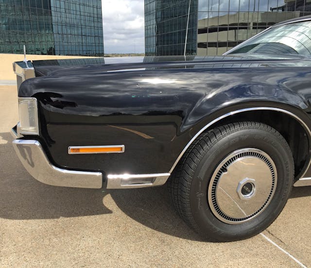
The bumper’s curvature is somewhat replicated in the lights: A parking/turn signal visually perches atop the bumper, the side marker sits lower, while the cornering light lives in a chrome panel that “feels” like it could be the bumper’s point of origin.
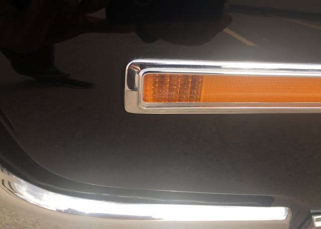
Shockingly, only the first inch illuminates. The rest is a reflector.
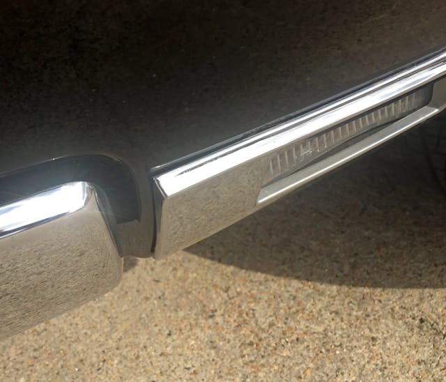
I mentioned the cornering light’s chrome panel only feels like it matches the bumper—because it clearly does not.
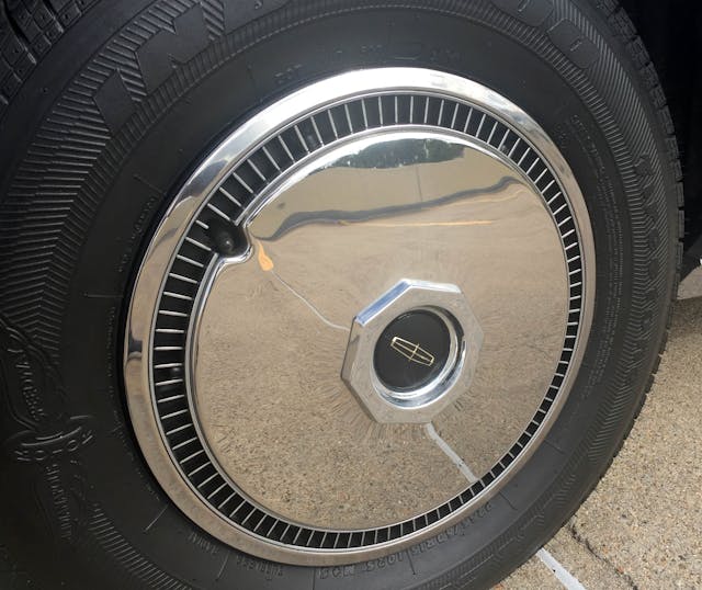
Lack of whitewall tires is unfortunate, but the tire size (and the wider steel wheels beneath) explains this is actually a sleeper Hot Rod Lincoln. While the motor makes itself known at times, the factory minimalist disc wheel covers are perfect for such a clean design.
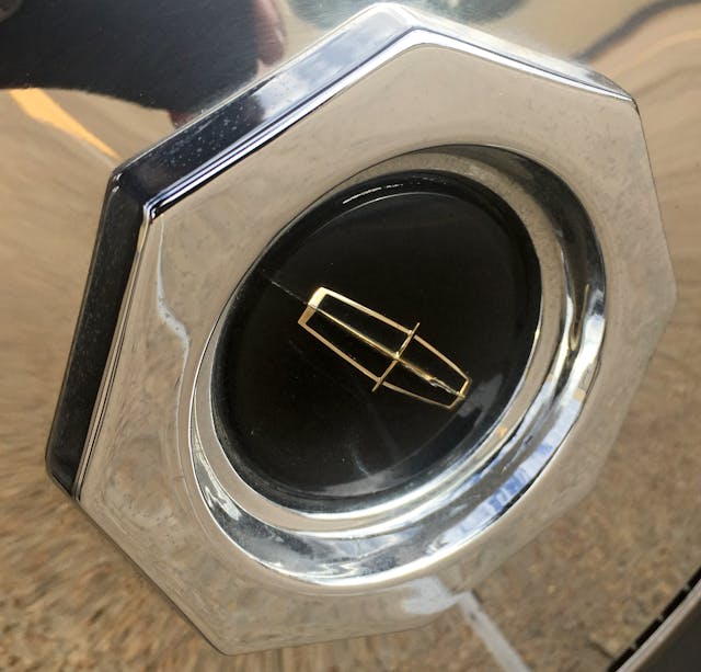
The octagonal wheel center with gold Continental star was a design hallmark for decades … until it wasn’t.
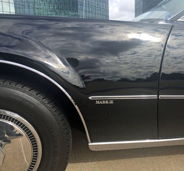
Cab-backward design is not space-efficient, but the tiny emblem and pinky-finger-thin rub-strip allow unfettered appreciation of all that wasted space.
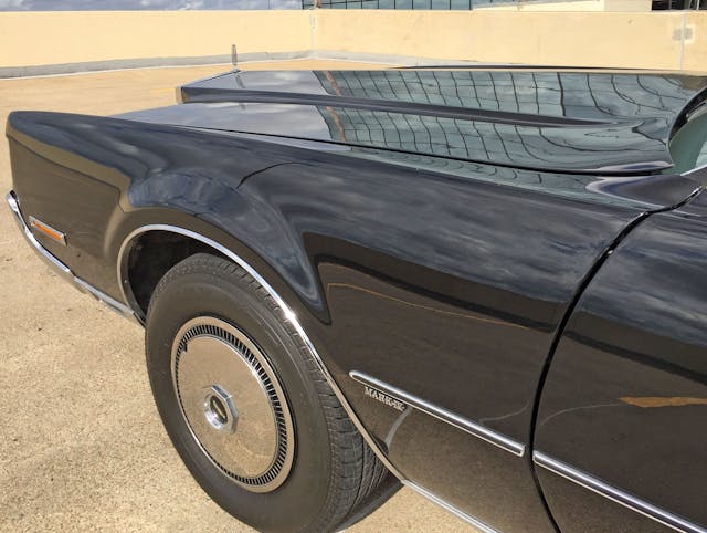
While the dash-to-axle ratio presents well, it gets lost when compared to the front overhang. Ferrari touring car this ain’t.
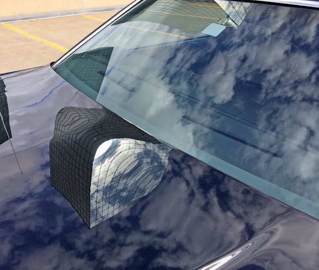
Another case of minimal design adding more excitement than the alternative. Invisible cowls/wipers need to make a comeback.
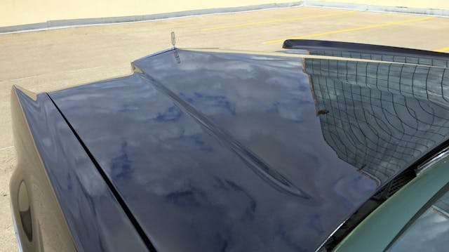
The best angle for the Mark IV’s blade fenders, wedge grille, and hood is still from behind, setting off the excellent use of negative area to best effect. The Mark’s designers and clay modelers spent quality time removing copious amounts of clay from this front end before the design made production.
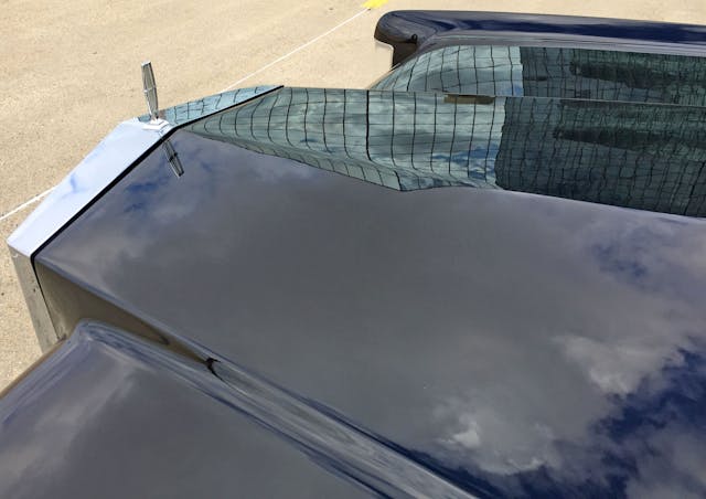
This balance of hard creases and gentle curves is absolutely perfect for a flagship luxury vehicle.

This design makes for a stunning picture of the road ahead, and parking is a breeze with those fenders.
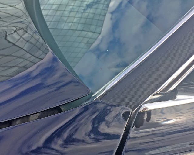
While panel gaps are inconsistent, the logical transition from fender to A-pillar is admirable. The edge of the hood also forms the line for the end of the fender and the beginning of the door’s DLO (daylight opening).
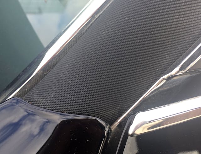
The addition of a texture (i.e. the vinyl roof) gives extra depth.

The sleek A-pillar and scalloped door turn into a gentle upward curve after the B-pillar. Too bad the same tooling was used for the 1972 Thunderbird.
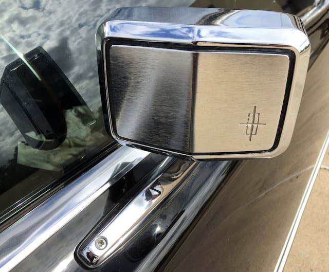
The mirror reminds you that the Mark ain’t no T-Bird, but its exposed screws are more offensive than the turn signals.
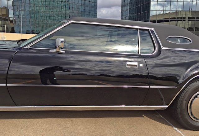
The subtle vinyl-top grain and oval quarter window (yes, this was the first Lincoln to wear the feature) set the Mark apart from the Thunderbird—for the better, too—but the two cars share the same sheetmetal underneath.
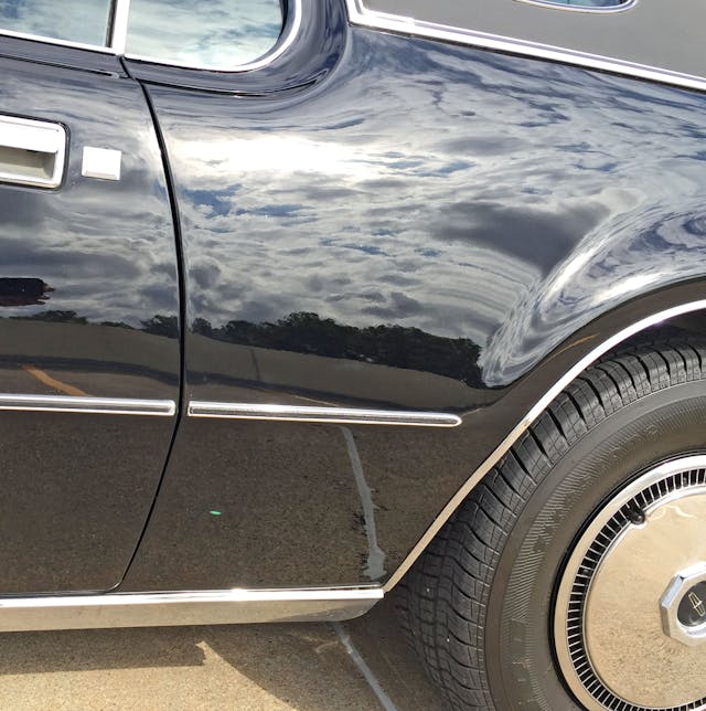
The body protection moldings are unique to the Mark IV, but the disc wheel covers are the main differentiator between this and the Thunderbird.
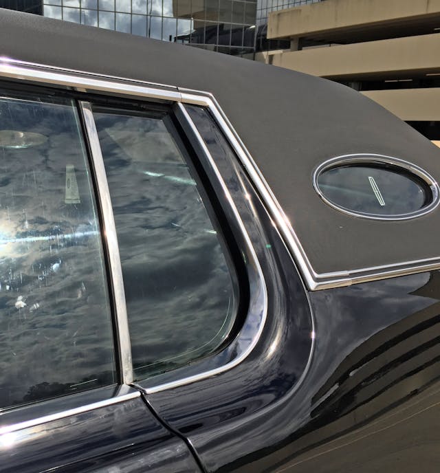
It’s a shame that this scalloped carve-out of negative area was also available at a Ford dealership.
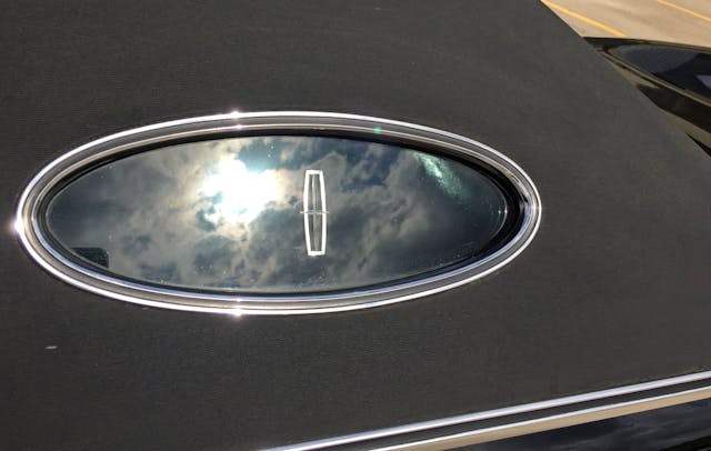
The beveled, jeweled Continental star sandwiched in the Mark IV’s opera window dances relative to the position of sunlight.
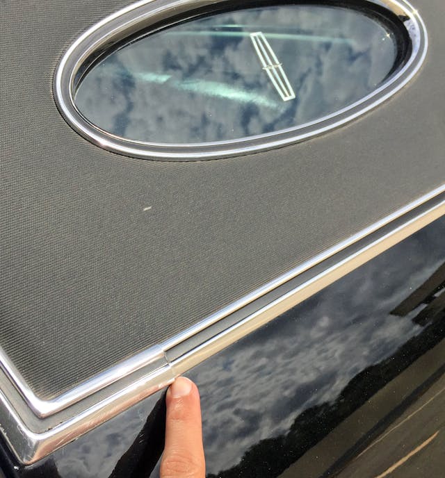
Not only is the vinyl roof bulky and “visually heavy” atop an otherwise sleek body, but the bean counters had their way via multiple trim pieces.
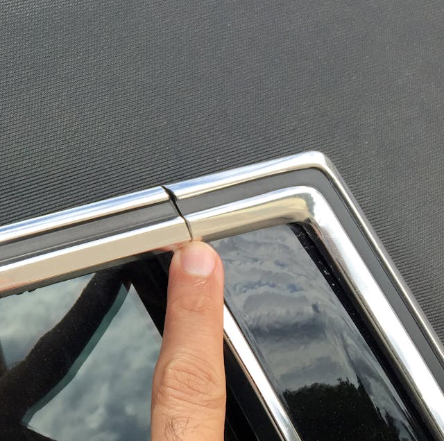
The B-pillar trim’s unfortunate joinery suggests that combining straight pieces with bendy bits into a single part was out of the question.
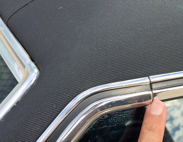
The windshield trim lacks the black-painted groove seen everywhere else, making it harder to notice the multiple pieces.
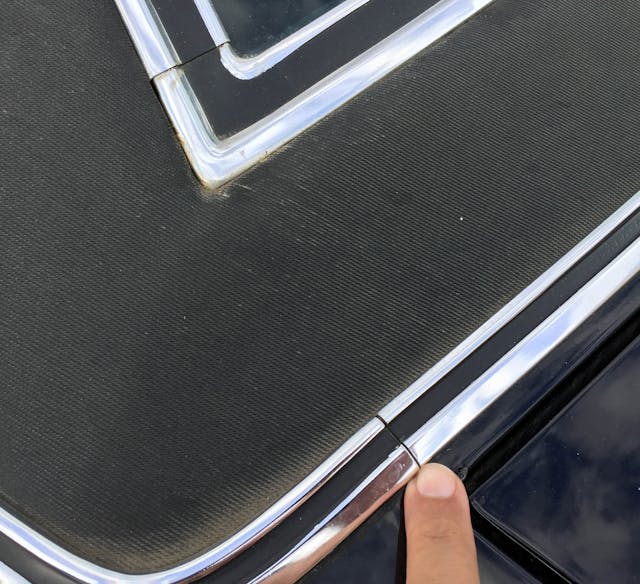
There are far too many trim pieces to call out individually, so this is a good place to stop.
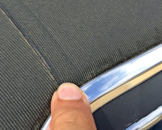
That said, the three pieces of vinyl that form the padded roof look both logical in design and somewhat expensive in craftsmanship.
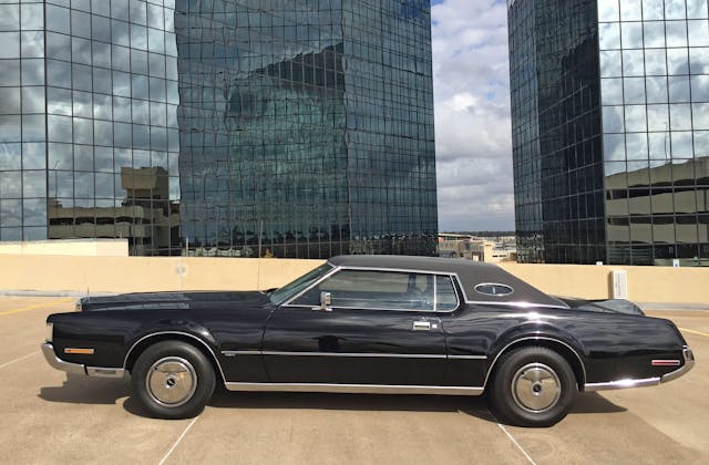
Behold personal luxury before it became attainable in Cordobas and Gran Torinos. Styling for such a posh segment dictated a trunk sized for a few overnight bags and golf clubs, a back seat useful for those with short legs, and vulgar amounts of decadence for the two up front.
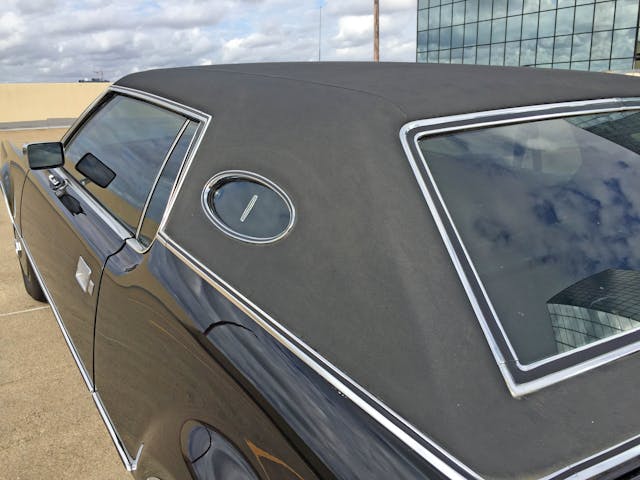
Perhaps this roof is better for a Mark Series, and the Thunderbird needed a less massive affair?
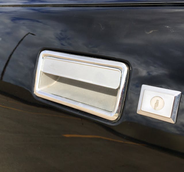
Wafer-thin metal door handles mount flush to the body. Wonderful execution, but shared with the Thunderbird (and the 1971 Mustang, but who’s counting!).
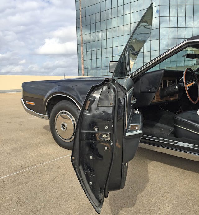
Make no mistake, this monstrosity is sleek and sculpted: The door’s tumblehome ensures this personal luxury coupe translates into a form-fitting cabin.
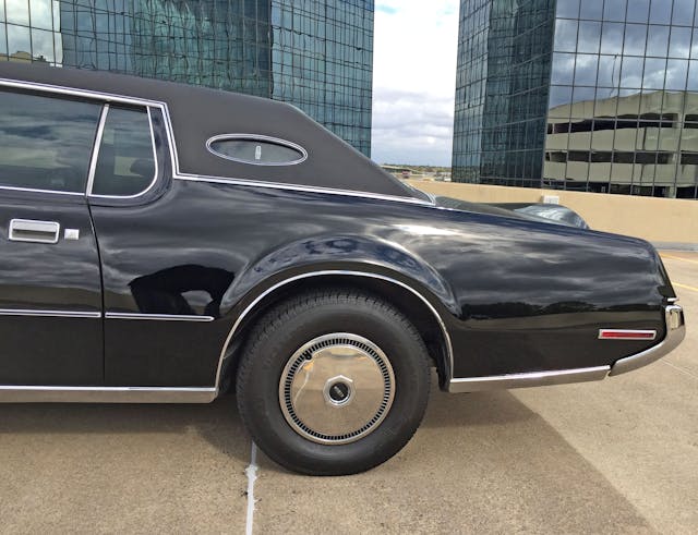
The sleek, tapered quarter panel is hamstrung by the roof’s staid and static demeanor.
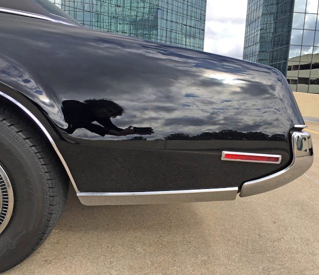
You can see (former GM designer) Don “D.A.” Johnson’s inspiration for the Zimmer Quicksilver.
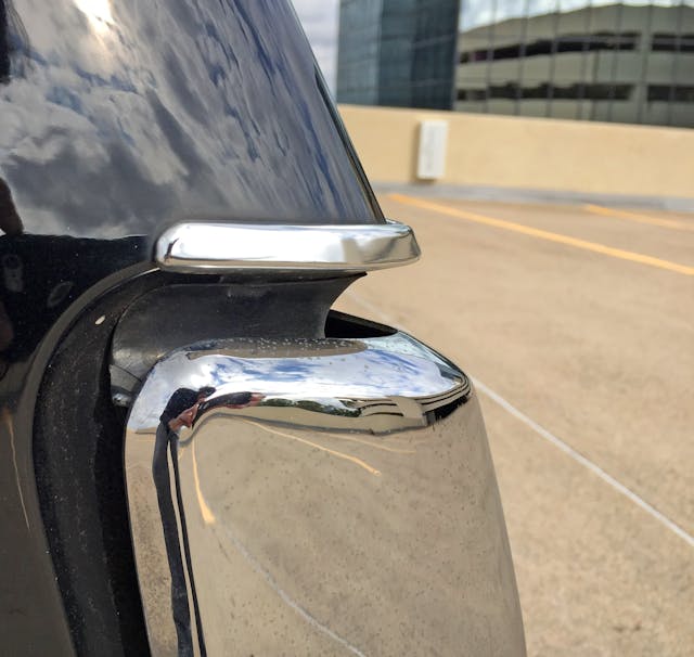
There’s a sliver of chrome just like this at the front. Too bad that the trim continues clumsily around the quarter panel rather than ending at the blade fenders.
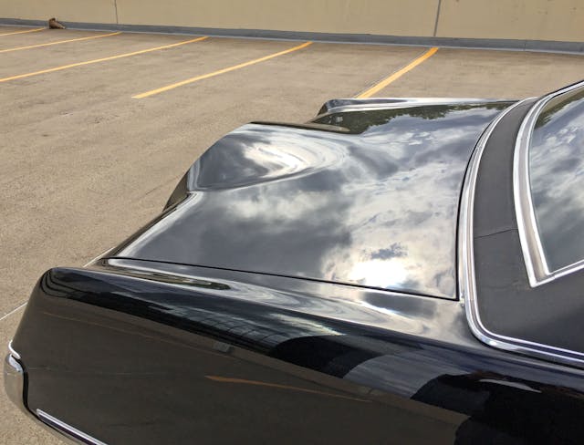
There’s a fair bit of blade in the rear, too: Massive negative area in the trunk allows each corner to pop above the horizon. And a Continental Mark Series simply demands a Continental kit rising majestically above it all, right?
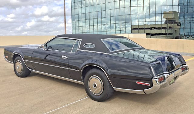
Thick lower trim at the rocker/quarter panel is a stark contrast to the painted bodywork’s unfettered freedom to gently bend and sway into a slant back, Continental-kitted posterior.

The aforementioned flow is a stark contrast to the basic and dowdy roof design.
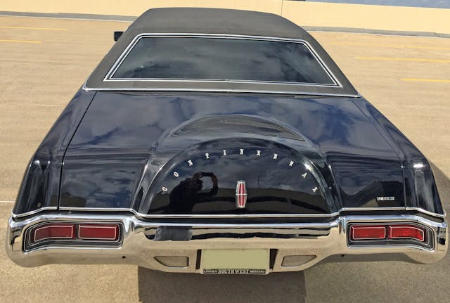
Even so, the whole package works, because the bumper/fenders logically translate up the roof pillar’s tumble-homed curve.
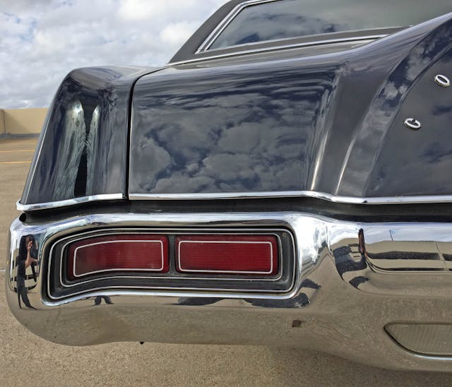
Deeply recessed taillights are a nice consolation prize for the failure to replicate the front’s covered-headlight treatment.
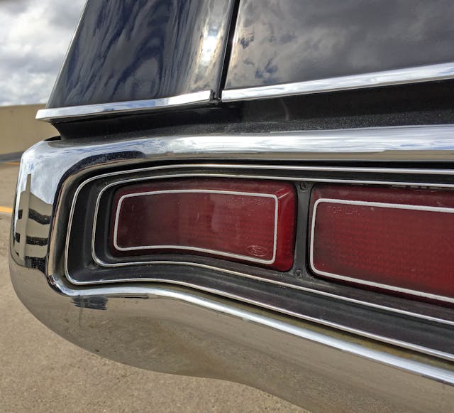
Concentric forms and the smearing of taillights around the bumper keeps the Mark IV from looking like the 1971 Dodge Dart.
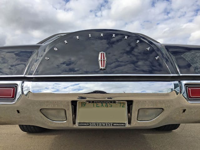
Backup lights emulate the Continental kit’s form, while the triangular gaps between bumper and license plate shows how dramatically the bumper tapers inside the body.
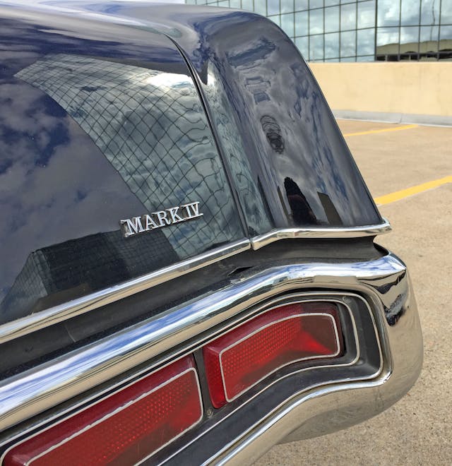
It’s kind of a shame the Mark IV lamp treatment didn’t extend further to the Mark IV’s centerline: The Lincoln Continental sedan/coupe of the era had longer lights with three bulbs to make that happen.
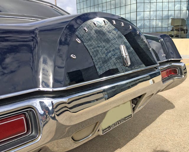
The extended Continental kit is a forgotten victim of 5-mph bumper regulations. It’s making a statement, much like the front grille.
The trunk lock hidden behind the red Continental star is a nice visual tie-in to the grille, too.
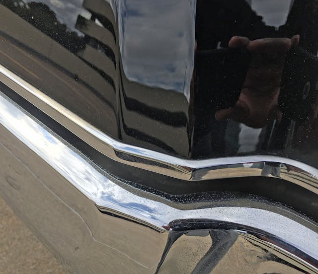
If you couldn’t see the bends/creases that make the Continental kit so remarkable … here they are.
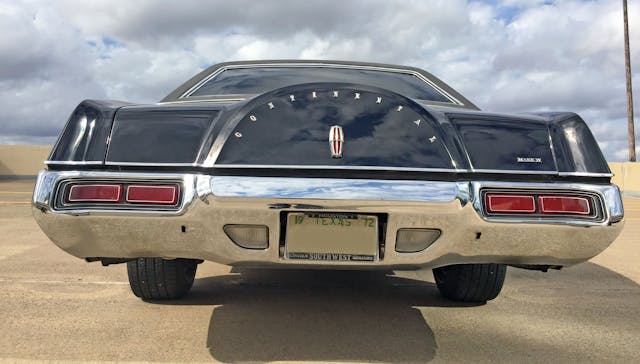
The Mark IV’s slant-back trunk found the ideal dance partner in this elegantly sculpted rear bumper. The two components combine to bless the 1972 Mark IV with the pinnacle of pointy posteriors in the pre-regulatory period of product design.
While the Thunderbird DNA is inescapable—the situation is far, far worse inside—the 1972 Continental Mark IV stands on its own as a Lincoln product. Even if you aren’t supposed to call it a Lincoln, as FoMoCo spelled C-O-N-T-I-N-E-N-T-A-L out for all the haters.
Or whatever haters were called back then. Thank you all for reading, and I hope you have a lovely day.


Of all that’s been written about the MARK IV I find this article to be my fav. But I would like to add some info you and your readers may find interesting. I am coming up on a year of owning my 72 Mark IV and through my ownership and by a happenstance local contact, I discovered the opera windows were yet another contracted out part (like the ASC sunroofs ) actually with Tiffin Glass company of Ohio. Each window was hand etched on a piece work basis and then filled ( inlaid ) with platinum. Hence the why for their “dancing in the light”. Only 4 men were hired at Tiffin to do this and I have a letter from one of them confirming this info. I can supply this proof on request. This is fitting information that should be more widely known as this was after all the most expensive American car of it’s year.
Thanks for this wonderfully detailed review of such a wonderful automobile. My dad gave my mother a 1972 for her 40th birthday. The best part for 15 year old me was that I got her 1969 Riviera hand-me-down. I loved the lines on that car. She did have the full waterfall grill without the crossbar. I was always under the impression that it was because it was an early made 72, and that to satiate the Naderites, it was added later in the year. Interesting to now understand that it was an option. She kept it for 2 years, then while dad was away for a month, she traded it for a new BMW. Dad hated the BMW because the AC was less than adequate and blew ice from the dash. While she was in Europe for a few months, He traded the Beemer for a new Black Diamond Mark IV. Another stunner…even with the railroad tie bolted to the front facia. It was an interesting family for sure.
I am glad you enjoyed it, David!