Media | Articles
Vellum Venom: 2024 Toyota Crown Platinum
The new Toyota Crown is two-tone, and that refers to more than just its paint scheme. In one sense it’s an honorable advancement for a famous nameplate, but it could be construed as an insult to decades of heritage. Japanese-market car nuts love the Crown limousine’s legacy, but it should be no secret at this point that carmakers care more about money than enthusiasts’ attachment to history. Fewer and fewer people buy true sedans and coupes anymore, so perhaps Toyota can’t be blamed for making this revived Crown a kind of tall-ish crossover utility.
It’s to the point that two-box car designs resembling CUVs are becoming the norm. The Crown attempts to either inspire or feed the market’s appetite for elegance rather than outright family hauling. In that respect, it’s a modern relative of the 1937 Chevrolet Sport Coupe.
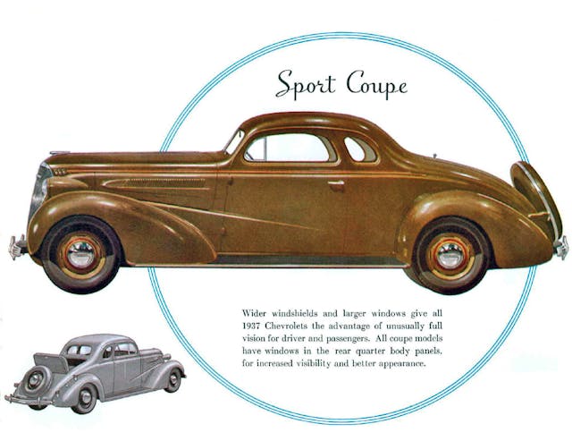
Back in the 1930s, the coupe’s sporty style was underpinned by an upright ladder frame, tall running boards, and bolt-on fenders of a conventional sedan, albeit with a faster C-pillar to create three boxes instead of two. I once hated to admit that a BMW X6 was a Coupe SUV, but that vehicle’s success (combined with the existence of many subsequent imitators) establishes that the genre is legit. So why don’t we run it across the vellum to learn more?
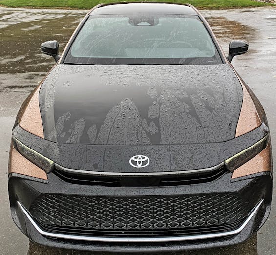
Aside from the rain (sorry about that!) you’ll first notice Toyota’s Hammerhead front-end design language on the Crown’s dual-toned schnoz. The header panel above the headlights is designed to have the thrusting appendages of the hammerhead shark from which the name is derived.
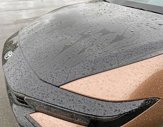
This Brown Crown (the nickname I gave this particular press loaner that we reviewed here) is the top-line Platinum model. That trim wears a two-tone scheme that accentuates the Hammerhead with a striking blow to your senses via bronze sides with a strong blackout center spine.
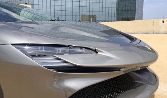
Readers of the Vellum Venom series may remember my take on the 2020 Ferrari SF90 Stradale and how its yet-to-be-named hammerhead front schnoz makes the car’s increased frontal area still look sleek and cool. The SF90’s nose, like that of every other new car sold in Europe, has to be pedestrian-friendly, and the hammerhead style definitely accomplishes the extra height with a dash of aggression worthy of a Ferrari.
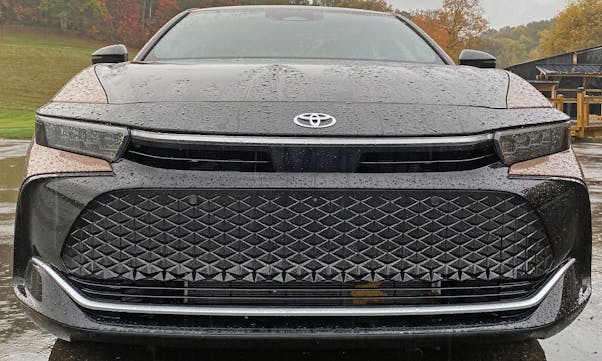
The hammerhead nose on the Crown dovetails with Toyota’s new corporate branding. I’d argue works better on the new Prius, but the design has merit here. The Crown’s headlights are much lower relative to the top of the hood. Nothing can save a modern front bumper from “gaping maw” grille styling, but the extra black elements on the Brown Crown help the eyes focus on the bronze paint wrapping inwards.

Note how the rainwater cascades down the hood: That’s where the hood drops significantly to let the Hammerhead DNA come into play.
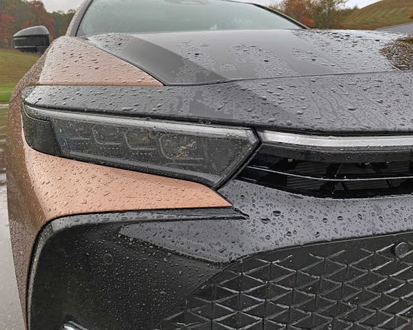
While this Brown Crown’s extensive use of black accentuates the contrasts, the LED headlight array is surprisingly understated—lost in a sea of shadows.
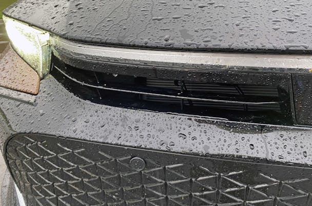
There’s a functional grille between the headlights, and its linear texture is replicated by the form of the Crown’s center light bar non-functional clear lens.
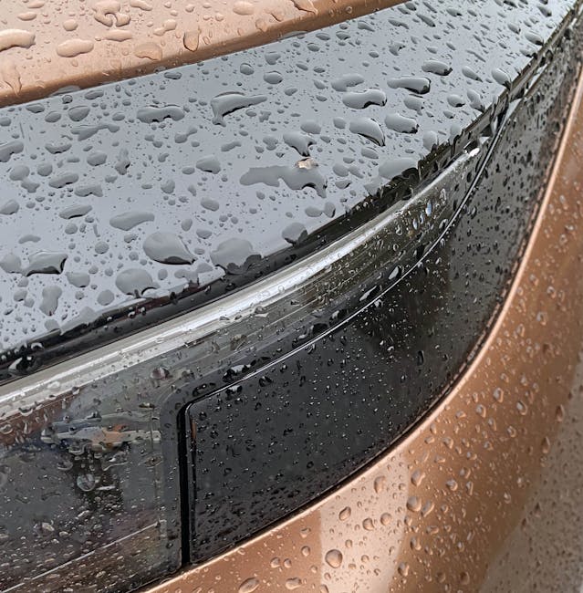
The LED array should not ordinarily turn the corner for the purpose of side illumination, but if you’re gonna do it, I always advocate not to use a pointless black filler panel for the gap. (At least side-impact collisions might be cheaper to repair this way.)
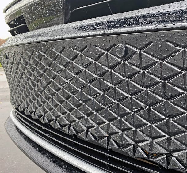
Speaking of non-functional design, the Crown has a huge fake grille, complete with a triangular graphic worthy of a mid-century bathroom backsplash. As much as I love to trash these open-mouth grilles, the bottom texture is genuinely cool; there’s a dynamic element to the triangles, suggesting they might all open up and fly away like geometric butterflies.
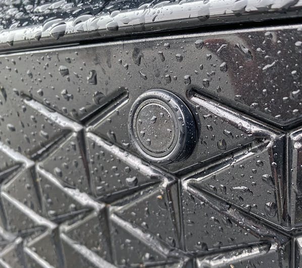
Someone needs to invent a triangular sensor lens to complete the look for this grille.
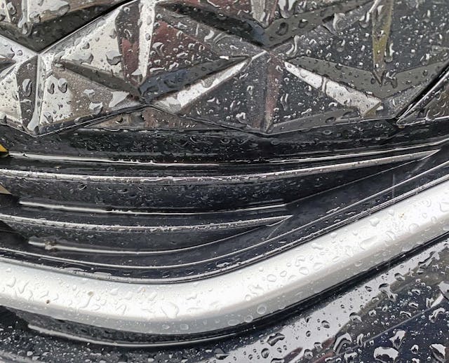
There is a second grille beneath the triangles, but it’s solid at the corners.
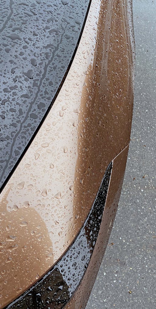
Move up the eye as we turn the front corner and one notices a muscular tone to the Crown’s fender. It’s tapered and elegantly surfaced, accentuated by a long-ish front overhang.
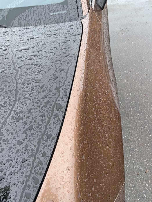
The same strong, muscular vibes continue as you extend past the front axle.
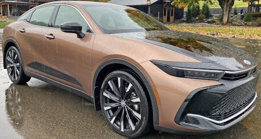
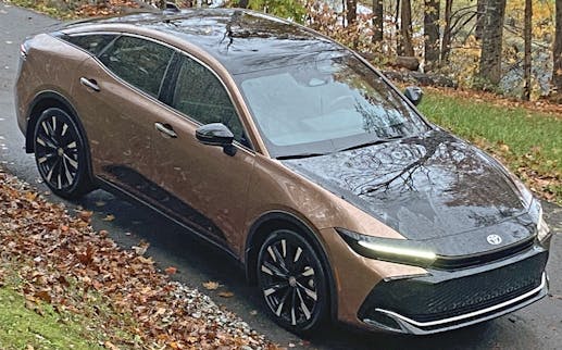
Yes, it’s a strange-looking face, and much like the 2022 BMW M3’s rear bumper, the Crown’s front grille area is doing a duck face; there’s a large black element thrusting forward while sucking inward from the brown fenders. This level of topographical layering is far easier to see from the front-three-quarter view.
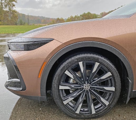
The side view doesn’t adequately show how the front bumper’s extensive layering. But it does show how the Hammerhead nose rests atop the headlights (and headlight filler panel), giving the Crown the appearance of furrowed eyebrows above the headlight’s eyes.
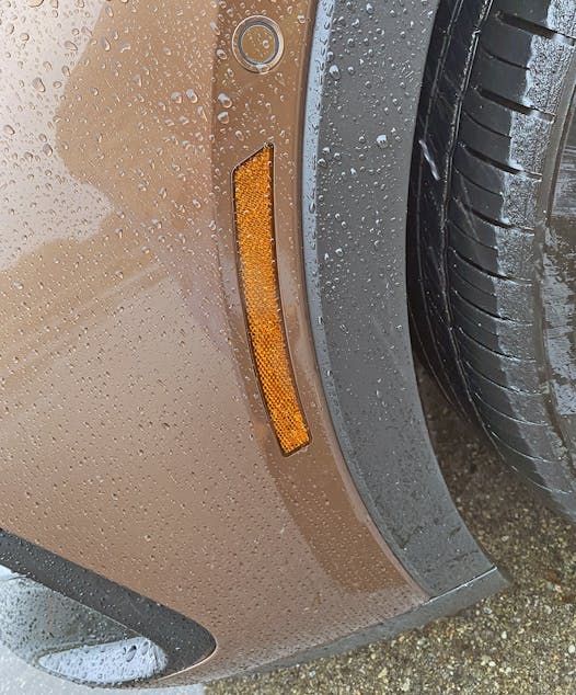
Like so many modern cars, the fender has a flat spot leading up to the wheel arch. And there’s the requisite reflector lens in the flat spot. The round proximity sensor is a mandatory piece of kit at the Crown’s mid-$50,000s premium price point, and the extra layer of textured black plastic is needed to make this tall vehicle look like a coupe-ish SUV. The painted surfaces thus look smaller, helping your eye focus on the sleekness and less on the body’s inherent tallness.
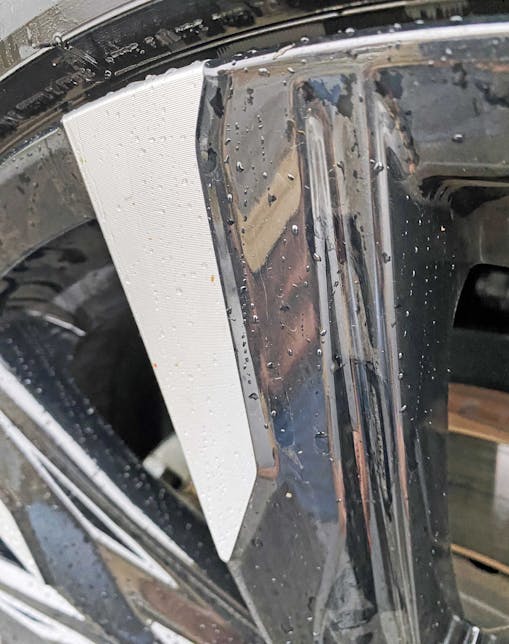
There’s something about the rendering of these black spokes with machined high spots that reminds me of the legs on Marcel Duchamp’s Nude Descending a Staircase No 2. Perhaps the wheels, when at speed, look a little like that modern masterpiece, too?
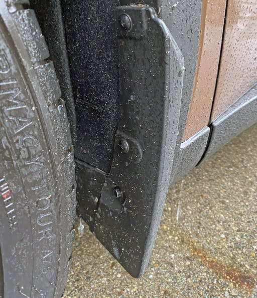
These mud flaps are admittedly a little tacky by luxury SUV standards. They also reveal another downside to these tall vehicles with huge wheel arches, even with twenty-one-inch wheels: the eye will naturally wander to all the open space and wonder why such a puny flap was so poorly integrated into the fender. It’s probably an aerodynamics-friendly way to keep the fender free from dirt kicking up from the tire, but the visual consequence is an uncomfortable middle-ground between functionality and aerodynamic understatement.
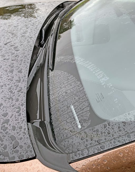
We offer no such over-analysis for the Crown’s cowl—it’s just a small area of black plastic harkening back to an era when everything had cab-backward design.
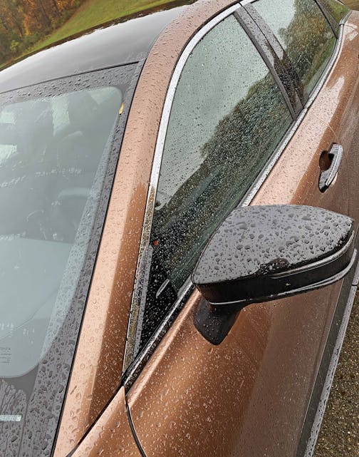
Coupe-ish SUVs tend to excel in dramatic roof pillar design, as this is where you can make a tall vehicle look sleek and sporty, and here the meeting point of A-pillar/door/fender is darn near perfect.
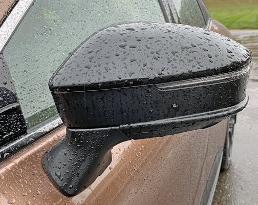
I question the use of black paint for the side view mirrors, but it certainly shows commitment to the two-tone theme of this Platinum model.
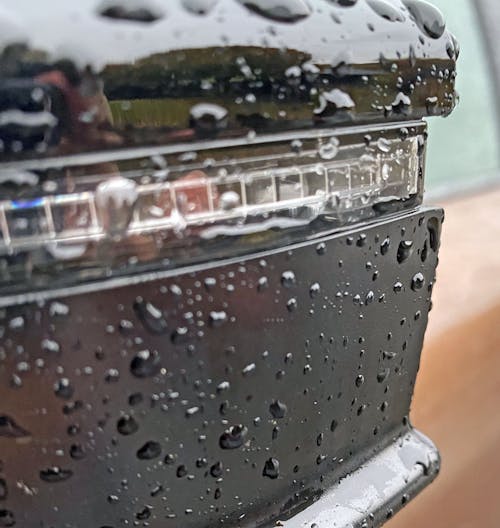
There’s some fine chiseling going on between the mirror body and the recessed turn signal light.
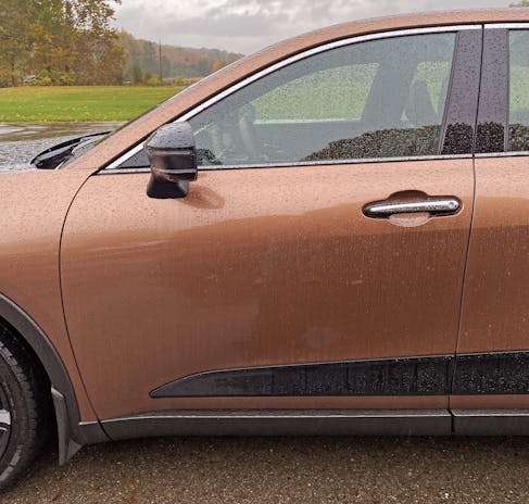
The door’s front cut line jets backward elegantly with the A-pillar, while there’s an interesting carve-out for the negative area where the door meets the rocker panel.
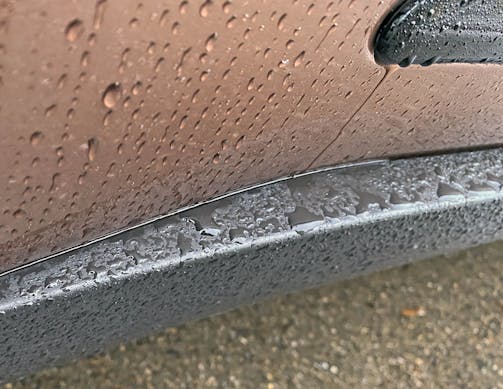
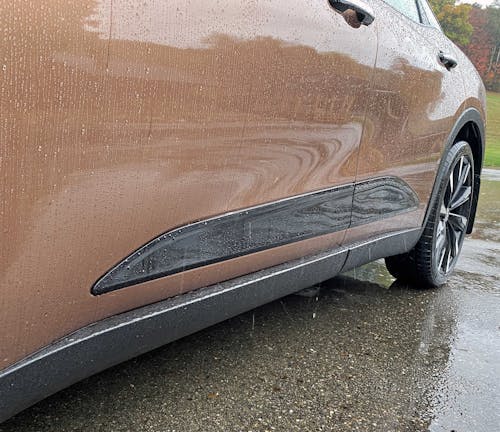
Sure enough, the bronze-painted doors suck inward to provide surface tension on the Crown’s tall bodyside. The black rub strip replicates the door’s surface tension and breaks up the wall of a single-toned panel.
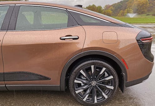
There’s an up-kick to the rear door that, when combined with the huge wheel arches, looks like a smirk on a human face. I first saw this “smirk” on my parents’ 1975 Mercury Montego sedan, as I’d always be sitting in the back seat as a child.
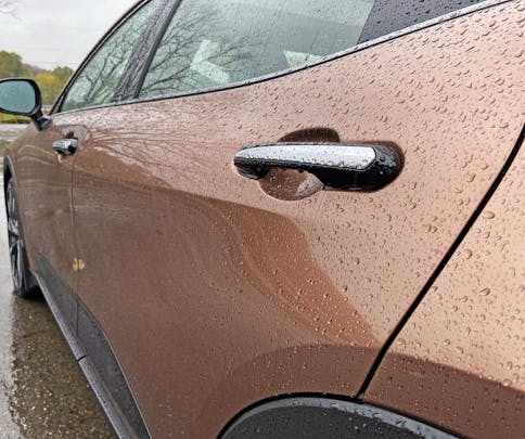
The smirk might be more visible from this angle, as there’s a hard bend right below the door handles that shows just how aggressively the rear door kicks upward.
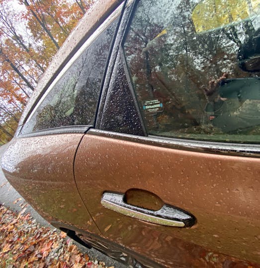
Too bad the smirk wasn’t tall enough to eliminate the need for the huge plastic triangle, which ensures the rear window will roll down without interference from the wheel arch.
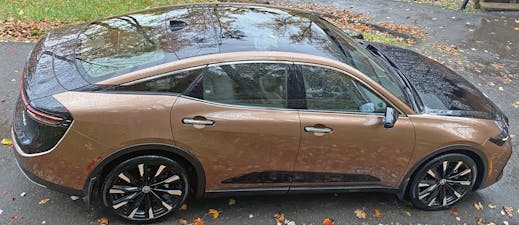
Window tinting should be mandatory with a two-tone Crown, as the clear windows take away from the aggressive blackout treatment that Toyota’s trimmers surely envisioned.
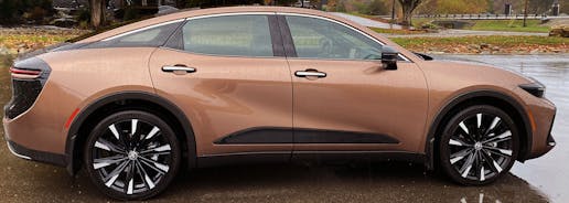
Back to the notion of surface tension: Note how both the gentle and hard bends in the doors make the body side look muscular and taut.
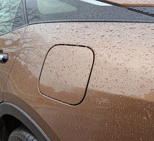
Toyota continues the surface tensioning in the quarter panel, with less effectiveness. It’s a shame these quarters couldn’t be “sucked in” as aggressively as the doors, but safety, cargo space, and platform sharing of hard points clearly ruled the day.
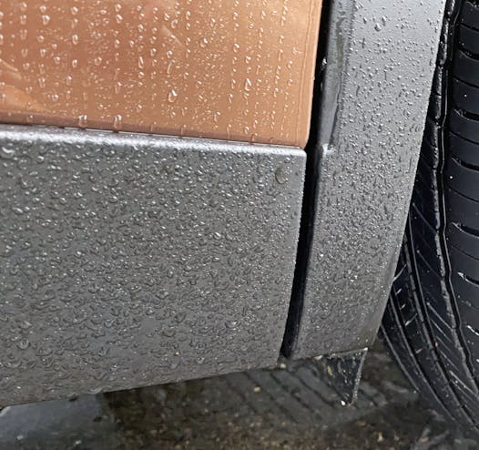
The space where the rocker panel meets the rear wheel arch is shockingly angular compared to most other vantage points of this Brown Crown.
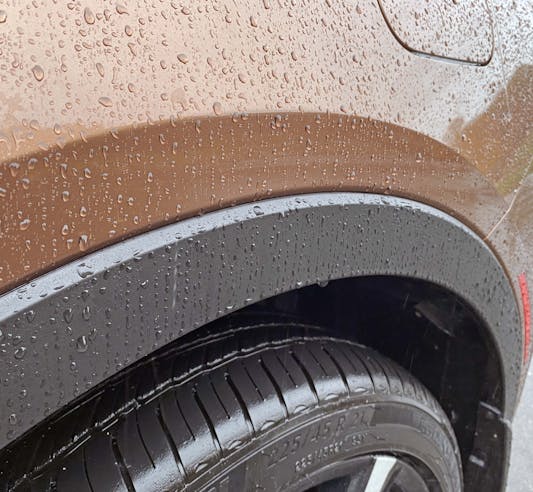
In case you forgot how tall this Coupe SUV is, here’s a view of the rear wheel arch’s plastic filler panel to visually halve its height.
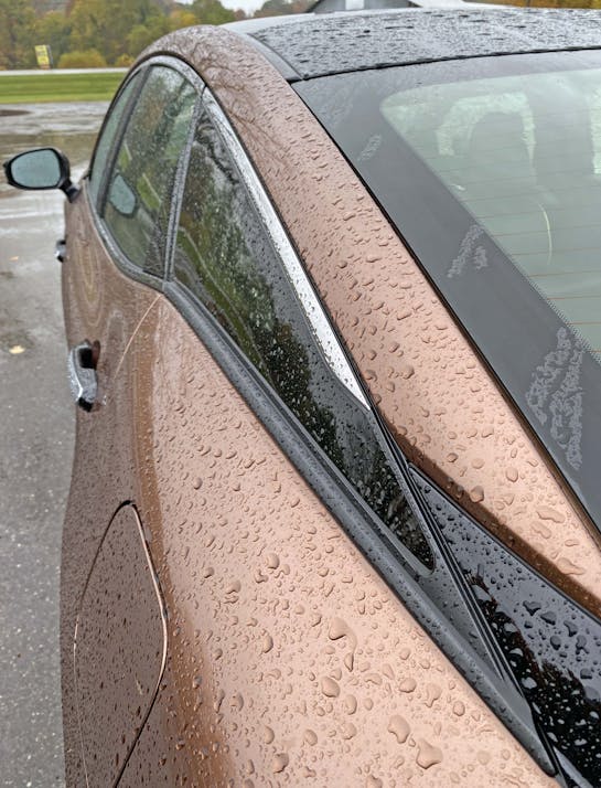
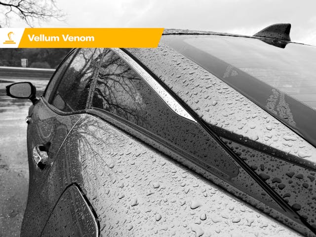
This Crown still has a coupe-like C-pillar feel in its D-pillar. And it works, provided you don’t marinate on the logical but questionable transitions from black, brown, glass, rubber, and chrome.
There’s simply too much going on to truly enjoy a fastback … sigh … coupe.
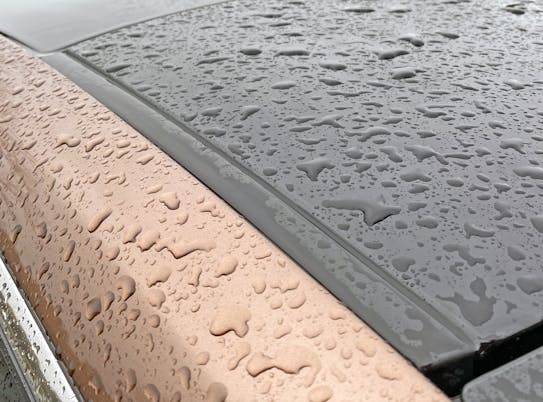
The brown cant rails do work well with the black roof. If only all elements of the two-tone paint job worked this well.
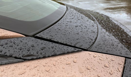
Much like the D-pillar’s entanglement of lines and shapes, the decklid has a non-functional stamping to help explain what’s going on beside it. We’ve seen a similar issue with the Porsche Taycan; big things trying to look like coupes always need to cheat a bit.
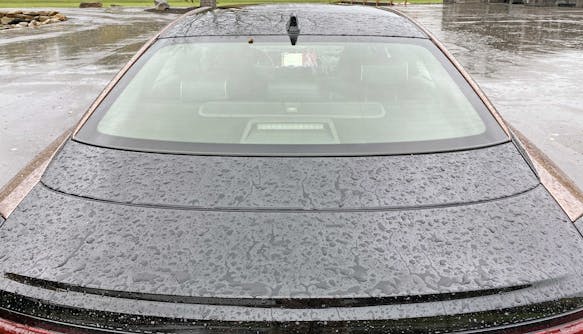
I’ll not that the two tone black/brown paint makes that stamping look rather pointless. Everything lives under that shadow of darkness.
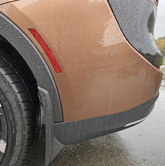
Like many modern crossovers, the shelf-free Crown does a fantastic job hiding the fact it has rear bumpers out back there, somewhere.
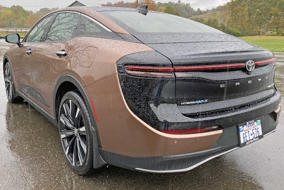
While the front end’s two-tone treatment looks like an angry bat coming out of a brown cocoon, the rear has no theme to mimic the front. Some more aggressive surfacing/negative area in the quarter panels would help make the black trim “pop” away from the brown body. But again, you can’t tweak the rear of a shared SUV platform too aggressively without incurring a lot more cost. And I bet Toyota already broke the bank (as it were) when making a new roof for the Crown.
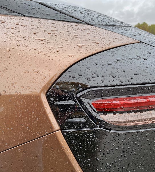
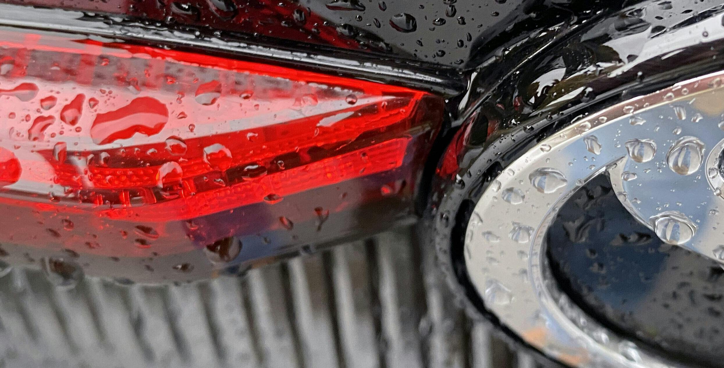
Any further, deeper, surfacing efforts where brown meets black might also muck up aerodynamics, as these two foils near the tail light housing suggest. Those foils might have to stick out 1+ inch further if the rear end’s blackout treatment was as aggressively surfaced as the front.
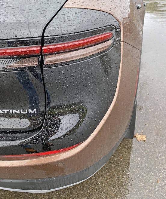
But there’s a serious need for more surfacing to separate the two colors. While the lower part works well thanks to a strong carveout for those little red lenses, the top makes very little sense thanks to an all-black decklid and a mismatched quarter panel. Something that’s gloss black needs to be sunken in a good inch in some places for this to make sense.
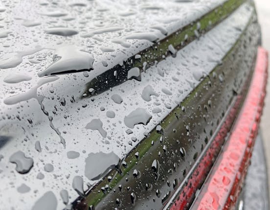
Toyota did throw us surfacing freaks a bone, as there’s a gentle bump at the decklid’s, uh, crown. It’s just a bit too subtle to make an impact like similar contours in the front end.
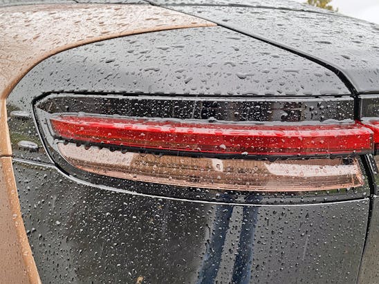
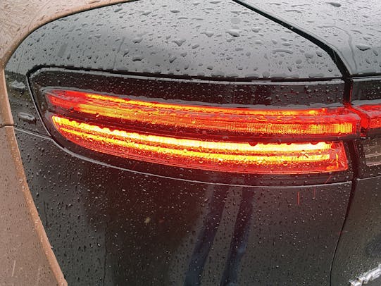
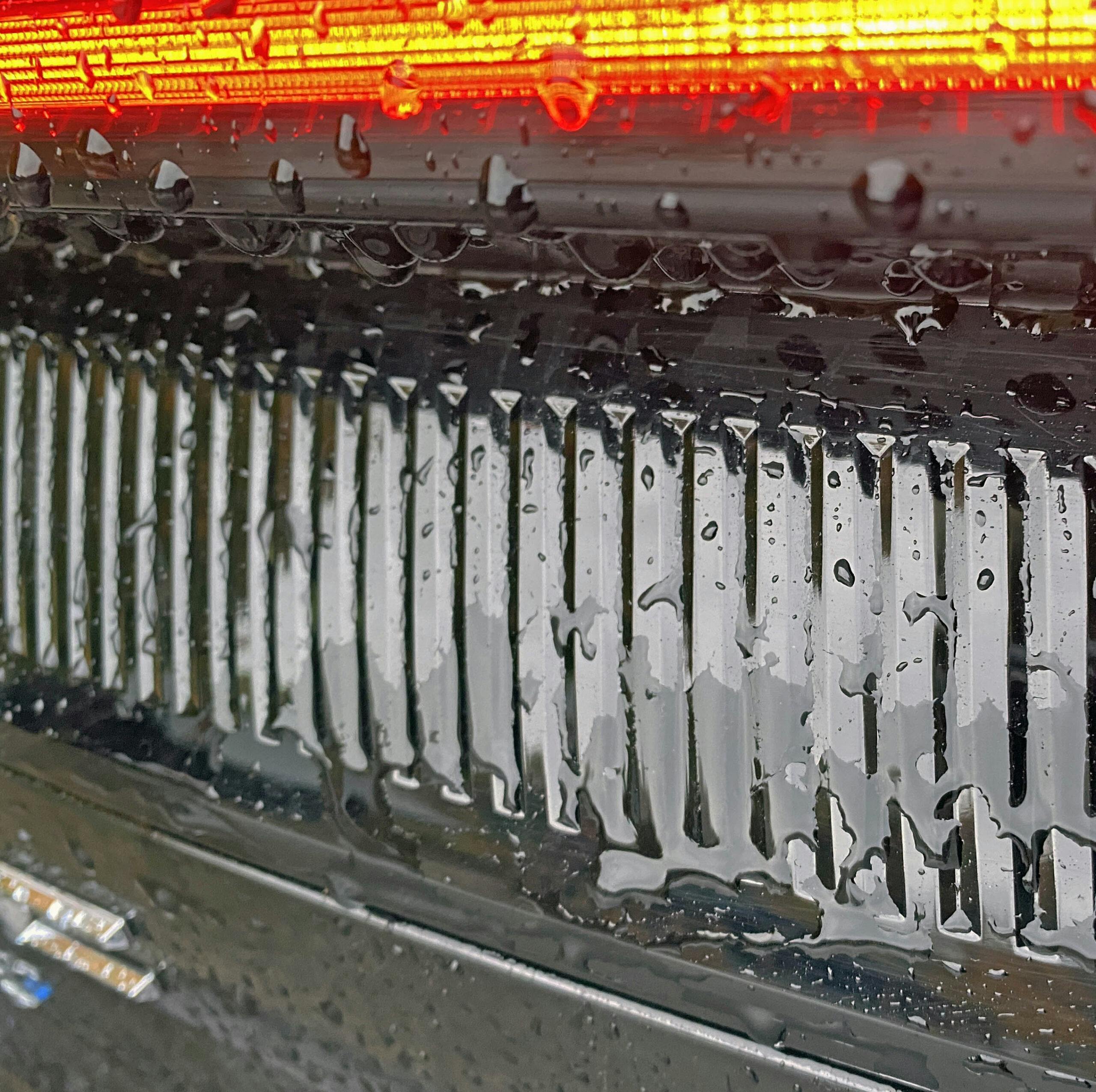
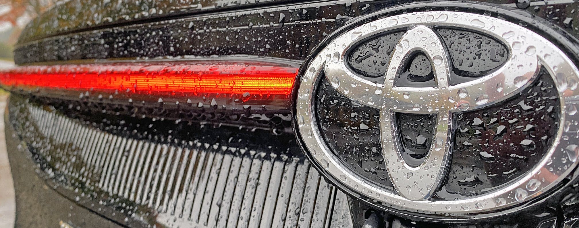
It’s kind of a shame that the skinny red heckblende has to be thicker at the corners to integrate a brake/turn light. But the lack of uniformity is offset by intriguing textures and depth just below.
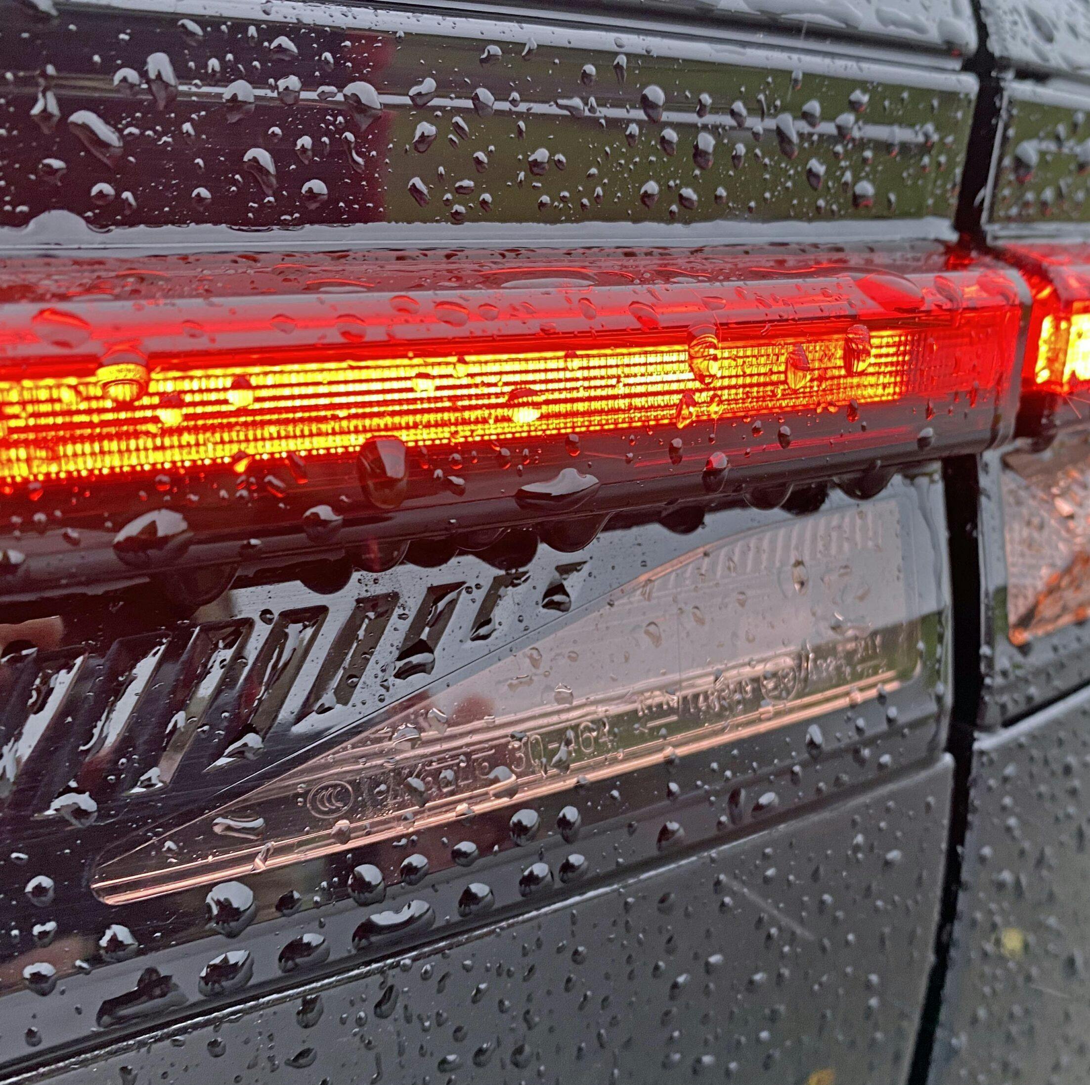
The ribbed and ramp-like panel below fills in the gaps between a thin heckblende and a thicker brake/turn assembly. The other gap filler is a brake/turn signal extension in the hatch door (second photo) which is purely cosmetic. Both items visually force your eye upward, where you notice the heckblende’s contouring as it reaches the central Toyota emblem. It’s like starburst, with the Toyota logo being the central sun of the Crown’s rear-end styling treatment.
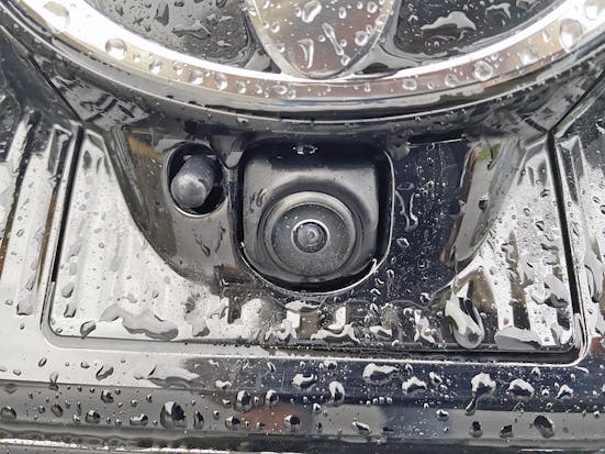
The only downside is the camera has no other place to live but below that central sun. This wouldn’t happen if there was a high-mount license plate like more conventional SUVs that don’t cosplay as coupes.
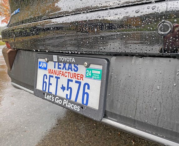
The rear bumper’s matte black treatment behind the license plate ensures the gloss black above will indeed “Go Places.”
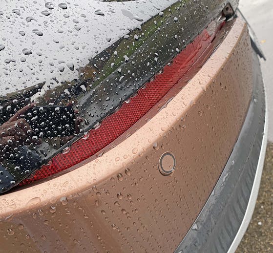
Recessed reflector lights between black and brown add more depth and texture, ensuring this large posterior remains taut and slimmer looking.
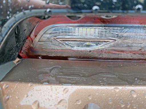
The aforementioned two foils upstream from the tail lights make sense, but the airfoil in the reverse light in the rear bumper seems to lack purpose. Maybe, due to its puny size and low location, the foil is needed to keep water and dirt from collecting, obscuring its light output.
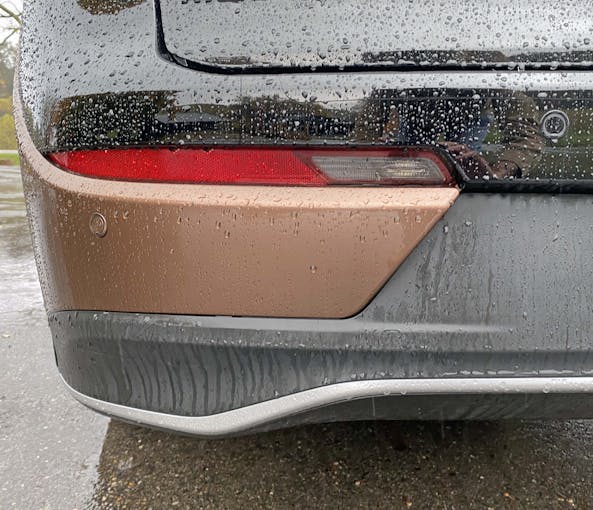
The brown, gloss black, matte black, and red lighting elements are surprisingly well integrated into shapes and lines that define the Crown’s rear end.
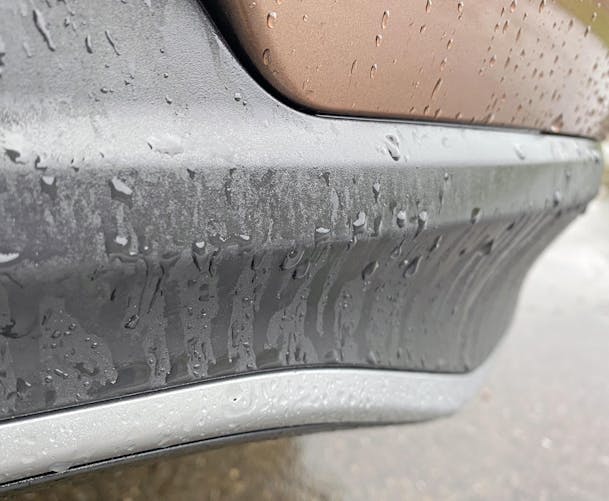
However, there are over-contoured, frumpy bits in the rear bumper. The things you gotta do to make a Coupe SUV look sleek and sporty, eh?
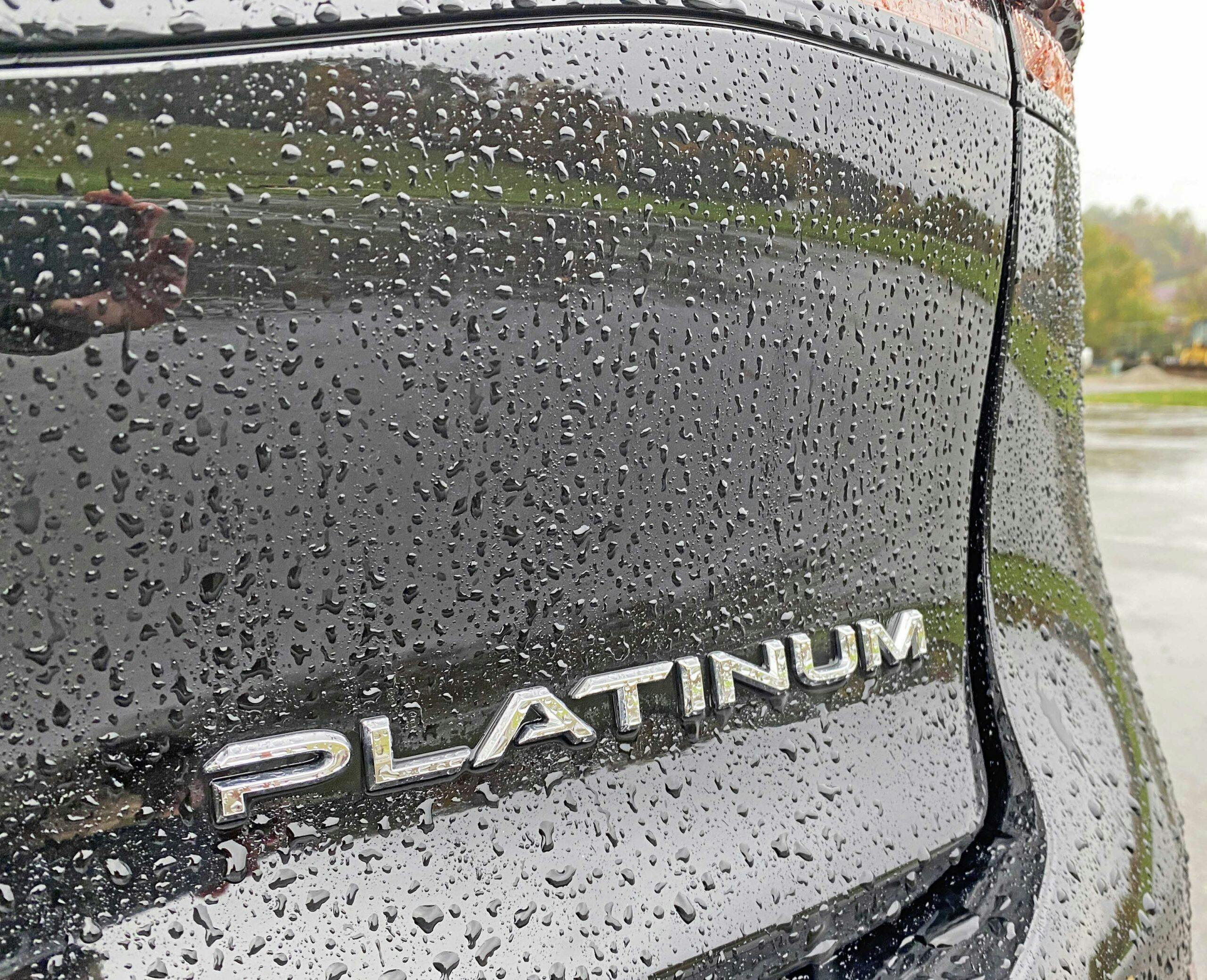
Someone did a great job making a flat spot on the curvaceous decklid, ensuring Toyota’s badging isn’t an afterthought like the 2006 Camry’s decklid.
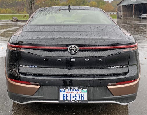
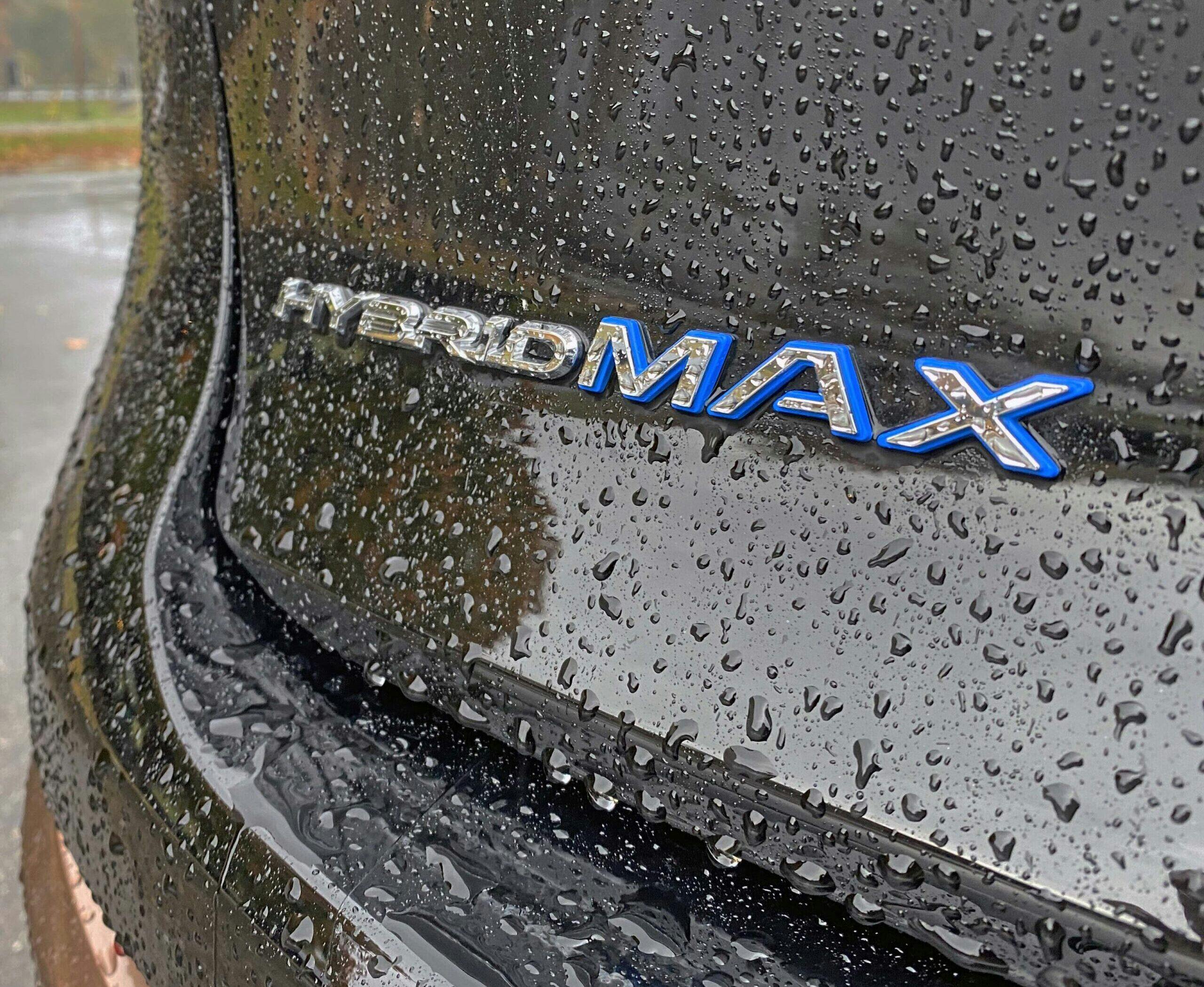
All the slender, long lines on the Crown’s tall posterior do a great job making this Coupe SUV look as sleek as a real coupe. Or not, but the Crown is at least more like a Porsche Taycan, right down to the sleek C-R-O-W-N lettering and the bizarre (yet necessary) stamping behind the rear window.
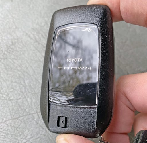
In the spirit of well-disguised parts sharing, the Crown overlay on Toyota’s ordinary key fob is a nice touch. It shows that Toyota cares enough about the Crown brand to ensure owners are treated differently at many turns, though this premium model is at its core a TNGA-K platform derivative.
I had the distinct pleasure of driving this car on Hocking Hills’ technically impressive and wholly beautiful roads. There was impressive coordination between turbocharger, electric motor, and six-speed automatic. If only the convoluted exterior design was as delightful as this complicated yet dialed-in powertrain.
Not that engineers and designers are competing directly for accolades once a vehicle reaches production, but its clear which team ensured this Brown Crown stole my heart. Thank you for reading, and I hope you have a lovely day.
***
Check out the Hagerty Media homepage so you don’t miss a single story, or better yet, bookmark it. To get our best stories delivered right to your inbox, subscribe to our newsletters.


Sajeev, I appreciate the great lengths that you go to in your Vellom Venom articles, especially your attempts to find virtue where there is very little, must be difficult.
This thing is nothing more than a bloated two tone Camry on platforms and could not have been more hideous had Toyota’s design mandate been to it’s designers, to make it it as ugly as possible.
I understand the design limitations that such things as CAFE standards and DOT safety regs. place on current automotive design, but can’t help but think that they can do better. Some car makers have proven that in recent years with the modernization of throwback designs.
But your comment “it should be no secret at this point that carmakers care more about money than enthusiasts’ attachment to history.” pretty well sums it up.
This may be a “halo car” for Toyota, but I just can’t imagine many of them being sold……..or maybe they will, it is a Toyota after all. Perhaps the purpose of all the ugly design going on out there is just that, if people have no other choice, I guess they’ll buy what’s available.
I’ll continue to drive old cars with some character and that don’t look like a praying mantis sucking in a butterfly or a prop from the movie Predator.
Thank you again for your continued readership, TeutonicScot. The Brown Crown was surprisingly easy to find virtue, once I got over these three facts about modern car design:
1. CUVs are fundamentally good for a lot of people.
2. Fastback rooflines deserve to live even if coupes die.
3. Big noses with silly grilles won’t go away until cars get lower cowl heights so trucks and CUV/SUVs can stop overcompensating.
The current world of car designs is too dystopian for me, but beauty can still be found just about anywhere.
Sajeev, your points are well taken and I will only add this to each.
1.My wife drives a Mazda CX-30, she loves it…….I hate the way it looks, but for the utility that she gets from it, she cares little what it looks like. All wheel drive is reassuring for her and for me knowing she has it in our snowy clime, and it hauls a ton of groceries. Not so huge that she can’t park it between parking space lines.
2. Agree on long rooflines. It will be a tragic day when the final coupe is made. Hope to never see that, but they are few and far between anymore. Was passed this morning on the freeway by a 2 door Hyundai Elantra (rare) and thought how much better the little car looked than the 4 door.
3. Unfortunate, but true. That space has to be filled with something. Ah, for the days of nice chrome grilles and design freedom that didn’t have to take aerodynamics into account to meet some bureaucratic standard.
Appreciate the article, you keep writing them and I’ll keep reading them.
Your design analysis is, as always, insightful and a pleasure to read. But this is an ugly car!
Thank you Mark, I am glad you enjoyed reading it. Hopefully the next one will be more appealing to your senses!
That to me looks like the 2024 AnyCar. Is it a car? Is it an SUV? It can’t seem to decide, and neither I suppose can its perspective buyer. They try to do crazy things with the taillights and grille because the rest of the car is pretty much a formless blob.
A sign of the times as pointed out above – but that is pretty much why I drive older cars.
Granted I pretty much always drive older cars but the two-tone Crown is anything like a generic formless blob. CUVs are all around me, but this one sticks out like a sore thumb. And maybe in a good way.
https://images.app.goo.gl/AdKmnN4E4kgpjWPb8
This is the 2024 Buick Envista. It is the first CUV (other than this one) that my Google-enabled fingers encountered. The challenge is to cover the front and back and see how many people can tell them apart
I say all of this with love. If the late 70s and 80s were the malaise era for performance, we are living in the malaise era for styling. Despite this, you do manage to squeeze any inkling or hint of styling out of (what is in my opinion) a very bland and formless automobile of the day
Oh we were living in a Malaise era for styling back then too. Pillar-less hardtops going way of the dodo bird proved that.
There are parallels between both eras for styling, that’s for sure. Both the 1975 Cosmo and the 2024 Mazda CX-90 are products of their time, but they are clearly Mazda’s take on the subject matter.
Point taken, but the Crown is 13 inches longer, and that extra length even makes the front and rear fascias look special when you walk around it in real life.
It’s like a 1978 Continental Mark V (Toyota) vs a downsized 1980 Continental Mark VI (Buick). They do the same things front and rear, but one looks the part and the other struggles.
2-D googling rarely conveys the reality of a car’s design for me…if it did I’d be able to write a lot more Vellum Venoms!