Vellum Venom: 2024 Aston Martin Valhalla
Rarely does Vellum Venom have the luxury of showcasing a prototype hypercar in the metal. That’s mostly because yours truly is rather awful at the many emails and phone calls it takes to set up something like that. Luckily, then, that I’m Houston born and bred. My fair city has itself a metric ton of oil money, which means generational wealth is regularly invested in cars. Slabs drive the Texas streets right alongside the freshest stock from the local Aston Martin dealer.
So yes, I had the pleasure of scoping out the Valhalla’s contours in Aston’s nearby showroom. I did not, however, sample the sounds of theforce-fed V-8 and a hybrid powertrain, good for a reported 937 horsepower. My interest, on this day, was running the body across the vellum. Join me on the journey.
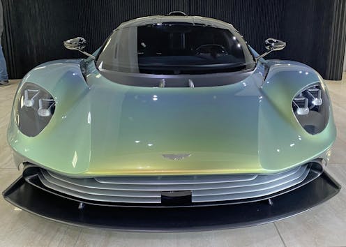
When I was a budding car designer with yet-to-be-dashed hopes and dreams, I’d sketch luxurious supercars in the margins around my math class notes. I was inspired by the itty-bitty horseshoe grille on the Bugatti EB110, and my aim was to turn aspirational design features (Cadillac tail fins, Rolls Royce grilles, etc) into features befitting a mid-engine exotic.
After all, condensing things can be wonderful! Condensed milk turns coffee and cakes into rocket ships dancing across your palate.
And like a proper sherry reduction, Aston Martin nailed the Valhalla design. The dream machine takes Aston’s signature grille/hood contouring and forces it upon a short nose, aerodynamic-intensive lower facsia, and a requisite, impossibly decadent, ground-hugging frame.
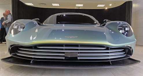
The famous Aston grille, though butchered in early versions of the latest Vantage, is a dominant theme on the Valhalla hyper car. The forms that made this face a pop culture icon (thanks to James Bond) and a local car show stunner (thanks to leasing companies) now extends below the headlights, with large silver bars masking aggressive aerodynamics.
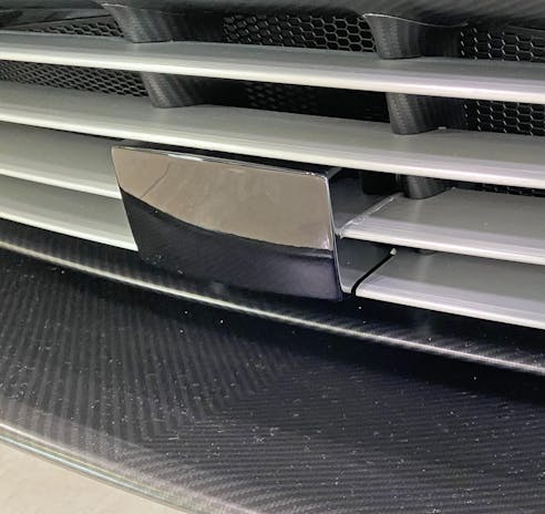
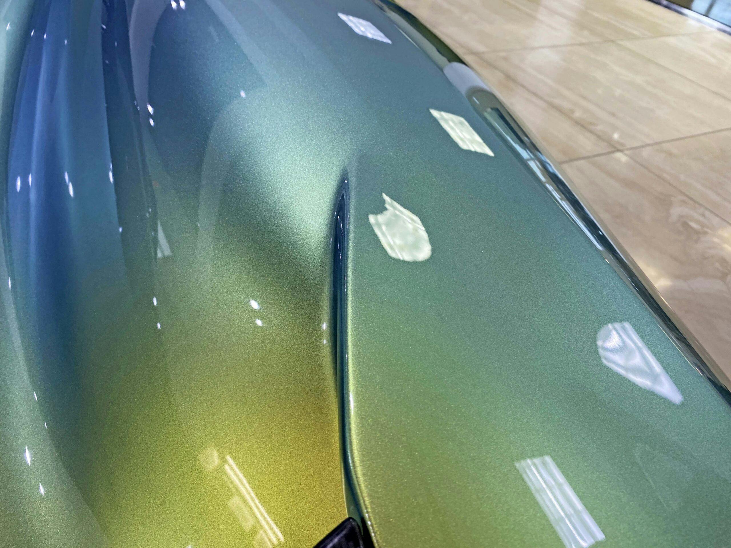
There’s a lot of high tech going on here, and some tech ruins grilles. But this black sensor rectangle is about as subtle you can get on a car with such little frontal area and little height.
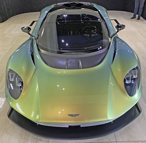
Stand over it and then the grille disappears! What’s left is that classic Aston hood bulge, on display in some form since the DB Mark III of 1957. When plastered atop the short nose, massive front splitter and the long windscreen of a mid-engine chassis, the end result is a car that looks like nothing else in its class. It’s awe-inspiring to behold, and probably the most honest, creative implementation of “brand DNA” buzzwording by a design studio I’ve seen in decades.
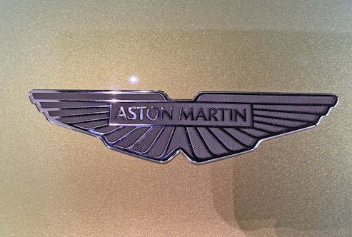
Photography was surprisingly challenging with all the light sources in the showroom. Getting a good badge shot usually isn’t hard, but the Valhalla’s is small and conservative. There’s good reason for that: the coachwork is doing the heavy lifting. But take note of the texture behind the Aston’s signature graphic; this is truly a luxury product that sweats the details.
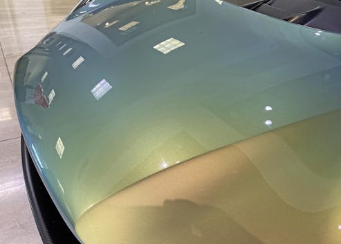
The proper English term for the Aston’s familiar front-end style is the “bonnet airdam,” which likely serves double duty as a pedestrian safety implement and an aero-trick that creates a negative pressure zone at the base of the windscreen.
Or so I’ve been told. But the further back we go, the more apparent trickery unfolds.
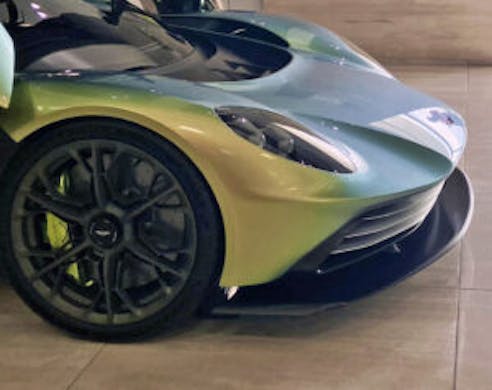
The side view is one of the few angles from which the upturned bonnet airdam looks like a big honkin’ nose. Luckily there’s a massive splitter below to take off some of the visual weight.
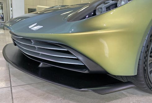
Stubby schnoz aside, the entire form is clean and free of clutter. The wide grille accentuates the Valhalla’s long, horizontal lines. From this angle, it’s a night-and-day difference between other manufacturers’ mid-engine designs that are either too overwrought in their sporting pretension, or over-styled with too many action lines.
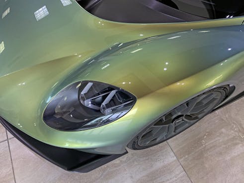
What really makes the Aston so special is also what differentiates the brand as a maker of grand tourers: a minimal amount of cutlines so the body contours can sing an unfettered song of its designer’s intentions.
No frunk, no Senna-aping cooling ducts/aero tweaks, all of which means more room for headlights to play perfectly with the curves of (the space normally reserved for a) fender. More to the point, everything from the “fender” contours to all the lines inside the headlight likely point to a common vanishing point.
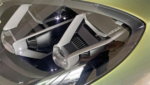
There’s a specific area where styling and functionality merge beautifully on the Valhalla: the front lighting. The (presumably LED) headlights sport cooling fins, jeweled focusing glass, and some combination of turn signal and marker lens. The Valhalla gave these functional bits the futurist, yet delightful whimsy of a Michael Graves teakettle.
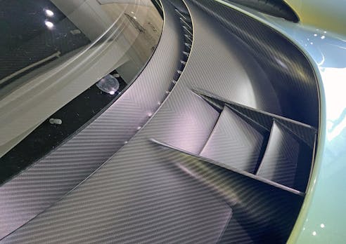
And yet, there’s a lot overtly fancy, functional bits on this car as well. Only difference is that Aston Martin took pains to hide much of it under muted tones that are both physically and visually separate from the loud, green body elements.
What pains, specifically, you might ask?
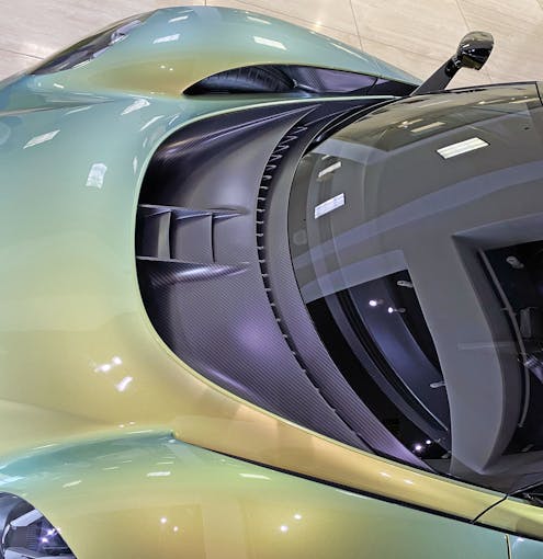
Note the presence of the passenger side tire in the blacked out hole in the fender. Yes, designers did a fantastic job hiding that massive hole. And it’s such a uniquely thrilling element that you can’t stop looking at it.
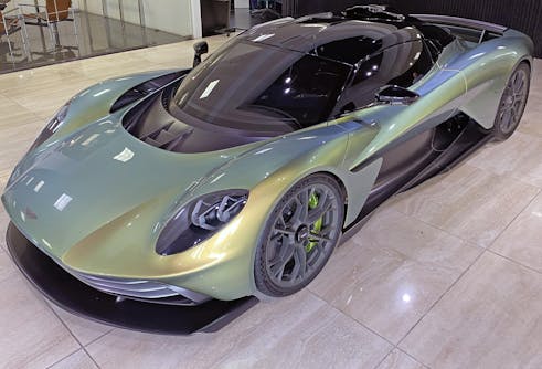
Go ahead and zoom in, the passenger-side tire is visible. Also note how the bonnet airdam’s raised profile provides the aforementioned “negative pressure zone at the base of the windscreen.” I’ll bet you dollars to donuts it also provides a low pressure zone worthy of hurricane-like wind extraction for the tires, too.
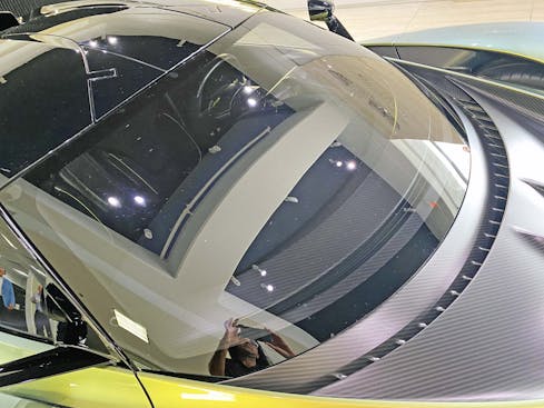
The carbon-fiber cowl is both expressive and subtle, to the point its hard to see just now complex and appealing the “pillarless” windscreen treatment is on the Valhalla. Blackout A-pillars are a common trick on everything from Range Rovers to the Kia Soul, but you’re in the big leagues when a piece of glass wraps around a significant portion of the pillar.
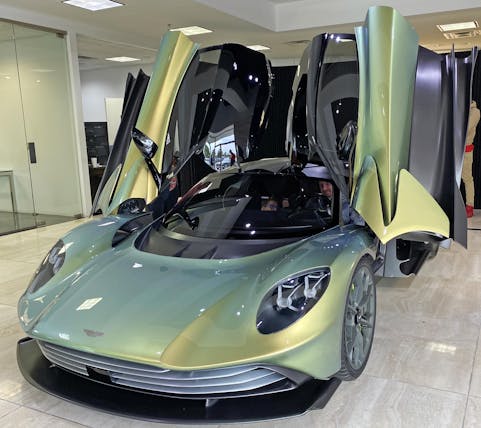
The aerodynamic tricks around the front wheels ends into feather-like appendages on the Valhalla’s dihedral door hinges. We’ve seen these doors too many times, but just like a functional spoiler, their engineering merit endures.
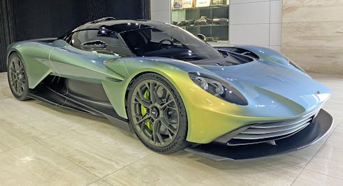
Like every super-hyper car of this modern era, the negative area (i.e. carve-outs for scoops) have the chance to make functional art along the body. It’s aggressive and busy for a run-of-the-mill Aston Martin, but it’s clearly the most refined body in its class. Clearly the work of a luxury coachbuilder.
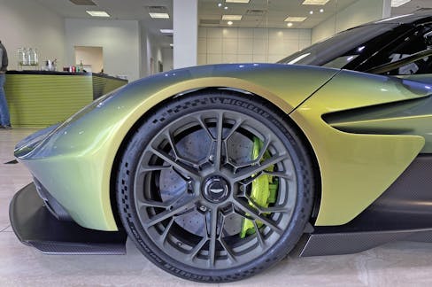
It would be neat if the door cutline was behind the fender “feathers,” as then the doors would open behind them (eliminating that slash between the A-pillar and the front wheel). The resultant one-piece fender would provide a neoclassic, even pre-war demeanor to the front end. I am sure there are several reasons why that can’t happen, but its alway fun to dream a little dream.
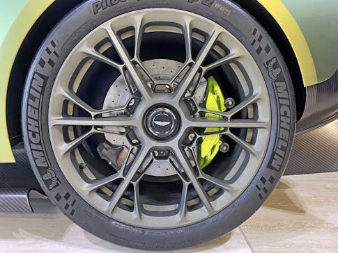
Even the snowflake pattern wheels somehow look like the work of a GT carmaker that is dabbling in the supercar space. You know, just because it can and has a Formula 1 team to puff up.
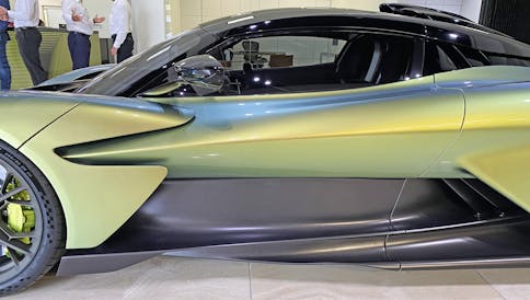
The Valhalla’s mid-section sports the taut muscles of an Olympic medalist. Added depth via a black roof and charcoal lower insert are almost unnecessary, but do a fantastic job to help the eyes focus away from the functional bits. Instead you are forced to fixate on the aggressive contours finished in the green body color.
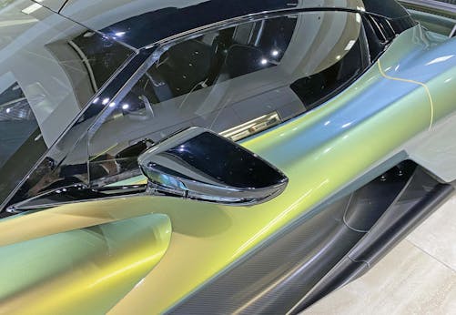
The aforementioned floating fender/feathers becomes a dominant element on the door, keeping your eyes from noticing just the A-pillar relative invisibility.
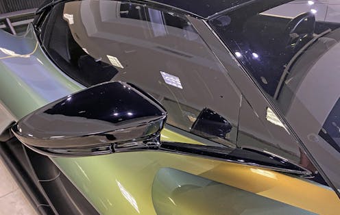
While the entire A-pillar isn’t covered in a Mercury Sable-like sheet of glass, the glossy bit between the two bits of glass is almost invisible. Even in person! There’s simply to many other touches on which to fixate, like the impossibly-thin side view mirror arm.
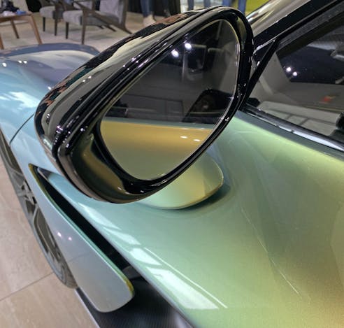
An exciting mirror from the non-functional side but surprisingly mundane to behold on the business end. That said, the trim that gives the glass a countersunk feel is worthy of the Aston Martin badge. The details never disappoint with this car.
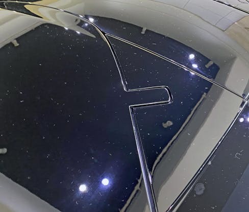
Those slick door hinges have the same external cutout as the McLaren Senna from our 2020 analysis, except these appear to have tighter panel gaps.
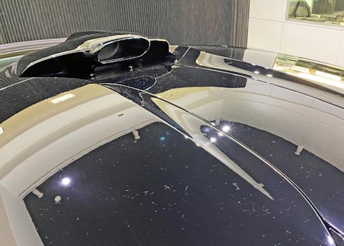
And, even with a Senna-worthy intake scoop, the Valhalla’s roof is a more sculptural element. This feels like the right move.
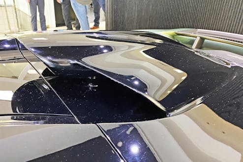
Photographing the scoop’s bi-wing shape is rather challenging, but even under the cover of gloss black, the assertive spaceship-like demeanor cannot be hidden.
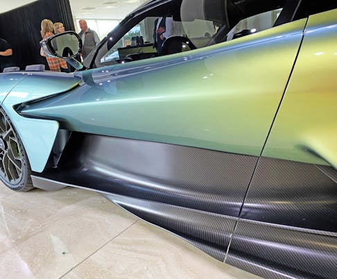
Leave the roof again and note how the inner scoop has the gentle curve of a bathtub as it climaxes to the rear of the door. I regularly insist that interplay between hard angles and soft curves makes any design excel; compare the insane angles of the Citroën Karin to the harshness of the Tesla Cybertruck for proof that both must exist in harmony.
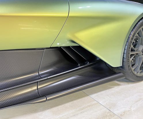
That bathtub curve is also functional, forcing air underneath the green wing of the rear quarter panel. Odds are that wing does a great job moving air over the rear wheel, but the soft (closer to the door) and hard transitions (wheel arch) also adds surface tension to what would otherwise be a flabby contour.
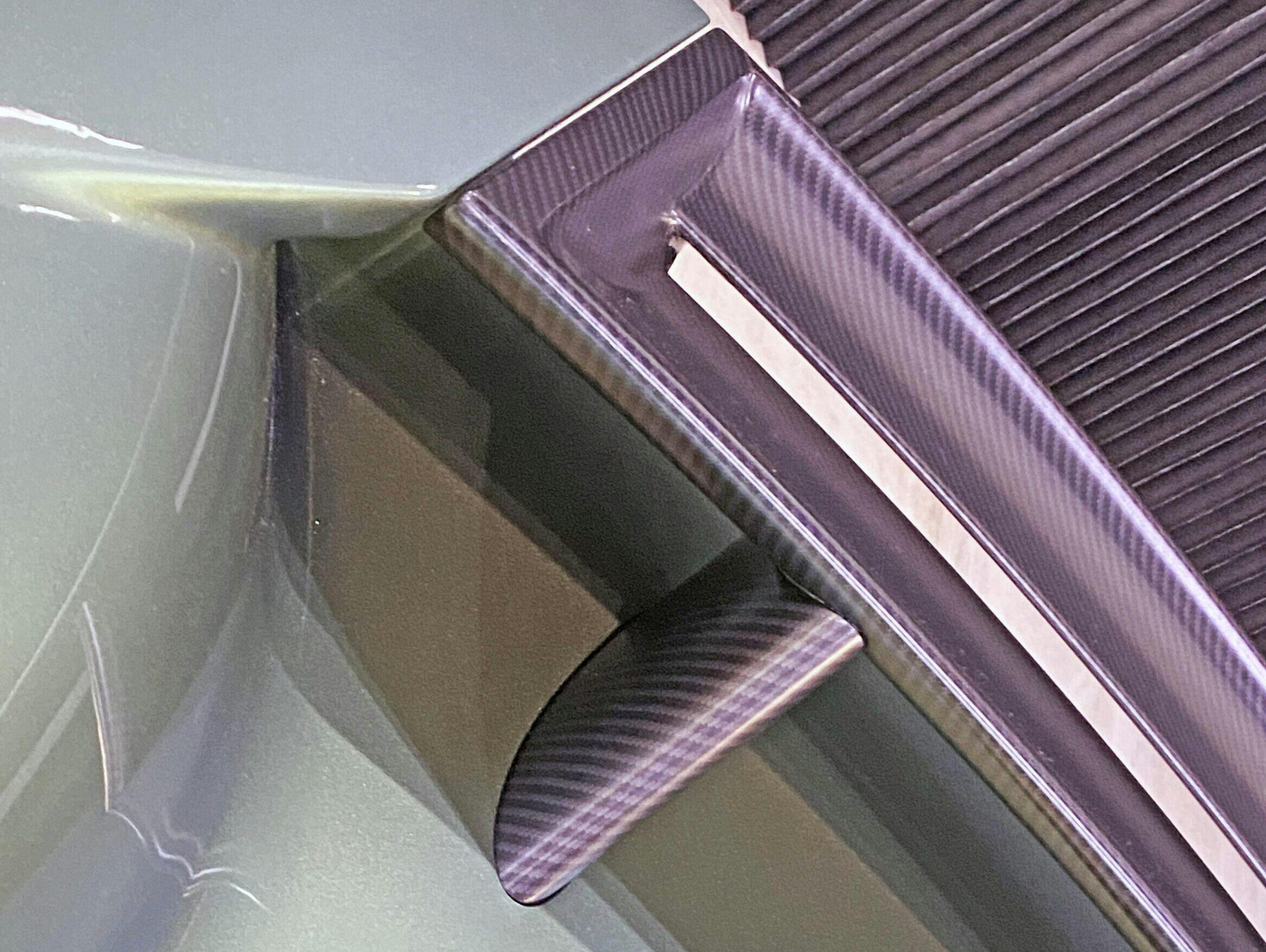
Speaking of, note how the curved carbon-fiber contour at the base of the “rocker panel” gets thicker and rounder as it leaves the area right below the side-view mirror. Look at the previous photo to see just how radical the transition truly is.
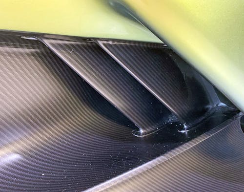
Unlike the Ford GT, it’s much harder to see what the air is used for once it enters the body, but the carbon-fiber detailing is stunning and brilliantly crafted.
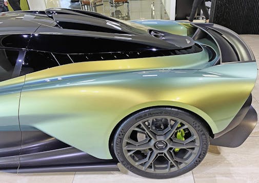
The mushroom-shaped, Nintendo “goomba” roof is rather unique in its seemingly one-piece shape. It visually holds everything from you’d expect from this genre, from intake snorkel to exhaust pipes. Unlike the video game character, the green body underneath rises up to match its contouring, and allows for cooling/extraction fins between both elements.
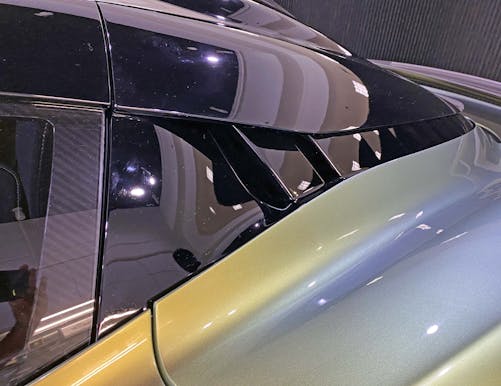
The B-pillar elegantly transitions into ductwork for the engine compartment. It is a nice move aside from the awkward cutline, as the green door cuts into the body a couple inches farther away from the line used for the door glass (and the roof).
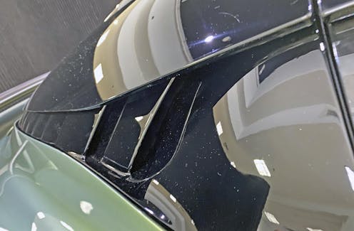
The space between roof and body is both a functional and high-end take on the sad DLO FAIL we seen on the most recent Nissan sedans (8th Gen Maxima, 6th Gen Altima).
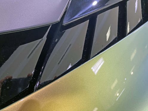
To be clear the (seemingly) functional aspect of these ducts ensures this isn’t a DLO FAIL. Too bad front-wheel-drive Nissan sedans don’t need such functionality, no?
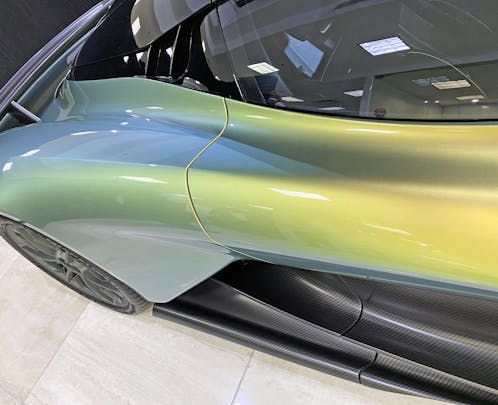
The details can be fussy up close (especially at the rocker panels) but once you are 2+ feet away the whole affair is a fantastic blend of long lines, hard edges and soft contours. The lack of a huge hole on the painted quarter panel is a nice change from its competition.
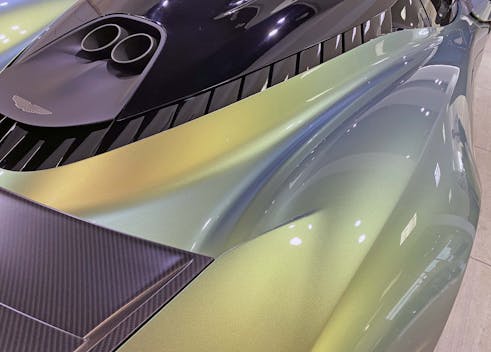
Everything flows in a logical and organic way, much like drawings of the human muscular system. The cooling vents below the roofline remind me of six-pack muscles, and everything else is similarly taut but with much longer lines (like muscles across a femur, for example).
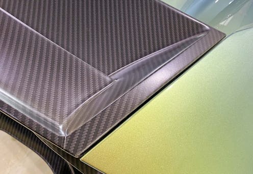
The only flies in the ointment are the hard edges present in the carbon-fiber rear spoiler; they don’t strike the same balance as the hard/soft lines on the side.
While I understand this vehicle’s mission, and our general fascination with carbon-fiber aerodynamic tweaks (both factory and aftermarket) the Valhalla’s coachwork truly deserves a body-color spoiler for a clean, minimal, and luxurious integration worthy of all the effort place on its roof.
Or all the effort of the fourth-generation Camaro, as the Hagerty Community so generously mentioned in the past.
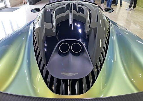
But what does strike a perfect balance are the hard/soft shapes, the light and dark colors and the brilliant integration of functionally-relevant design features into an absolutely stunning hypercar body. Especially in how the black roof seemingly floats atop those vents: the Valhalla looks like an underwater creature worthy of comparison to Mother Nature’s finest.
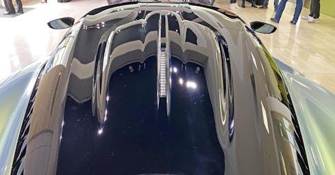
The spine on the back of the air intake is another example of a pleasant balance of hard lines and soft contours. It makes for a good transition from the angular front of this element (seen 9 photos ago) because the rest of the roof would otherwise visually conflict with such an aggressively angular intake.
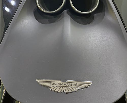
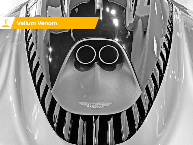
While the exhaust panel (for lack of a better phrase) makes for an elegant transition down to the cooling ducts, its almost intoxicating to look at it up close. This way you can admire the contrast of a metal logo and flat charcoal paint: a wonderful keystone to an otherwise shiny and bulbous roof design.
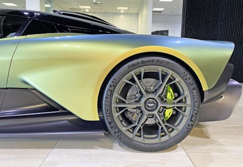
The exhaust panel is indeed a finishing touch for the roof. But can we say the same about the layers of bumperage on the rear end?
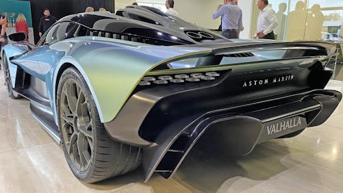
The layers make far more visual sense from the three-quarter angle. Sure, the bumper is a bit uh … Georgia O’Keeffe-y, but maybe that’s the appeal?
And before you scroll down, note how well the bathtub side contouring works with the body side, and note how the door’s contour matches that of the rocker panel.
Nice. Very nice.
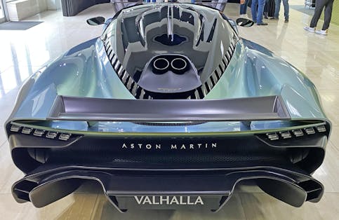
The frumpy shaped lower valance/rear diffuser looks more impressive in person, but the Valhalla’s rear end is still an absolute delight. Probably because everything from the roof to the taillights points inward, leading to a vanishing point on the same plane as the “H” in the Valhalla’s license plate frame.
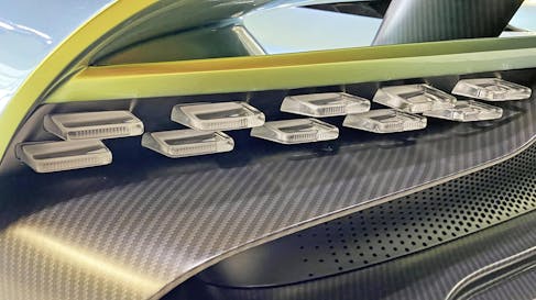
This LED array isn’t exactly busy, but it adds another type of texture to the swoopy carbon fiber, and the organic holes punched into the rear fascia.
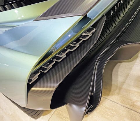
There’s a LOT to process, but within those folded textures are rewards just ready for you to reap.
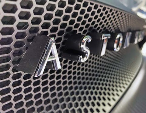
The rear fascia’s honeycomb grille tightens up in the middle, while the company logo rises atop like a brilliantly-rendered relief painting.
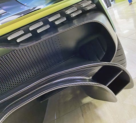
The Valhalla gets really serious from this angle. Also note just how much tread is exposed from the rear tire. The tricks seen at the front axle were not forgotten back here.
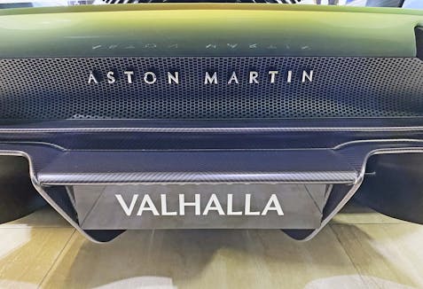
The textures! The curves! The colors! They give an air of luxury and craftsmanship, which is what we should demand from every modern-day Aston Martin. I can’t imagine what these lines would “feel like” after pairing them with those 937 ponies and a twisty road to really bond with the vehicle.
Brittanica defines Valhalla as “as a splendid palace, roofed with shields, where the warriors feast on the flesh of a boar slaughtered daily and made whole again each evening.” While Odin and his fallen soldiers live a life of privilege in Valhalla, Aston Martin brought it to earth for the human eye to savor. This is one helluva rolling tribute to that Nordic place of myth.
Thank you for reading, I hope you have a lovely day.
And thanks to Aston Martin Houston for their generous invitation to see the Valhalla!


I was indifferent to the design initially, but your analysis has made me realize how spectacular it actually is. I would totally take this over anything else in the segment now!
That’s fantastic to hear! While I haven’t seen every car in this segment (i.e. would be nice to see the McLaren Speedtail, but I question if its the performer of the Valhalla) there’s no doubt in my mind that I would take this over any other $500,000+ hyper car too!
This is an excellent write up and I appreciate the high quality photos which truly capture the design detail. The pearl paint on this was well chosen and accentuates the lines of contours of the body. I wish more automotive journalists would adopt your writing style and photography as the article is both very informative and shows off the best of this car.
I am thrilled to hear you enjoyed all the hard work that went into this article! Thanks Mark!