Vellum Venom: 2022 BMW M3
Hagerty’s delightfully, insightfully perceptive editor-at-large Sam Smith put his trained hands on this BMW M3 shortly before I found a quiet, unadorned section of GingerMan Raceway—where our staff was holding a track test—for Vellum Venom–ing. I am only bringing him up to thank him for the perfect summation of my design analysis:
“Have you ever had an old friend go off and make a bunch of new friends, then become what those new friends seem to want?”
Friends forever? That’s a question with a dicey answer. Let’s examine the M3 that Sam Smith sampled, right after he ripped it around GingerMan. Embrace the bug splatters: Automotive journalism gets messy at times.
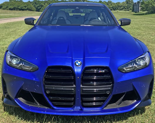
Believe it or not, this is still the M3 we all know and love; it just went to a college that had a larger endowment fund than yours did. Perhaps it needs to scream its assertiveness amongst a sea of dual-motor Tesla Model 3s that blandly put down comparable 0-60 numbers with soulless precision.
Clearly someone’s got something to say, and the days of M-series understatement are long, looooong gone.

But did BMW really have to throw away decades of understated assertion for such overzealousness?
If you squint really, really hard, this M3’s bumper and headlight arrangement can look like a more angular, more muscular versions of the E46 (2000–2006) M3’s schnoz. That insane grille looks more normal if you let your eyes glaze over to the point that its integral blackout bumper-panel blends into the lower fascia.
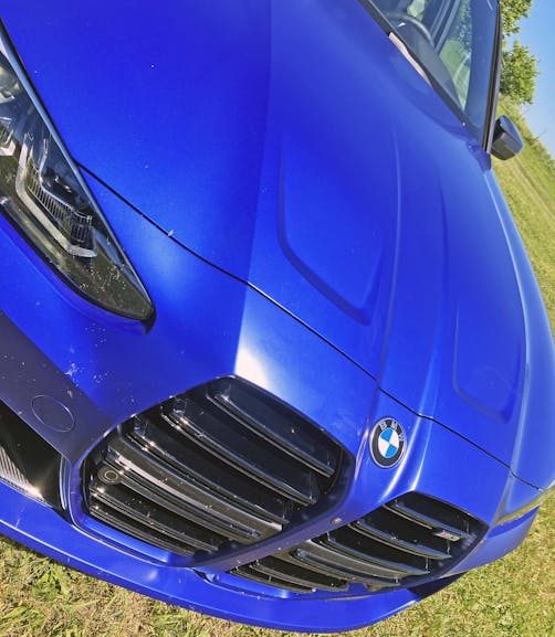
But the bumper panel doesn’t blend in, as BMW made a point to extend the grilles far south of the bumper’s crash point. We’re now in a modern era that caters to a generation who could care less about the E30 (1986 to 1991) M3’s subtle body kit. Today’s audience might even enjoy BMW’s hat-tip to the bumper/lower grille treatment of cars like the 1973 Olds Cutlass.

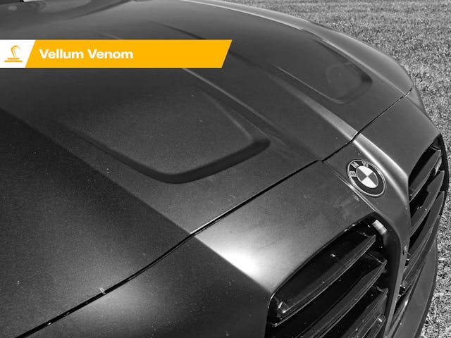
It’s understandable and almost acceptable, as I am not necessarily a hater of today’s gaping-maw design. Faces can’t stay the same in our society; design stagnation only works for Tesla and modern Mopar muscle. Speaking of, the M3’s twin power-domed hood looks much like that of the 2010 Dodge Charger SXT. As a follower of mine on Instagram notes:
“That’s a dope looking Dodge Charger 👌🏻 👀”
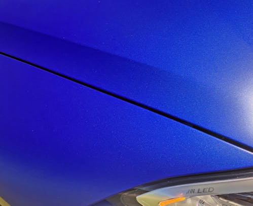
See that line above the hood’s cutline? The one that makes a slight shadow over the hood? It is the beginning of the M3’s next problem: a tall cowl that requires such a large face and the requisite monstrous grille.
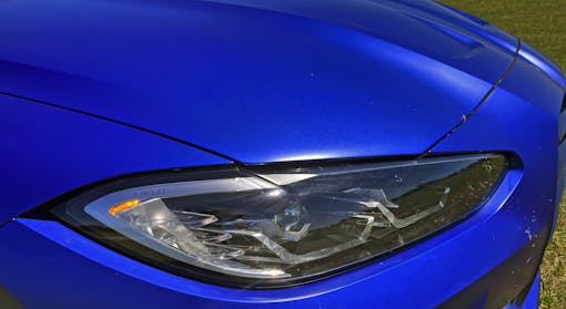
But we need not concentrate on the M3’s big face and tall cowl just yet, because from here, the front looks just as low-slung as that of the Toyota GR86 or Subaru BRZ. The sleek, fast, and somewhat angry headlights look marvelous on this long hood.

Considering LED technology is cheaper than incandescent on places like eBay and Amazon, perhaps BMW had no need to advertise itself here. The technology isn’t the selling point; it’s the level of detail in the execution. Better yet, let the complex, plasti-crystal lenses do the talking.
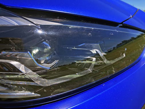
Because the LED-infused stuff behind these clear lenses? They are gorgeous in a sci-fi movie-set kinda way.

Alas, we must step back and remind ourselves those lights don’t exist in a vacuum. There’s a busy bumper, and BMW’s twin grilles emerging from dual power bulges now resemble lungs instead of kidneys. A damn shame for traditionalists.

That said, note the bumper’s delicious inward taper. It keeps the front end from looking flabby—from multiple viewpoints, too. The air curtains at the corner and the cooling ducts to the right are aggressively chiseled to remind everyone this ain’t no Tesla (or lease-special 330i).

There’s a hint of “exposed fan blade” imagery from the world of aircraft in these finned air-routing panels. The interplay between painted plastic and exposed carbon fiber keeps this from looking cheap or tacky.
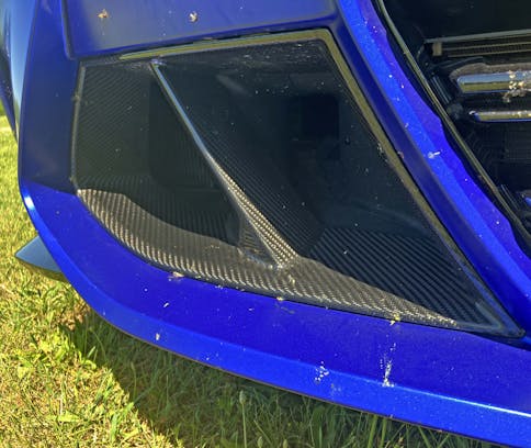
There’s a certain gravitas lent to the car by these huge carbon-fiber ducts; it’s only logical that an M3 that requires such aggressive cooling would perform like no M-series before it.
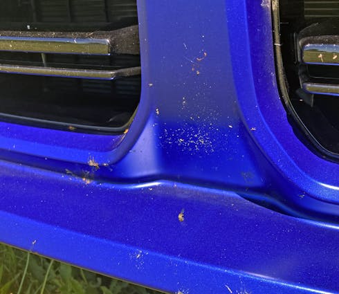
The bumper’s middle section shows a similar attention to detail, as the massive “lung” grilles have strong bumper contouring to ensure they aren’t stylistic afterthoughts. The bevels and muscular bends make each feel like a concrete reinforcement to the facade of a utilitarian building, like a powerplant.
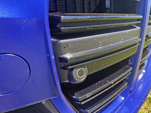
But still, the bumper’s middle section has to protect the car in a frontal collision. The grille’s texture suffers from the need to perform a necessary task.

Even so, it’s truly shameful to see how poorly the parking sensors were integrated into the functional crash element of the bumper. Pimples really have no place on a car as serious as this.
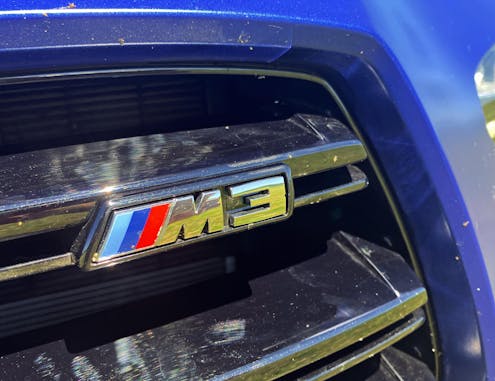
Just in case you forgot what you’re buying, there’s an M3 badge that awkwardly rests atop the massive grille’s demure horizontal slat.
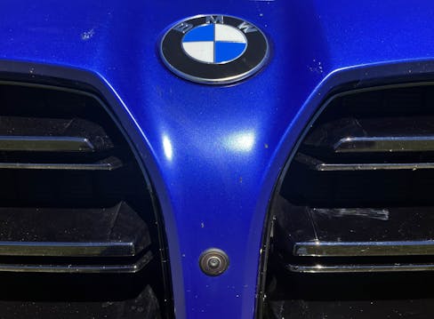
As much as I encourage creativity in the (otherwise conservative) world of commercial car design, adding flared nostrils to a BMW product seems so counterintuitive to the brand’s identity. Or at least, what the brand used to stand for.
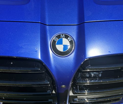
I still find something to like in the M3’s massive nose, as the grilles do inject an element of utilitarian functionality to the body. They read like an HVAC contractor doing the tango with an architect. More to the point, the M3 looks expensive, eye-catching, and immensely functional—just like the Inside Out building in London.

Despite that argument, no amount of inside-out HVAC functionality and sculptural integrations into a massive snout can mask the offensiveness of these openings.
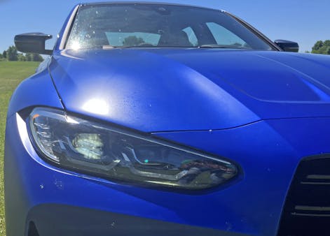
That grille is just way too over-the-top for a body with contrasting elements in so many other places. Remember that hood contour I previously mentioned? See where it goes? That’s the main problem here.

Again, the M3 has many sleek design features, as the short overhangs also look rather sporty with fast lines on the hood and headlights. Even the bumper’s cooling vents complement the headlights; from a side view, the fascia gives the appearance of an assertive undersea creature.
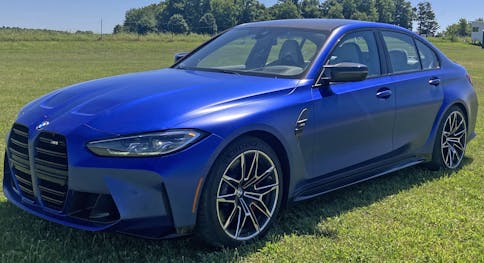
Thanks to the functional, solid bumper components within the grilles, one can imagine the M3 with a normal set of kidneys in lieu of these monstrous lungs. But would any one talk about this car if they did? Is all PR still good PR?
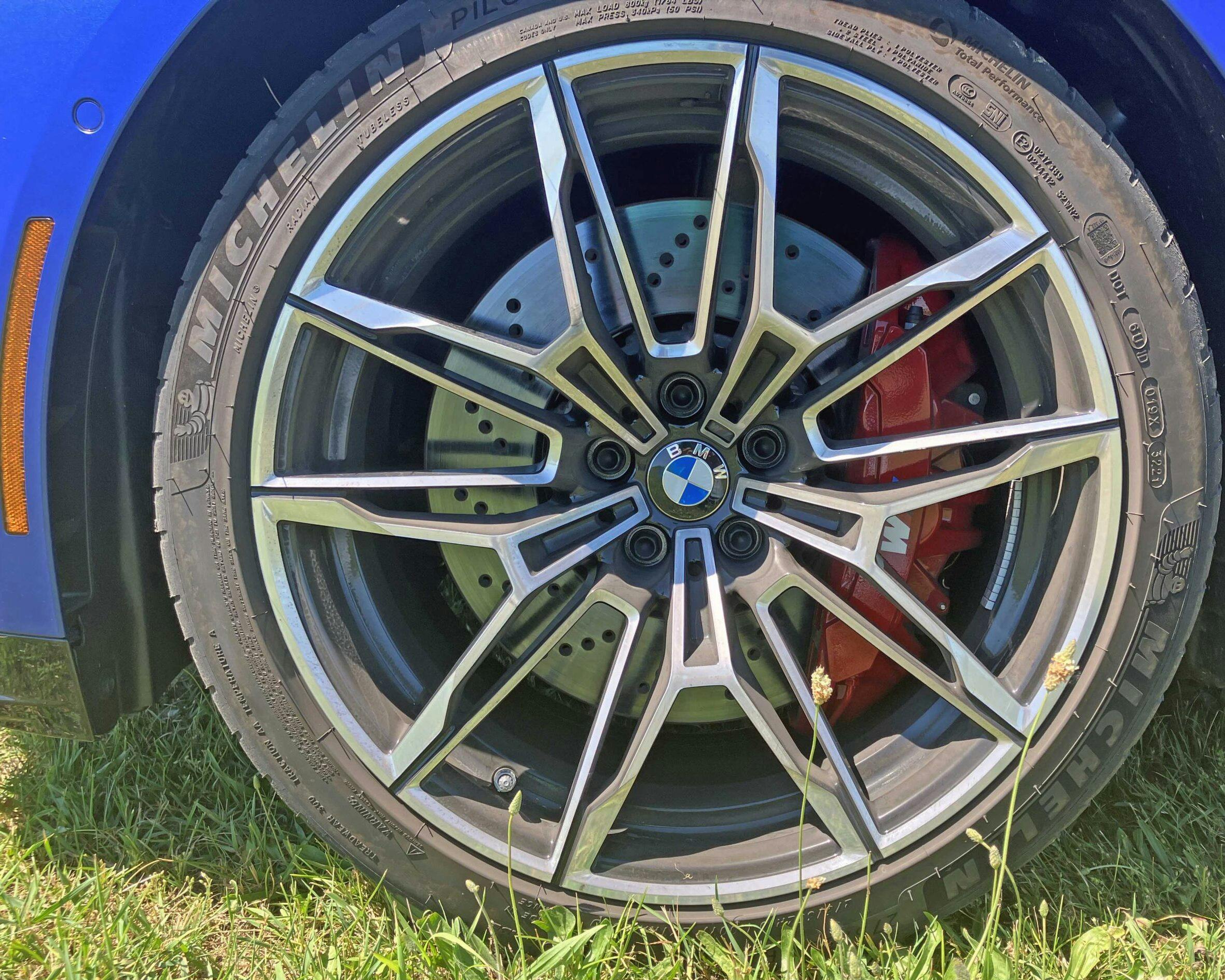
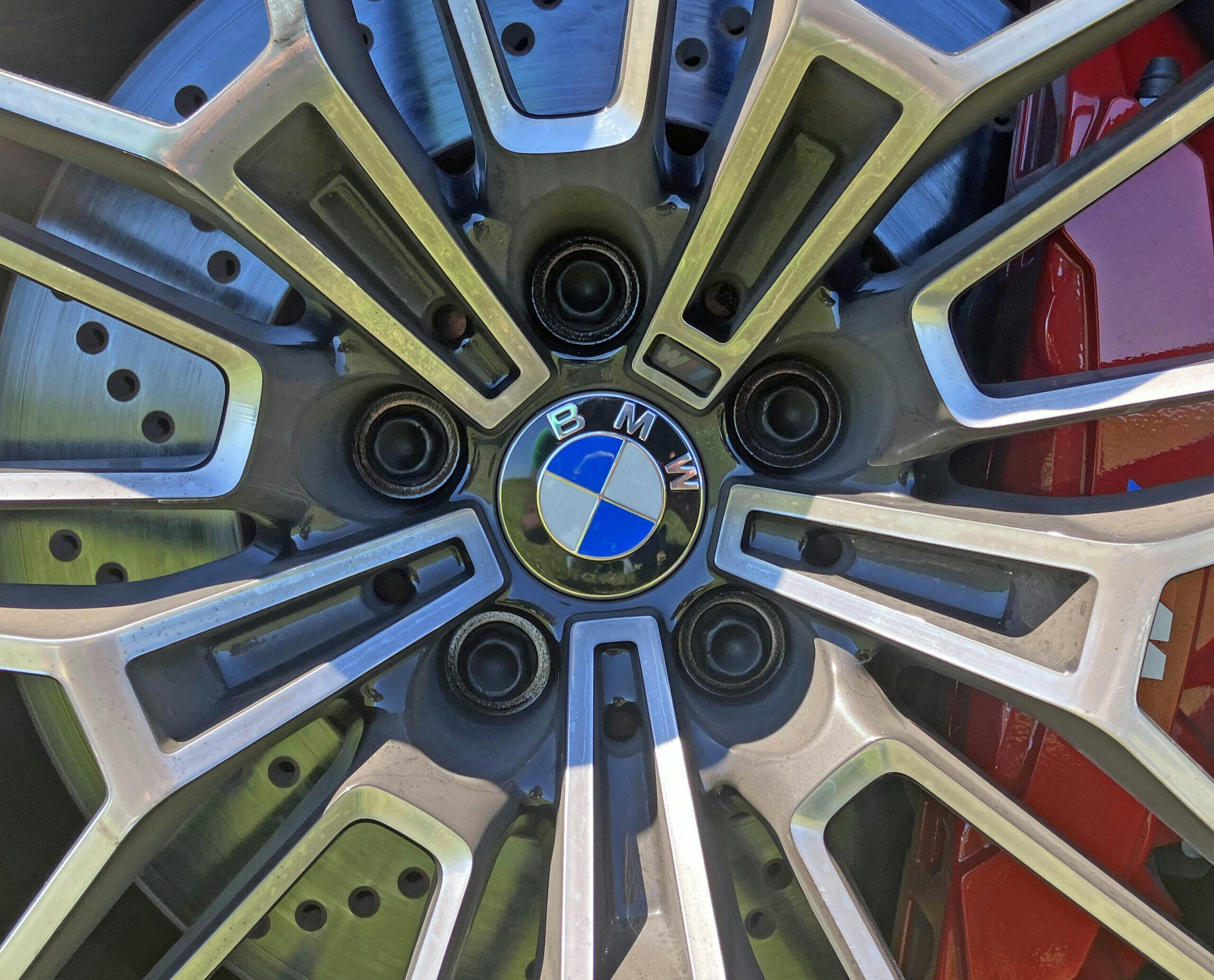
BMW, like most high-end carmakers, always spends the coin to make complex wheel castings. Machining that hub musta cost a pretty penny, and the seamless integration of the classic M-series emblem in one of the spokes is one of the (many) reasons why so many love this brand, warts and all.
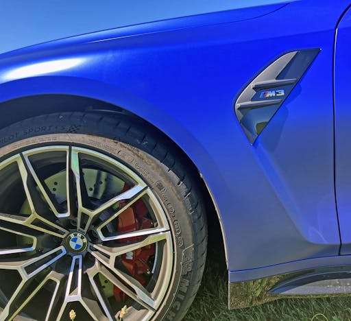
I remember remarking that the E46 M3’s air extractor was a bit over the top for a fender; now, these things have to look like something on an airplane. A tall vehicle needs to style its massive vertical surfaces, though, and that flying boomerang ain’t a half bad way to do it.
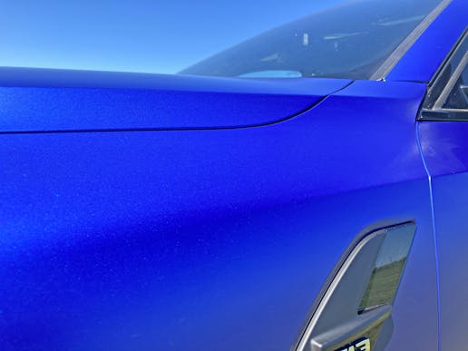
Sure, it was twenty paragraphs ago, but that hood crease is now a representation of just how tall and ungainly the M3’s modern cowl truly is for a sedan. A cowl this tall (and the pedestrian-friendly space between it and the engine) almost sits parallel to the hood from this angle. The latest Honda Accord commits this same sin at this exact vantage point.

Step back, however, and reap the benefits of designers who endlessly hone a product, especially a luxury one: The surfacing ensures that your eyes “pay no attention to the man behind the curtain,” drawing them away from that erect cowl to fixate on the fast lines laid atop it.
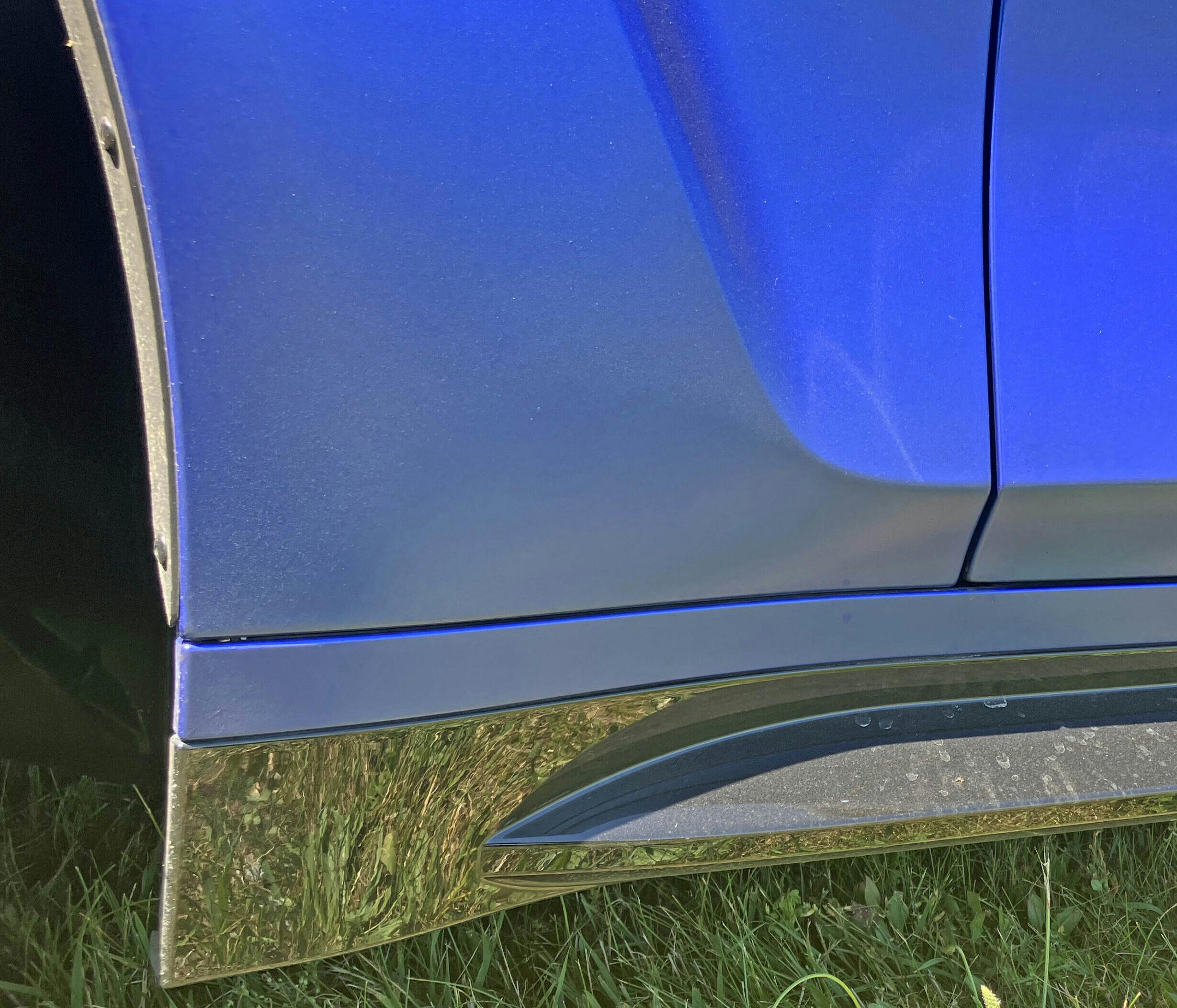
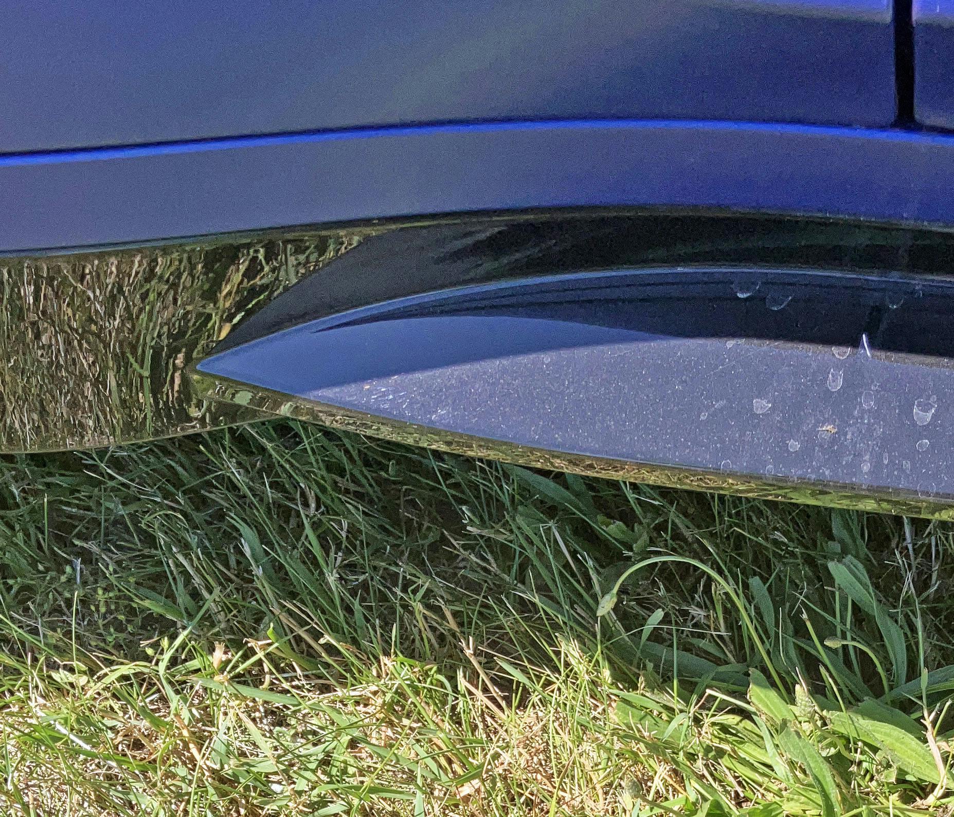
You don’t notice just how aggressively contoured the rocker panels are until you squat down and witness the inward taper between the front wheel and the front door. Another necessary element in surfacing an insanely tall body, I guess!

Note the three fender creases: one for the door, one for the top, and one transition to help the tall cowl elegantly translate into the downward slope for the front end. One day we’ll re-introduce lower cowls with no need for such nonsense. One can hope.

Much like the expensive wheel castings, these carbon-fiber mirrors look proper for an M-series BMW. Mounting them to the A-pillar avoids DLO FAIL, too.
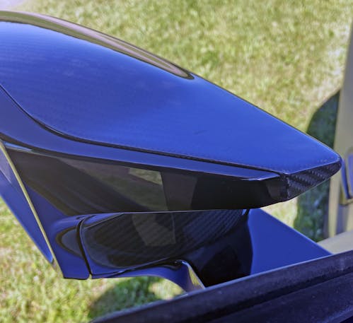
The mirror appears to have a pointed fairing for extra visual sleekness. Or, more likely, for NVH control at high speed.
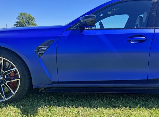
Step back and admire the elongated dash-to-axle ratio, the hallmark of a rear-wheel-drive platform and also a hallmark of the BMW 3-series.
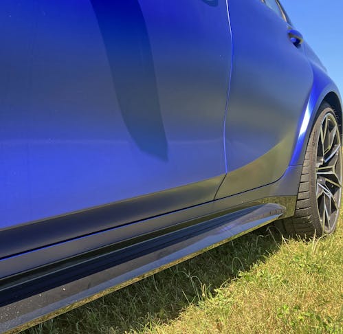
The rocker panels push back out toward the rear wheel, and there’s a nice character line above to bring some excitement to these tall doors.
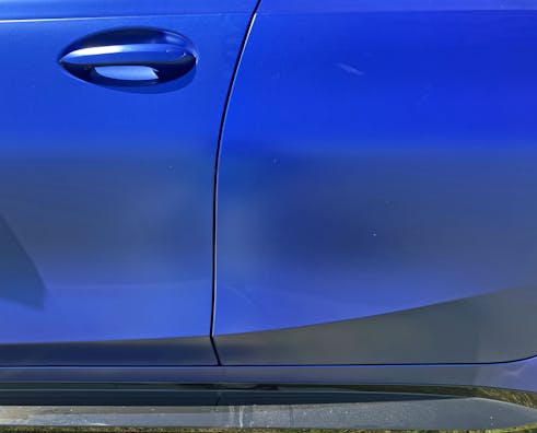
When focusing on the cabin’s center section, note the door cutline, as it incorporates both gentle and aggressive bends. The cutline is also a witness to the complex body surfacing on the 3-series doors.

No such complex contouring is present on the actual B-pillars; instead there’s a strong, smooth, and laser-straight line. Thank goodness for that.

While the current G20 generation (the chassis introduced in 2018) body is rather large for the 3-series lineage, the wheelbase between the B-pillar and the rear axle is somewhat modest. As is the rear overhang. Well, by modern car standards, at least.

The 3’s dogleg gets even more contrived thanks to a straight cutline in the door against the “curved plateau” found in all modern automotive wheel arches. There’s not enough space between these disparate elements to let each visually breathe (so to speak).
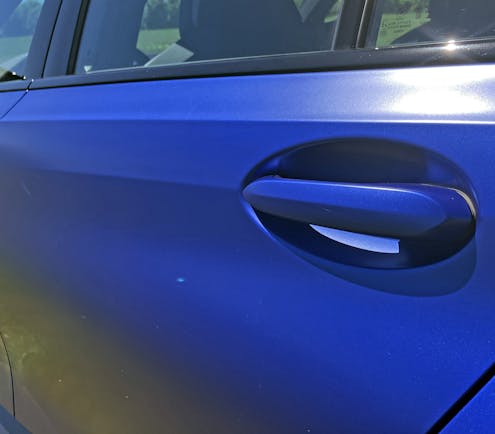
A character line bisecting the door handles has been a 3 Series hallmark since the E46 generation, and the two elements have sported a distinct correlation since the E30. Nice to see some traditions haven’t gone out of style.
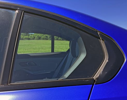
The Hofmeister kink has been a BMW signature for decades. Now, it is a function-less piece of black plastic that isn’t even integral to the window design. What a shameful implementation of DLO FAIL.

The details may disappoint, but there’s still something about an expertly sculpted M3 silhouette. The C-pillar and quarter panel look positively muscular in the light of day. And with M3 levels of wheel diameter for that intense stance? Still works for me.
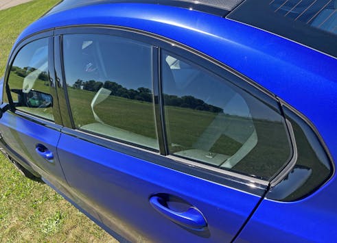
I’ll say it again: Ruining a perfect daylight opening with that awful Hofmeister kink extension is a shame. But note how it’s not just a “Hofmeister shaped” panel; it has bevels to add aggression. This isn’t a kink, it’s an arrowhead.

The subtlety of the E36’s stamped metal frame around said kink is a long forgotten memory, but at least the 2022 car’s body side looks muscular enough to go with that steroid-infused front end.
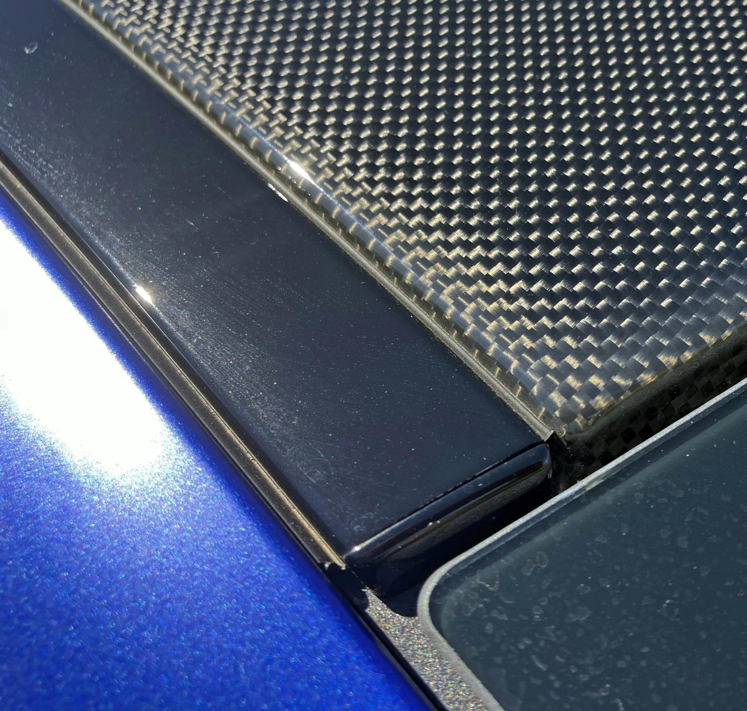
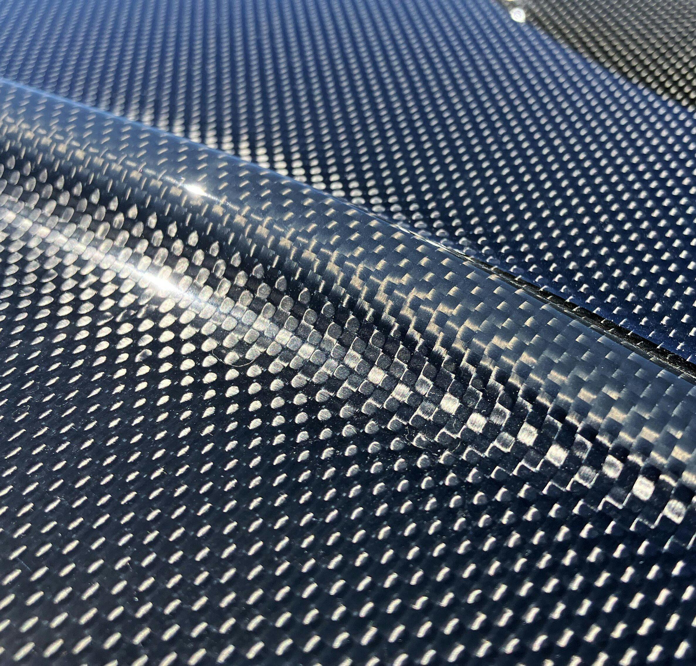
Carbon-fiber roof panels likely have a modest performance benefit in this top-heavy era of curtain airbags and hyper-reinforced roof pillars. Function aside, the contouring on this one is a delight to behold.
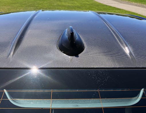
The aforementioned contouring lines up with the CHMSL’s external frame.
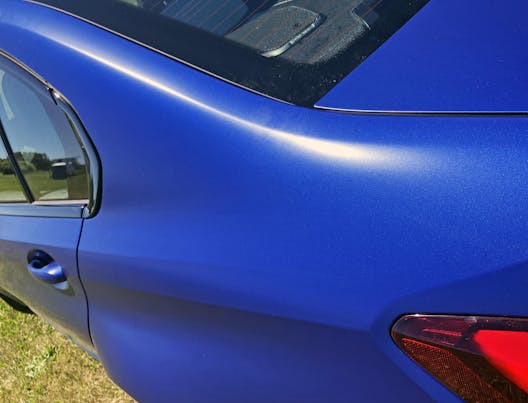
These fender flares look like tumors, but the subtle C-pillar crease elegantly slides down the quarter panel. The latter is only slightly more pronounced than it is on the E39 M5.
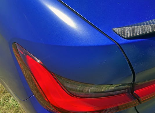
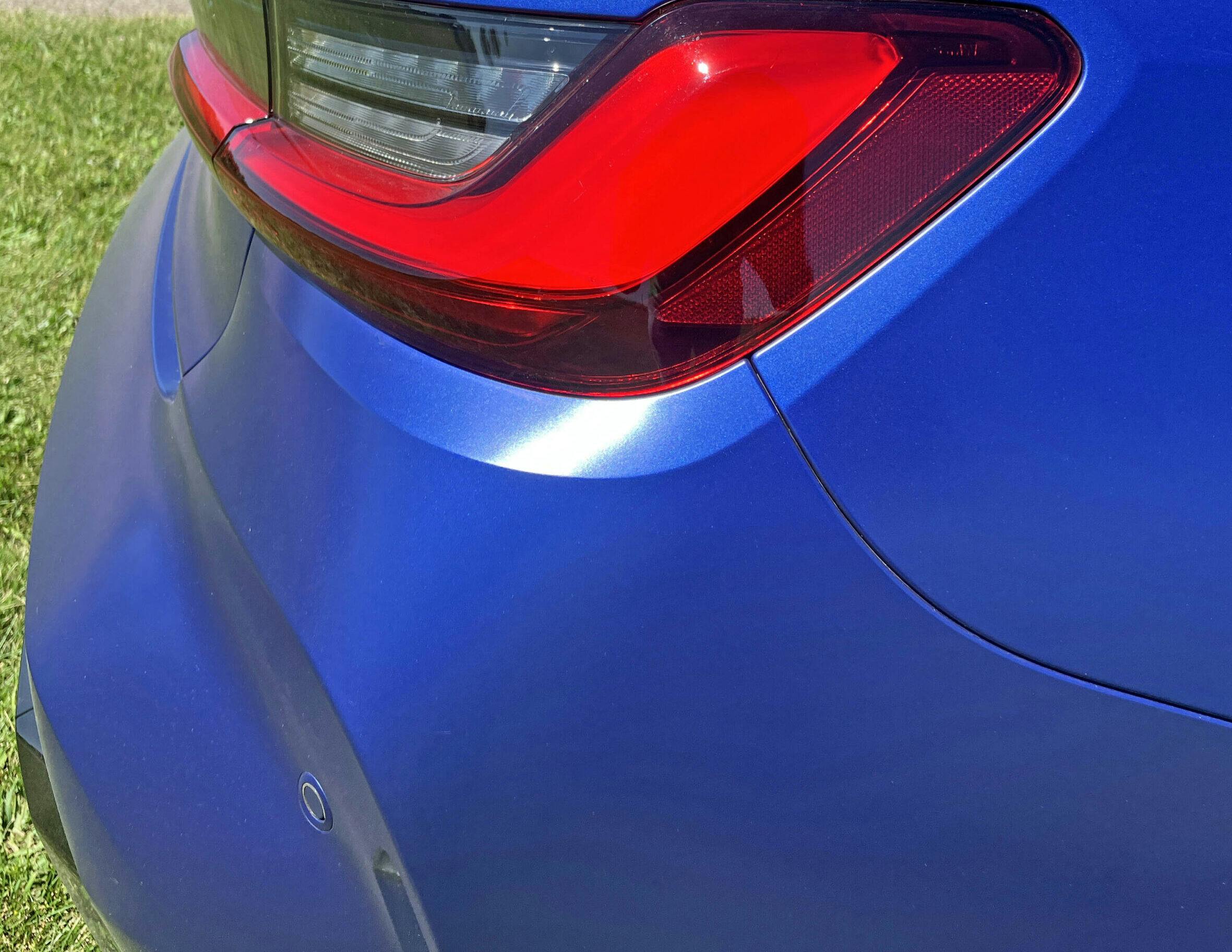
The hard bend between the taillight and the horizontal has a sculptural element, removing bulk to make a more elegant transition for such a tall posterior.
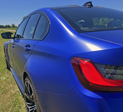
The hard bend bisecting the door handles runs to the tip of the taillight, while the sculptural lopping of metal above the taillight is also executed below it.
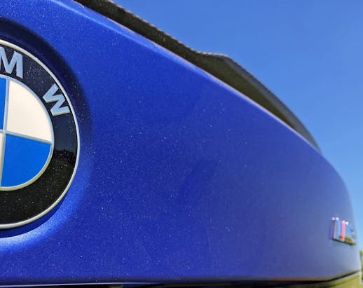
BMW even lopped the center section of the decklid spoiler. Like, awesome.
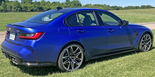
There’s a shocking amount of “stair stepping” from top to bottom, as this M3’s spoiler-tipped rear probably stands far taller than the E30 M3’s, even with that car’s fixed wing.

I know it’s just my bias as a Lincoln-Mercury fanboi, but so many manufacturers make Continental kit homages in their decklids these days.
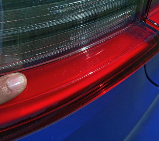
The top of the taillight’s red section is actually parallel to the ground, adding to the aforementioned stair-step effect.
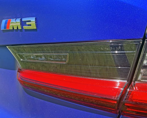
Note the height of the smoked lens. There’s a pretty significant drop from the decklid to the ground below, so that step is greatly appreciated.

The red light is almost an interim bumper at this point, making a significant break in the vertical drop of the M3’s body.

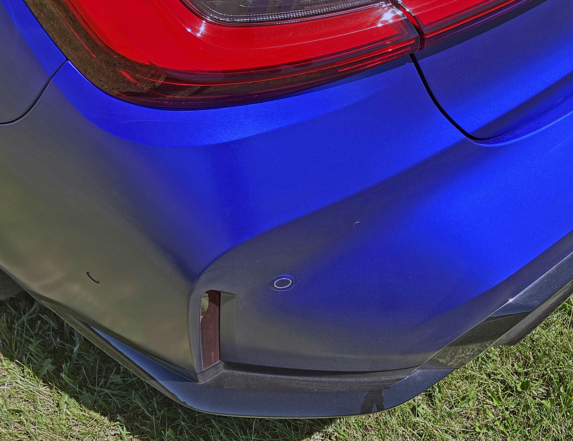
Below the light are wavy, sculptural elements and a hard inward bend that likely helps you find the base of the decklid by touch. The rear bumper, much like the rocker panels, sucks inward to reduce visual weight.

The M3’s cornucopia of bumper contouring is just as radical as that controversial front fascia. But unlike the front, it successfully differentiates the M-series from its pedestrian counterparts without offending the purist’s sensibilities.

Rear reflectors are hidden behind the hard edge of the side-to-rear transition. It’s a slick execution, both literally (aerodynamic benefit to hard transitions in this location) and figuratively (aesthetics).
Oh, and note the lower contouring in how it matches the rocker panels just a few feet away.

The overwrought bumper diffuser elements make sense given the M3’s modern mission. Problem is, they give a designer leeway to turn the Hofmeister kink into a complementary arrowhead. Such integration is usually cohesive and great appreciated, but it feels wrong if you have any connection to M-series vehicles of yesteryear.
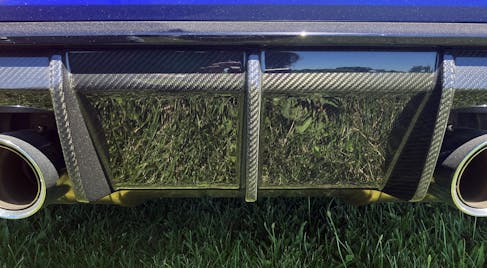
Rear diffusers have merit, and a brilliantly finished carbon-fiber affair is eye catching, functional, and expected at this price point. ($90,095 as-tested, in case you were wondering.)
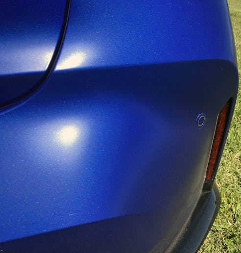
Perhaps the M3’s bumper is doing the duck face, the “pucker up for a kiss” expression that plagued social media for so many years. But there’s a flaw in its complexion, as parking sensors never integrate as well as we’d like on complex surfaces.
Stairs, stairs everywhere. That said, it’s actually a good look, as it eliminates the traditional bumper shelf and shrinks this huge fascia. The problem is that such manipulation was needed in the first place.

A pursed-lip “duck face” looks pretty fantastic with quad pipes finishing off the look. All points on the M3’s jutting rear bumper lead to a vanishing point many, many feet in front of it.

There’s a certain old school DTM race car look about the M3’s rear. The car’s ready for a fight, and let’s face it, this sucker still performs when you push it to the limit.

Perhaps its my affinity to the E39 M5’s LeMans Blue paint and caramel interior, but there’s something about a modern BMW finished in blue, sporting a carbon-fiber roof, and three contrast-colored headrests that instantly triggers my excitement for the M-series brand.
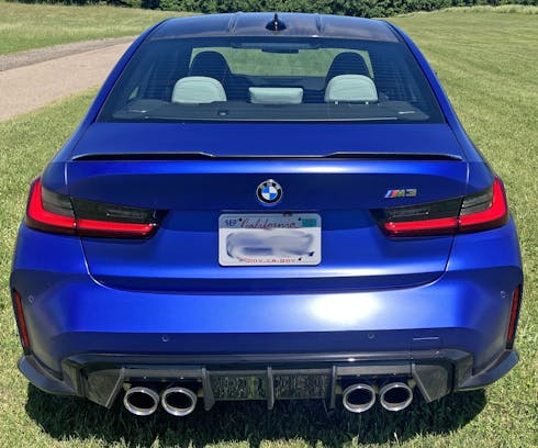
Even with the duck face, that is still an ungainly rear bumper. Considering the risk BMW took up front with the lung-shaped grilles, it’s surprising the designers chose modest tweaks at the rear to hide all the bulk.

I am not Sam Smith, but driving this M3 is a strange mix of pure joy with rough jolts of unnecessary aggression. The seats are a bit firm (even by BMW standards) and the suspension is surprisingly jarring at times.
That agreement between visual aesthetic and behind-the-wheel experience is precisely why it’s hard to flat-out dislike the styling. BMW absolutely, unequivocally designed the M3 to look how it feels.

Perhaps I like the M3’s styling for being so true to the car underneath. That preference is a sin I can live with, even if I want to slap myself for saying it. Perhaps I can earn atonement in the next Vellum Venom, and there’s a true beauty in our future …
Thank you for reading, and I hope you have a lovely day.
Check out the Hagerty Media homepage so you don’t miss a single story, or better yet, bookmark it. To get our best stories delivered right to your inbox, subscribe to our newsletters.


They say beauty is in the eye of the beholder. Sorry, but as someone who has owned various Bimmers, in my opinion, this is just plain ugly. What a shame to see what BMW has become.
The grille is ridiculous. It was an attempt at coming up with something new in an era where there isn’t much new left on the table. The rest of the car looks fine. What I really want to know is has it bloated into a 5000 lb behemoth loaded with dopey electrical doohickeys so you can take your hands off the wheel of a sports car and let it drive itself while you instagram on the infotainment center, or is it still a relatively nimble driver’s car?
TG, it is indeed relatively nimble. As a driver’s car, well, there are other, better models out there now. Sam answers your question well here: https://www.hagerty.com/media/new-car-reviews/track-thoughts-there-is-nothing-quite-like-the-2022-bmw-m3/
Another brilliantly insightful take, chapeau!
Glad you enjoyed it!
As always, top notch work on breaking down the good and bad elements of such a controversial design my friend! You sum it up perfectly, the styling fits the car’s ethos. This is a modern weapon for those that are seduced by brutality rather than subtlety, favoring force over finesse. Cheers to those who will enjoy what this beast has to offer!
This thing is truly a weapon. It’s a beast. A bit too much for me, but at least the styling doesn’t oversell the guts underneath. Thank you for reading, I sincerely appreciate it.
BMW has produced some of the most beautiful, enduring designs in all of automotive history. This is not one of them.
Once again, thank you for the time and effort you put into these, Sajeev, they’re the reason I visit this site (other than paying my annual Premium on the Land Ark.
As for the name on the headlights, I could be conflating things but when I was an adjuster, a visible logo that was integrated into the part and was visible on the car meant that you could not replace it with aftermarket. The best example I can give of that are rear bumpers with the name of the car or brand embossed into them. Think New Edge Mustangs or 90s Camaros. Because aftermarket companies would need to license the name to use it on their part, and the car companies wouldn’t do that, the part would need to be made without it. That materially changes the part to make it not like kind or quality. It ensures that insurers of folks who over estimate their driving prowess head straight to the BMW dealers to replace those LED headlights. But, since LEDs are so cheap to make and were touted as a way to save the consumer money, clearly a new set of M3 headlights cost, what, $60?
Thank you yet again for reading and for your kind words.
You aren’t conflating things, but I would like to suggest that the “visible logo” doesn’t promote LED technology as its almost old hat at this point. Just integrate a BMW roundel instead, it accomplishes the same task with far less braggadocio. Think GEN V Jetta headlight, which was probably a high watermark for the…umm…watermark.
As to the $60 cost, most of the cost associated is in choosing the right components and making them road legal in the EU and North America. Anyone can solder some LEDs on a board and slam it into a plastic housing, but making them legal and pretty (i.e. all those reflectors are very expensive looking) never comes cheap.
There is a difference between muscularity and bloat. This BMW is bloated, swollen, with layer upon layer of folded fat. The massive maw and flared snout, the protruding but end, the bulging flanks all speak of mass rather than muscle. The visual bulk of this car corresponds to its 3,900 pounds of weight. This is no longer the capable driver’s car that was BMW. This bloated behemoth was not designed to carve laps on the track, but to cruise lethargically around mall parking lots.
Unfortunately (unfortunately?) the styling doesn’t lie, this thing is a track beast as Sam Smith suggested. Just because most folks will putter around the mall in this thing doesn’t mean BMW phoned it in and made a poseur. It’s just no longer small and understated. It’s a straight up beast, and I am not terribly thrilled about it.