Vellum Venom: 2022 Alfa Romeo Giulia Quadrifoglio
In our road test of the 2022 Alfa Romeo Giulia Quadrifoglio, we suggested this machine “doesn’t chase numbers so much as it delivers a unique experience.” Which is a nice way of saying the BMW M3 we also tested was a more impressive performer on track, if fractions of seconds matter to you.
But park the cars nose to nose and time stands still: Then, only one warms the cockles of your heart.
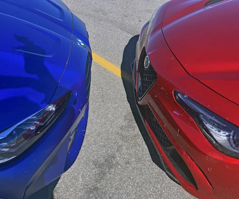
While I have begrudging levels of respect for the M3’s styling as complement to its Germanic engineering excellence, the Italian Alfa is a pure romance of form. A visual caress of sculptural elements masquerading as a performance sedan. There can only be one winner, but let’s see why the Giulia Quadrifoglio was the top dog.
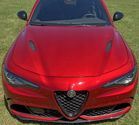
Italian cars are typecast as gorgeous works of art, but everything from the functionally stunning Fiat Panda to this Alfa Romeo Giulia looks outstanding relative to its competition from any other country, stereotype or no. And I can’t stop making connections to this car’s front fascia to that of the Lancia Aurelia B24: The modest scudetto (grille) of each machine is perfectly situated amongst all the other relevant design features present on the front clip. Let’s zoom in and see.
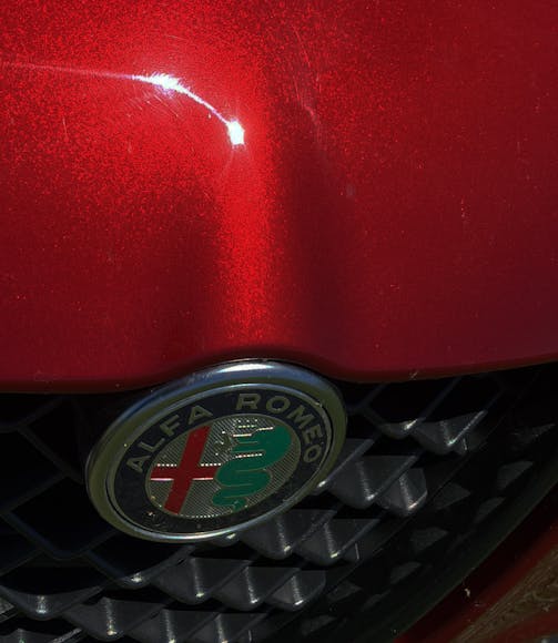
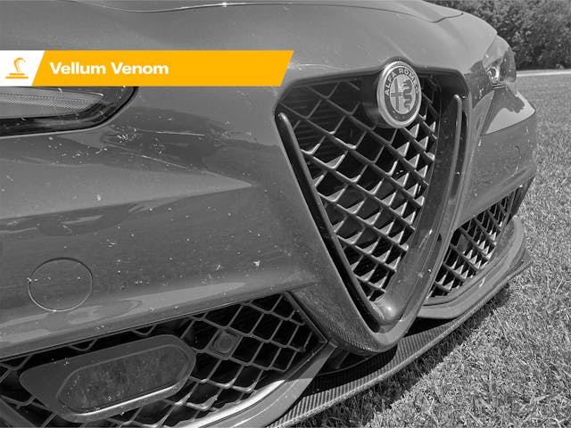
Alfa does “bump a cutline to accentuate a badge” better than any other automaker. That’s because its badge works like plate tectonics, causing a 3-D bump in the fascia.
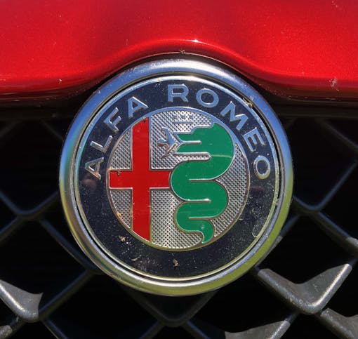
The bump is less obvious when looking at it head-on, which goes to show why examining car designs in a 3-D environment (i.e. the real world) will always be superior. (But you should still be reading this digital, 2-D sheet of Vellum Venom.)
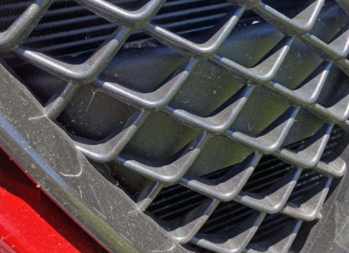
Just like the BMW M3, the Alfa hides a big bumper behind its grille. Unlike the Bimmer, the Alfa’s is tiny, making for an aperture that easily hides the solid black reinforcement.
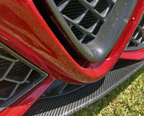
This might be my favorite angle, as there may not be a front fascia this dynamic yet wholly logical. It could be a deep sea creation of Mother Nature, to be honest.
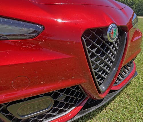
Aside from the Alfa’s height (a common problem with cars today, thanks to safety concerns) as witnessed in the tall, flat, and painted surface that resembles a bumper, the front end looks like a fantastic tribute to the voluptuous fenders of yesteryear’s Italian masterpieces. Of course, that flat area looks like a bumper because it is; it lines up with the black bar behind the grille.
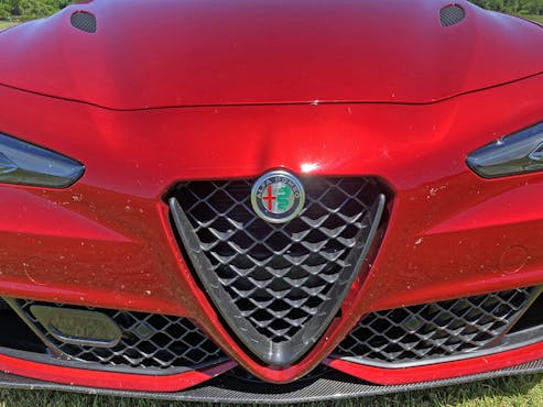
Imagine how lean, low, and attractive this face could be if it didn’t need that bumper behind the grille (and the flat portion of the front fascia). Or at least, if it could do with less bumper height.

Even the proximity sensors, normally an afterthought, are elegantly integrated into the teeth of Alfa’s grille. Their aim transitions elegantly from vertical to, um, whatever angle the sensor needs to do its job, with a rippling plastic surround. The insert is a fantastic distraction compared to the annoying lumps and carveouts housing the digital eyeballs of its competition.
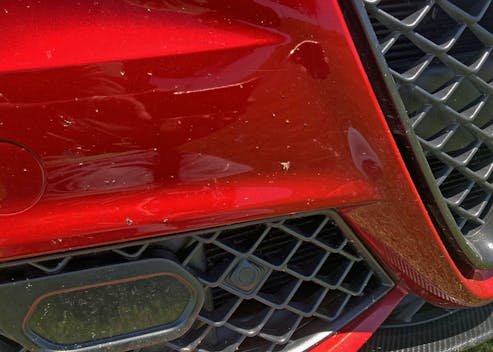
Here’s a better shot of the shelf, the unfortunate byproduct of legislation that requires cars to be a little bit taller to cause less severe injury to pedestrians in the case of an impact. At least Alfa doubled down on the shelf’s presence with taut contouring that works well with the curvy grilles and headlights. Ditto on the big sensor for driver assistance: It is shaped a bit like the grille’s teeth. (Rather than just an ugly box.)

Speaking of curves, the bumper has a lot of them, and they all play well together. And do a fantastic job hiding the functional radiators behind the scenes.
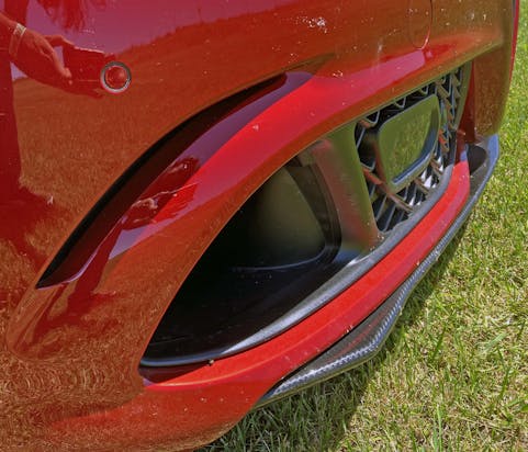
The secondary cooling slot likely could have been integrated into larger holes below, but this is a far sweeter implementation, as it removes visual heft from the tall, painted surface.

Carbon-fiber splitters haven’t been this subtle, elegant, yet wholly outstanding in a long time.

Sadly, all these sleek and sexy elements do indeed have to live on a tall face. Cost of doing business, don’t ya know?
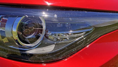
The headlights are pretty enough. But there’s something lacking compared to the level of detail, the depth and surfacing present in the M3’s crystal orb lights.
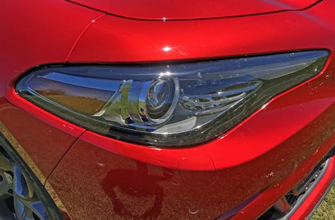
The hard transition from the organic body around the lights to the upright bumper assembly isn’t quite as elegant as the same section on the M3. That’s mostly because the Alfa’s cutline from bumper to fender begins in the middle of the light, and not at the end.

And that cutline makes no sense with the one above the headlight.

But, as the headlight tapers into the grille, you see just how important it is for designers to spend countless hours to surface a panel for maximum effect. Well, maximum in a truly subtle manner!

The hood vents are a combination of gills (below) and grilles (honeycomb, above) that ensures both safety, for the components underneath, and cohesiveness, with the grille’s texture.

And those vents naturally, beautifully, integrate into the bulges that rise above the hood’s depressed lower section.
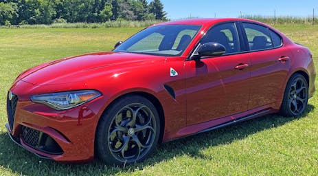
The elegant surfacing is one of the best reasons to abandon the finest designs of BMW’s M-series, as those cars clearly abandon the sensibilities present in the Alfa’s sleek and aggressive lines. Very long lines at that, which keep things flowing from one panel to the next.
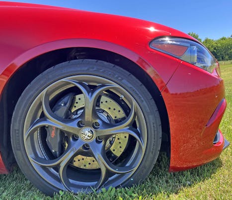
Shame about the cutlines, but the lack of front overhang is absolutely appropriate for a car with this level of performance.

The Quadrifoglio’s unique five-leaf clover wheels are a fantastic element of branding DNA for Alfa Romeo.
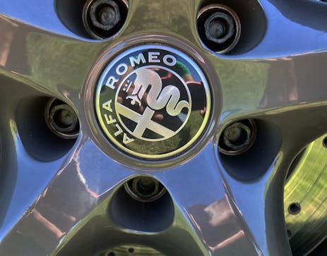
Sadly, these flagship wheels lack the deep-well, expensive casting/machining effort present in the M3 rims from the same angle.

A flagship performer without red brake calipers? Nice.
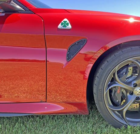
The dash-to-axle is on par with BMW’s gold standard for rear-wheel-drive-biased architecture.

Too bad the fender vent, complete with occasionally solid honeycomb texturing, looks cheap compared to the M3’s multifaceted, fender-mounted cooling spear.

Speaking of spears, the carbon-fiber-infused ground effects along the rocker panels are just as subtle as the front splitter.
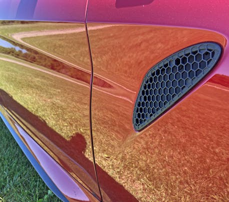
Because of the aforementioned height, make note of the extra surfacing on these tall side panels. They reveal nothing as overdone as the M3’s equivalent panels, but even the fender vent has a “spear” coming from the door and intersecting with its lower hemisphere.
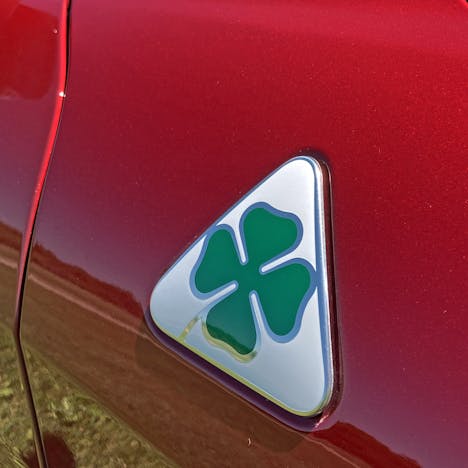
Like a prancing horse on a Ferrari, this badge puts the four-leaf clover in Quadrifoglio. But there’s a problem, as this badge can’t live at the top of the fender, proudly perching like that yellow shield on a Ferrari.

Again, this is a tall sports sedan with a series of misleading creases to make it look smaller and sportier than it truly is. One can argue that Alfa did a better job than BMW here, but beauty is a tough nut to crack when cowls need to be this tall.

The plastic-covered cowl is pretty tidy, at least. But it meets the red fender in a more downmarket fashion relative to the M3’s sunken, hidden design.
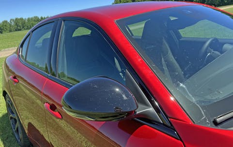
It’s fantastic to see more and more cars reverting back to sideview mirrors bolted to the area closer to the A-pillar and not to the painted door surface itself. This practice visually speeds everything up; otherwise, the mirror’s stalk looks like a freestanding pillar on an otherwise “speedy” body.

There’s far less surfacing here, relative to the same area on the M3. And that’s a great thing, because at some point a painter must know when to stop painting.

The same applies to the logically round shape of the sideview mirror. Perhaps the M3’s pointy airfoil mirror assembly is quieter at 100+ mph, but that’s a sacrifice I can live with.

The tall, clean, and elegant forms from the front fascia are not in vain; the side view is similarly sleek and flowing. Never hurts to be laid atop a vehicle with rear-wheel-drive-oriented proportioning, too.

Rounded elements in a B-pillar are generally a horrible idea (unless you’re making the Nissan Cube) but I have a feeling that the talented Alfa folks behind this design coulda rounded these blacked-out covers just a smidge and gotten away with it. And the change woulda worked, considering all the curves present elsewhere in the Guilia.
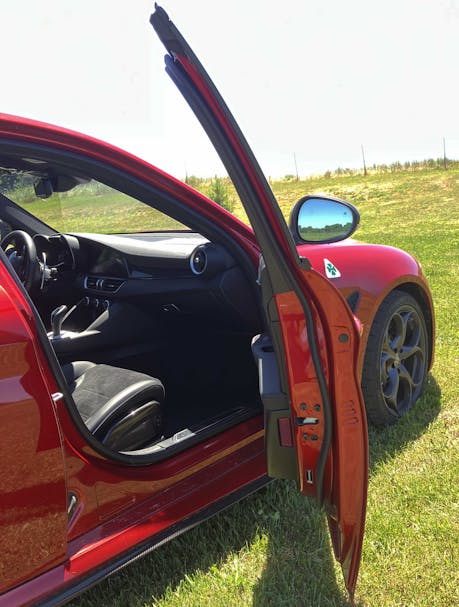
All cars have about the same amount of tumblehome these days, which I attribute to the need for head-curtain airbags, but the door’s voluptuous cross-section makes the Alfa feel like it has more taper, top-to-bottom.
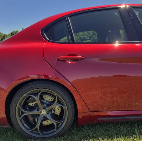
The door cutline doesn’t flow terribly well with the wheel arch behind it nor with the vent window above. That said, the opening’s edge is still a taut, muscular, and exciting work of automotive packaging.

That vent window has elements of the Hofmeister kink, but the Giulia integrates them in a more respectful manner than the M3, which uses fake plastic extensions.
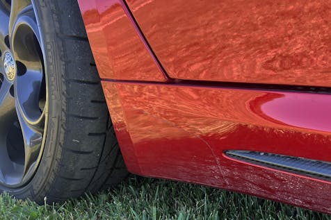
It’s unfortunate the flattened-out wheel-arch contour isn’t met with a sympathetic curve from the door cutline, but at least the rocker panel’s carbon-fiber insert remains understated even at its coda.
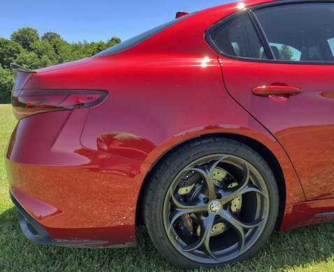
While the lack of rear overhang is expected and encouraged, the ratio of taillight to rear bumper is skewed too heavily to the latter. The imbalance makes the Alfa look like a child with chubby cheeks; in comparison, the aggressive “duck face” taper of the M3’s rear bumper gives it a chiseled, more aggressive appearance.
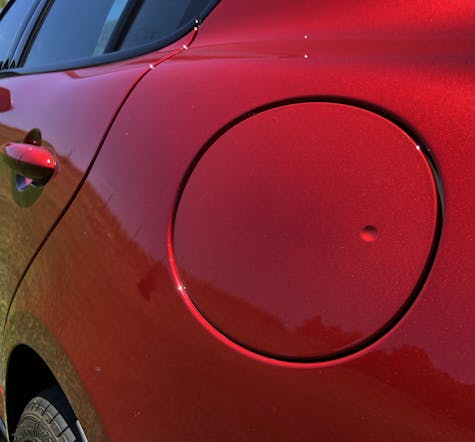
There was nothing terribly wrong with the M3’s square fuel-filler door, even though it was bent to match the body’s surfacing. But there’s something so much better about a round door for a round gas-filler neck, and a smooth body panel for it to reside on without excessive contouring.

The Giulia’s properly muscular quarter-panel creates a shoulder line worthy of the performance beneath.

The seam between roof and quarter panel is usually covered by a plastic rail. Not having it could be considered cheap, but I see its absence as a pure expression of a different era in body construction.
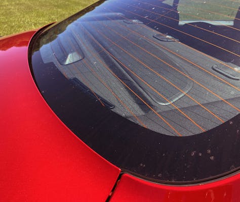
The rounded, organic forms found upstream are complemented by a rounded rear window and a tapered trunk cutline. Compared to the unyielding box forms in the M3, this is another pleasant throwback of the Giulia to less austere times.
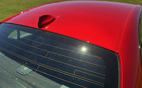
Luckily the window isn’t as rounded as that of the 1996 Ford Taurus, which took ovoid shapes to a logical extreme … that nobody asked for.

The rear three-quarter view shows a nice mix of hard bends and soft contouring, especially at the hip-shaped bend above the rear door handle. Exhausts, diffusers and spoilers ensure you know this isn’t a $419/month lease special (yes, I googled it) on a baseline Giulia.
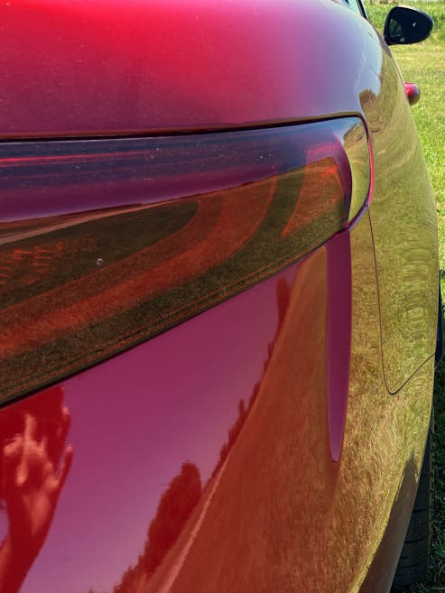
Like most modern sedans, the hard bend at the bumper’s corner is probably there to clean up airflow at the rear. Its seemingly arbitrary implementation relative to the taillight’s internal design and the bumper cutline is a bit unfortunate.
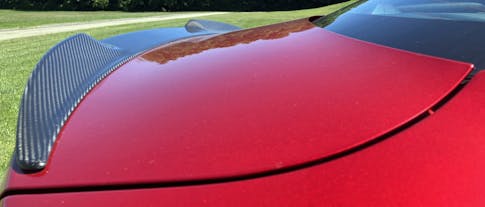
A panel gap this size is disappointing at darn near any price point, but the same twin-winged, carbon fiber’d rear spoiler design also seen on the M3 is fun to behold.
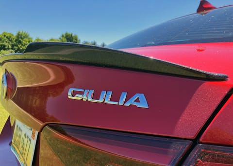
Emblems denoting a specific model are regularly finished in chrome like this, but considering the charcoal wheels and all the carbon fiber? The high-shine just seems out of place …
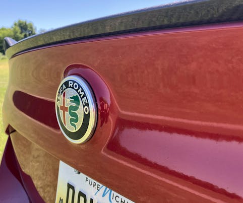
… especially considering how your eyes want to focus on the trunk contouring made specifically for the round, chromed Alfa Romeo emblem in the center. It’s a good look and could use less distraction from the name-specific emblems, at least on an assertive Quadrifoglio model.
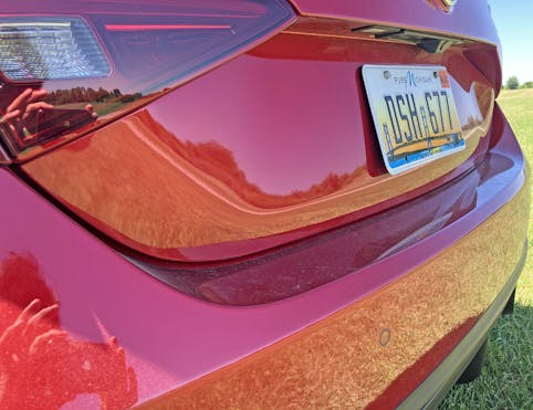
This particular blend of taillight, trunk grab handle, backup camera, and negative area for the license plate looks too much like the rear of the VW Jetta. While the Giulia is far more muscular, the section of taillight that bolts to the decklid needs to look more distinctive. The Alfa predates the VW, but life isn’t fair: Sometimes, a cheaper vehicle rips off your design and prints it off for the masses.

As we go down the bumper, make note of just how aggressive that hard bend is, and how it matches nothing else on the body. Why? Aerodynamics.

If only the bumper’s contouring could work as well as this flare’s integration with the black diffuser assembly. The curves and hard bends sing in perfect harmony.
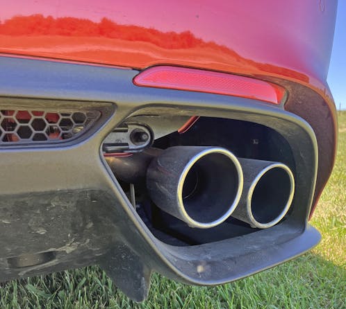
Even the honeycomb grille’s border and the standalone red reflectors look like they were used as reference points for the rest of the diffuser.
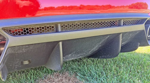
And no good diffuser for a premium sporting sedan is complete without adding a couple of strakes for high-speed functionality.
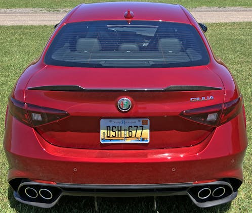
While it may look like a sexy Jetta, the Giulia has the requisite aerodynamic hardware to keep the family-car references at bay. Even the base model is far more muscular and taut and a mere VW product, while the negative area used for the license plate does a fantastic job thinning out the mass generated by the tall posterior.

It’s all very classically logical, especially compared to the duckface contouring of the M3’s posterior. Everything is in its right place, even if the thick decklid and massive bumper make me long for the days of smaller, shorter performance sedans. But the E39-chassis M5 is never coming back, so let’s instead revel in the fact that the high watermark of performance sedan design didn’t leave us; it just moved to Italy.
Thank you for reading—I hope you have a lovely day.
***
Check out the Hagerty Media homepage so you don’t miss a single story, or better yet, bookmark it. To get our best stories delivered right to your inbox, subscribe to our newsletters.


Its a beautiful sedan, with a lot of vitality, and guts. It tires will spin, make smoke, and the exhaust will bark at you like a dragon. You will know imediatly that it not to be tangled with. It is fast, furious, and wild beyound its siblings. It will run fast than you, brake harder, then eat you for lunch. All you have to do is make sure it is well hydrated with a tripple martini (gas).
Agree on the rear door cutline and front fascia 2 cutlines being a miss.
The rear one even if just the lower half curved with the wheel opening a bit wouldn’t stick out. The front… why they aren’t curved to visually meet across the gap seems lazy to me.
I’d like to think the front one had some engineering issue under the skin that made it cost prohibitive to do right.
The rear doors just seems like a misguided attempt to remove “softness” by adding a harsh cut line, as there isn’t anything too space-challenged in that area of the quarter panel.
No matter, thanks for the comment!