Vellum Venom: 2020 Ferrari SF90 Stradale

Sure, the 2020 Ferrari SF90 Stradale puts down impressive performance stats that few can touch, and from some angles its sleek, angular styling is worthy of the lean, mean, turbocharged V-8 Ferrari engineering sat between its hips. But from other vantage points it’s clear this all-wheel-drive, hybrid powertrain, 3500+ pound (as tested) heavyweight is also beautifully curvaceous. Ferrari’s pursuing a bizarre middle ground here—and not simply by blending combustion and hybrid technologies. Let’s see what makes the SF90 Stradale such a unique machine.
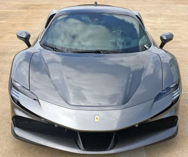
The SF90 shares some chassis engineering with the Ferrari F8 and outgoing 488, and the negative areas in the hood pay a wonderful homage to the 488 Pista. There’s a squinty pair of headlights, broad fender arches, and a gentle yet deliberate amount of contouring on the bumper.
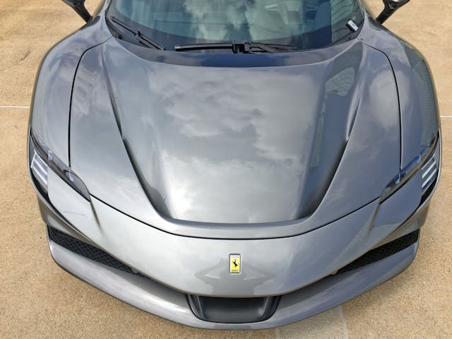
Thanks to a central black scoop sticking out its tongue, there’s a strong correlation to the center of the bumper and the outer bounds of the hood bulge. This creates a strong form to which everything else presented must play second fiddle.
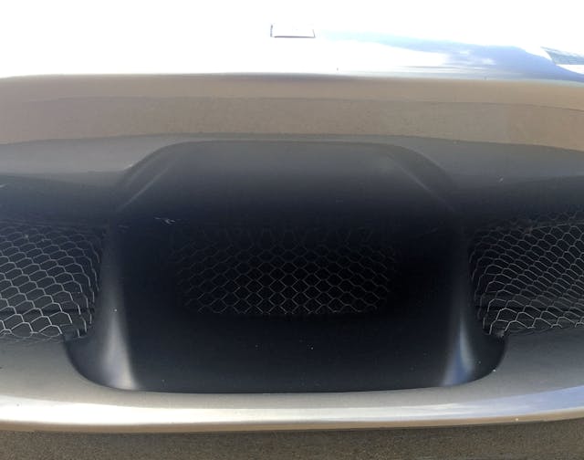
Behind the bumper lies a thin metal screen that looks a bit more expensive to make than your average roll of chicken wire.

Even the SF90’s bumper tongue has a muscular, streamlined surface-tension about it.
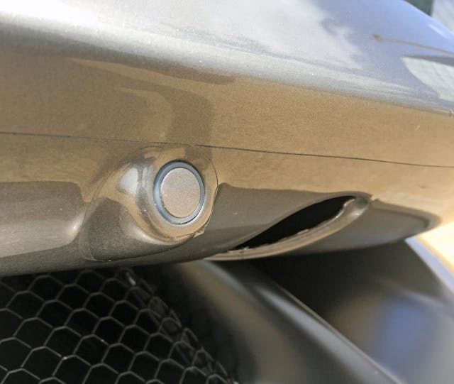
The bumper has a very pronounced “beak” shape, protruding so far forward that the proximity sensors are difficult to see without getting down to a dog’s eye view. This elegantly integrates a normally ugly body-warm, keeping the sensor from interrupting the flow of the rakish body.

The beaked bumper doesn’t sweep back organically to the corners. Instead there’s a C8 Corvette–like “triangular protuberance” as I previously mentioned.

Unlike the C8’s value-priced bumper protuberance, the SF90’s grille wraps around and becomes a fish-shaped “mouth” with an airfoil at the bottom corner.

The three lower “gills” behind the fish-mouth opening are almost worthy of the Stingray name.

Speaking of Chevy references, the SF90 shares the Ferrari 488 Pista’s love for the 1998 Camaro’s front end. It’s beautiful, and shows the potential of the fourth-gen Camaro … if Chevrolet hadn’t been tasked with selling an affordable pony car to the masses, of course.

Indeed, the low-volume 488 Pista’s negative hood space lived to see another day. It feels like a water feature in an open space: effortless, modest, and stunning at the same time.
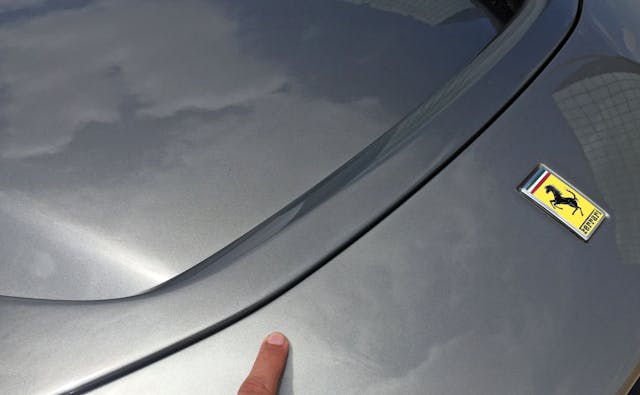
The negative hood space’s contouring actually starts in the bumper, but it’s so subtle that only inspection in bright sunlight reveals the truth.
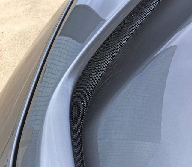
The negative space’s outer boundary does a ribbon twist worthy of gift wrapping at Neiman Marcus. It is a nice contrast to the rather flat metal grille right below it.

Like so many modern supercars, the SF90 has a hard crease in its front fenders. Only one, mercifully.
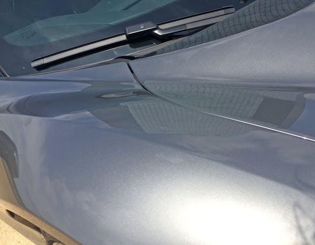
The crease gets more defined and relevant, possibly for aerodynamics, as the fender flows downstream.

Note how the reflected white stripe (in the concrete) bends to the left and disappears well before the headlight: That’s the bumper’s vertical-to-horizontal transition, and the subtle execution deserves appreciation.
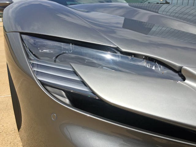
From this angle, the reflected white stripe on the concrete disappears to a vanishing point south of the headlights. Too bad the fender and hood shut line do not match from this angle.
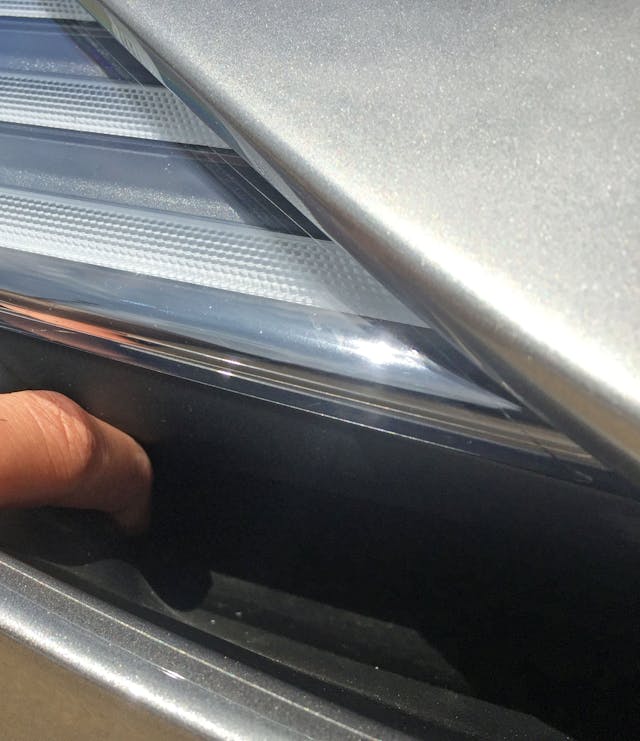
As the finger shows, the bumper cover utilizes negative space for some aerodynamic trick—or perhaps a cooling vent. Either way, it’s a clever disguise making it nearly impossible to see the engineering underneath.
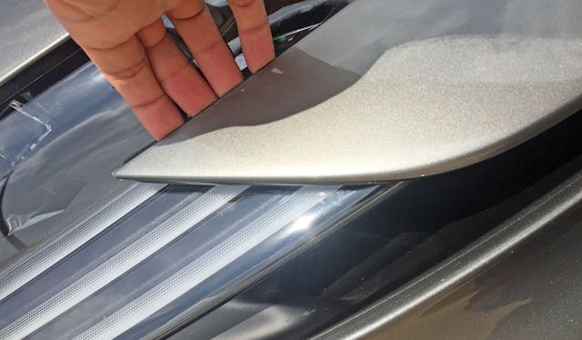
Much like the McLaren Senna’s rear spoiler, the SF90’s bumper cover isn’t firmly attached to the body. Unlike the Senna, the benefit of this design cue is unclear.
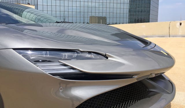
While very pointy and heavily contoured, the lines are mostly complementary and quickly sweep backwards without distraction.
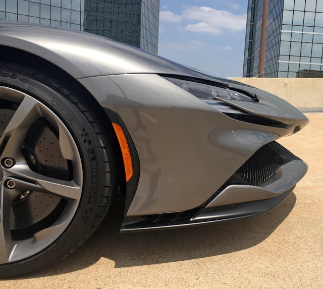
Clearly the SF90’s been on an odd diet, as the pointed beak is artificially inflated at its tip. Put another way, the headlight’s sleek, taut lines aren’t matched by the center of the bumper. (Or those of the lower valence and front splitter, for that matter.) This is probably a nod to European pedestrian safety standards.

The black plastic “plateau” which houses the amber marker light also appears to be a Gurney flap. Its increased height above the bumper and forward-pointing shape suggest it could deflect air around the wheel arch.

There’s a fair bit of aerodynamic trickery happening on the wheel, but Ferrari kept some traditional aspects of a five-spoke wheel (exposed lugs, slender spokes).

From the center, the spokes look more like triangular slices of a pizza meeting up to a central Ferrari emblem. As they extend to the rim, the spokes get fatter and significantly flatter.

These cast-aluminum submarines coming up for air look a lot like vortex generators. Who knows, maybe this helps open-spaced wheels manage airflow more like solid discs.

Behind the wheel lies a door cutline that’s surprisingly sympathetic to the round wheel arch.
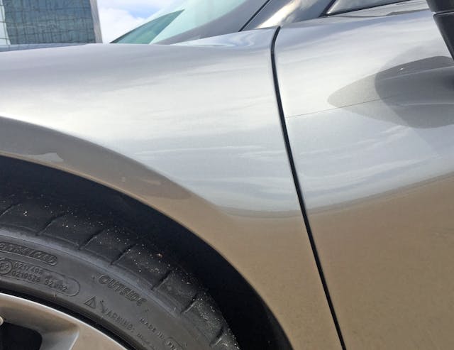
Note the bend in the skyline (reflection) between the door and the wheel arch. This is a slightly awkward transition from the adjacent and omnipresent hard bend in modern wheel arches. Oh, the beauty we could make without omnipresent hard-bending wheel arches!
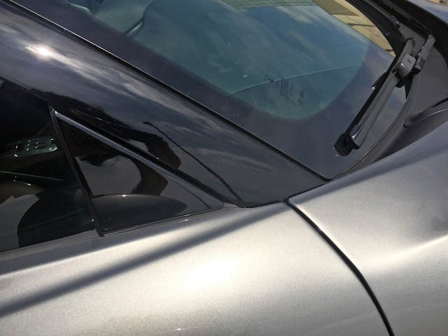
The transition from fender top to door is far more assertive and elegant, even though this spot is the genesis of two different planes on the SF90’s door.
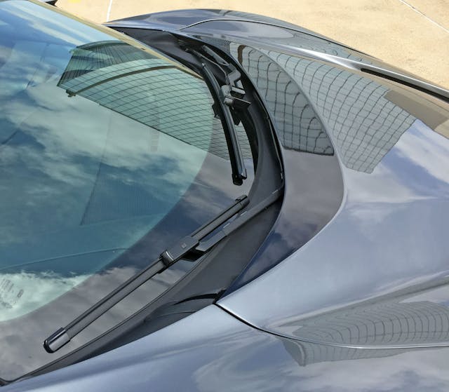
While not as offensive as the black vinyl “top” on some 2017– Camry SEs, the hood’s shadowed-out portion is a surprising bit of cheating in a somewhat unnecessary place.
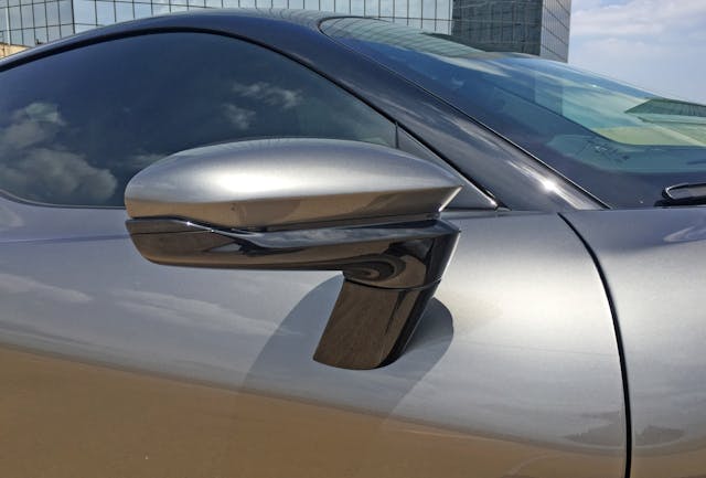
The pedestal-mount side mirrors emulate the front bumper’s pointy bits, including said bumper’s airfoil design at each corner.

And yet everything is rounded on the backside, except for a straight line in the lower left corner of the mirror. Clearly the subtle, nearly imperceptible curves at the front did their job for the mirror itself.
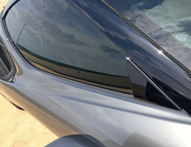
The aforementioned fender-to-door transition does indeed become two planes on the same panel: One traditional shelf below the DLO (day-light opening, i.e. the glass) and another leading to the quarter panel’s ductwork.

There’s a lot to process here. For starters, the cooling duct cuts out so much negative area that the door and quarter panel look like a DLO “hoodie” with its hood resting atop the SF90’s shoulders. Then the door cutlines pull away from each other. On top of that, the lower door’s transition from a hard crease at the rocker panel turns into a gentle curve sweeping upward for no apparent reason.
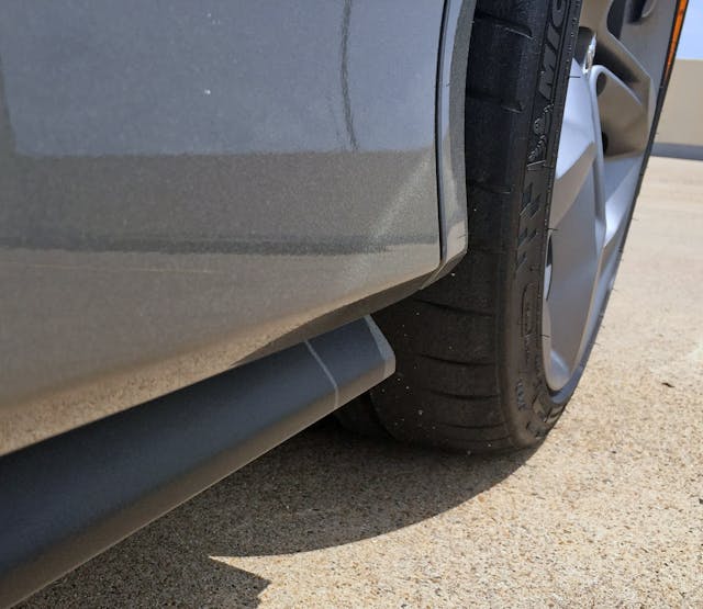
Back to the lower door’s hard crease: Note the black plastic rocker-panel cover that’s tucked below it. This becomes an infinite edge that’s far more appealing than the expected butting-up of a flat door panel and a vertical plastic-rocker cover.
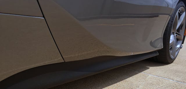
Now go back to the lower door’s upward transition. Note how the concrete’s reflection changes as the sweep does its thing. There might be a missed opportunity in not making this curve show some sympathy to the door’s cutline.
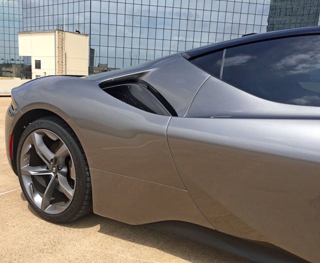
There’s something terribly un-Ferrari like about the aforementioned DLO hoodie. The extra painted surfaces add a vulgar amount of visual weight: losing this hoodie for a T-shirt (or a tank top?) would let the SF90’s glass be a slender neck to enhance this car’s obviously exotic proportioning.
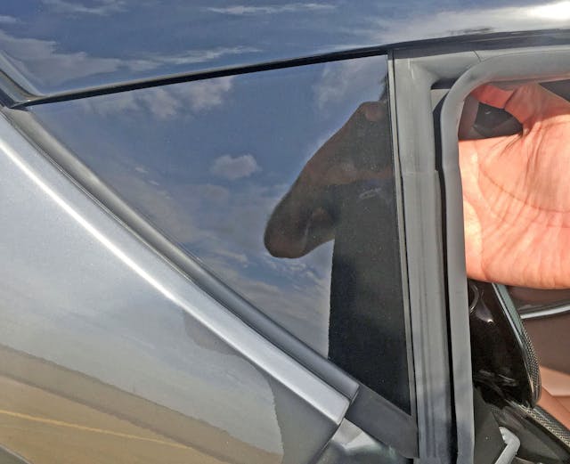
Perhaps you don’t need an actual slice of glass when your body has a DLO hoodie underneath. But this DLO FAIL is shameful at almost any price, especially this Ferrari’s $500K one.
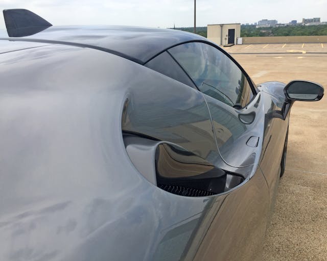
Perhaps a positive aspect to the SF90’s DLO hoodie is a Bugatti Chiron–worthy B-pillar with classically round forms. The DLO FAIL lines up with the door’s cutline and forms the part of the roof that curves downward into the air scoop. It’s very bulbous, and quite the departure from designs used in combustion-only Ferraris.
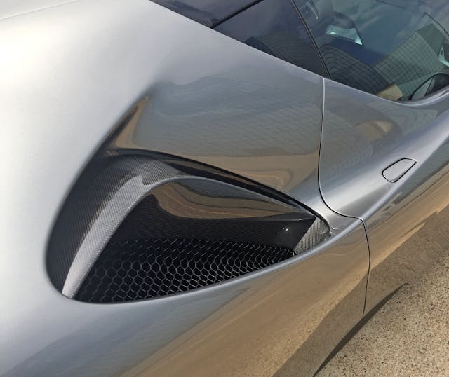
The round and chubby B-pillar/DLO hoodie looks more toned and muscular from this angle. But imagine the downward DLO of Delage’s D8 120 instead: Adding more glass would make the SF90 look less top-heavy.

One perk to the DLO hoodie is the (black) roof need not run all the way down to the base of the B-pillar. Like, awesome.
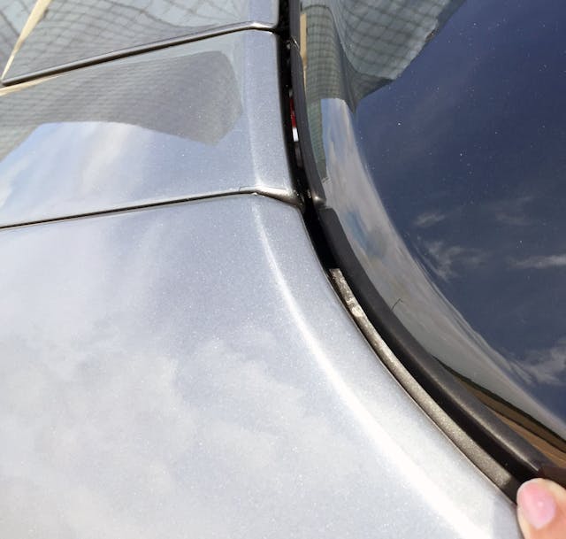
While the beveled panels insist this panel gap is by design, someone really needs to pull on the hoodie’s strings and tighten up these tolerances.
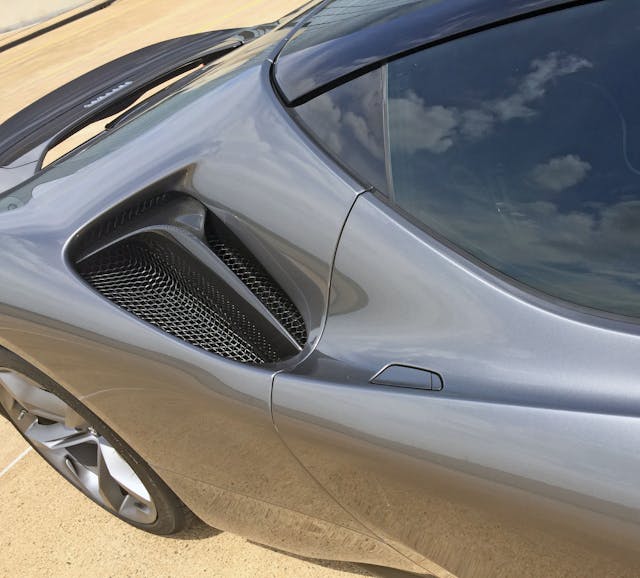
The DLO hoodie really irks me where it forces the door skin to jut upward. The door clearly wants to relax and slip down the lines leading to the air scoop. Put another way, look at the door’s exaggerated height relative to the C3 Corvette–like door handles.

And that scoop is far from an ordinary speed hole! The asymmetric, Y-shaped carbon-fiber affair presumably routes air to pertinent places beyond the scope of discussion here.

DLO-hoodie hate aside, it does look better from farther away. It might even give the SF90 a sleeker appearance than actual glazing on the B-pillar. And it does clearly differentiate the hybrid SF90 from its ICE-only siblings.
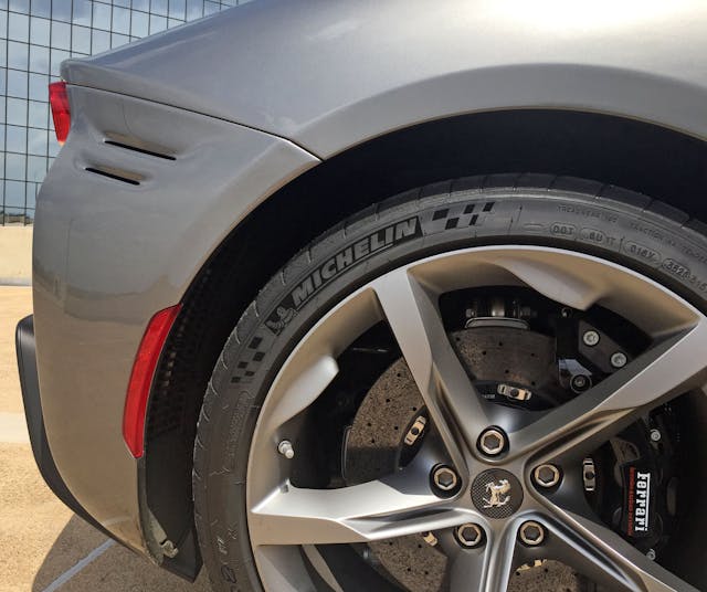
Somewhat like the front bumper’s three gills at the corner, the rear has very subtle slots made extra-forgettable via body-color finishing.
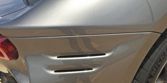
The gills would be more exciting if the bumper’s cutline shared the same space as the bend in the quarter panel, thereby eliminating a little bit of clutter.
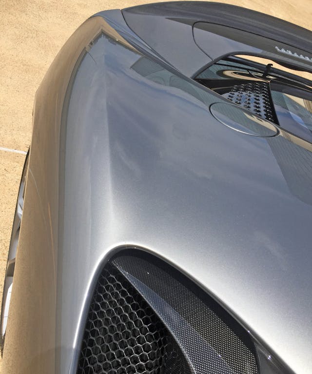
Much like the front fenders of the Ford GT from this angle, the SF 90’s rear quarter-panels have a hard crease in their middles.

Unlike the wedgey, architectural stylings of the Ford GT, this crease is almost mandatory to firm up the bulky curves of the DLO hoodie.
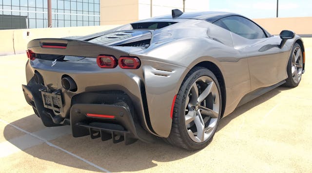
Also unlike the Ford GT, the crease also turns down, into the bumper panel. It’s a shame the spoiler starts so close to the rear wheel, as its placement breaks up that muscular flow.

Wraparound red lenses and extractor vents? Check.
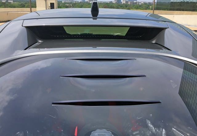
What was a DLO hoodie is now a dividing point between a black roof and a glass cover (with more gills) for the SF90’s gasoline-swilling bits. The contrast is more radical when finished in resale red, but it’s still there in dark gray.

We aren’t done with the DLO hoodie, apparently. That’s because it also has little cooling ducts that match the rear bumper’s gills.
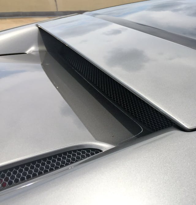
The hoodie also sports a separate panel up top, with hard corners that seem poorly integrated into the rest of the hoodie.

But that’s only from up close, as the separate panel merely adds another layer of complexity to an already difficult-to-scan posterior. The DLO hoodie is now a C-shaped crosswalk over the mechanical bits.

Circles are yet another texture implemented for cooling grilles. More isn’t necessarily better, but they kinda make sense with the round (electricity/fuel?) doors.

Glass and black metal lie below painted panels and a carbon-fiber spoiler. It’s a bizarre mishmash of textures and shapes, but the highly architectural nature of the landscape adds much needed logic.
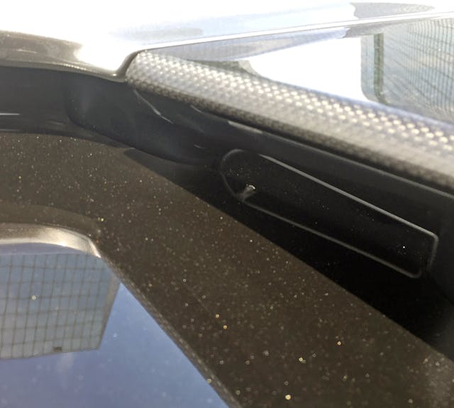
Ductwork abounds on the SF9: This unit is at the end of the black-metal panel and rests below the spoiler.
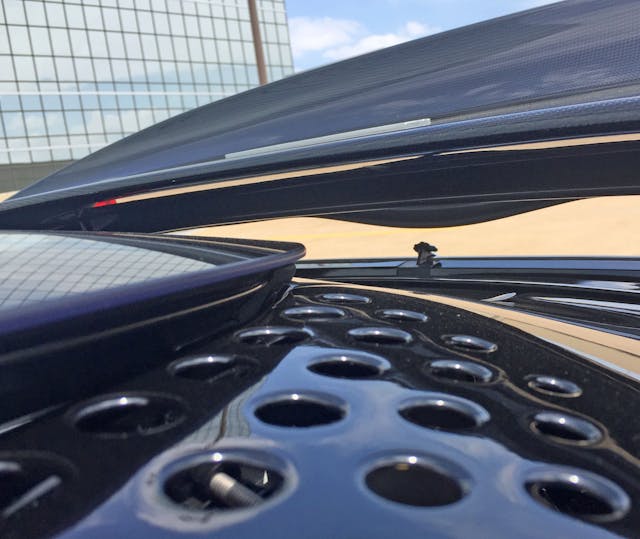
And the SF90’s various levels really feel like a landscape, albeit a moonscape from some angles.

Lotsa hot air inside that DLO hoodie: The SF90’s twin-turbocharged engine (note the red camshaft covers) is nestled unbelievably low in the frame.
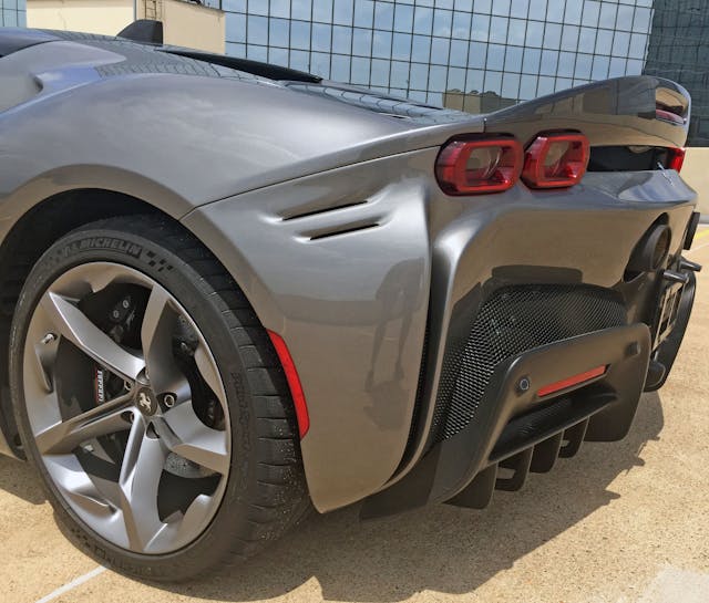
Let’s step back again and look at the design elements presented: a muscular quarter panel that arcs down into the bumper; a “frowny face,” painted rear bumper with radical cooling vents and diffusers at the bottom; an erect carbon-fiber spoiler (on Assetto Fiorano models); and taillights worthy of a Chevrolet.
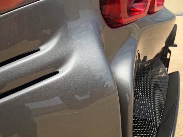
The curvaceous transition from muscular side-paneling to the frowny face also sports an elevation change that pays homage to things seen in nature. Perhaps the folds of a Shar Pei dog or something tulip-like?
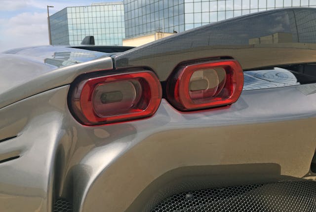
These Camaro-like, rectangular-ish lights are a big change from the round affairs worn by most Prancing Horses. That’s the point in a hybrid-powertrain Ferrari. Then again there are a multitude of bumper grilles dying to play their part in a Testarossa-worthy lighting homage.

The two-piece Assetto Fiorano carbon-fiber spoiler is surprisingly tacky, as the texture integrates poorly with the painted body. Since this is a two-piece affair, having a painted base with a carbon fiber insert would help.
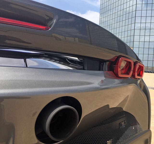
Luckily the carbon fiber blends in well with this particular color, allowing the eye to scan the spoiler’s aggressive downward arch placed against the complementary protuberance from the center of the bumper.

The SF90’s spoiler does a mighty fine job spoiling the air between the taillights …
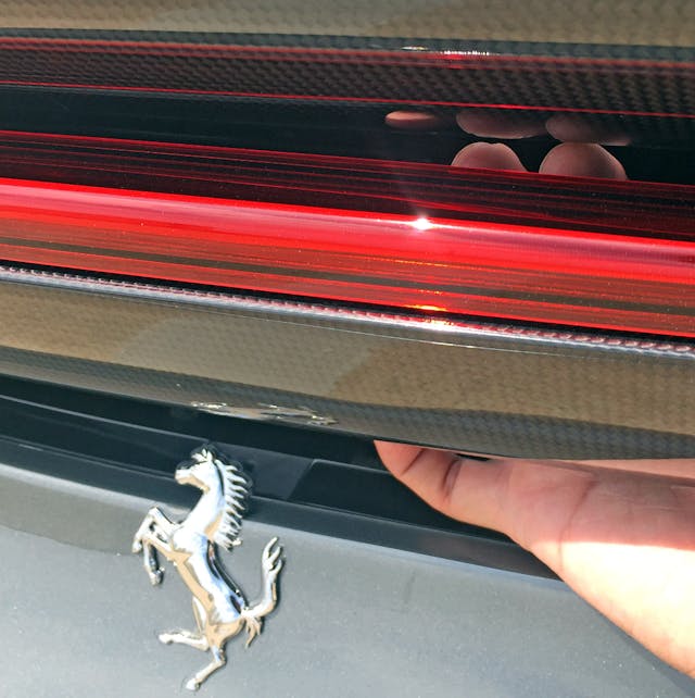
… and, as my fingers show, between the CHMSL and the spoiler.

The SF90 continues Ferrari’s trend of exposing the head of its logo to open air. It makes more visual sense from a few feet away.
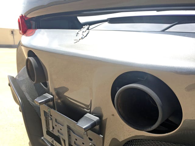
The higher elevations of the bumper’s curve make a great place to mount exhaust pipes and a license plate. Can’t say the same for the unbelievably clunky, lamp pole–inspired license plate lights.
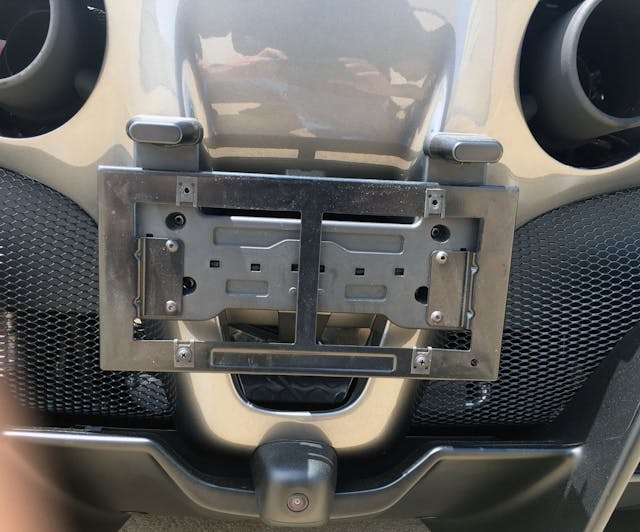
The negative area behind the license plate has the “tongue” feel of the front bumper’s black scoop. All of which leaves no room for a cleanly integrated backup camera, apparently. This is a far cry from the outgoing Pista.

The thrusting, mesh-wire cooling vents give an “open glovebox” vibe to the bumper.
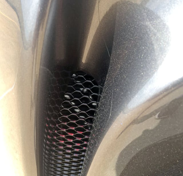
Speaking of meshwork, it’s even in the folds at each end of the bumper.
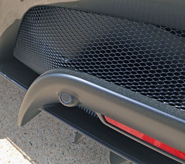
Much like the Pista’s, the SF90’s rear valence has upward jutting bumperettes housing reflector lenses and proximity sensors.

Not all of the valence’s rear diffusers are solid. I’d love to know the aerodynamic (or weight-reducing?) benefit here.

Seen as a whole, the open glovebox bumperettes, bold spoiler, and heavily contoured bumper all make sense, as does the emblem that isn’t fully affixed to the bumper. Extra cohesiveness comes from the strong lines present in the upper bumper, spoiler, and the deep folds at each corner.

But in the end (so to speak), the SF90’s styling parallels its complex, all-wheel-drive-and-hybrid powertrain: There sure is a lot going on here. The three different grille textures (wire mesh, circular holes, thin slots) alone are cause for concern.
Don’t get me wrong, the SF90 is still a good design with acres of curb appeal. But it’s trying to look less like a Ferrari—perhaps more like a Bugatti. Which also foreshadows the SF90’s excessive curb weight, and its impressive yet socially-distanced driving dynamics. Sometimes it’s nice to judge a book by its cover; in this case of this Ferrari, the pages inside don’t stray far away from the impression created by the dust jacket.
Thank you for reading, and I hope you have a lovely day.

