Vellum Venom: 2020 Corvette Stingray (C8)
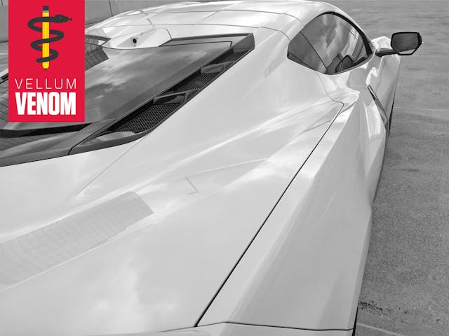
My time on the road with the C8 Corvette had moments of thrilling acceleration, fantastic dynamics, impressive ride quality, and a sense of engineering superiority wrapped in an appealing asking price. There’s no doubt the mid-engine Corvette honors Zora’s engineering legacy, but the new blueprint also inspired a change in style that represents an even stronger break from tradition than the change in engine placement. A dose of the unconventional is a good thing—if executed correctly. After we run the vellum over the 2020 Corvette, give us your thoughts in the comments below!
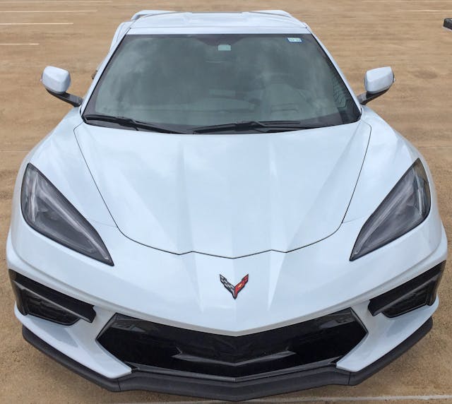
The C8 is a value-minded supercar but adding, deleting, and organizing lines doesn’t cost a thing: Designers spend countless hours value-adding onto a 3D model, and from this angle the look is nearly perfect. Note the strong center hood spine, flowing hood bulges turning into fender muscles, and a very aggressive lower bumper with a clever blackout center section that likely lowers the cost of replacement parts in minor accidents. Even the LED spears in the headlights do a fantastic job complementing the C8’s form.
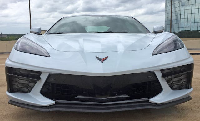
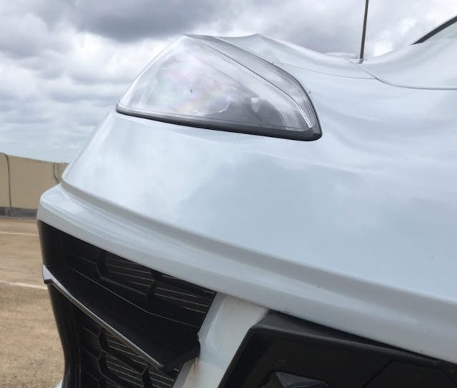
Hunker down, and things start going sideways. The bumper’s lower half sticks out further than the fender, giving the appearance of wide, inflamed jowls. This jaw needs a cortisone injection, stat!
The thick-cheeked C8 also has bumper “fangs” at each corner that complement the headlight’s natural curve. It’s a sporty but excessive, relative to everything north of the bumper’s centerline. Lamborghini’s bumpers have been trending this aggressive direction in the last decade, so these “fangs” have precedent.
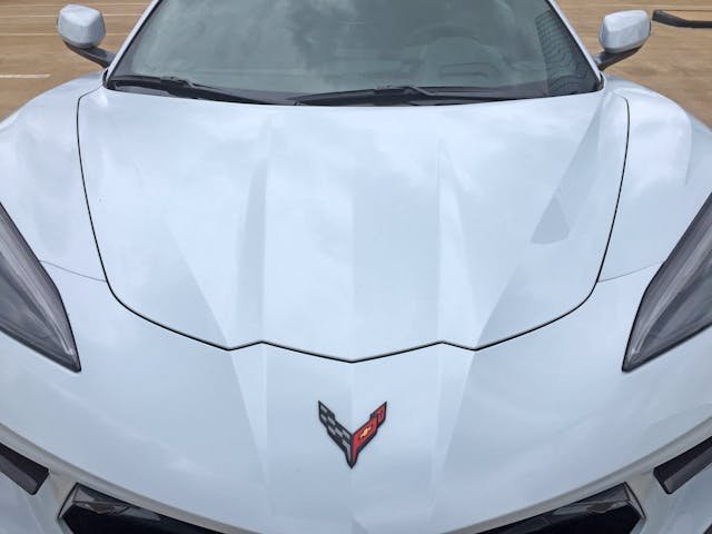
The center hood bulge sports an assertive bevel that rises up from a wider, plateau-like surface that shoots back to the A-pillar. Both fenders enjoy their own hard angle starting just north of the headlights.
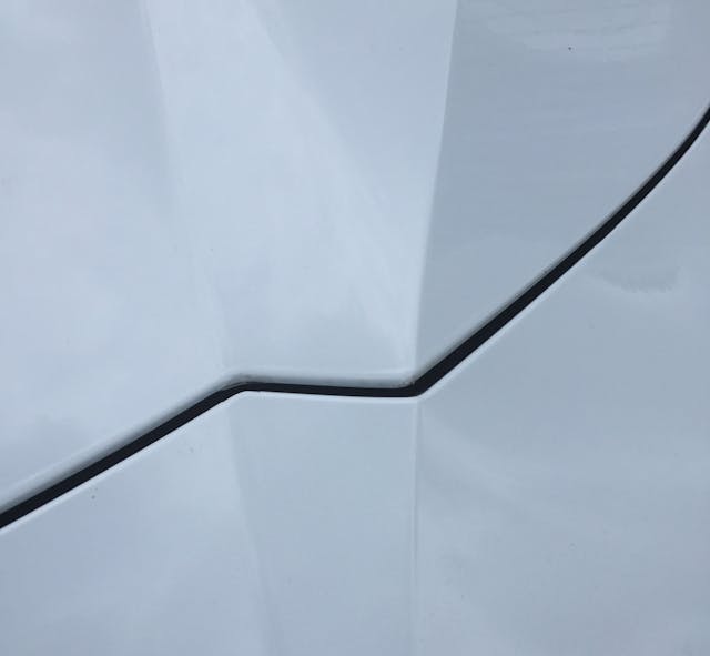
The zig-zag cutline is an unfortunate byproduct.
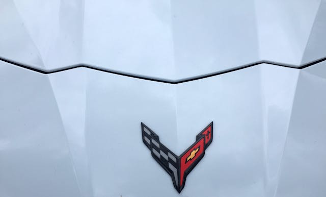
Hood cutlines emulating Charlie Brown’s signature yellow t-shirt are distracting. Let’s blame the Lamborghini Aventador for starting the trend with a cutline that confirmed to the shape of the company logo.
That said, the steeply-raked crossed flag emblem is a wonderful blending of Corvette history with some of the boldness displayed in the USAF’s logo.
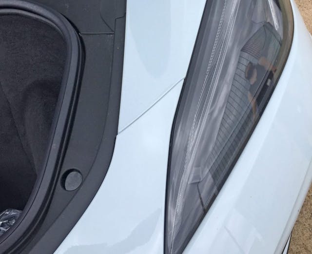
This isn’t the only mid-engine supercar with an unfortunate, horizontal cutline where the hood/bumper/fender meet. However, I wonder about the challenges (i.e. cost) of extending the black plastic trunk liner so the hood could meet the headlight. Or even better, have the hood/fender/bumper converge at a “point of interest” on the headlight instead (see Lamborghini Huracán).
That said, Chevrolet already gave us a better hood cutline.
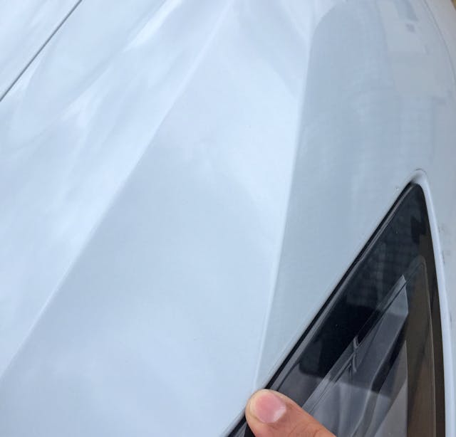
Or maybe this one.
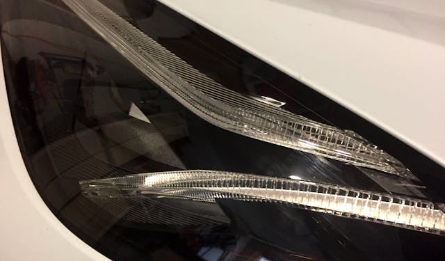
The alternative cutlines integrate nicely with the LED headlight spears.
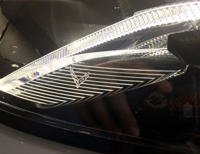
The external spear has an elegant Easter Egg behind a lined wall.
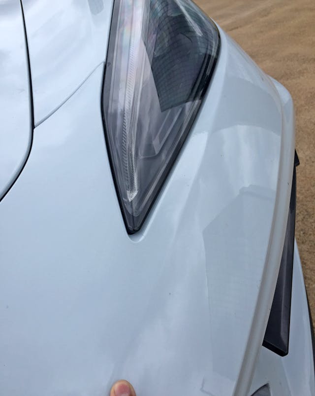
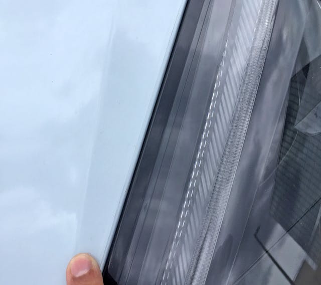
Back to body creases: Why does this one (starting at my finger) exist?
Below it are two more creases that signify the bumper’s leading edge. There’s a slim transition and another that turns into the oversized jowl. Both vanish to the same centerline, thankfully.
Fewer lines, in theory, means less distraction, potentially making Corvette’s mid-engine proportions clearer and even more assertive in such a competitive and fiercely brand-loyal market segment.
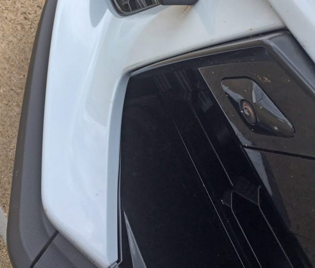
The previously-mentioned, painted bumper fangs are a great idea. They allow all 2020 C8s to share the same center section, thus saving money on production and lowering insurance repair costs.
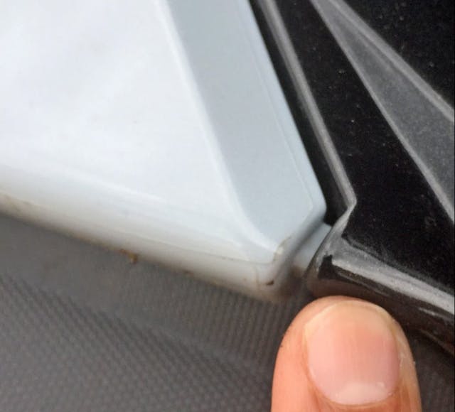
The downside is that more parts in different colors complicate proper fit and finish on the assembly line.
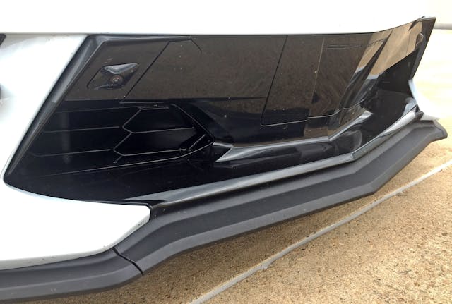
For owners unlucky enough to need it, the front license plate cover is a welcome throwback to the C4 and C5 generations. The Z51-spec splitter emulates the bumper contouring wonderfully.
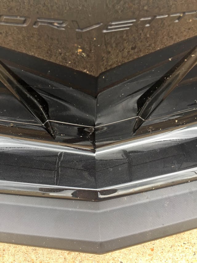
Sometimes the C8 feels like a curio cabinet of interesting notions. The front plate cover’s tapered carveout looks like a smoked-glass vase resting behind a black lacquer cabinet. It’s a shame the correlation between this and the central hood bulge isn’t more pronounced.
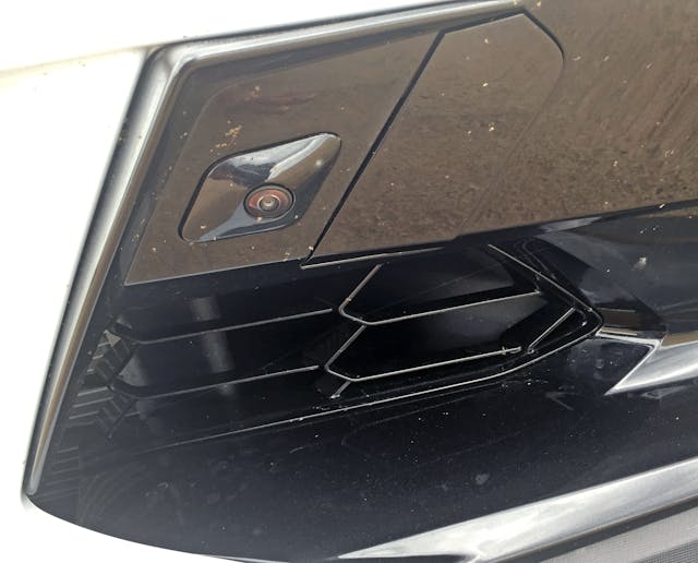
Such a large, gloss-black center section attracts the eyes to less-valuable real estate. Choosing matte black plastic for the portion around the grille (or introducing a second, matte black “picture frame” insert) would add depth and integrate the front splitter with the bumper. On top of that, a reduction in shiny surfacing is less visually distracting.
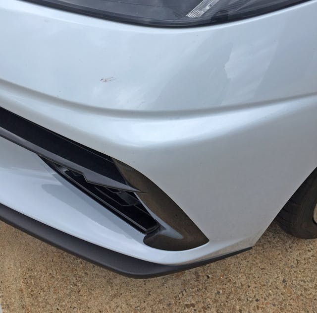
Moving to the corner, the central triangular protuberance forms the beginning of the aforementioned jowl: not only does section add visual heft, it shows how rapidly the C8 translates from bumper to fender.
Many a Ferrari and Lamborghini have more front overhang for the sake of a more elegant bumper-to-fender transition.
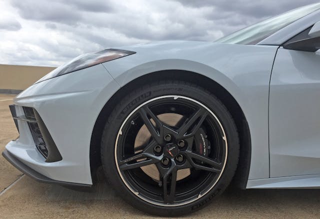
Speaking of that transition, note the C8’s headlight height relative to the wheel arch. The headlight’s base falls high up on the wheel arch—almost at 12:00, if you imagine the arch as a clock. (For comparison, the Ferrari 488’s headlight brushes the 10:00 mark.) This placement gives the C8 a taller stance from many angles.
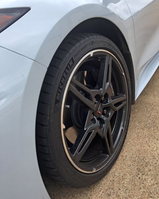
The requisite “flattened” wheel arch breaks up the space between the fender tops and the wheel itself. It feels necessary here, due to the top-heavy fenders.
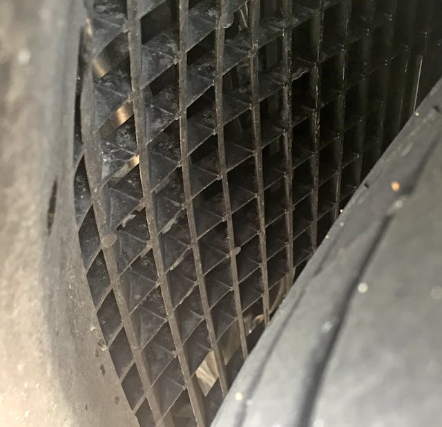
While nothing like the aerodynamic madness of the McLaren Senna, large grilles ahead of the front wheels serve a valid purpose for both radiator/brake cooling and airflow management.
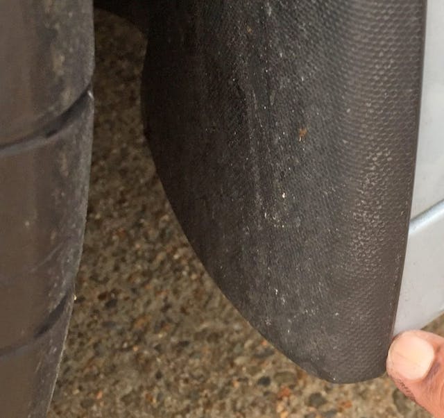
The back of the wheel arch reveals a fender liner that fits over the painted body. Not terribly pretty, but a great way to protect the body from tire-flung debris.
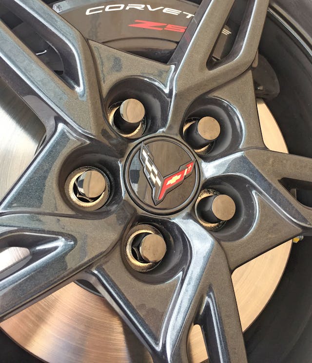
The star-shaped wheel center with raised, split spokes radiating outward certainly does not hail from the “less is more” school of thought. Z51-stamped brake calipers nicely assert the optional, performance-minded package.
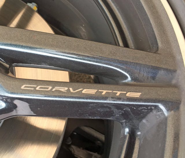
It’s a good thing one wheel spoke informs the viewer this is a Corvette—it’s impossible to know otherwise.
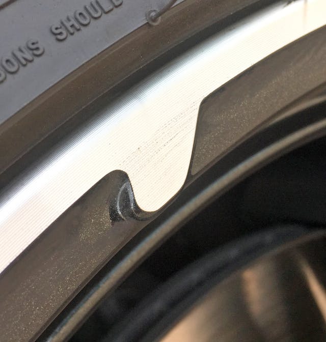
The polished lip against the recessed, blacked-out background gives the C8’s wheel a serrated saw-blade feel.
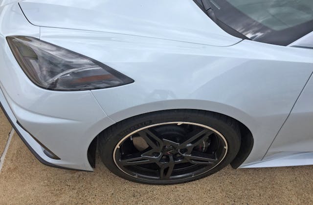
However, that saw-esque blade rim makes sense on such a hyperactive, perpendicular, and top-heavy body. If you’ve got a large canvas to cover, better paint everywhere you can.
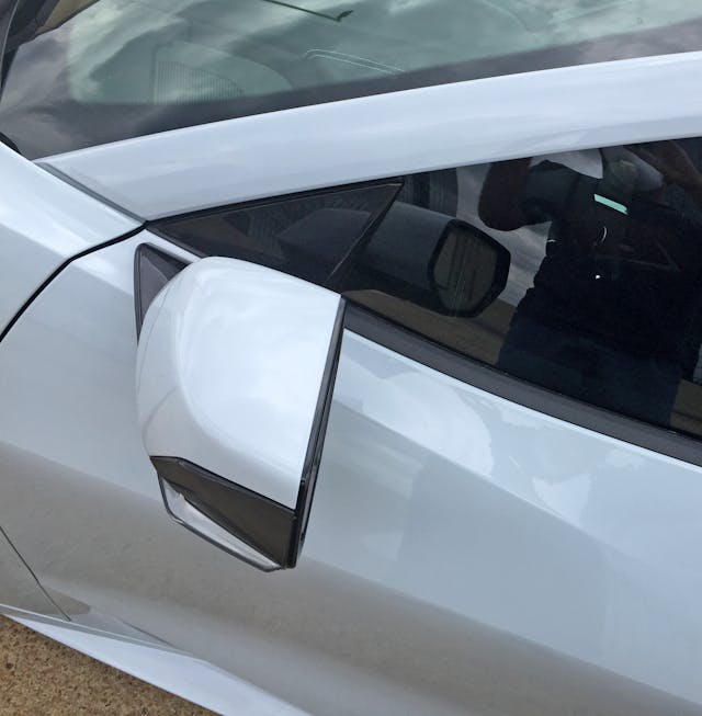
Boxy and tall proportions be damned, Chevy designers nailed the A-pillar/fender/door meeting point. The door elegantly sucks inward near the rocker panel while the fender’s creases sweep effortlessly into the door’s center midsection.
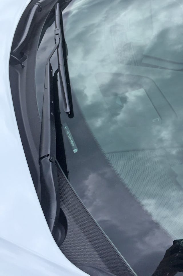
The cowl is tidy and modestly sized, as expected in a mid-engine design.
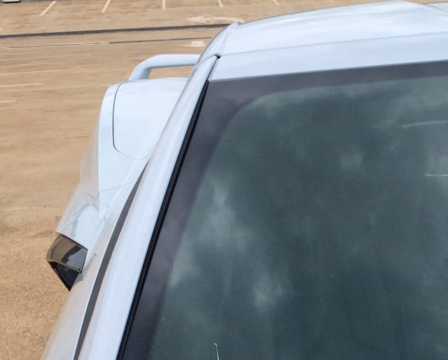
Much like the vertical demeanor of the fender’s side profile, the roofline’s transition from windscreen to A-pillar forms a nearly 90-degree angle. The blackout area in the glass suggests a sleeker transition is possible though, possibly, not preferred.
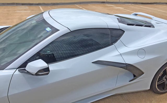
A little curve around the windshield frame would add contrast to all the harsh angles, but the overall flow here is both exciting and elegant. These large swoops should’ve done the C8 a favor via transitioning into the front bumper’s buffet of angles, killing off that buffet’s superfluous items in the process.
These large swoops should’ve done the C8 a favor by transitioning more smoothly into the front bumper’s all-you-can-eat buffet of angles and, potentially, eliminating some superfluous creases along the way.
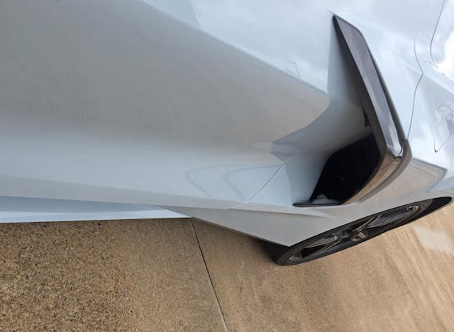
Integrating the door handle into the black-rimmed intake slot thrusts it into unexpected real estate. Open the door and half of the black rim becomes superfluous, but the placement does allow for an ergonomic door handle.
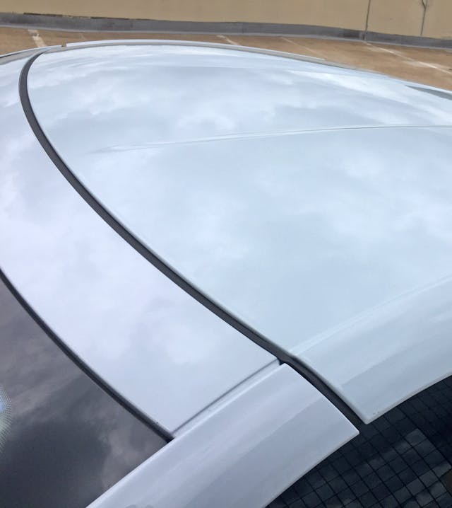
The removable targa roof is a welcome bit of Corvette DNA, but there’s little reason for it to continue an arch begun by the A-pillar. Arched roofs only work on cars with an unbroken line of sheetmetal; a smoother roof with rain gutters, like a McLaren 570’s, would help eliminate the C8’s visual noise.
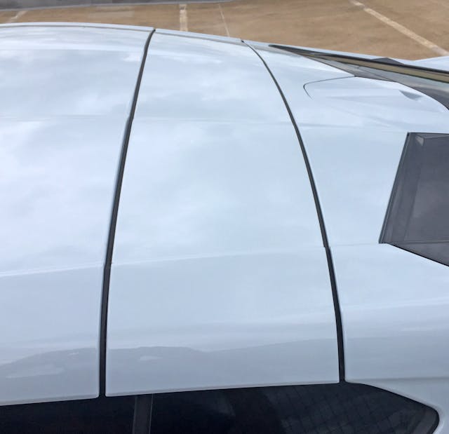
Several sweeping lines compete for your attention with the cutlines of the targa, roof, and hatch.
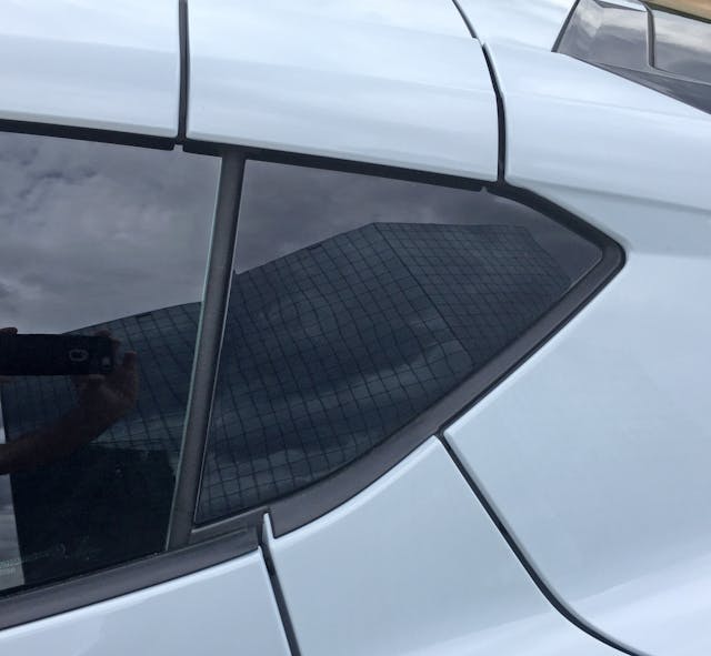
It’s a shame the glass/bodyside cutlines don’t begin where the roof cutlines end!
Even worse, that quarter window is actually DLO FAIL: a fake window trying to make the C8’s greenhouse look faster. The fail would make more sense if the fake window ended at the imaginary line between the top and bottom cutlines for the rear hatch, thus deleting the hard crease extending from its pointy finale.
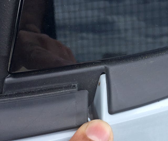
Eliminating the B-pillar’s DLO FAIL in lieu of a more elegant hatch cutline would also reduce visual clutter, vanquish the need for a fake perimeter seal (that doesn’t cover the entire perimeter), and lower the cost of production.
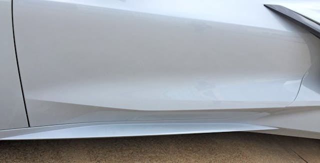
The door’s sweeping lines look even better when using a dog’s eye view.
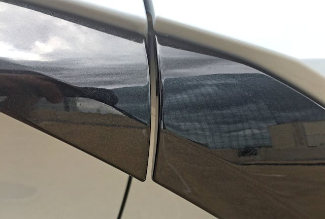
Hiding the door handle in the black spar that goes to the intake duct is clever—but something looks a bit off.
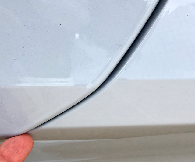
Jagged cutlines are mandatory for a body this angular, but they highlight the couple millimeters of sag on this Vette’s door. On a less “bendy” body side, this misalignment would be less noticeable.
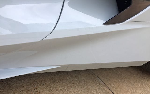
The rocker panel’s spear ends unceremoniously before the intake duct. The next-highest spear does double duty as the scoops’s lower boundary and a character line extending deeper into the quarter panel.
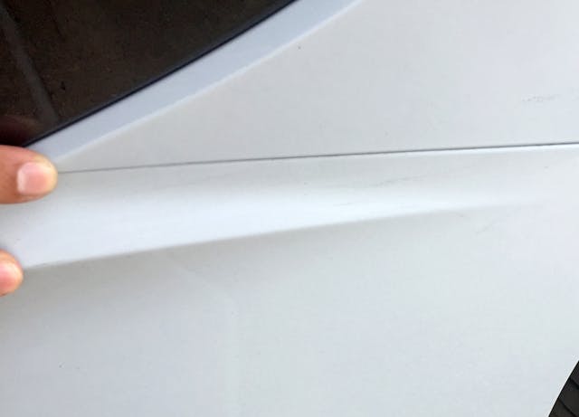
Too bad the spear extension doesn’t integrate with the body cutline placed due north.
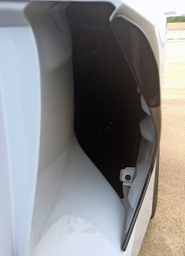
While a cosmetic grille (hiding the attachment hardware) inside the duct would impress, the omission isn’t a deal-breaker at this price.
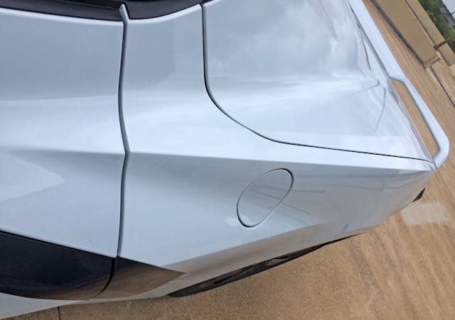
Chevy’s designers need to re-think the intake duct’s girth relative to the gas door: Smeared circles on a wedgey body do not an elegant sports car make.
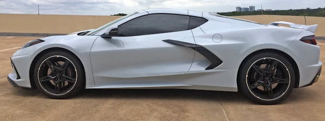
It’s tall, upright, and sports a mind-numbing number of creases. Maybe Chip Foose should overlay these lines on the lower-slung body of a McLaren 720 or Ferrari F8.
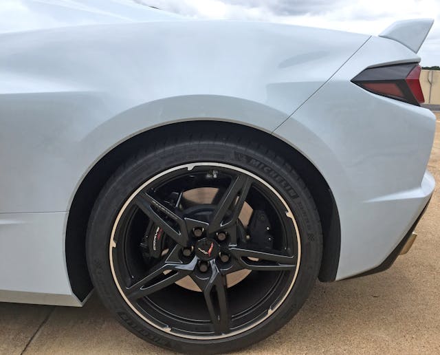
See the hard bend starting from the left and ending at the taillight? Make note of the cancerous bulge hindering its progression. This area is one of the reasons why the C8’s posterior is so vertical and massive.
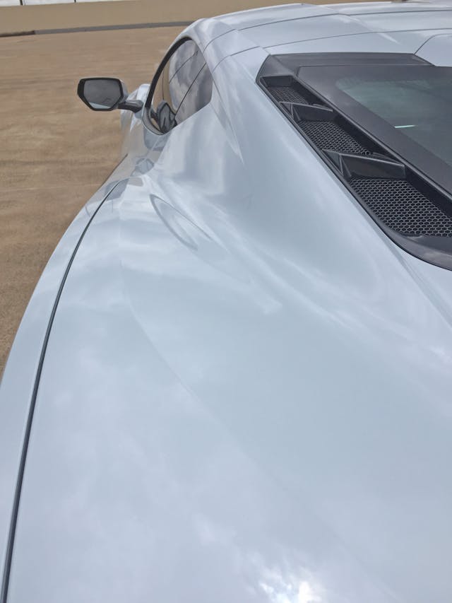
On the other hand, perhaps you can never have too much real estate.
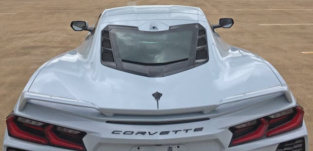
The roof is surprisingly upright-looking (even though it’s very sleek indeed) and that hard bend between the B-pillar and the rear hatch’s cutline adds much-needed surface tension. Still, there’s not much one can do with so much horizontal surface area.
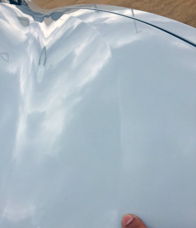
Imagine if that bend was actually the C8’s outermost body line. Sure, designers would need to reduce its taper to ensure the C8 doesn’t end in a pointy bumper; but a happier medium between pointy and expansive is possible.
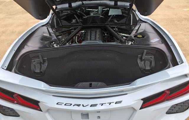
Rumor has it Chevrolet insisted the C8 possessed enough cargo space for multiple duffle bags, golf clubs, etc. What’s certain is that the targa panel fits here, which is incredibly convenient …
… and a silly compromise for those who want a low-slung, tightly-proportioned alternative to an import. The underlying concern for designers and management is this: Which customer base will determine the mid-engine Corvette brand’s long-term future?
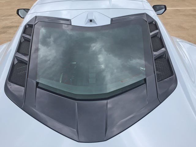
The perimeter of the rear glass/engine cover emulates the assertive angles of the C8’s crossed flag emblem, but the (wonderful-to-use) rearview mirror camera stands out, bare of the dark paint that covers every other point of the frame.
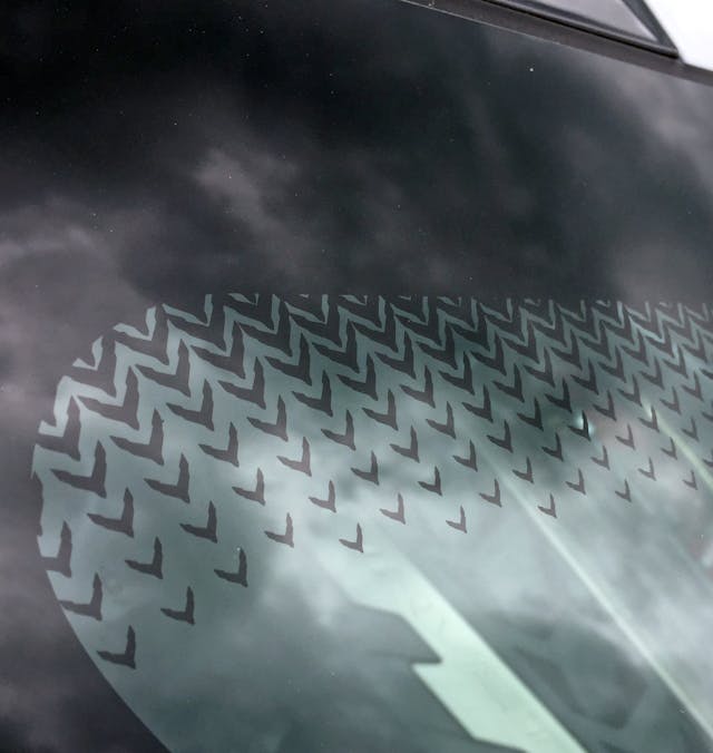
Nobody wants their sports car getting egged to this extent, even if we’re discussing Easter Egg logos.
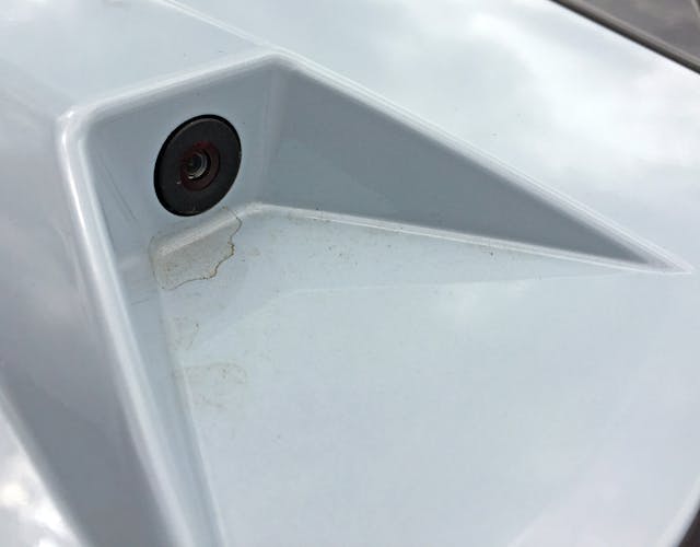
Sometimes standing out isn’t a great idea, especially when dirt collects after an unexpected rain storm.
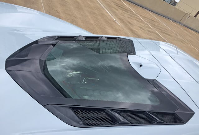
Body-color camera bezel aside, this is one of the most refined, logical, and organized areas on the C8.
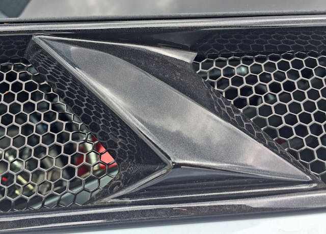
Radical wedges around the rear glass have a cohesive voice not seen elsewhere and don’t at all diminish the C8’s shock-and-awe factor.
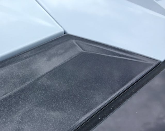
Again, some C8 details are powerful, logical, and anything but fussy.
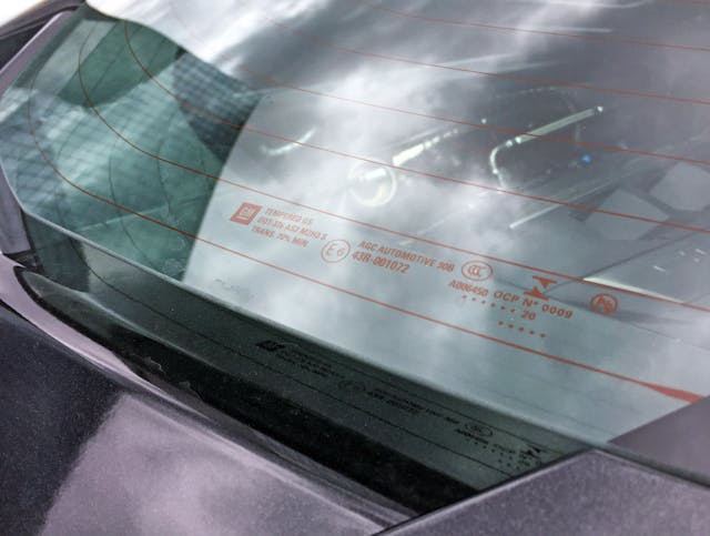
The engine cover is indeed a sheet of glass with defroster wires, which are likely unnecessary once that LT2 reaches operating temperature. Or if you use either of the two rearward cameras, but I digress…
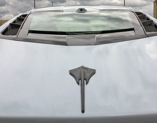
The Stingray logo teases us with the notion of a Corvette sporting a slender, tapered posterior.
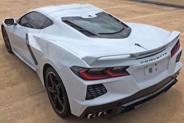
Unlike previous Vettes (C5–C7) with unabashedly tall posteriors, the C8 tries to soften the visual blow with a turned-down rear fascia. The air extractors then force the eye to prioritize the fascia’s horizontal layers: however, an unnecessarily strong base walks around the bumper, cutting into the side profile.
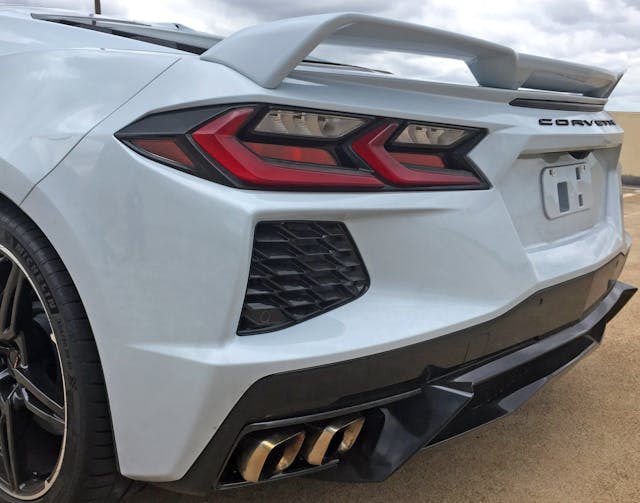
Most of those lines point to a “fish mouth” face holding the rear license plate. The most obvious contribution to this sensation comes from the Camaro/C7 Corvette-inspired rear lights.
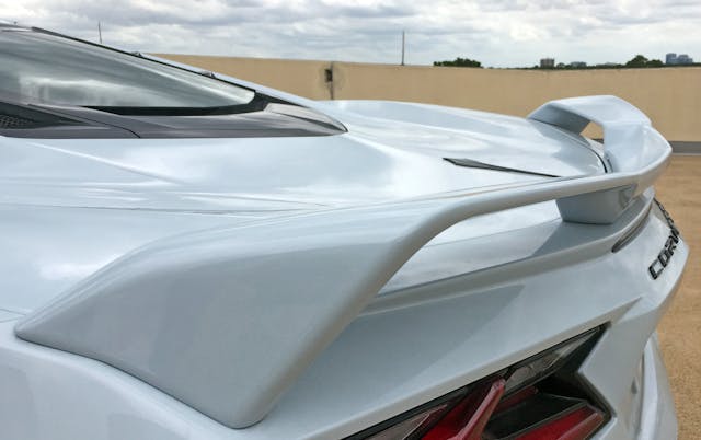
The fast lines from nearly every angle leave a challenging footprint on which to mount the Z51-spec spoiler and demand boomerang shape with an aggressively-angled center section.
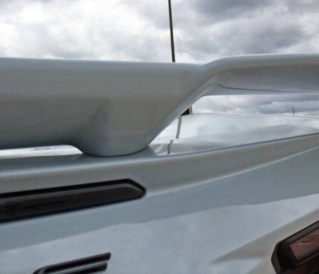
The spoiler’s outer “wings” have significantly more negative area than the inner portion mounted atop the center high mount stop light (CHMSL).
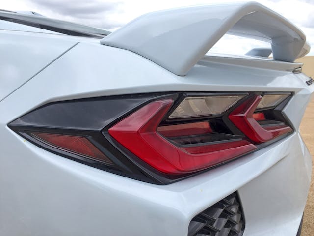
It’s a shame that such a jarring downward angle was needed to give the C8 a modicum of rear end taper.
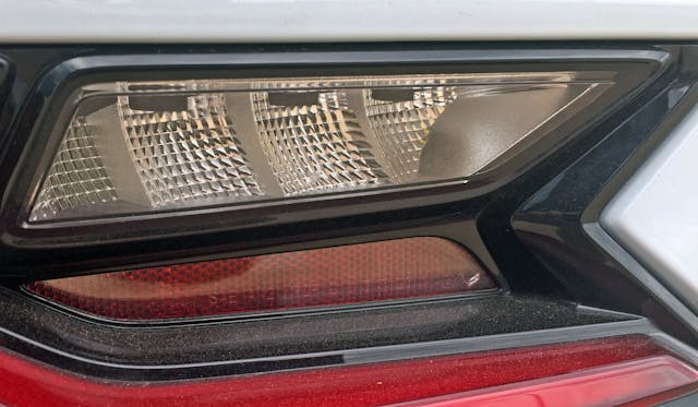
The signal lights fill out the black frame and are sequential—a nice touch. The red reflector does not fill the frame and features an unfortunately thick, rounded-off bezel at the right-hand corner instead. The C8 is nothing if not an exercise in contrasts.
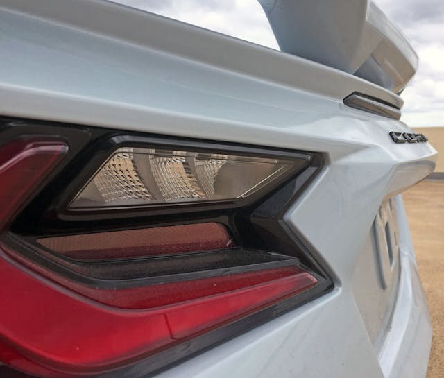
At least four planes of painted bumper are required to merge the area around the lights to the fish mouth.
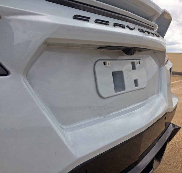
A few softer panel transitions would clean up all the jaggedness.
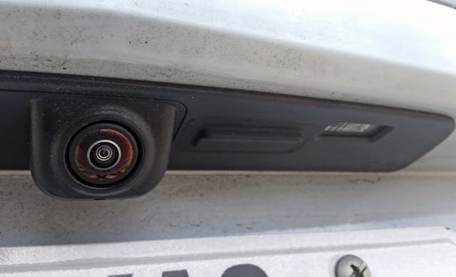
Soft curves gently cradling the backup camera deserve some complementary tenderness elsewhere.
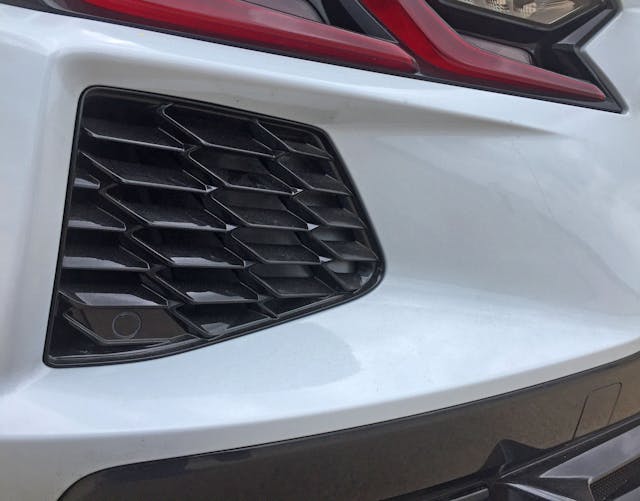
Dramatically scalloped extractors do a fair job carving out chunks of the C8’s otherwise-massive rear end.
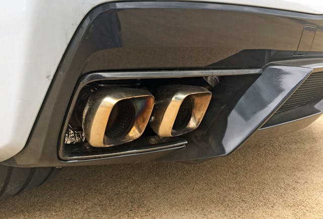
Square-ish tail pipes are mandatory on a body with so many angles and hard edges, and the black panel insert does a good job visually thinning the rear end. It would likely do a better job if finished in matte black.
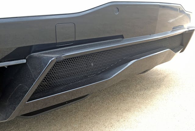
This is a surprisingly boring diffuser considering the rest of the C8’s radical design. Much like the lower front fascia, another component finished in matte black would spice things up here. Perhaps designers needed to leave room for upgrades on upcoming higher-trim levels.
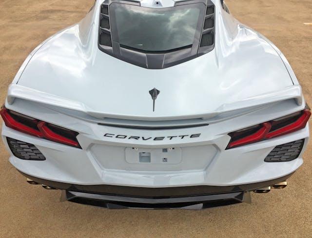
There’s so much going on that designers couldn’t rest the Corvette lettering on a straight line, thus confronting the universal problem of arranging an even number of letters on a V-shaped angle. Since there’s no center letter, just about any word will look lopsided; one with the contrasting middle letters “V” (which is visually light) and “E” (visually heavy) is no exception.
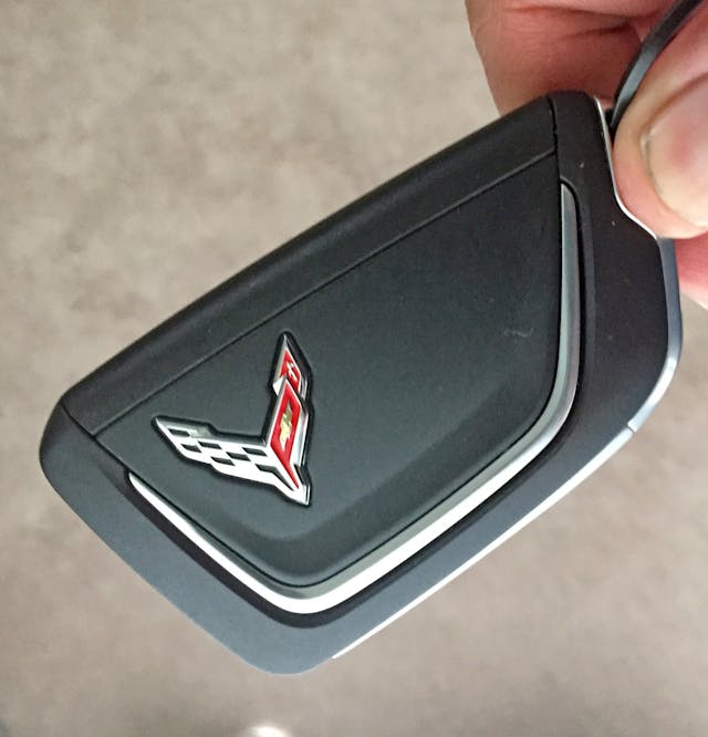
Peace and harmony are hard to find these days. Even the C8’s key fob combats symmetry, proportion, and refined contouring via hard cutlines meeting illogical soft curves.
The C8’s design takes me back to several “kiss of death” comments I heard as a Transportation Design student: backhanded compliments in a studio likening your renderings either to comic book illustrations or to the exaggerated scale model nested inside a Hot Wheels blister pack. Both comparisons implied you lacked the refinement needed for a career in an OEM design studio. When delivered by a teacher (in front of everyone), either verdict could dissolve a student’s passion into quiet sadness in a matter of seconds. However, that was 20-something years ago, and different design aesthetics (like big-mouthed crossovers) made production since then. Rendering a new Corvette on vellum paper may indeed be comic-book worthy by 2000’s standards, but here it is in the flesh. Which is quite the accomplishment.
Vellum Venom critiques are only skin-deep, and the C8 Corvette is a revolutionary package under the skin. I look forward to a future C8 with a more logical design and slimmer proportions via lack of interest in carrying golf clubs and targa roofs.
Thank you for reading, and I hope you have a lovely day.

