Vellum Venom: 2019 McLaren Senna
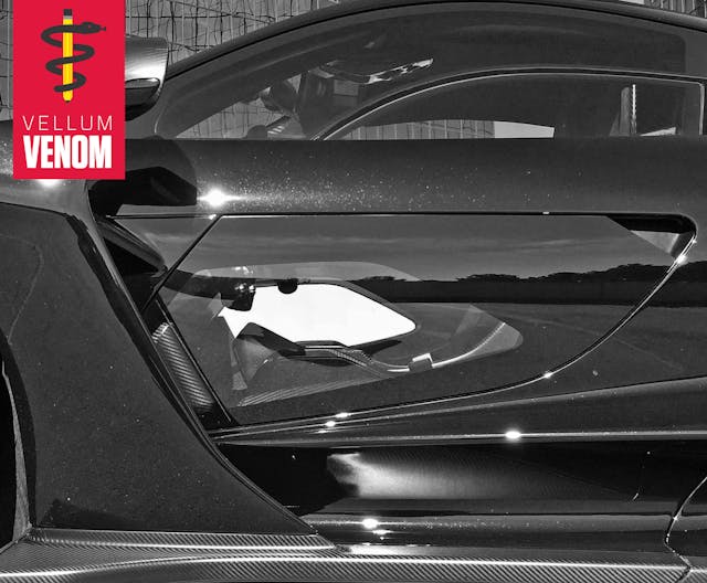
McLaren touts the Senna as “the ultimate distillation of the company’s ‘form follows function’ design mantra. To observe the detailed work that has gone into every aerodynamic element of the McLaren Senna is mesmerizing.”
Truer words were never spoken—and design must indeed be mesmerizing when you’re referring to a hypercar with a seven-figure asking price. At this level design must excite, but after taking 120+ photos of the Senna’s every detail, the excitement turned into data overload. Like beholding art in a museum versus Google image search, it’s impossible to cover every external detail in a single article you could comfortably read in one sitting.
So consider the endlessly complex Senna as a “must see to appreciate” machine. And here’s a starter kit for when you get that chance.
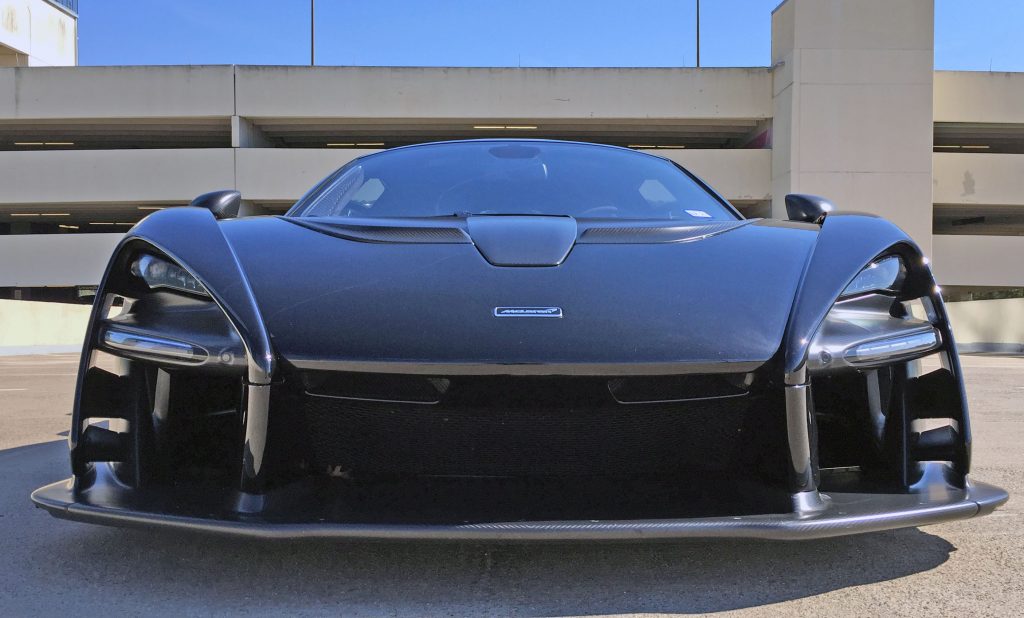
While McLaren’s recent creations have a design ethos worthy of a major automaker’s styling studio, the Senna makes brand integrity take a back seat to aerodynamics. The front splitter is a carbon-fiber foundation massive enough for a two-story condo. The sheer volume of air channels above is impossible to beautify. The headlight buckets’ external contours give a nod to McLaren’s DNA, mirroring a curve omnipresent in contemporary McLaren emblems.
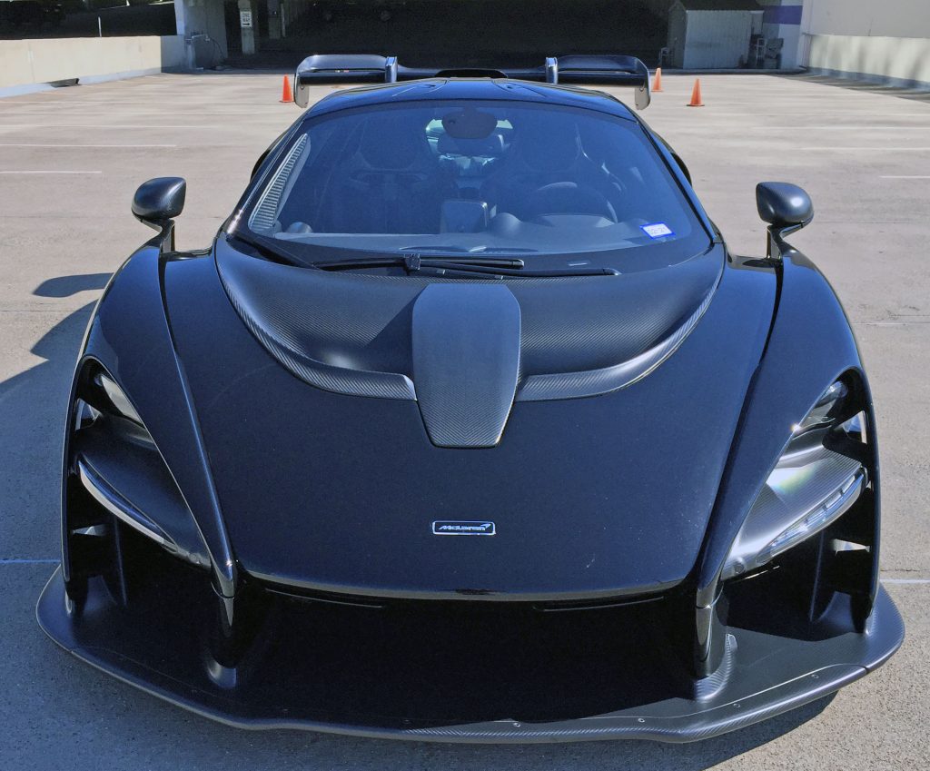
Sit higher and the package blends a bit better: The four “legs” from the front splitter form the headlight buckets and eventually translate to massive fenders. Even when made of eye-catching carbon fiber, the hood vents are surprisingly understated.
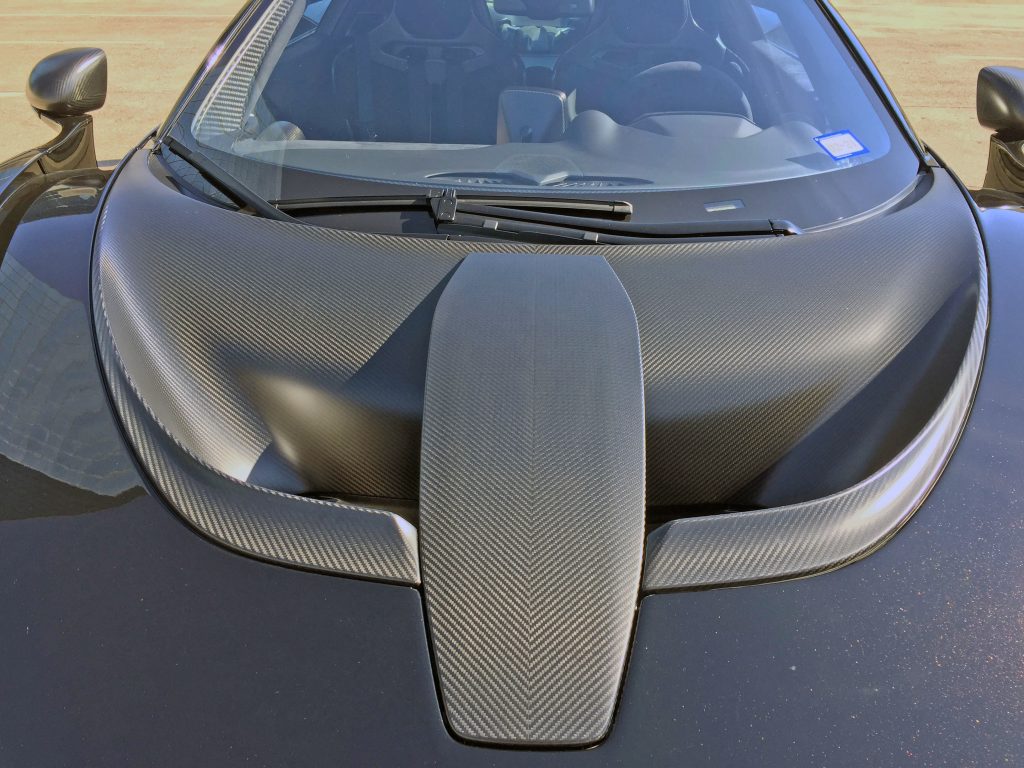
To wit, the Senna’s hood artfully guides air away from the vents using a Gurney flap (likely to create a low-pressure zone for scavenging air out of the vents) while the stunningly well-crafted weave visually pushes your eyes away from the centerline.
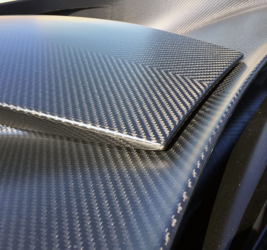
The oddly shaped centerpiece is a hinged storage nook. Not much room for anything larger than a battery tender, but note how the carbon fiber continuously forces your eyes either right or left of centerline.
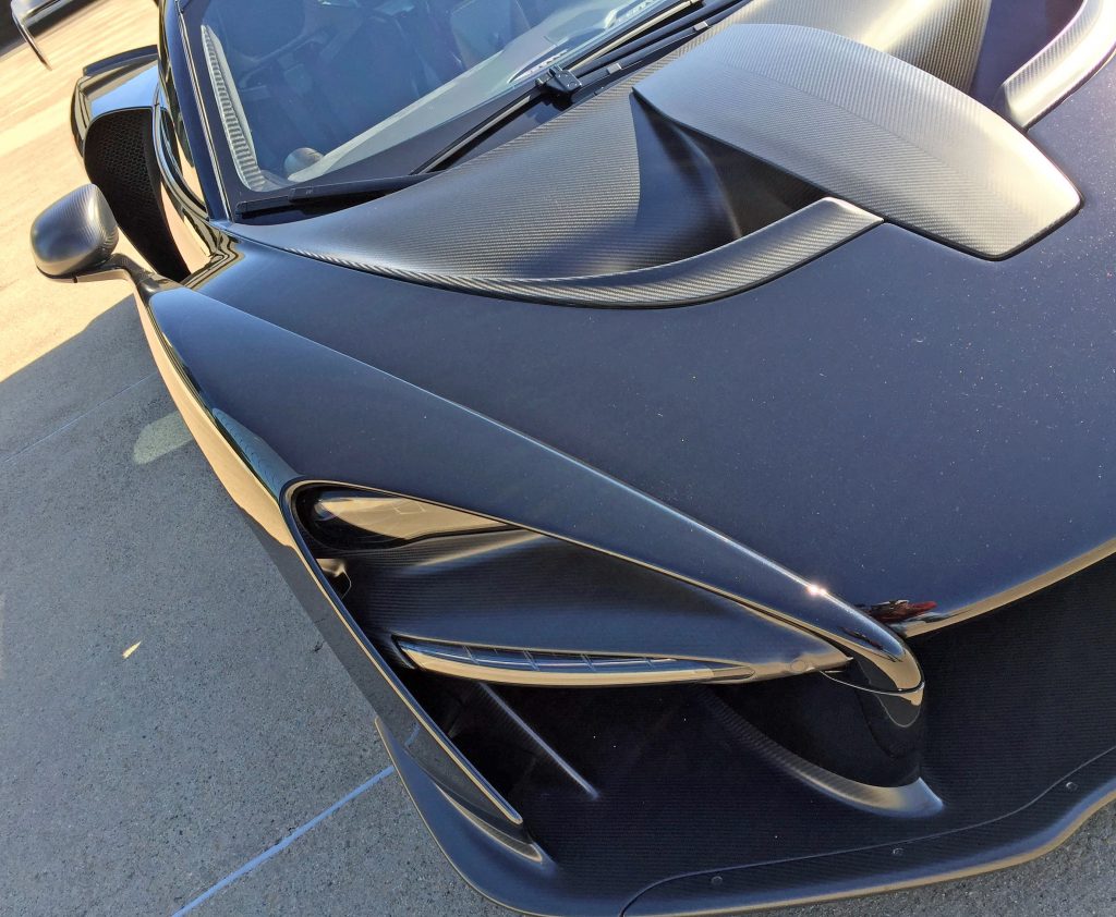
The carbon-fiber sweeps compliment the headlight bucket’s curvature, and the hood’s leading edge is emulated in the turn signal light, making a continuous arch across the front end.
As the hood nears the cabin, notice how its lower height translates into an unobstructed shot at the rear cooling duct.
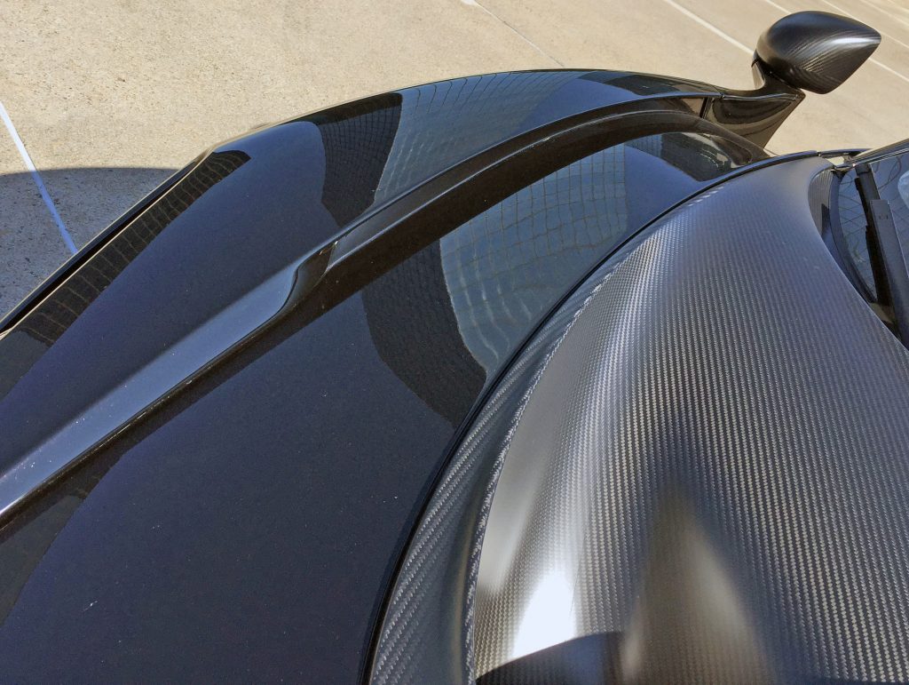
The sunken hood translates into adding negative area (space reserved for nothing) for aerodynamic benefit, and makes the door-mounted mirror look like it’s about to jump off a cliff. An unmistakable design element, unearthed.
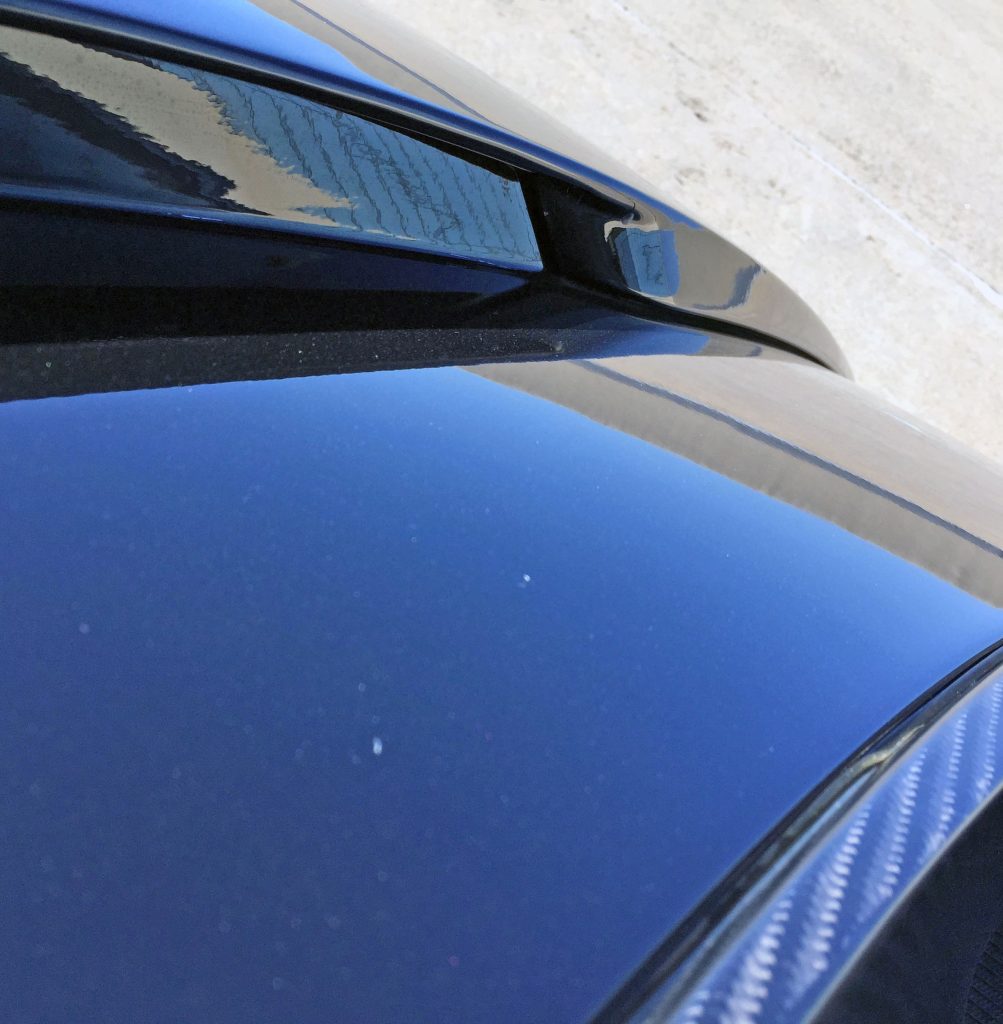
Look closer at the fender and it’s clear the hood isn’t the only negative area influencer: McLaren chiseled out real estate to ensure air passing over the hood has more room to flow, possibly slowing down velocity for even more aerodynamic benefit.
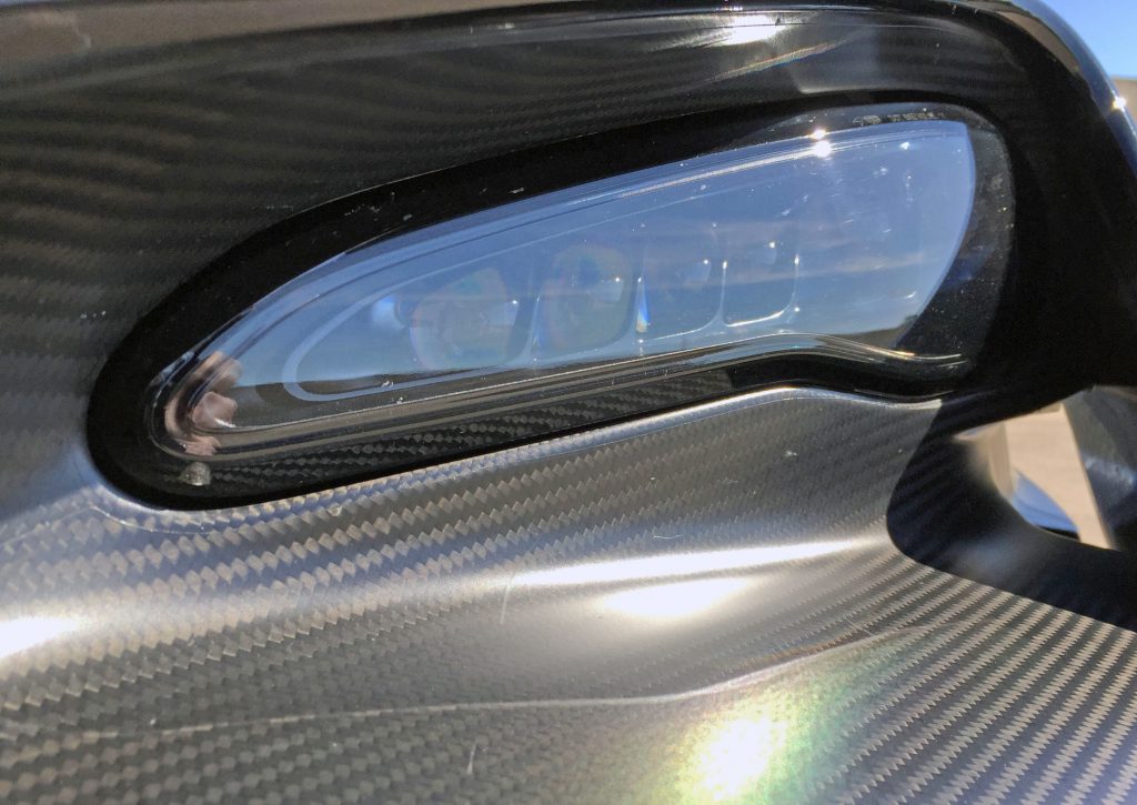
If you’re gonna rob the parts bin, make it a McLaren bin: these lights look like they belong on a 720S, and look fantastic in a Senna carbon-fiber bucket. Note the straight shot from below the headlight to the Senna’s body side, likely acting as a source of fresh air for the front wheel’s air curtain and aero tricks to come.
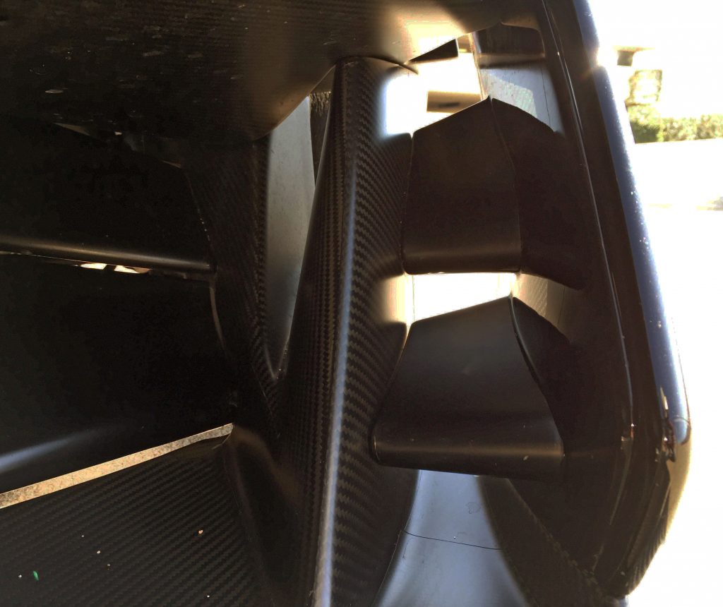
Below the headlight bucket lis four adjustable “aero blades” that rotate depending on, well, more driving parameters than a styling critique shall cover.
It’s a fascinating bit of kit; hence most owners paint them in a more striking color.
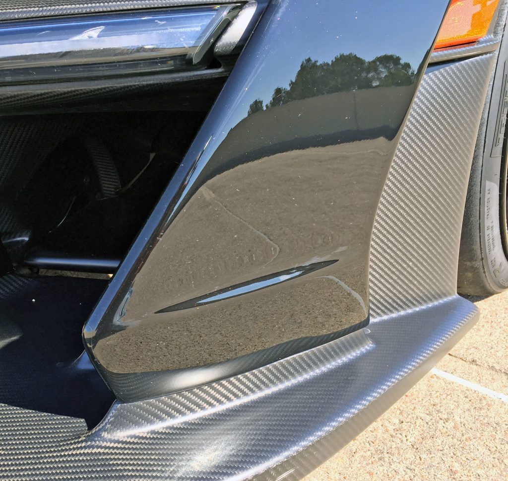
The outermost leg emerging from the splitter has a confusing duality, stemming from the initial carbon-fiber outgrowth to the forward-jutting knee of the painted fender. Maybe there’s an aerodynamic benefit; or, perhaps, it’s an awkward homage to the little brother 570S, right down to the elongated fender bubble casting a reflection of the blue sky (instead of the concrete below).
The Senna’s front turn signal (the clear lens) has a bit more of a gap than expected on this side.
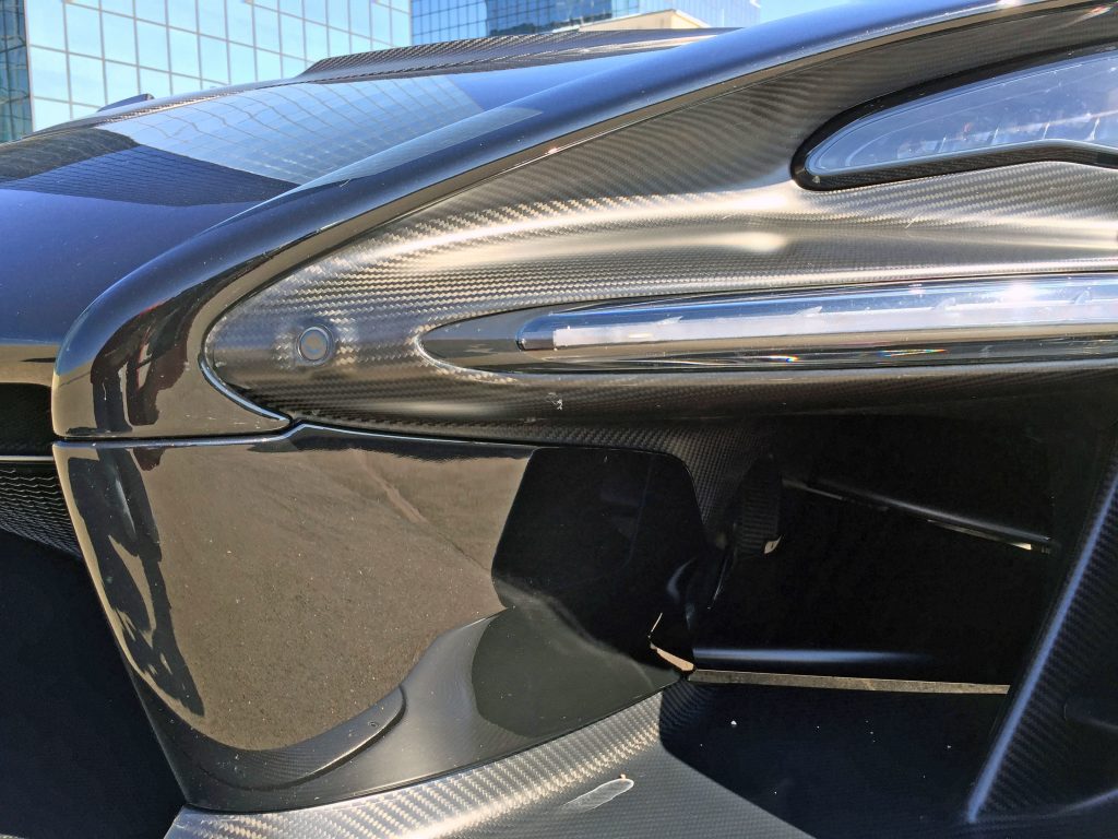
Gaps are no issue on the other side!
If a car ever needed parking sensors, it’d be one with a front splitter this expensive: The sensor’s forward-facing orientation means the headlight bucket needs a bulge, but the contour is beautifully slathered in carbon fiber.
The forward thrusting knee of the last photo is emulated once again on the inner leg, but the bend happens much higher up: Symmetry is usually nice to have, but maybe all the scoops, splitters and spoilers diminish that need here.
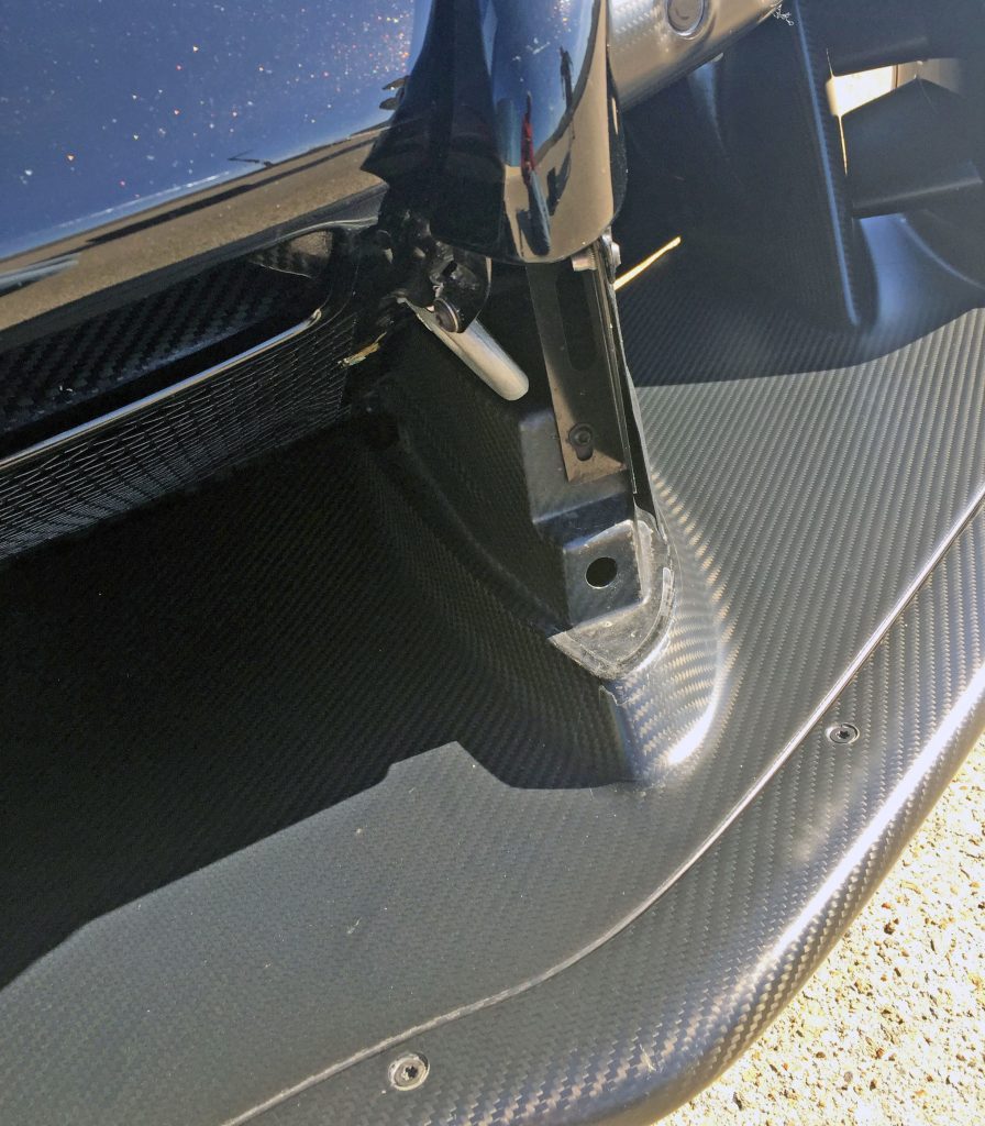
The inner leg has a false panel below its knee bend. Every racer needs what’s inside when their ride stops running: a tow hook.
And if your towing issue is correlated to front splitter damage, take comfort in the exposed fasteners: they imply you can replace the sacrificial part and save big money (so to speak).
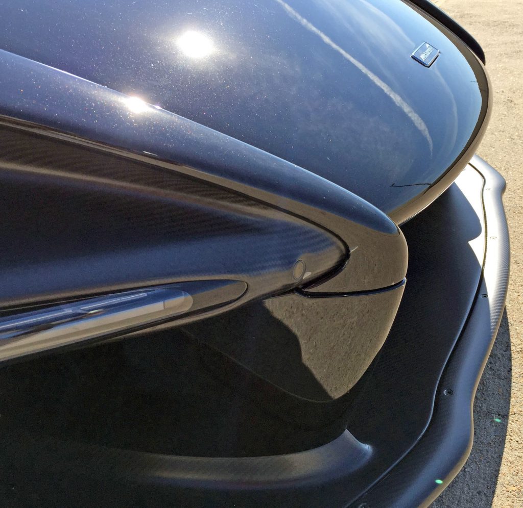
Unlike other McLarens, the Senna’s inner legs push beyond the hood line, turning into a Jaguar E-type bumper homage. These pointy appendages combined with the curvy hood and long splitter give the Senna a cartilage-laden face similar to a ray (the fish, not the Corvette).
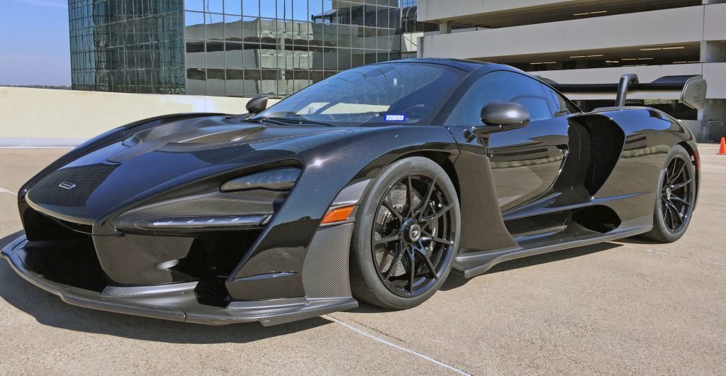
Step back and the inner/outer legs, the headlight bucket, and all those various shocking elements blend into one of the most radical front three-quarters ever made. Even better, the outer leg is a flying buttress!
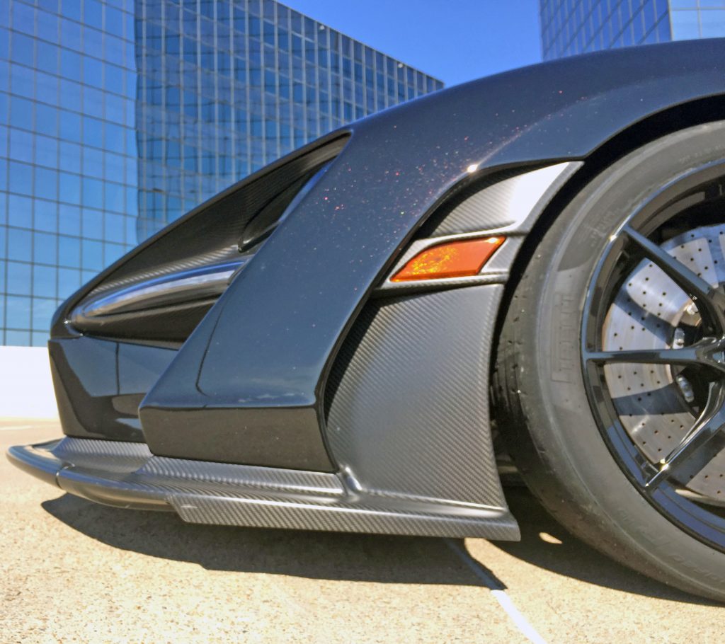
The two legs from the splitter make sense from this angle: the outer legs finally echo the inner’s form, thrusting forward while the same carbon fiber around the headlights tapers out to allow large amounts of air to escape the body and flow past the wheel.
The amber marker light’s curvature doesn’t emulate the backside of the leg; odds are this is a parts-bin affair.
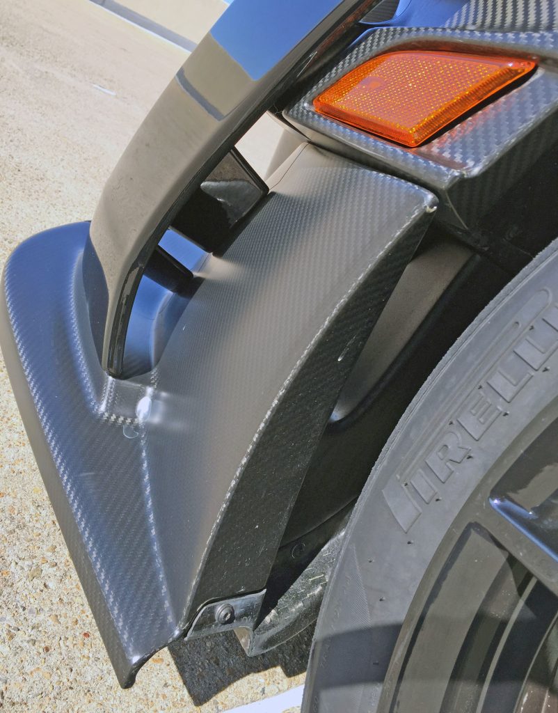
The outer leg’s backside shows just how much air is channeled downstream: comparing the Senna’s air curtains to those of most passenger cars is like comparing a fire hose to a squirt gun.
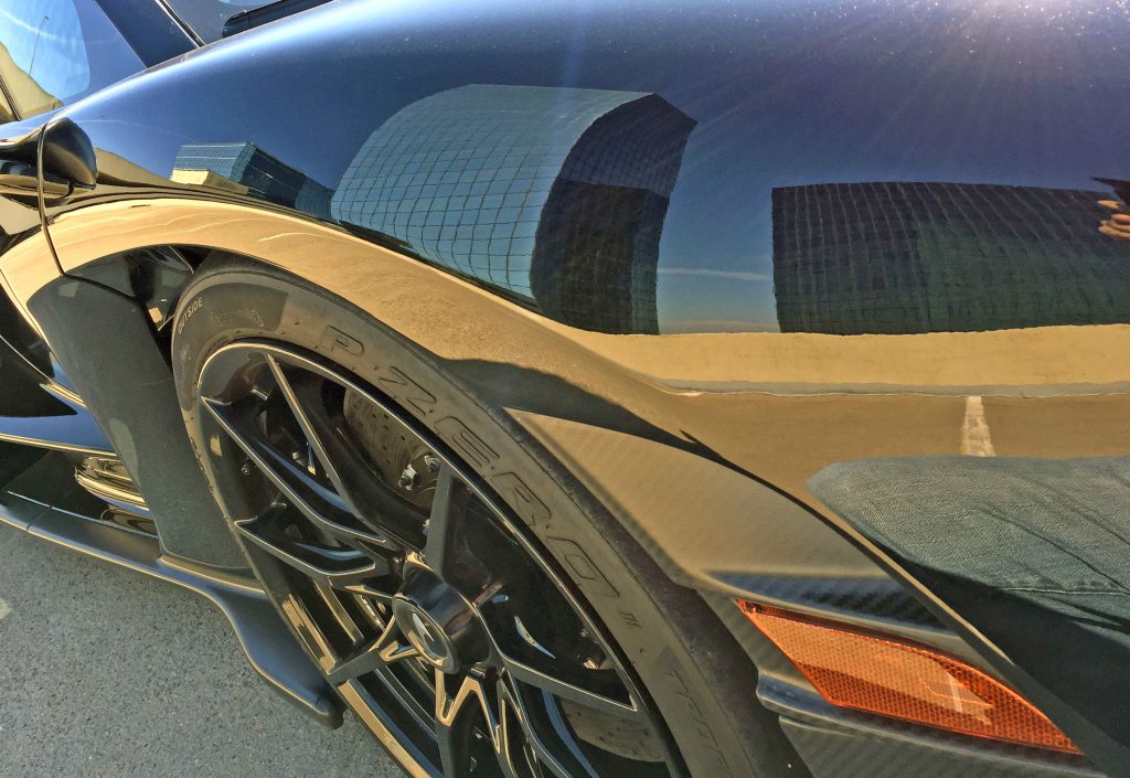
Note the fender’s strong, sweeping character line distorting the concrete reflection as it arches back.
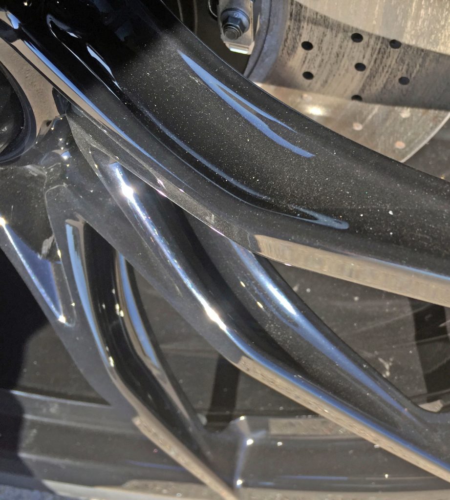
The unconventional single-hub, nine-spoke wheel is clearly cast for weight savings. Each spoke looks like a spoon carved out its sides, while delicately thinning as it reaches the rim. The effect is reminiscent of spider’s legs.
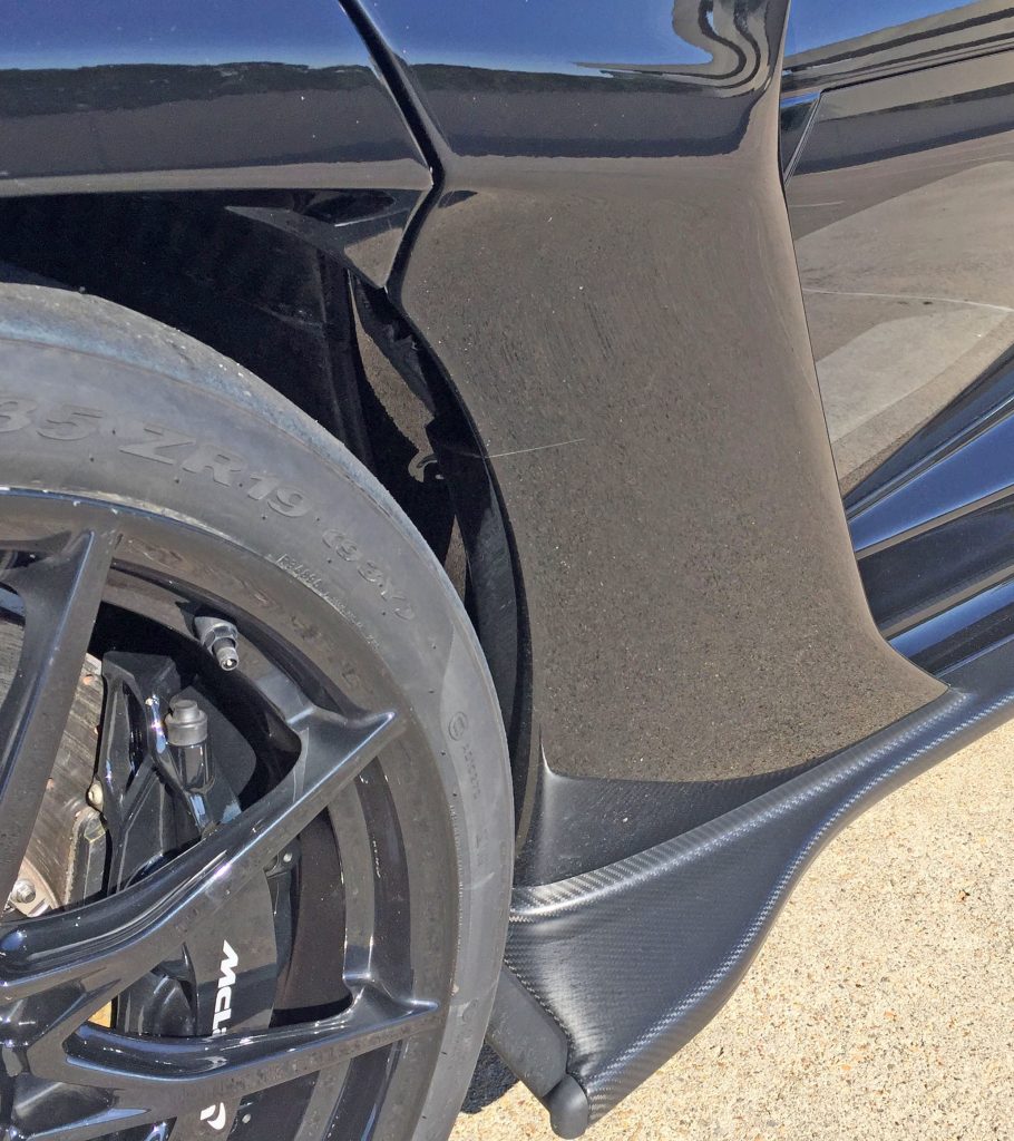
As nearly half of the wheel arch is connected to the door, this must be the most confounding intersection of fender and front door on the planet. The door heavily tapers inward, allowing air from both the inside and outside of the wheel to exit the fender—while having its own flying buttress (in the foreground).
There’s another flat carbon-fiber panel that takes off where the front splitter left: Going to the wheel’s outer edge and its depth shows how far the door sinks inward.
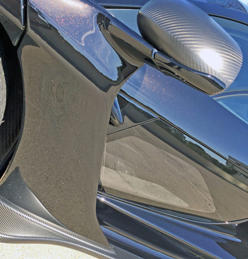
The door’s flying buttress makes a happy home for the gently cupped side-view mirror mount, and has a taut form that clearly routes air where the rear-engine, turbocharged Senna needs it most. The forward-thrust sensation of the entire panel is muscular, too.
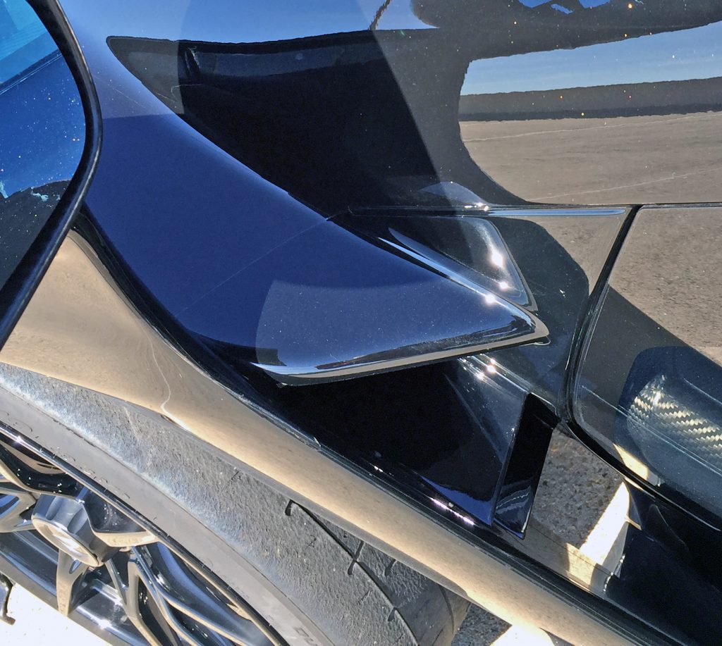
What’s behind the buttress? A direct shot of concrete below, two splitters in the middle and the finale of the hood curve that swooped so dramatically between the fender and the windscreen.
This is one seriously multi-tasking door.
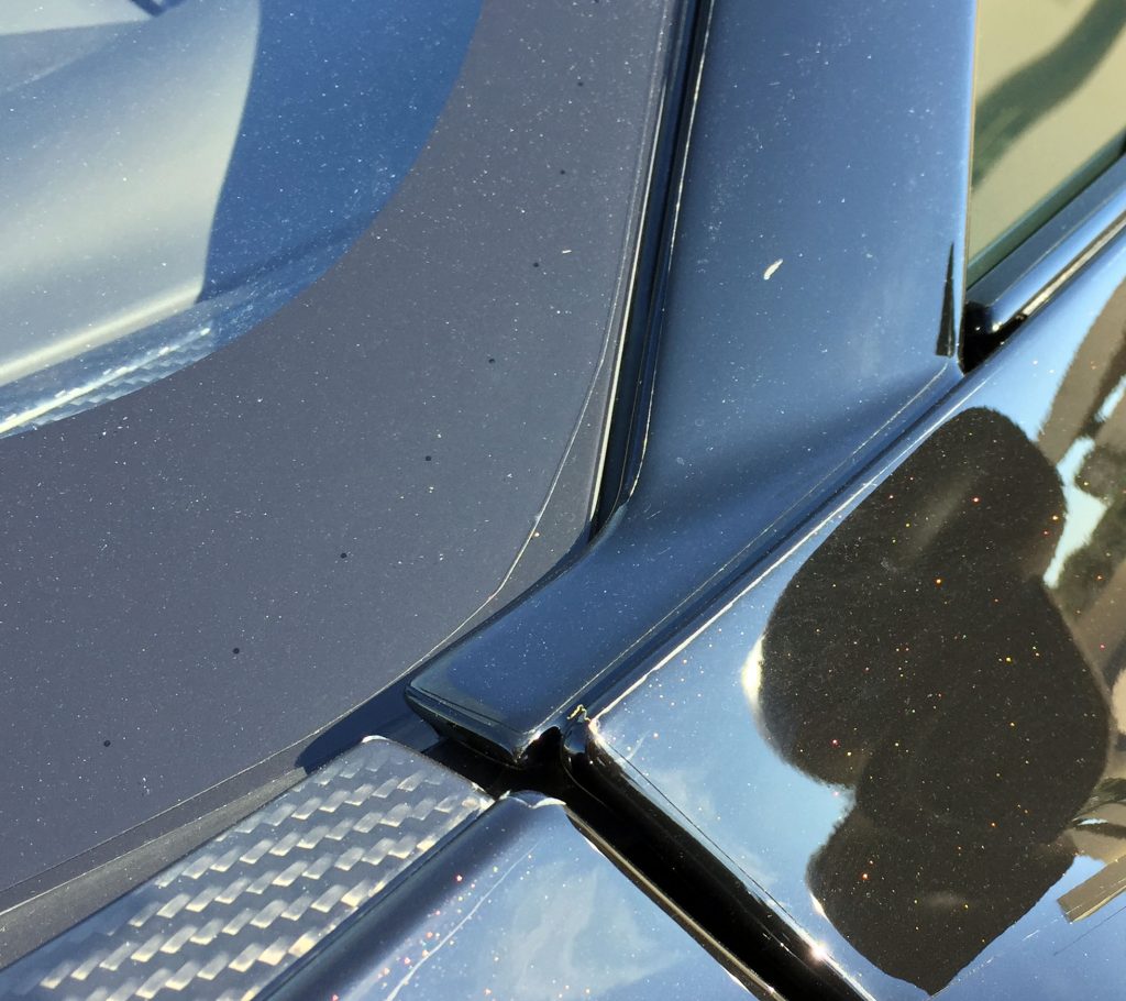
Normally such a haphazard ending from carbon-fiber part to painted A-pillar deserves a wicked screed for such a poor transition, but it’s just an nitpicky footnote on a body this radical. Would have been nice if there were a separate panel to continue the form and stop at the base of what would be the A-pillar (note the shadow at the base), however.
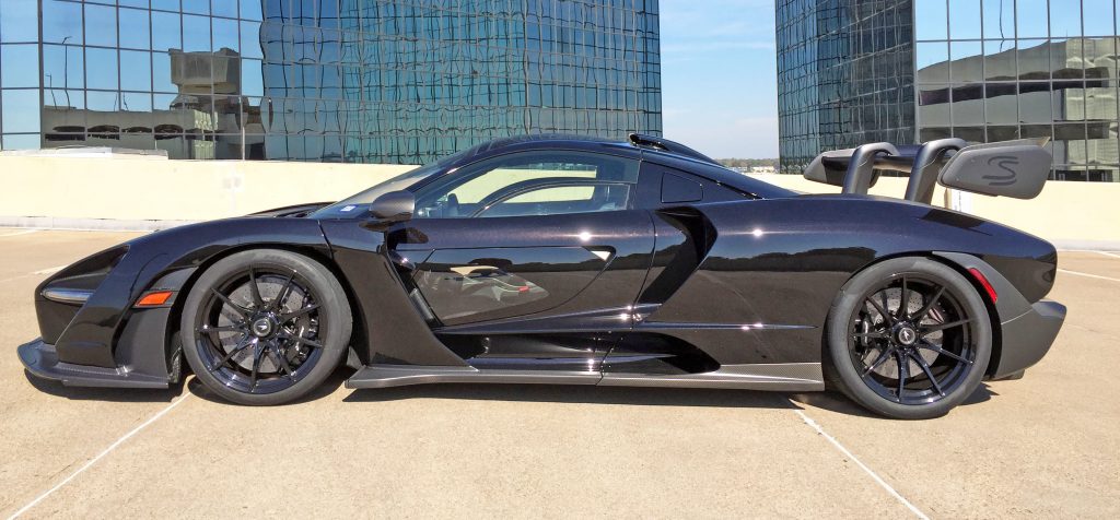
The Senna is a complex and confounding blend of curves, razor-sharp lines, massive carve-outs of negative area, and a radical hanging spoiler. The roofline, even with an intake duct, seems almost normal in comparison.
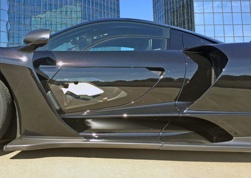
The door’s clean face pushes air back for two cooling scoops that dominate the quarter panel. But the Senna’s coolest party tricks are the clear door panel inserts.
Previously implemented from the commercial truck world (often Euro-spec, cab-over rigs) for ease in maneuvering in tight spaces, the Senna’s glass door sections make it easier to spot an errant curb and, possibly, to find that apex that got lost as you turned into a tight sweeper. Forget about how cool it looks—this is a functional design element that could save you tens of thousands of dollars in collision repair.
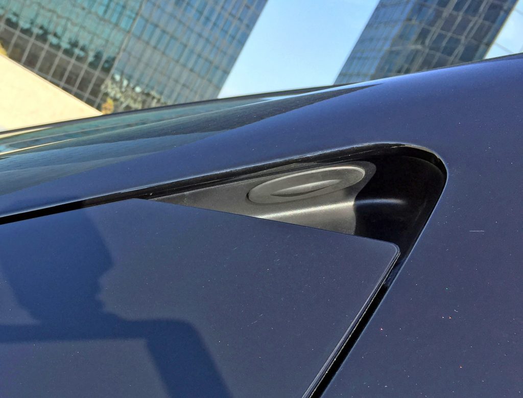
Ironically, the nook holding the door release button emulates the profiles of both quarter-panel scoops.
That said, have a look at the sealed-in-rubber door release button, noteworthy on any other car but quite boring in this application.
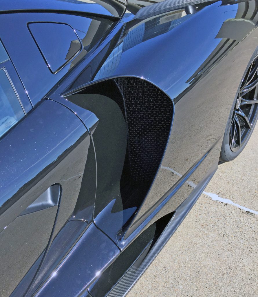
The grilles are blocking-plate-free (they better be, at this price!) and have a similar shape to the headlight buckets, which in turn are a hat-tip to the McLaren swoosh. Too bad the homages rarely blend seamlessly into the entire body, but that’s not the point.
It’s truly amazing how much negative area was carved out between the front and rear wheels to make this happen.
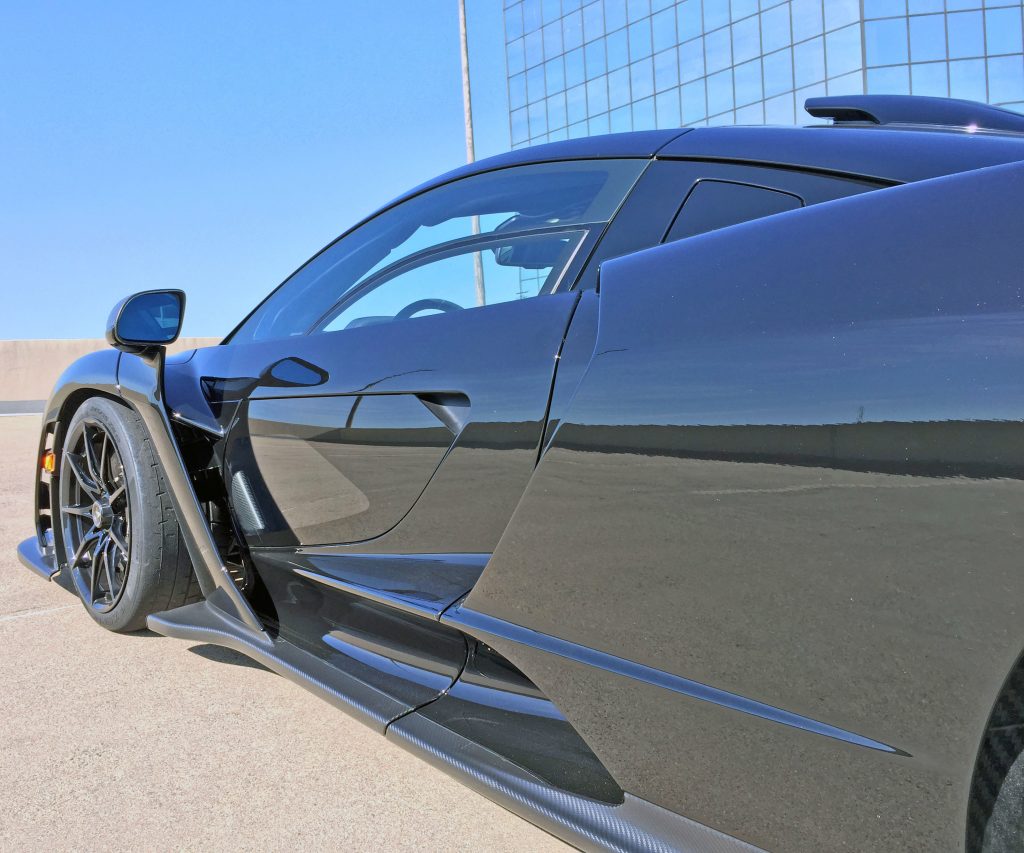
Back to the body, with a quarter panel that cleans up nicely once clearing the massive scoops.
The center and the roof-mounted scoop complement each other, and the door spear elegantly slices into the quarter panel. Compared to other angles, this quarter panel shot lets the eye relax, soaking up much-needed sections of taut, (somewhat) flat paneling.
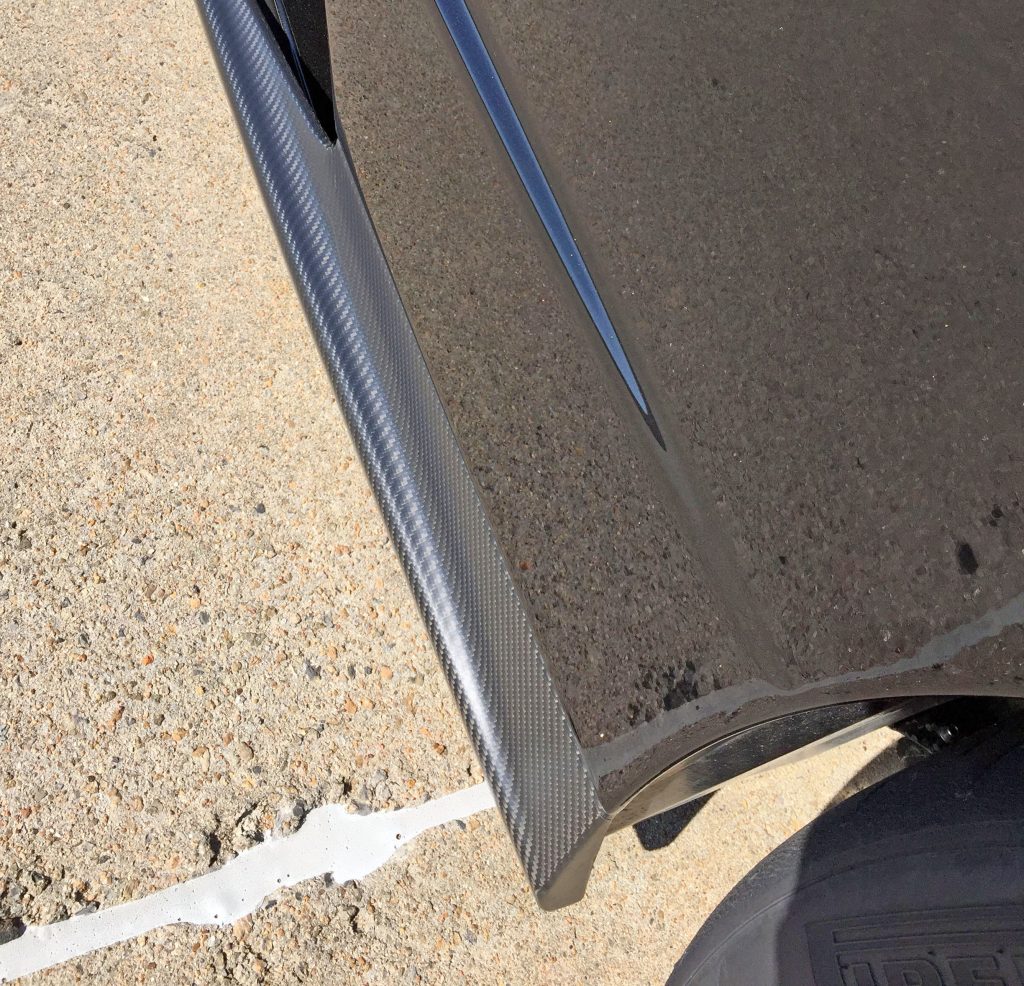
Even the carbon-fiber base translates into a calm, subtle mix of flat planes and gentle curves.
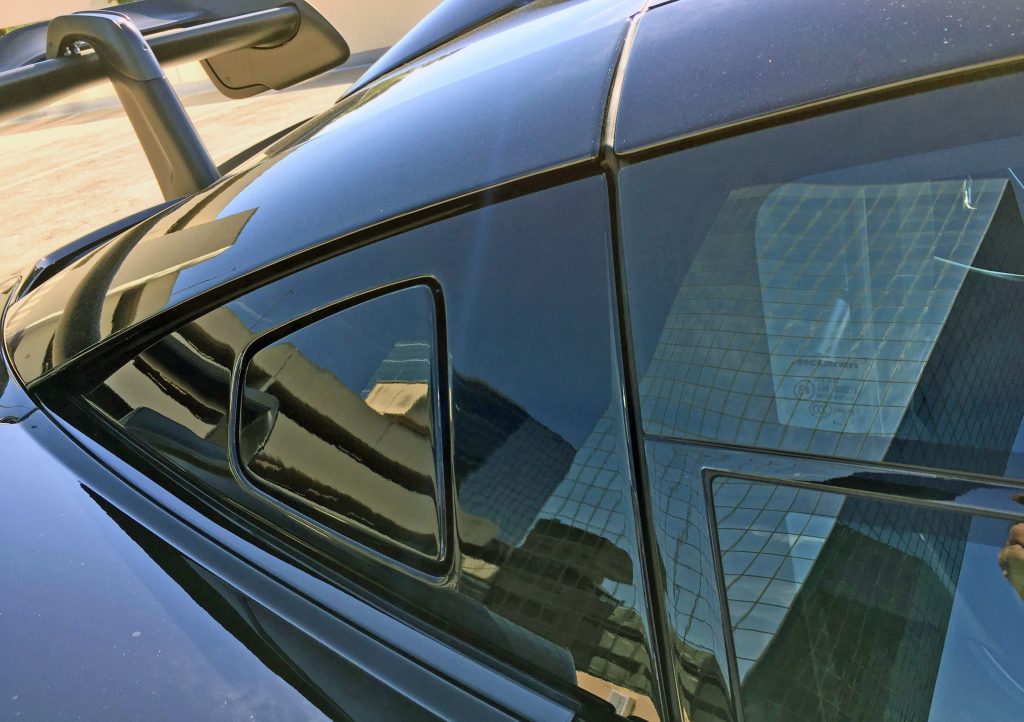
Many pieces (fuel/coolant doors in black panels, fixed upper-door glass, roll-down lower glass à la Subaru SVX) in the daylight opening (DLO) work in harmony. Except the fuel/coolant access doors are set in a solid panel styled to resemble a quarter window, which longtime readers know classifies this section as a DLO FAIL.
Via an all-black roof and the owner’s decision to tint the glass, the end result is far more convincing than the Ford GT DLO FAIL (though Ford cheated on a much smaller scale).
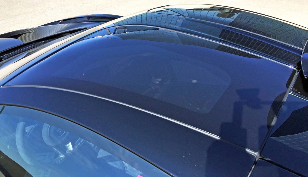
The doors extend up to the middle of the roof, likely out of jealousy from “losing” so much real estate to the negative area between the wheels.
No matter, this is nothing less than a modern interpretation of T-tops, albeit with fixed glass panels.
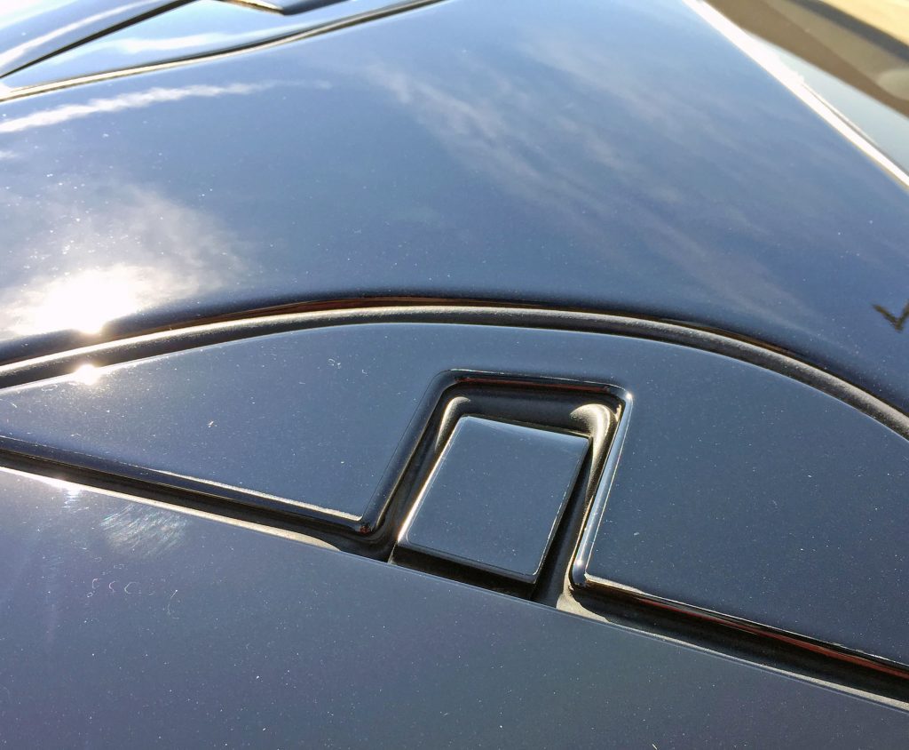
Since the upper door/roof hinges are exposed, they are sealed tight by a gasket that balloons when closed, but remains below the surface.
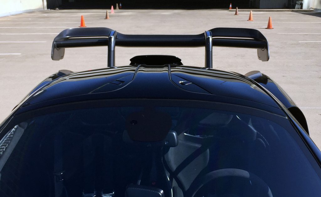
Not too many vehicles have a door hinge in the middle of the roof, but the Senna’s lightweight construction makes this a reality.
And that mental wing? More on that later.
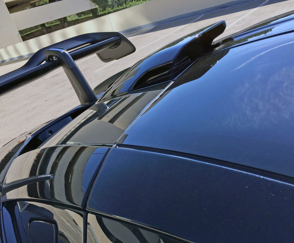
Behind the doors lies the rest of the roof with a chiseled, sleek, and downright subtle intake scoop. Unlike the other performance features in this design, the mouth is notably smaller than the entire scoop’s frontal area.
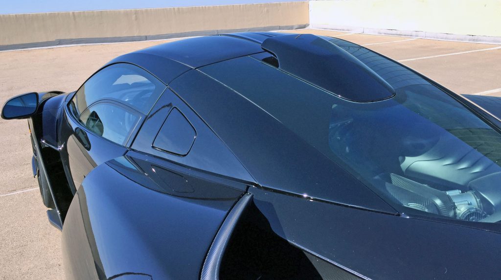
You can see how much space is reserved for non-scooping duties from this angle.
No matter, most (if not all) Sennas are finished with black roofs to retain a cohesive, almost conventional-passenger-car feel. The large quarter window DLO FAIL was likely implemented to complement the glass present on the doors, roof, and engine cover.
Further proof of that reasoning are the faux roof arches stretching between the A- and C-pillars: All indications lead to a quarter window that should be clear. But why do you need a roof arch when the door slices through it … in two places per side?
And what’s that little ridge of carbon fiber on the quarter panel?
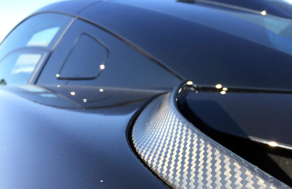
It’s the same Gurney flap found on the front. It forces air up to create a low-pressure zone for what’s coming next.
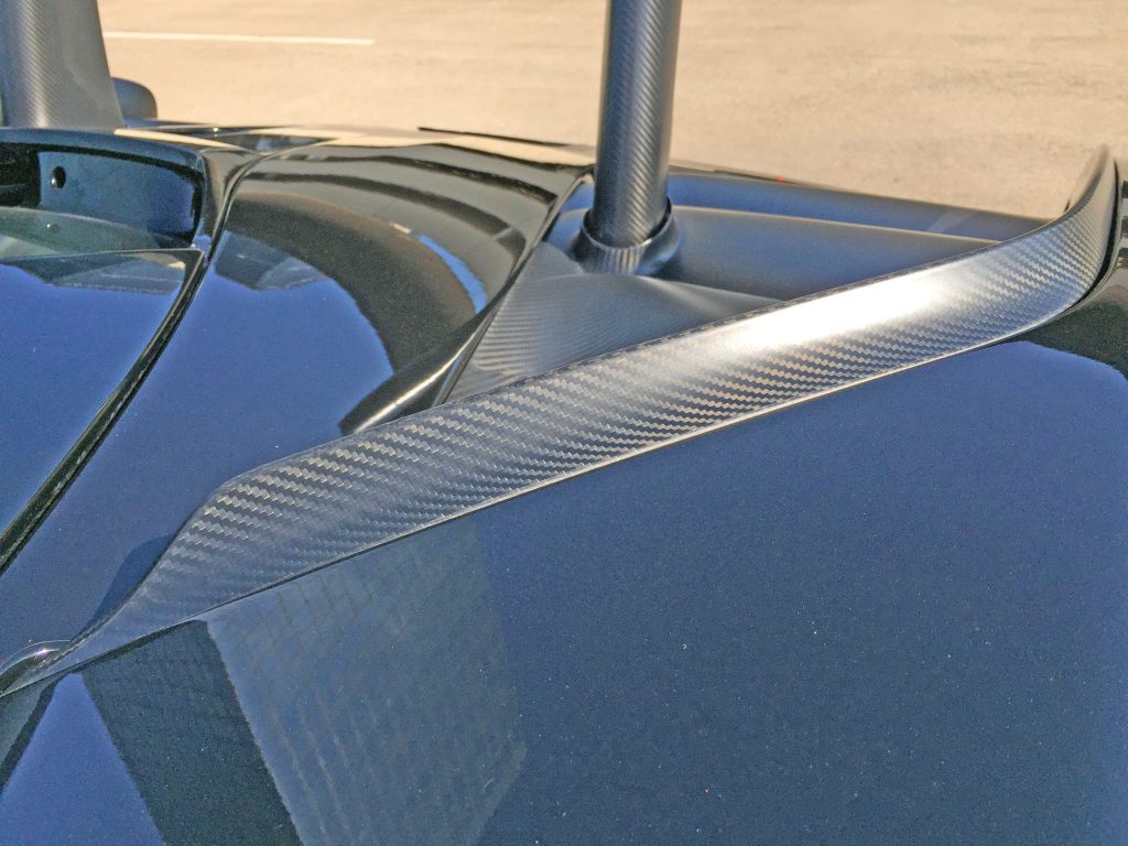
There is a ridiculous amount of cooling design features behind that ridge. And it’s all clad in carbon fiber.
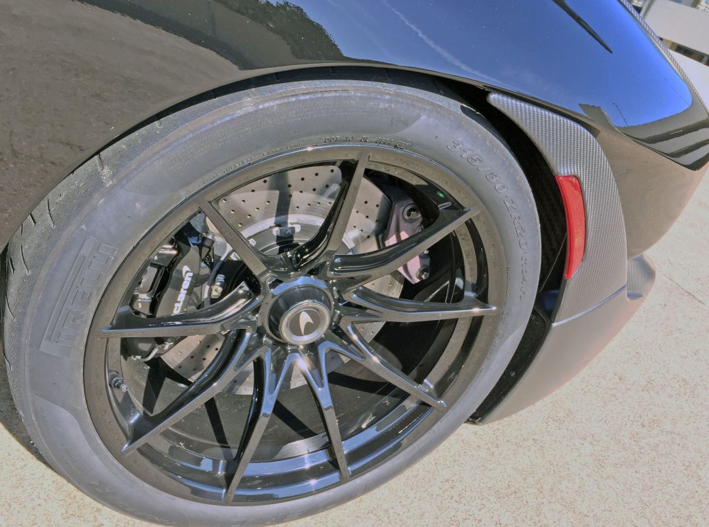
But wait, we need to see the body side’s final trick: the (painted) quarter panel sucks in to accommodate a carbon-fiber item that channels air away from the rear wheels.
Note how the carbon-fiber part tucks into the quarter panel’s ridge, and how the weave moves around the (parts-bin) marker light. Nice implementation.
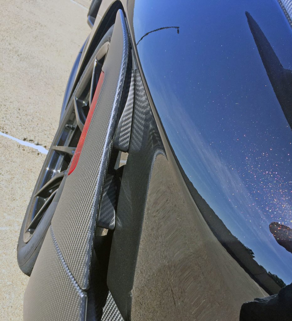
While the two internal splitters suggest otherwise, this assembly is not affixed to the quarter panel; it flexes outward as needed.
Note how both splitters sport matching carbon fiber weave patterns!
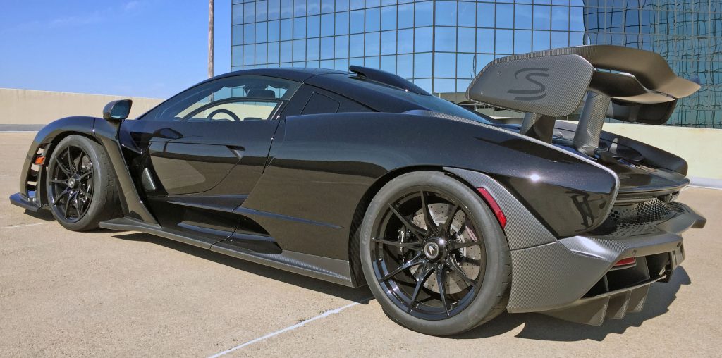
At the rear three-quarter view, note how the roofline’s downward slope is emulated in the spoiler’s side panelings and the quarter panel, but the fender’s final form isn’t nearly as sympathetic to the other curves. The rear bumper’s harsh contouring is beyond brutal, and the volume of detailing in the rear diffuser detailing is absolutely bonkers.
It’s a crazy package, but you haven’t seen the rear end’s clean portion yet.
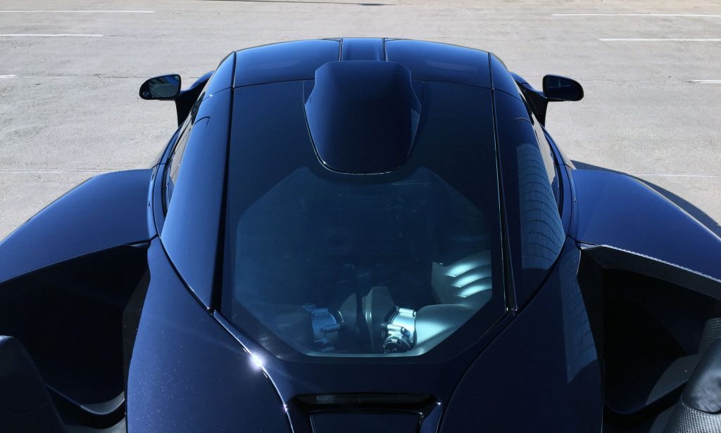
Upstream from the rear wing, the mid-engine Senna almost looks conventional.
Sure, the exhaust vents are worthy of a fighter pilot, but the (fake) roof pillars are those of a mainstream coupe, with a strong taper starting at the door and ending at the engine. Add the bat-wing-worthy side-view mirrors, include the roof-mounted intake and there’s a symmetric harmony presented here.
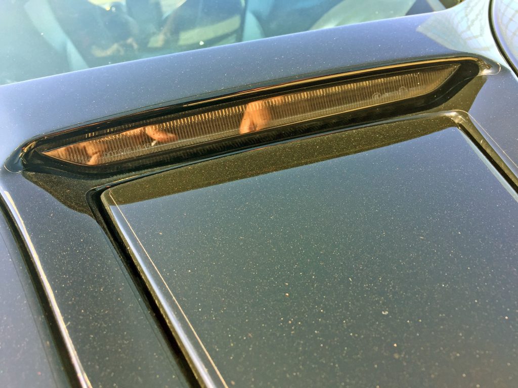
The center high mount stop light (CHMSL) is cleverly mounted below the engine glass, as the decklid tapers down. The designers’ choice not to implement a red lens keeps this element from detracting from the package, and the tail/brake lights do the same.
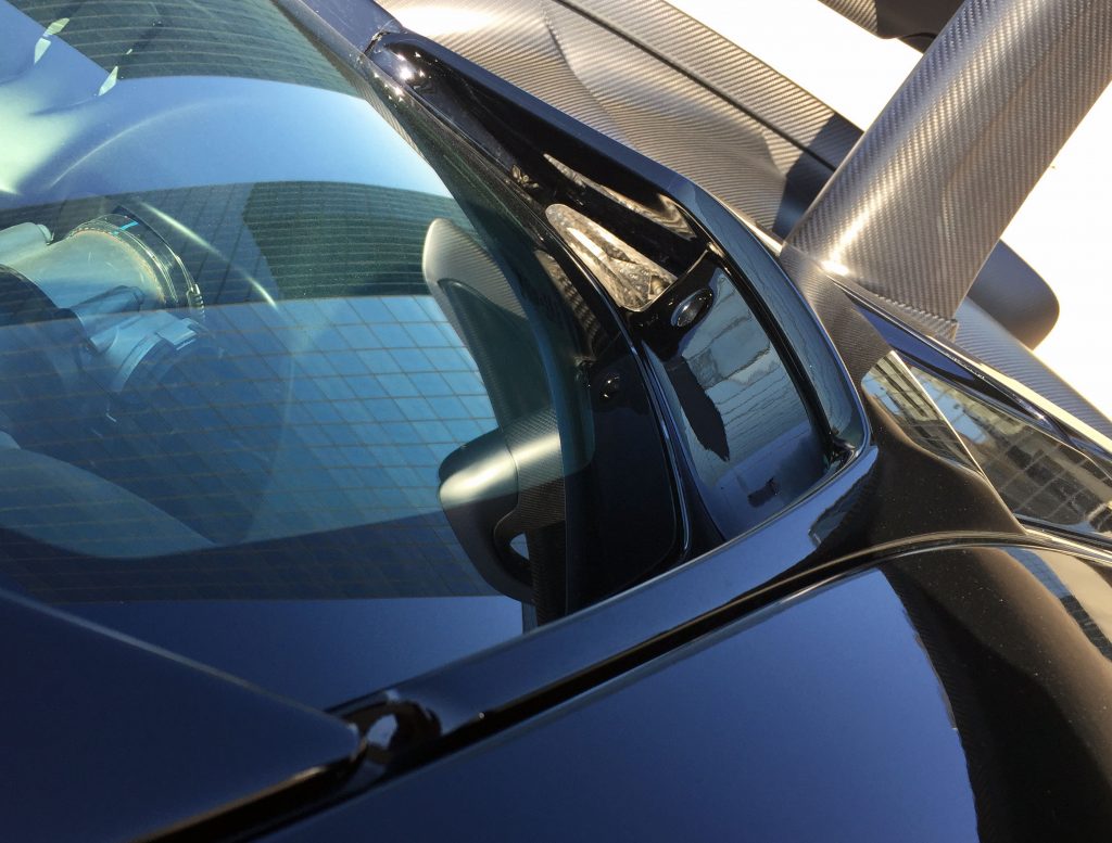
The rear glass dips below the decklid, and includes an access hole to open for engine service. Not exactly an ergonomic treat, but user serviceability shouldn’t be a Senna owner’s concern.
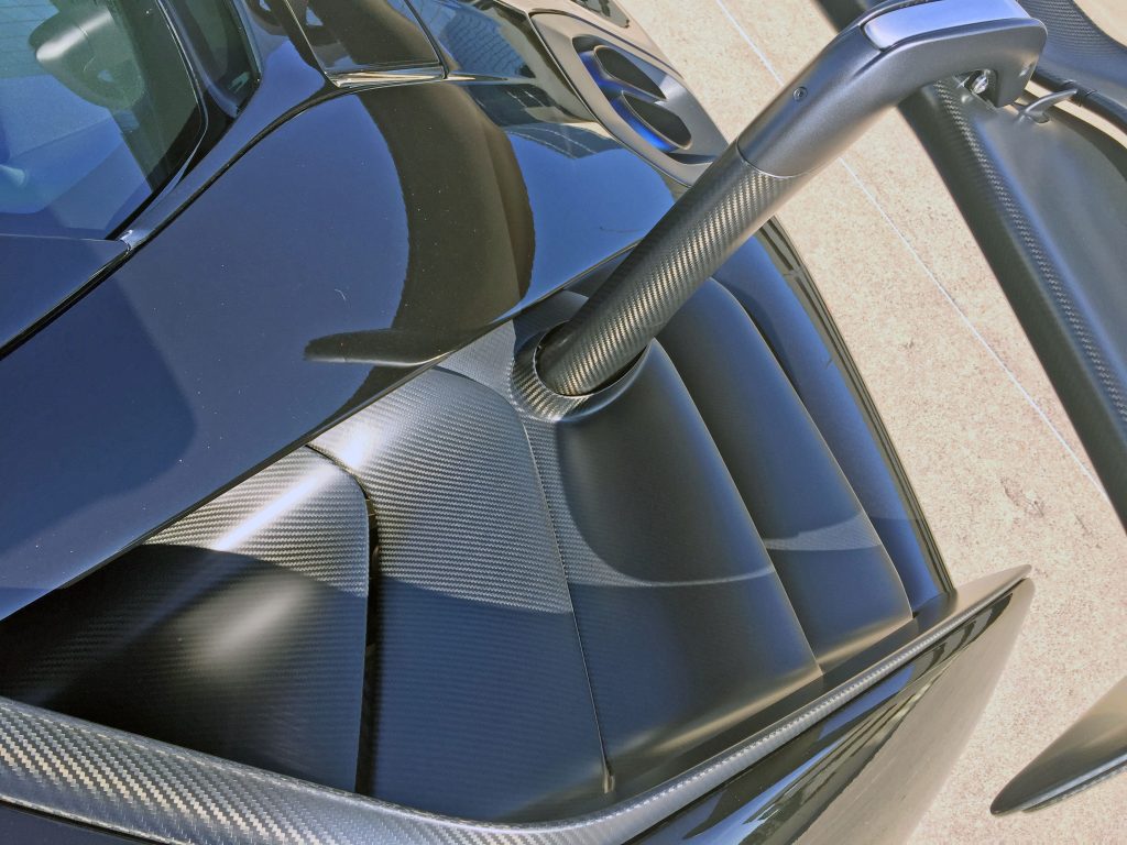
Back on the decklid, the Senna feels like a waterfall feature in a perfectly manicured garden or a stairway to a million-dollar heaven. The cooling vents’ soft, organic curves are a stark contrast to the brutally hard edges present almost everywhere else: It’s another wave of delicious complexity to an already confounding design.
Also behold the flush-mount exhausts, yet another harsh element added to the mix!
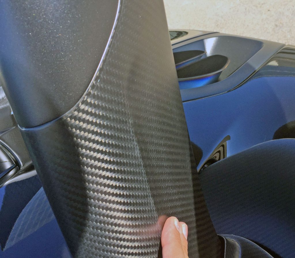
Going up to the spoiler nets more stunning implementations of carbon fiber and organic contouring, but first, observe this unexpected bit of negative area on the spoiler’s arm.
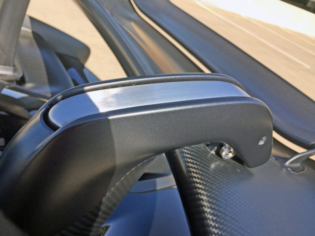
The spoiler arm claws over the actual spoiler, and automatically pivots just like the splitters below the headlights. The non-traditional mounting (hanging, not affixed) means the spoiler cleanly meets the air: another reason why the Senna is so expensive.
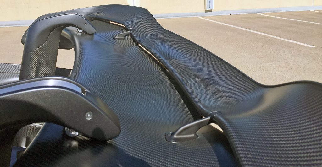
A second, baby wing makes sense considering every other loony engineering trick present. Its contouring matches the parent wing and the carbon-fiber weave literally dances over the form.
If only other elements on the Senna’s body were so well-integrated.
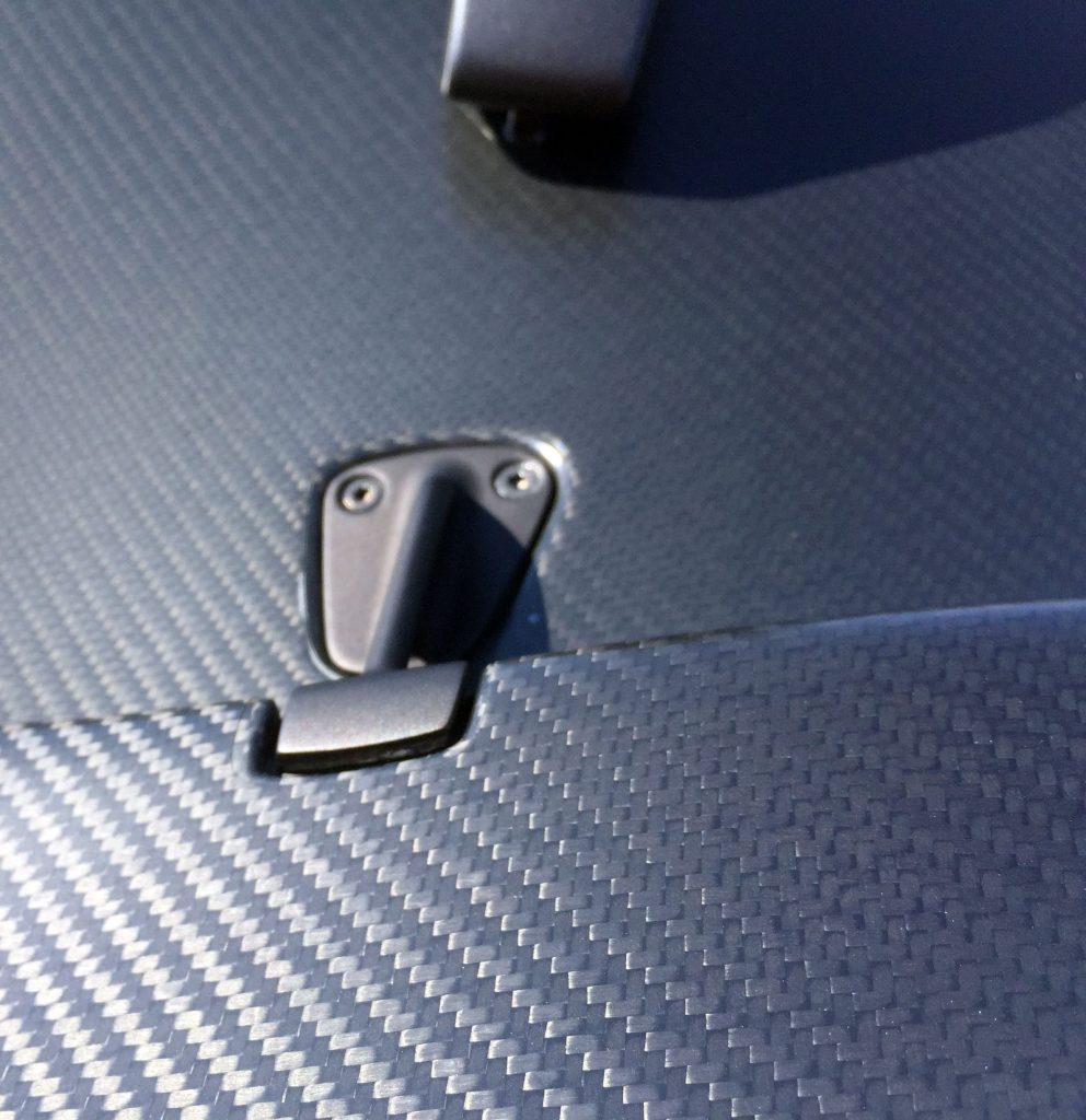
Even the baby wing’s metal mount is expertly crafted, flushed in for minimal interference.
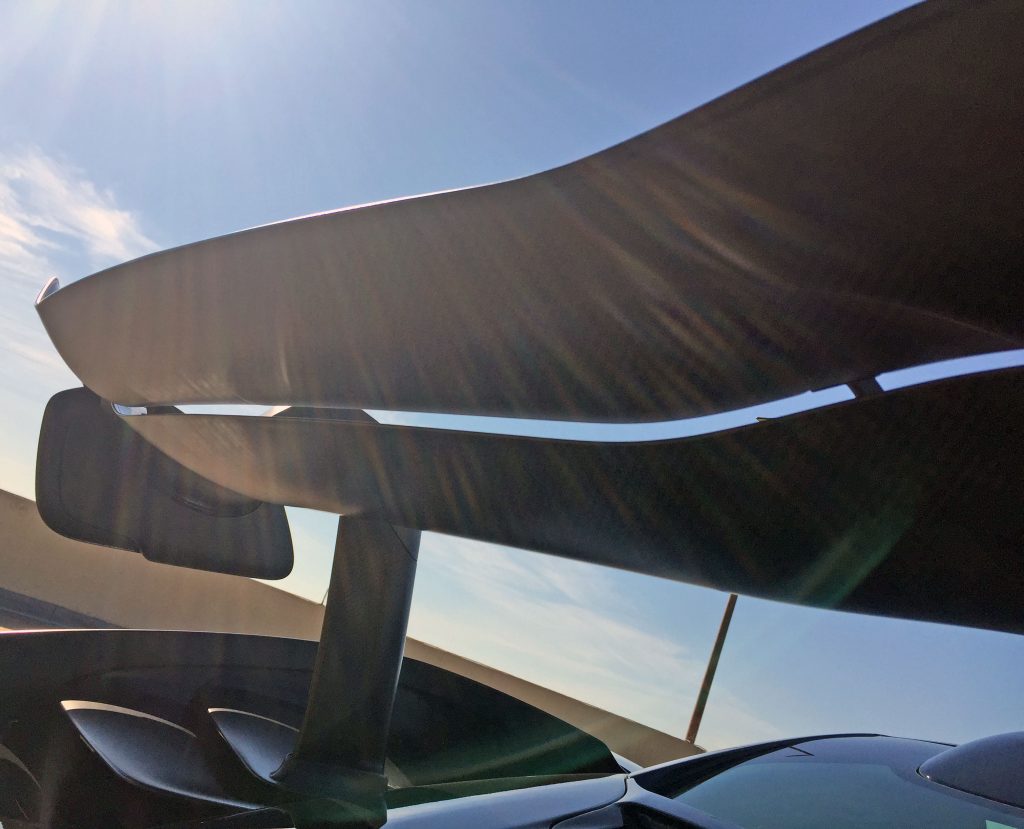
Why have one floating wing when you can hang two?
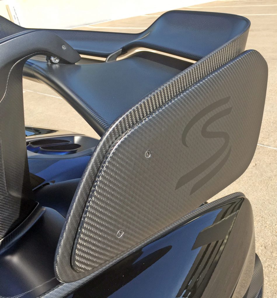
Both wings meet at the corners to share the same side paneling, complete with another fancy chunk of bolt-in carbon-fiber that sympathizes with the wing’s curvatures.
No wonder McLaren deemed this a worthy location for the Senna logo.
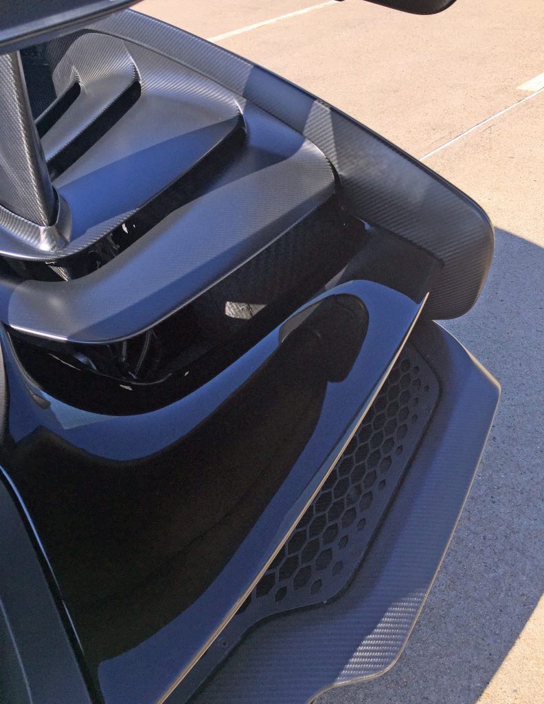
Shouldn’t all hanging wings meet a carbon-fiber stairway to turbocharged heaven? And those stairs blend into the carbon-fiber blade fenders elegantly.
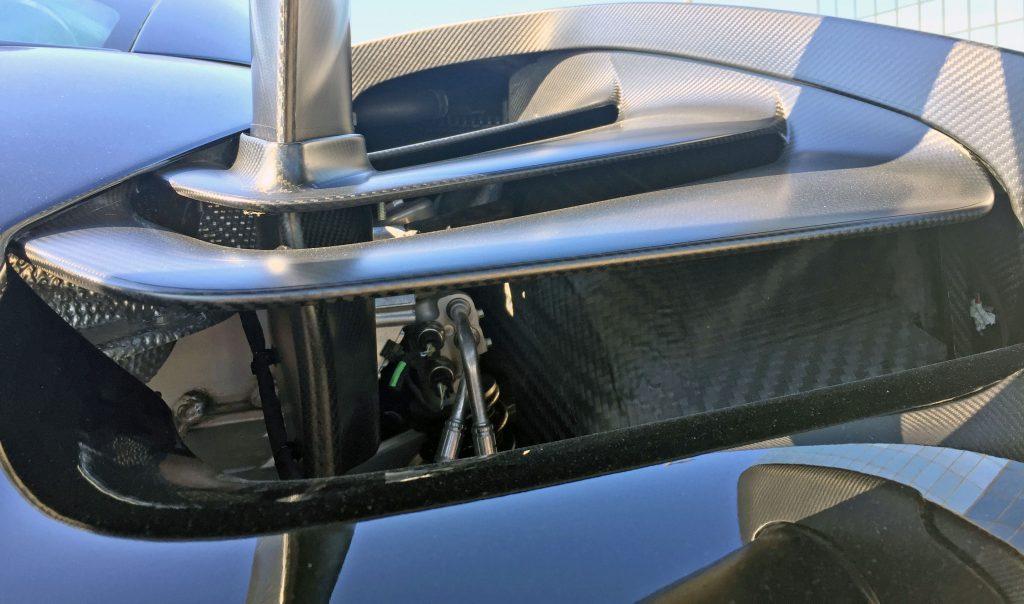
The fins are clearly crafted to scavenge discarded air with efficiency. Key mechanical components are left elegantly exposed, from certain angles. Note how deep into the body the spoiler mounts go. The wheel arches are made of carbon fiber with a more raw finish.
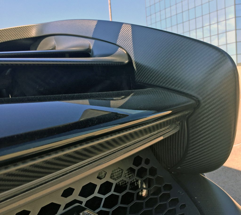
The elegant curves and strong lines continue when the fender meets the bumper. If carbon fiber wasn’t enough texture, the filler panel is a honeycomb with an almost invisible, clear brake light.
Even better, the honeycomb uses the uniformity seen elsewhere, but deconstructs as it reaches the edge: likely adding rigidity with another layer of complexity.
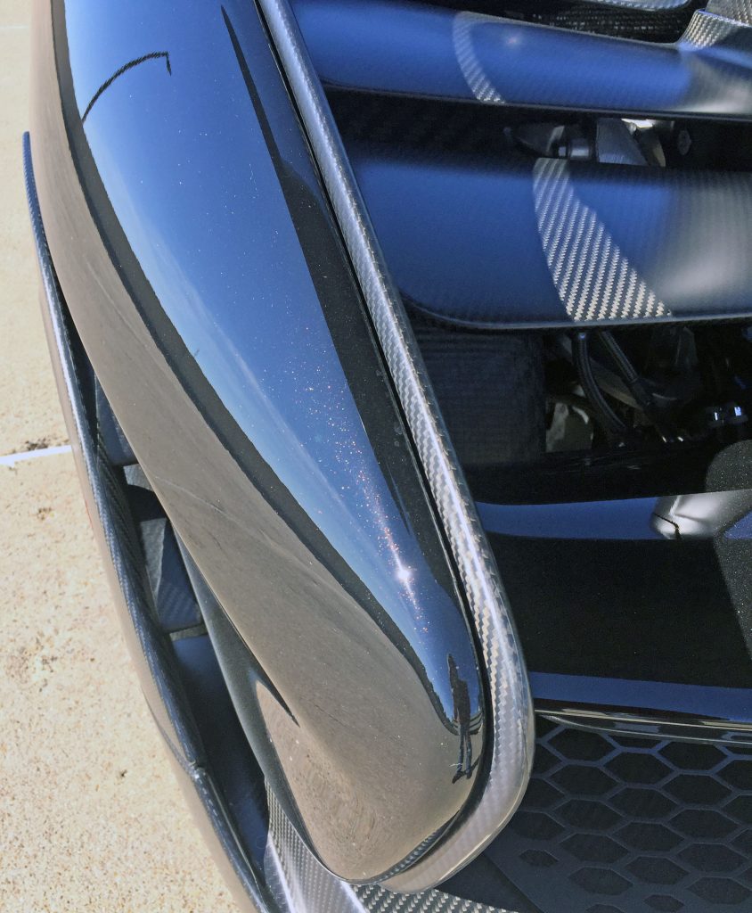
The carbon-fiber internal blade fender makes a delicious icing on the cake that is the painted quarter panel. The Senna is a harmony of organic curves and flowing lines from this vantage point.
Add the gold- and brown-infused MSO paint worthy of the stained glass paneling in a 1970s wet bar and this Senna is a cornucopia of contrasts.
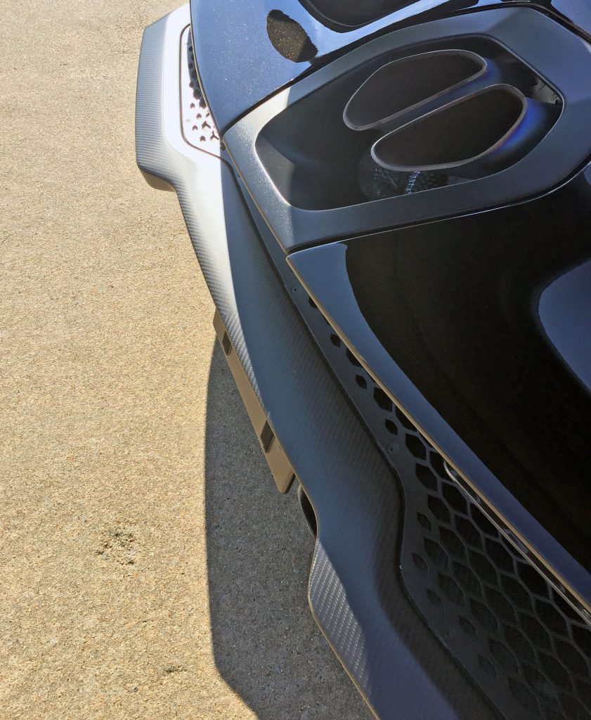
The Senna’s posterior gives off a frumpy face with a furrowed forehead appearance, especially with the bumper curving into an uncomfortable smile. Too bad McLaren carved out so much bumper; the face would look more pleasant with a more conventional arch.
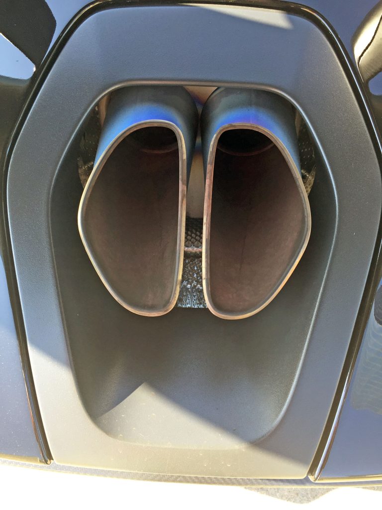
The exhaust cutout is reminiscent of that Ghostface mask from the Scream movie series.
Howling ensues from the round exhaust tubes molded into the Senna’s signature form, since, in fact, there’s more real estate for a third pipe. (Or longer, droopier-faced tail pipes.) Euro-spec Sennas have a third pipe thanks to noise pollution laws, which makes the whole affair far more respectful of the honeycomb theme seen elsewhere.
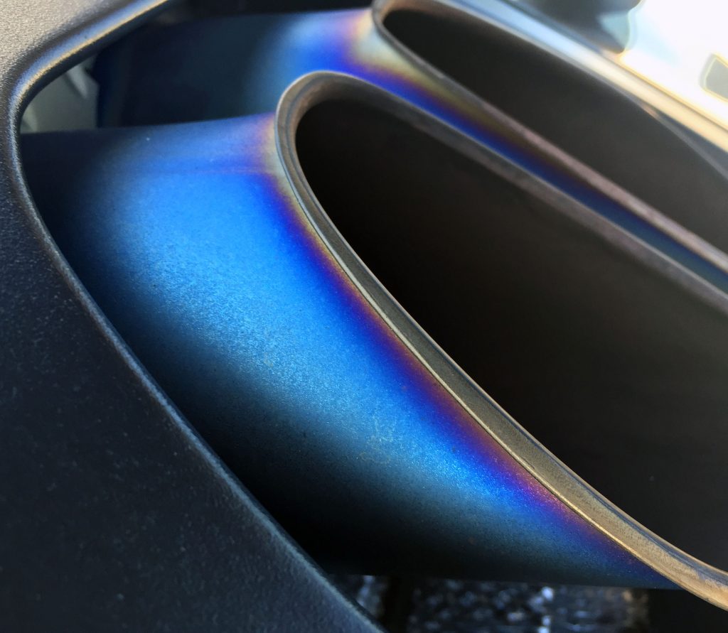
The spook factor only amplifies after a few heat cycles against the clean edge on the exhaust tips.
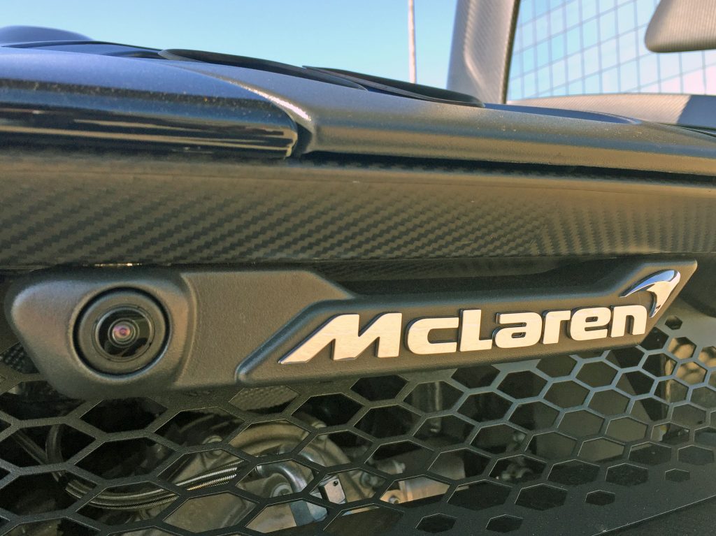
The integrated camera/emblem combo looks like a colossal afterthought. Shame there couldn’t be a carbon-fiber bubble holding both, much like the front parking sensors in the headlight buckets.
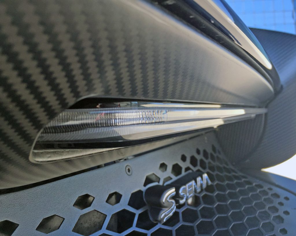
No such issue with the brake/tail light and the Senna emblems: Both emerge from their backgrounds with elegance and a sense of craftsmanship.
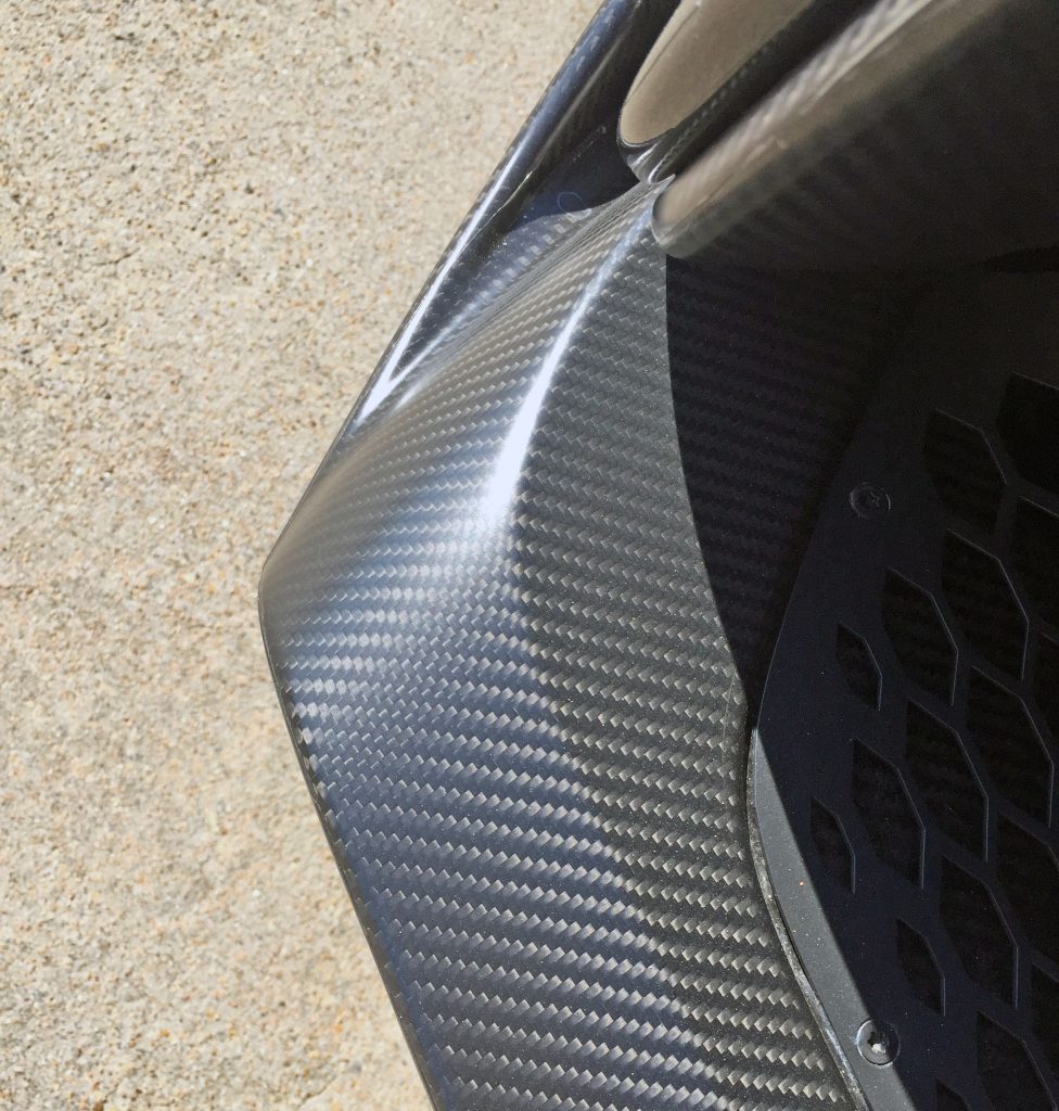
Speaking of craftsmanship, the bumper’s gentle curves and hard bends do a fantastic job showing off the carbon fiber weave.
And where the bumper meets the side paneling? This must be a pricey component to produce.
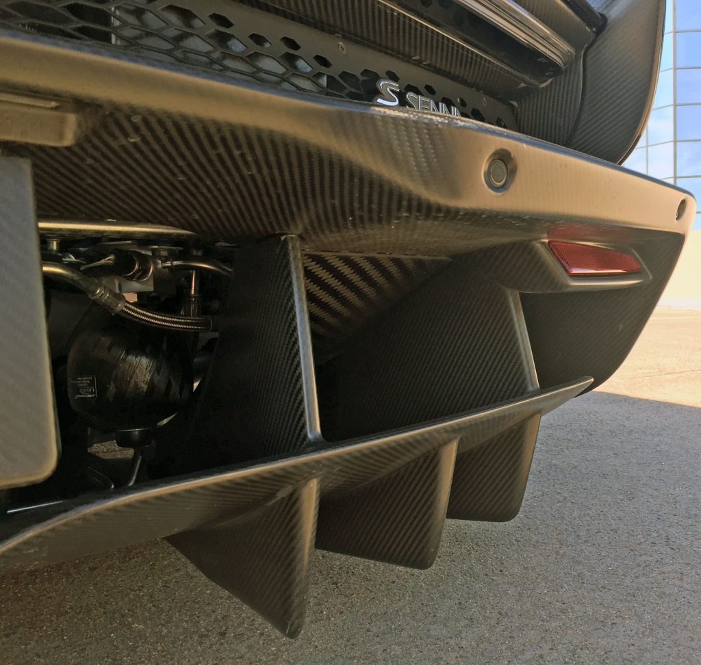
Speaking of pricey: The lower diffuser appears to be a single unit. The angles and fins are presumably downforce-friendly, and the immense amount of negative area rivals the upper half of the rear deck in beauty—if for no other reason than it lets the Senna’s mechanical bits truly shine.
Also, make note of the red reflectors: Such an integration of carbon fiber would have been nice on the backup camera.
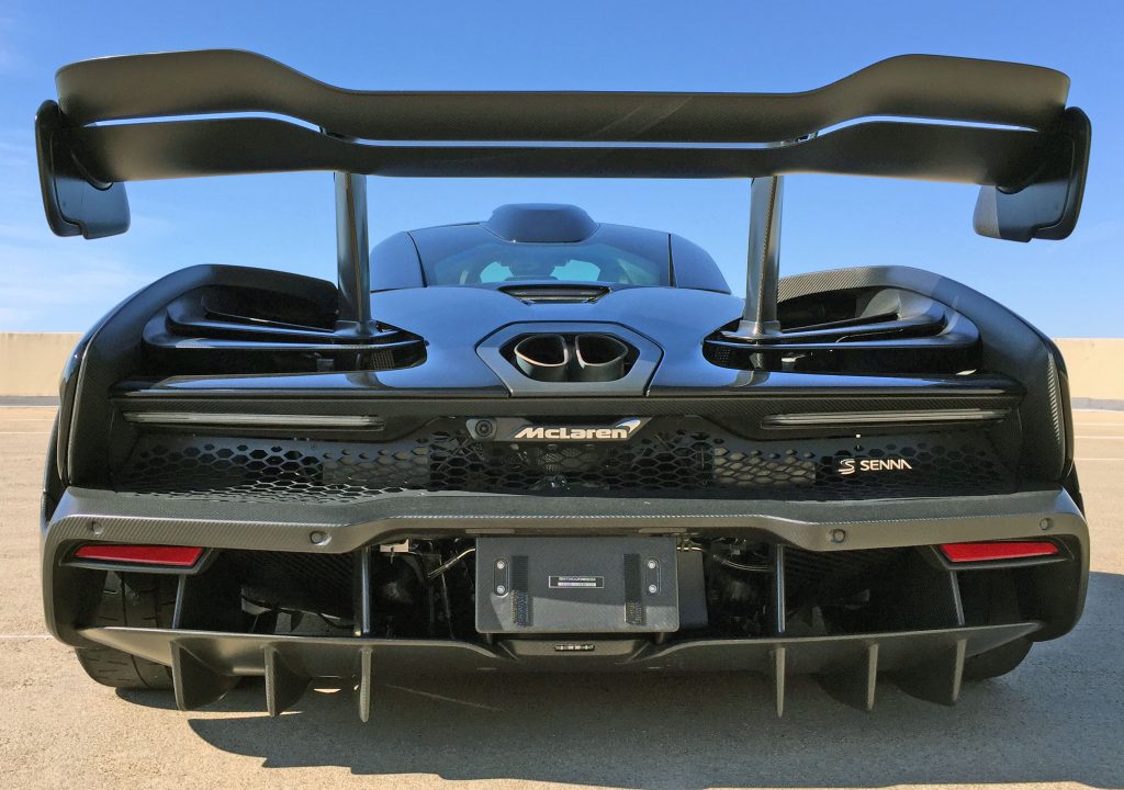
Perhaps the Senna’s angry posterior needs to lighten up, but it has more negative area than positive! This must be a first for a modern, street-legal vehicle.
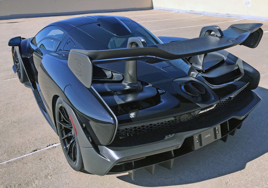
The Senna rarely lets your eyes relax—nearly every vantage point challenges your standards of appropriate car design. And at speed, all those splitters, spoilers, and flying buttresses must be a living and breathing work of aerodynamic art.
During my time with the Senna I noted that, at some point, you’re just buying art. While the 500 people who commissioned one likely aren’t thrilled with the current depreciation (online classifieds suggest that figure ranges from 10 to 20 percent), they bought into the equivalent of Picasso’s estate: Not every artist dies penniless, but their investors still get a sizable return on their investment.
Because Senna owners likely bought the McLaren equivalent of Les Femmes d’Algers. Thanks for reading, and I hope you have a wonderful day.

