Vellum Venom: 1987 Porsche 928 S4
The energy crisis, air pollution concerns, occupant crash protection, and the terrifying prospect of stagflation all weighed heavily on Porsche during the 1970s, but Porschephiles loyal to the 911 never cared for the fruits of their revised business strategy. Perhaps things have since changed; indeed, the current 991/992’s demeanor owes more to the Porsche 928 than air-cooled 911s of yore.
The 911’s heir apparent reached its final form in November 1973, penned by a design team headed by Anatole Lapine. While pejoratives like “German Camaro” remain, Lapine insisted the group drew inspiration from an obscure corner of Chevrolet history: the Bertone-penned Chevrolet Testudo concept. With such a crazy backstory, a suitably radical car from one of the industry’s most tumultuous time periods certainly deserves a run over the vellum.
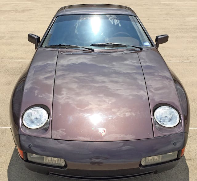
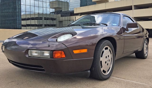
The 928 S4 sported a revised front bumper with rounded edges that formed a stark contrast to the original 928’s angular wedge bumper. Still, the S4’s long and unadorned hood, the exposed wiper arms, the recessed headlights, and the steeply raked sides of its cabin (i.e., tumblehome) remain true to the original.
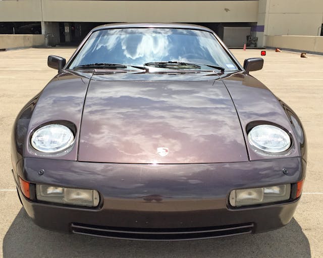
Many (most?) prefer the S4’s curvy cohesiveness, including the driving/fog light covers that sit flush with the bumper. Those lights are staggered to match the bumper’s contouring, which logically accentuates the bumper’s continuation of the fender bulges. Only the linear hood/fender/bumper cutlines feel lost without the blocky feeling of the original’s wedge bumper.
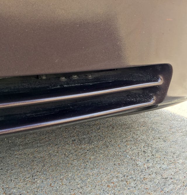
Compared to the original 928’s black plastic ribbon, the S4’s integral lower spoiler nicely cleans up the bumper. The subtle slotted cutouts are longer than before, giving the S4 more of a road-hugging demeanor.
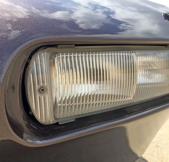
Flush-mounted covers are a modern(ish) notion, but the exposed screw reveals that the S4 is still a product of a simpler time. The ribbed, faux-lighting texture cleverly integrates the off-the-shelf lighting pods and the S4’s unique contours.
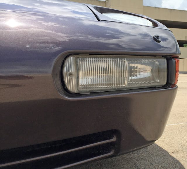
The headlight washer (corner) feels like a pimple on an otherwise perfect face.
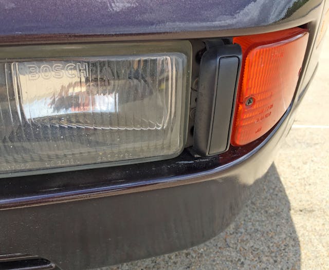
The black plastic divider is a cheap but highly effective way to transition from a clear light cover to a standalone turn signal light and ensures your eyes don’t notice the mucky transition. Much like bumperettes on Malaise-Era chrome bumpers, the perimeter etching adds texture and looks somewhat more expensive.
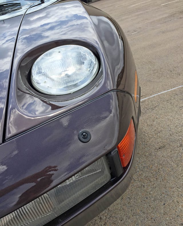
Thanks to the long overhang, the 928’s front end has the muscular demeanor of a C4 Corvette. The fender’s strong taper (as it meets the bumper) makes an already low front end feel like it’s diving even lower to meet lighting pods. Unlike the C4, the 928’s aggressive transition from top to side restrains the design to a hard border.
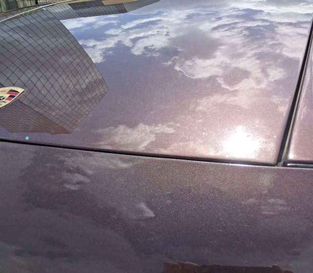
The harsh hood/bumper/fender cutlines connect the 928 to the 911’s DNA, and the gold badge eliminates any doubt.
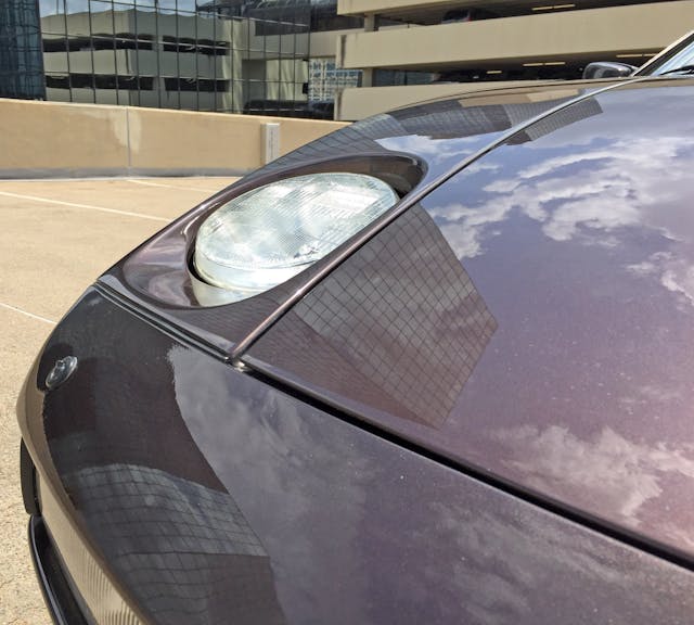
Note how the headlight’s strong bevel remains visible when the lamp is retracted into the body: Even the 928’s curves have strong angles behind them.
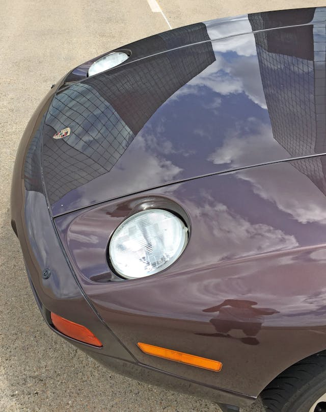
This long, low, and wide front end has a “pucker up for a kiss” taper, which is further accentuated by the hood’s minimalist form.
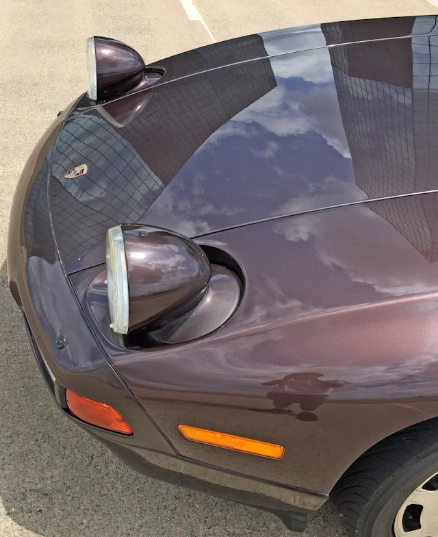
Less minimalist with the headlights on! The headlight’s body-color frames replicate a light bulb’s tapering form: Perhaps this is a monochrome tribute to the free-standing headlights gracing Virgil Exner’s 1961–63 Chrysler Imperial.
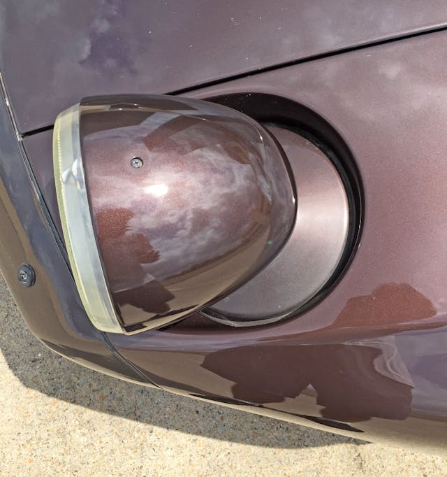
An exposed screw on a megabuck Porsche ain’t no thing; it’s only exposed when you can’t see it (when driving at night or in inclement weather).
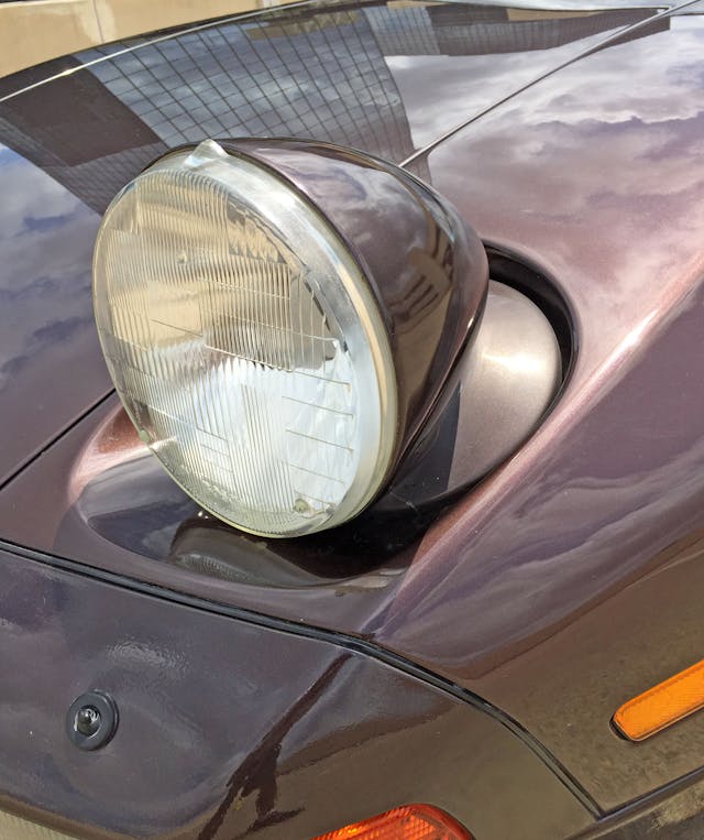
The U.S.-spec glass lenses are mediocre performers at best, but the look ensures the 928’s impressive aerodynamics still pay homage to the 911’s ubiquitous fender-mounted headlights … at night, at least.
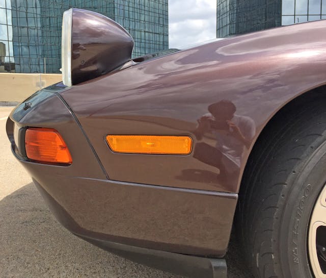
Pop-up lights ensure the design receives the lowest fenders possible, and (usually) translates into less overall frontal area. Well, at least in the daytime.
However, the headlights stand out farther because most other lines meet around the 928’s centerline’s vanishing point. Even the thin black plastic lower spoiler tapers upward to meet the vanishing point.
The amber light’s uneven thickness is a rare mismatch on an otherwise streamlined fascia. European-spec 928s push the side marker behind the front wheel, allowing for a distraction-free swath of painted paneling.
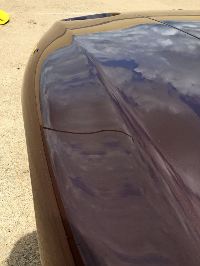
The fender’s hard transition from top to side is softer from this angle and necessary to keep the fenders from turning into amorphous blobs. It’s also a more refined progression relative to the hard crease present in the Chevrolet Testudo concept.
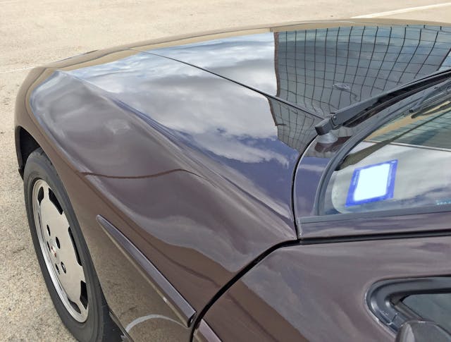
The main reason the 928 sports such a long hood is the expansive space between the front wheel and the firewall (i.e. dash-to-axle ratio). The look is further refined thanks to the aforementioned hard bend and a softer, more muscular tone in the fender bulge.
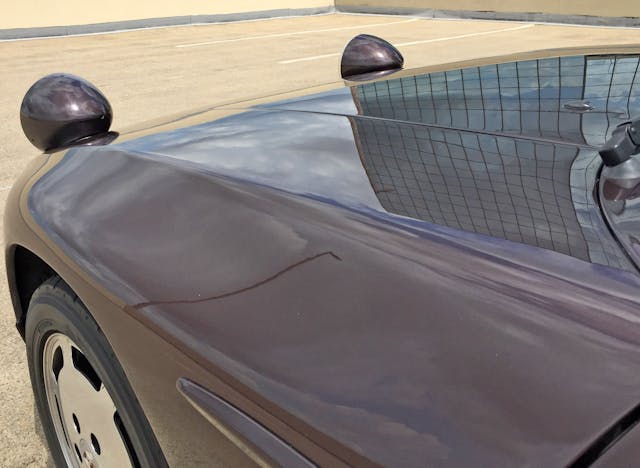
Pop-up headlights shaped to match the light’s inherent form look even better across a long, flowing plane of chocolate-colored sheetmetal.
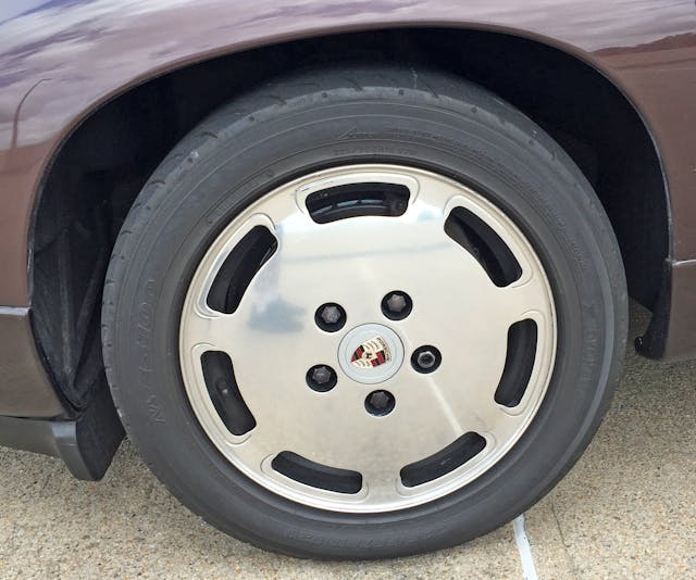
The slotted, flat-face wheel works well enough on the 928’s rotund body, but the original 928’s teledial wheel was far more exciting.
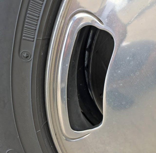
Perhaps the sympathetic carve-outs are a worthwhile expense; otherwise these wheels would be a cheaply produced design not befitting a Porsche asking price.
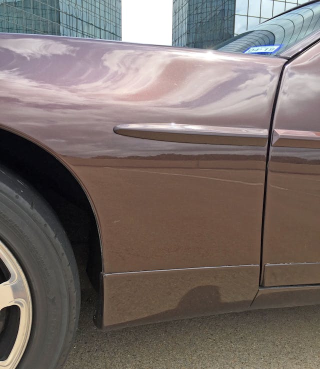
While the lower fender/rocker/door extensions are far too minimalist to be called tacky, they kill original design’s organically tapered rocker panels. Even worse, the massive bodyside moldings add shameful amounts of visual weight to such a sleek dash-to-axle space. The bulk comes from their height: tall enough to need a significant carveout for the door to clear the fender when opening.
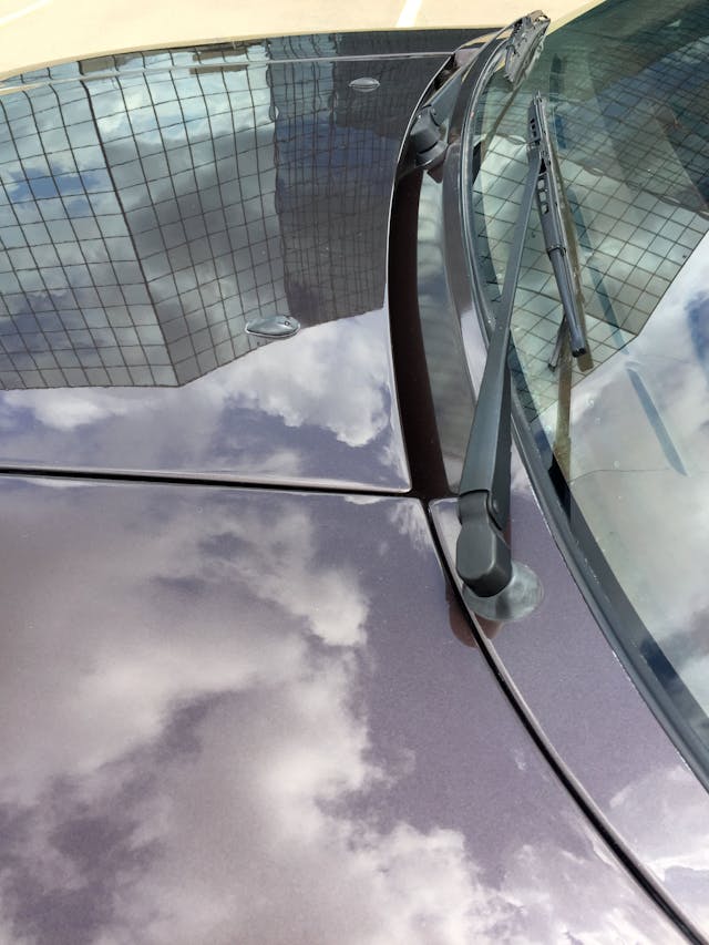
The painted, plastic-free cowl is remarkably clean by today’s standards, especially the architecturally minimalist vent. However, the exposed wiper arms are a clear indication of this car’s 1970s origins.
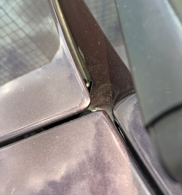
Minimalist designs are often the most expensive to make, because prying eyes can quickly spot a poorly integrated transition. The 928’s cowl doesn’t disappoint.
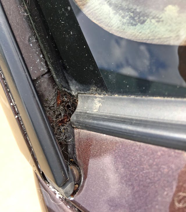
Minimalist design fails when a crevice starts collecting garbage. Get this A-pillar a McMansion-worthy crown molding, stat!
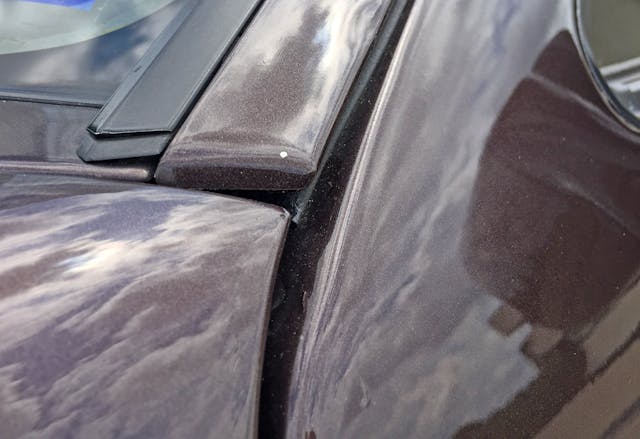
The fender/A-pillar/door meeting point reveals uneven gaps. Perhaps this is a byproduct of the era’s aluminum panel construction?
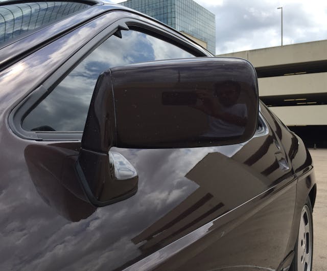
Door-mounted side-view mirrors on blocky pedestals accentuate the door’s steep tumblehome, much like the current 911’s mirror assembly.
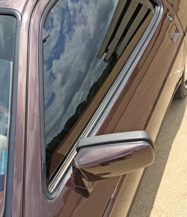
The painted A-pillar is visually split by a door cutline, instead of today’s mandatory cutline integration with the greenhouse’s upper boundary—quite the retro treat.
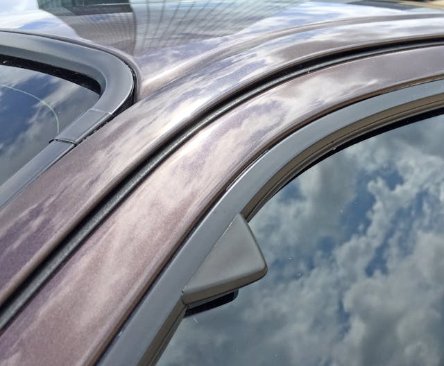
A quiet treat, as well; as wind noise was non-existent. Plus, these triangular glass run channels keep the window’s operation smooth even at ridiculous speeds.
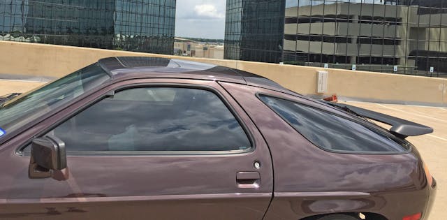
The B-pillar sports the same bisected feel as the A-pillar, thanks to that massive ovoid door. The rear hatch lacks the Testudo’s wraparound glass, but the quarter windows emulate the shape. Those windows fall halfway between two radical notions: the conceptual (i.e., impractical) Testudo and Dick Teague’s overtly functional, upright AMC Pacer.
Thanks to Porsche’s implementation of the theme, it’s clear Goldilocks found the 928’s greenhouse porridge to be juuuuuust right!
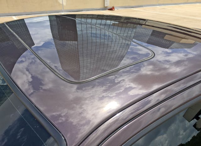
A traditional sunroof (metal, not glass) is a rare sight today, which is unfortunate considering their superior heat resistance when not in use.
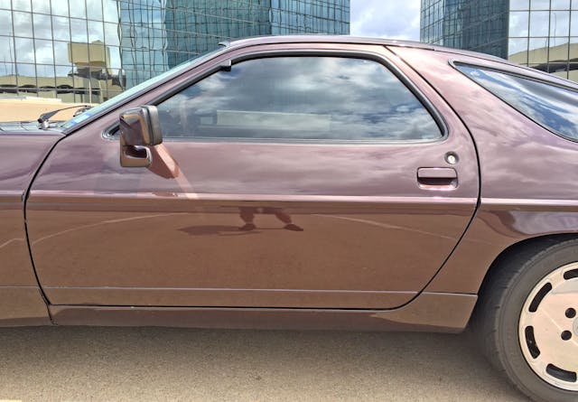
Plastic folding sideview mirrors were generally blocky during the 928’s genesis, but it’s surprising that designers didn’t rethink them for the S4’s redesign. The door itself demonstrates wonderful interplay between the upper half’s roundness and the door’s more assertive, angled cutlines as it approaches the rocker.
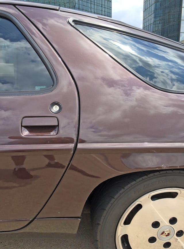
Indeed, the door is not a smooth, singular curve; it’s more of a parentheses that bulked up at the gym. Visually, it thrusts itself down the 928’s bodyside.
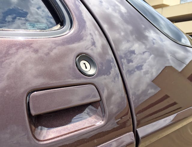
The flush-mounted door handle was forward-thinking for the 1970s, but the huge door lock bezel suggests that same era posed serious limitations for designers.
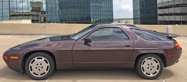
The 928 would clean up nicely with keyless entry, a molding delete, and sleeker side mirrors. However, the long hood/short deck design is classic gran turismo, the generous dash-to-axle ratio ensures the V-8 engine sits behind the front axle, and low-slung body makes any modern vehicle look top-heavy and clumsy.
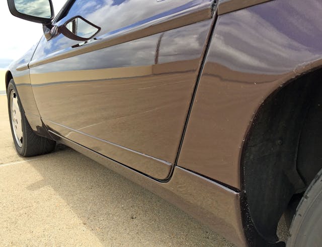
Still, there’s no excuse for the tacked-on rocker and lower-door skin inserts at a Porsche price point.
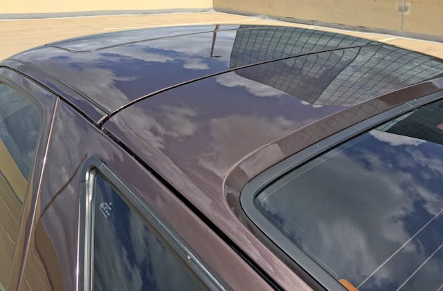
While the door cutline and the quarter window’s leading edge sing in harmony, the rain gutters’ extra cut lines are a bit dissonant, even with a flush fit.
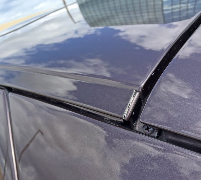
The panel gaps are large for a high-end vehicle, and the exposed screw is unexpected.
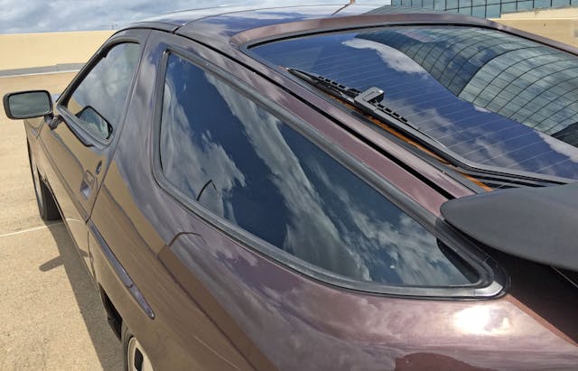
The Testudo’s influence once again arrives in the rounded quarter panels. The main difference is that the 928’s (very stiff) chassis forgoes the wraparound hatch glass for extra metal, while the side glass treatments push upstream (instead of the Testudo’s laid-back lines).
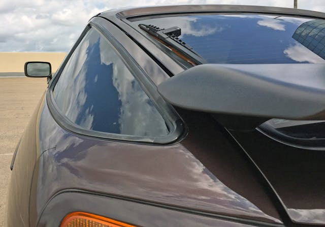
The hatchback’s glass is surprisingly sunken, while side glass is curved to both meet the B-pillar’s tumblehome and the rear end’s taper. That must be an expensive piece of glass to produce.
Imagine being a 911 fanatic and seeing this in the showroom circa 1978: “Radical” doesn’t even begin to cover it.
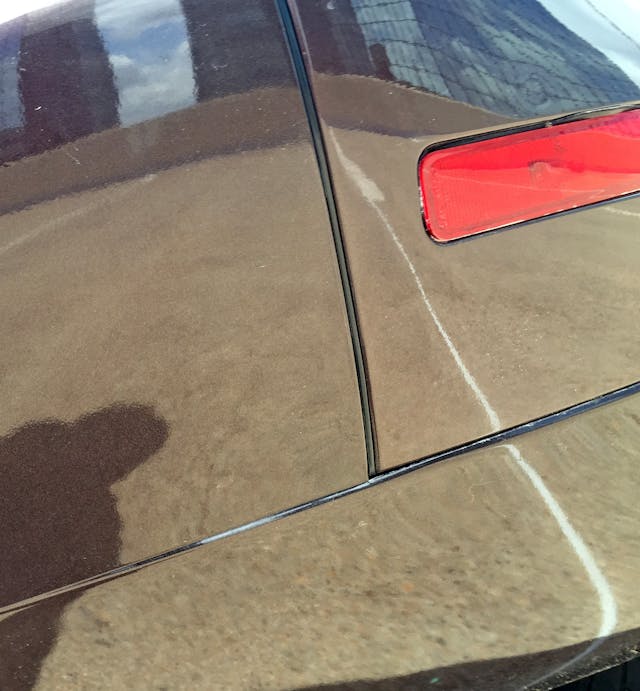
Much like the hood/fender/bumper cutlines, the rear bumper’s meeting points are surprisingly angular and static.
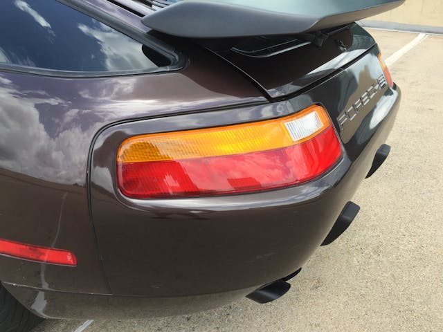
The S4’s revised bumper is a significant departure from the original, with harsher wedge forms that minimize the original’s subtle use of curves. The S4’s significantly larger lighting pods are flush-mounted, and each pushes deeper toward the 928’s centerline.
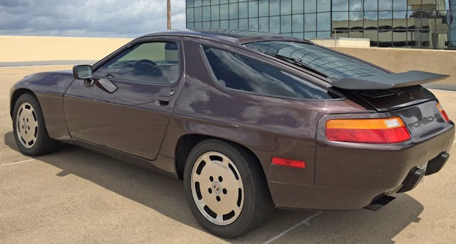
To say these lights dominate the rear end styling is understatement. The irony here is that conceptual sketches from 1973 (found in page 65 of Project 928) show the S4’s lighting pods compressed into a footprint worthy of the original 1978 model. This stillborn design notion retained the 928’s signature rounded rear, but alas—the 1980s redesign chose a harsher path.
The harshness of the S4’s bumper comes from a ramp-like plane above the equator. The ramp is integrated into the body via the bodyside’s centerline crease (which is often obscured by the molding).
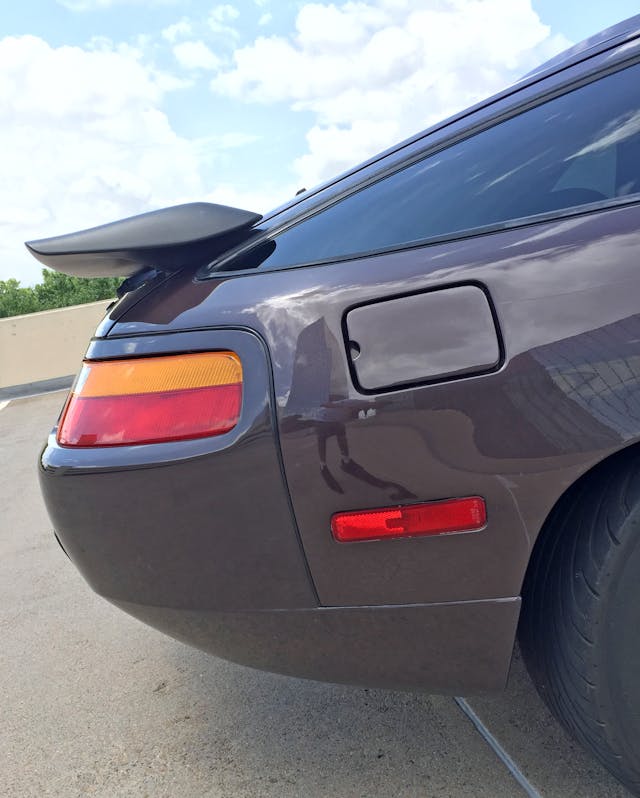
Eschewing the original (928 S) spoiler’s mission of following rounded contours by wrapping around both the hatch and the side windows, the S4’s spoiler kinda spoils everything by being a traditional shelf. Once again, the S4’s lights dominate the package.
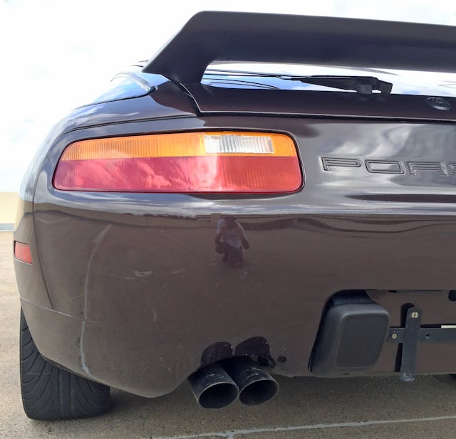
However, the S4 re-think is too well thought out to be an insult to the original. Much like the front, the S4 once again “puckers up for a kiss” as the bumper tapers heavily inward. Note the dual exhausts exit on the same side, a notion that should make a comeback for packaging efficiency.
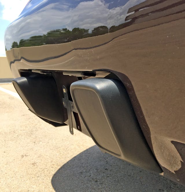
Like the black plastic divider between the side marker and center driving lights, the bumper overriders have a clever relief to keep them from looking cheaper or tackier than necessary.
The aforementioned bodyside crease wraps around the painted bumper, subsequently becoming its most dominant form. Because the bumper is ramp-like and flat above this crease, it provides an underline for the PORSCHE lettering.
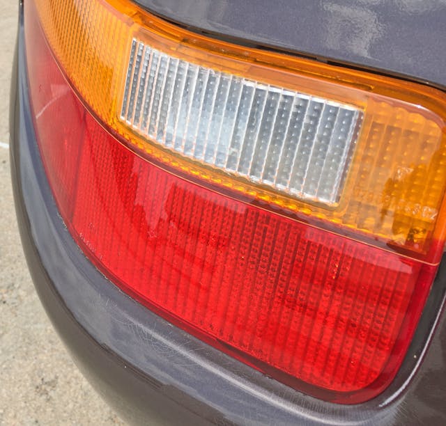
Flush-mounted taillights with such an aggressive wrap exemplify the mission of a mid-cycle refresh: While the original’s horizontal rectangles let the eyes focus on the 928’s rear with minimal distraction, they clearly hailed from a different decade of automobile design.
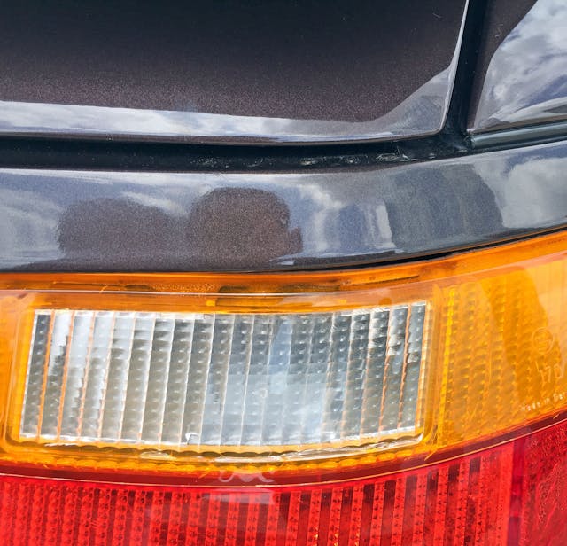
Note how the hatchback has a slight bend at the corner, emulated in the lights and especially in the reverse light.
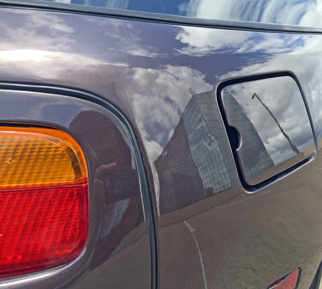
A conventional gas door is less so thanks to a flush-mount cutout, in lieu of the more commonplace divot for one’s finger.
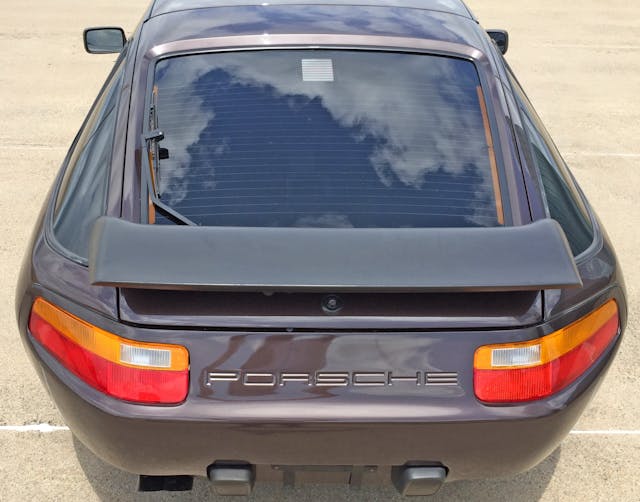
There’s a lumpy, frumpy demeanor to the S4s revised hips, mostly due to that harsh horizontal centerline. However, the taillight and spoiler’s complementary lines work to the bumper’s favor.
Sajeev Mehta | Hagerty Media Site
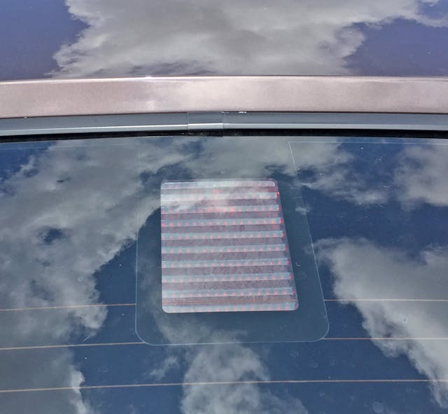
Sajeev Mehta | Hagerty Media SiteTucked under the glass and sporting a subtle louvered treatment, the center high mount stop light (CHMSL) is far less challenging to the 928’s original form than the spoiler and bumper below.
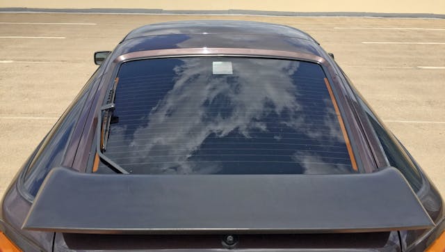
From here the 928’s original teardrop shape returns, even if the spoiler hides the “sins” of radical 1970s design.
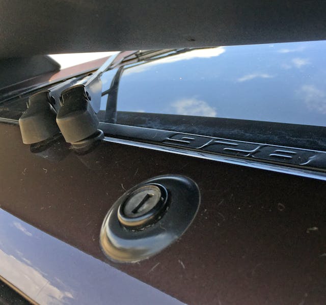
What are those sins? No longer can you easily spot the large lock cylinder, the dual arm rear wiper, and the beautiful “928” embossed window trim. Why not save some coin by deleting the 928 embossing, if nobody’s supposed to see it?
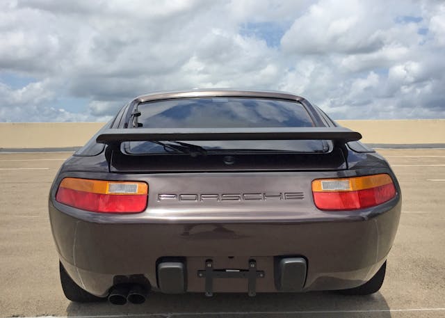
While 928 S4’s redesigned bits are but a mere mid-cycle redesign by industry standards, they permanently altered the original’s heavily contoured, oval-ified rear vision. Imagine if Porsche had the absolute gall to smear oversized lighting pods over the iconic 911’s front end … oh wait, that’s the oft-maligned 996.
This isn’t a hack job Ferrari 512 M, though: the 928 S4 is still gorgeous, with far, far superior performance over its predecessor. The best of both worlds would be an S4 with 928 bumpers/lights, teledial wheels, and a pascha interior. Anatole Lapine might approve such a fanboy homage, as he didn’t subscribe to the cult of 911. When asked about Porsche’s icon, he remarked, “I drove plenty, but I’ve never owned one. I’ve got a 3-liter Jaguar S-Type. It’s a great looking car. I think William Lyons would have approved.”
Talk about a brilliant deflection! Obviously Lapine’s experiences with corporate culture ensured he was both a gifted wordsmith and a talented designer.
Thank you for reading, and I hope you have a lovely day.


Just beautifully written. As a 20 year driver of an S4 you picked out detail I had forgotten, or maybe never seen. Your words were artistry!
That’s high praise considering its from a long term owner of this car! Thank you for reading, I sincerely appreciate your kind words.