Vellum Venom: 1937 Cord 812 Supercharged
Quick—name the first American automobile produced with front-wheel drive. Depending on who you ask, the title goes to either the Cord L-29 or the Ruxton. So what makes the all-but-identical, front-wheel-drive Cord 810 (1936) and 812 (1937) far more memorable than their predecessors? The 810/812 was a clean-sheet design offered by Gordon Buehrig, Vince Gardner—and Alex Tremulis, of course.
Buehrig and Co. chose the streamline moderne school of design as its muse. A “futurist” derivation of Art Deco often associated with architecture (think vintage hotels in Miami’s South Beach), streamline moderne was also responsible for functionally sleek consumer electronics; planes, trains, and boats that look like they’re moving when still; and cars like the Chrysler Airflow and the Tatra 77. The Depression-era swagger gave the signature style for Cord’s impressive engineering. Since it inspired both GM (Olds Toronado) and Ford (1970 coffin-nosed Continental), we must run the vellum over it.
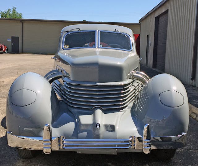
It’s certainly ahead of its time: Covered headlights, a rear-hinged hood (which eliminated the need for an external radiator grille and spine-like central hinge), and a transaxle mounted ahead of that supercharged mill ensured ample inspiration for a unique, cutting-edge luxury car facade.
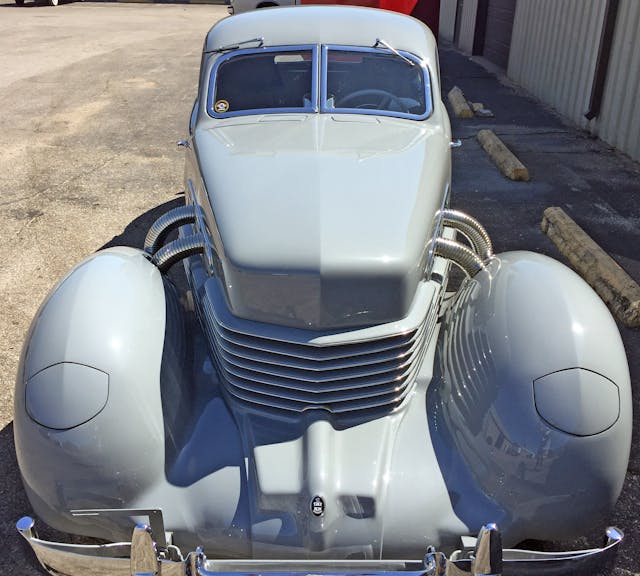
Just as Ford made radical use of negative area around the rear-mounted engine of its 2019 GT, Cord eliminated unnecessary bulk between the fenders and that coffin-shaped nose. The negative area goes further, owning the space between the front bumper, the fenders, and the grille thanks to the compact nature of its transaxle. Kudos to the designers for taking the creative freedom that configuration allowed and reaching for the stars.
Chrome grille accents balance the visual weight of the ribbed and chromed exhaust heat-shields, and they form a visual “bridge of bling” to the chrome bumper.
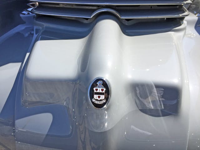
Those grille accents complement the chrome ring around the Cord family’s coat of arms: The whole affair gives an air of traditional elegance to an otherwise modernist body.
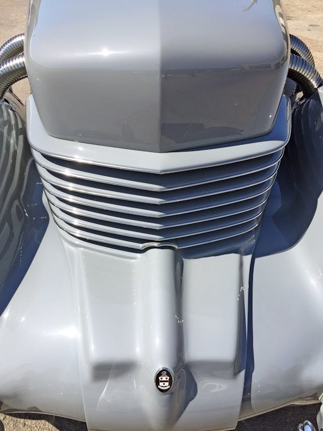
Somewhat like a bedsheet over a sleeping beauty, that center panel drapes over the Cord’s radical gearbox.
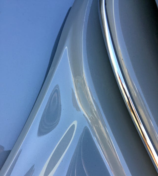
Note how the center panel blossoms to match the grille, giving a sense of speed as the engine bay whisks your eyes down the chassis.
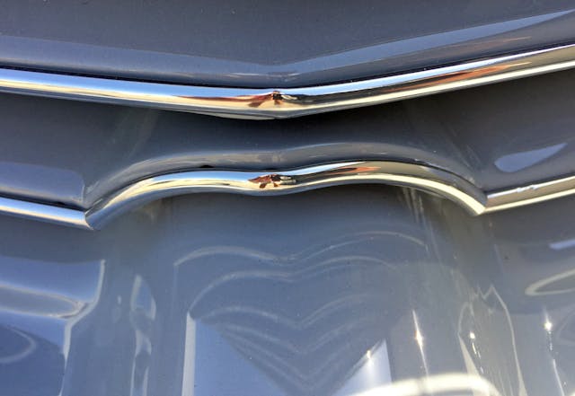
Because there isn’t enough surface area, you can’t have a flat-paneled, body-color grille texture on a traditional radiator; but Cord proved that adding such a grille in front of the radiator opened up a world of possibilities to automobile design.
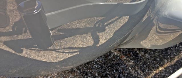
While its internal radiators were a step ahead in 1937, the Cord’s external bumpers (see reflection) represented old-world craftsmanship and allowed a premium vehicle to show off its body’s elegant leading edge. Lacking the voluptuousness of one-off, custom bodies of the era, the Cord has a certain restraint typical of cars that, no matter their era, were ahead of their time.
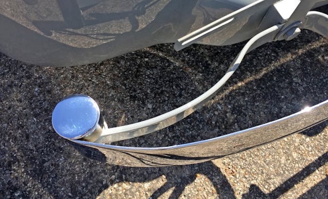
Wispy, chromed bumpers were par for the course, but imagine if large amounts of that chrome plating were painted body-color to create even more of a streamline moderne theme.
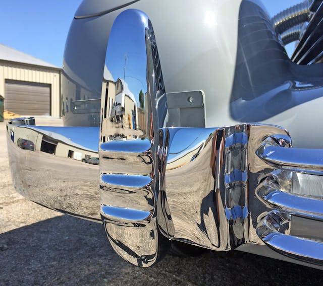
More paint and less chrome would predict the future, but the Cord’s ribbed bumperette, thick metal face, and delicate tri-bar center section are still a welcome nod to streamline moderne‘s sense of aerodynamics (as it were) and the time period’s impression of visual speed.
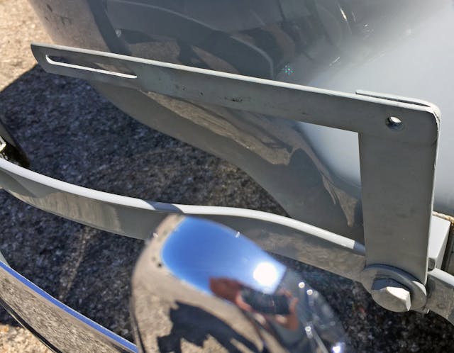
The front license-plate holder is certainly downmarket, but consider the cost-prohibitiveness of making such a radical vehicle when the parent company was on the verge of bankruptcy (Auburn, Cord, and Duesenberg would all fold in 1937).
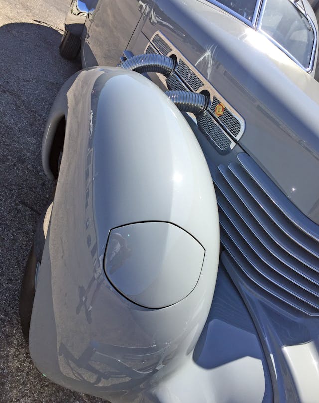
Cord spent money where it mattered: bashing a single sheet of metal into these fenders and that one-piece hood.
The cooling vents were beyond subtle, and the exhaust cutouts were sufficiently decadent for a Duesenberg. While the latter feature isn’t streamline moderne in spirit, it makes sense considering that the same company made the Deusenberg Model J. Branding is nothing if not crucial to the luxury car game!
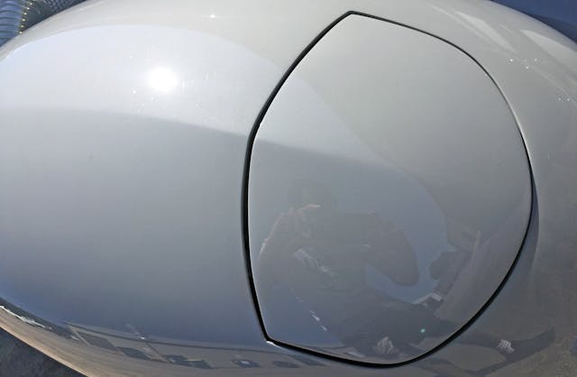
A hard crease in the middle of a front end panel is uncommon for this era, but it matches the next crease (presented below).
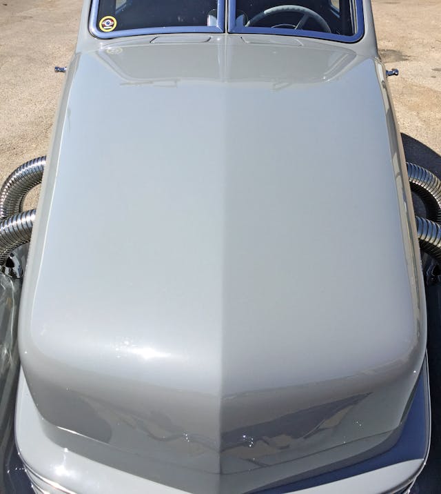
This is a good time to reiterate the radical implications of a rear-hinged hood: creating a coffin nose and foreshadowing a future in which every car gets a “face,” independent of a radiator’s design constraints.
The creative license generated here for future designers cannot be understated.
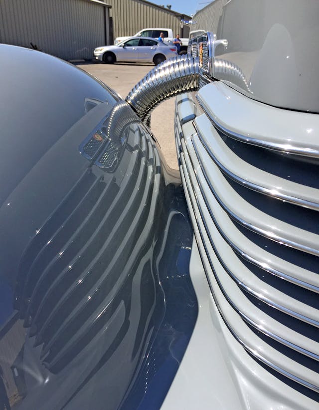
Considering the reflection, perhaps there’s no stronger tribute to streamline moderne than the Cord’s wraparound grille.
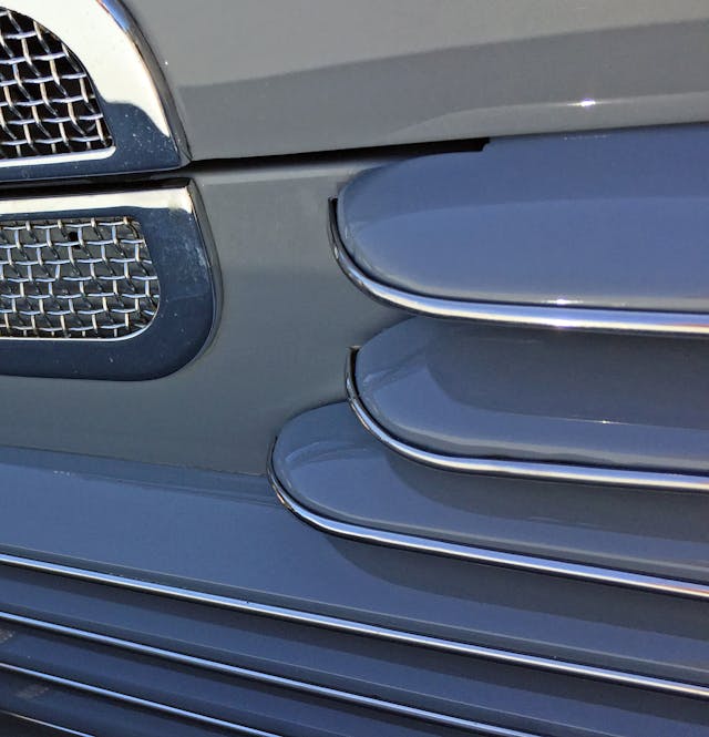
The first two grilles are short, the third is a bit longer, and the remainder continue to the end of the panel. The odd flow is accentuated by those delicate chrome inserts, giving the impression of several elongated, inedible Milano cookies stacked together. Considering Pepperidge Farm was founded in 1937, is this a coincidence?
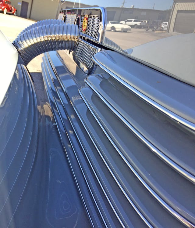
Would the Cord be streamline moderne if the grilles didn’t move around the engine cooling vent like lines of smoke around a car in a wind tunnel?
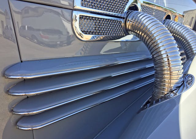
Perhaps those grilles went an inch too far, but they must extend beyond the engine compartment to give the sensation of speed needed for the design to work.
Those speedy lines and the slow, stodgy exhaust-pipe covers, on the other hand, mix like oil and water.
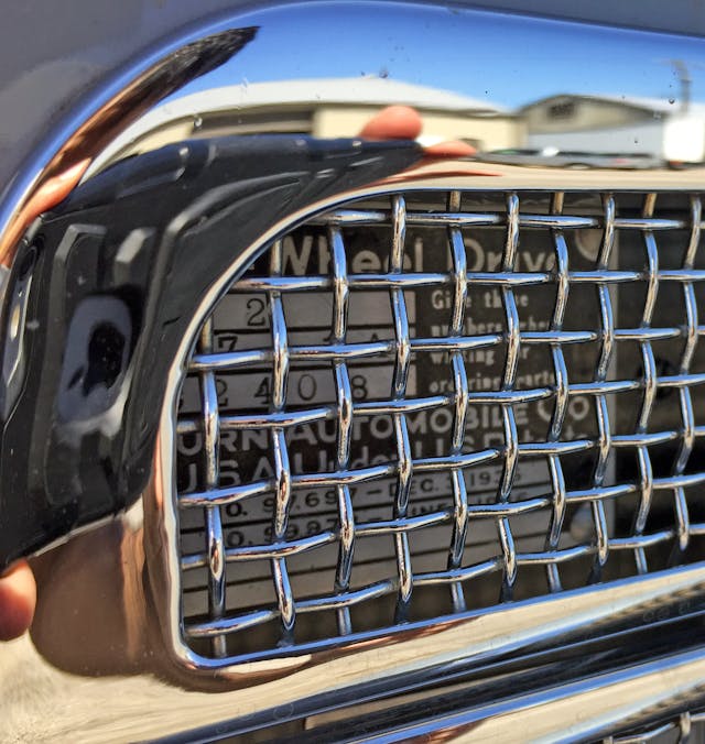
The grille texture still looks expensive; everything from today’s factory Bentleys to anything roaming the streets with an aftermarket STRUT grille embraces the mesh look.
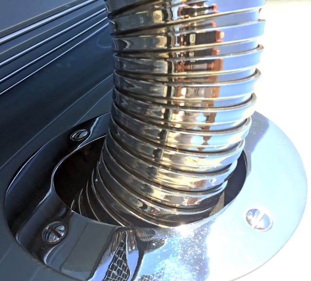
Exhaust pipe sleeves and screw-in fender grommets are so extravagant that you almost forget the nation was in the depths of the Great Depression at the time.
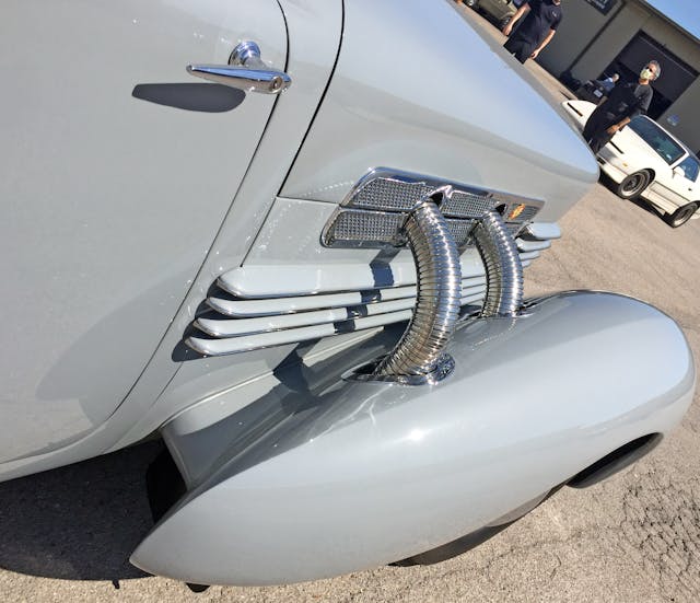
The fender’s hard center line (over the headlights) ends at a sharp rear coda, an elegant ending for many beautiful lines. If you needed proof that vanishing points in automobile design are crucial to beauty and harmony, here you go. The deletion of running boards was a front-wheel-drive Ruxton innovation, but their absence makes more sense when bullet-tipped fenders highlight the change.
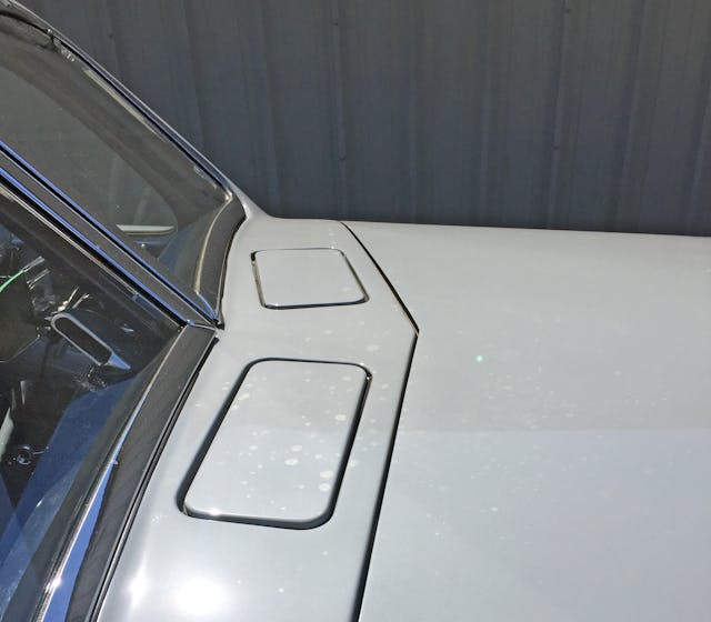
Pop-out, fresh-air ducts match the hood’s V-shaped cutline, but the windshields’ concave curves are better suited to a teardrop-influenced Talbot Lago.
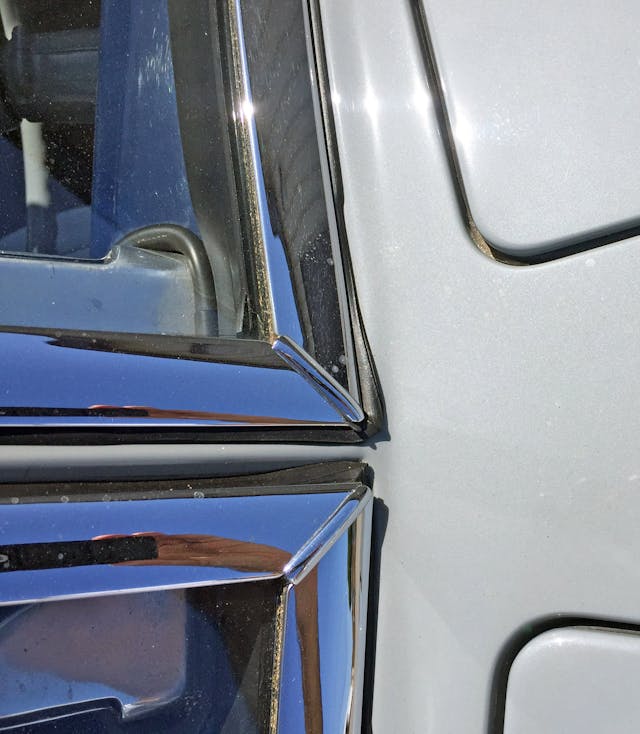
While the chrome is suitably upscale, the multi-piece design and squished weatherstripping is a bit clumsy. Since this Cord sports a concours-quality restoration, the arrangement is likely correct.
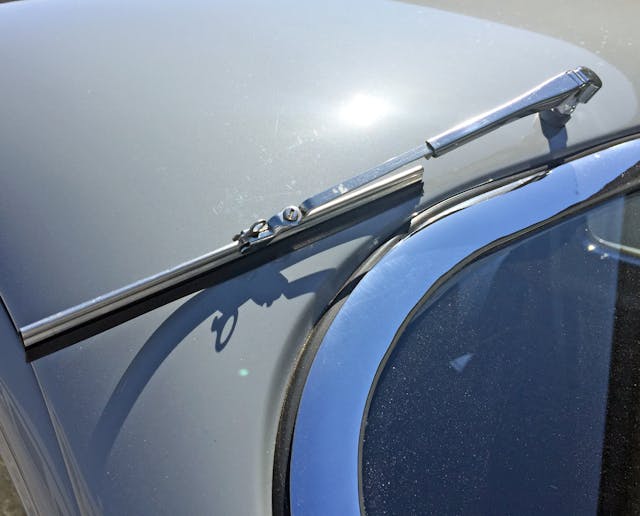
Since every Ford from the Model A to its 1937 Ford successor had beautifully integrated wipers (on an admittedly flat windscreen) Cord really needed to do better for this luxury vehicle.
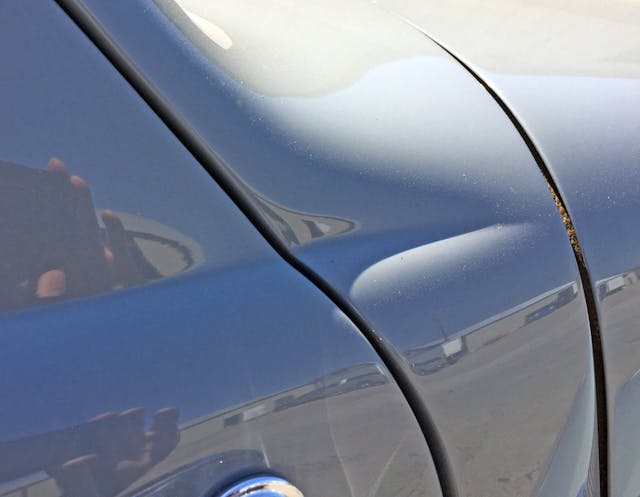
Note of the cowl’s crease—it forms a C-shaped contour around the entire cabin.
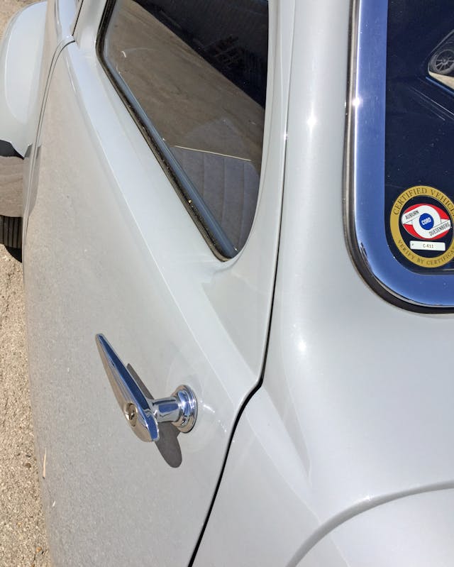
The crease naturally blends into the lower boundary of the daylight opening (DLO), marking a strong change between the slab-sided door and curvaceous window treatment. Again, the lack of running boards adds more negative area; the rear fenders now live in solitude.
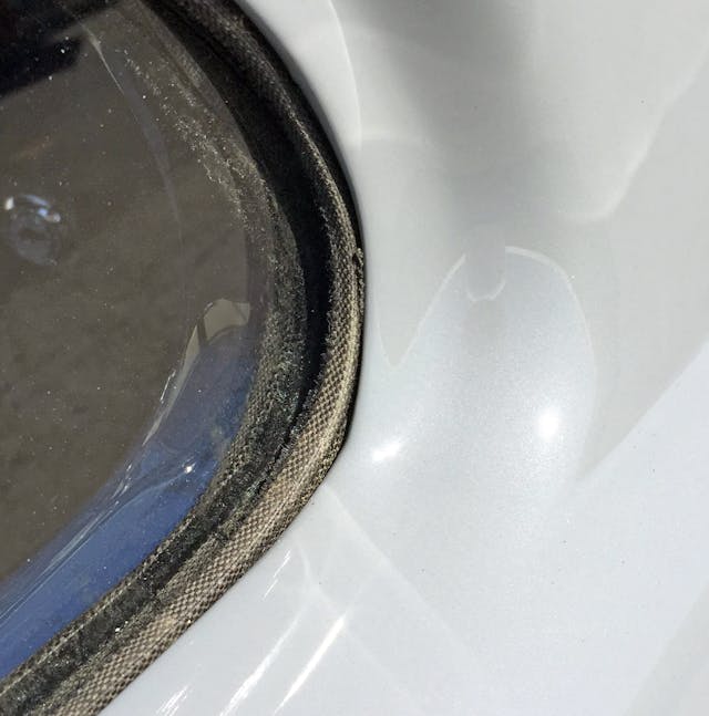
The door’s sloppy curve visually “digs” into the window weatherstripping. Bummer.
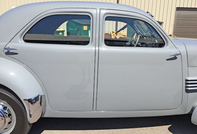
The greenhouse has a sleekness not seen on sedans until the 1940s, while the deletion of the running boards exposes the rocker panels and likely necessitates the fender’s chrome cover to protect against rock chips.
The strong parallel lines and right angles around the B-pillar create visual harmony as they blossom out to the doors. However, while the front suicide door’s taper clashes slightly with the more vertical cowl, the rear door naturally flows down the C-pillar and around the fender.
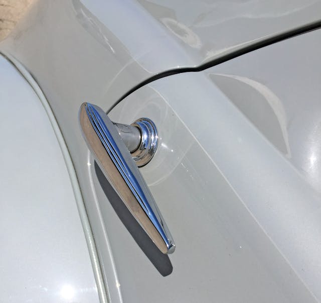
Door handles are “of the era,” right down to the speed lines embodying the streamline moderne aesthetic.
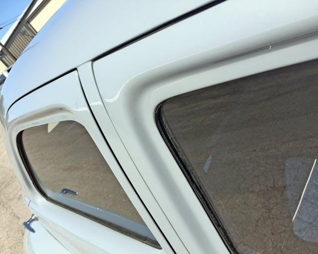
Tucker made waves with wraparound door sills, but Cord did it with understatement a decade beforehand.
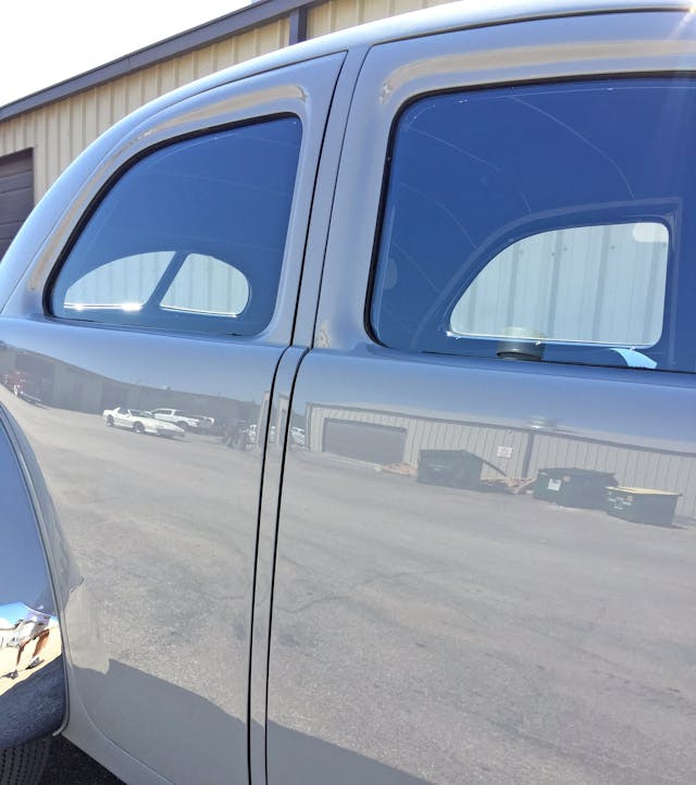
Forget streamline moderne’s stereotype as either excessively linear or overly curvaceous; the cabin’s distraction-free body side mimics streamlined locomotives of the era.
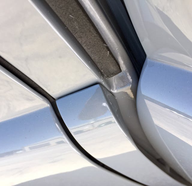
Opening the suicide door reveals how the B-pillar (and the associated body panel) are separate from the metal affair that meets the exterior door skins.
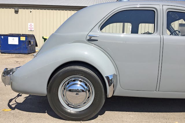
The wheel arches taper aggressively inward, perhaps too much for the (correctly sized) tires.
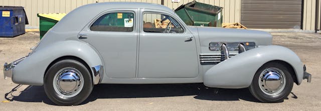
Focus on the low stance, that cab-backward design, the exposed rocker panels, the fender’s forward-thrusting motion, and the effortless transition between A, B, and C pillars.
The concrete (technically, Cadet Gray) color also pays homage to streamline moderne’s impact on architecture of the era. Yes, really.
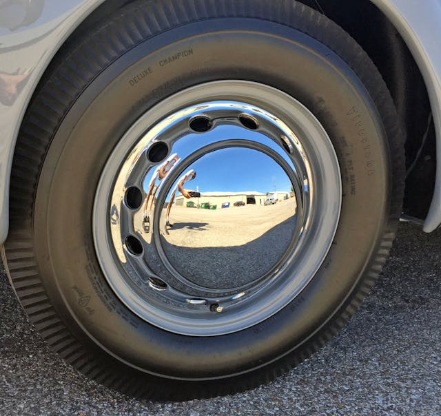
The chrome wheel cover is pure minimalism, but portholes give it an Art Deco feel.
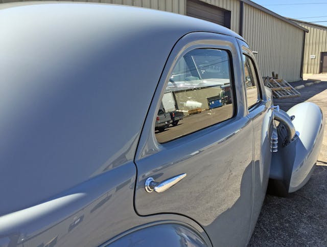
Imagine disembarking a Mercury train, leaving the Palo Alto station in California, and approaching this portal. That’s a streamline moderne moment worth a daydream.
The body tapers inward, the front clip floats in space (without running boards), and you soak up the airplane-like shape of the fender before you duck down to slide into the sleek cabin. That crease you saw running through the headlight doors? That becomes a hard bend which creates the fender’s strong shadow.
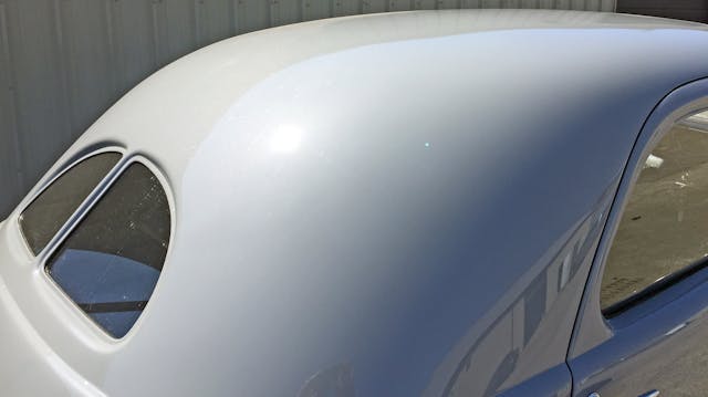
The roof could have been a hemispherical dome if not for C-pillar’s radical plunge. Such a drop was needed to meet the similarly “fast” rear deck.
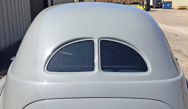
Note how the rear window’s chrome-free, stamped recesses are pure and simple relative to the front’s implementation. The look is period-appropriate but feels surprisingly downmarket, considering that the roof’s heavy use of tumblehome (narrowing width as you climb up the roof) creates a dowdy, gumdrop shape.
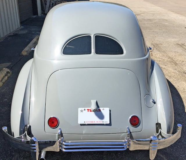
The character line that started at the base of the A-pillar circles the rear, delineating the roof and deck lid. That deck lid’s slope is very aggressive, with integrated taillights that are a welcome change from the hanging appendages seen elsewhere in the 1930s. Note how small the windows are relative to both the roof and deck lid!
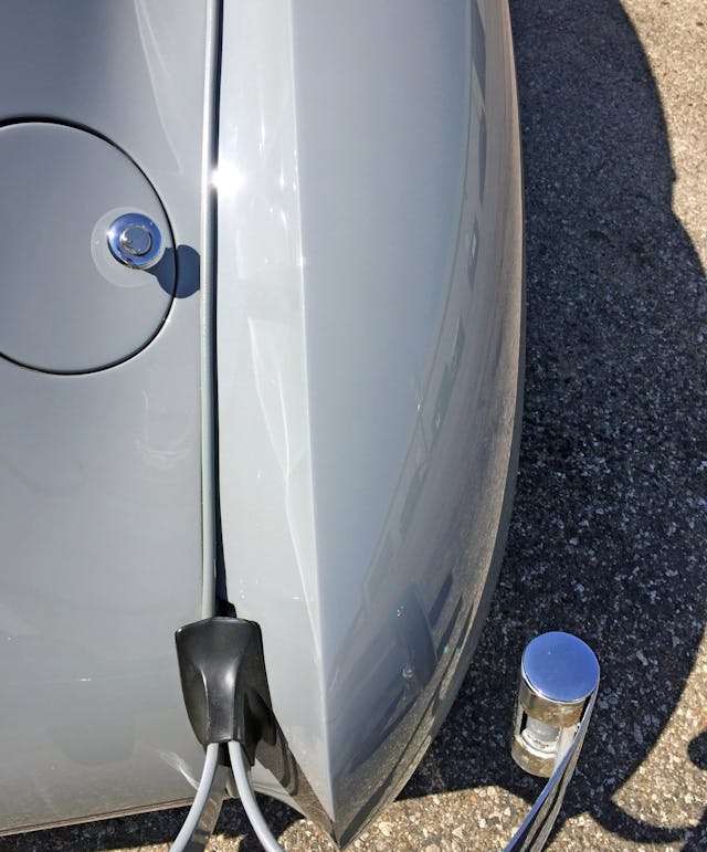
Much like the front fenders, the Cord’s rear fenders end at a point. Each apex lies beyond the trunk’s edge; but unlike the front, there’s a bumper in your line of sight.
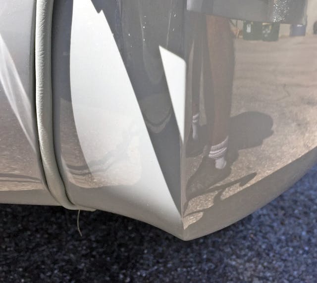
Much better! Even the fender welting (the piping between the panels) looks upscale when bolted to that beauty.
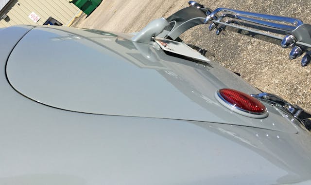
Clearly the Cord wasn’t intended for utility. This aggressive slant ensures you won’t carry a well-endowed family’s worth of luggage.
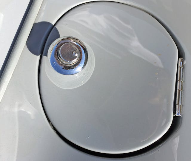
The hidden gas cap was no small feat, with its covered lock mechanism and hinge sunk into the body.
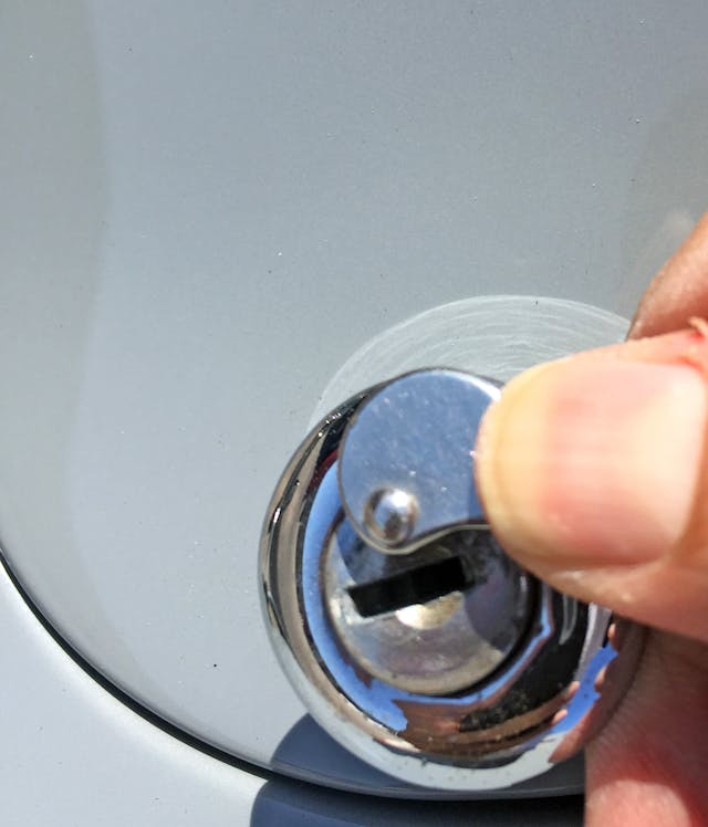
Compared to the same feature found on luxury cars from the 1950s, the thicker, spring-loaded cover moves with a surprising amount of heft.
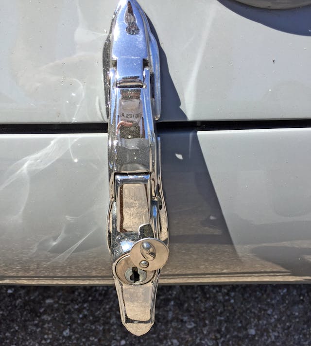
Pre-war craftsmanship shows strongly in the trunk latches, especially the unit equipped with the lock mechanism.
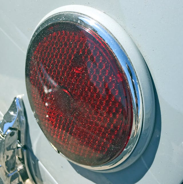
Rear lights mounted so close to the body without exposed screws is outstanding. Two layers of paint and chrome feel expensive but look modest.
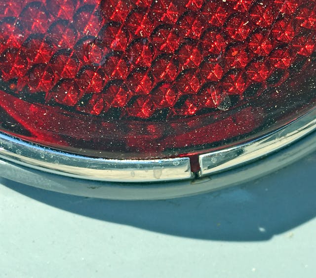
It’s kind of sad they couldn’t make a better bit of chrome for a car of this magnitude.
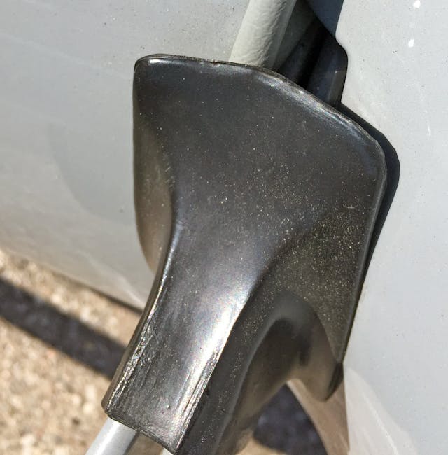
The rear bumper meets the fender, fender welting, and deck lid in a difficult position. Sadly, the black modesty sleeve does a poor job sealing against those complex shapes.
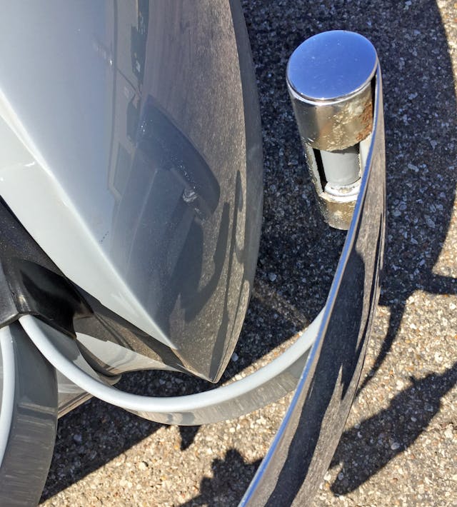
These bumpers may be glorified leaf springs, but the combination of body-color paint and chrome exterior trimmings is suitably beautiful. The cylinder with a metal ribbon shooting out its side isn’t unique, but charms the eye much like a staircase railing at a streamline moderne movie theater.
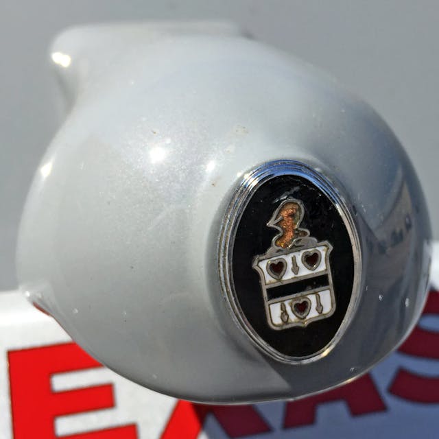
The license-plate light sports the same family crest as the front. However, it’s an oddly shaped assembly.
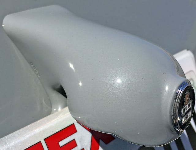
The droopy blob of a light lacks elegant streamlining. Since it’s the deck lid’s most conspicuous protuberance, that’s unfortunate.
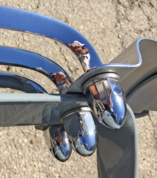
Chrome acorn nuts for each bumper rod are indeed gorgeous. It’s almost unfortunate they hide inside the bumper.
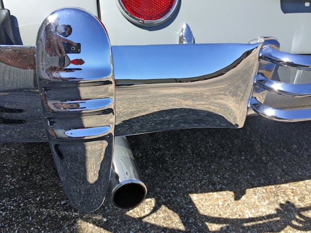
The triple-bar theme is repeated at the rear with an exhaust pipe hiding just behind the bumperette. These are probably the same parts, as bumper designs were somewhat interchangeable before the era of dagmars, aerodynamic tuning, or lightweight plastics.
While not perfect, the Cord 810 and 812 are unquestionably stunning. No other vehicle combined pop-up headlights, a radiator-free fascia, running board deletions, and low-slung, front-wheel drive tech into a streamline moderne package. The Cord 812 was a harbinger of things to come, but could anyone anticipate a world in which Cord’s innovations shared the road with CUVs that eschew the architectural advantages of their front-wheel-drive design for taller ride heights, running boards, front ends with goofy headlights, and grille textures mimicking the complexity of the radiators behind them?
We definitely need more streamline moderne in our showrooms and garages. Thank you for reading—I hope you have a lovely day.

