8 1960s Classics With Faces We Can’t Help but Love
We blame the weather. While the staff of this website calls many places in the United States (and overseas) home, the lion’s share of our editors are located somewhere in the Midwest. And right now, dear reader, the Midwest weather is volatile as hell.
Naturally, we turned to internal discussions about cars to cope with a week where temperatures fluctuated by as much as 50 degrees and weather patterns swung from rain to sun to snow and back again.
This time around, we got to talking about the ’60s, one of our hobby’s indisputable golden eras. That led to discussions about front-end design, and how radically different it was from automaker to automaker. In short order, many of us began campaigning for certain cars with front ends that stuck in our hearts and minds, for one reason or another.
Compiled here is a list of eight such cars. Beneath each nominee is a brief summary of why it warrants appreciation, made by each car’s loudest proponent in the (chat)room.
Rules? Delightfully few. The car had to be built at some point in the ’60s, and beyond that, it was up to each of us to make the case. Naturally, such a loose mission brief will have let many great cars slip through the cracks. Got one that should have made this list? Let fly in the comments below!
1968 Chevrolet El Camino
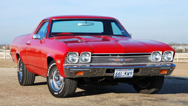
If your first thought was that the face of the ’68 ElCo is virtually the same as that of the Chevelle, allow our own Cameron Neveu to offer the most compelling—if a bit unorthodox—case for picking the former:
“Why the El Camino over the identical appearing 1968 Chevelle? Well, the ElCo front end looks even sweeter knowing you’ve got a bed out back.”
An open and shut case, in our eyes. The 1968 model’s four round headlights make it extra distinct, and while the performance fan in us enjoys the SS badge between those four eyes, there’s something about the long, horizontal Chevy emblem that we can’t resist.
1968 Citroën DS
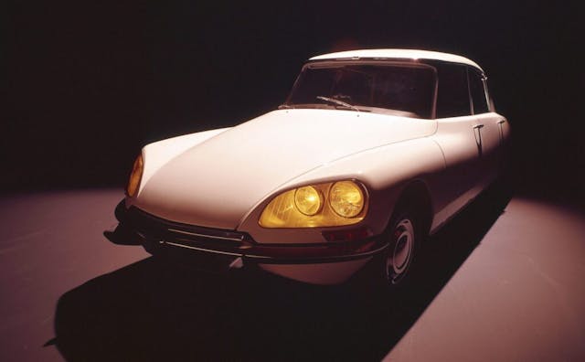
The DS pops up in all sorts of design lists, and for good reason. Those swooping body lines were quite brave for the era, and who could forget the high-tech hydraulic suspension that gave the car a magic carpet-like ride, helping to accentuate the design details that seemed to float over the blacktop? But the nose is worth celebrating on its own. As U.K. correspondent Nik Berg reminded us, if you sound out the DS title with a thick enough French accent, you’ll hear “Deésse,” which just happens to be French for “goddess.”
The big, wide headlights at either corner, contrasted with the waterfall of the hood in the middle, the exceedingly convex chrome bumper, and the lack of a grille make this front end as striking as they come.
1965 Buick Riviera
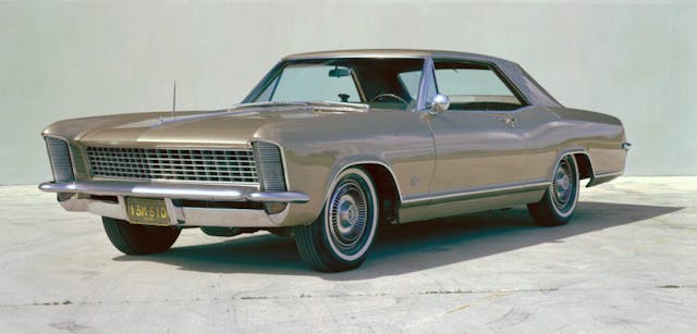
If the front end of a car were to be described as “very Teddy Roosevelt-esque,” could you picture it? In a single sentence, Eddy Eckart swayed the jury in his favor: “Simple, and formal in a means business kind of way, all without being too assertive.”
Gaze upon the forward cant of those headlamps; marvel at the buttresses flanking the massive hood. “The Riviera looks like a concept car that actually made it to production,” added Brandan Gillogly. There’s a reason this car is a popular choice for custom builders and restomod specialists, and it has everything to do with how the Riv’ manages to speak softly, while … well, you know the rest.
1966 Alfa Romeo Giulia Duetto Spider
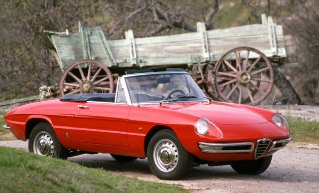
If the Riviera is an American sledgehammer, Stefan Lombard nominated a delicate Italian pickaxe to contrast it. While it’s hard to find a bad angle of the Giulia Duetto Spider, the car’s clean, simple face manages to avoid the “mouth-agape fish” look that so many small cars of the time suffered from.
He also noted that while many cars look great from a front 3/4 angle, it can be harder to make the head-on view sing. In the Duetto’s case, Lombard had this to say: “The sloping nose and covered headlights lead into that delicate V grille, which flows back beneath the car. I love it.” Hard to argue with that!
1969 Chevrolet Corvette
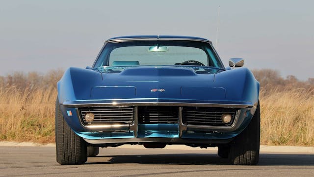
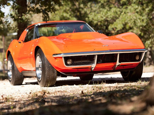
The chrome front bumper the third-gen Corvette stuck around through 1972, but since the design debuted in 1968, it counts. Resident Corvette fanatic Grace Houghton opted to shout out the 1969 model, and we didn’t need any additional convincing. Two beautifully high fenders dip down to a broad chrome bar that spans the width of the car’s face. Below the bumper, two rectangular inlets, each housing a round turn signal bulb. The look, as Houghton so eloquently put it, “manages to look muscular and delicate at the same time … So Mako Shark, and so good.”
Bonus points if we’re looking at a ’69 L88, with its massive hood bulge shrouding a 427 big-block.
1969 Ford Mustang Mach 1

Though it’s easy to blur the lines, it bears repeating that “muscle cars” and “pony cars” were not always the same things. When it debuted in April of 1964, the Mustang was a relatively docile thing. The front end might be famous now, but that has more to do with what the Mustang has become in automotive culture than it does with how it looks on its own.
That look began to change almost immediately, as our resident Ford guru Sajeev Mehta reminded us. By 1969, the Mustang’s face had gone from cheerful companion to something far more sinister. As Mehta put it: “The 1969 Mustang took the hum-drum front end of the 1965 model and made it deeper, more aggressive, and far more angry. It became half muscle car and half pony car.”
1963 Studebaker Avanti
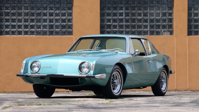
Though I’ll admit it’s not my favorite front end from the 1960s, there’s something distinctive and instantly recognizable about the Studebaker Avanti that warrants respect. Those perfectly round headlights seem like they should flank a broad grille, but instead, it’s just solid bodywork. That decision highlights the offset futuristic-script “Avanti” emblem that proudly proclaims the model’s identity. The fenders end in sharp corners, framing the simplicity of the grille-less countenance. You can’t help but appreciate designer Raymond Loewy’s flair for the dramatic.
“Counter-point, there should be a grille between this headlights and this nominee is actually bad.” – Stefan Lombard
Well, that’s just like, your opinion, man.
1968 Dodge Charger R/T
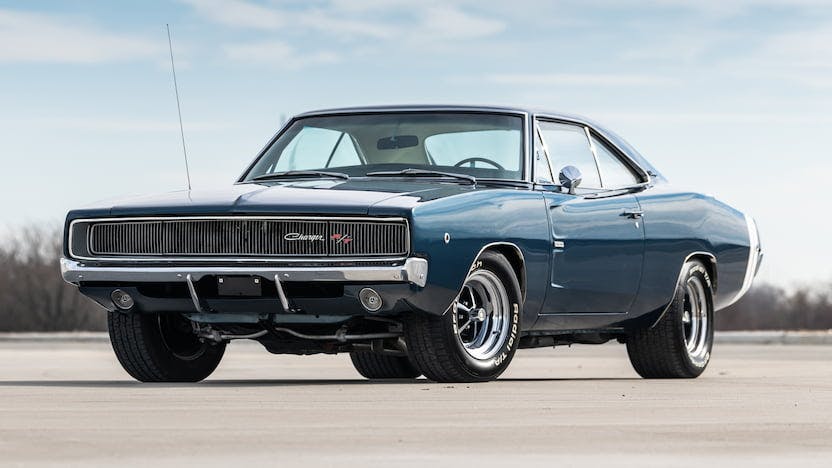
Fret not, Mopar fans, our site’s executive editor has you covered. Eric Weiner was swift and decisive with his nominee, the ’68 Charger. That broad, mail-slot rectangle of a grille is immediately recognizable. Hidden headlights add a menacing tone to the front end, and this is one of the few cars that makes a large front overhang look attractive.
This rectangular motif also carries over onto the new Dodge Charger. Anytime a front end’s design elements can look attractive in two distinctly different eras, you know you’ve got a winner in your hands.
***
Check out the Hagerty Media homepage so you don’t miss a single story, or better yet, bookmark it. To get our best stories delivered right to your inbox, subscribe to our newsletters.


I can’t believe you have not listed a 66-67 GTO front end, best ever . So ahead of its time.
I think if you’re not just sticking to American cars that you left out one of the most iconic and recognizable faces ever produced. The Volkswagen split window bus!
The 1965 Riviera has the clean lines and restraint that earns it a first place in this reader’s opinion. And I’m a Ford guy.
The Mk2 Mini should be on the list. The Alfa Spider is my favorite of this list, while the C3 is on my shortlist of ugliest cars ever made. Although, the early versions with chrome bumpers and vertical rear window are more tolerable.
If the Citroen DS and Avanti made the list, how about any Corvair from 1965 on? Unique front end for a unique car that could have been great were it not for a certain attorney/activist.
64 Studebaker Gran Turismo. Clean and classy. Especially in white under the streetlights.
Not a racecar, but everyone notices.
Yikes! No Bugeye Sprite or TR3?
Luve the ElCamino. Luve the Vette. But, Im picking the Riv. Love those hidaways. A tad bit more, I’ll take the 69 Caprice… of course, with the hideaways.
The L88 427 was an iron block. The super rare ZL1 427 was aluminum..
Assuming that we are not picking the model with the biggest advertising budget for the time of it’s introduction, two models that I can recall causing a huge amount of interest in car magazines were the 1968 AMC Javelin and the 1967 Toyota 2000 GT. They were, unlike, anything else of the time.
67-68 Cougar. Beautiful. Jag XKE.
You missed the 1967 Chevy K10. Iconic.
I rate this article a 5 out of 10. I’m goin to print it out and superimpose a ’67 Cougar over that egg with eyebrows Citroen.
The 65 Riv is first on my list, the first one I thought of. I’ve loved that one since I was a kid.
I haven’t liked the Alfa, I’m not sure exactly why, it just feels “off”. Not to fond of the CItroen DS either, although it was unique in the era.
The XKE should’ve been on the list in place of the Alfa or Citroen. That was a truly beautiful “face”, and I have Enzo Ferrari in my corner for that!
L88 was not an Aluminum Big Block. The ZL1 was the aluminum 427.
Thanks, Jim, I regret missing that one and have made the correction. -Eddy